This website uses cookies.
Services Deliverables
  • Signage
  • Wayfinding
  • Brand Guide
  • Website
  • Stage Backdrop
  • Freestanding Banners
  • Keynote Presentations
  • Certificates
  • ID Badges
  • Vinyl Wall Decals
  • Photo Booth Props

Celebrating student creativity and the growing impact of Swift education

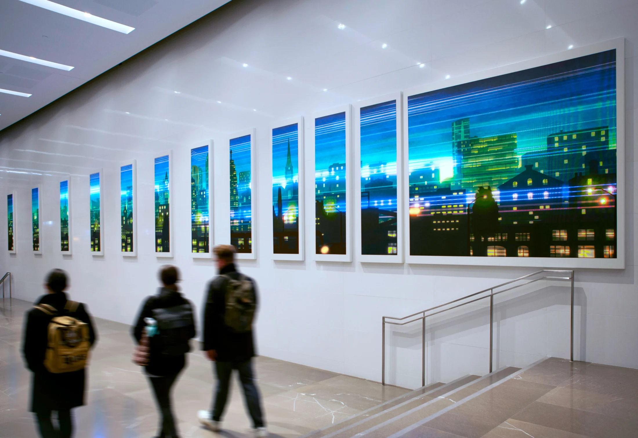
In 2025, nearly 1,000 students across Canada learned to code with Apple’s Swift curriculum through the Career Education Council (CEC), a registered charitable organization, culminating in a series of App Showcases in Vancouver, Toronto and Montreal. To build a visual identity for Develop the Future, we repurposed CEC’s signature chevrons, updating them with a vibrant gradient palette. By pairing these with a code-inspired monospace wordmark, the new brand honours its parent organization while reflecting the energy and coding ingenuity of the students. We translated this identity into an expansive suite of environmental and digital graphics, creating an immersive, high-energy atmosphere designed to celebrate the students’ hard work and achievements.
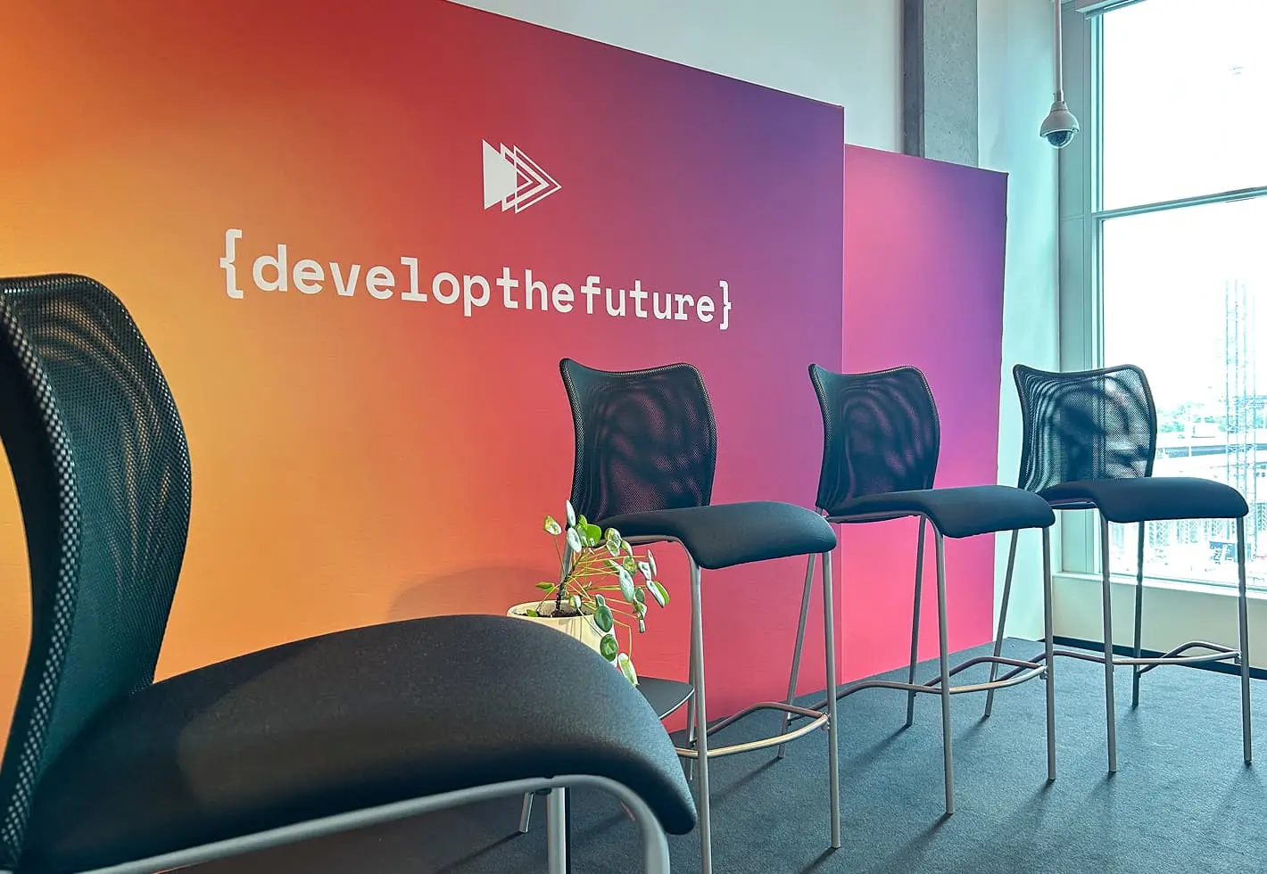
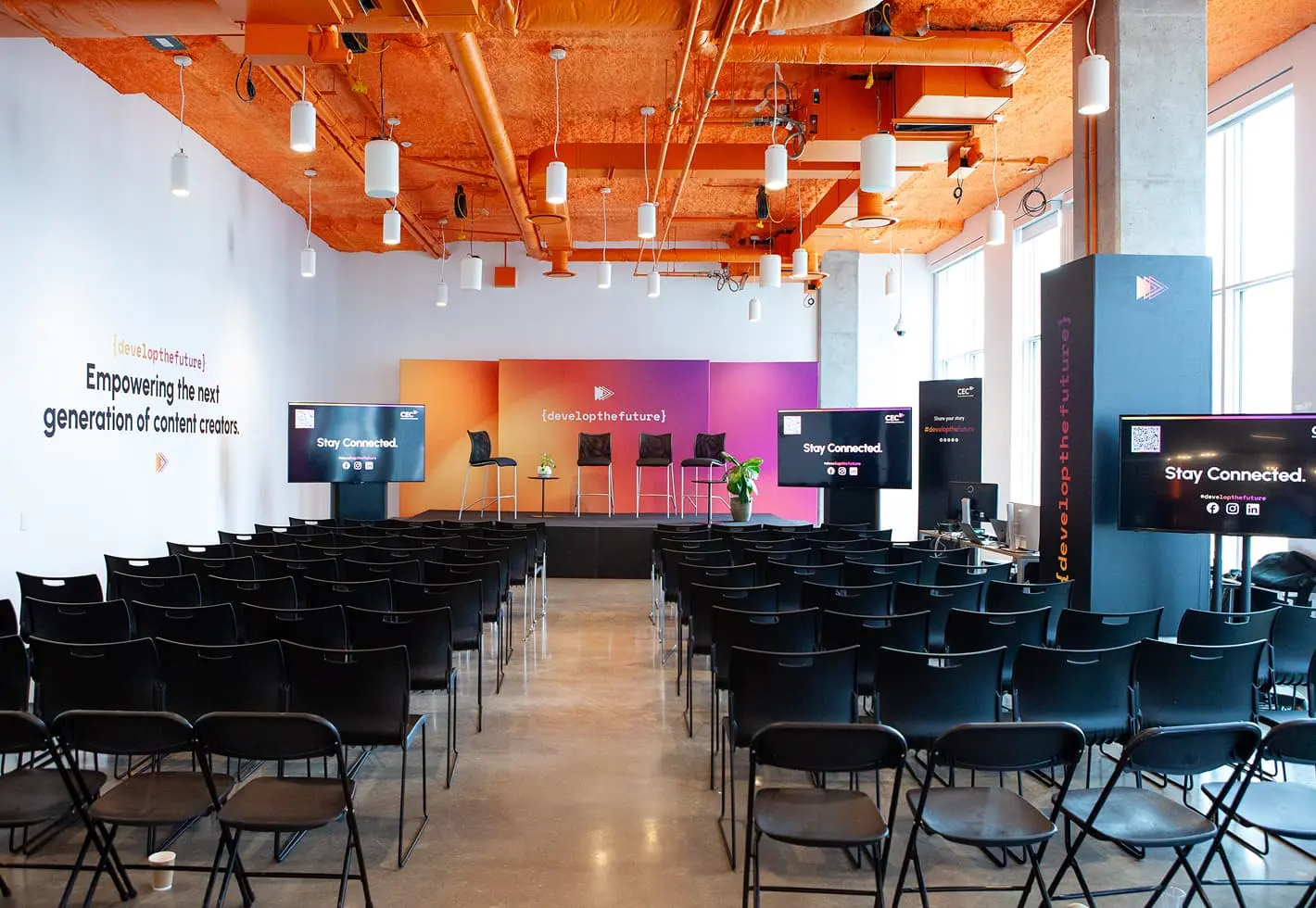
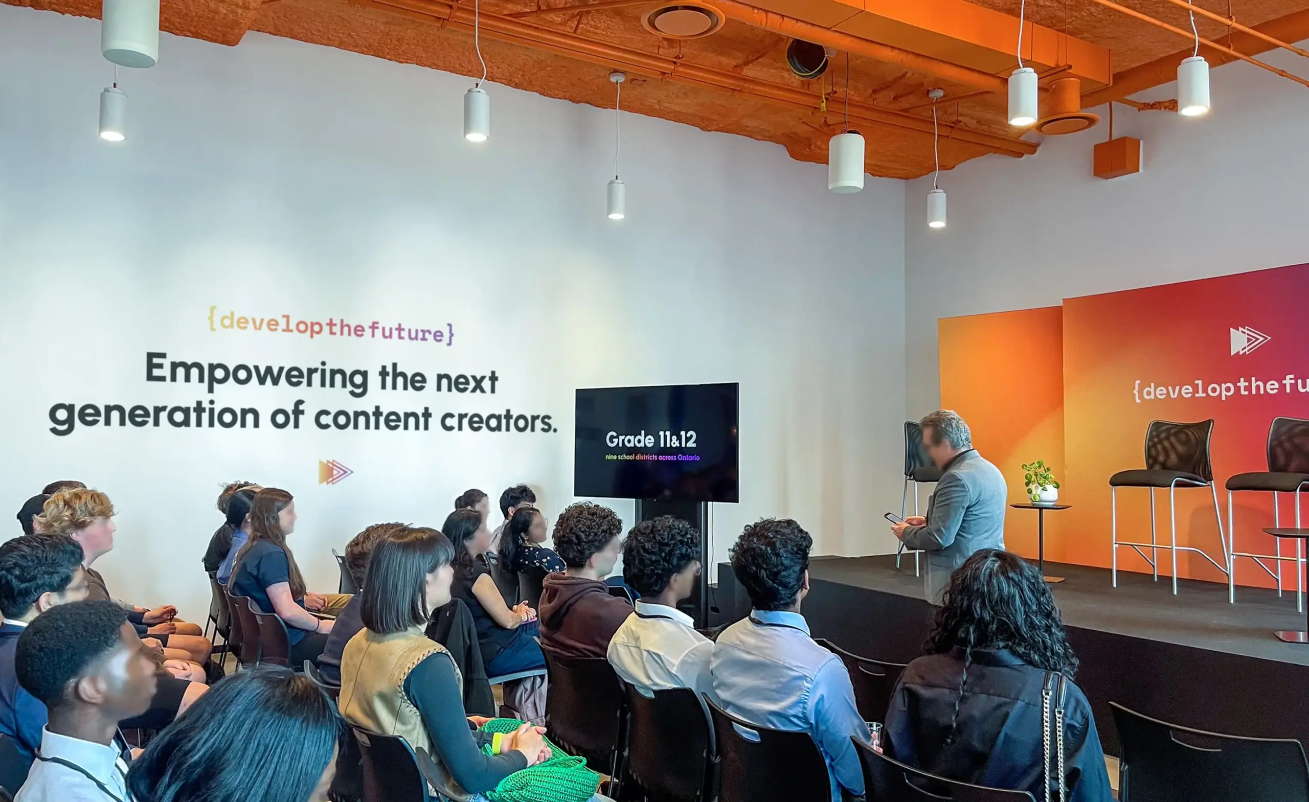
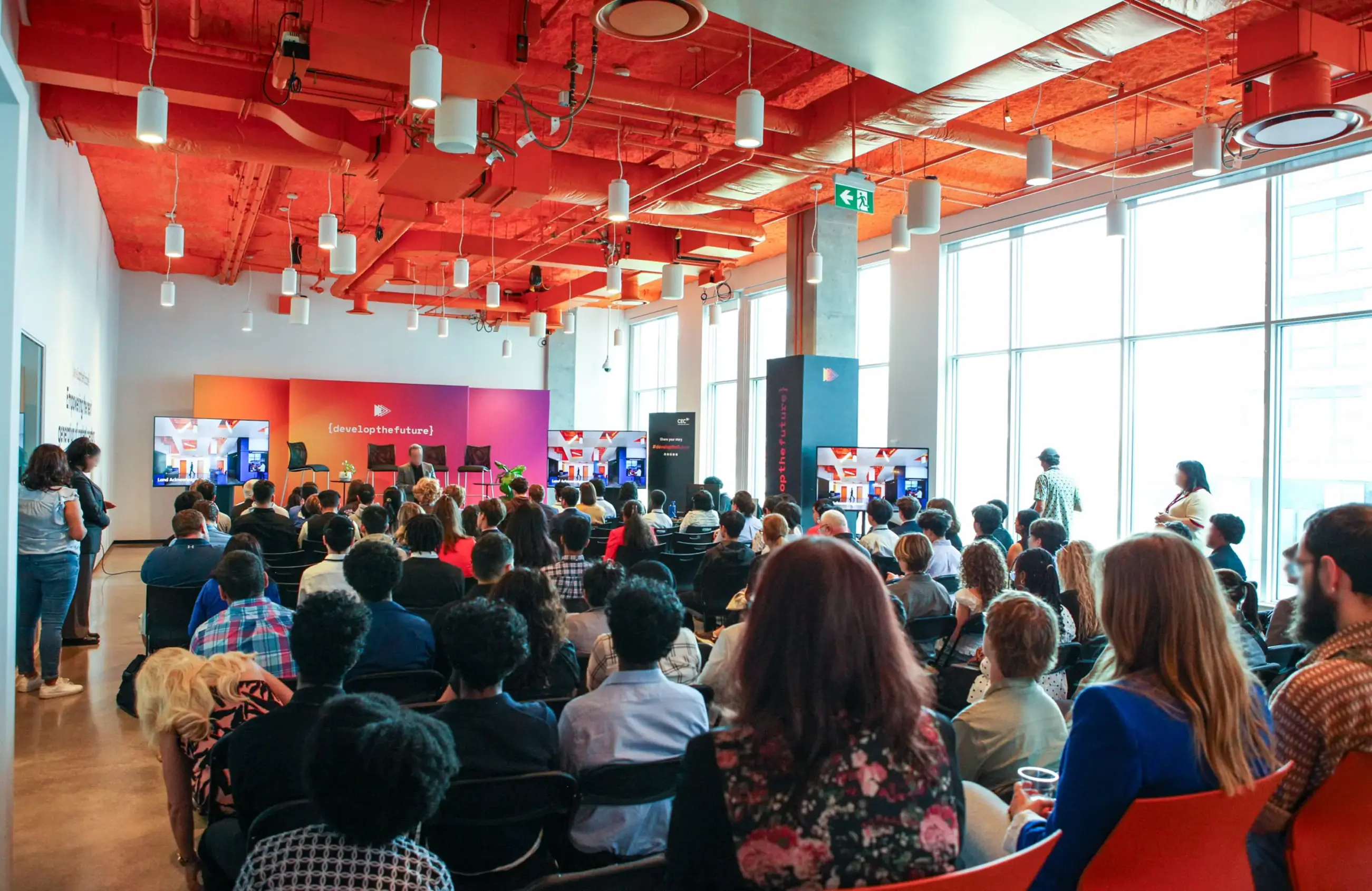
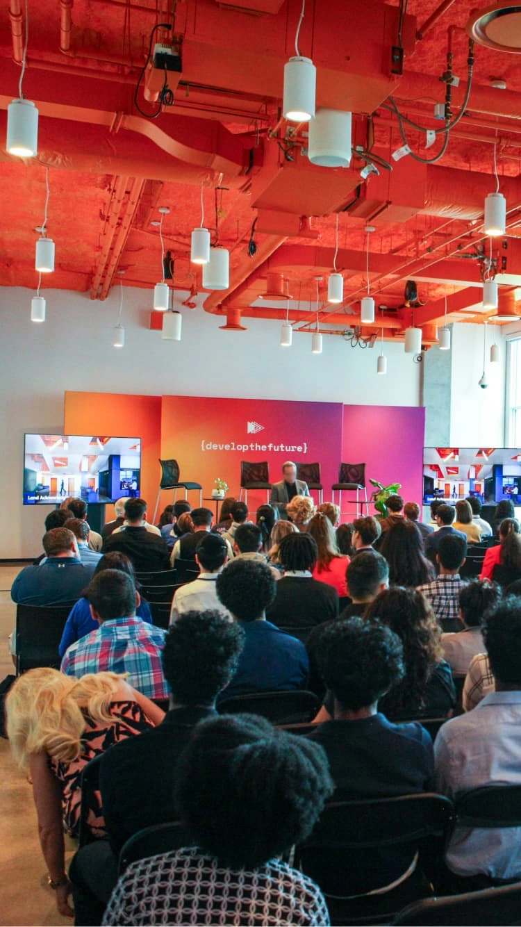
Branded environmental graphics and a main stage backdrop created an engaging event space (Toronto, ON)
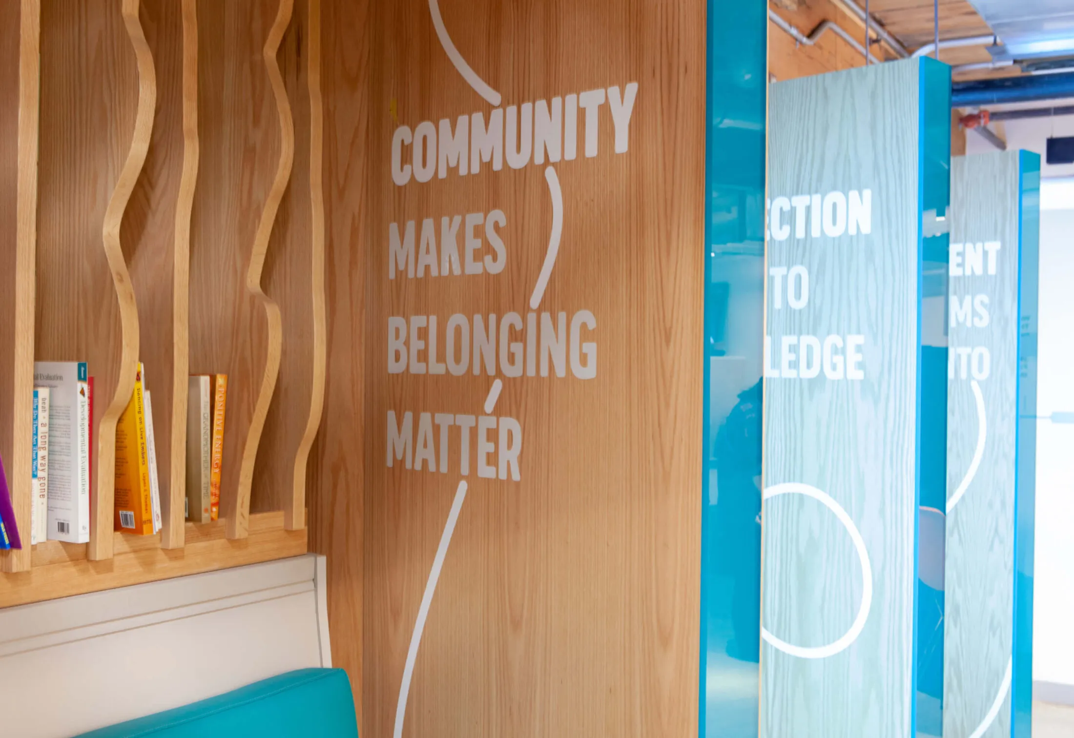
Inspirational and encouraging messages adorned the walls to engage students
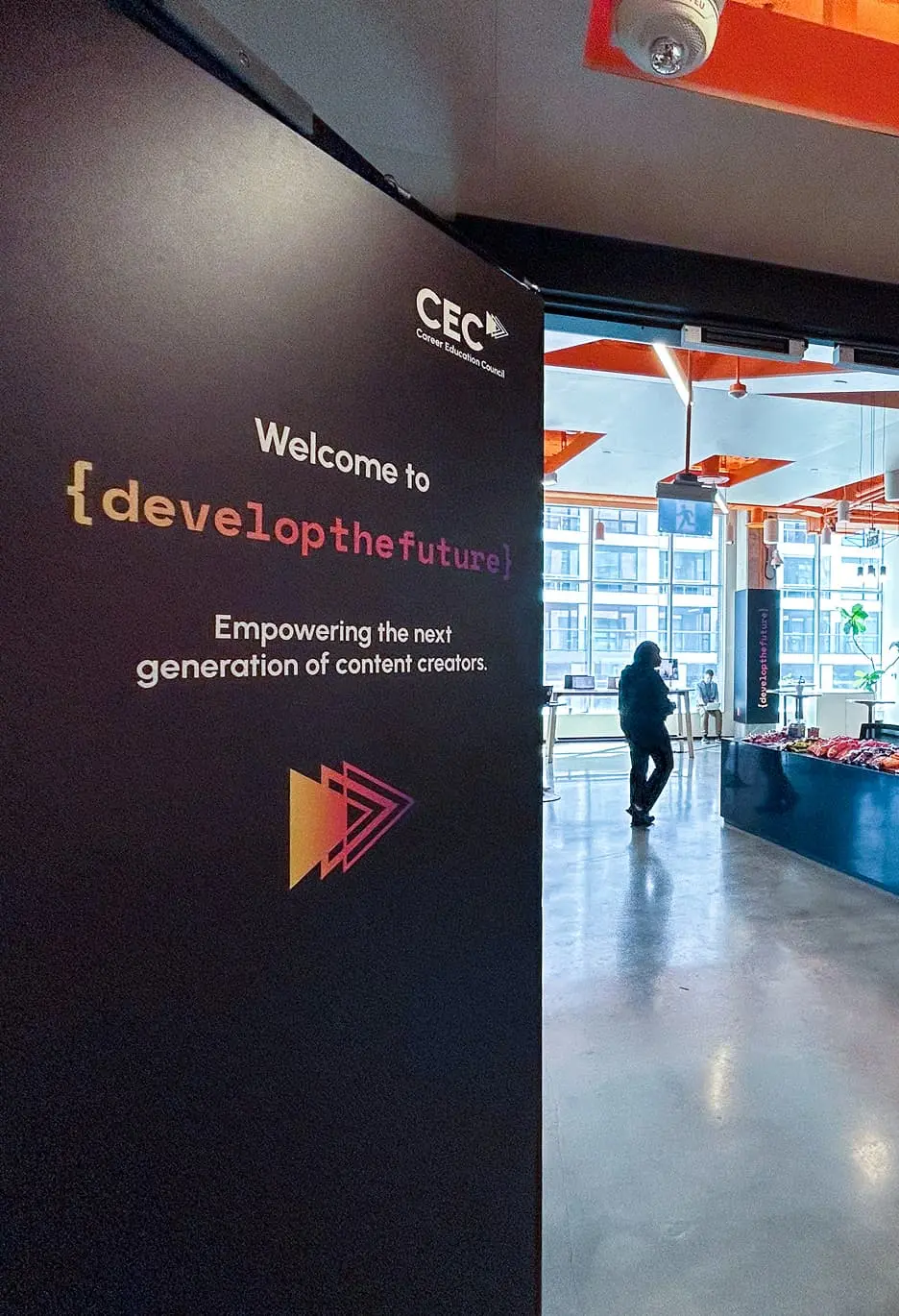
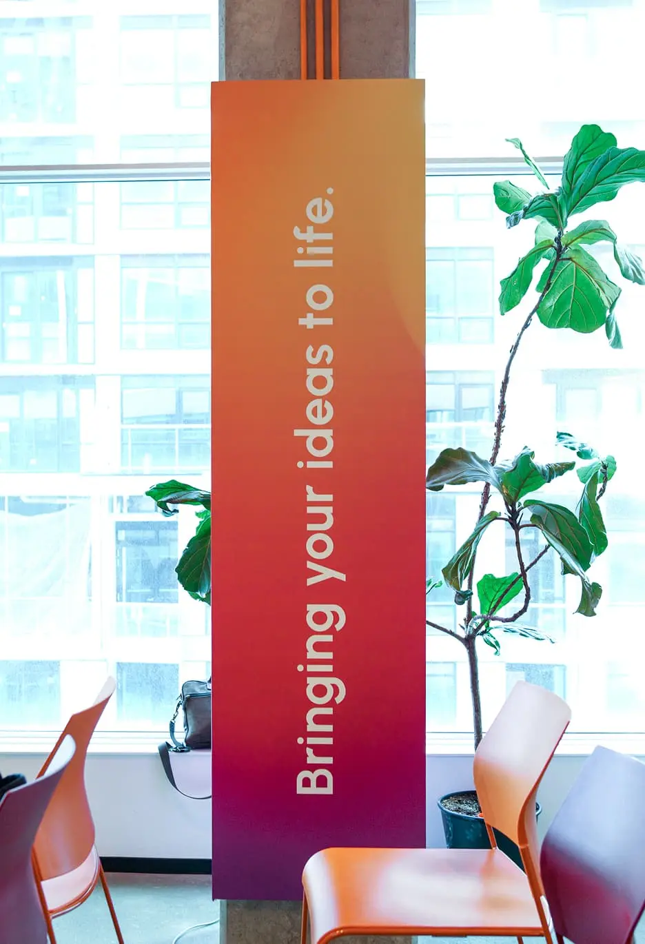
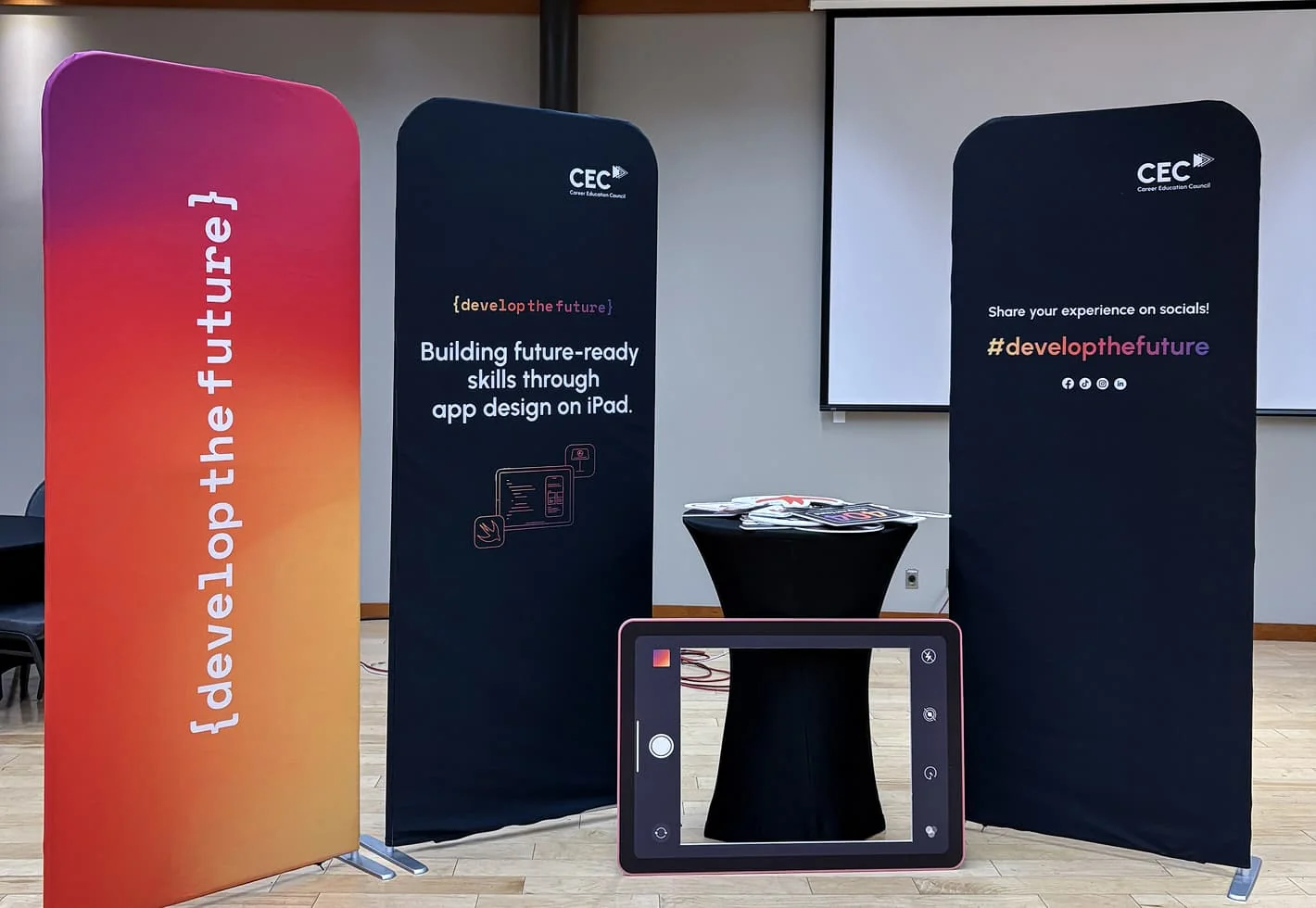
Forge designed a series of freestanding banners to welcome the students to the event and guide them throughout the space
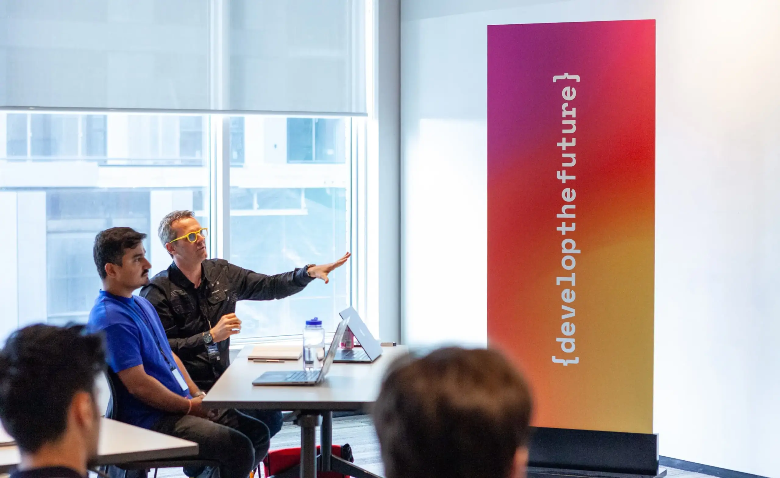
Industry experts provided feedback on students’ presentations
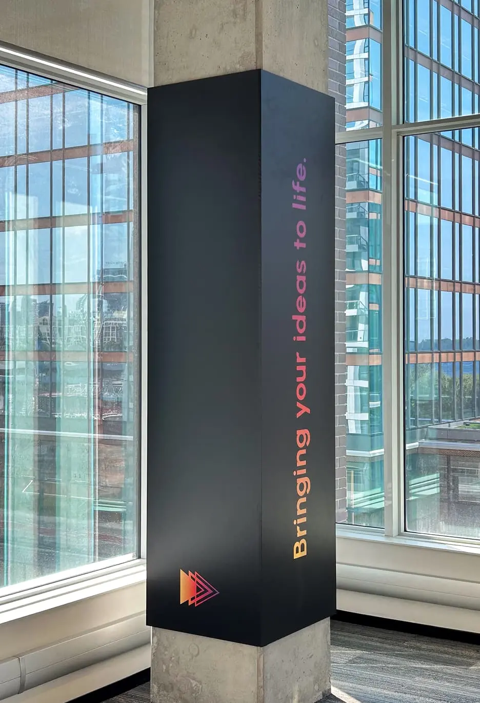
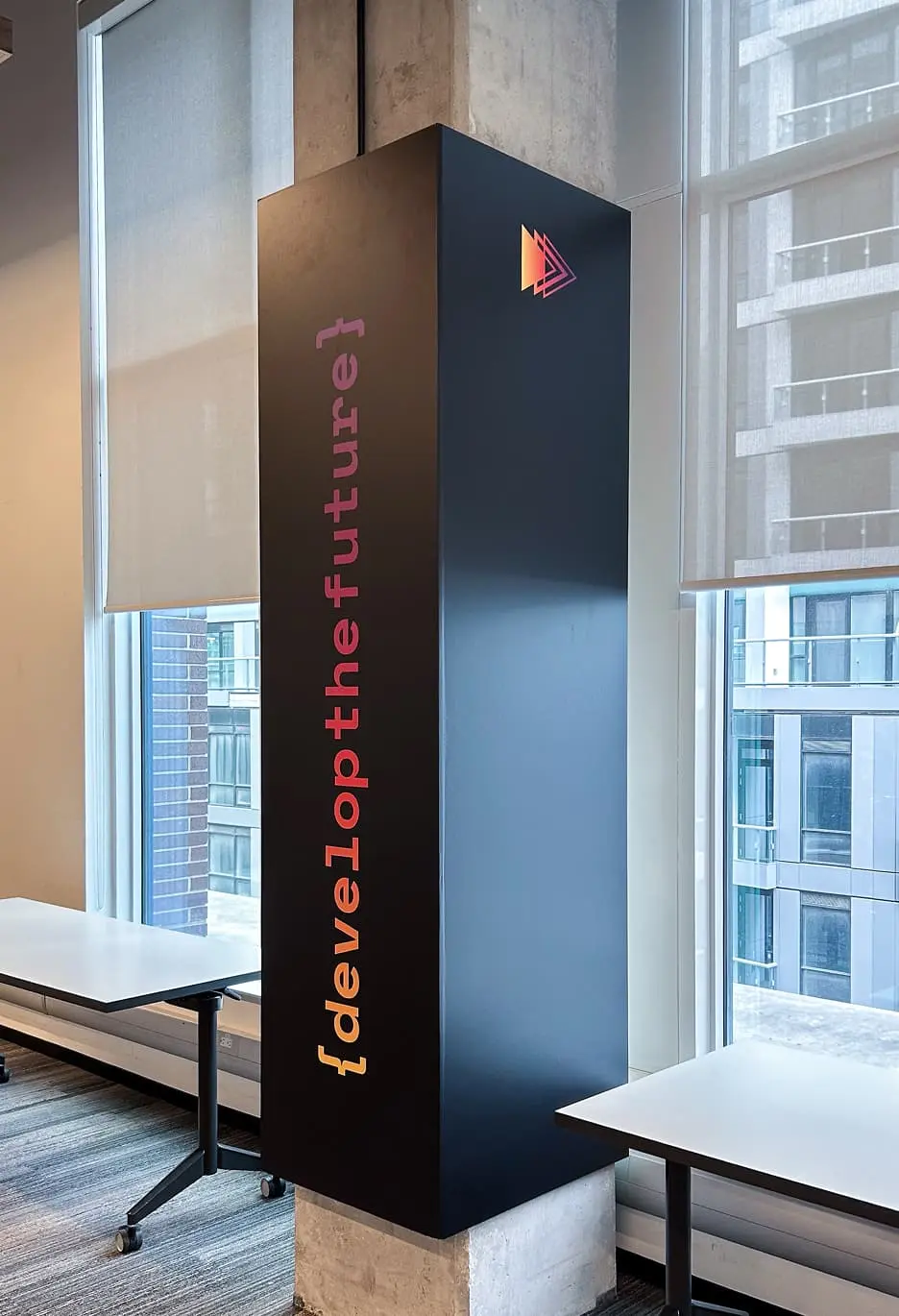
To enhance the event space, custom graphics were deployed across various touchpoints, including architectural column wraps
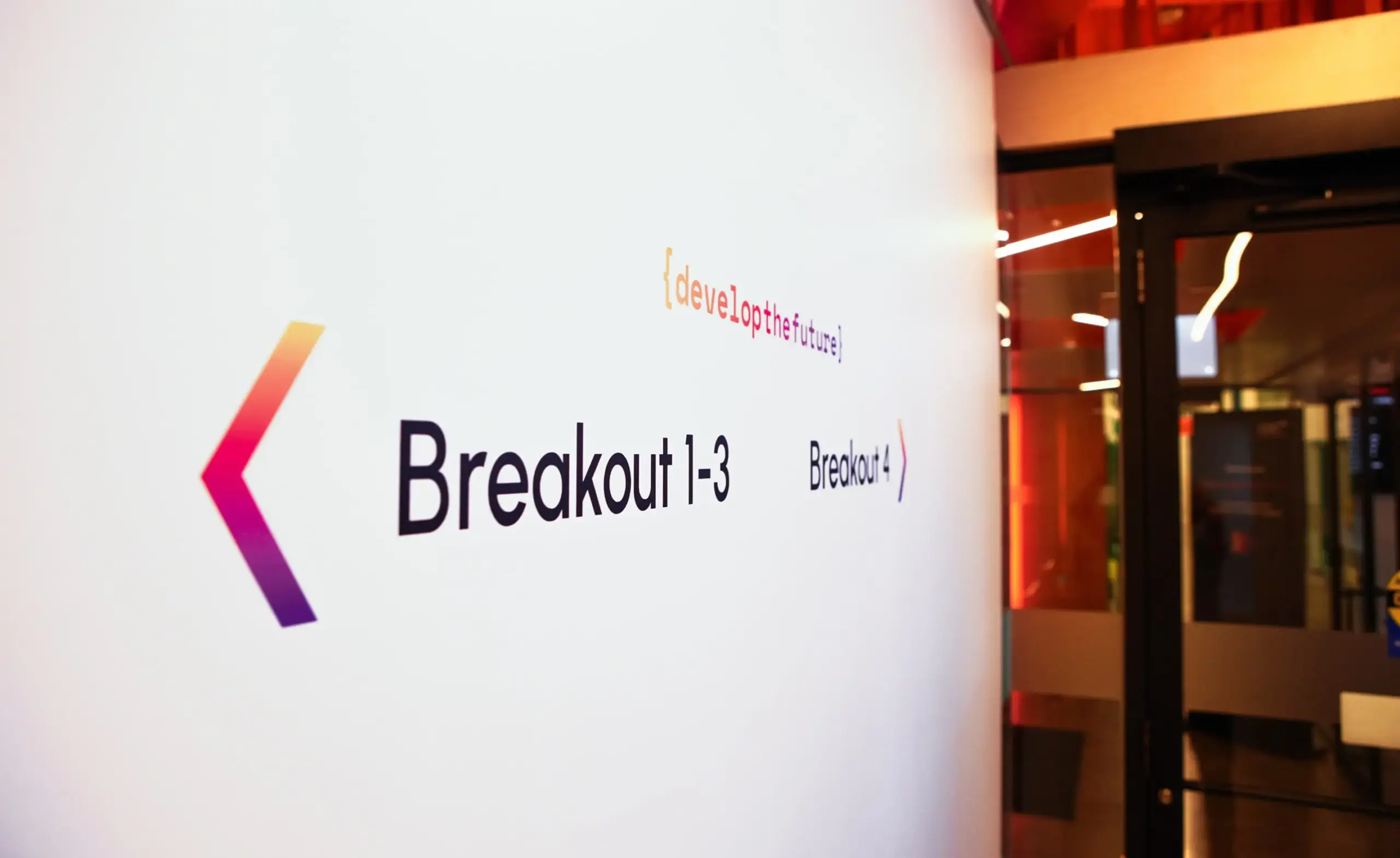
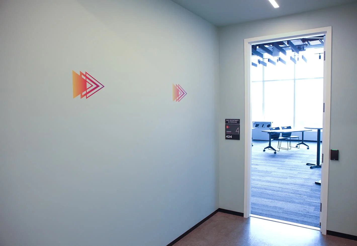
Directional wall decals helped guide students to the various breakout rooms
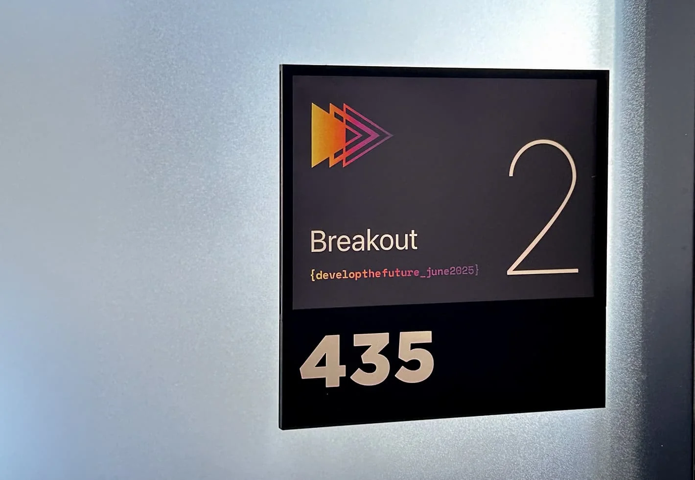
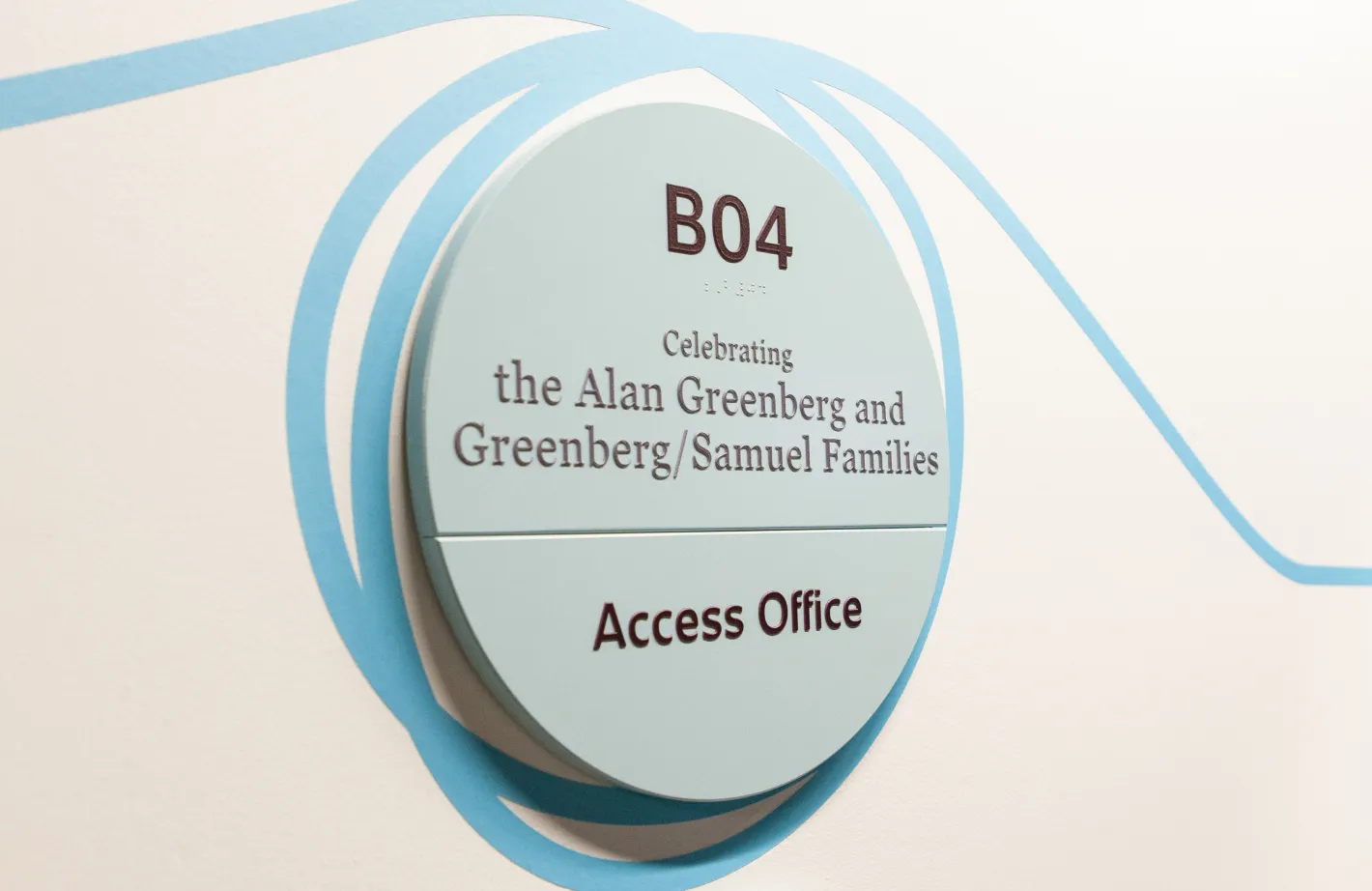
Branded room signage and wayfinding graphics were designed to guide students and make them feel welcome

Tactile brand touchpoints

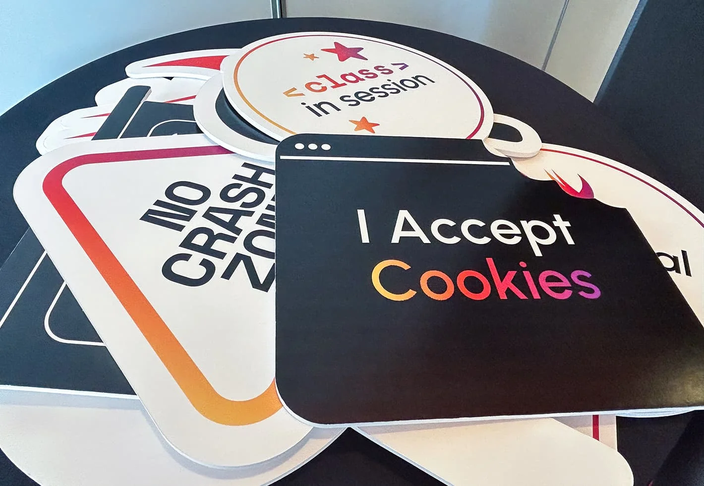
Develop the Future utilizes Apple’s Swift curriculum to introduce students to the world of app development. We brought this online learning environment to life through a diverse range of physical assets, beyond the signage and wayfinding. Smaller brand applications included interactive photo booth props, branded cookies, table cards and personalized ID badges that made each participant feel special.
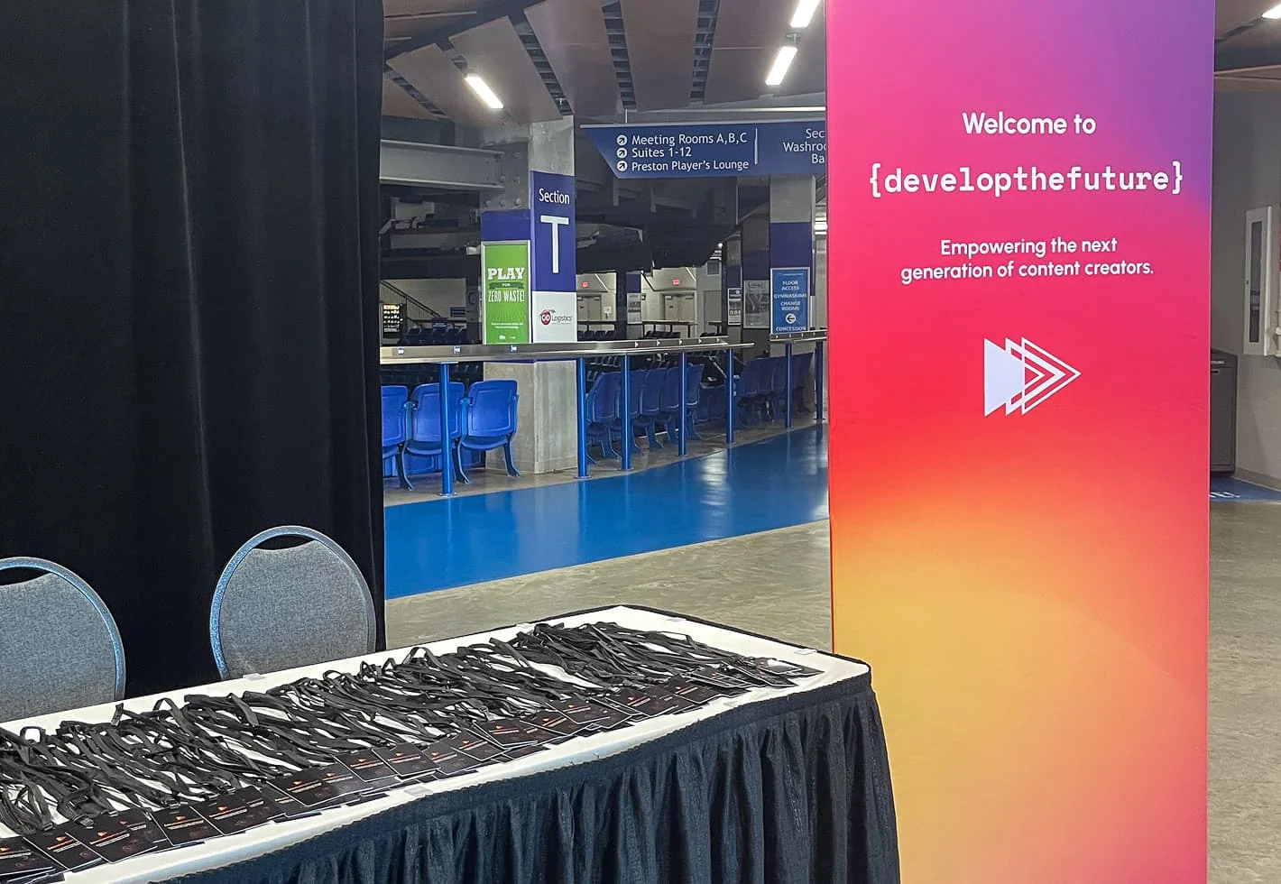
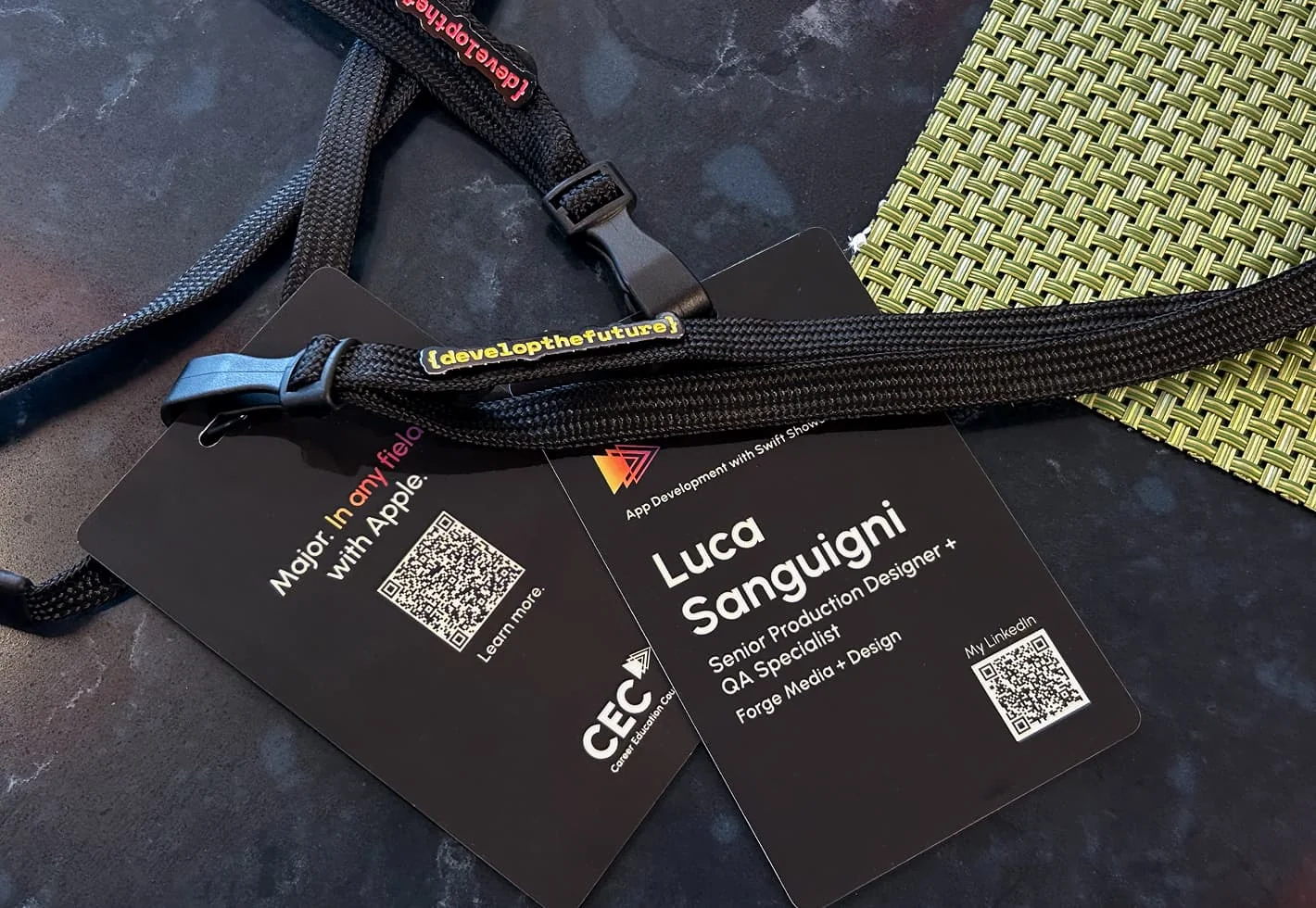
The students were welcomed with registration signage, personalized ID badges and branded enamel pins (Vancouver, BC)
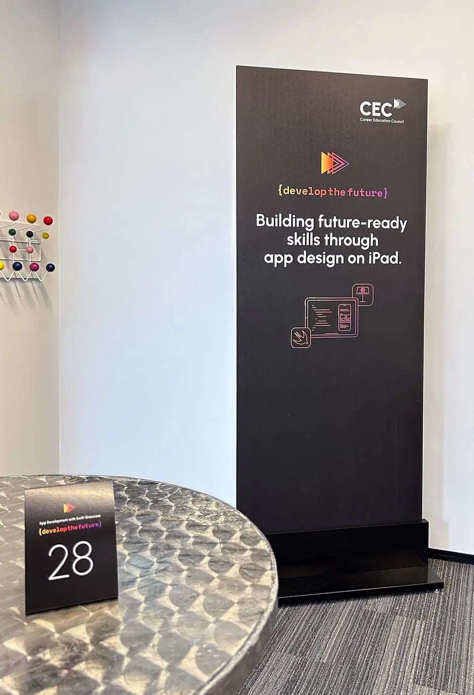
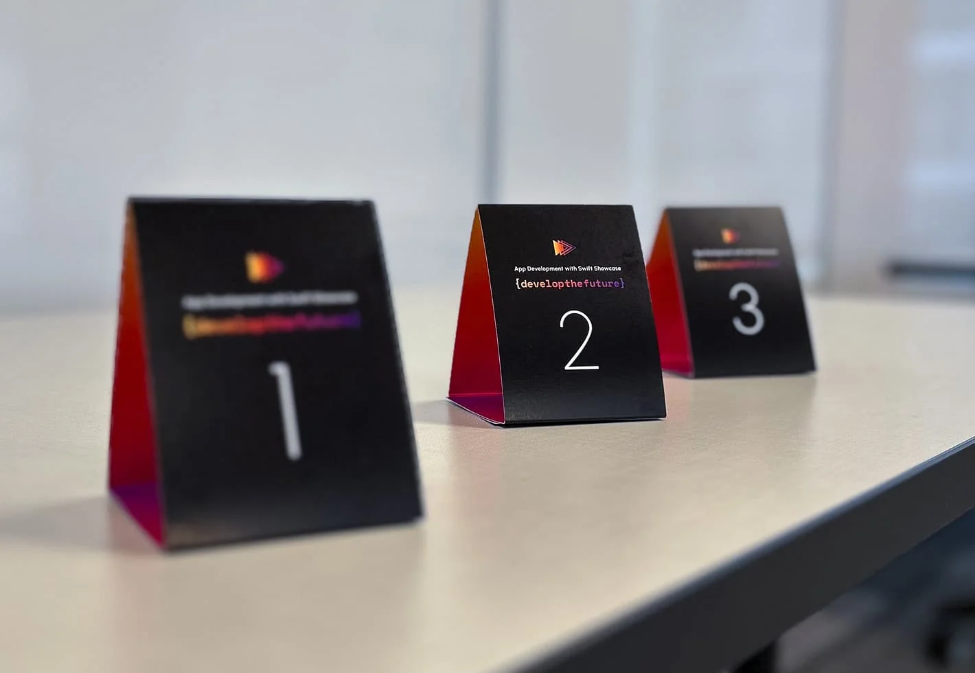
The event showcase room was enhanced through various graphics, including custom table signs
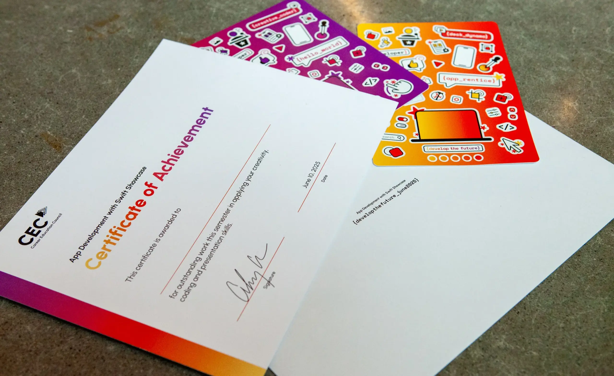
Upon completion of the program, students received an official Certificate of Achievement and custom program stickers (stickers courtesy of Duarte)
For a complete shareable experience, coding-themed banners and props were designed to invite students to partake in the photo booth (Vancouver, BC)
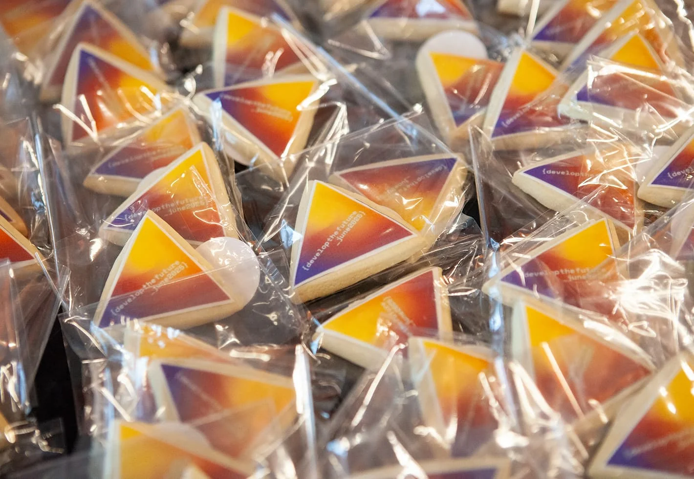

To round it all off, custom, branded cookies were offered as a take-home treat

Empowering educators, engaging students

We ensured the program’s visual identity felt as impactful in person as it did on screen. We equipped the CEC with a full toolkit of digital assets, including a dedicated website presence and templated keynote presentation slides for teachers to use as part of their lesson plans. By balancing deep-dive instructional guides with printable student worksheets and an App Showcase event manual, we ensured the program was as easy to execute as it was to learn.
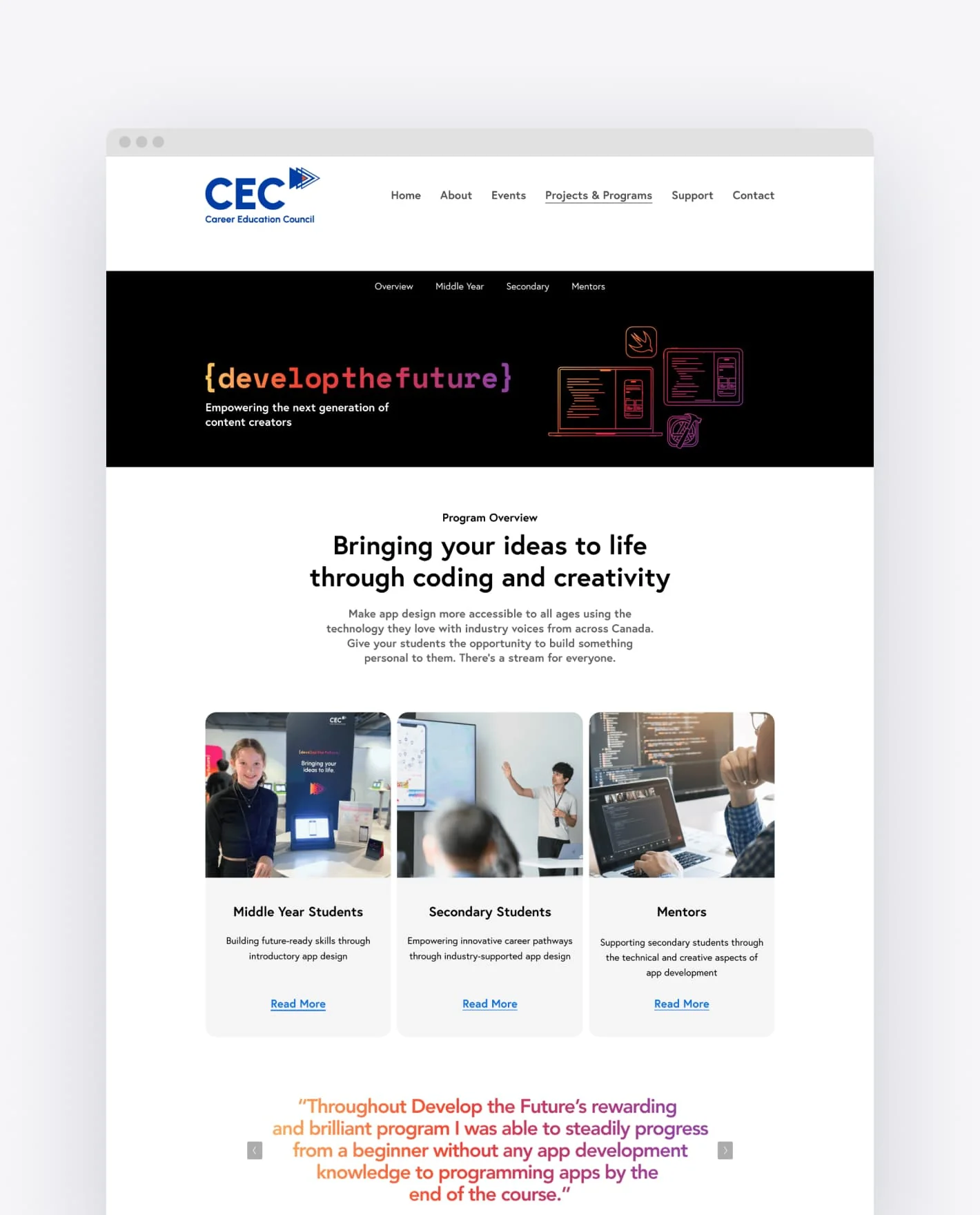
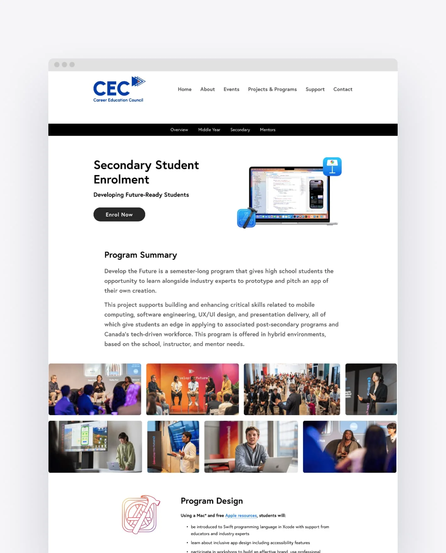
Develop the Future program landing page streamlines navigation for students, educators and mentors
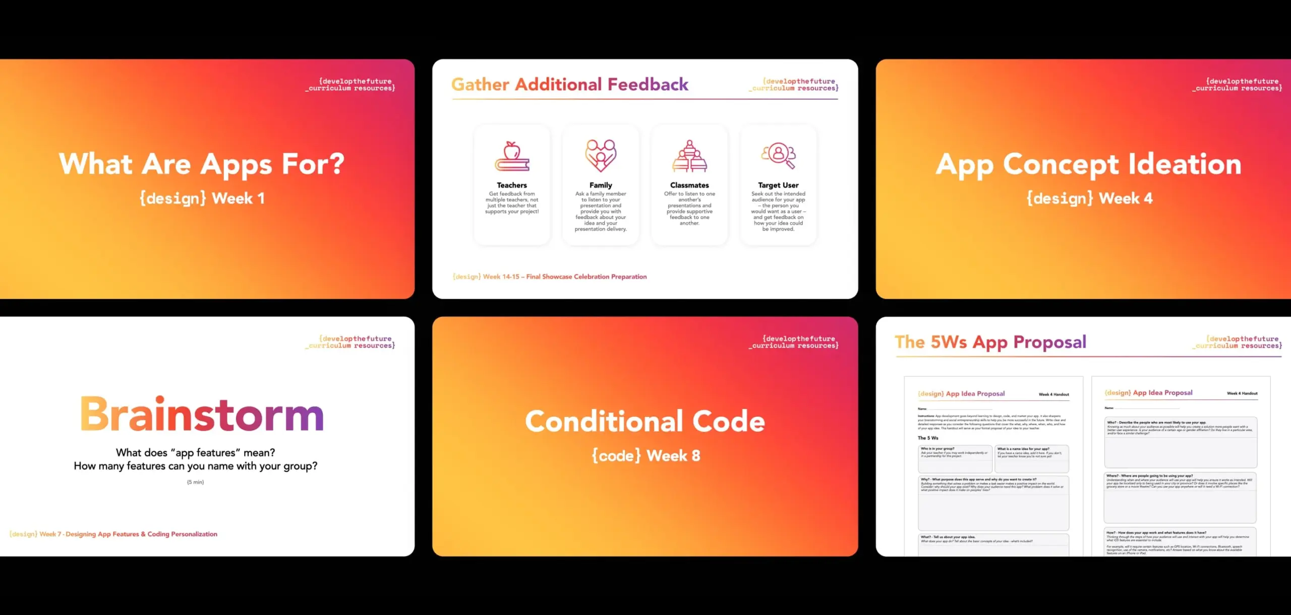
Weekly curriculum Keynote presentations were designed for effortless classroom delivery, covering everything from design thinking to final app prototyping
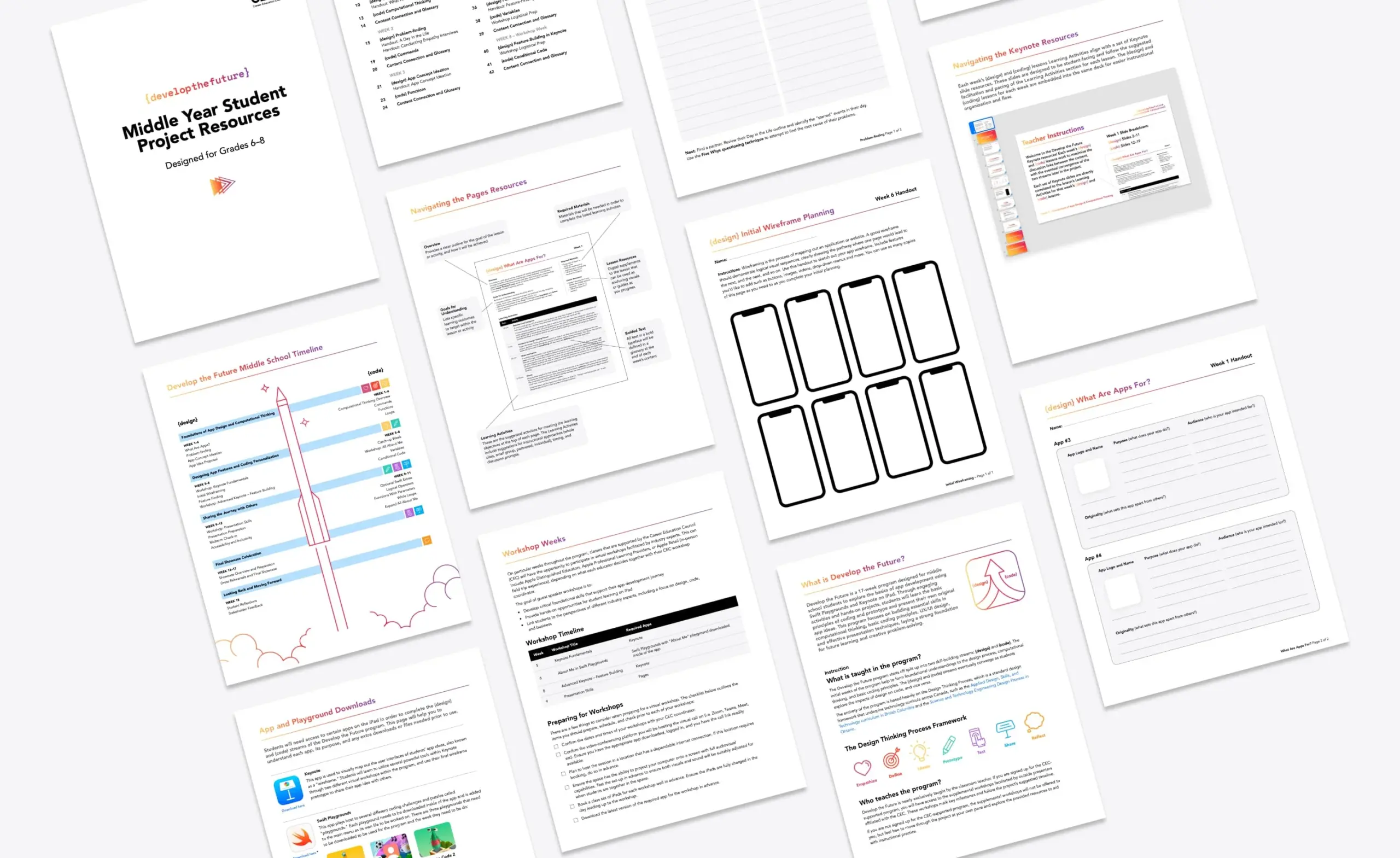
Comprehensive teacher resources featuring detailed lesson plans, instructional guides and printable student activity sheets
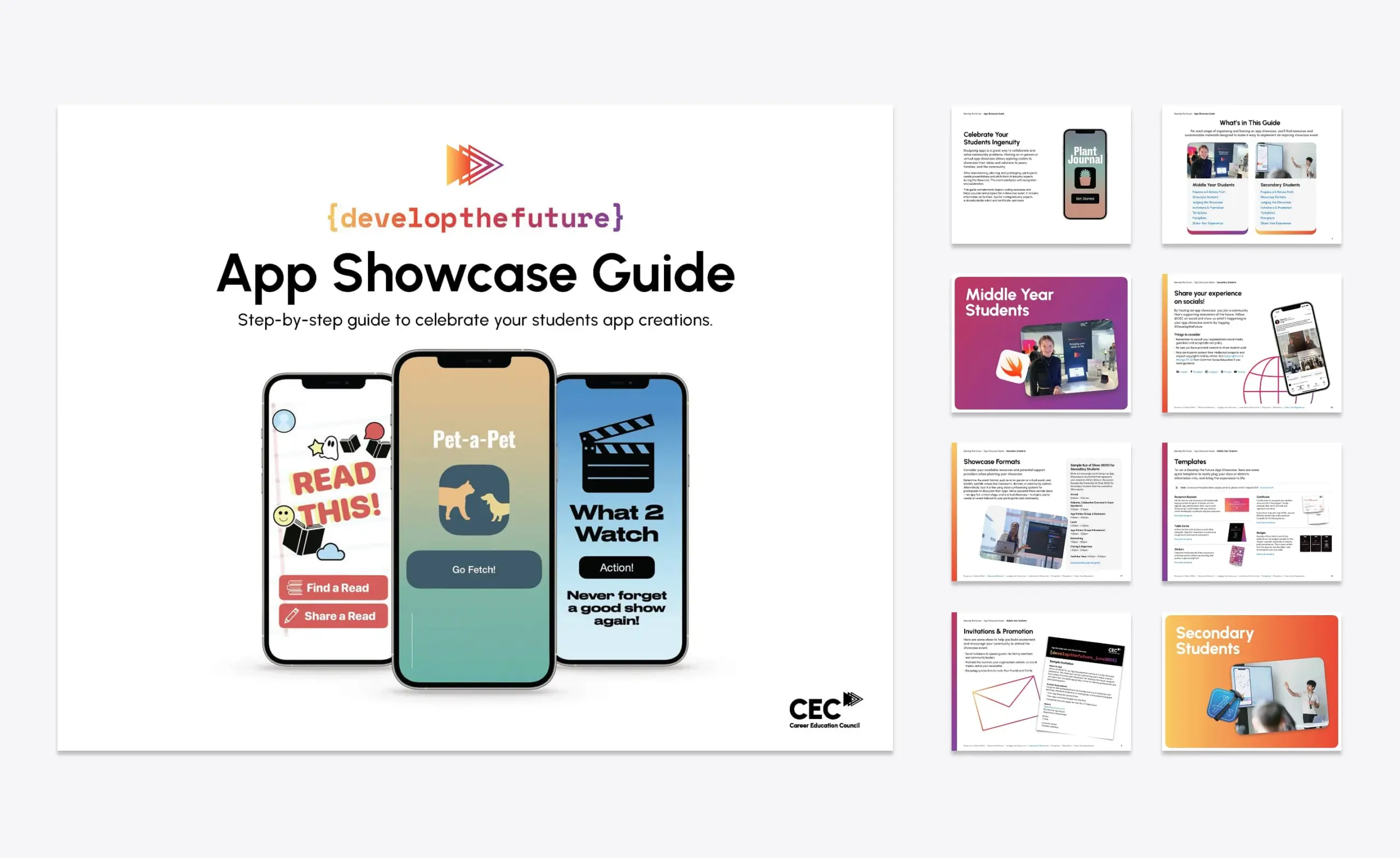
The App Showcase Guide provided a turnkey framework for the CEC staff to independently plan and execute branded celebratory events
  • 6 events
  • 5 days
  • 3 provinces
  • 2 languages
  • 1000 students
I love collaborating with Forge. They consistently deliver eye-catching, on-brand graphics that make our materials look polished and professional. Their creativity, reliability and understanding of our vision make them an invaluable partner. I look forward to teaming up with them on our next project!
Noah Carpenter, Program Manager, Develop the Future
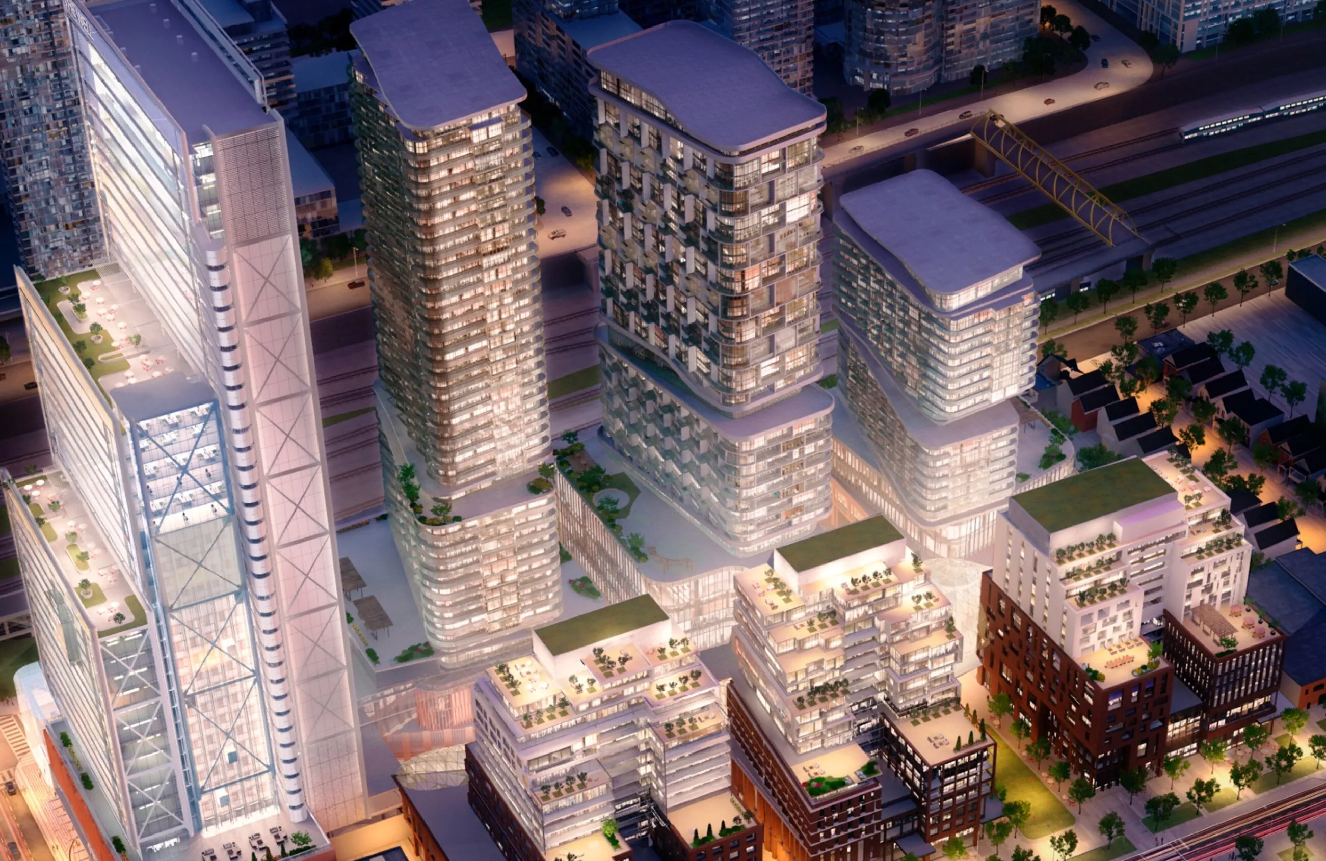
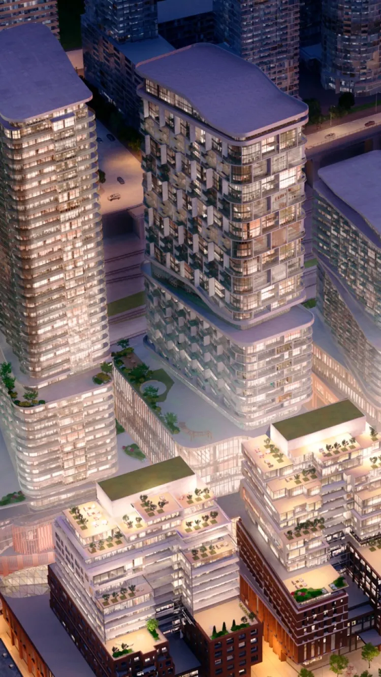
Aerial view of The Well development, featuring modern high-rise buildings and surrounding urban landscape. Aerial view of modern high-rise buildings with balconies and rooftop gardens.

The Well

Services Deliverables
  • Brochure
  • Website
  • Brand Guide Extension
  • Photography Art Direction
  • Video Production

A spirited environment to live, work, shop, and play

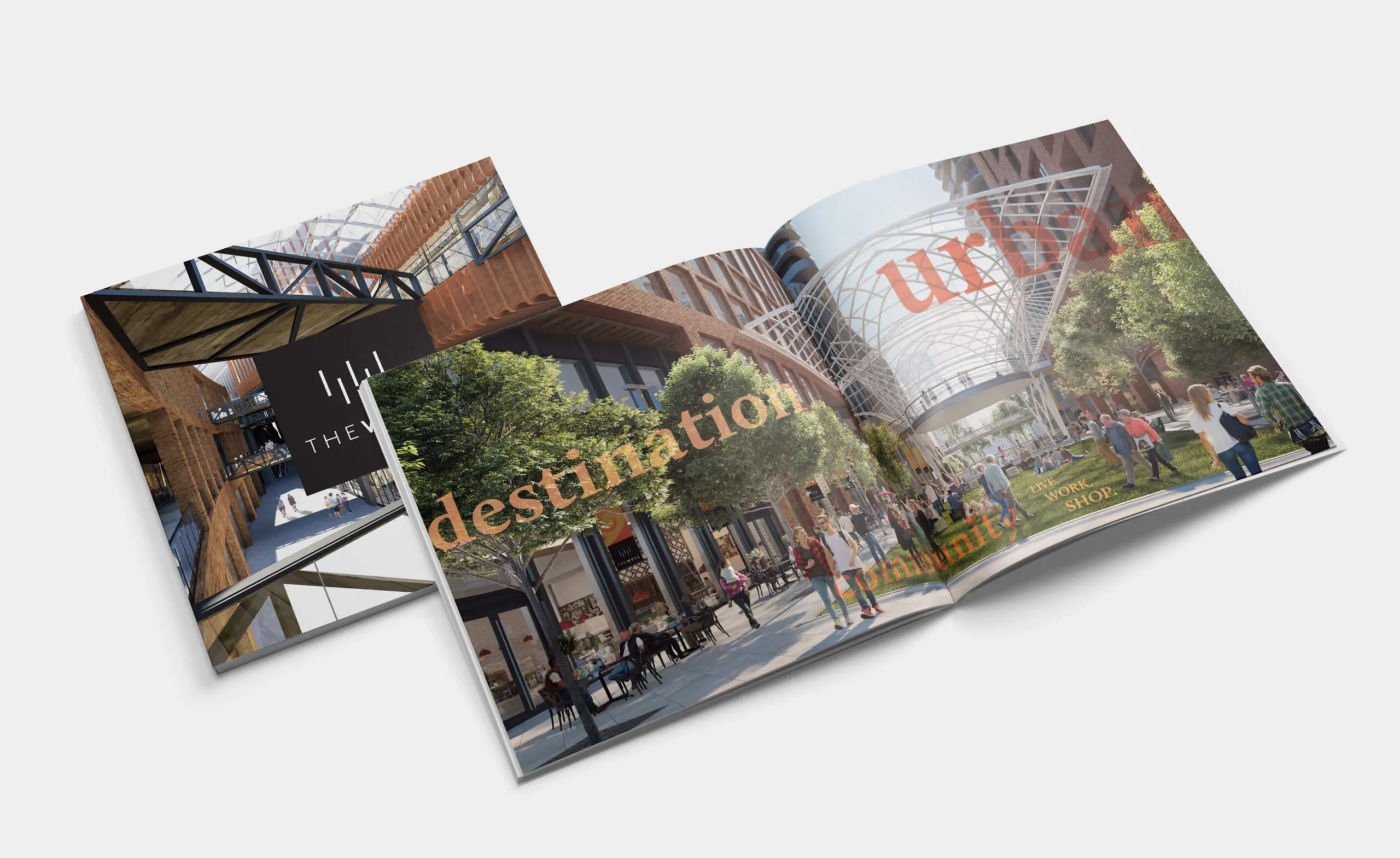
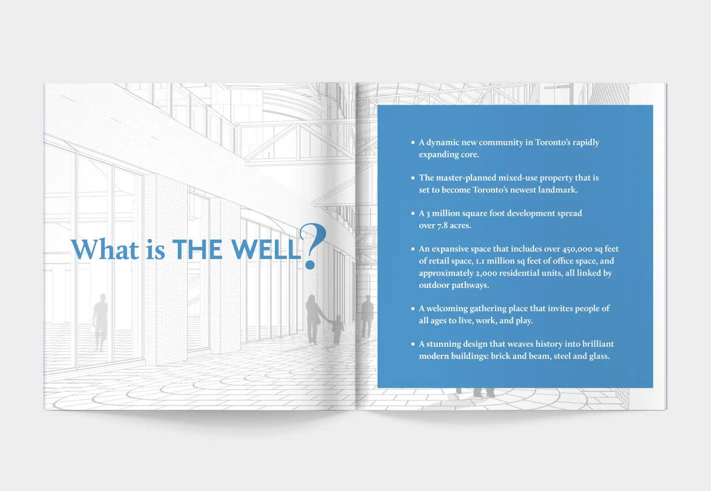
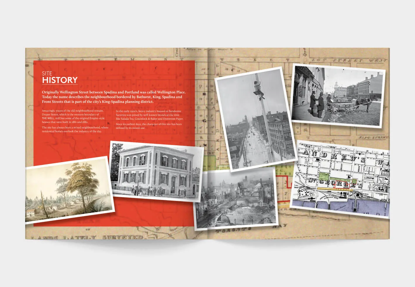
The Well is an innovative mixed-use property development in Toronto’s vibrant King West area where visitors and residents can eat, shop, work, live, and play. To introduce this multimillion-dollar endeavour to the public and generate buzz during a major media push, Forge created various marketing materials and brand assets including brochures with custom photography and vibrant layouts showcasing the properties features and the site’s exciting history.

Brochure spread showing urban development with text
Print collateral to promote offerings and communicate brand values
Illustration of
Site history of Wellington Place, Toronto, with historical images and maps.
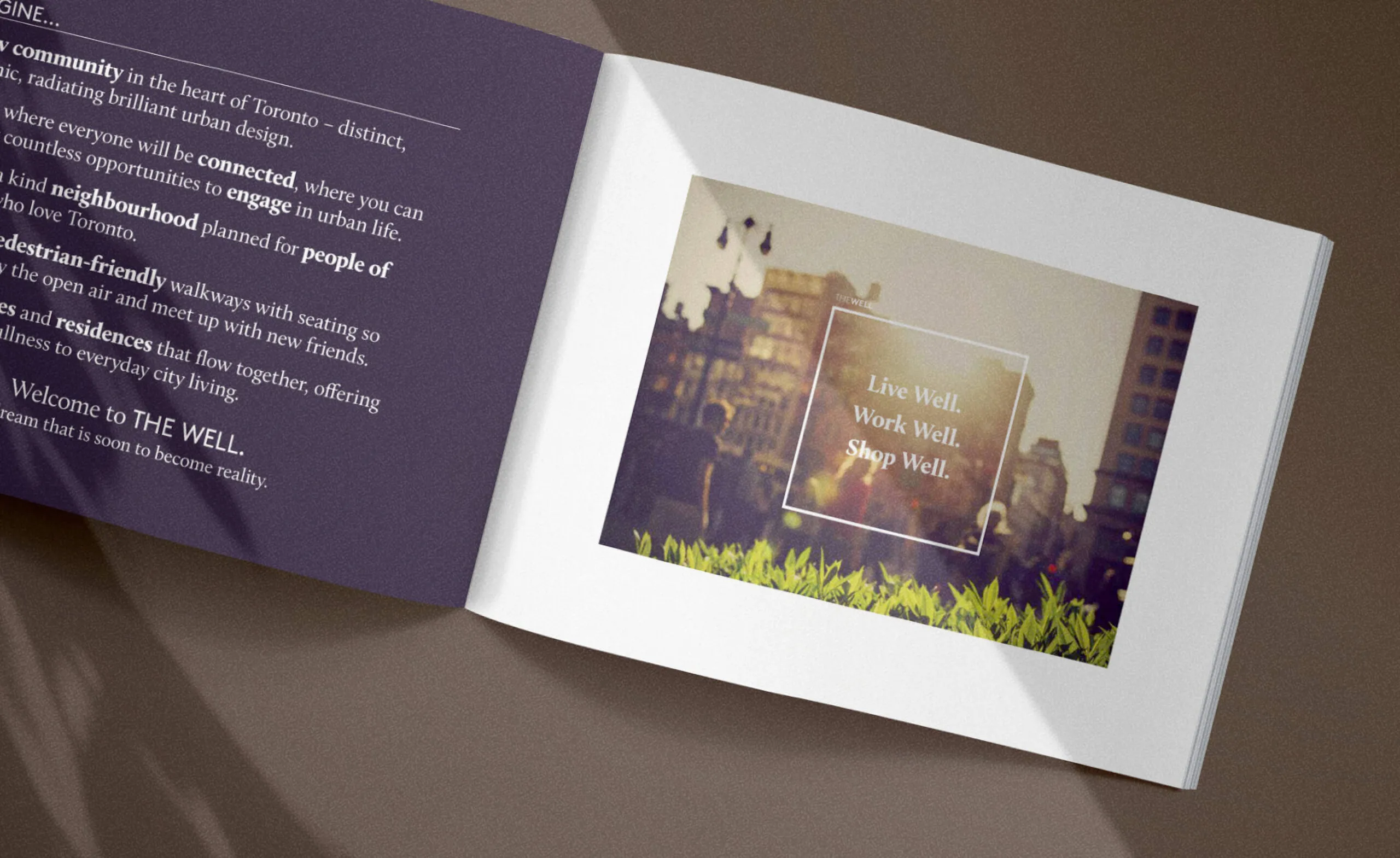
The Well: Live Well. Work Well. Shop Well.
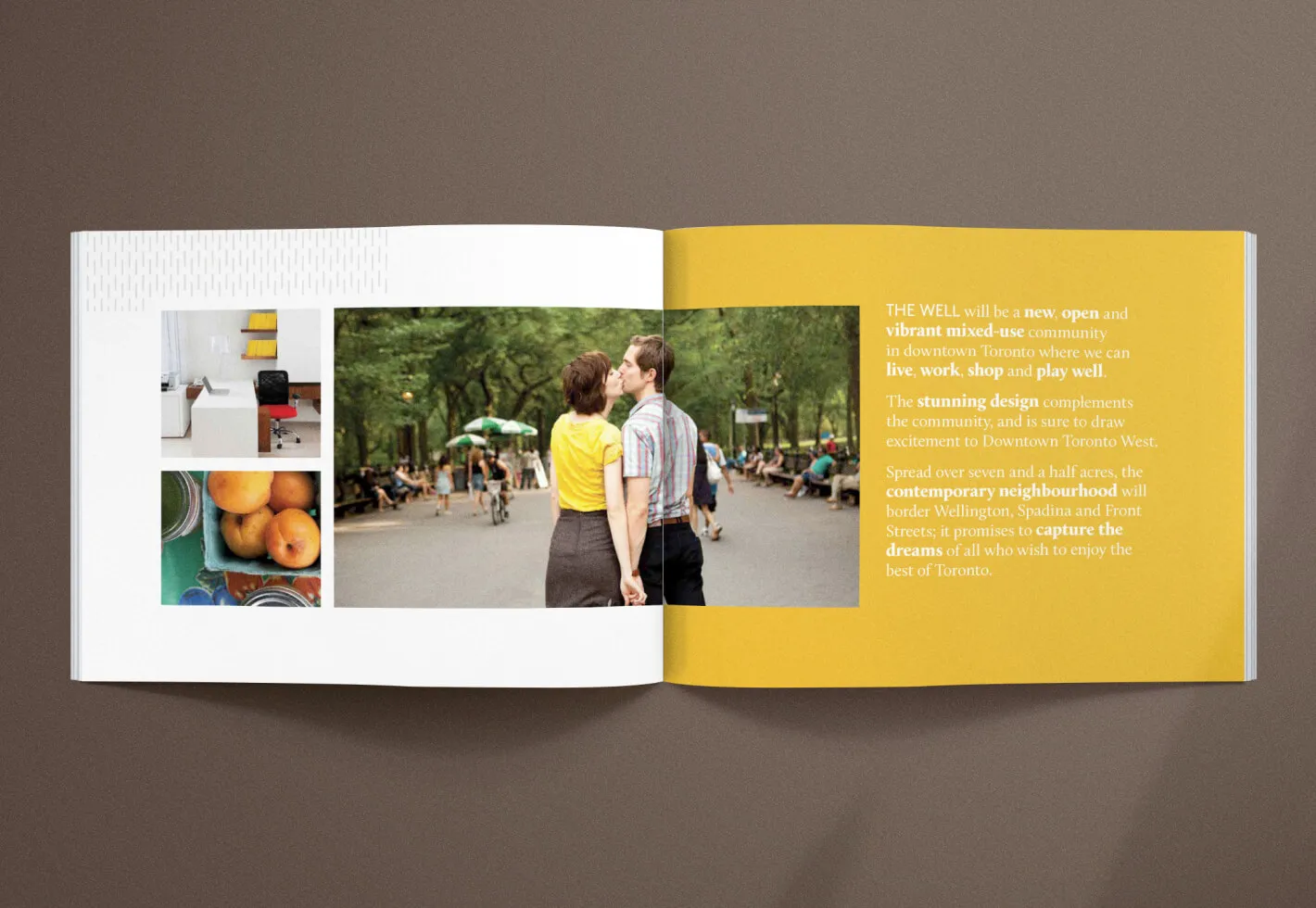
A couple kisses in a park with text about a new community development.
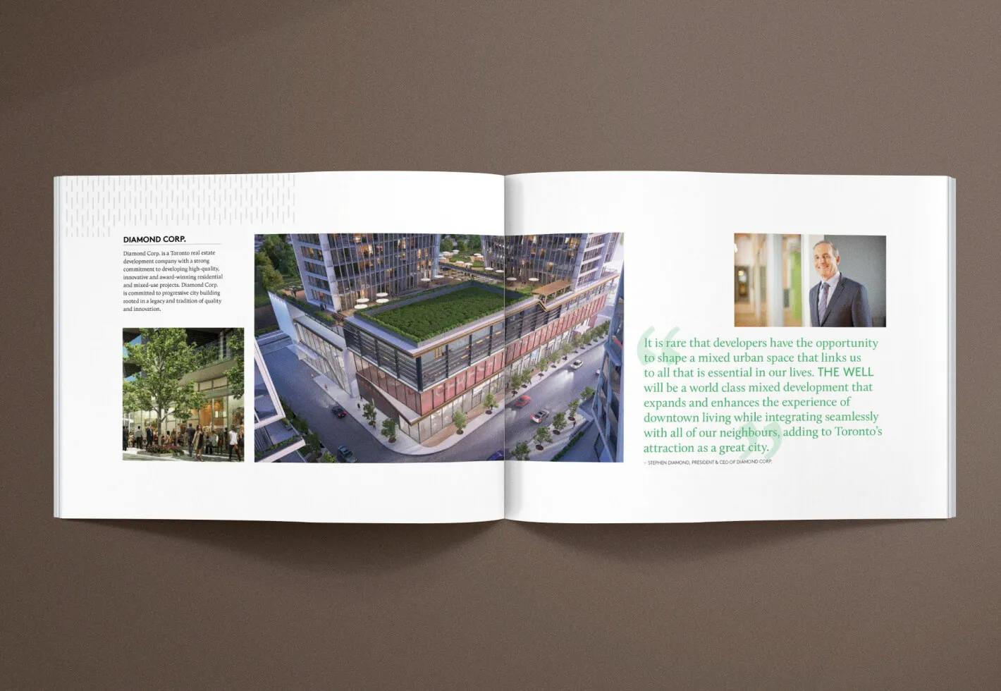
Diamond Corp. brochure featuring a rendering of The Well development and a quote from Stephen Diamond.

Moving the brand forward

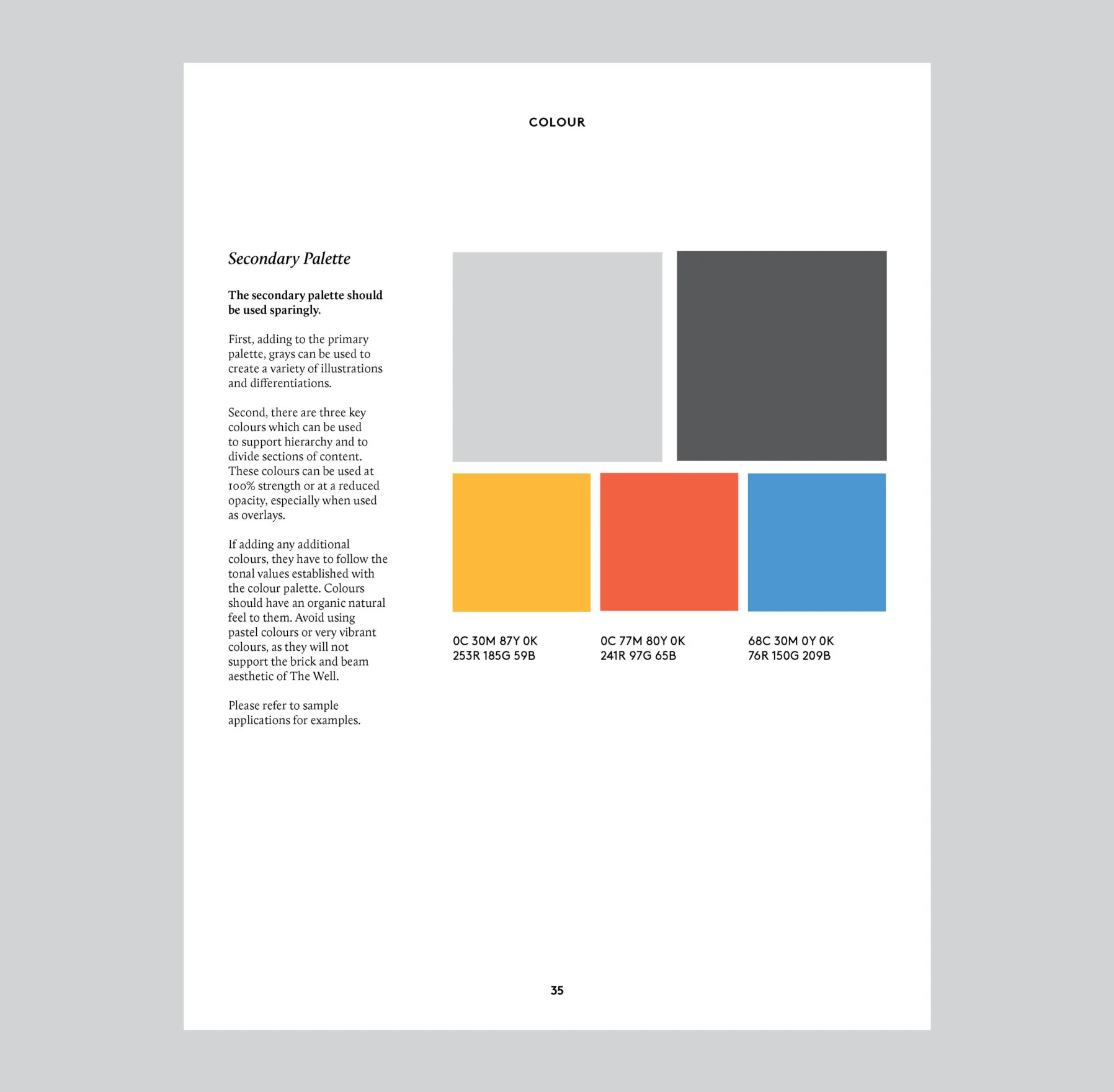
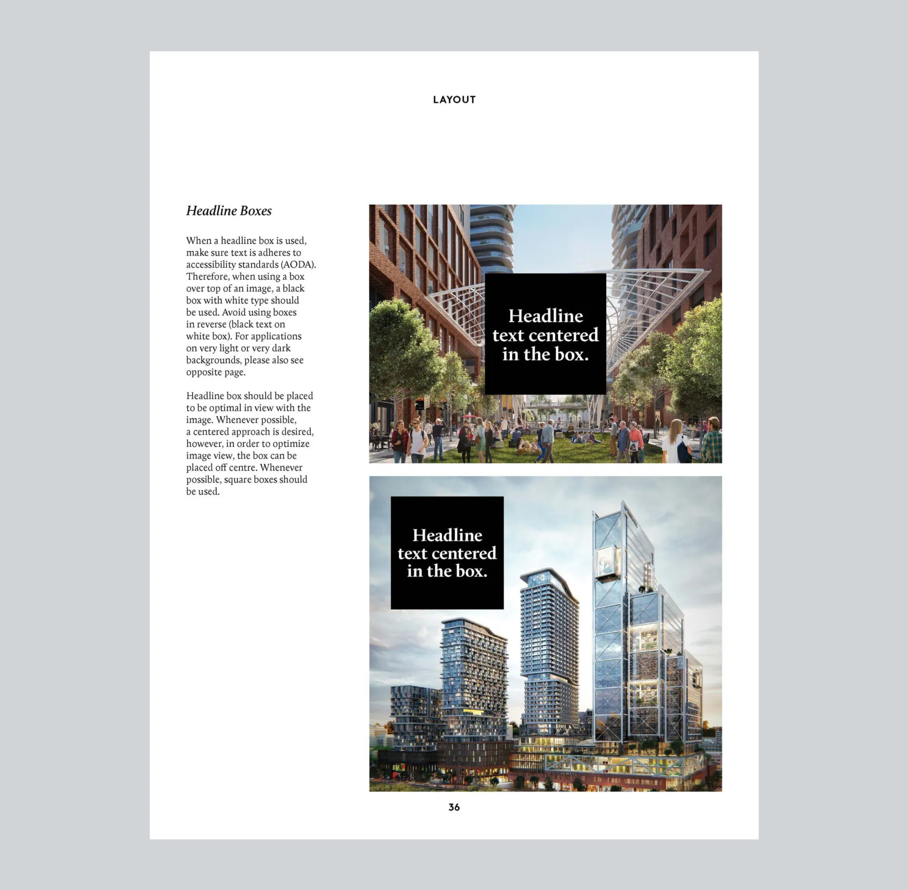
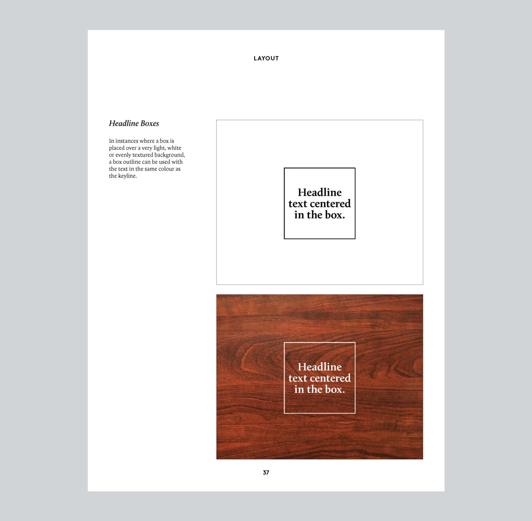
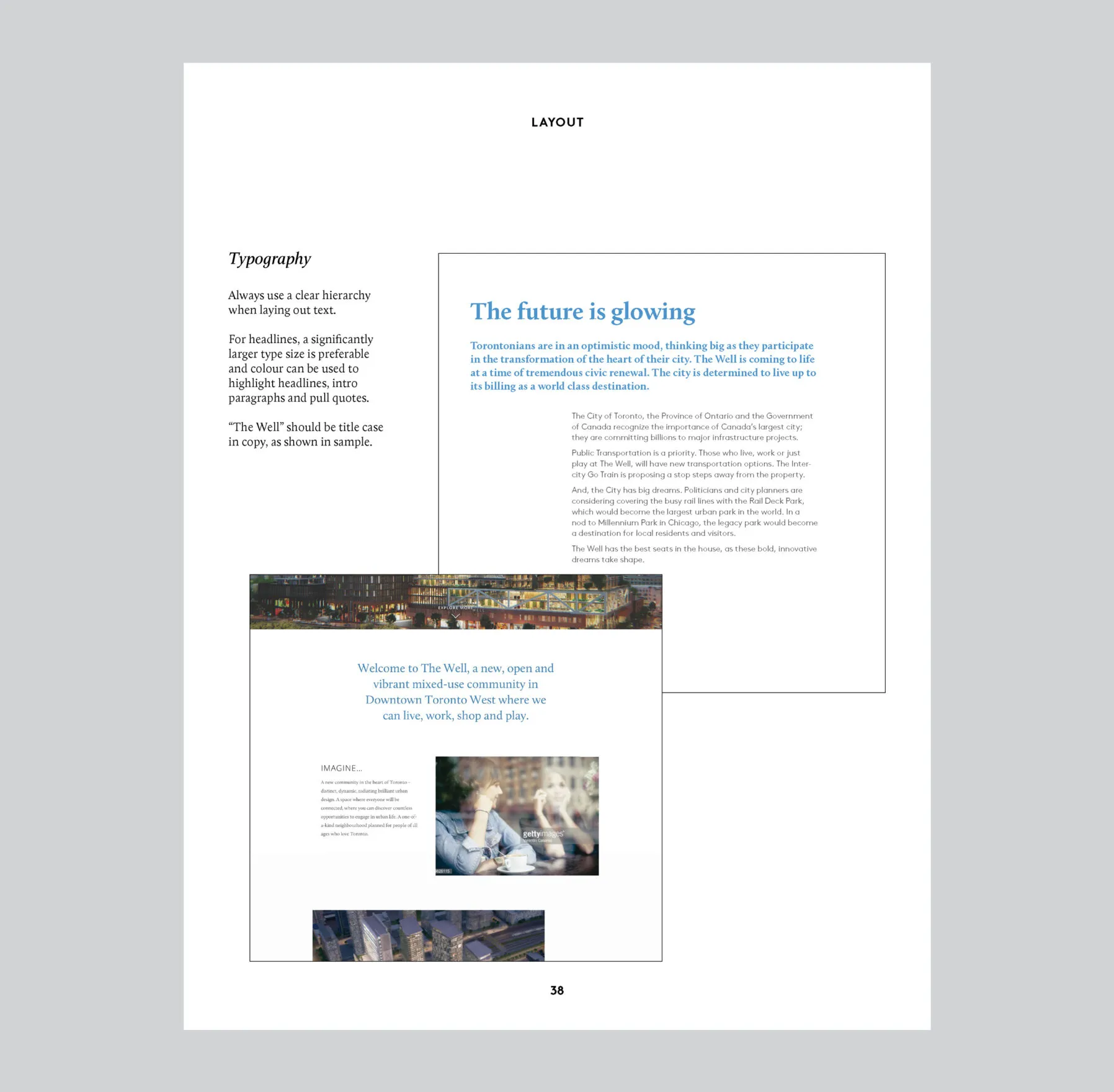
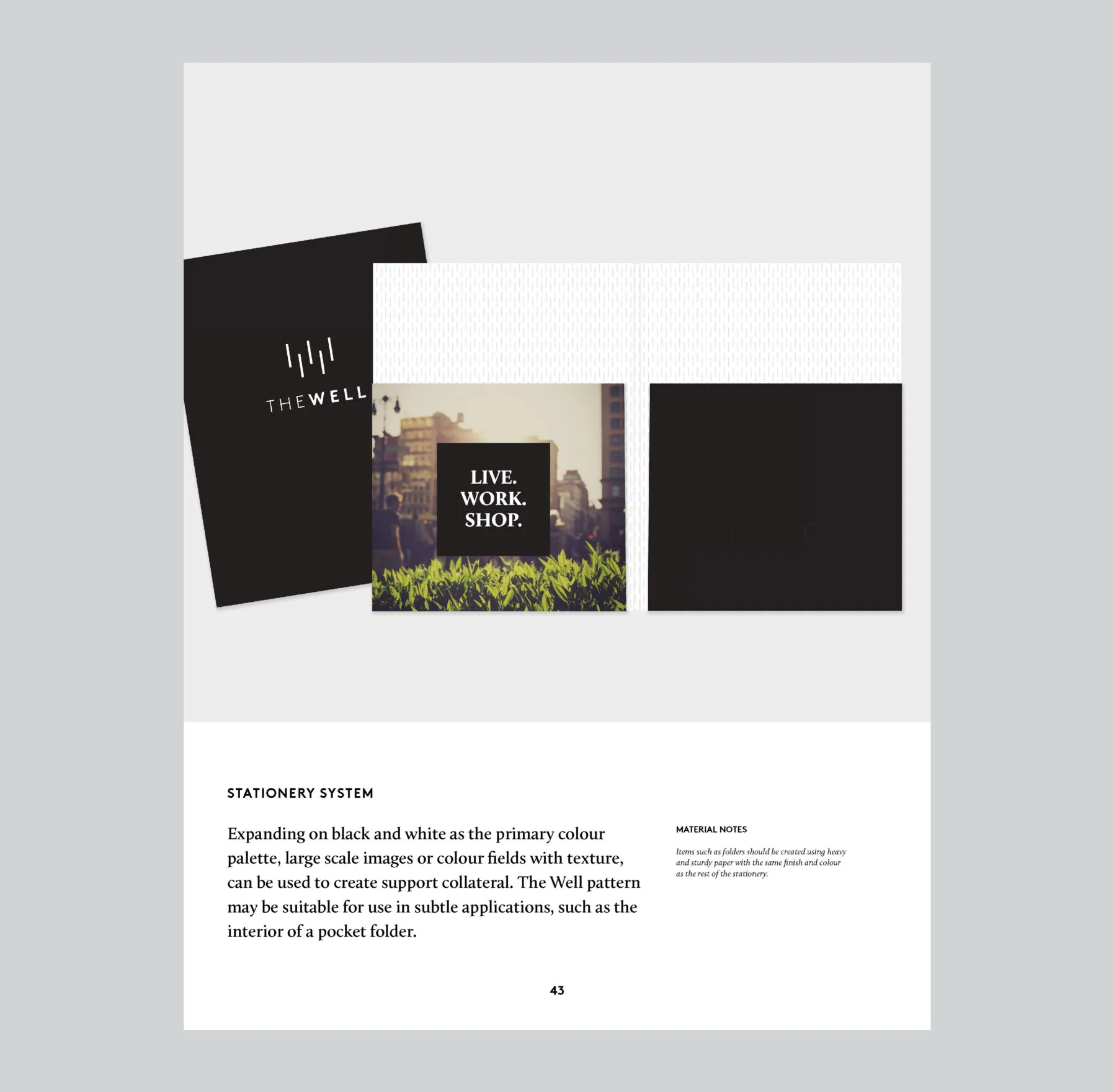
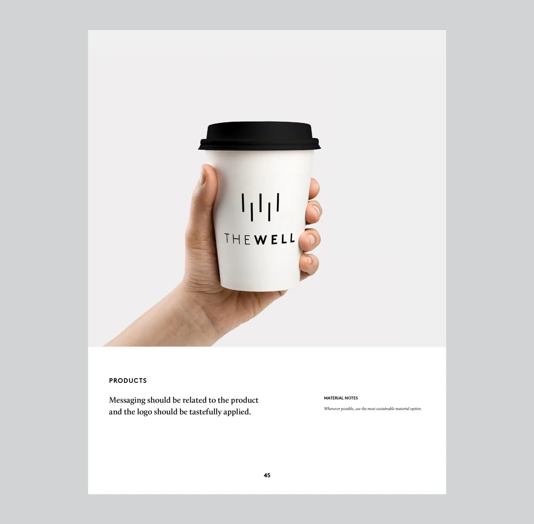
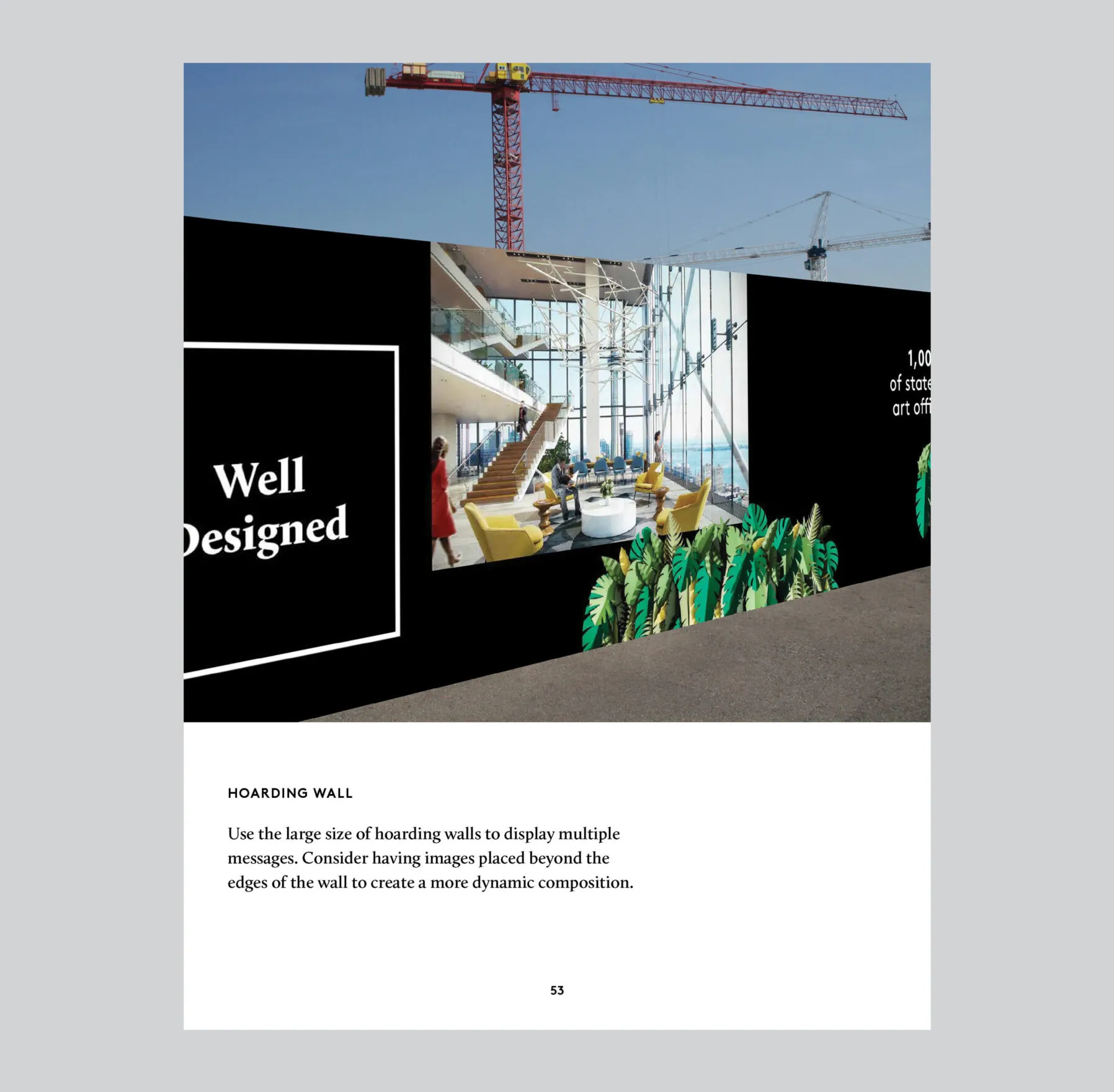
Expanding upon The Well’s existing brand guidelines created by Bruce Mau Design, additional standards were added by Forge, deepening the brand focus and addressing a broader range of brand application scenarios.

Engaging communities from near and far

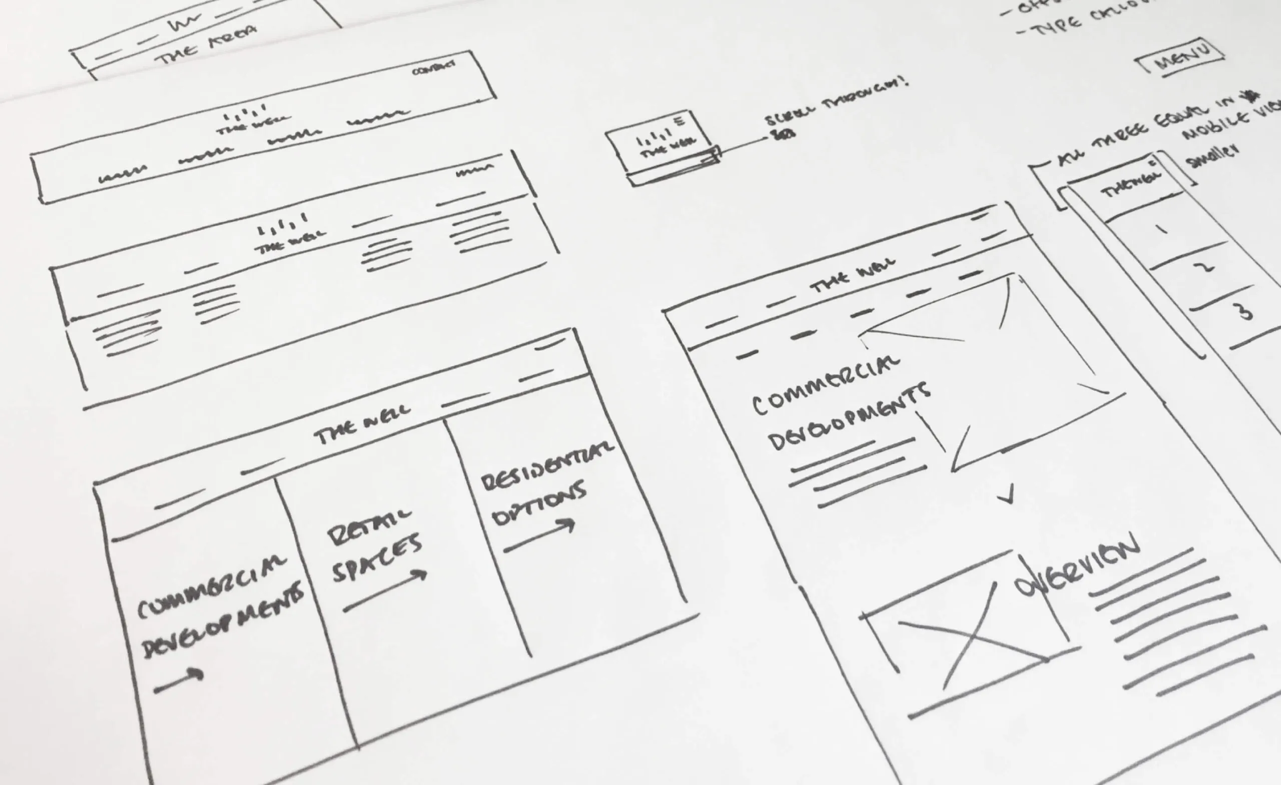
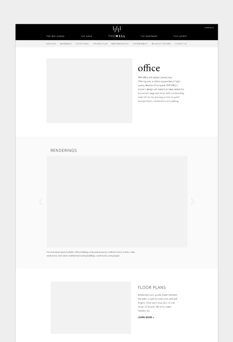
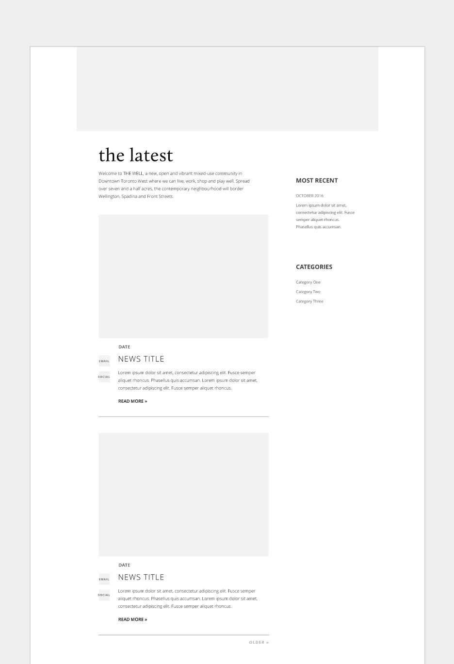
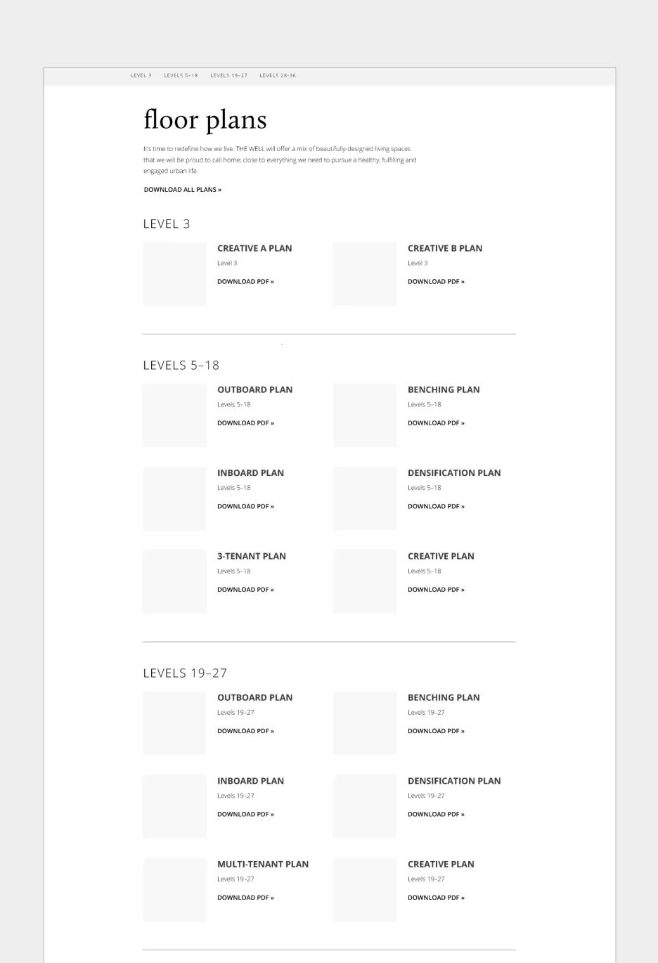
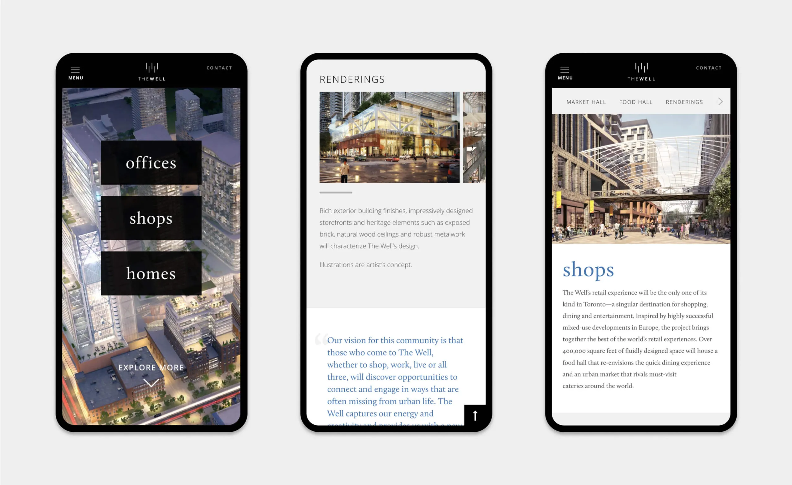
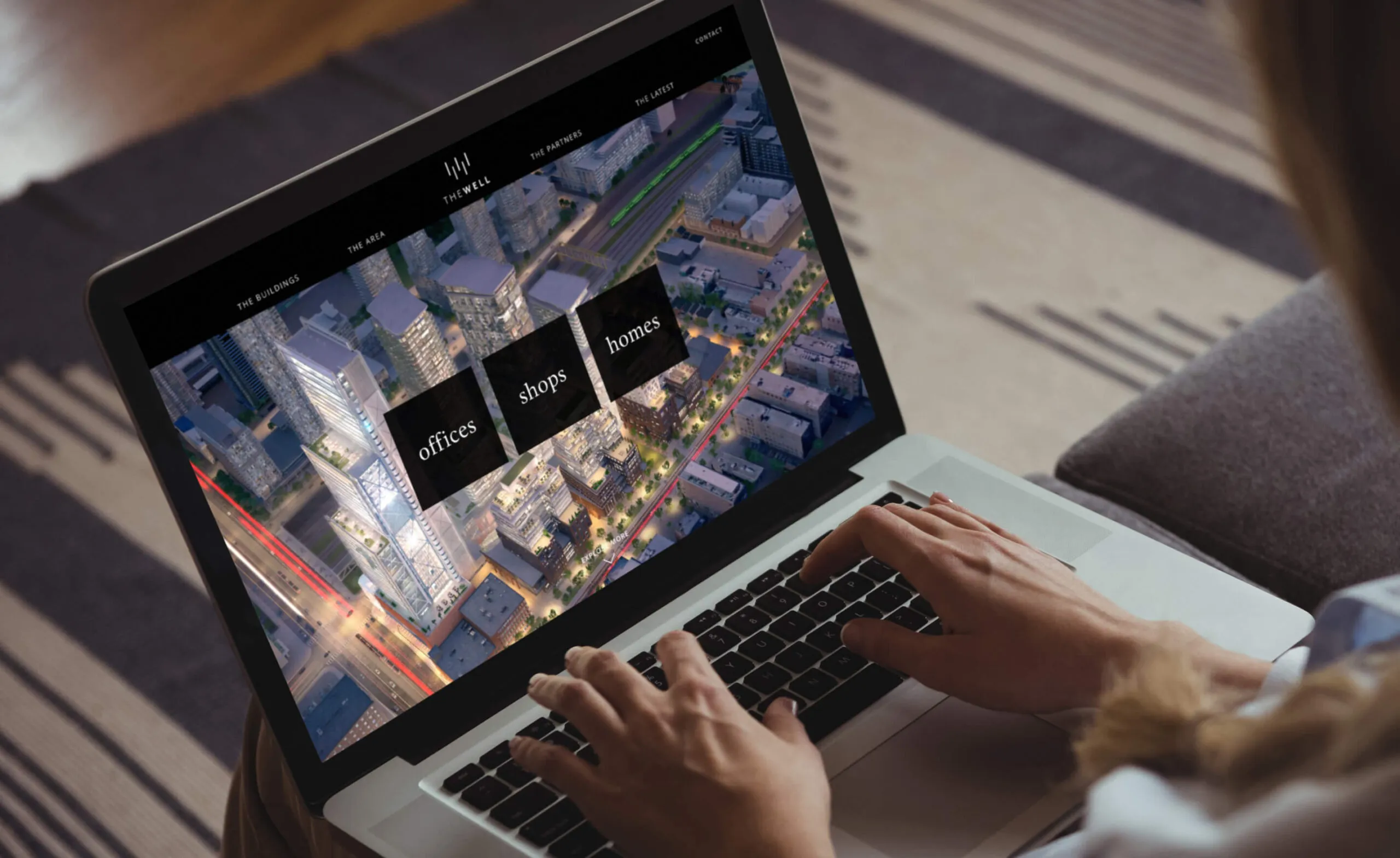
A website was created to showcase The Well’s various offerings, and provide an in-depth look at their residences, lifestyle amenities, flexible office spaces, retail locations, and the surrounding neighbourhood. Following an initial discovery phase, wireframes were created to determine an optimal strategy in presenting content and to create a dynamic and user-friendly experience.

Wireframe sketches for The Well website layouts
Low fidelity wireframing
The WELL office building renderings and floor plans
The latest news from The Well community in Downtown Toronto.
Floor plans for The Well building, categorized by level.
High fidelity wireframing

Creating a foundation for memorable experiences

With a focus on lifestyle photography, architectural renderings, and data visualization, the website welcomes users with a warm, lively, and inspiring look into The Well’s community-focused philosophy. Optimized for various devices, the website is both accessible and intuitive for a modern audience.

Features

Google Analytics integration

WordPress CMS

Custom theme

CRM integrated forms

Video animation

Custom photography

Amenities maps

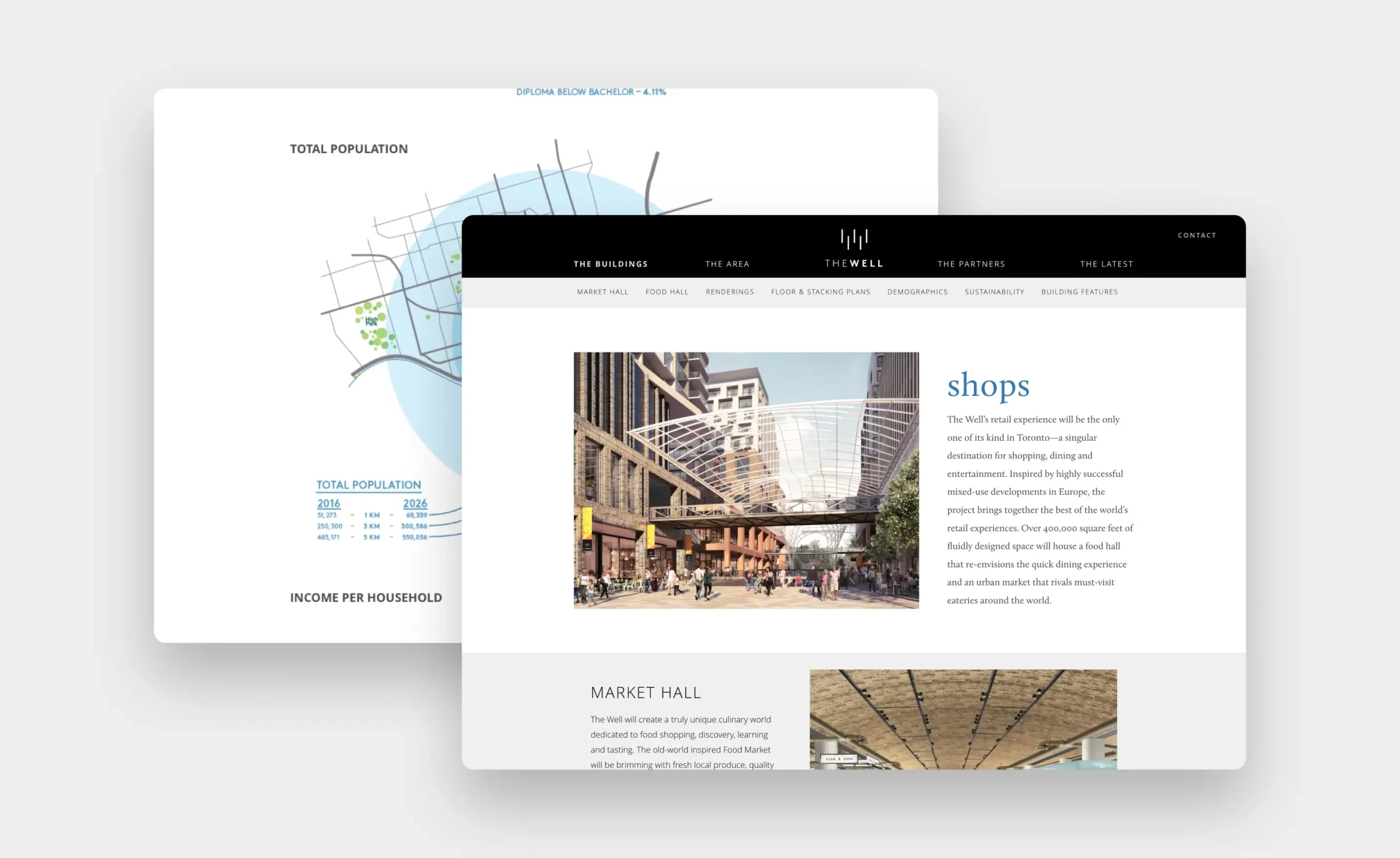
Data visualization

Website flexible for regular content updates
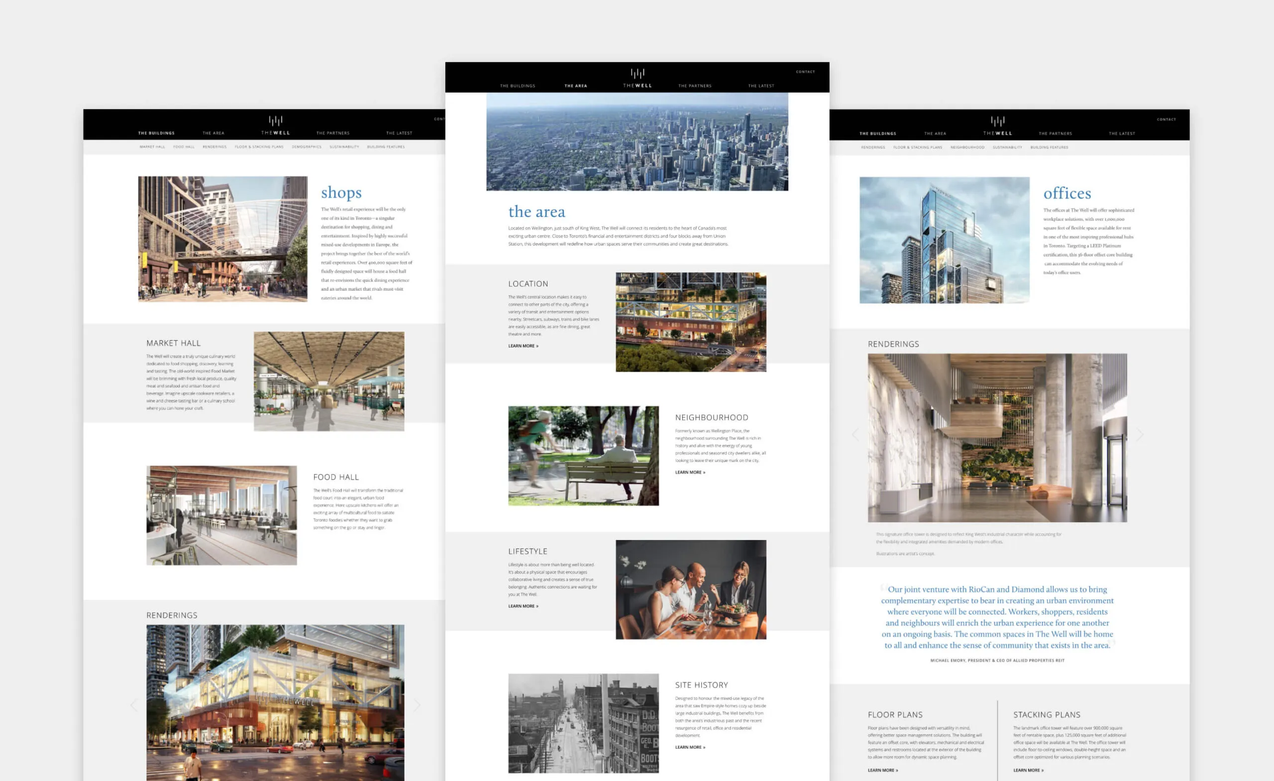
The Well development in Toronto, featuring shops, market hall, food hall, offices and renderings.
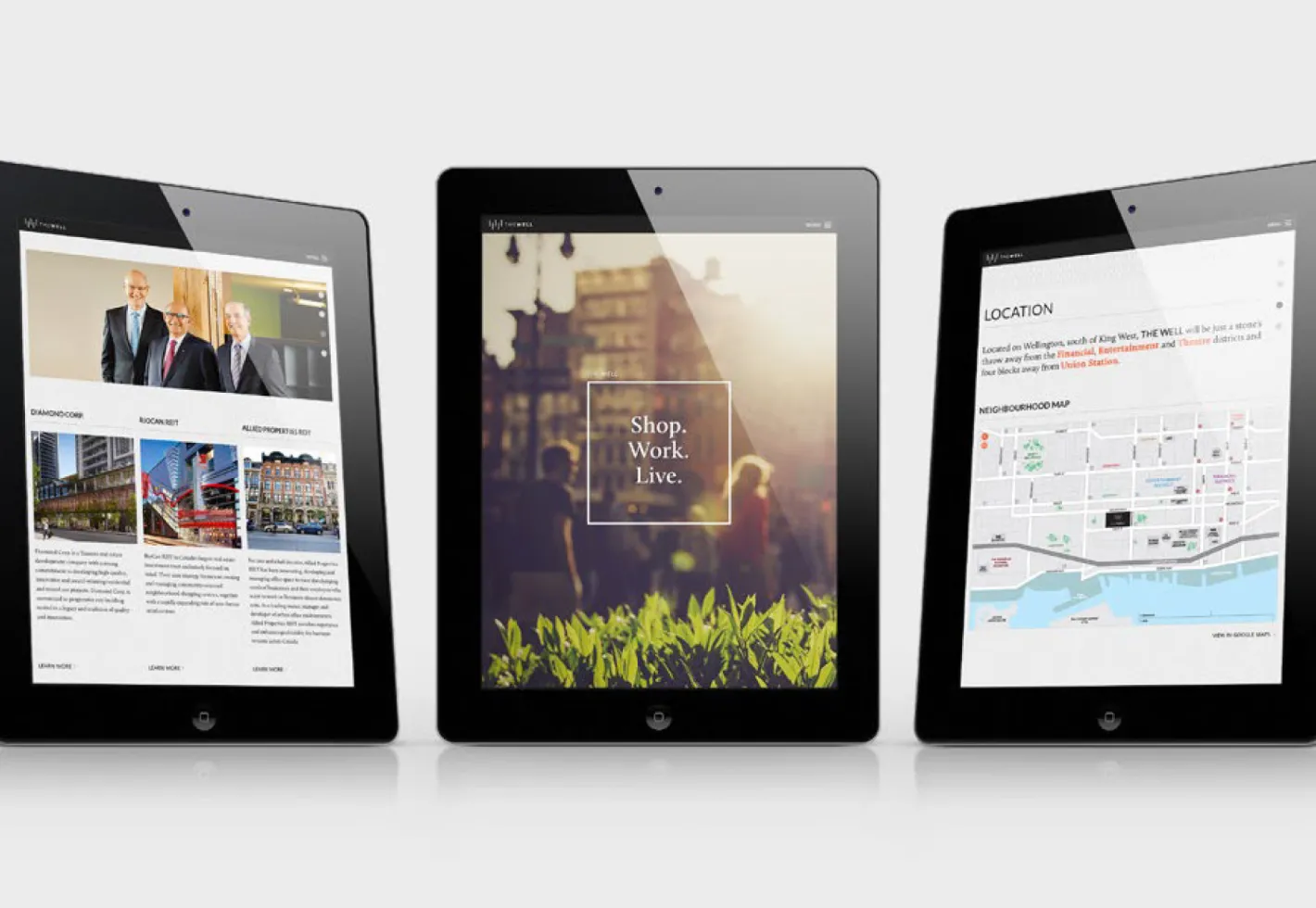
Three tablets displaying website content about The Well development.
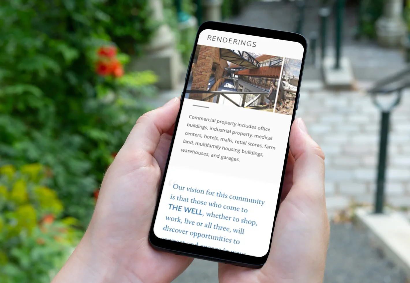
Phone displaying renderings and text about commercial property and community vision.
The Well retail experience in Toronto, featuring shops, market hall and renderings.
The Well development: renderings of shops, offices, and homes.
The Well website showing a city aerial view with navigation links for buildings, area, offices, shops, and homes.

Employing motion to amplify the message

To elevate the brand experience at events, our team produced a seamlessly-looping video to be leveraged in various presentation and promotional scenarios, providing The Well with a versatile and powerful marketing tool.

  • 22K daily guests
  • 1.7K premium residential units
  • 320K square feet of retail and food service
  • 1.2M square feet of office space
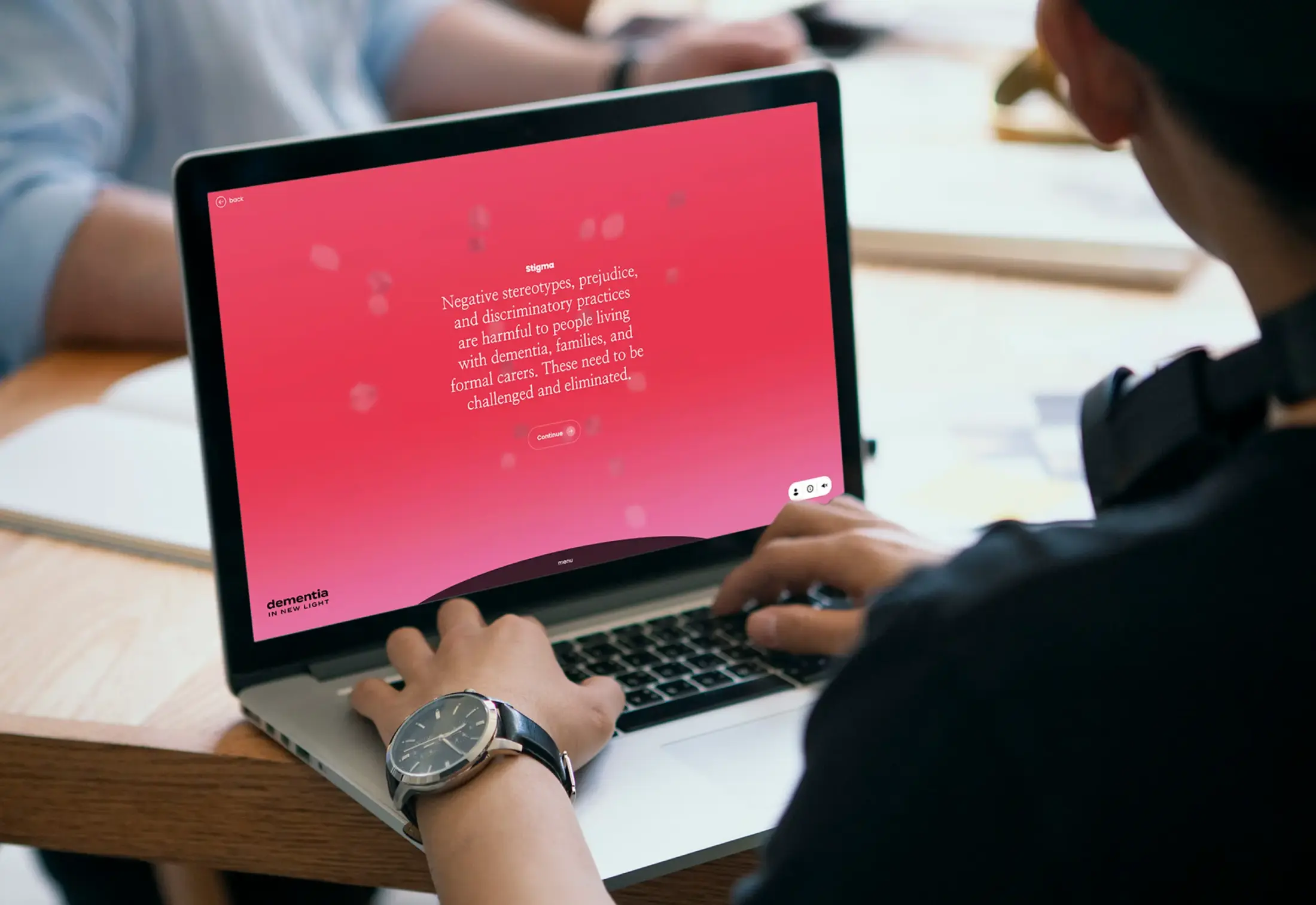
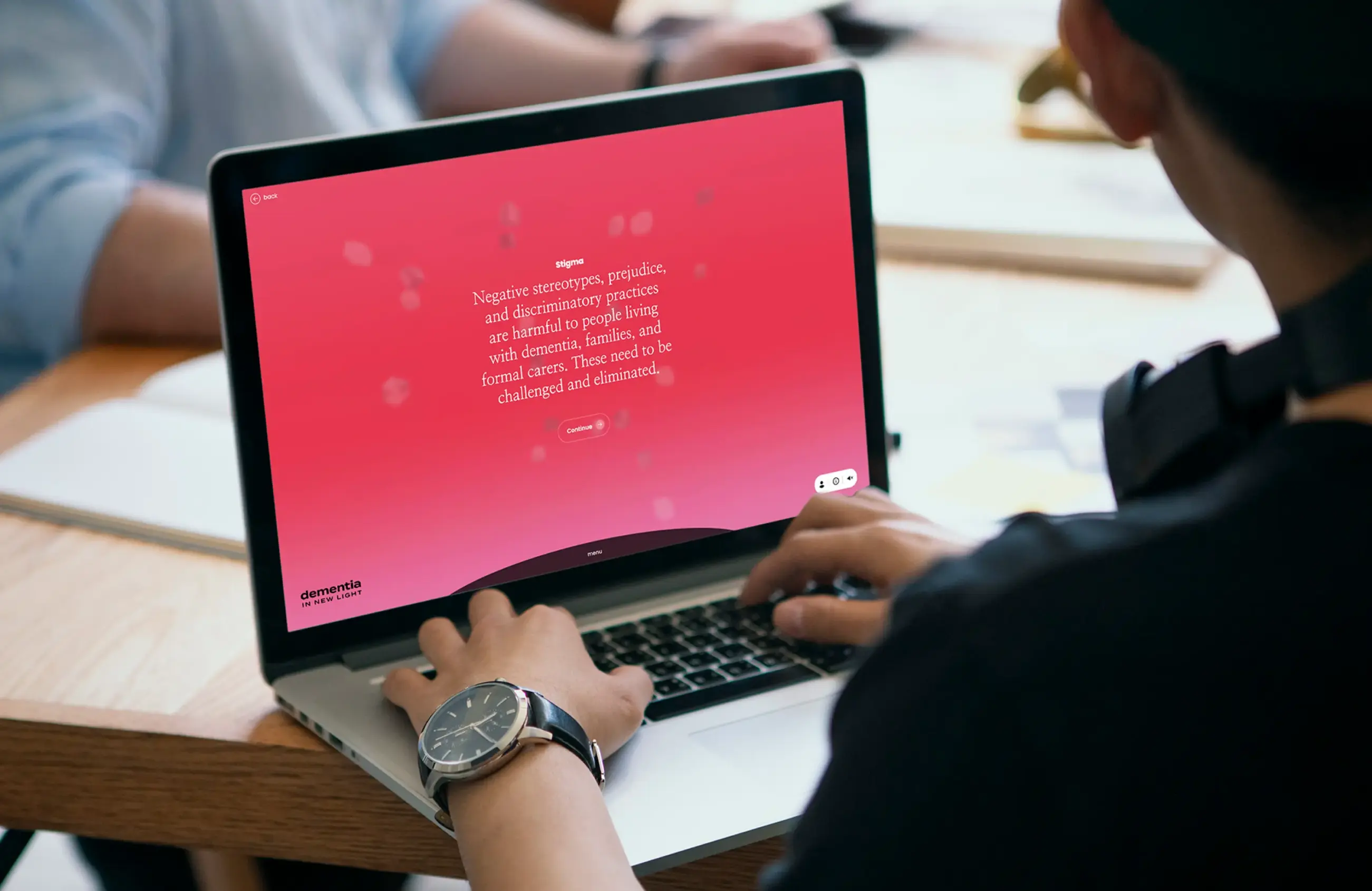
Person using a laptop displaying text about dementia stigma and a

Dementia In New Light

dementiainnewlight.com
Services Deliverables
  • Logo
  • Website
  • Illustration
  • Social Media
  • Lesson Development

Shedding light into the world of dementia

Dementia in New Light is a digital learning experience that builds upon the research-driven production, Cracked: New Light on Dementia. By following individuals with dementia and their families, it aims to challenge the stigma around dementia and its care. Forge collaborated with a diverse team of researchers and artists and applied co-design methodologies to create an accessible educational experience, fostering a reimagining of dementia and improved support for those impacted.

Features

Headless CMS

React framework

WebGL 3D render with custom shaders

User account portal

Analytics

Emotive narratives, challenging stigma

In our initial discovery phase, we met with the project stakeholders, care providers and individuals affected by dementia to understand how to spread awareness and educate people better about dementia and its effects. We listened to each individual’s story about their lived experiences, engaged in co-design discussions to shape our digital learning outcome and fostered an open, inclusive forum for collaboration. This discovery process uncovered invaluable information from diverse perspectives to enrich the outcome of our digital learning experience.

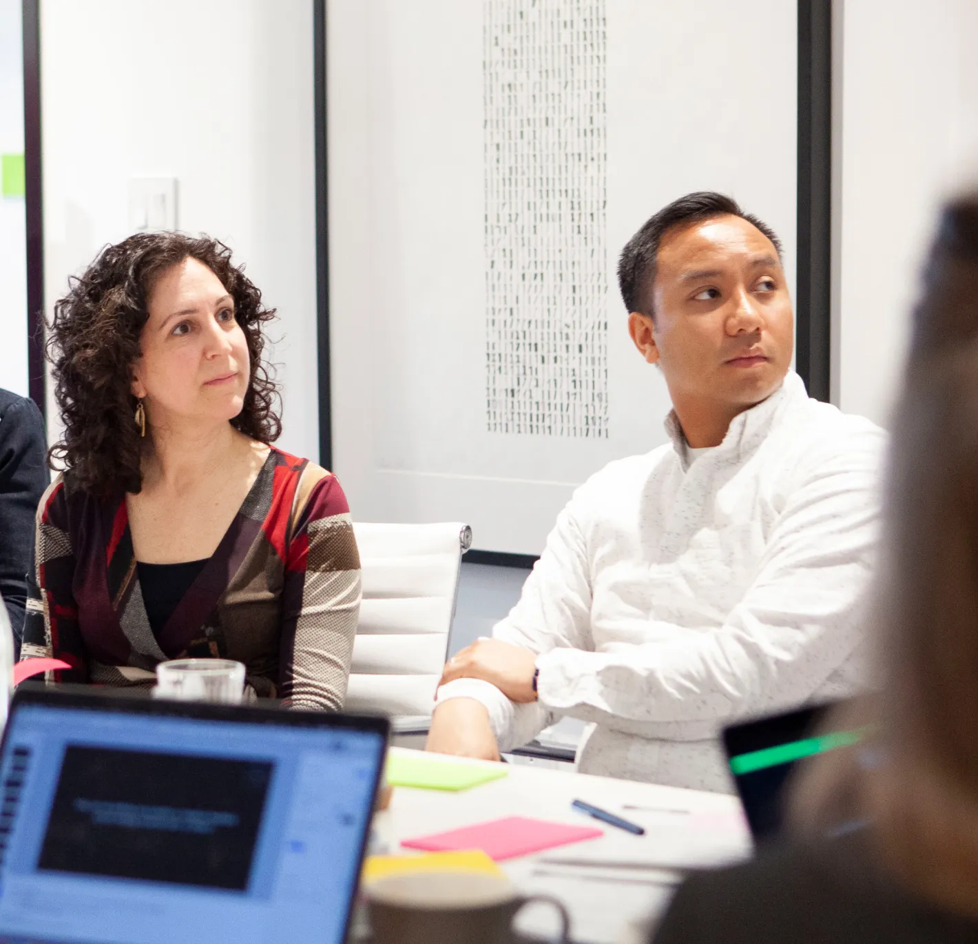
Two people sitting in a boardroom.
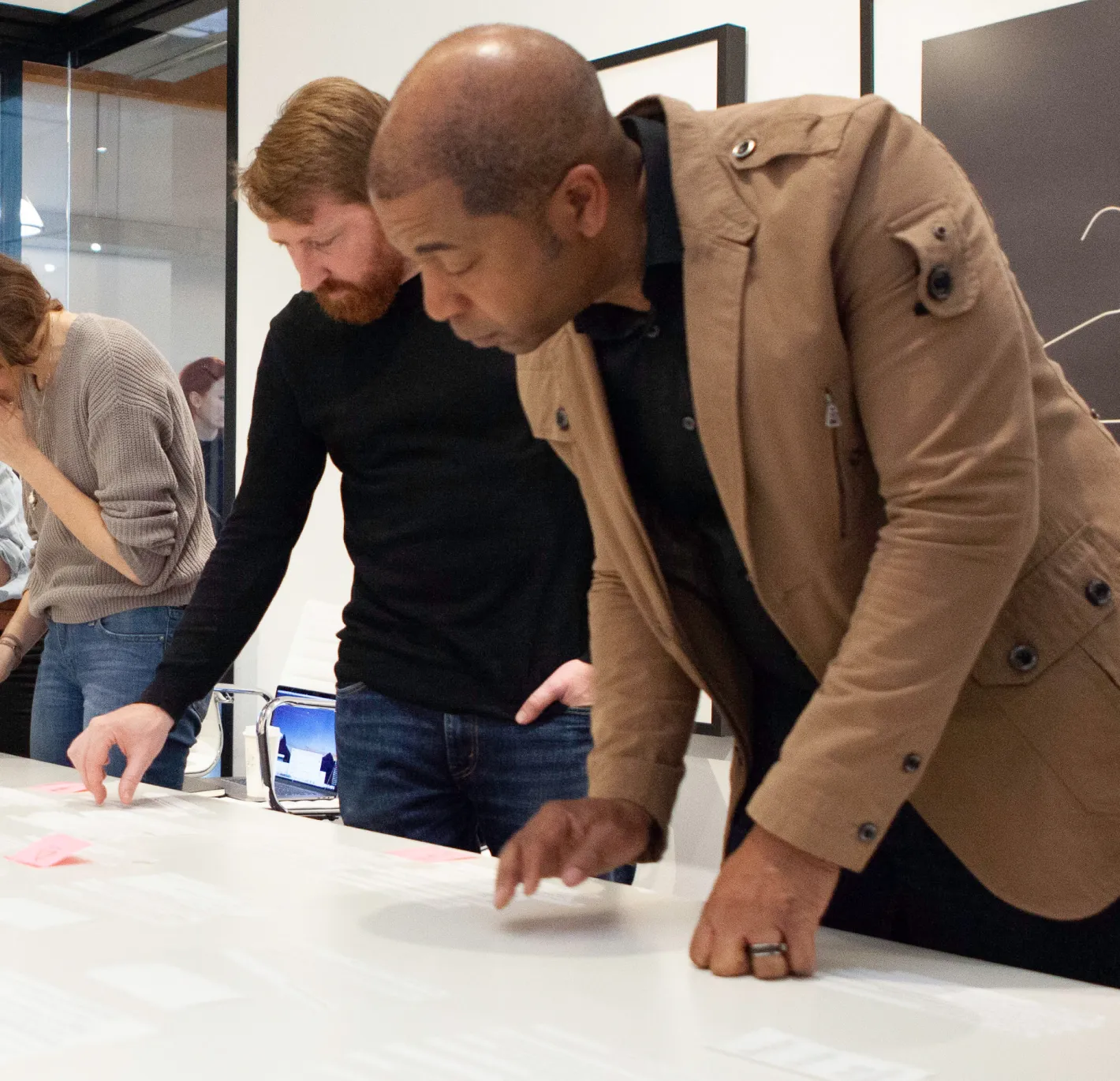
A group of people discussion research, while looking a table.
Snapshots from our discovery and research synthesis process

An engaging and informative experience

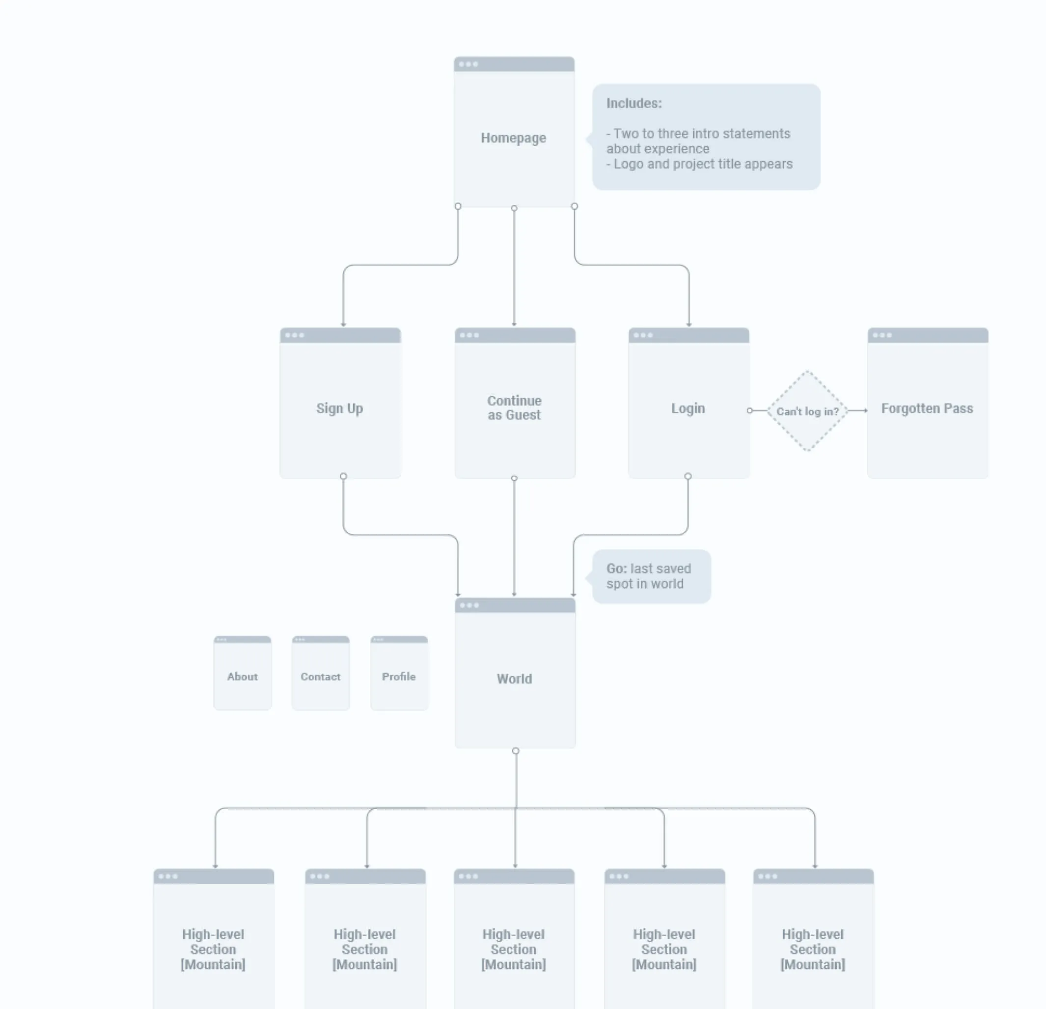
Our core objective was to enable learners to explore a wide range of topics related to dementia care while providing them with insights into the daily lives of persons living with dementia and their families, fostering empathy and understanding throughout their journey. To ensure an intuitive user journey, we developed detailed site architecture and wireframes, meticulously planning how learners would navigate the content.

An image showing the site architecture with information hierarchy
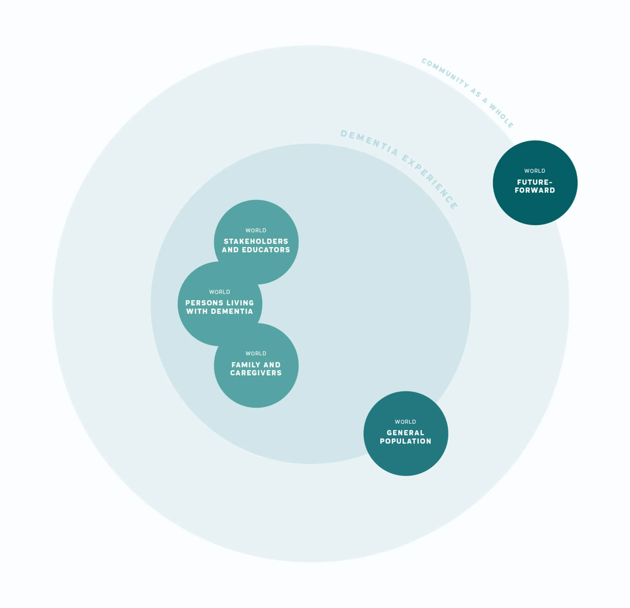
A circle diagram that shows the relationship between various topics
Detailed sitemap for a complex website and a small sample from our extensive discovery
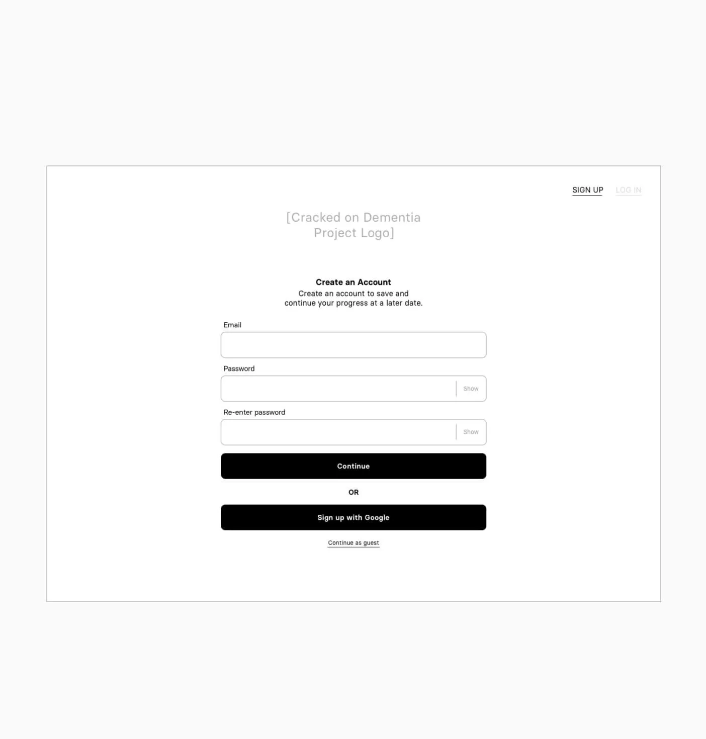
wireframe image of the login screen
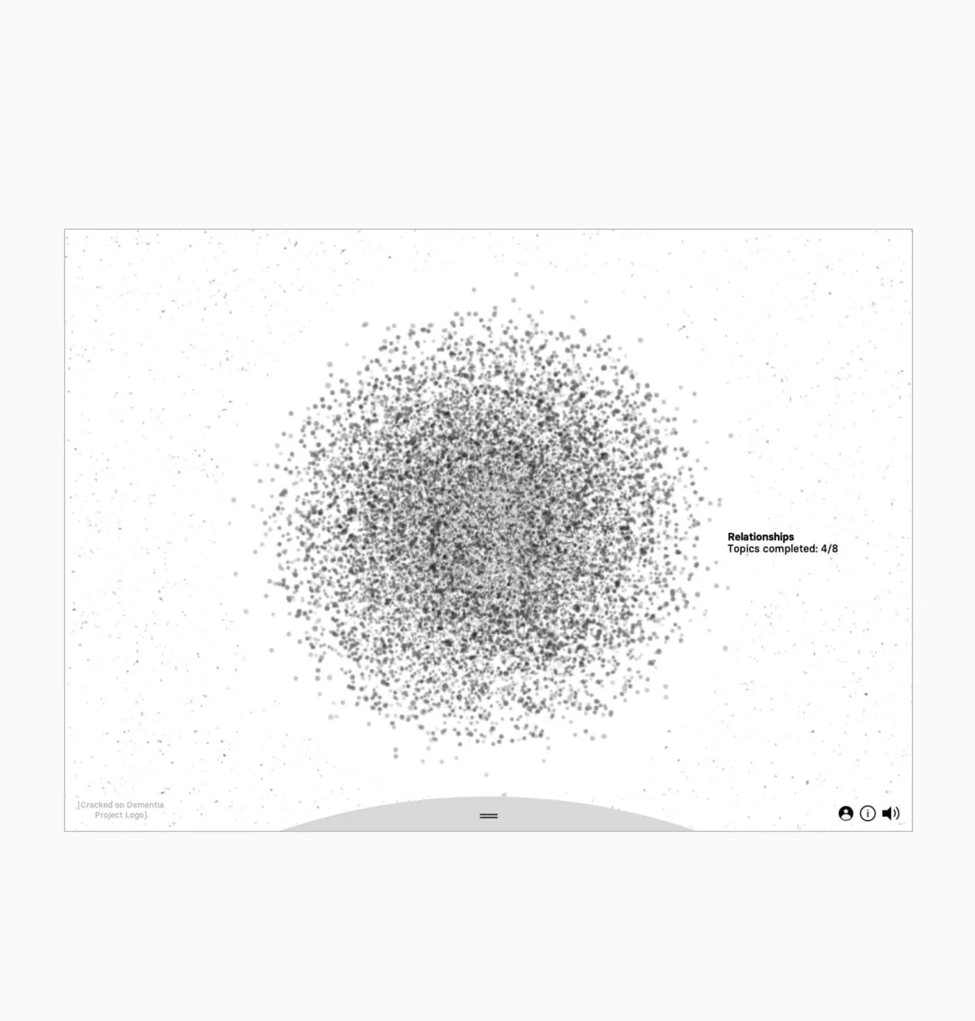
a sketch exploring the theme of murmuration, or clusters of meaning
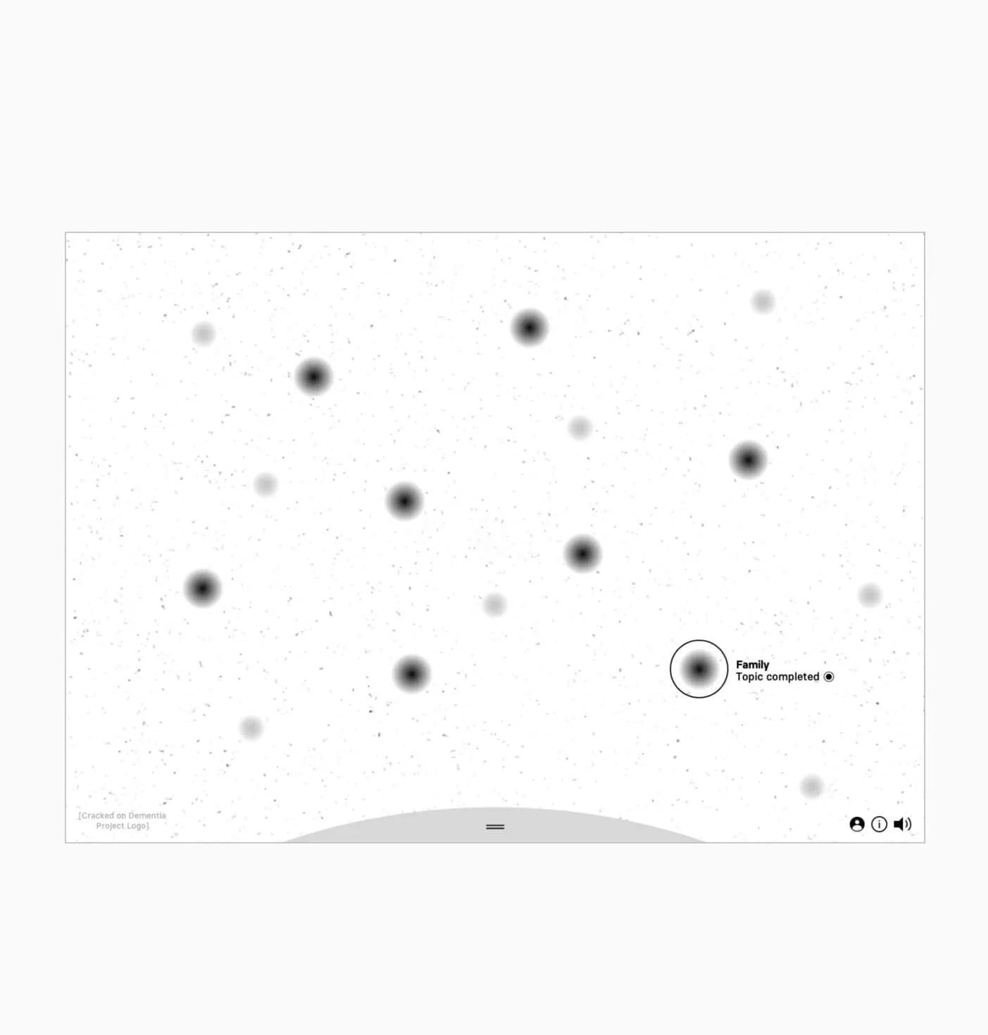
wireframe showing the idea behind the unique navigation
Wireframes to start defining the experience

Inspiring others to share their stories

The experience presents content in a number of ways and invites the learner to reflect on what they’ve seen and challenge their perceptions. Forge built a custom application backed by a headless CMS that allows the client to update content as needed.

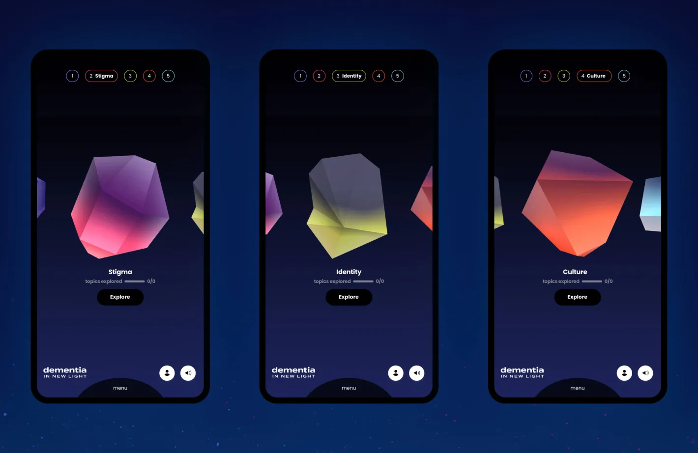
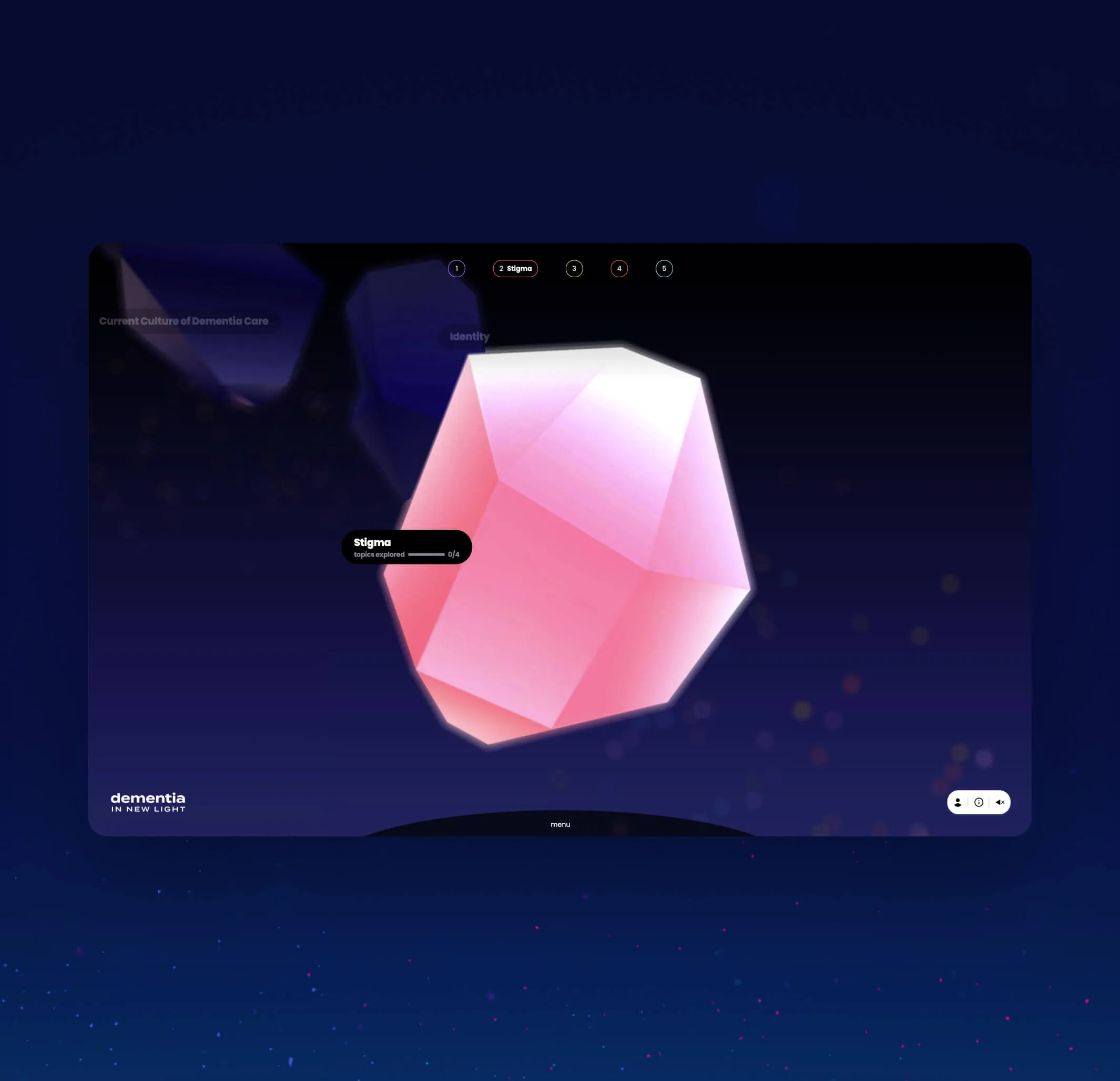
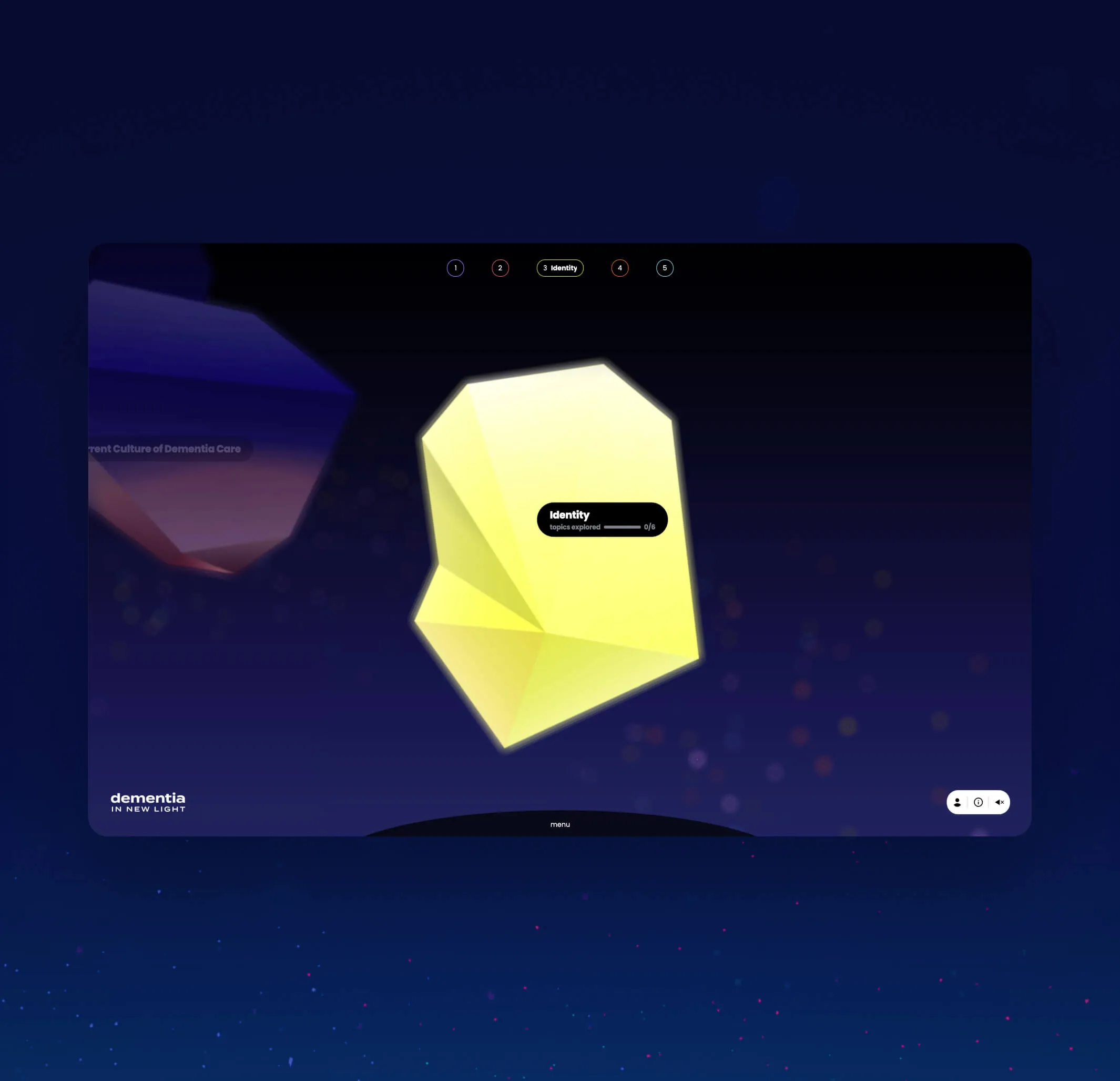
A close up of one of the topics in focus. The topic is shown as a crystal-like gem floating in space
Another close up of one of the topics in focus. The topic is shown as a crystal-like gem floating in space
Topics browser which acts as the main navigation
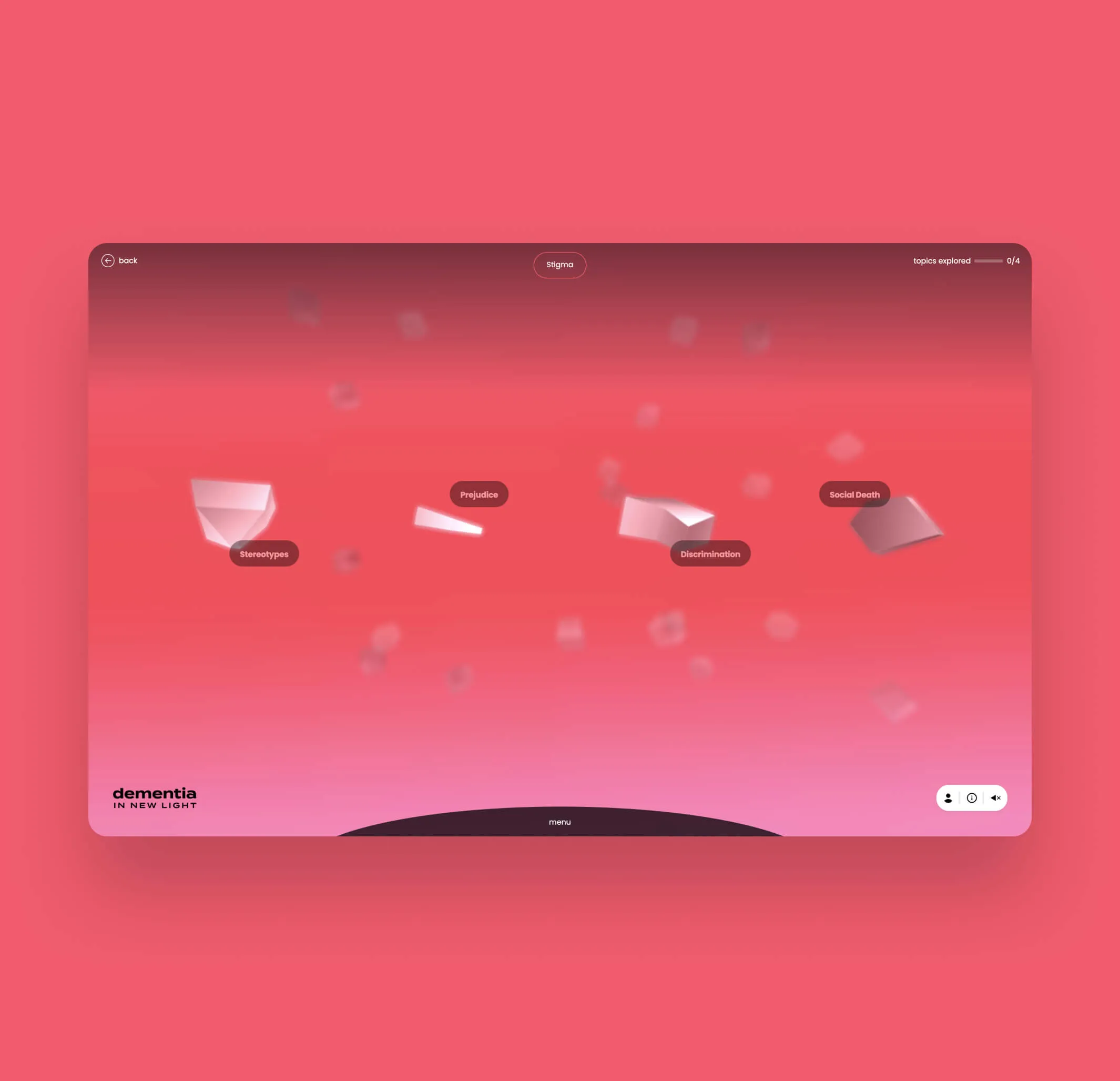
The stigma topic expanded, to show the sub topics. The topics are shown as crystal-like gems floating in space
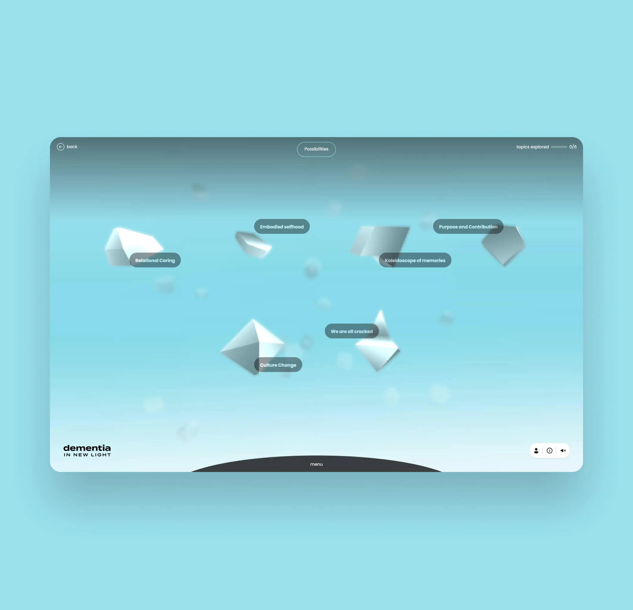
The Possibilities topic expanded, to show the sub topics. The topics are shown as crystal-like gems floating in space
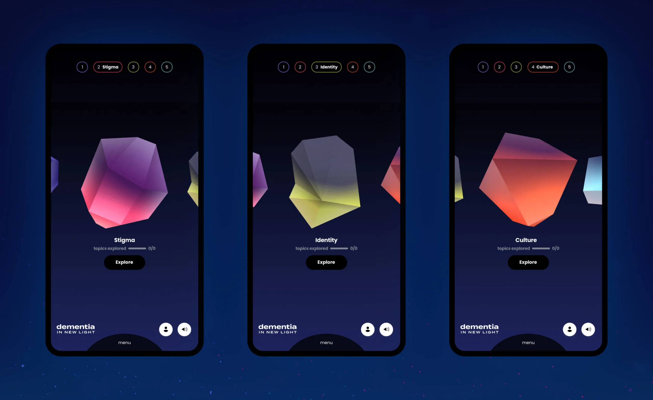
Three phone screens displaying abstract geometric shapes and topics related to dementia: Stigma, Identity, and Culture.

Shifting perspective through interactive storytelling

Learners are immersed through dynamic audio and visual learning moments while incorporating scenes from the original production. Learners can explore various topics surrounding dementia care and see things from the perspective of the person living with dementia and their families.

Illustration of a radio
Illustration of open eyes with eyebrows
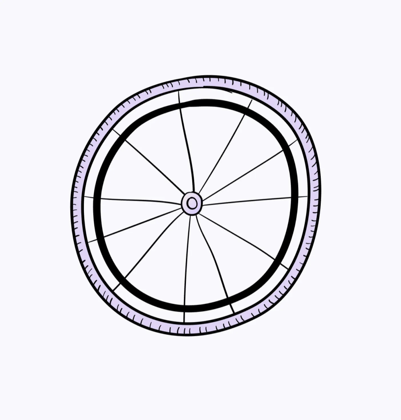
Illustration of a bike wheel
Custom illustrations to help tell the stories
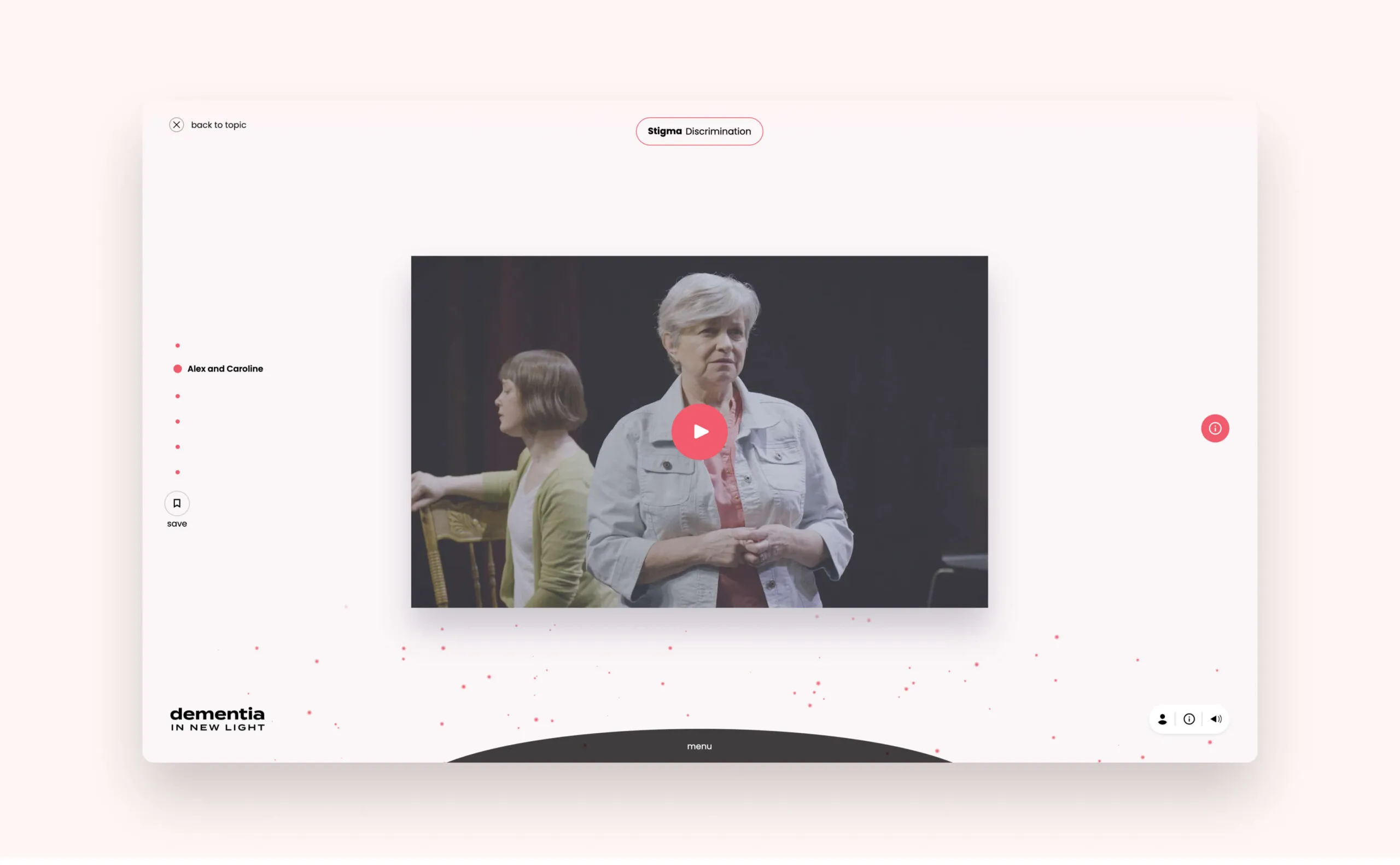
A desktop screen that shows what the video player looks like
Learning modules to educate users about dementia
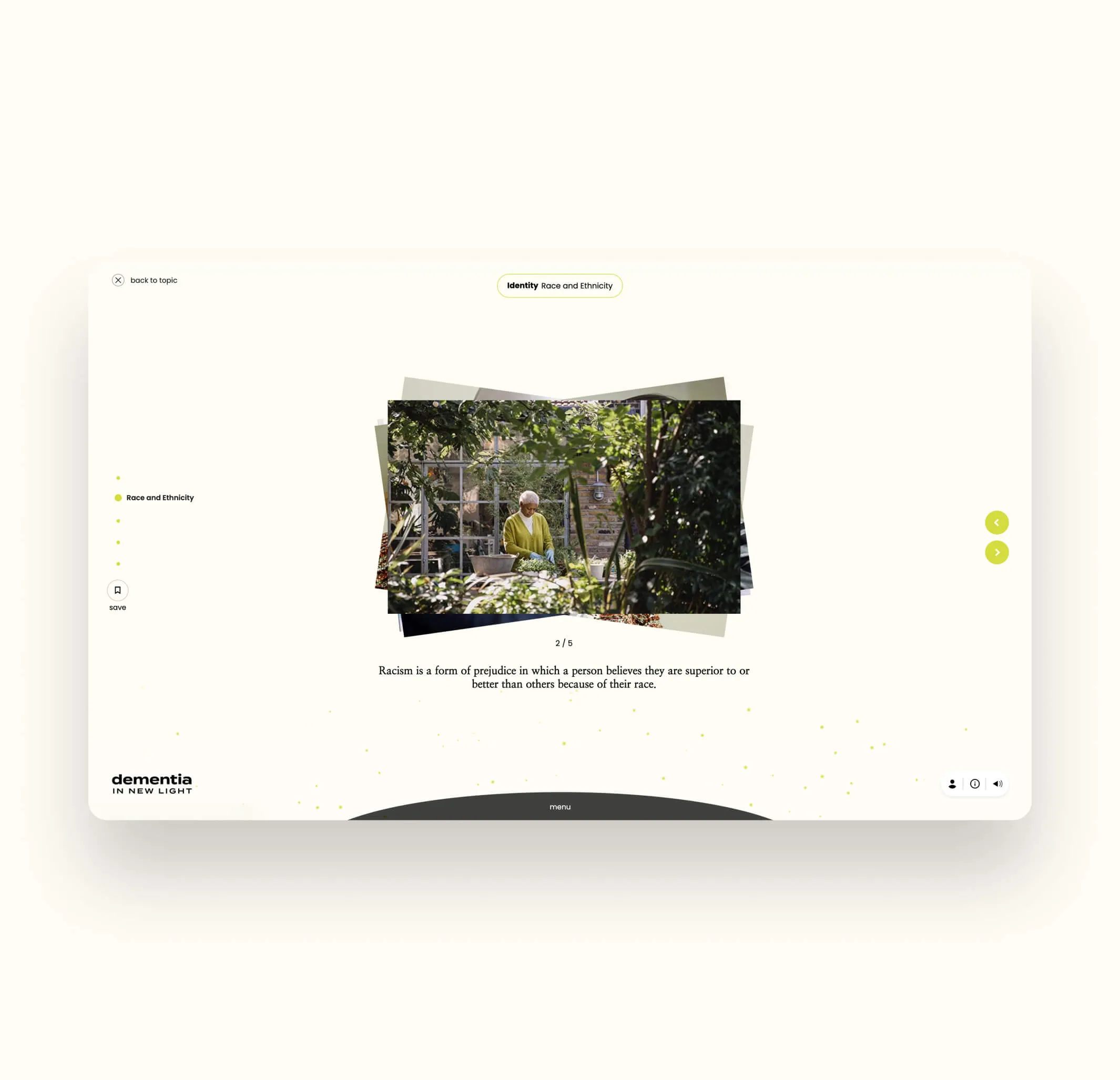
An image gallery is shown in one of the subtopics
A handwritten quote in one of the subtopics

Promoting engagement through tracked user progress

Learners have the ability to create personal accounts where engagement can be tracked and referenced throughout the experience, allowing them to take in content at their own pace and feel a sense of progress. Content can also be easily saved and referenced at any time.

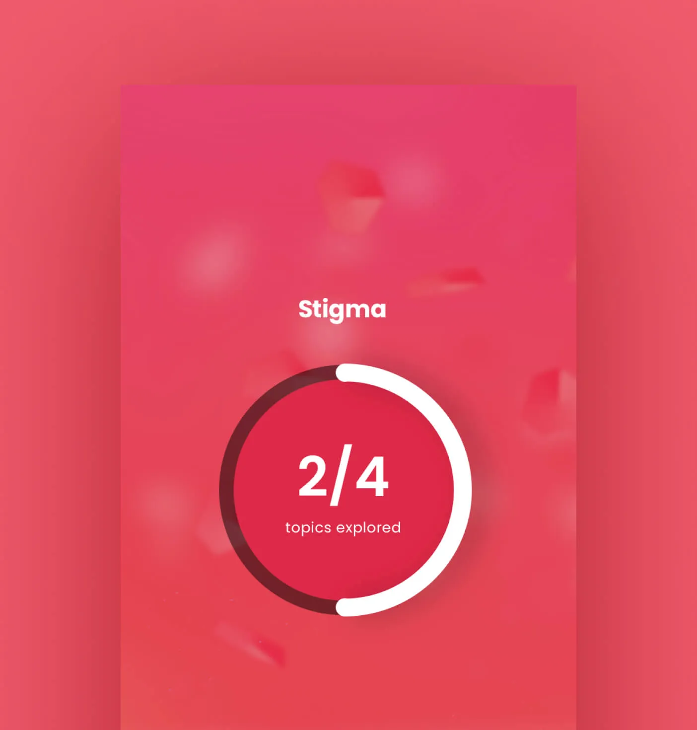
A screen showing that the Stigma topic is half completed.
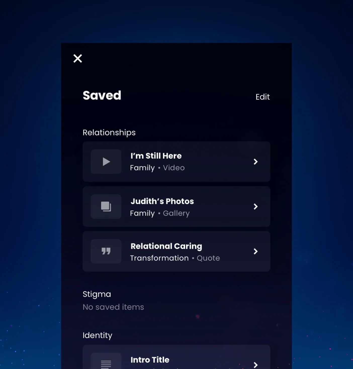
A screen showing learning modules the user has saved to their profile
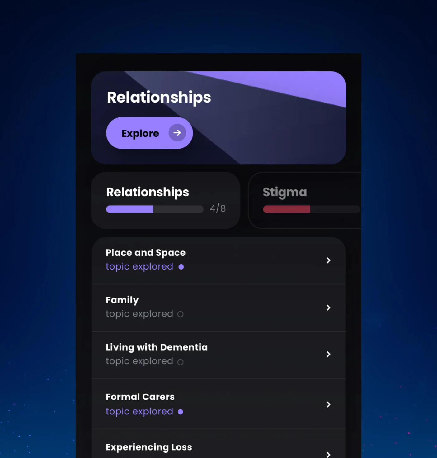
A screen showing the relationship topic with its sub topics and indicators to show which sections have been completed.
A playful display to keep track of your progress within the lesson plans
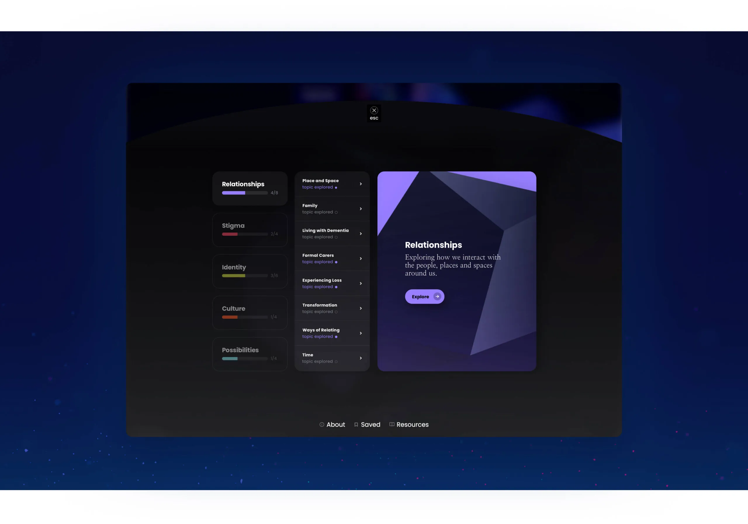
A desktop view of the Relationships topic, showing the sub topics and completion status of each topic.
  • 597K of people are living with dementia in Canada as of 2020
  • 61.8% of those living with dementia are women
Forge is a ‘dream team’! They developed an award-winning, multi-media digital learning experience about dementia-related stigma that deepens learners’ engagement. Despite the ever increasing complexities of its design and build, their team never disappointed – they model the very best of efficiency, ingenuity, and participatory design.
Pia Kontos, PhD, Senior Scientist, Professor
Out at Home text overlayed on a suburban street with a house and trees. Out at Home text with a rainbow flag overlay on a suburban street.

Out At Home

Services Deliverables
  • Video Production

An empowering training tool for home care workers

‘Out at Home’ is an educational video created for the University Health Network in association with the University of Guelph and Western University. Developed for use in training for those who work with the aging LGBTQ+ population in their homes, including nurses, personal support workers (PSWs), and other home care providers. Currently, no formal education exists surrounding the care of individuals from this marginalized and vulnerable community, which has frequently led to substandard and even detrimental treatment.

Sharing heartfelt and emotional stories

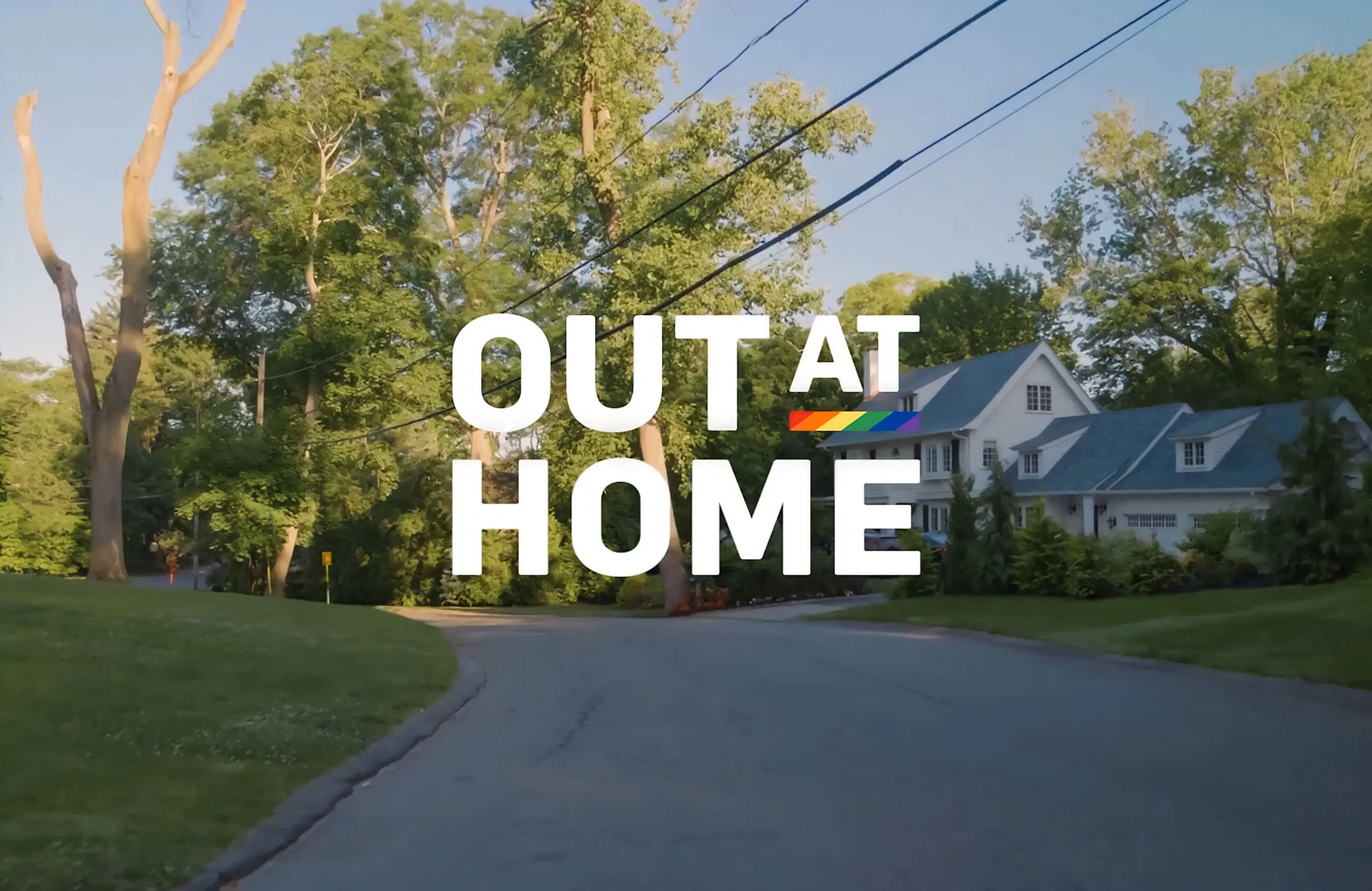
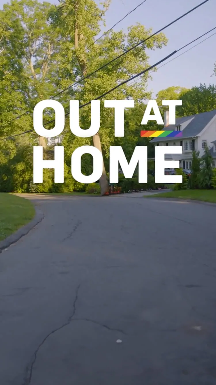
We created a brand for the project that appeared throughout the video, including a title introduction and all on-screen graphics. The established brand identity provides cohesion, clarity of information, and a final polish to the finished product that easily extends to further applications.

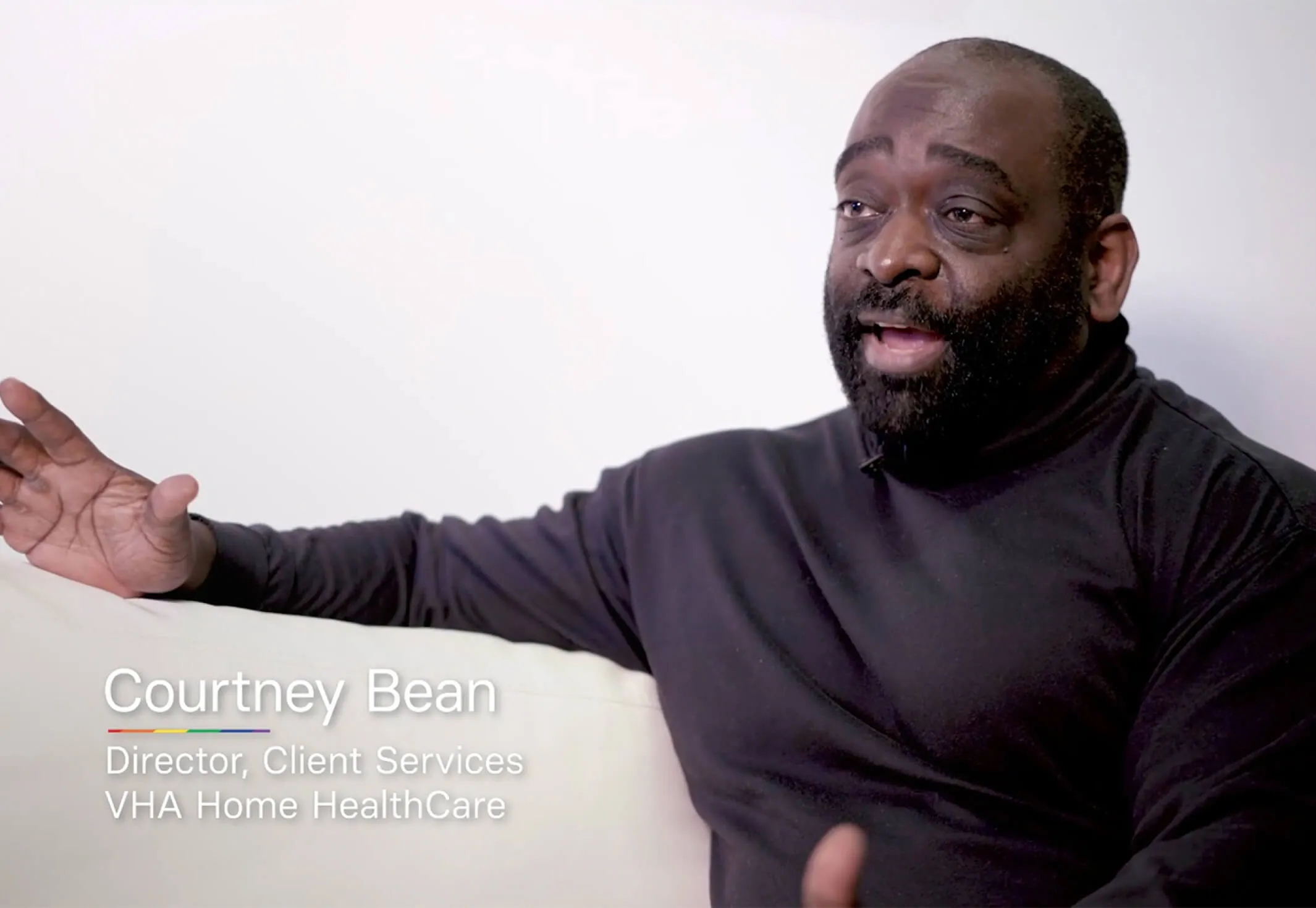
Courtney Bean, Director, Client Services at VHA Home HealthCare
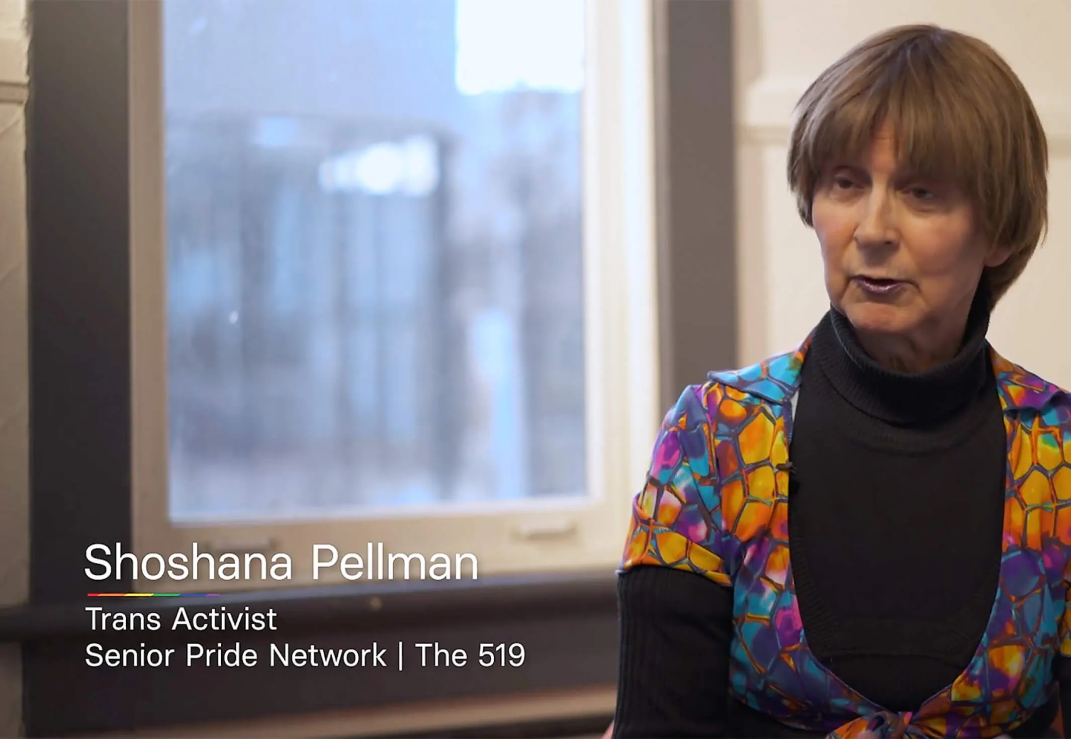
Shoshana Pellman, Trans Activist and Senior Pride Network member.
Interviews with representatives of the community
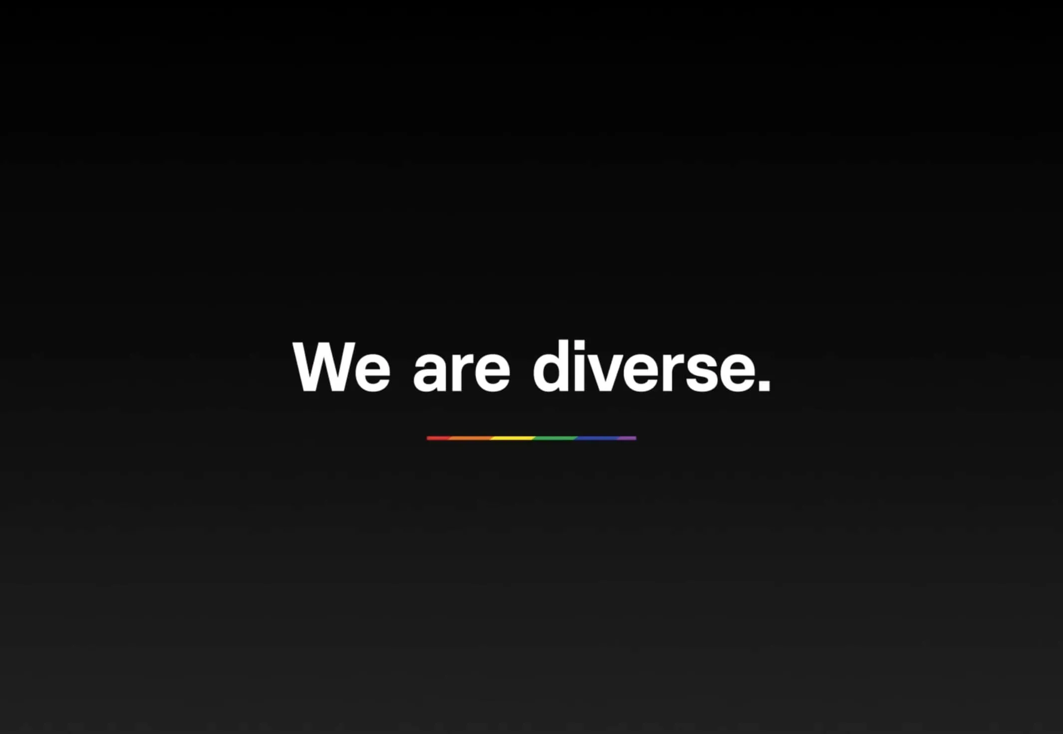
We are diverse. with a rainbow stripe.
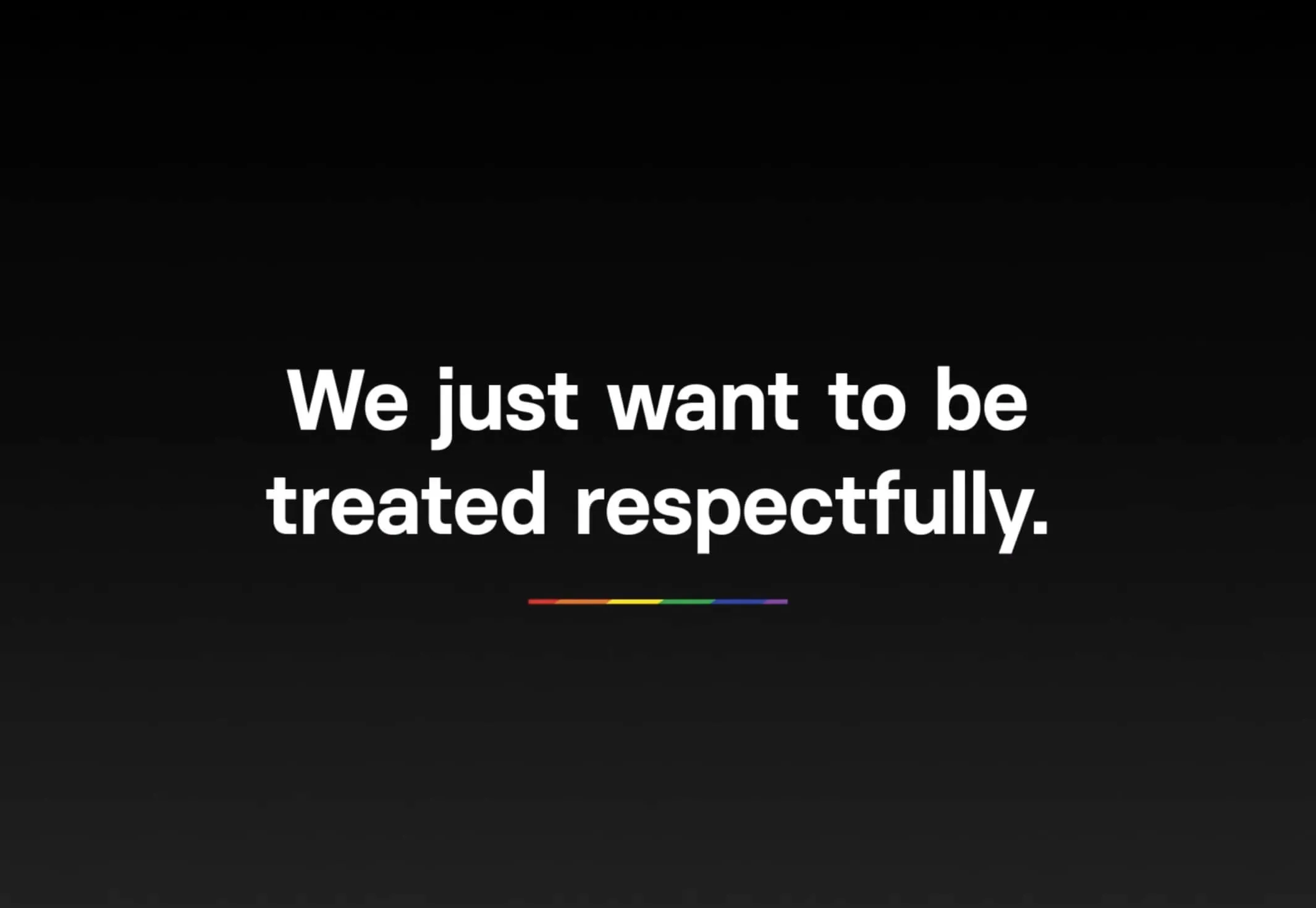
We just want to be treated respectfully. Rainbow stripe.

Illustrating the importance of good care

The video is an emotionally engaging introduction to this important topic, providing insight into the history and background of the LGBTQ+ community and how this has impacted them as they’ve aged. It shares heartfelt stories of how poor home care has affected them and how it needs to change. It also contextualizes practical information from other care workers in the industry on what should be improved, how to go about it, and how simple it is. Dramatizations directly illustrate what good care looks like and helps to humanize the topic into relatable scenarios. These elements come together to establish an effective training tool that is approachable, respectful and thought-provoking.

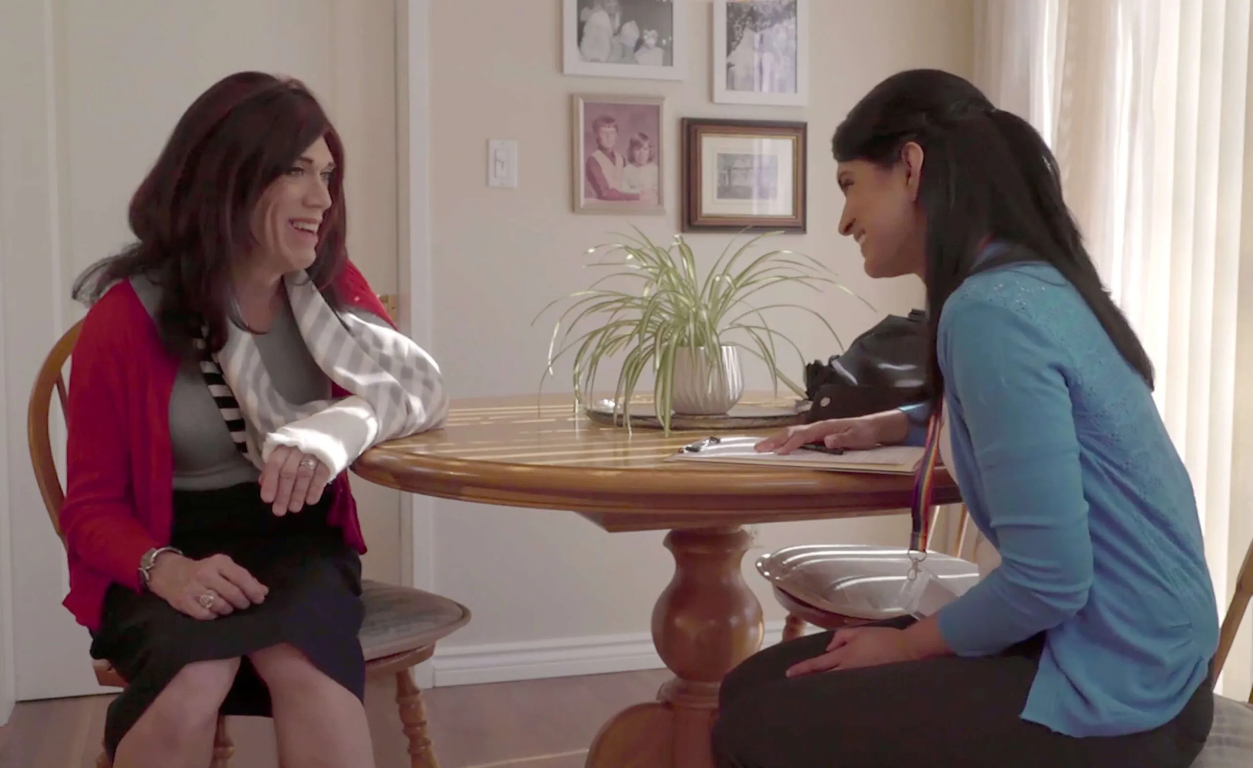
Two women sit at a table, one with a cast on her arm, talking.
Awards
  • The Association of Registered Graphic Designers of Canada (RGD) logo.

    So(cial) Good Design (Diversity, Equity and Inclusion) Winner, 2022.

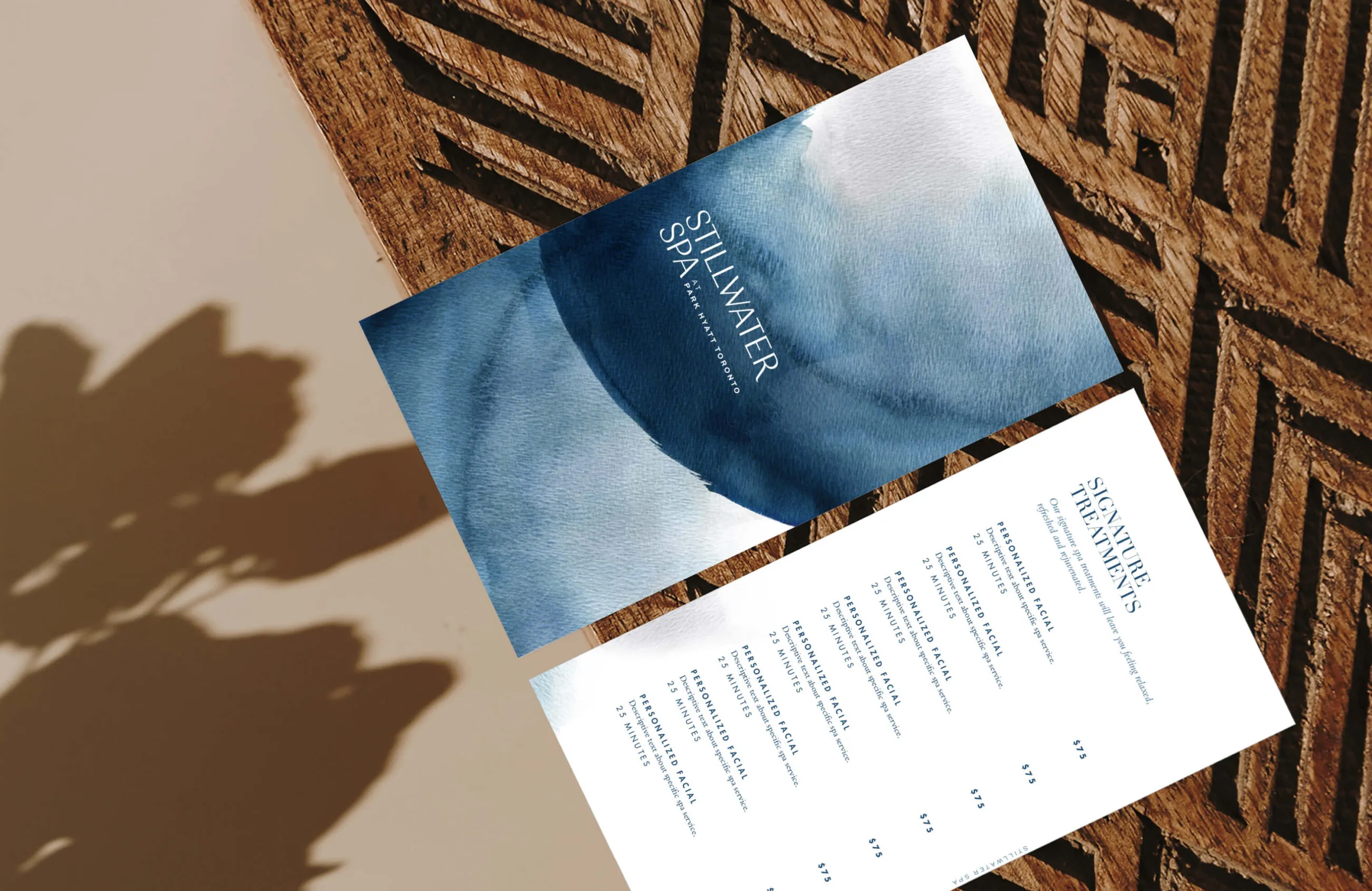
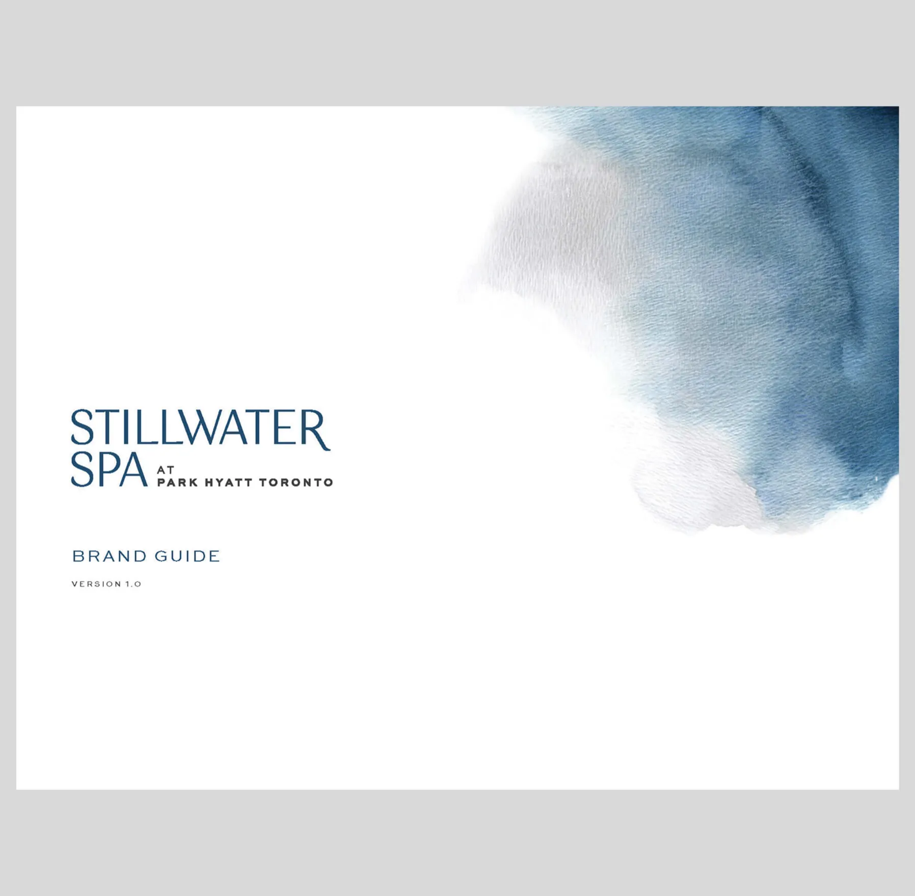
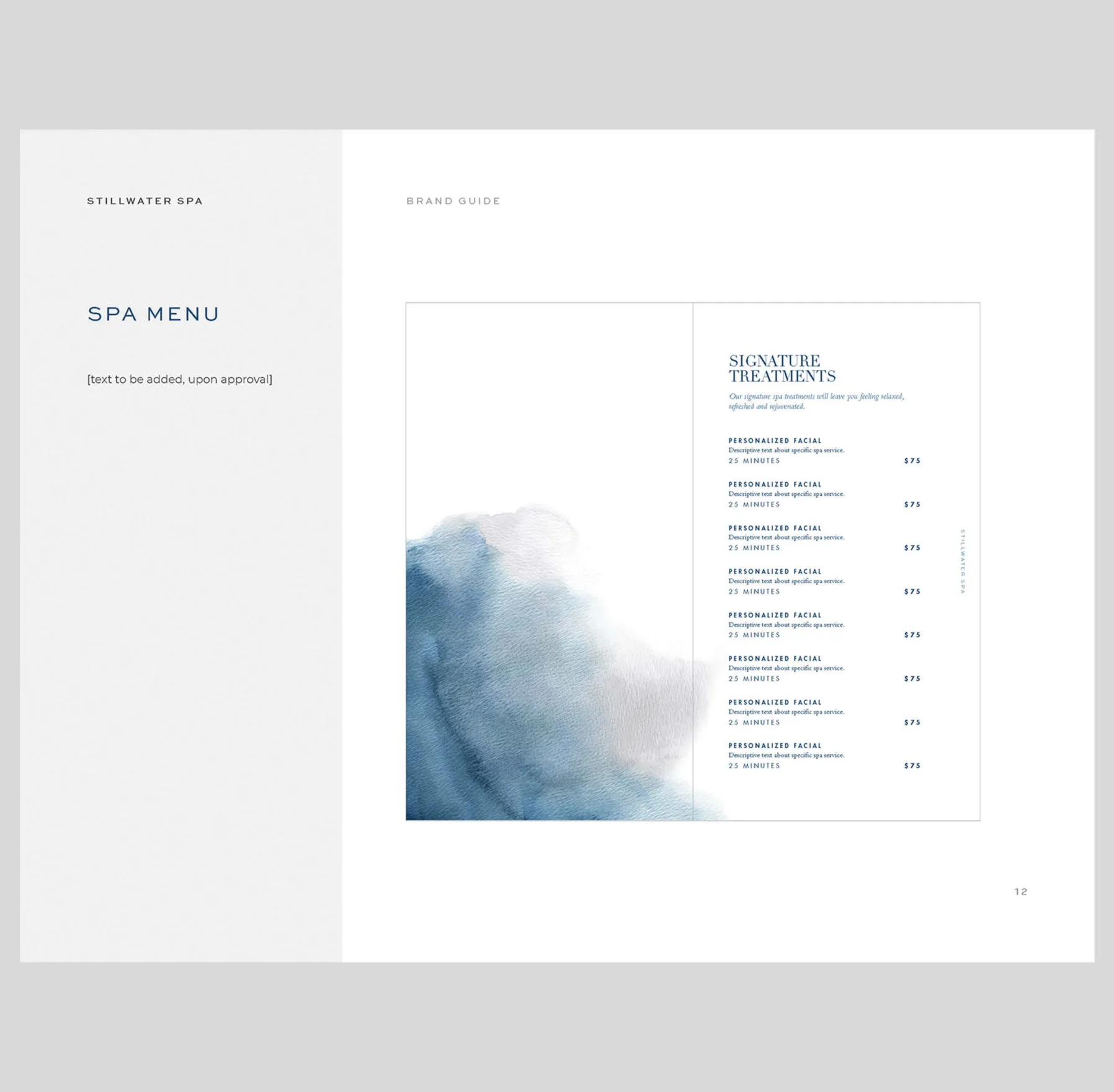
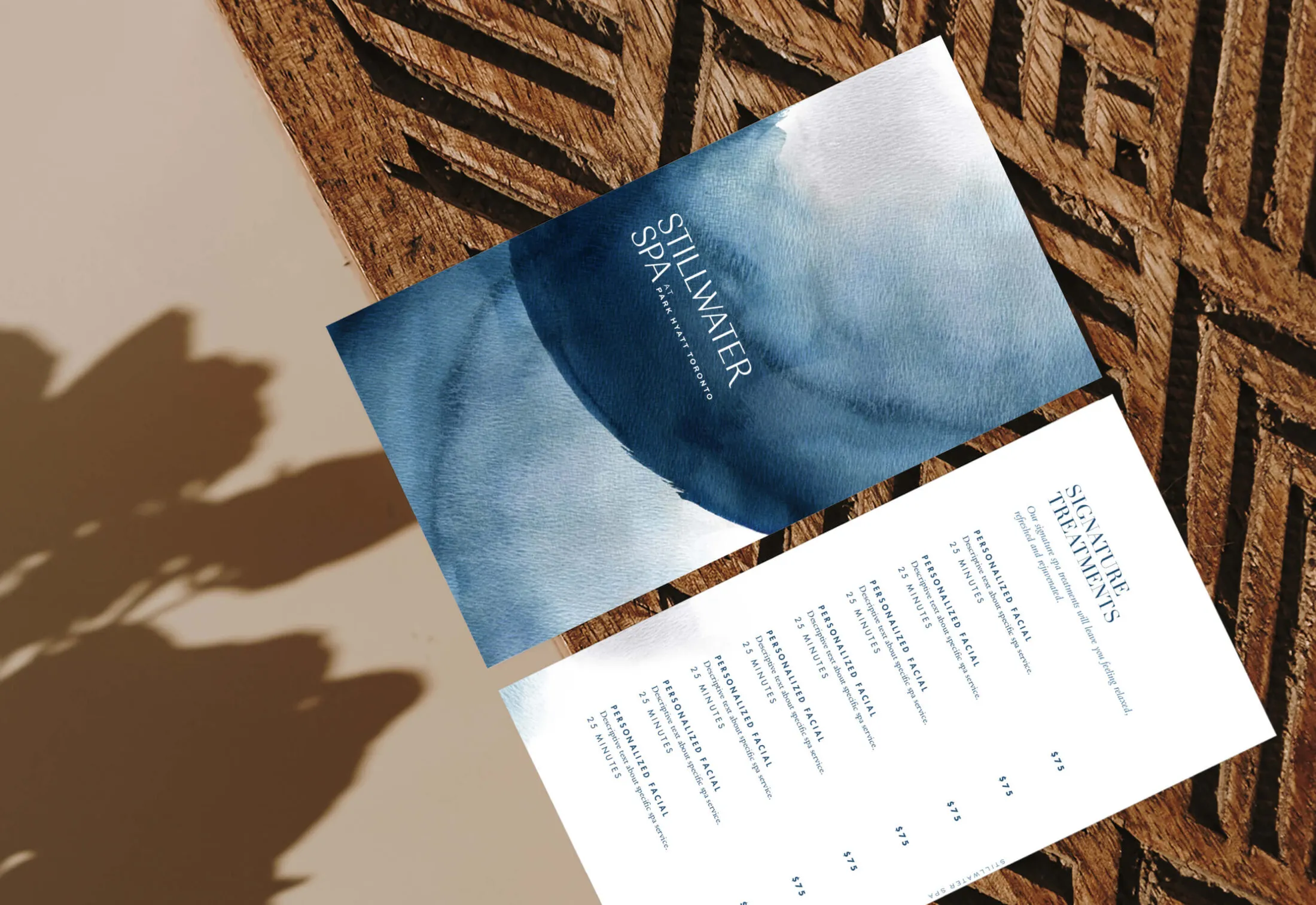
Stillwater Spa menu with watercolour design and signature treatments.

Stillwater Spa

Services Deliverables
  • Logo
  • Brand Guide
  • Marketing Materials
  • Stationery
  • Illustration
  • Placemaking

Redefining a sophisticated spa experience

Park Hyatt Toronto recently underwent a massive four-year renovation to redefine and reimagine the modern luxury hotel experience. Located in Toronto’s Yorkville neighbourhood, Park Hyatt offers timeless sophistication across all hotel amenities and spaces. With the hotel’s extensive transformation, an opportunity to rebrand Park Hyatt’s Stillwater Spa arose. Forge worked closely with the teams at Oxford Properties and Hyatt to ensure the branding captured the luxurious nature of the spa.

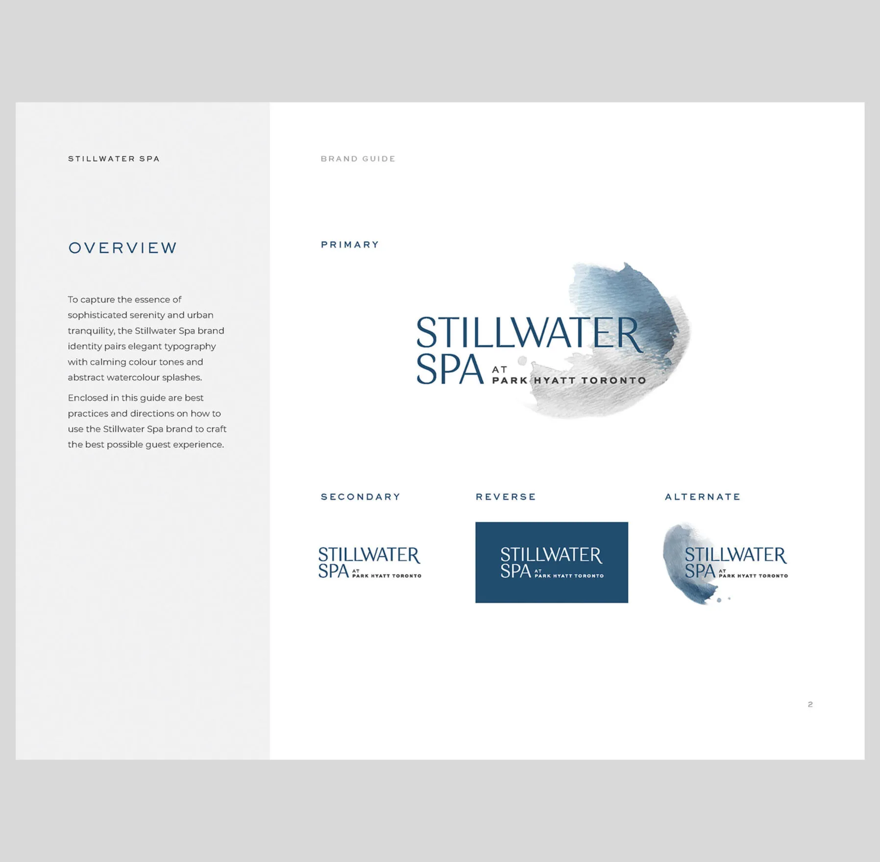
Logo inspired by the soft touch of watercolours
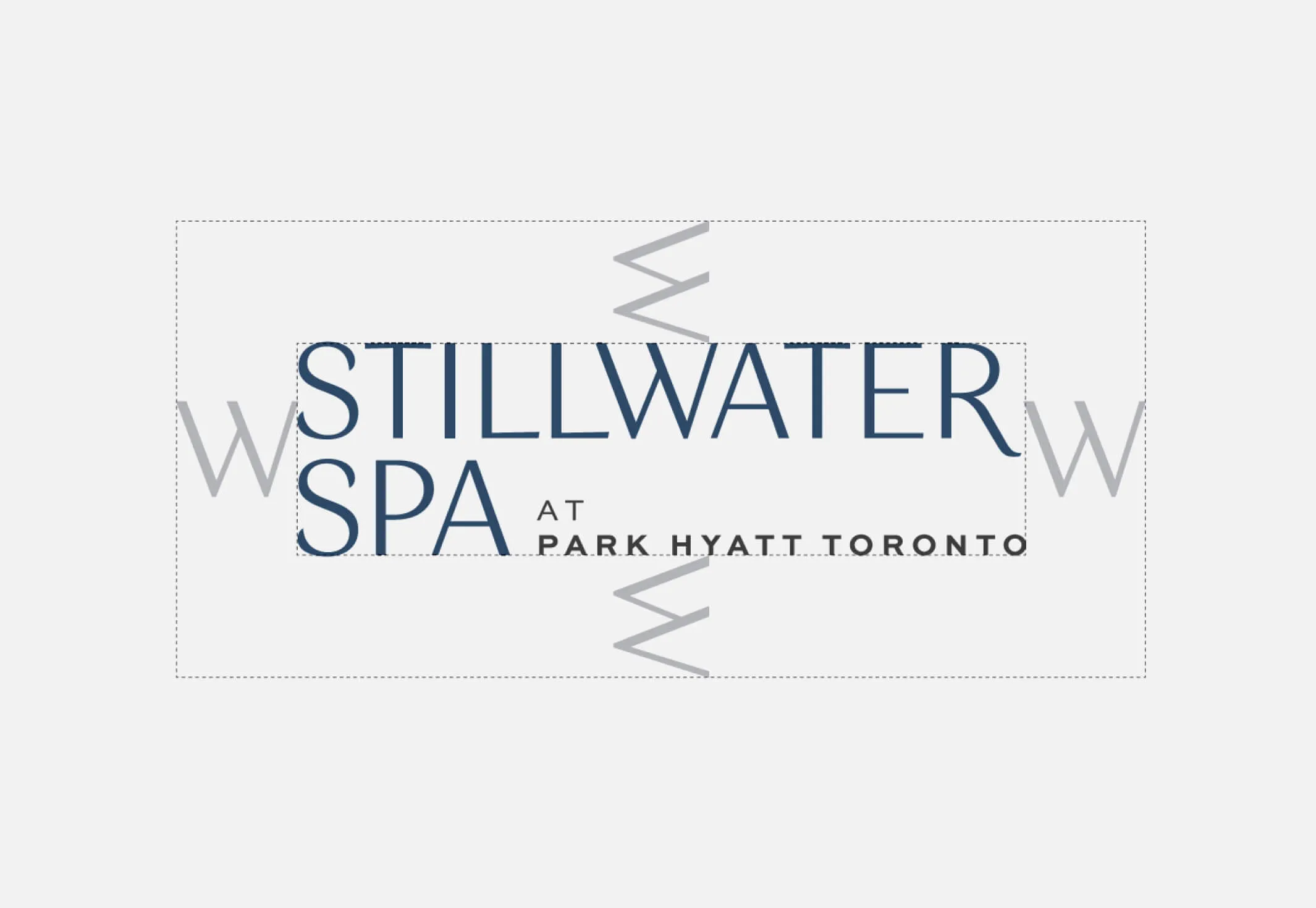
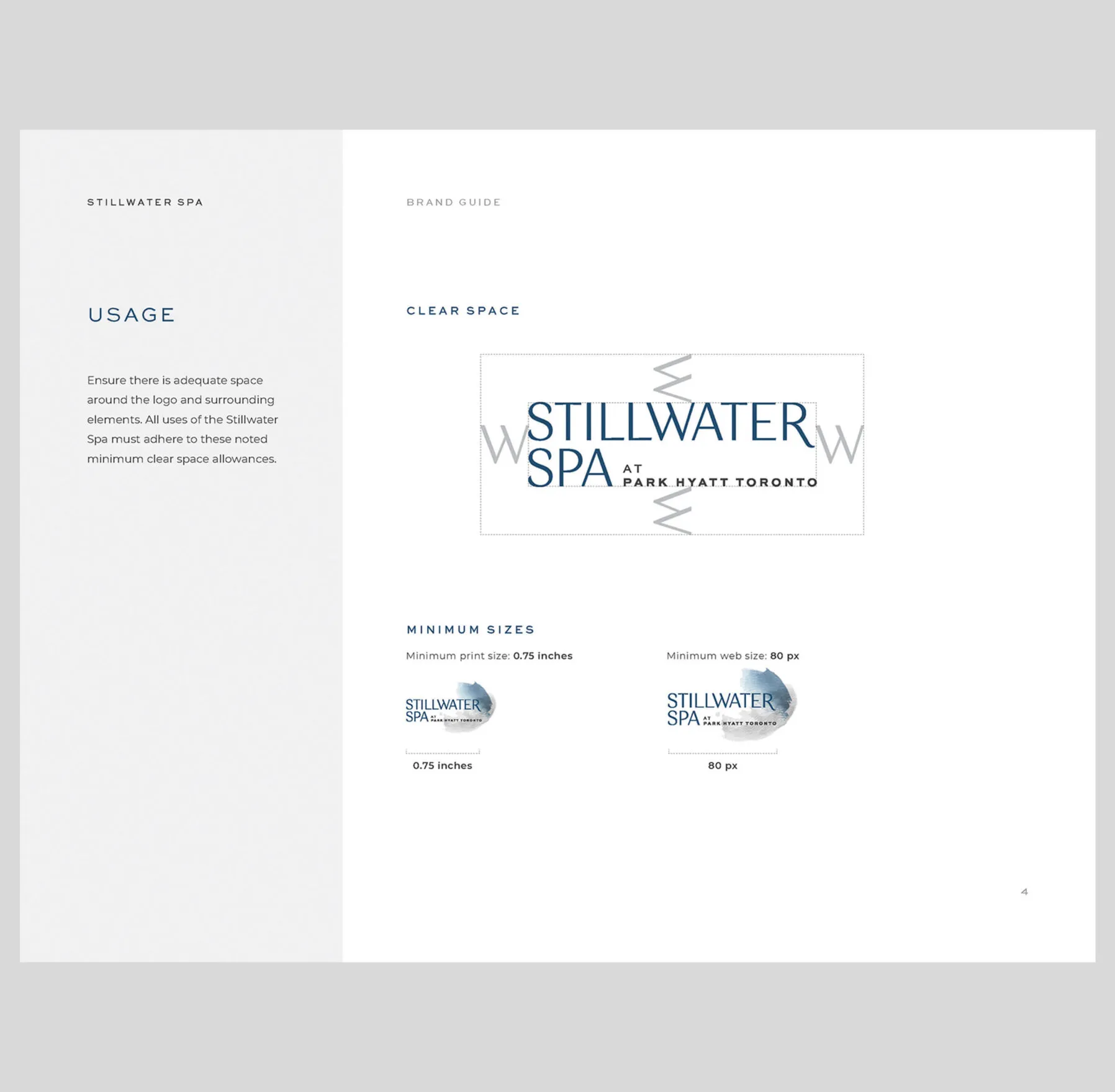
An image showing the safe space around the Stillwater Spa logo
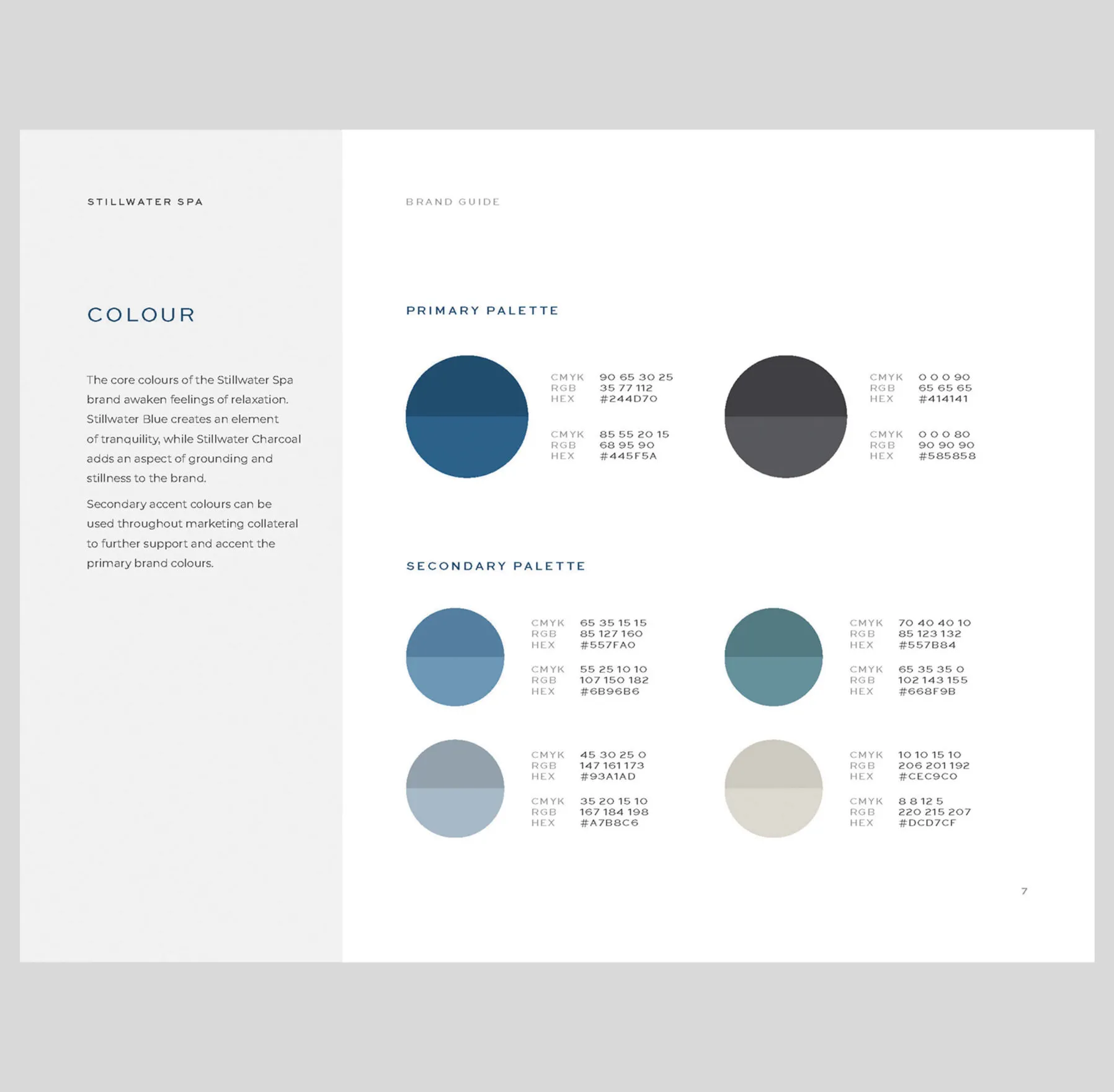
Vertical stripes of blue, grey and beige colours.
Clear space requirements and a delicate colour palette to support the brand
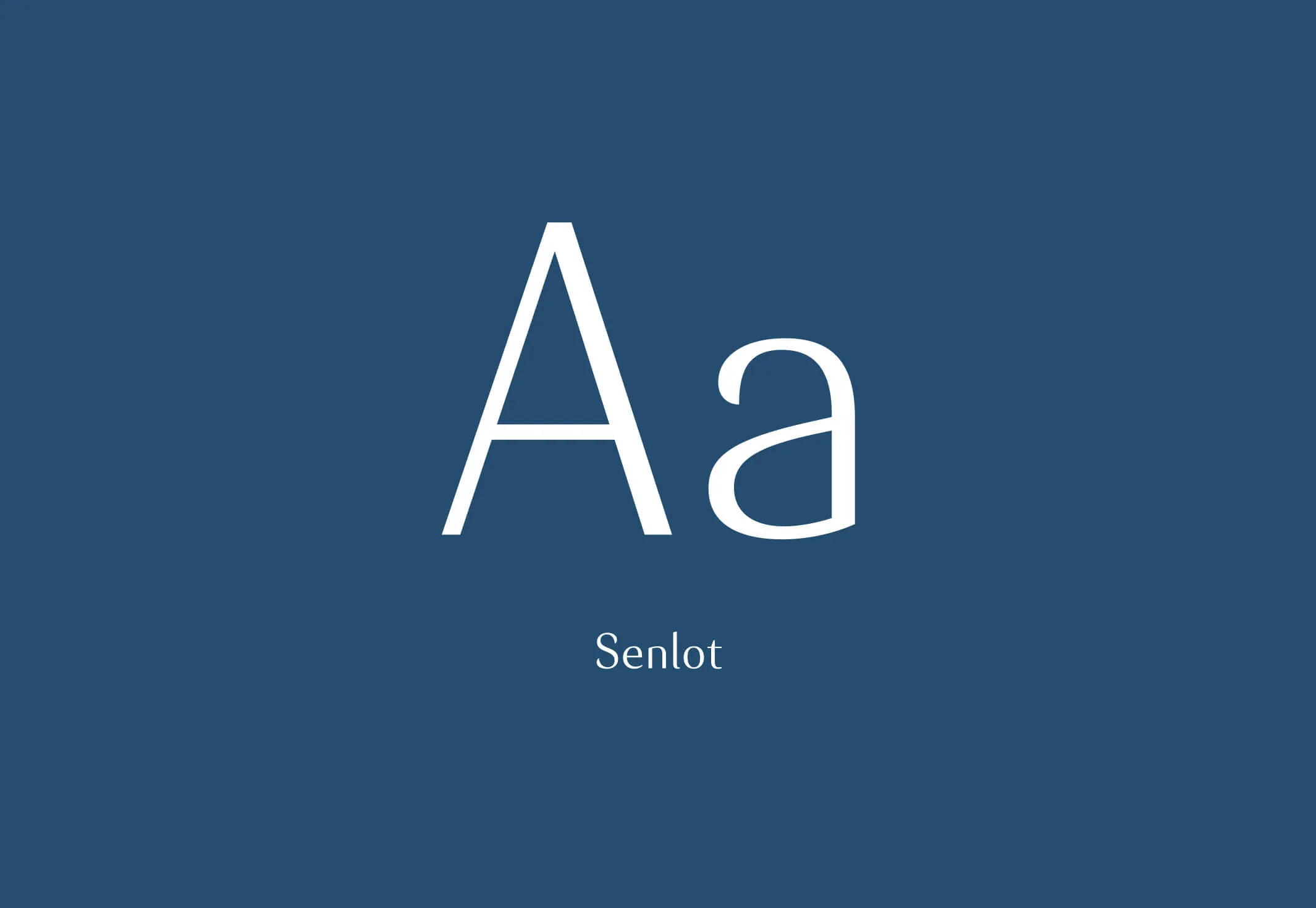
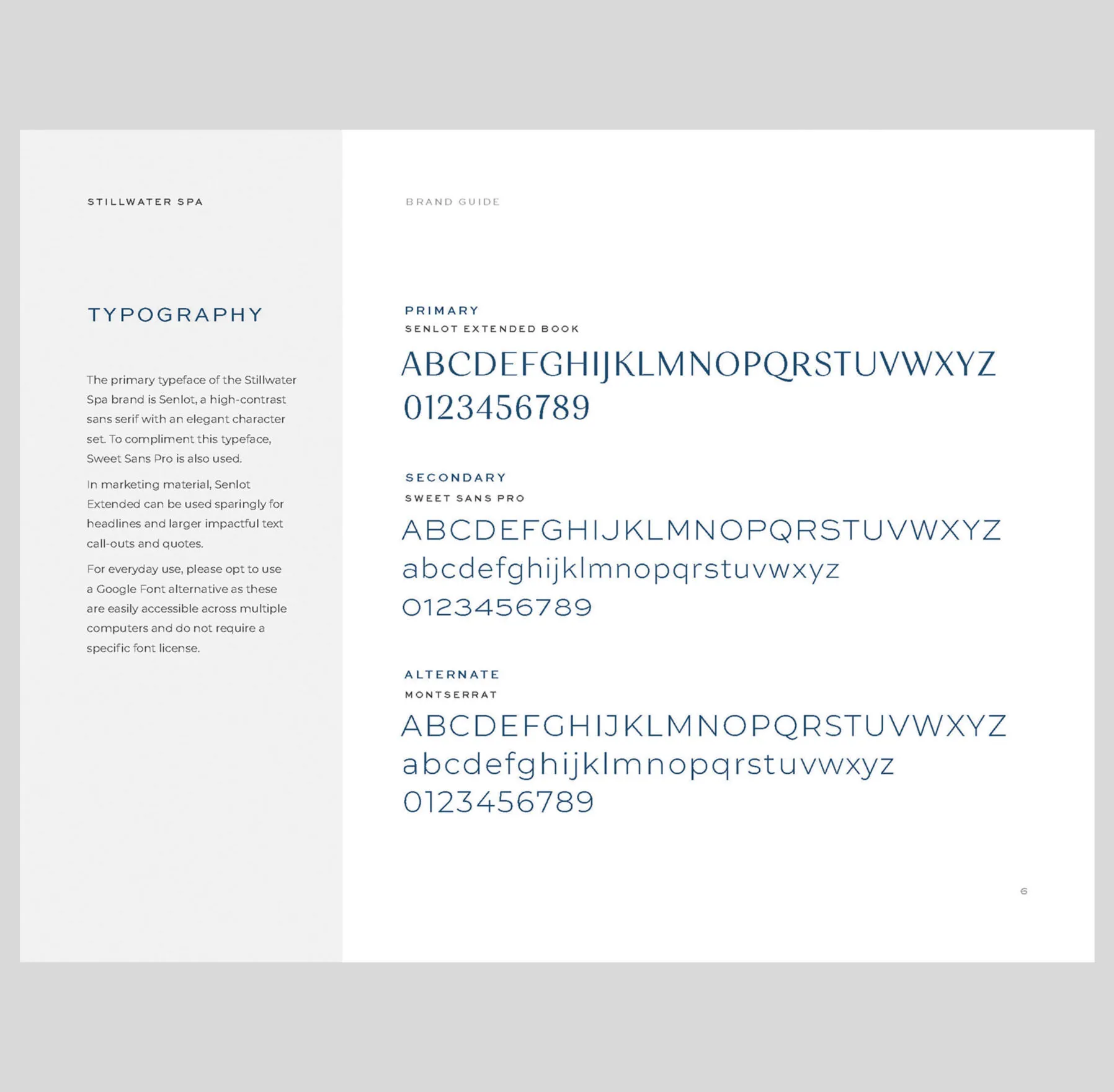
A letterform of the letter A for the font Senlot
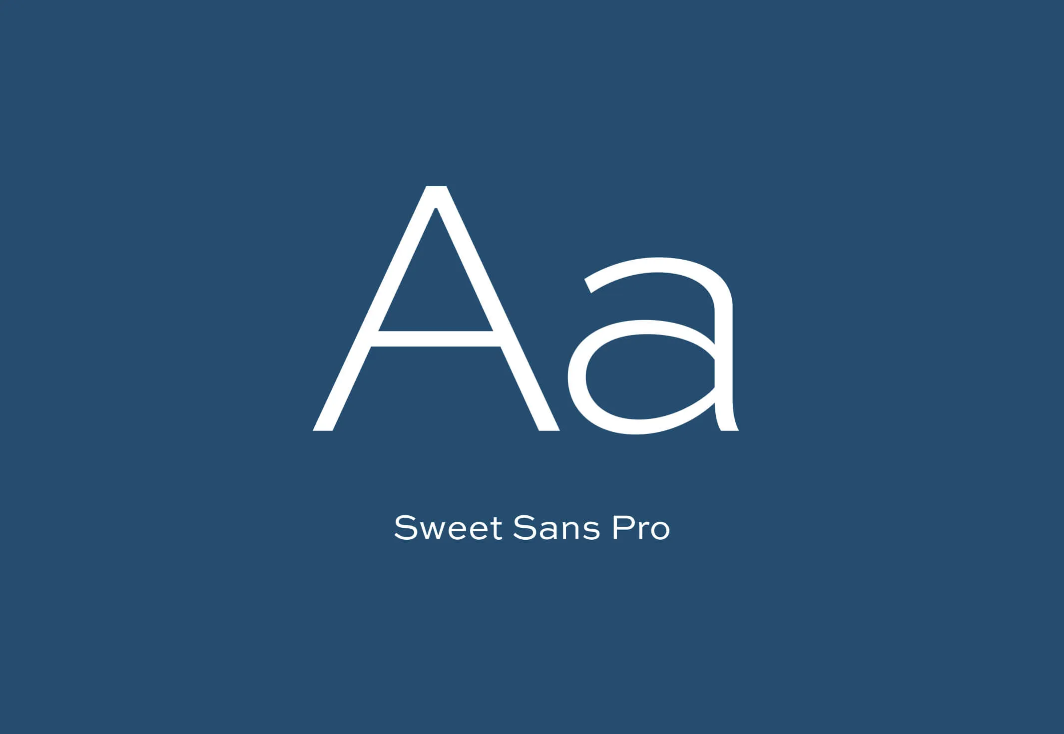
A letterform of the letter A for the font Sweet Sans Pro
Classy fonts for this high-end spa

Curating moments of calm and tranquility

Stillwater Spa is an oasis of urban tranquillity — a sanctuary where guests discover true serenity and balance through a hyper-personalized experience. We sought to explore ways to incorporate this curated aspect of the spa into the brand. What resulted was a distinct and elegant identity with ever-evolving watercolour brush strokes, enhancing the rejuvenation and refreshing sense of the brand.

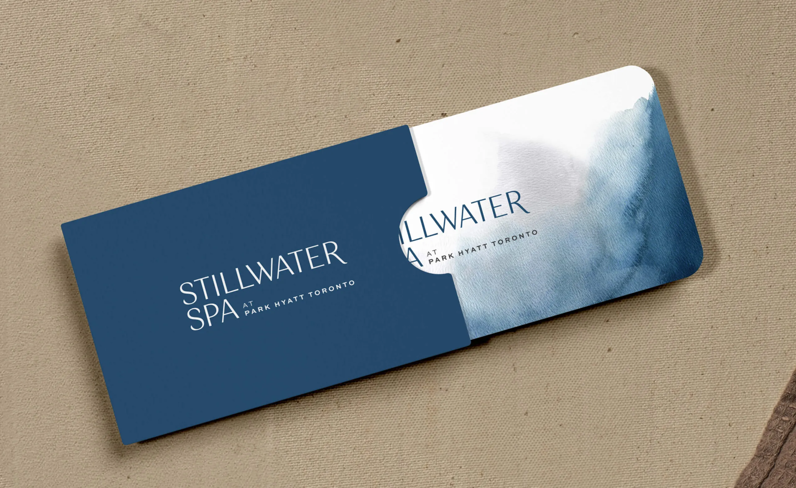
Stillwater Spa at Park Hyatt Toronto gift card with watercolour design.
Gift cards and packaging
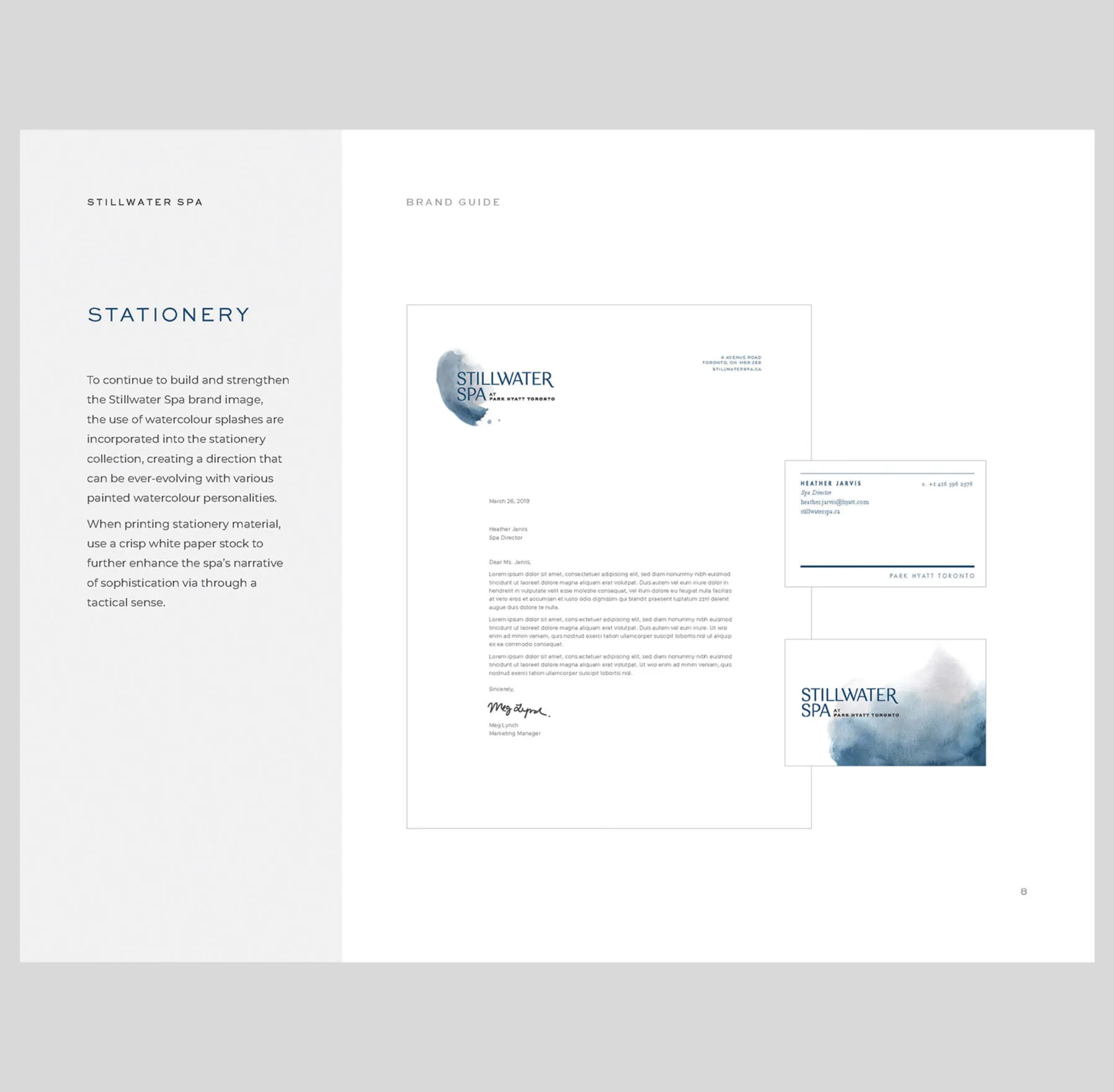
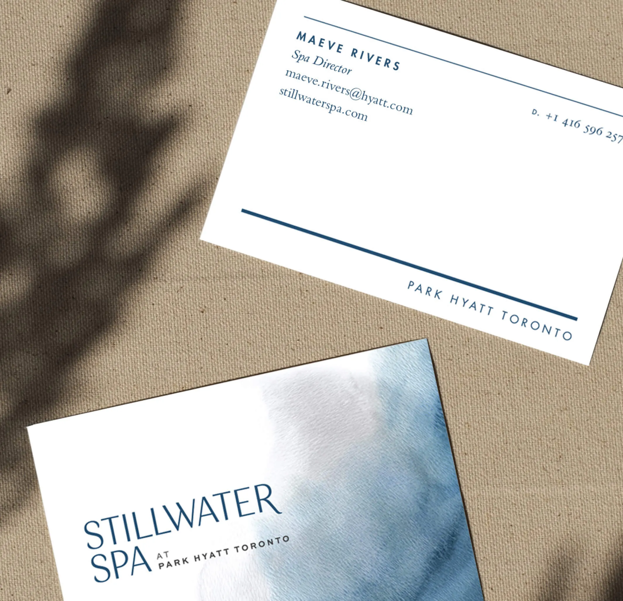
Business card for Maeve Rivers, Spa Director at Stillwater Spa, Park Hyatt Toronto.
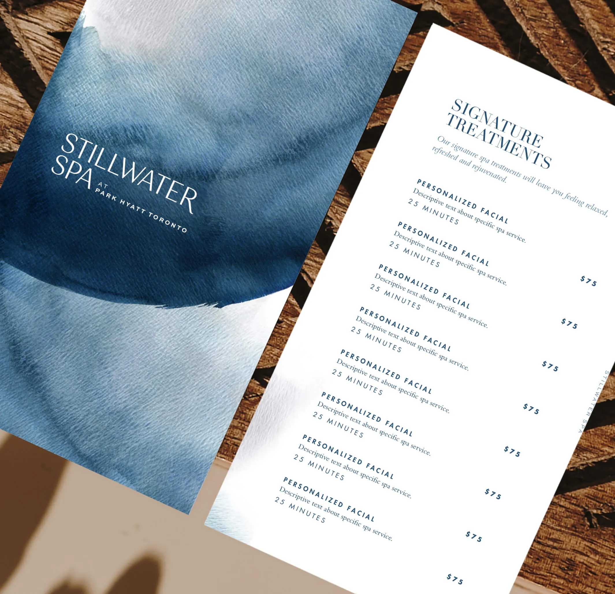
Stillwater Spa menu with signature treatments and prices.
Stationery and spa menu
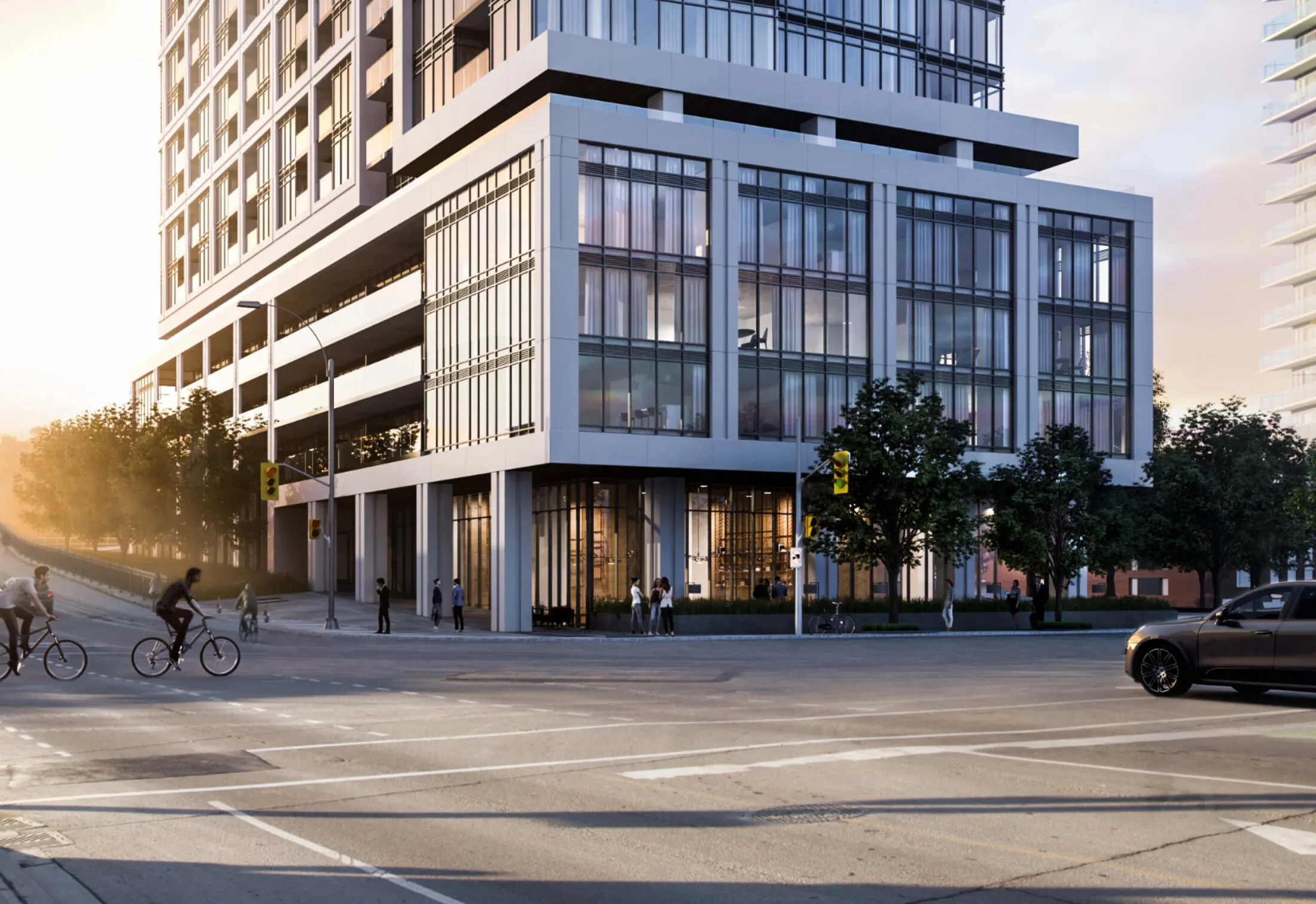
Modern apartment building with people and cars on a sunny street. Modern apartment building with cars and trees on a street.

Liberty House

Services Deliverables
  • Logo
  • Brand Guide
  • Marketing Materials
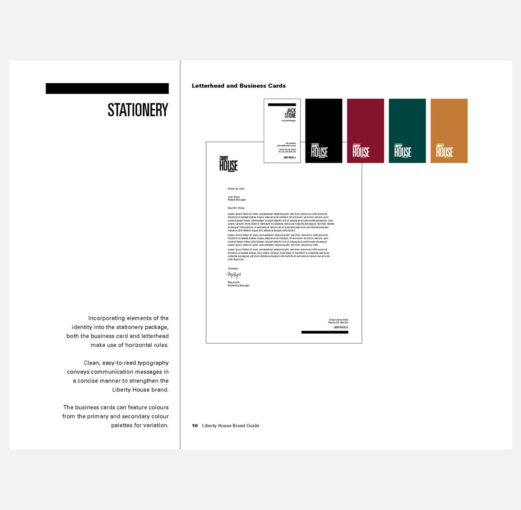
  • Stationery
  • Signage
  • Wayfinding
  • Uniforms
  • Placemaking
  • Masterplan

Fostering a culture of community within a community

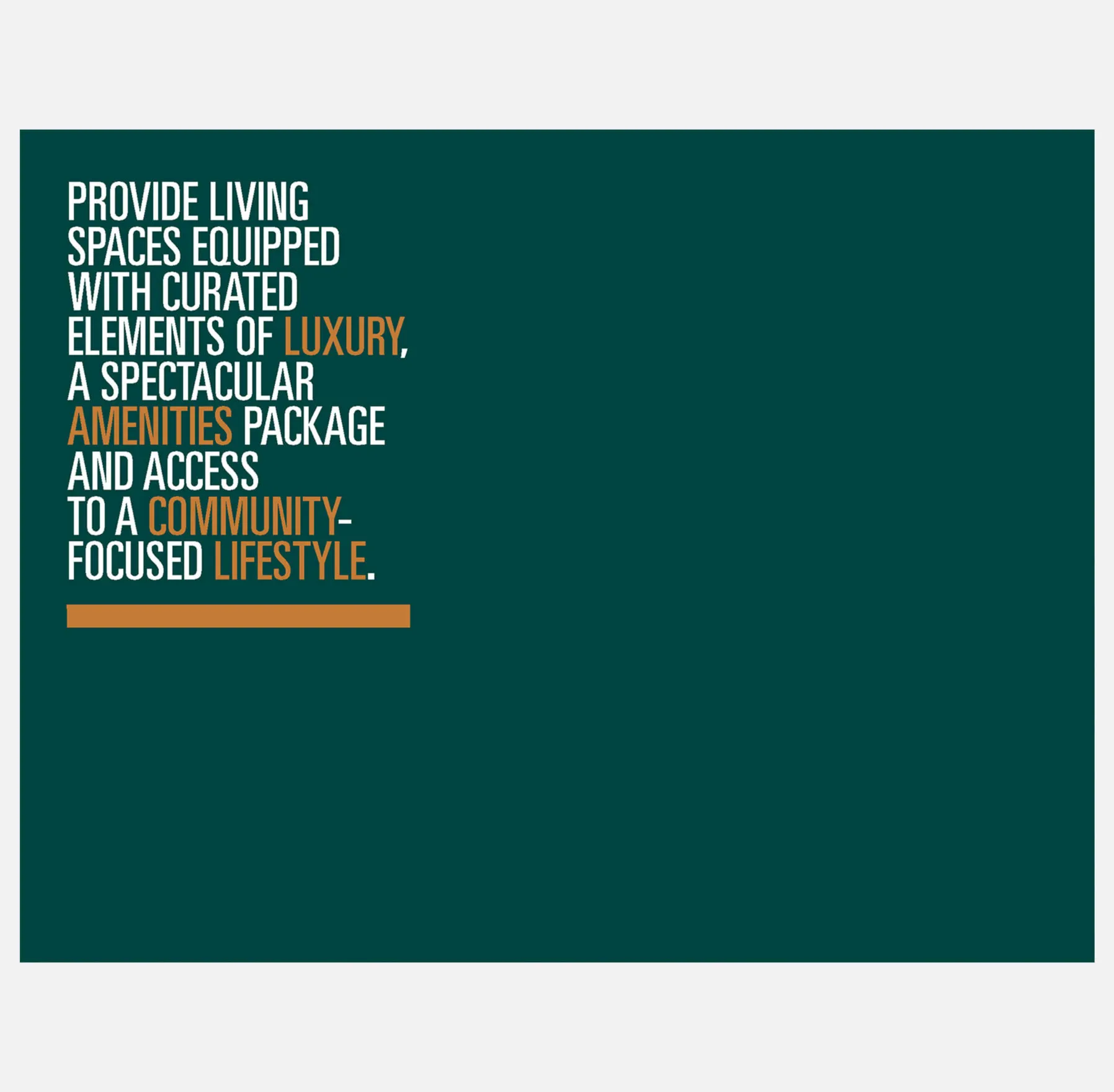
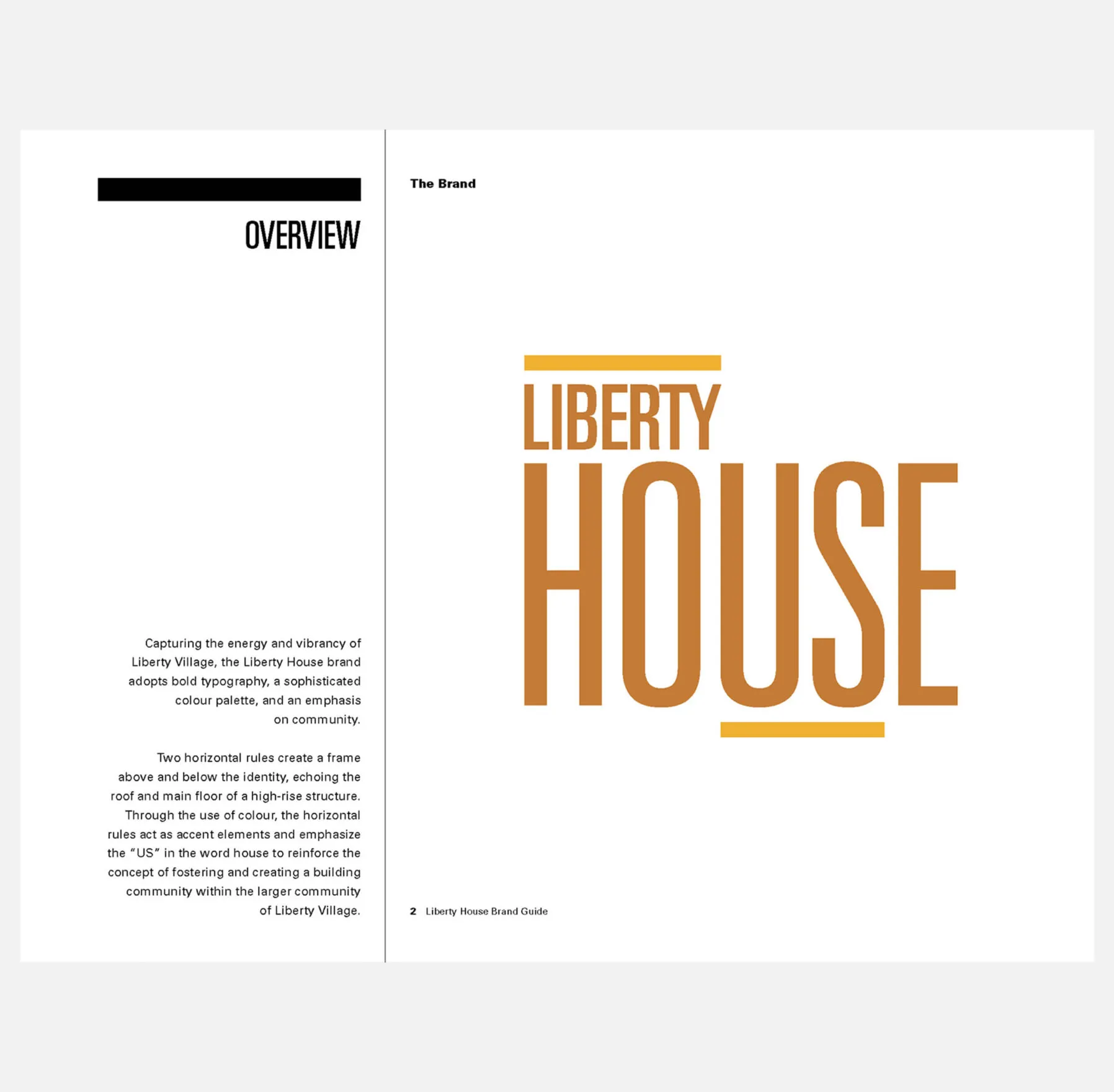
Equipped with luxury amenities and stylish spaces, Liberty House is an elevated rental development that strives to provide a community-focused lifestyle for all residents. To fill a gap in the purpose-built rental space, Fitzrovia aimed to build high-quality rental units with desirable amenity packages marketed to the millennial renter. Forge worked with Fitzrovia Real Estate to define a name and develop a brand for this new property.

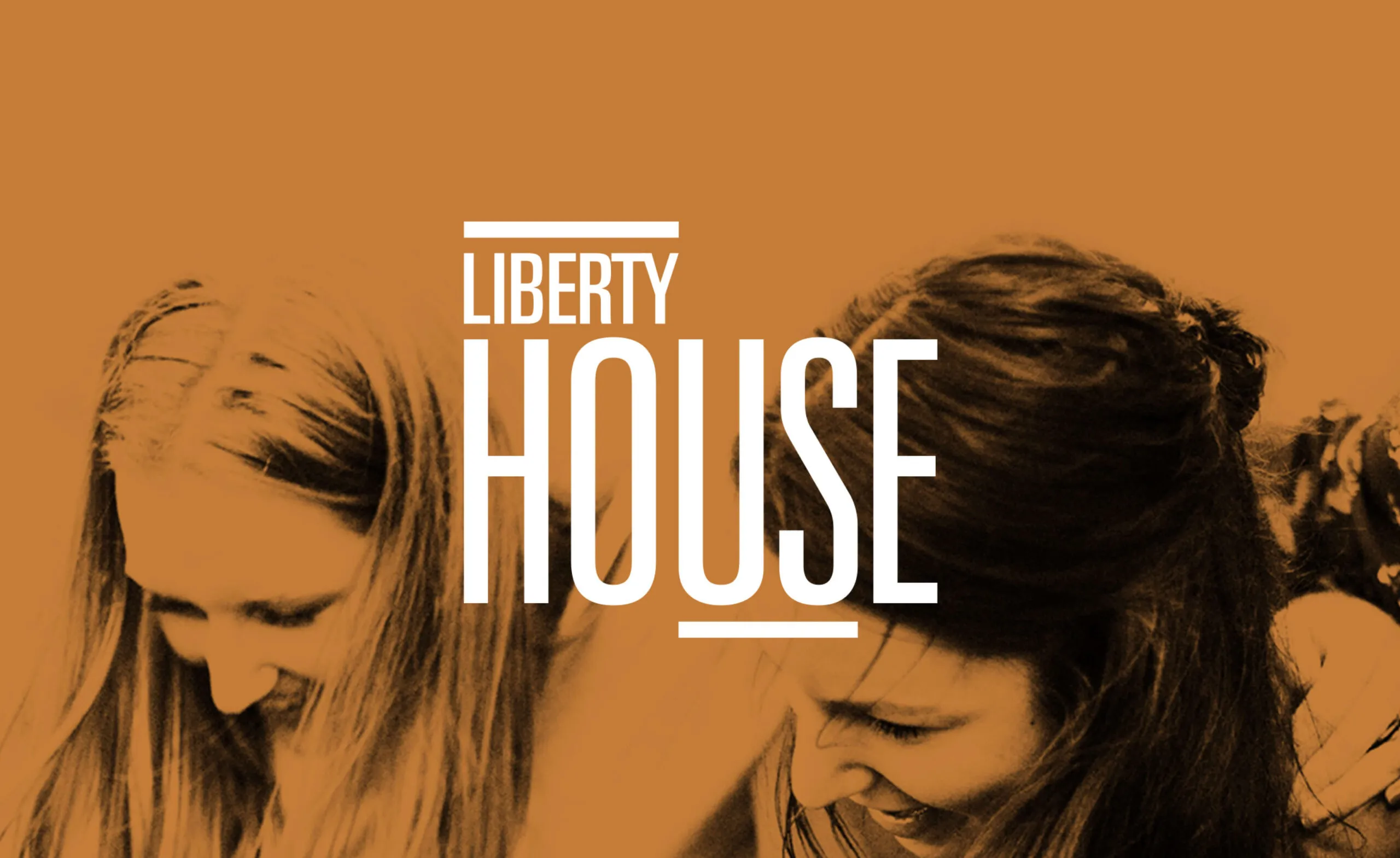
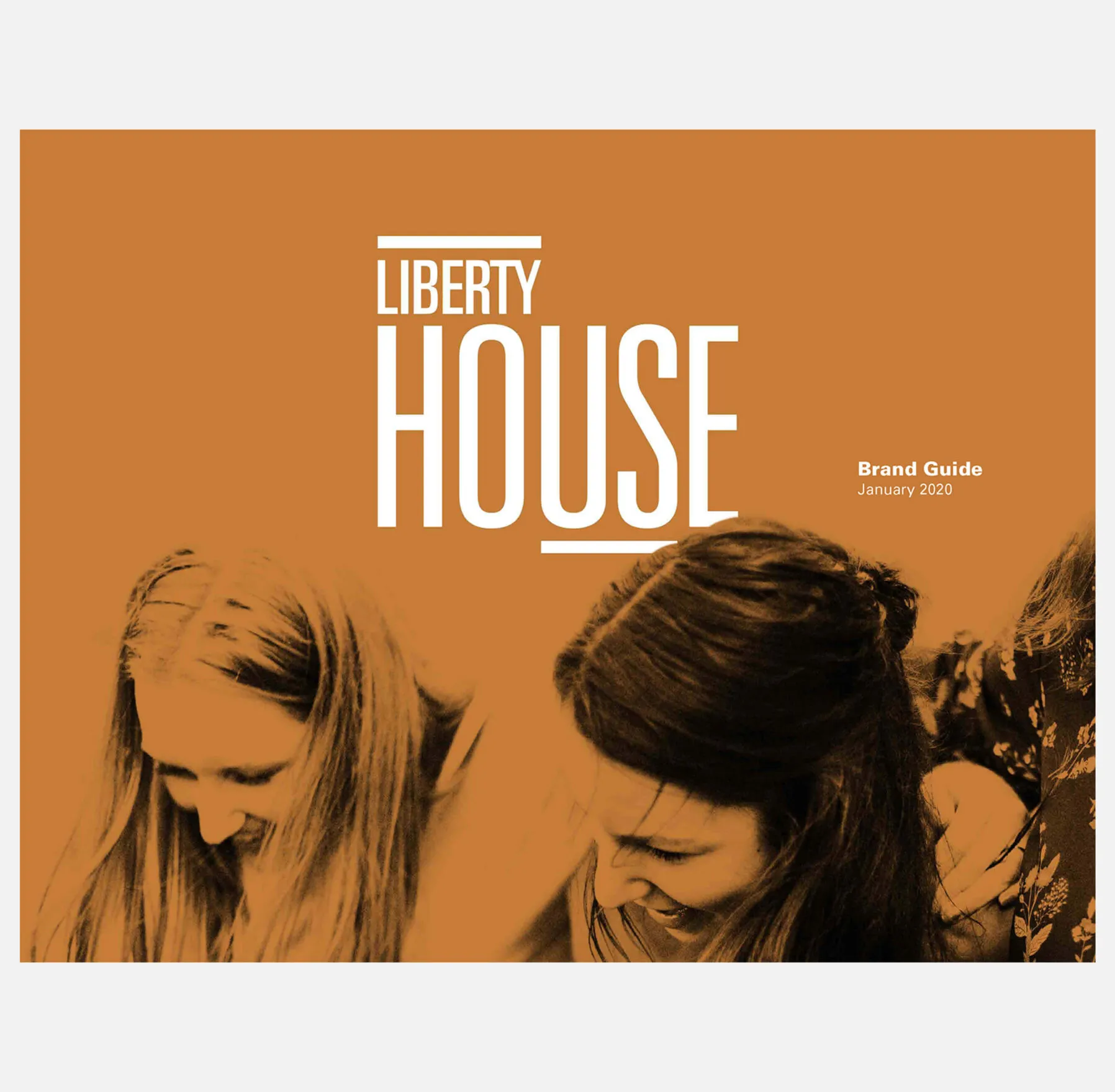
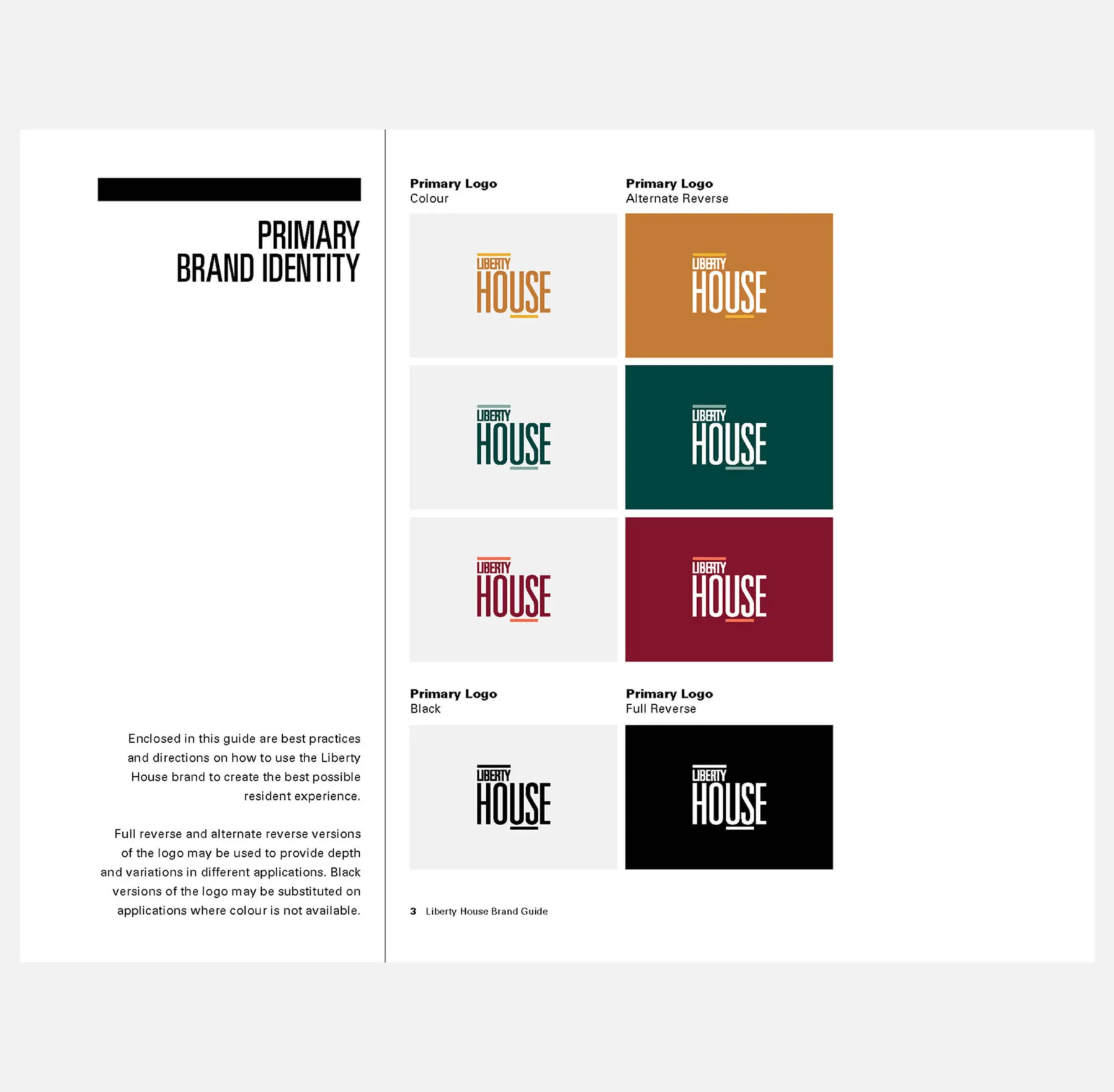
Liberty House logo with two women's faces in silhouette.
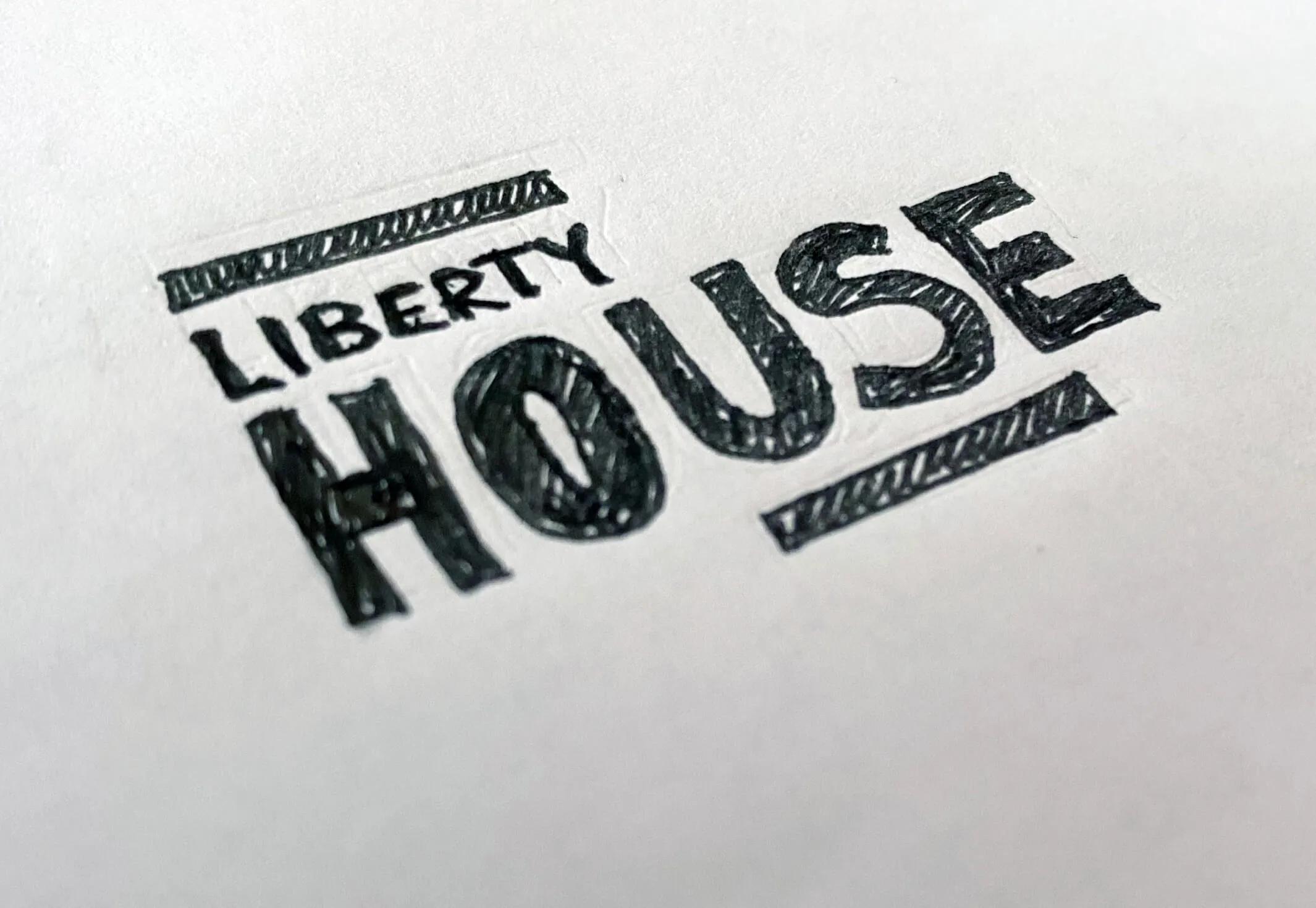
A preliminary sketch for the Liberty House logo
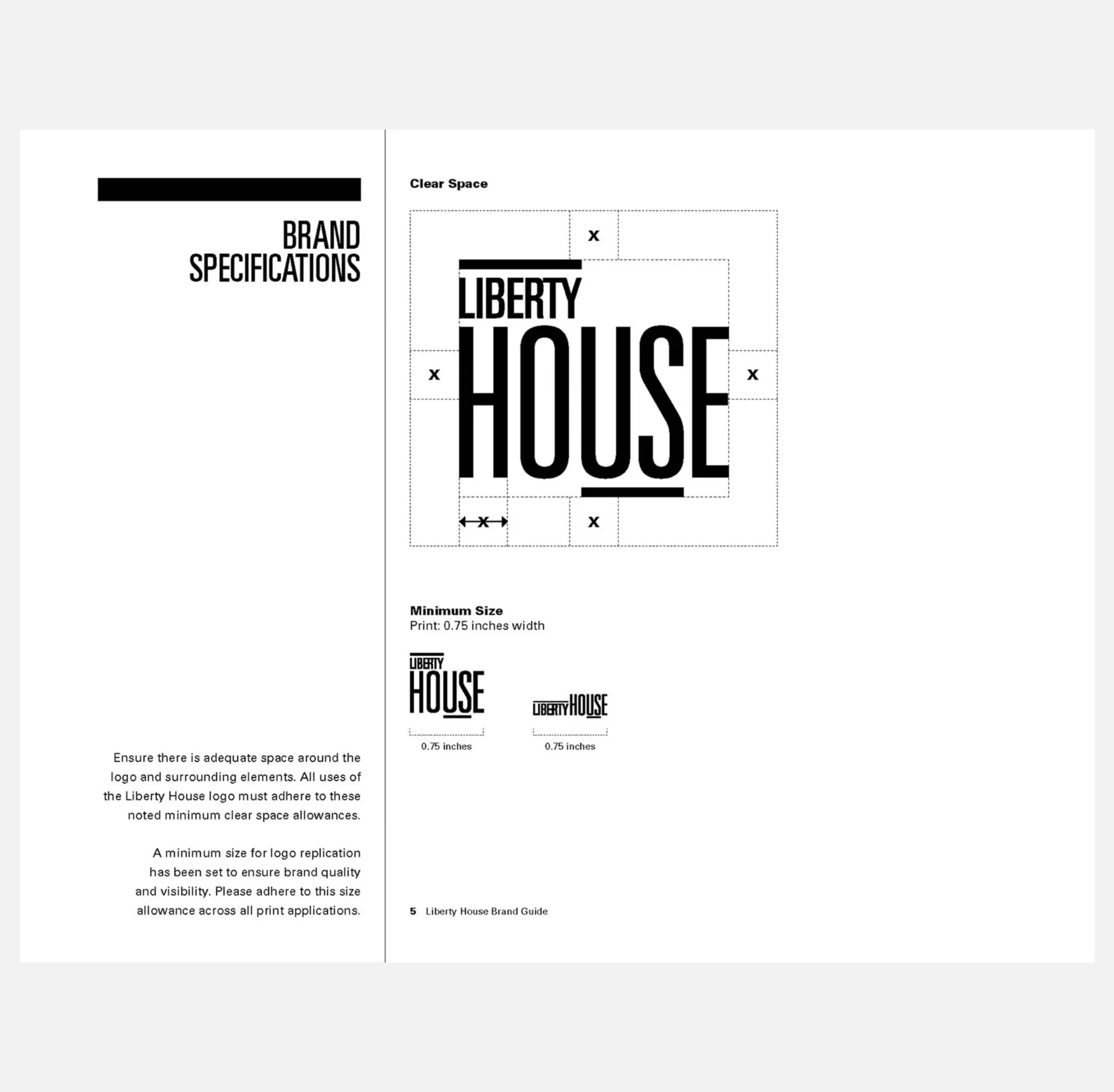
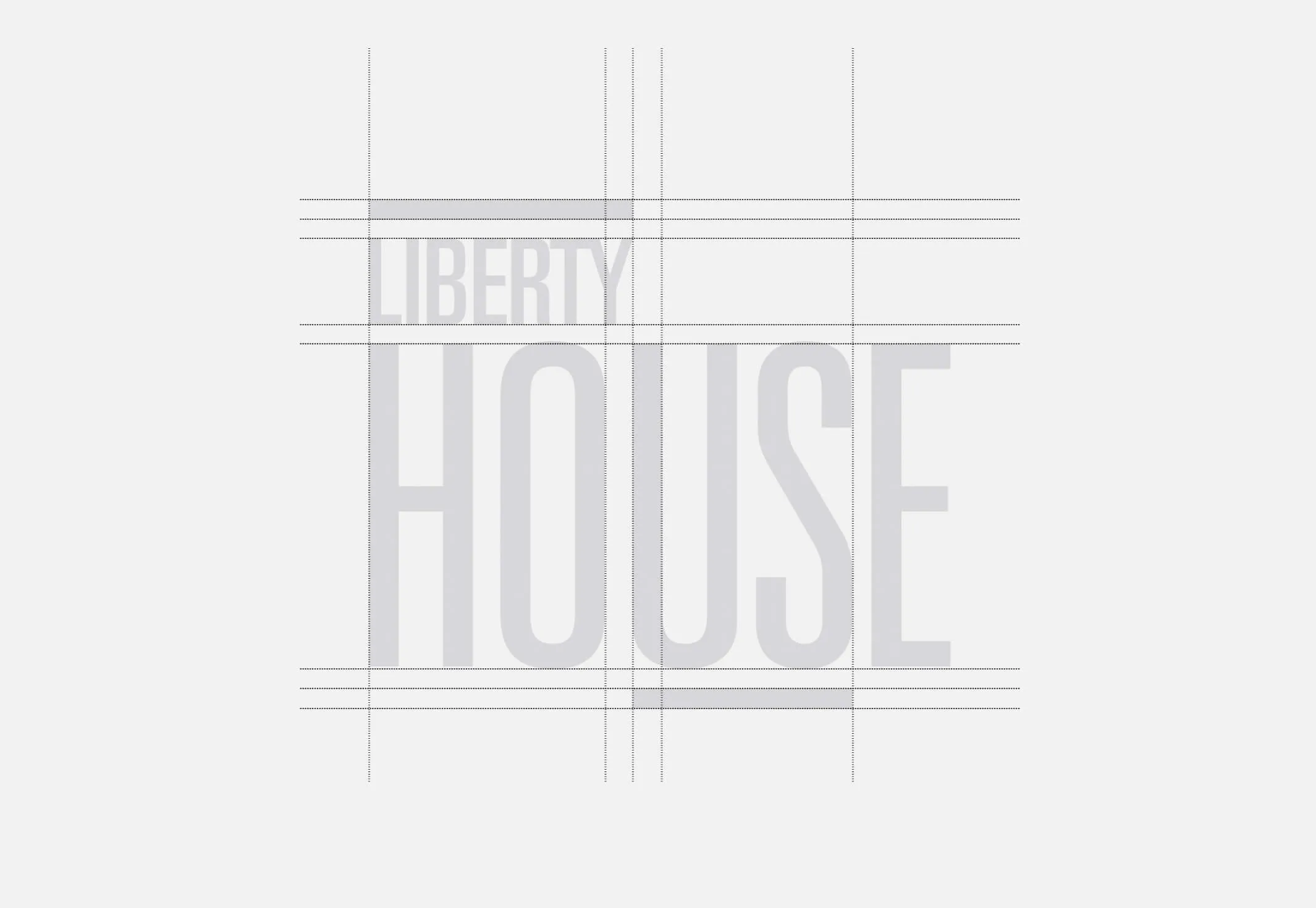
The Liberty House logo seen aligned to a grid
Preliminary sketch and a well structured logo for a fun brand
Abstract background with horizontal stripes in warm, earthy tones.
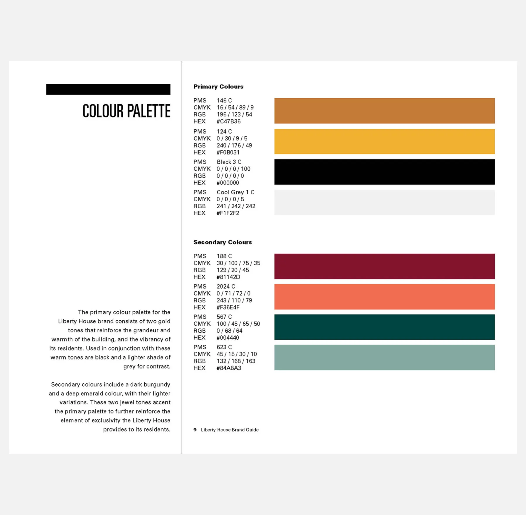
A sophisticated colour palette
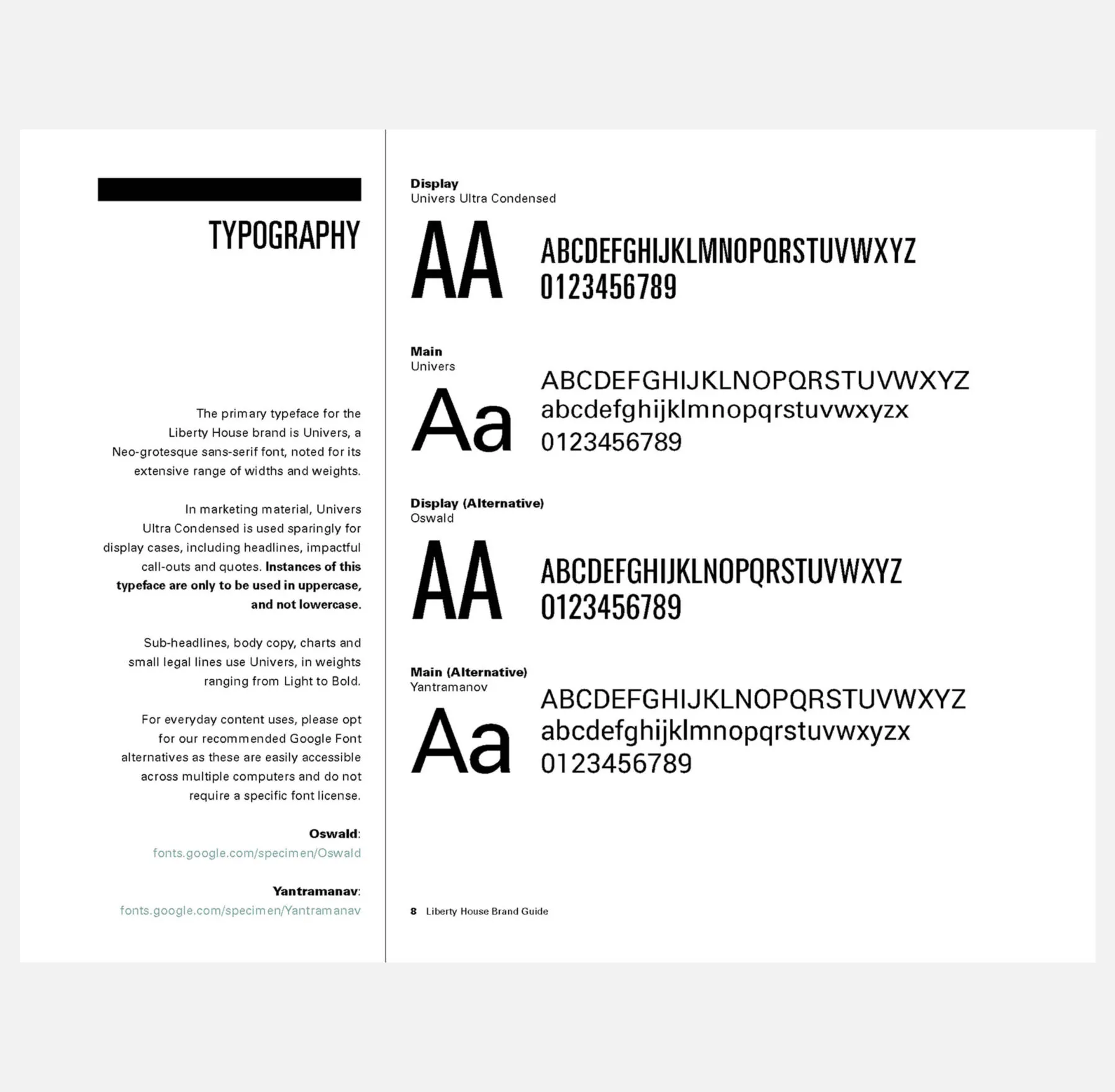
A letterform of the letter A for the font Univers Ultra Condensed.
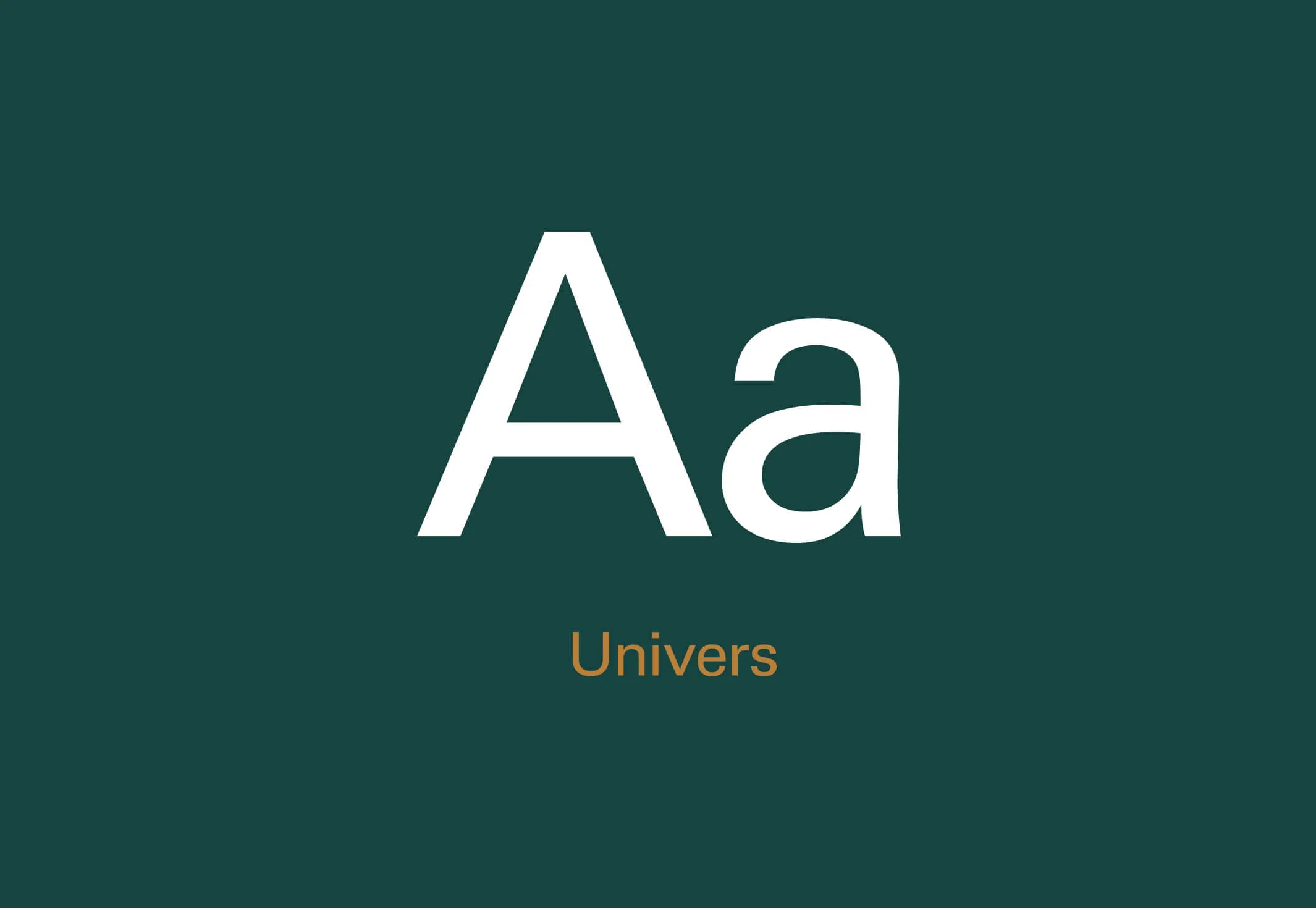
A letterform of the letter A for the font Univers.
Stylistic typography to communicate to the millennial audience

Resonating with the millennial renter

Seeking to evoke the community aspect of the property, the name Liberty House reflects the idea of one’s family all under one roof. The name also echoes the sense of pride and unity created by the development’s unique spaces, program offerings and amenities. Liberty House offers luxury living within reach to its residents.

Black polo shirt with
Liberty House logo
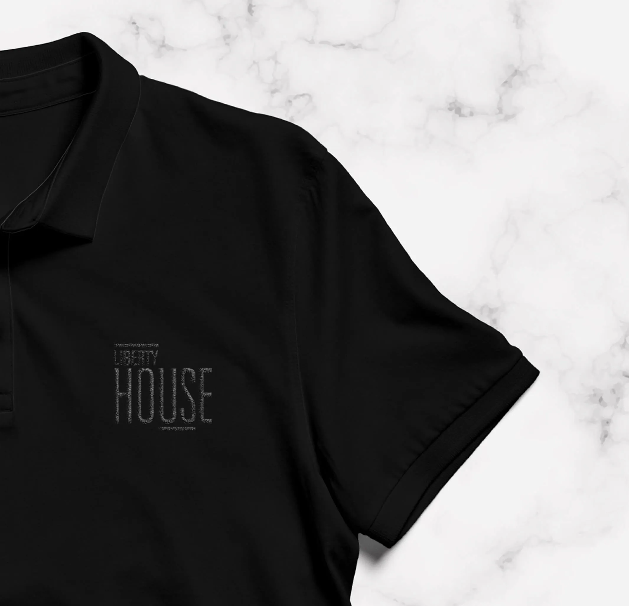
Uniforms
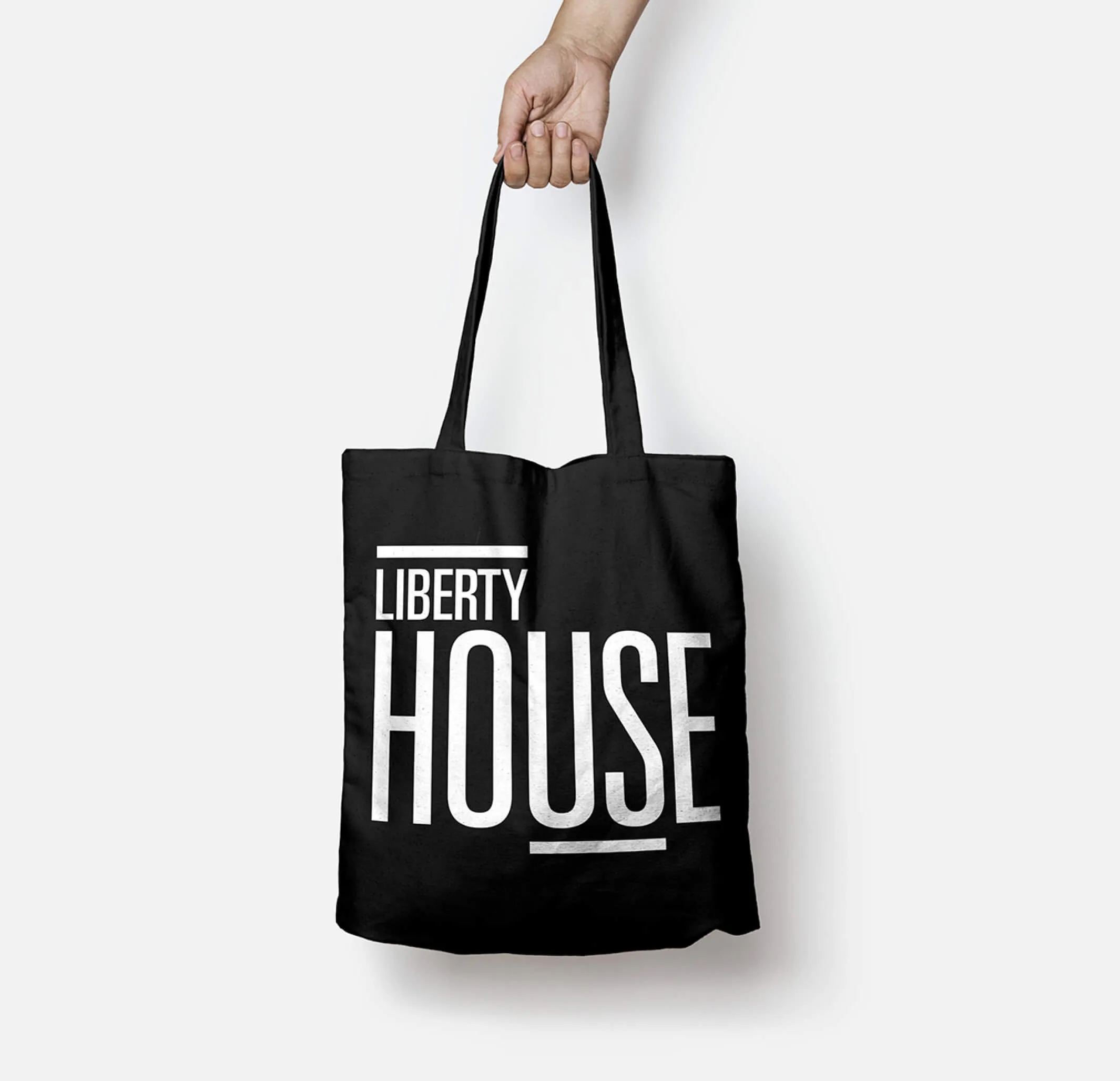
Black tote bag with
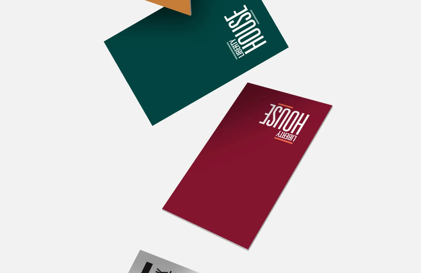
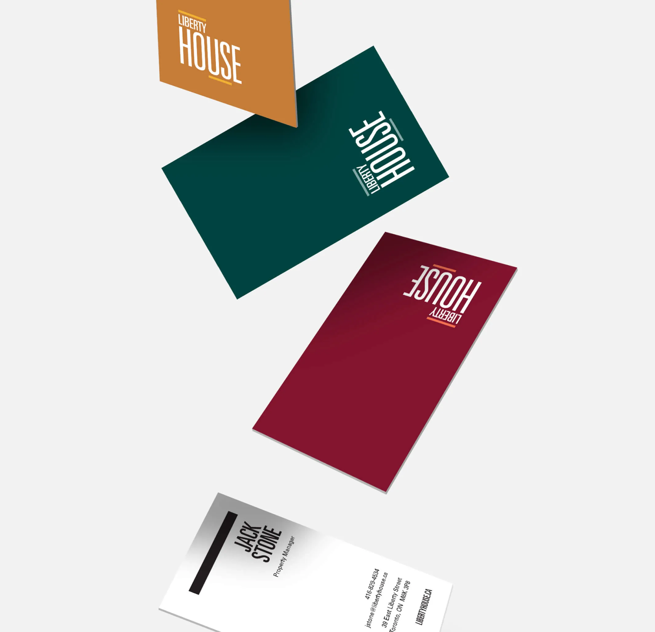
Business cards for Liberty House, featuring the company name and contact information.
Promotional materials and stationery

Luxury within reach

The property speaks to those looking for an aspirational lifestyle while remaining accessible to the young millennial renter. Curated elements of luxury are present in the buildings offerings and mirrored through the use of carefully chosen materials and custom flourishes throughout the signage program.

Restroom icons for men, women, and disabled individuals.
Abstract logo of two figures in an elevator with up and down arrows
Minimalist golden bicycle logo on a white background.
Custom pictograms to add flair to the signage program
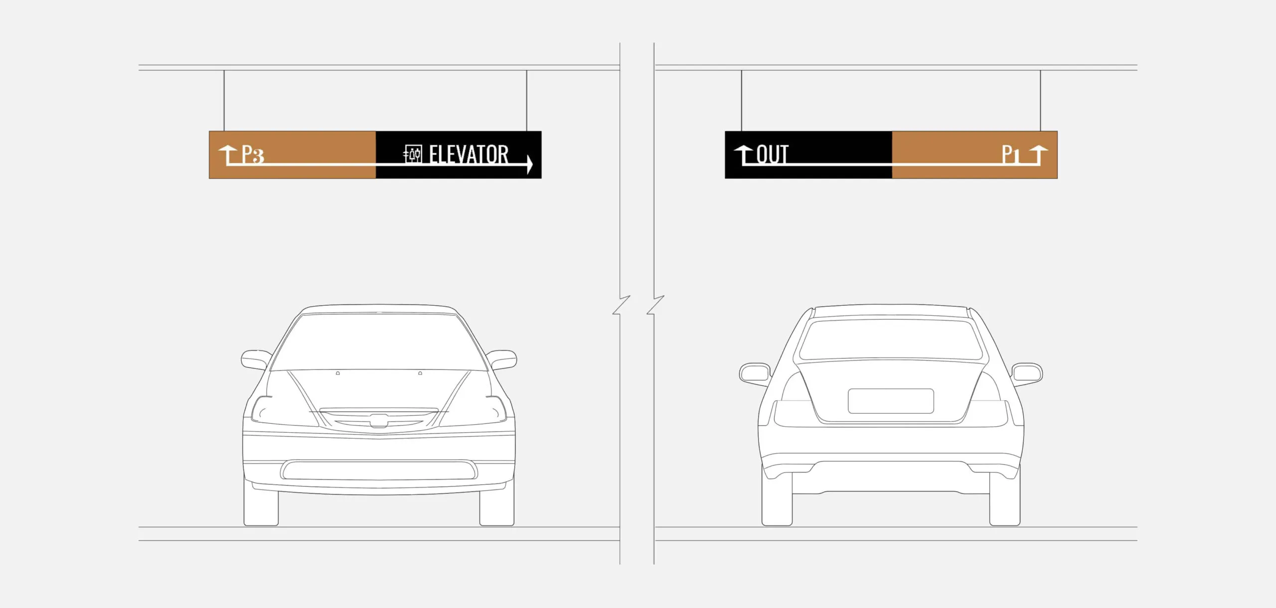
Parking garage signs for P3, Elevator, OUT, and P1 with cars.
Parking signage
Vertical gold frame with white numbers 1542 inside.
Two golden signs with numbers and arrows on a dark green background.
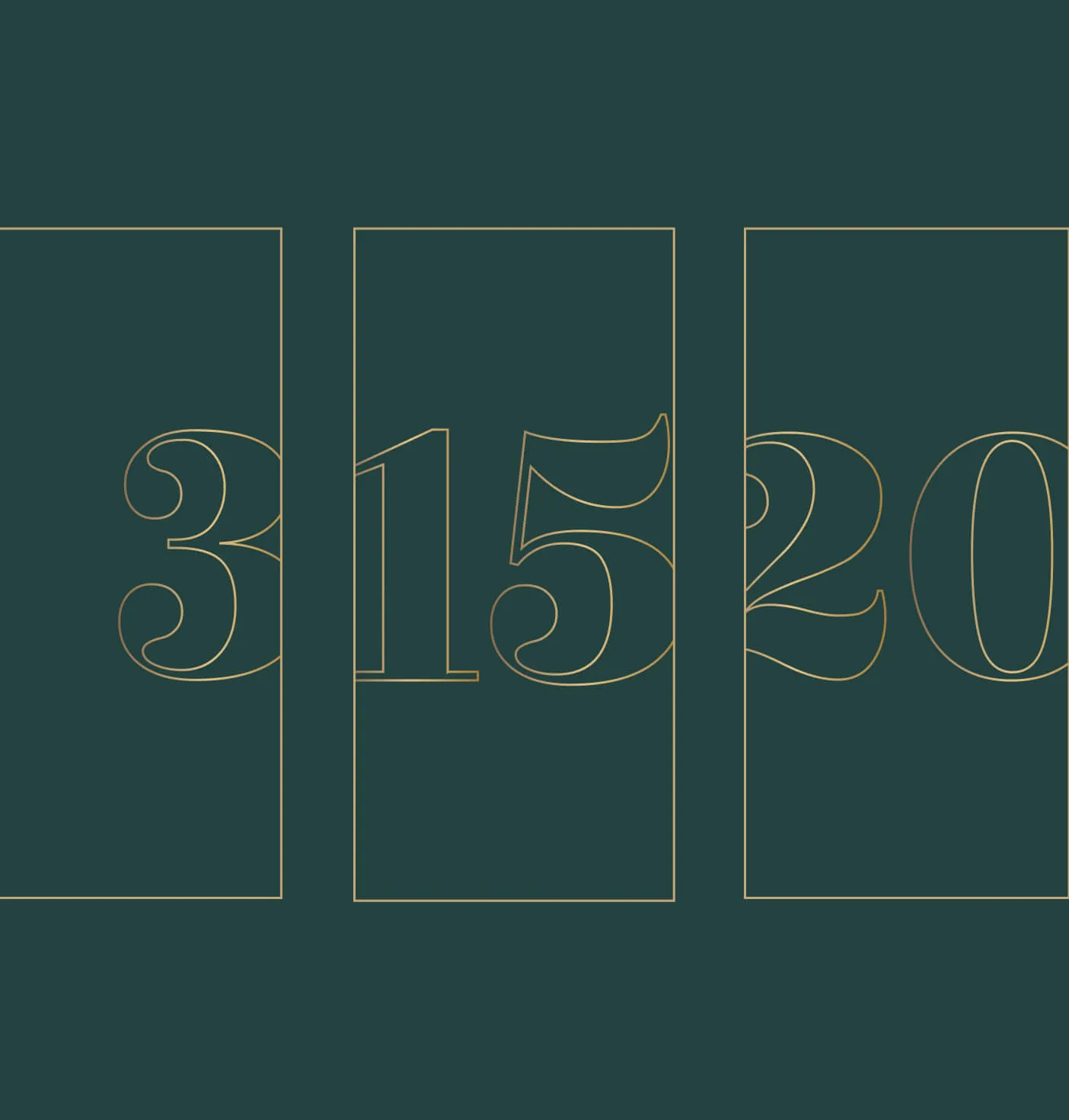
Art deco numbers 3, 15, and 20 in gold outline on a dark teal background.
Room signage, directional signage and floor ID’s
  • 290K sq. ft. of premium rental living space
  • 440 high-end rental units
  • 25 stories tall tower
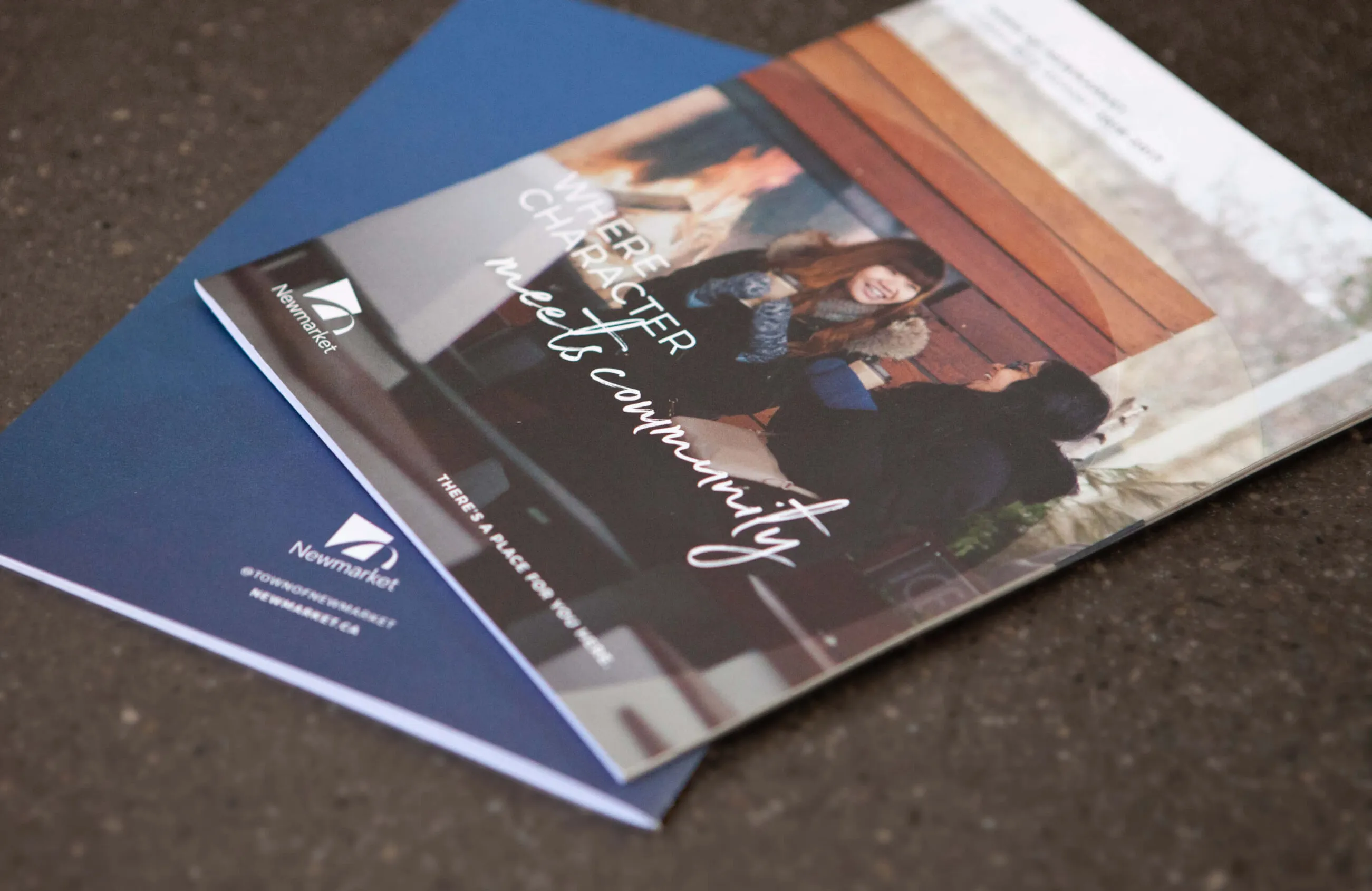
Brochure for the Town of Newmarket featuring the slogan

Town of Newmarket

Services Deliverables
  • Community Report
  • Marketing Materials
  • Photography Art Direction
  • Placemaking

Crafting a sense of community

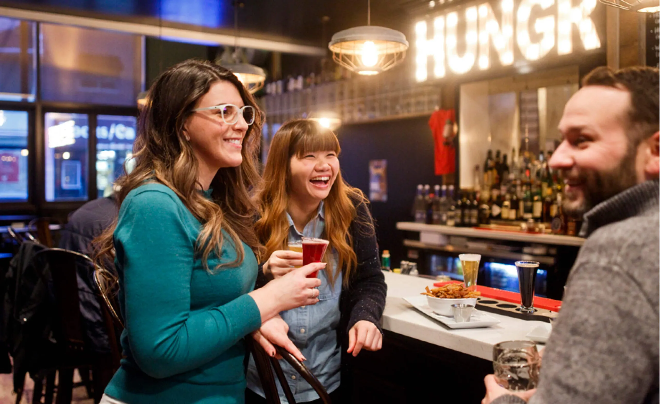
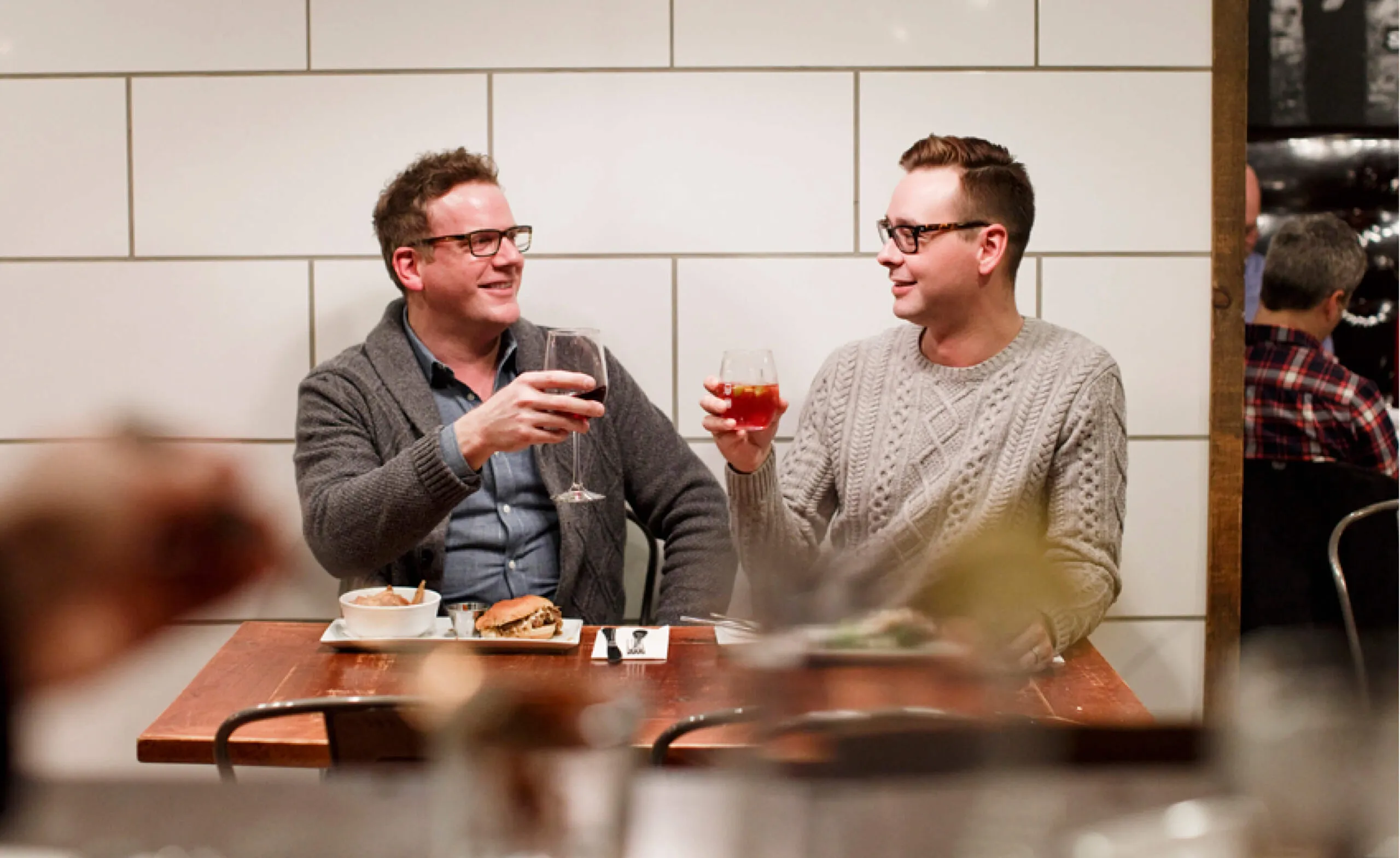
Located just north of Toronto, the Town of Newmarket is a bustling community of urban growth that curates a small-town feel for its residents while also providing the amenities of a bigger city. Looking to expand economic development and growth, the town engaged Forge and GCI Canada to develop and create a campaign centred around the concept of ‘live, work and play.’

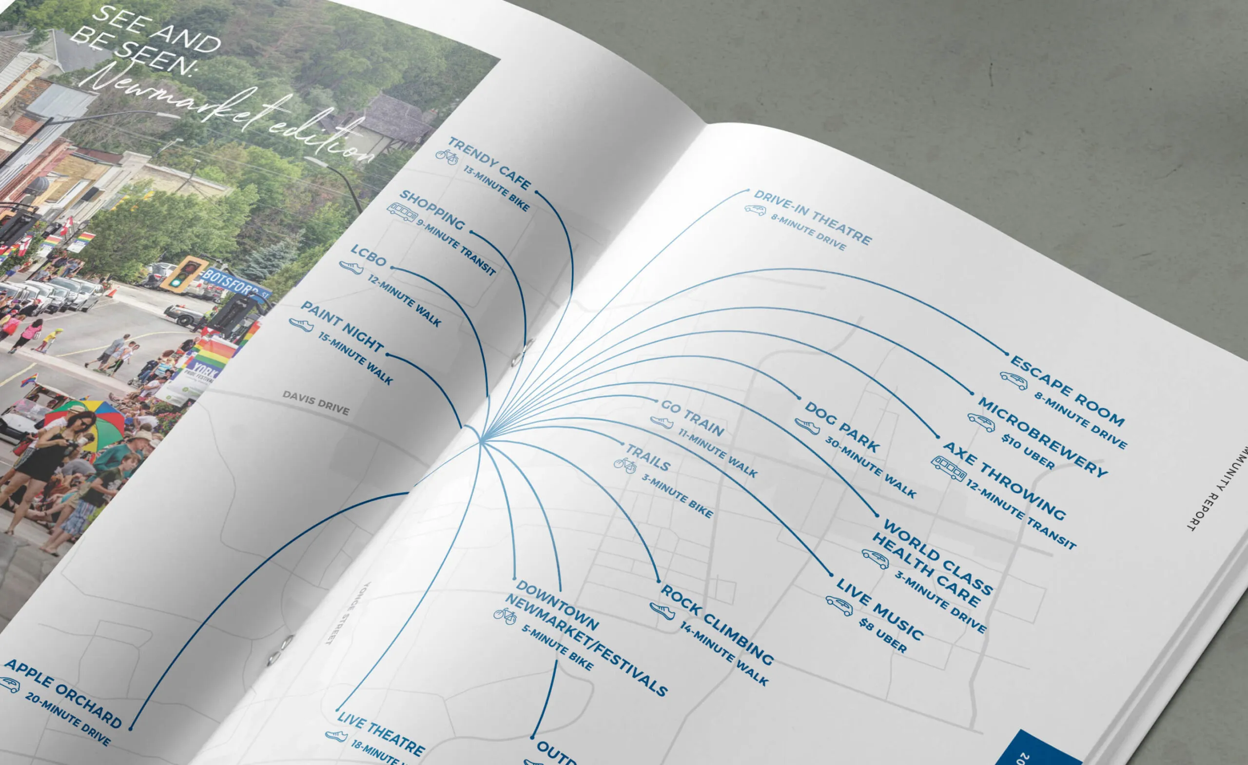
Map of Newmarket showing attractions and travel times by bike, walk, transit, or drive.
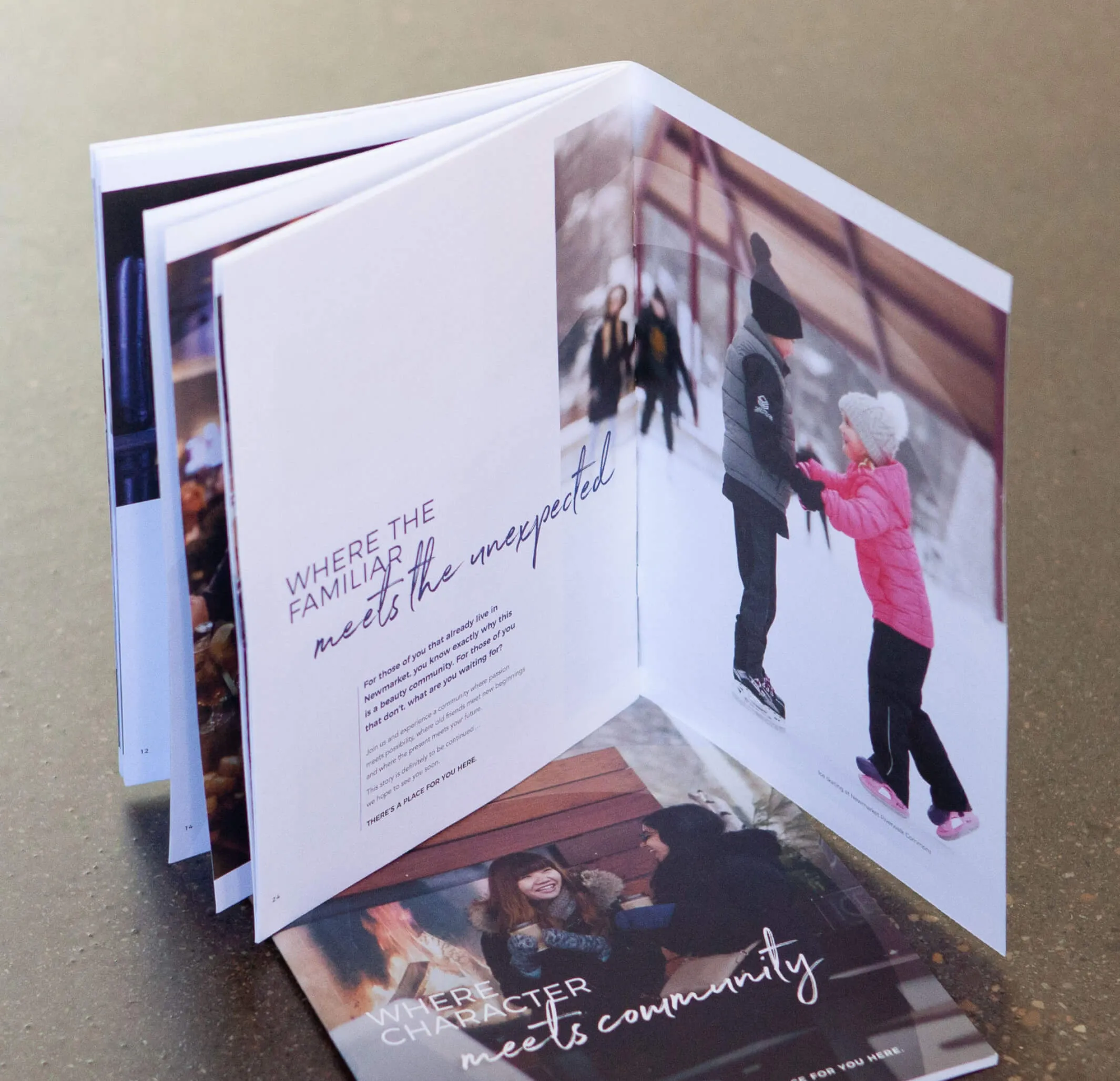
Community report showcasing everything Newmarket has to offer its residents
Brochure open to pages with text
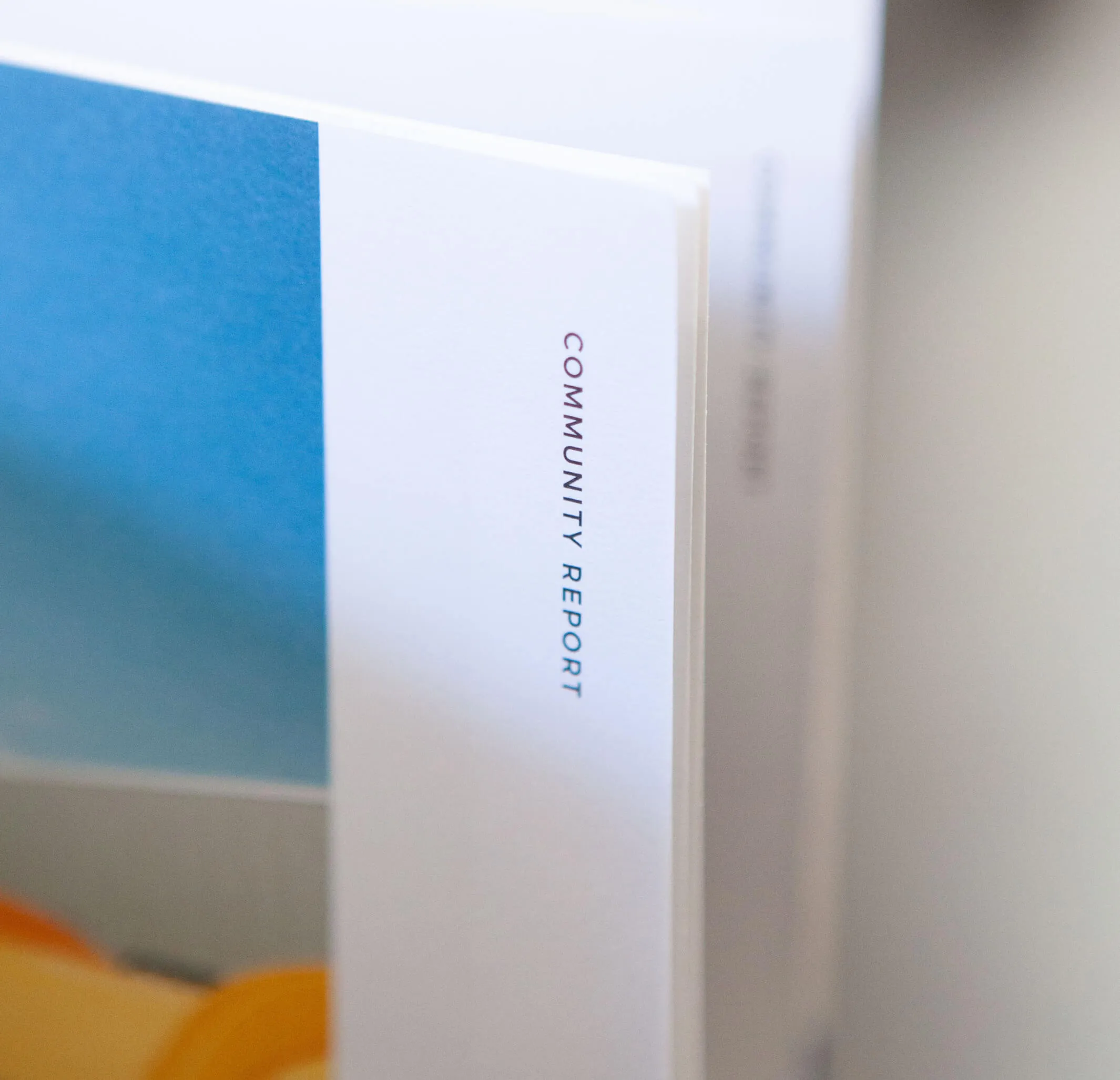
Community Report title on a brochure with a blue background.

Urban, suburban community pride

In support of this envisioned future, our team led the campaign strategy and crafted a comprehensive set of communications materials consisting of print collateral, photography and social media assets to promote a sense of community pride and capture the true nature of the Town.

Positioning a forward-thinking brand

As a result of our collective efforts, we have established the Town of Newmarket as a preferred community within the Greater Toronto Hamilton Area (GTHA) for economic development investment and effectively positioned their brand at both local and regional levels as a forerunner in creative urban, suburban community building.

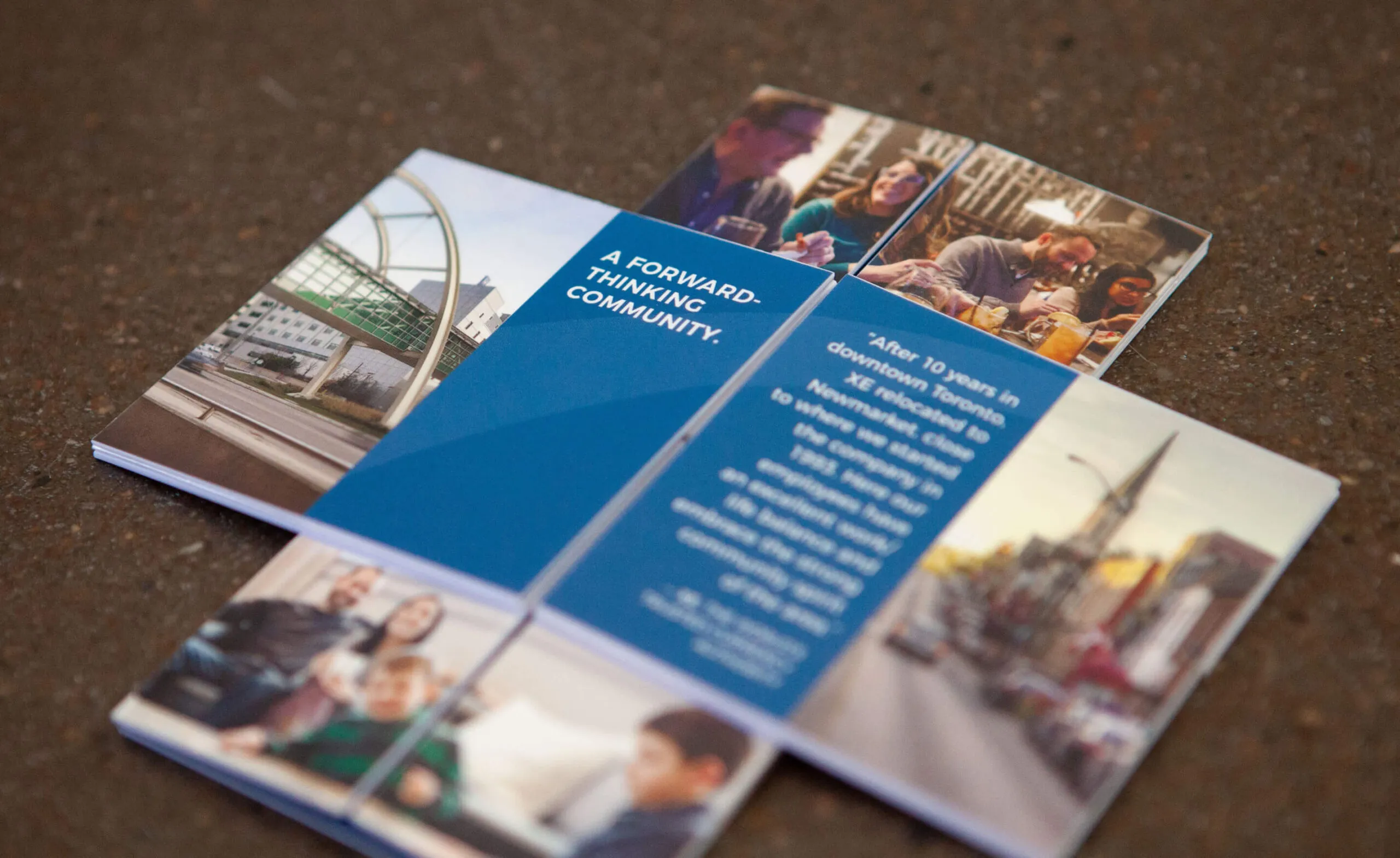
Brochure with
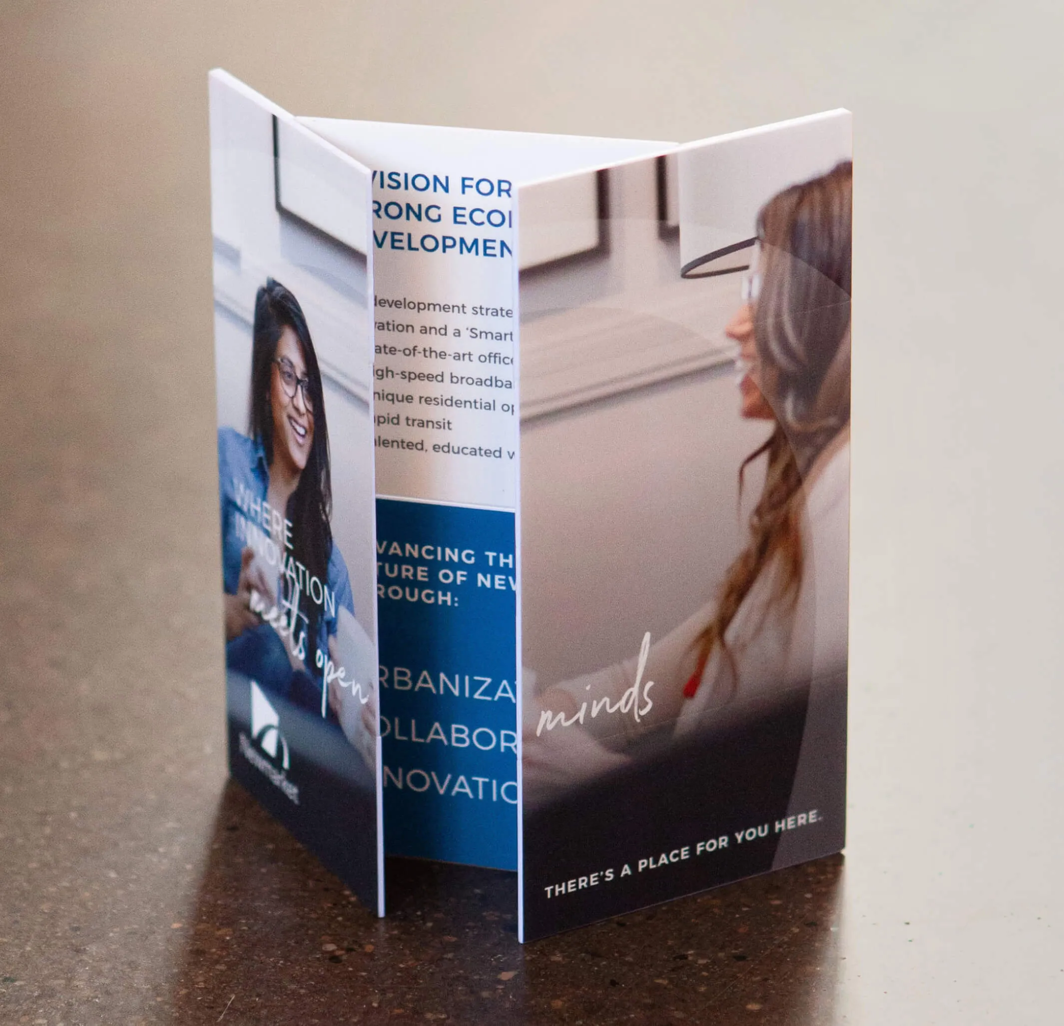
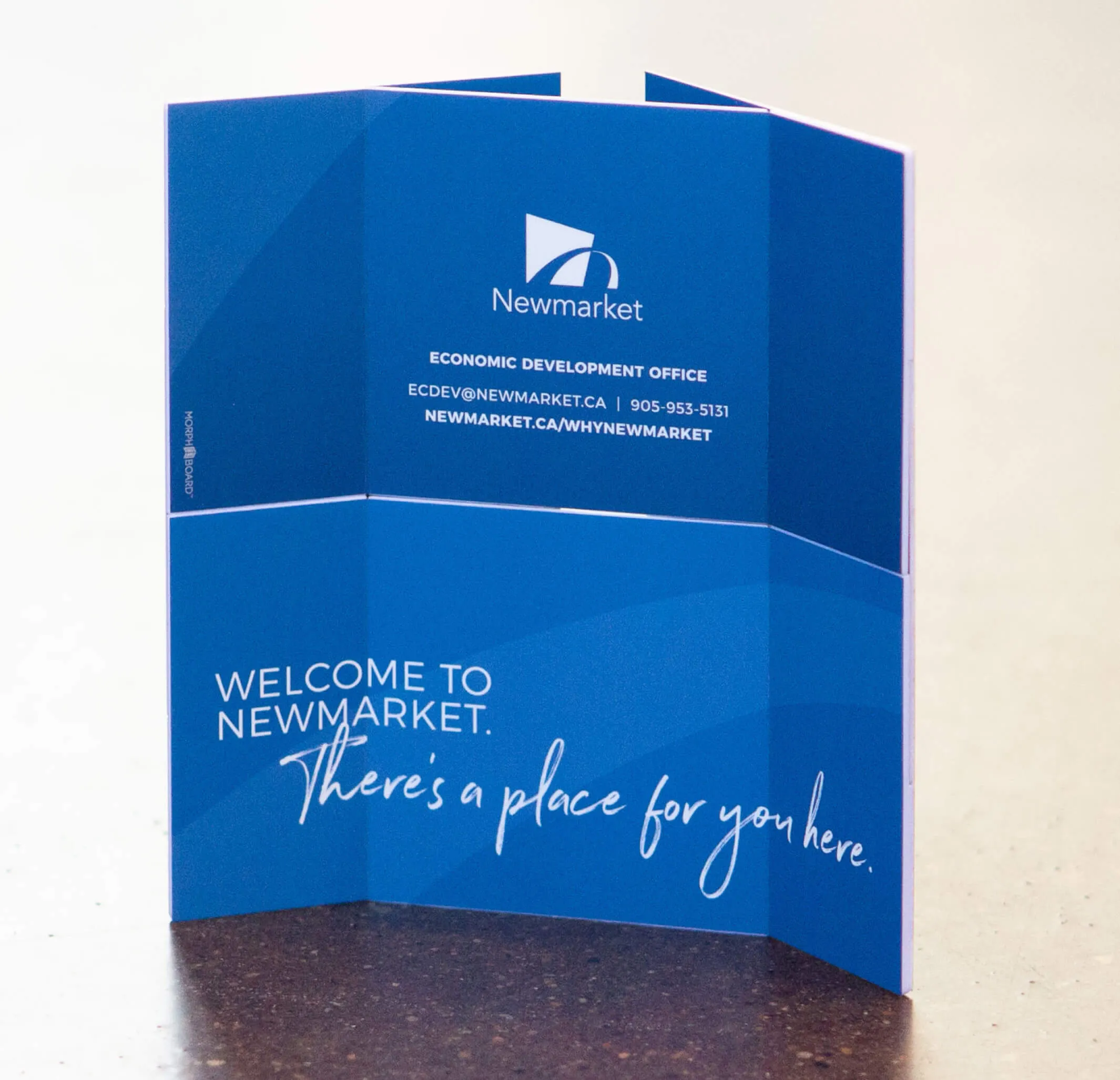
A fun, playful morph board was created for use by the busines team
Tri-fold brochure for Newmarket, Ontario, featuring images of people and text about development.
Newmarket Economic Development Office brochure with
  • 90K+ population of Newmarket
  • 33% of residents are immigrants
  • 48K jobs in Newmarket
  • 41 average age of residents
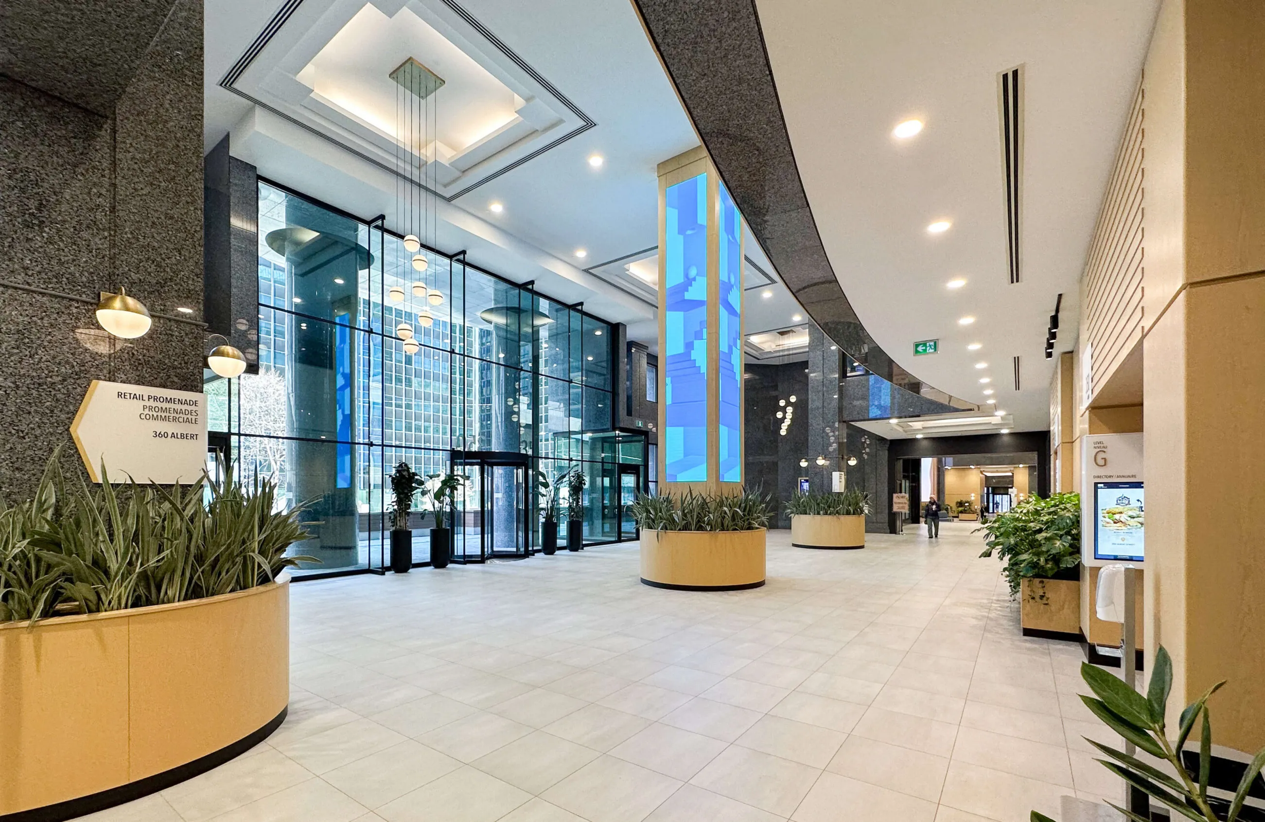
Modern office building lobby with large glass windows, plants, and a digital directory.

Constitution Square

Services Deliverables
  • Logo
  • Brand Guide
  • Illustration
  • Hoarding
  • Brochure
  • Motion Graphics
  • Social Media
  • Kiosk
  • Signage
  • Wayfinding
  • Art Installation
  • Marketing Materials
  • Placemaking
  • Masterplan
  • Video Production
  • Stationery
  • Website

Reimagining a workplace experience for a new era

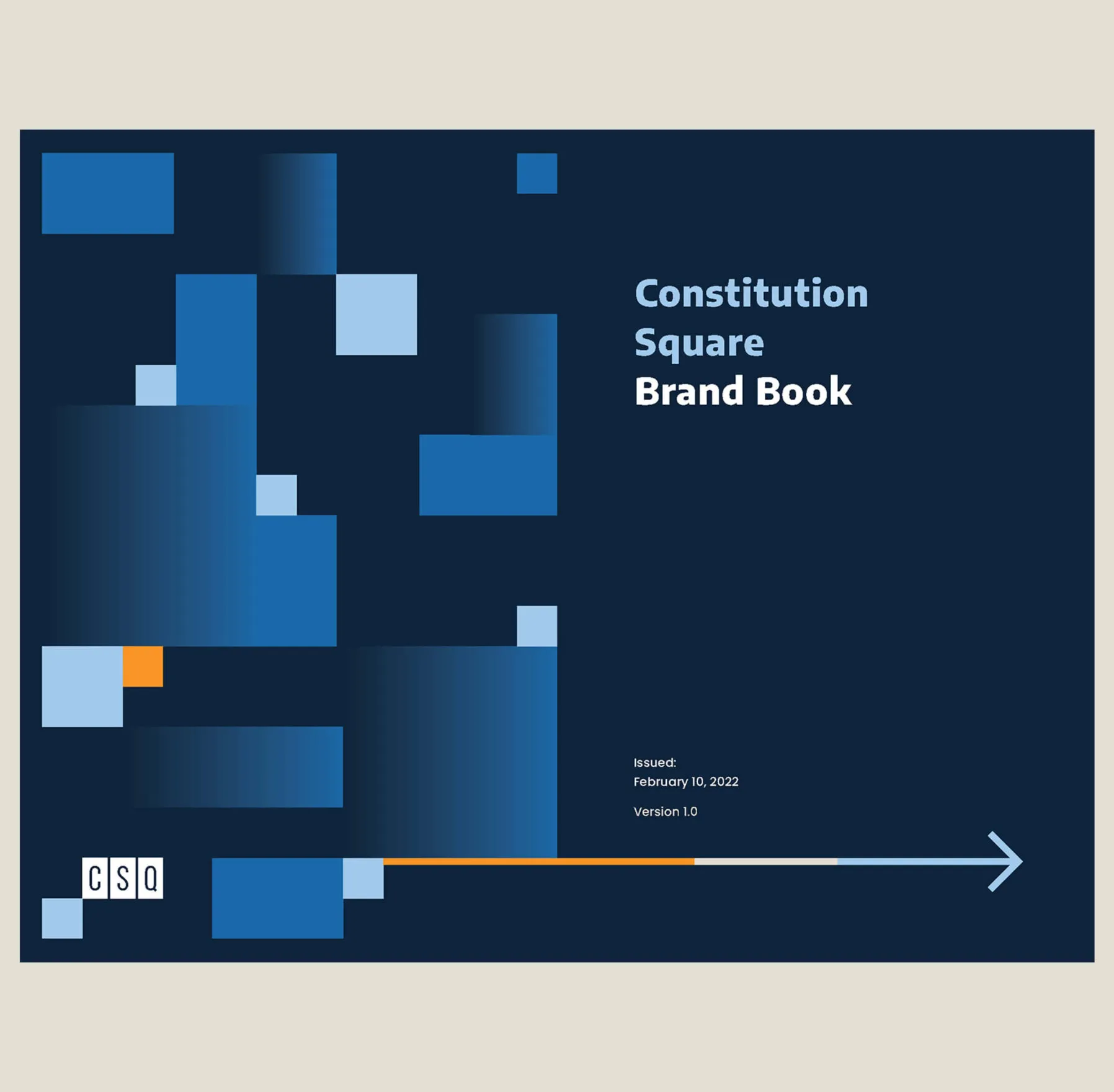
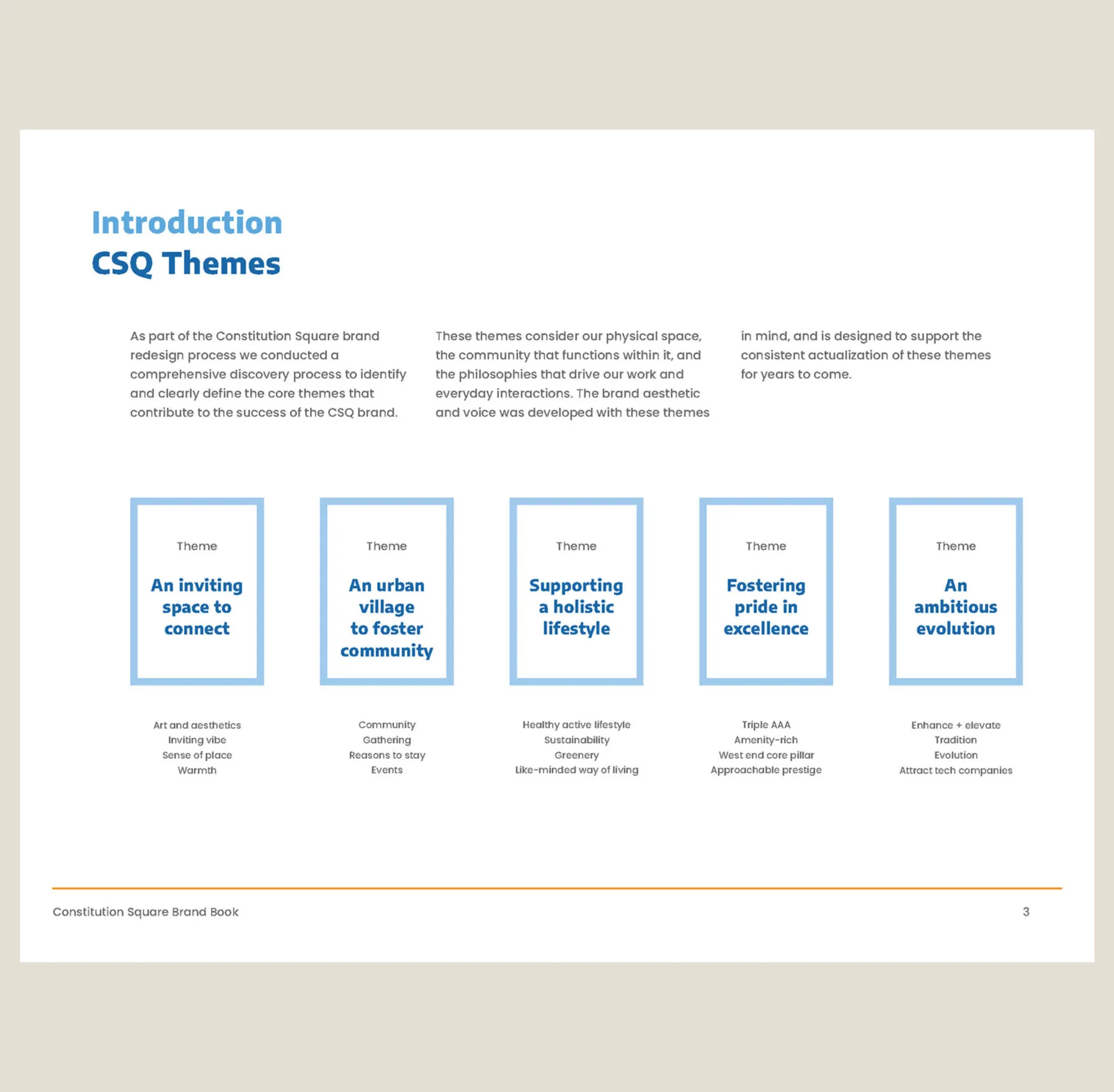
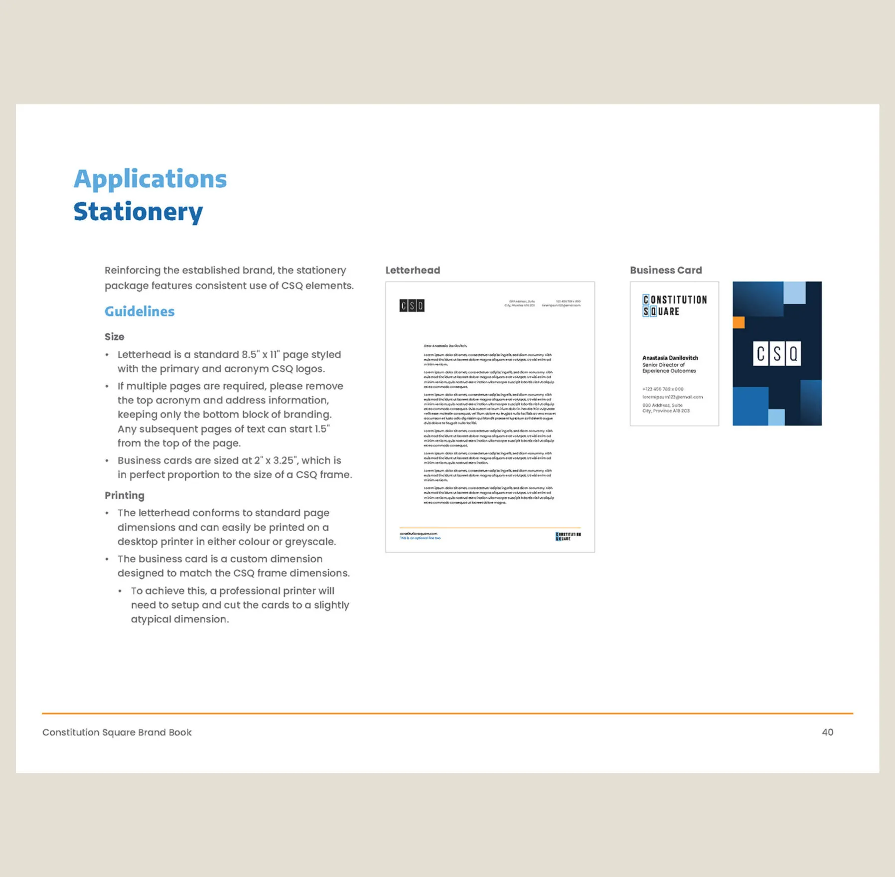
Constitution Square is an upscale office complex in the west end of downtown Ottawa, Ontario. It is an amenity-rich space that promotes connectivity and fosters community while conveying a sense of pride in supporting the ever-changing workplace experience. The Canderel team looked to Forge to bring this vision of a holistic workplace to life through brand, physical and digital signage, interactive displays, and digital public art.

A playful logo for a serious office building
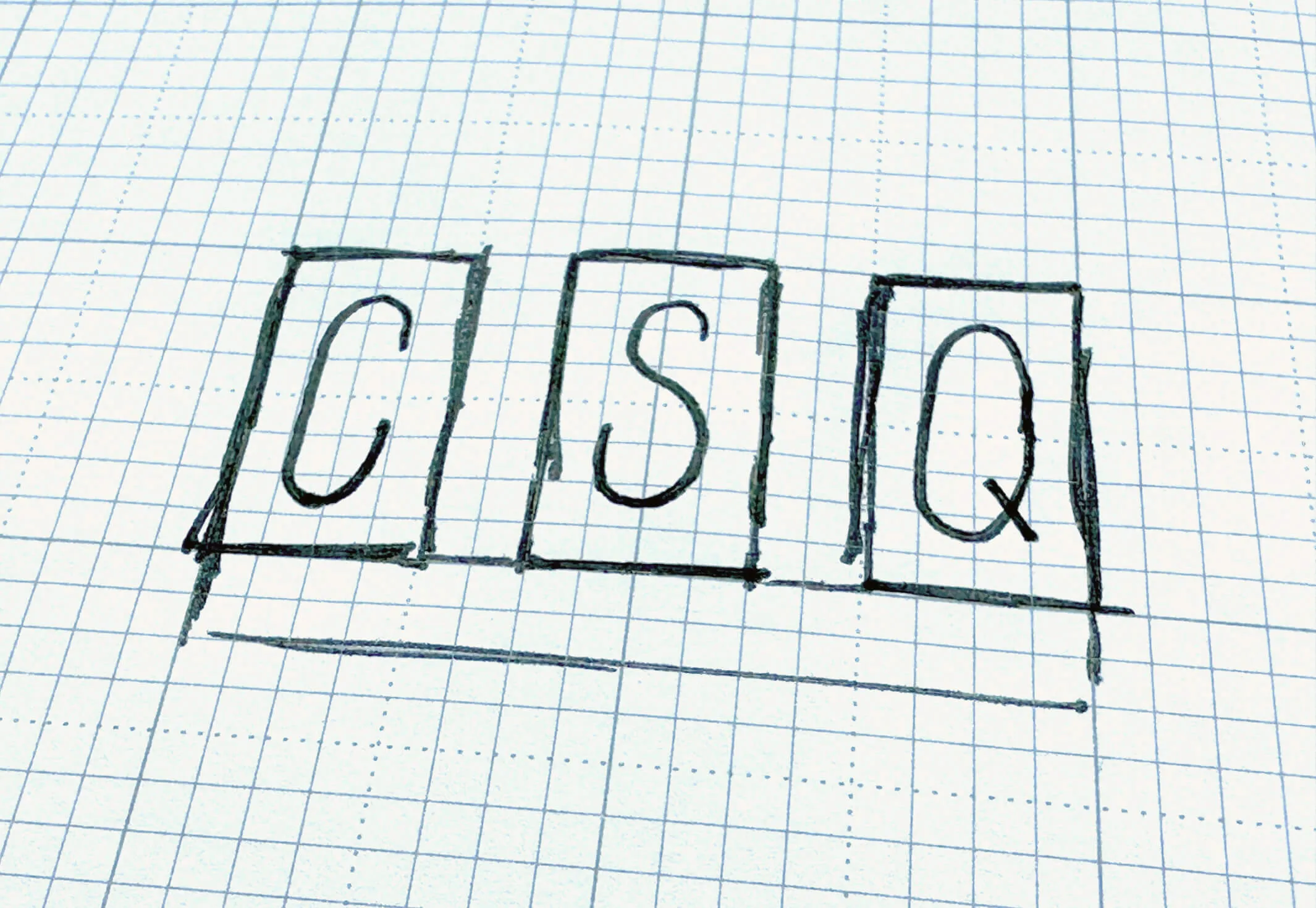
A preliminary sketch for the CSQ logo
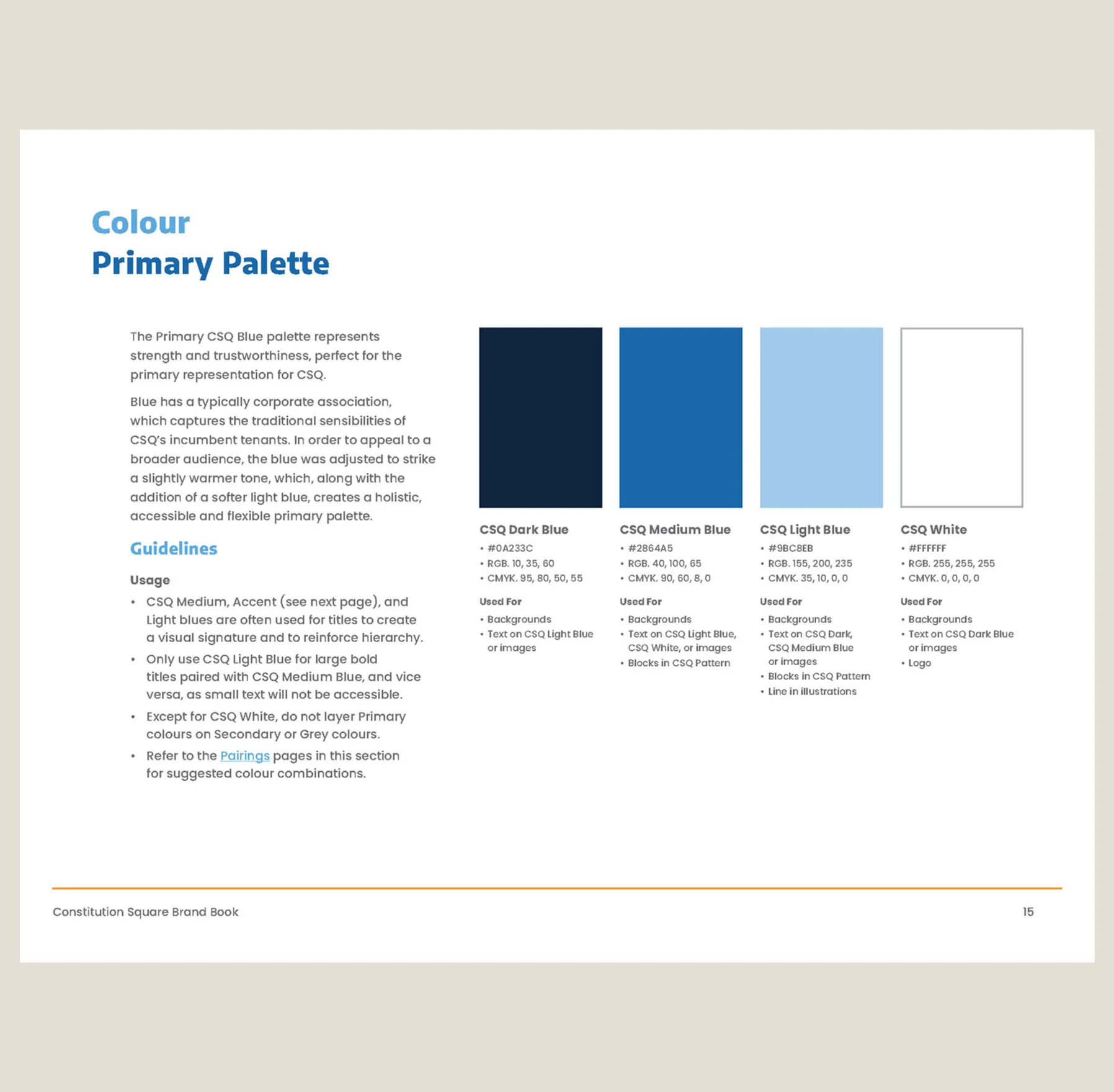
Colour palette with dark blue, medium blue, light blue, sky blue, orange and beige stripes.
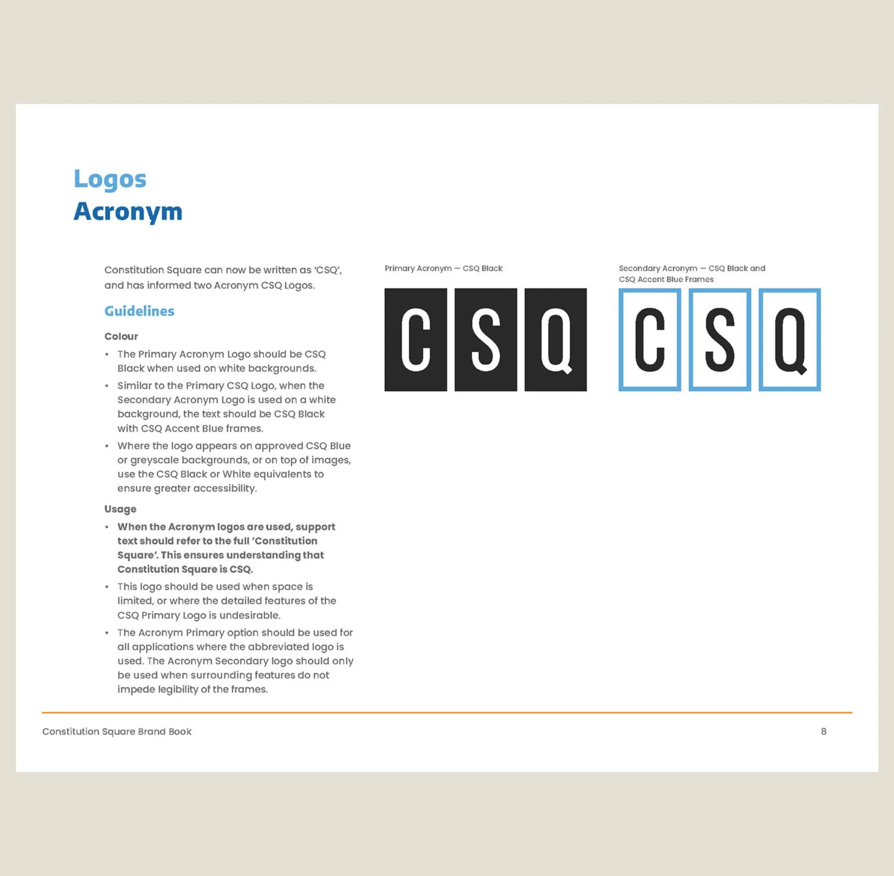
Logo inspired by the three towers of the building and a simple colour palette to support the brand
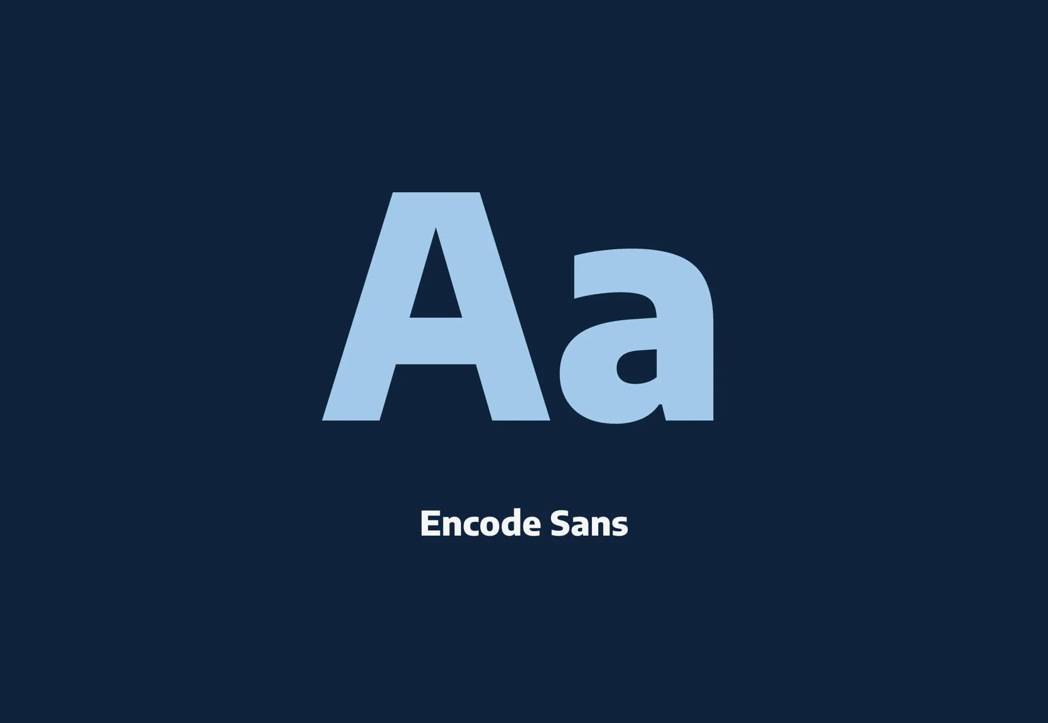
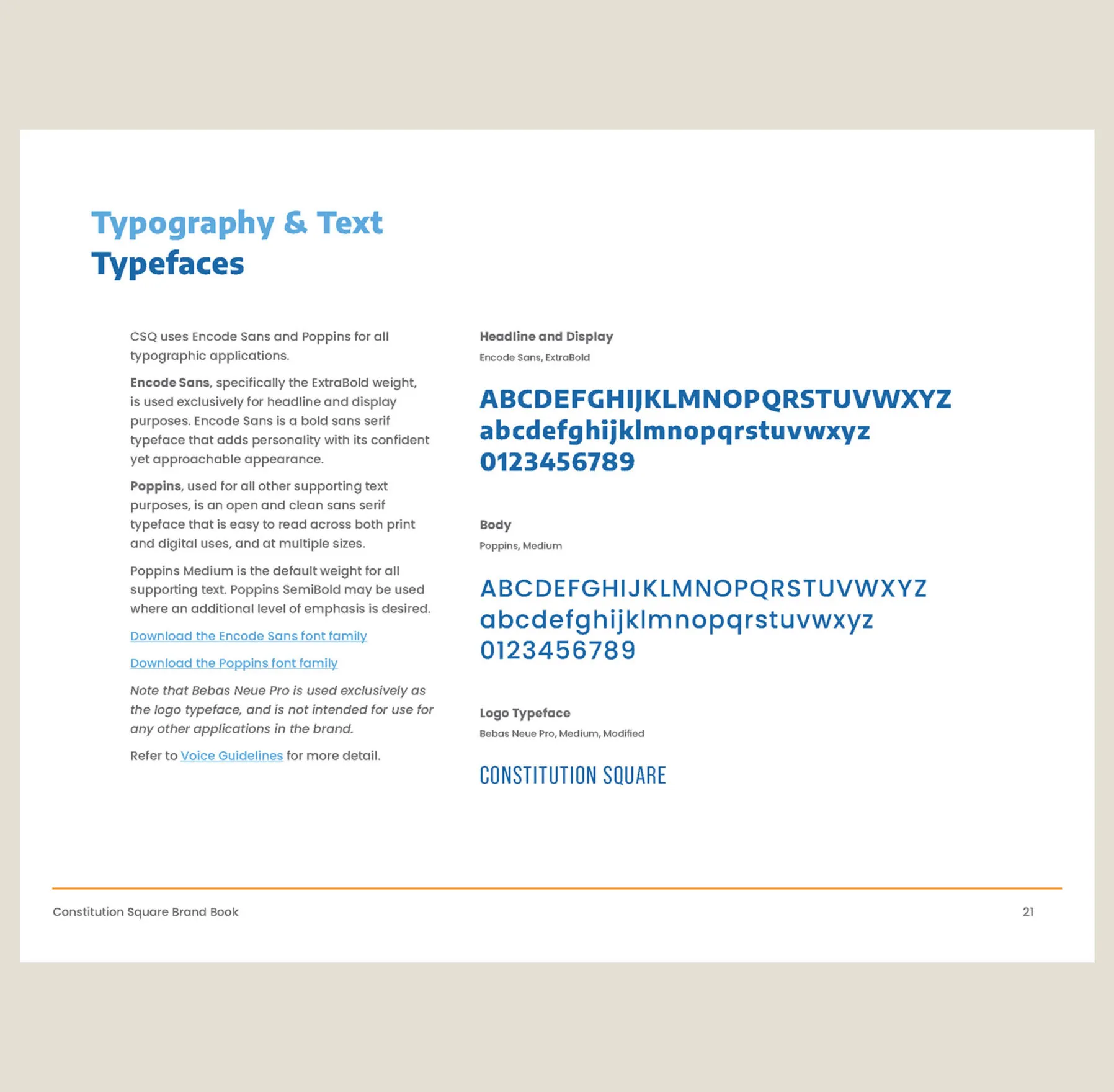
The Encode Sans font family, shown with large
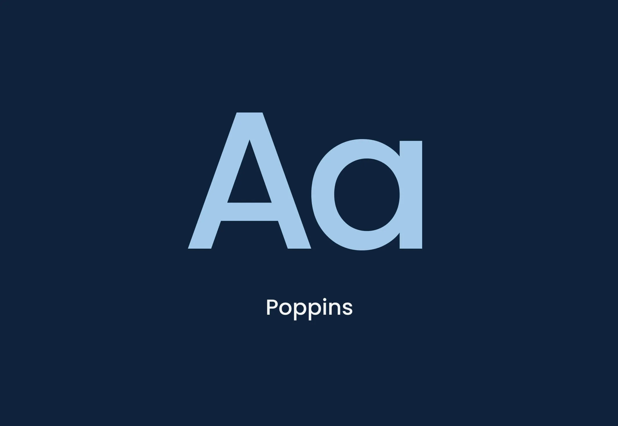
The Poppins font displayed with the letters Aa and the word Poppins.
Ownable typography to define all communications

Communicating an evolution to a modern audience

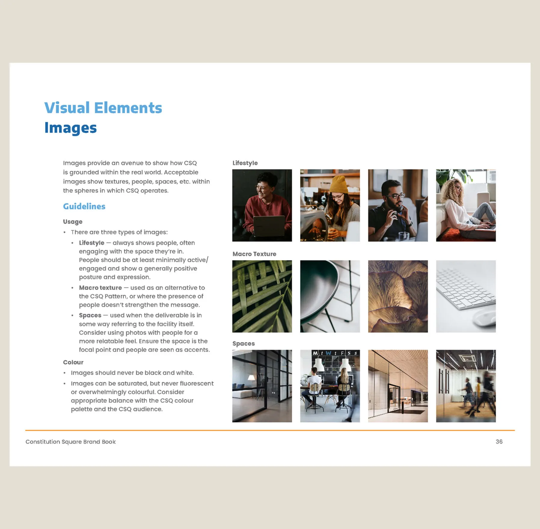
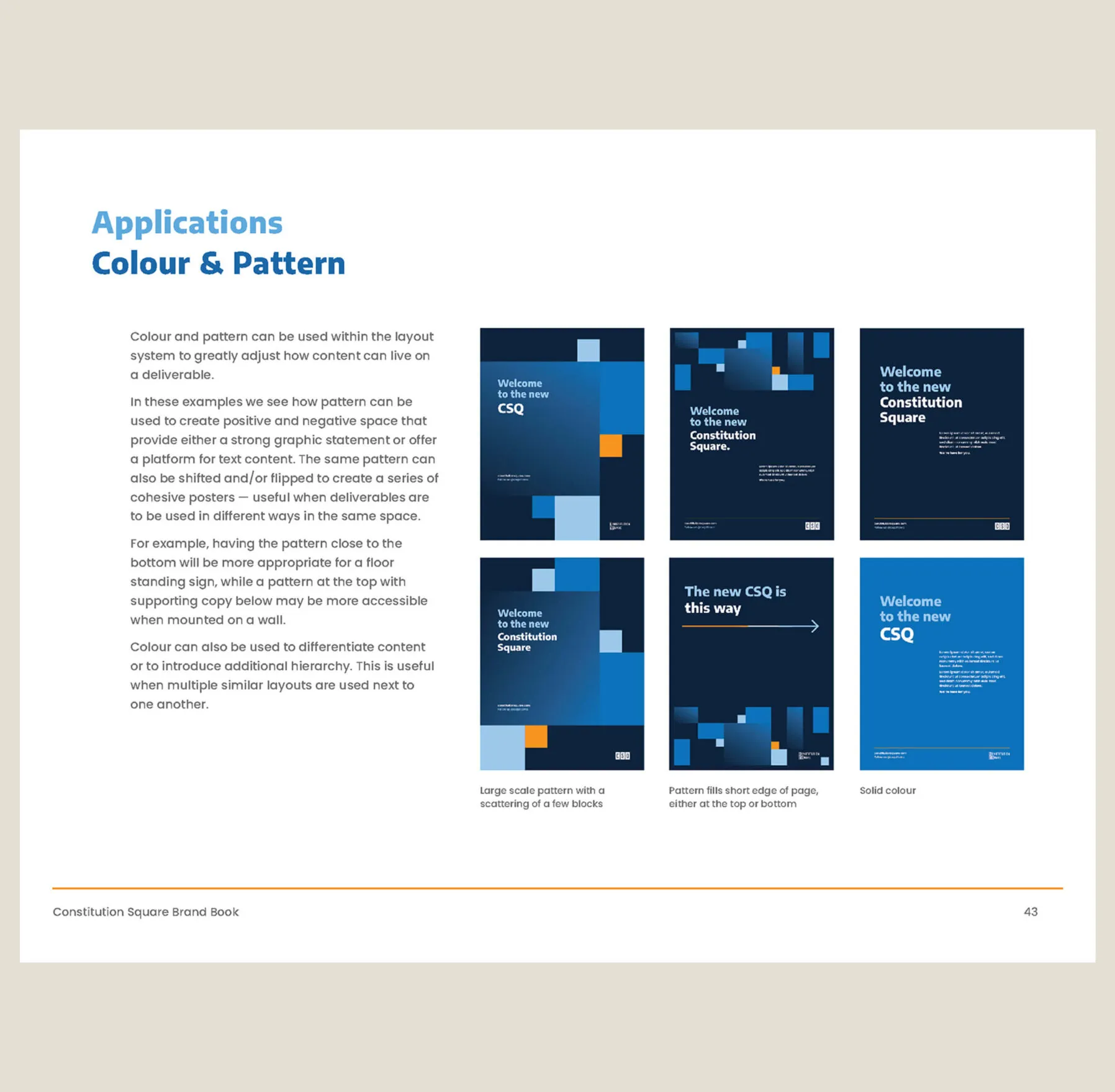
The newly established brand adds a sense of liveliness and forward-thinking reflected in the building’s vision—adopting a more casual tone of voice and a visual identity that is modern, friendly and relatable.

Minimalist illustration of a bicycle with orange frame and blue wheels on a dark blue background.
Abstract illustration of two overlapping chairs in orange and blue outlines on a dark blue background.
Custom illustrations to communicate all things about the brand
A banner with
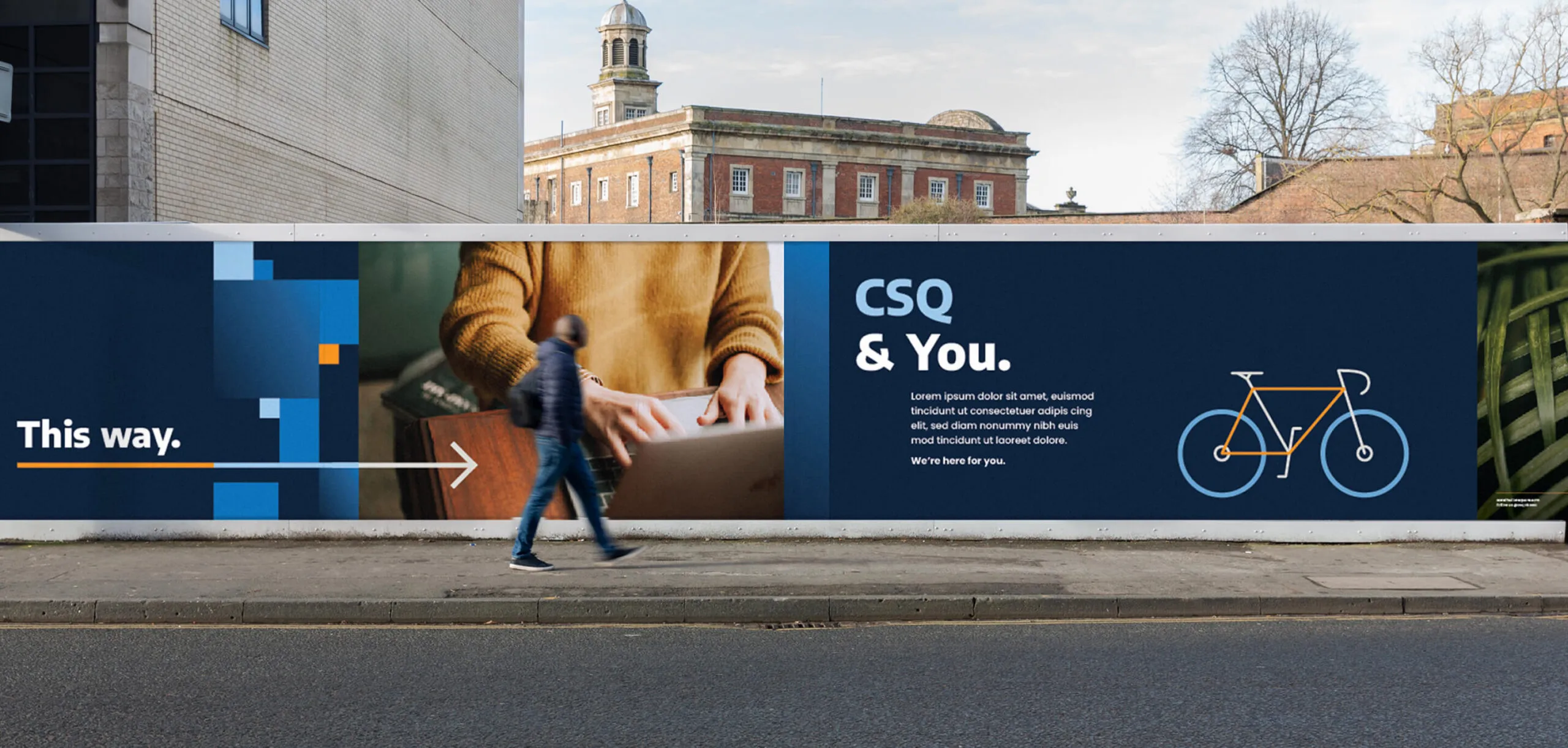
Bold hoarding to build suspense during construction
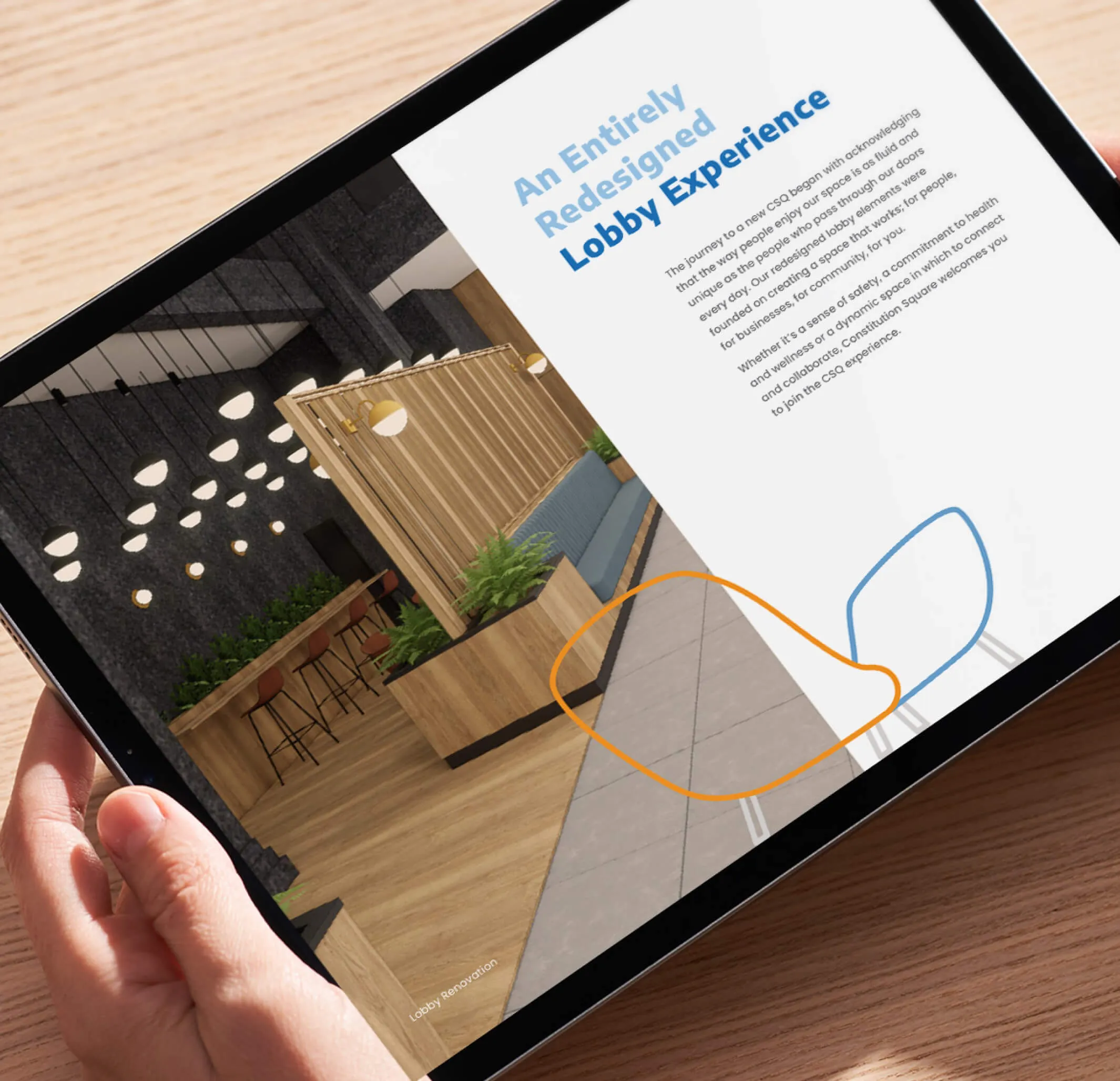
Tablet displaying a modern lobby renovation with text
Digital brochure for sales team
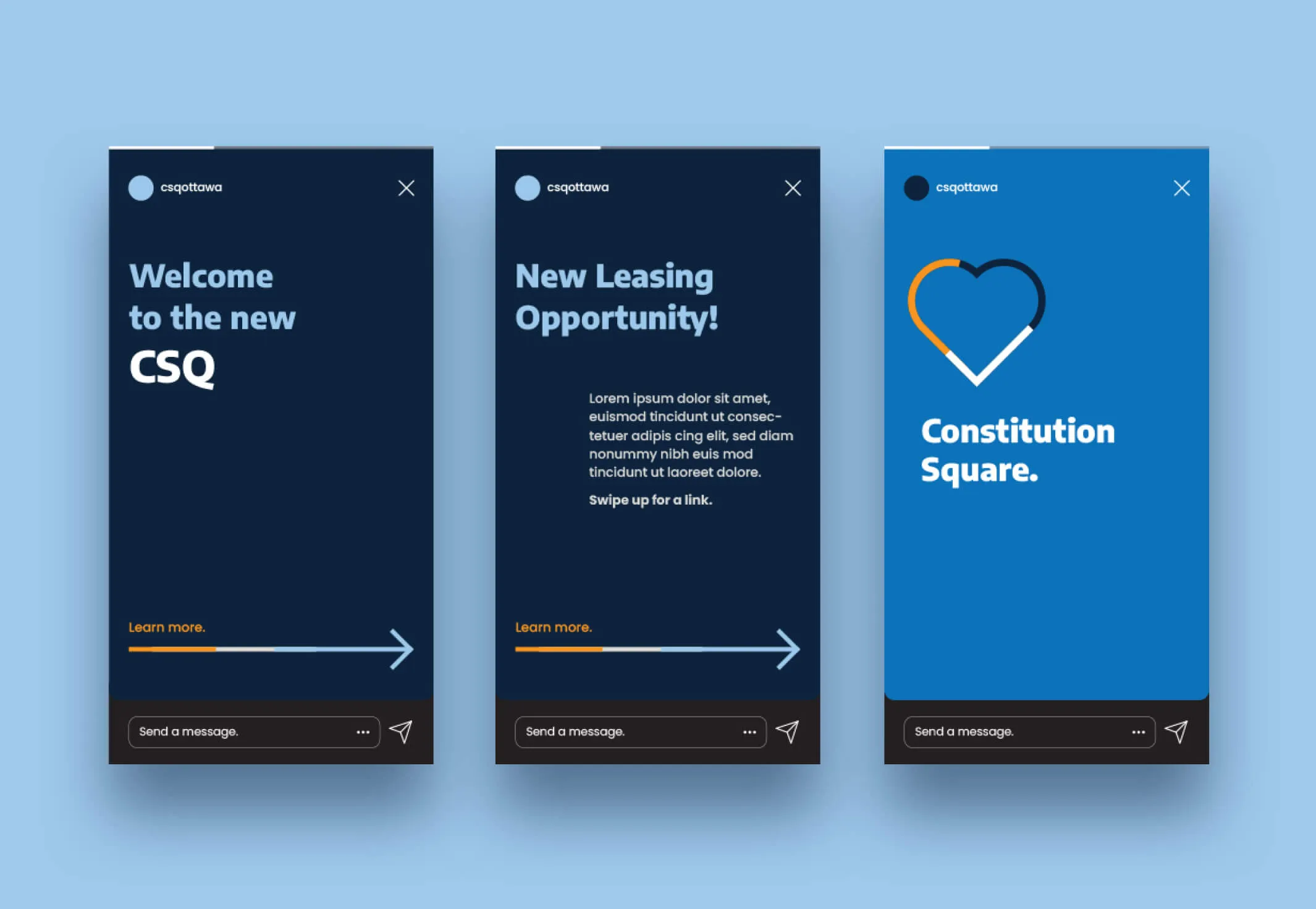
CSQ Ottawa social media story ads promoting the new Constitution Square
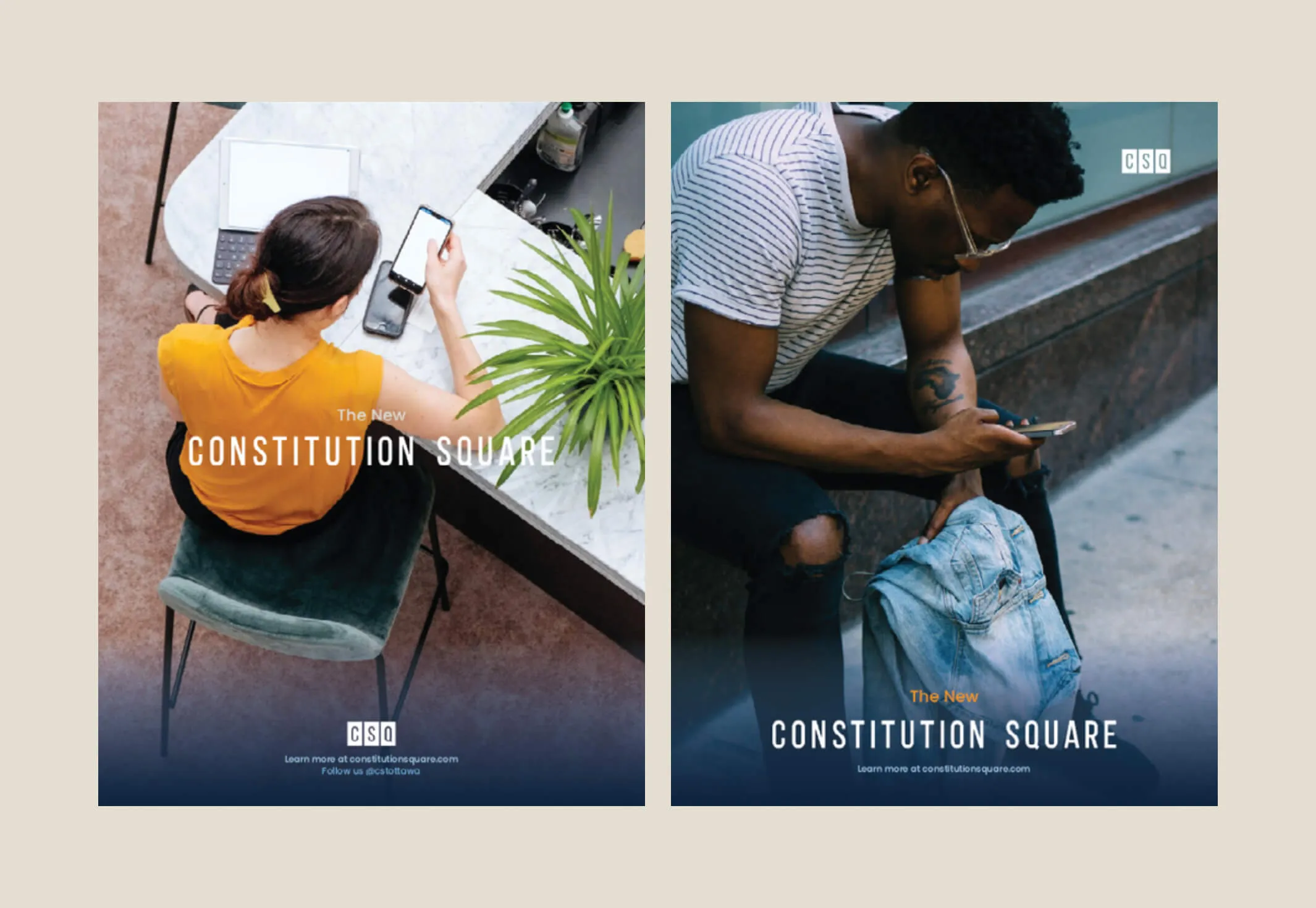
Two split images advertising Constitution Square, one with a woman at a table and the other with a man holding a jacket.
Social media and poster campaign to promote the changes

Establishing a strong sense of community and space

Our team developed design solutions that ensured an intuitive understanding of the connectivity of the three towers throughout the newly renovated concourse. The foremost opportunity was to create a strong sense of place and clear awareness of which of the three towers you were in, regardless of which entrance was used.

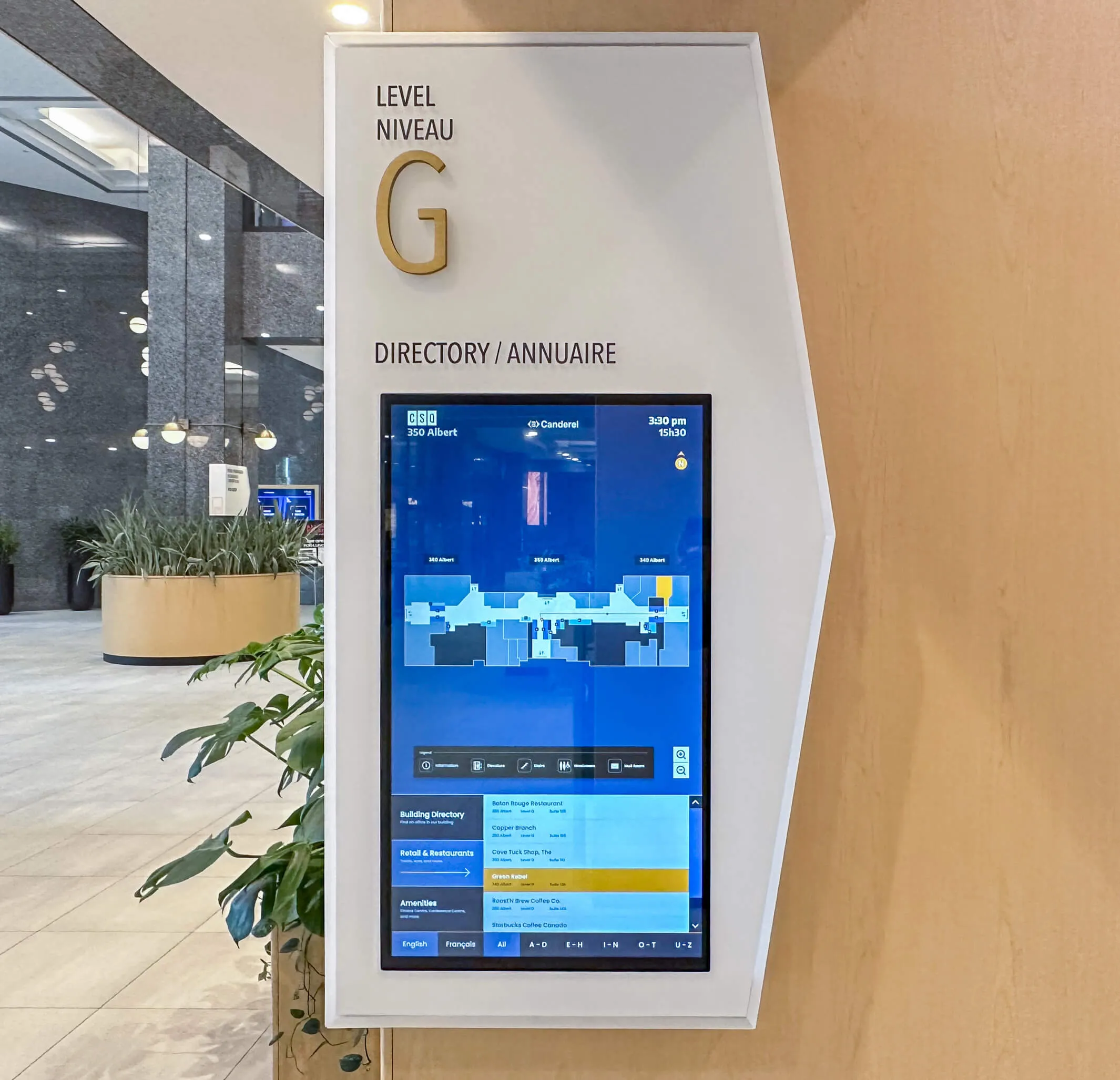
Digital directory sign for Level G at 350 Albert, showing a floor plan and business listings.
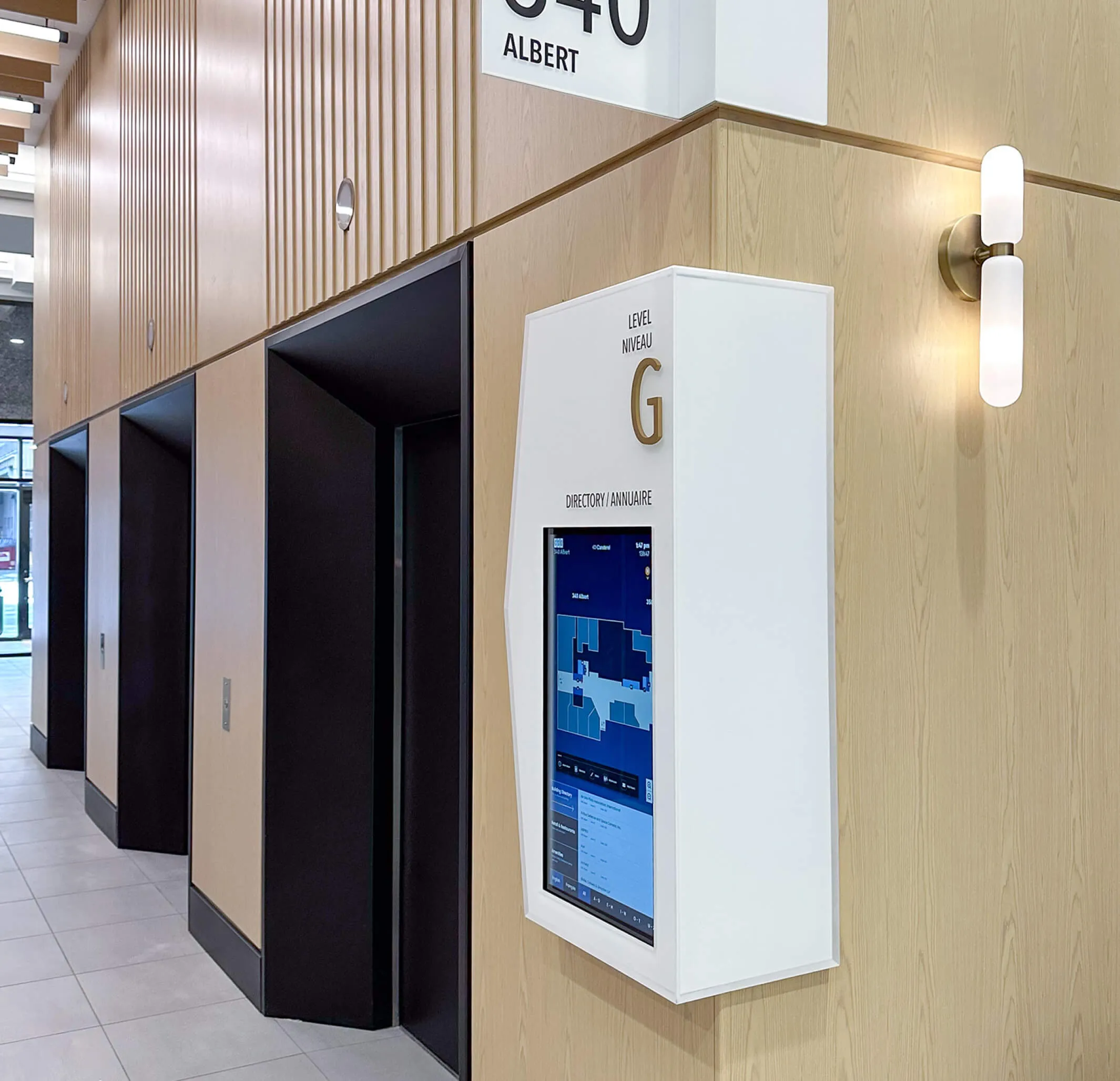
Modern building directory and elevators with wood paneling and contemporary lighting.
Interactive building directory integrated into signage program
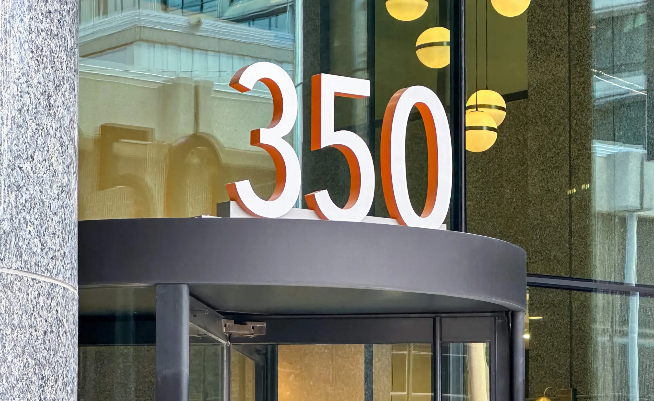
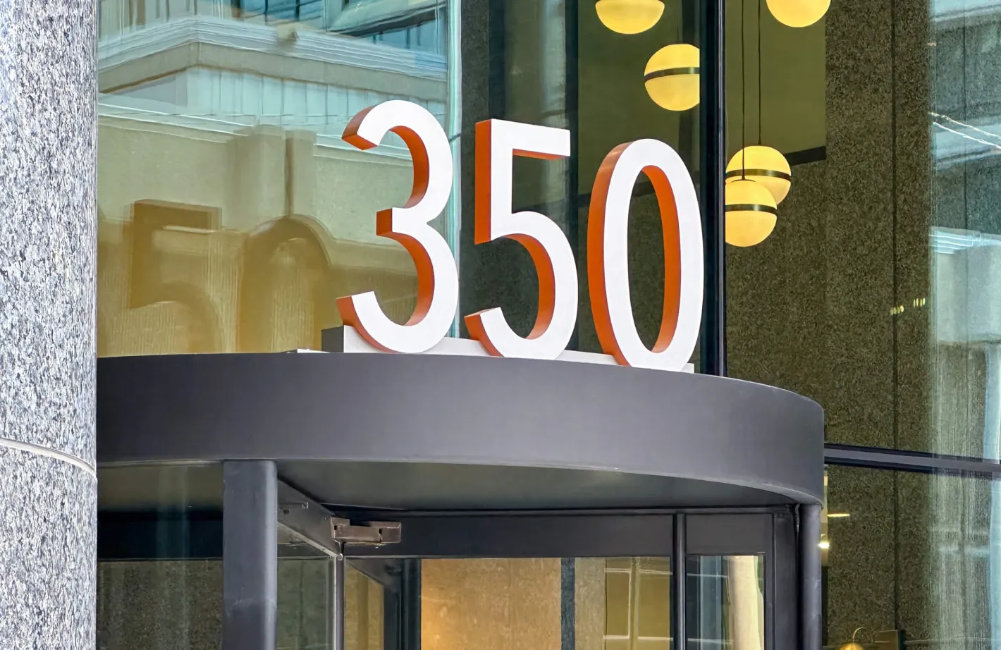
Building entrance sign with large white numbers
Bold signage to identify each of the three towers
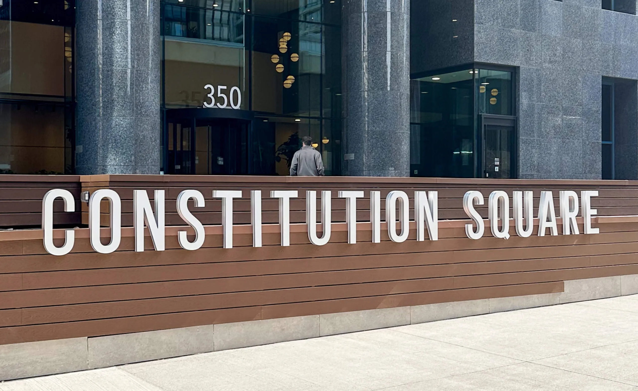
Constitution Square building sign with 350 address and revolving door entrance.
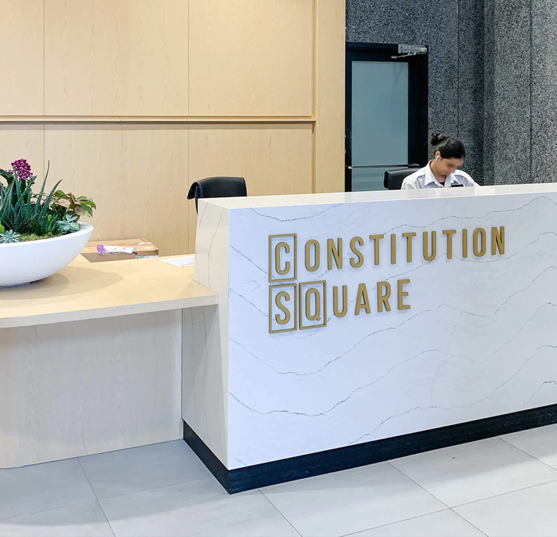
Reception desk with
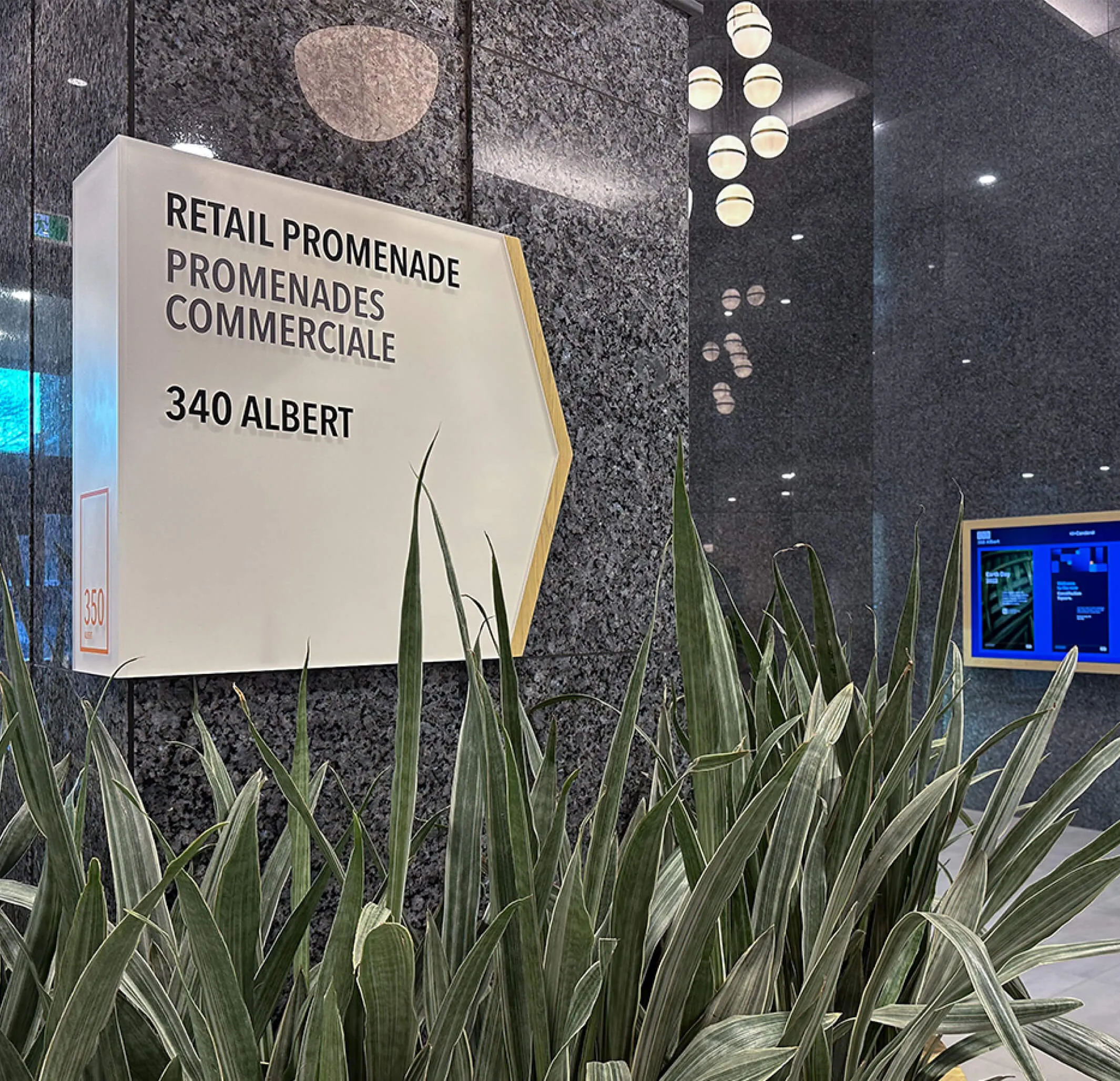
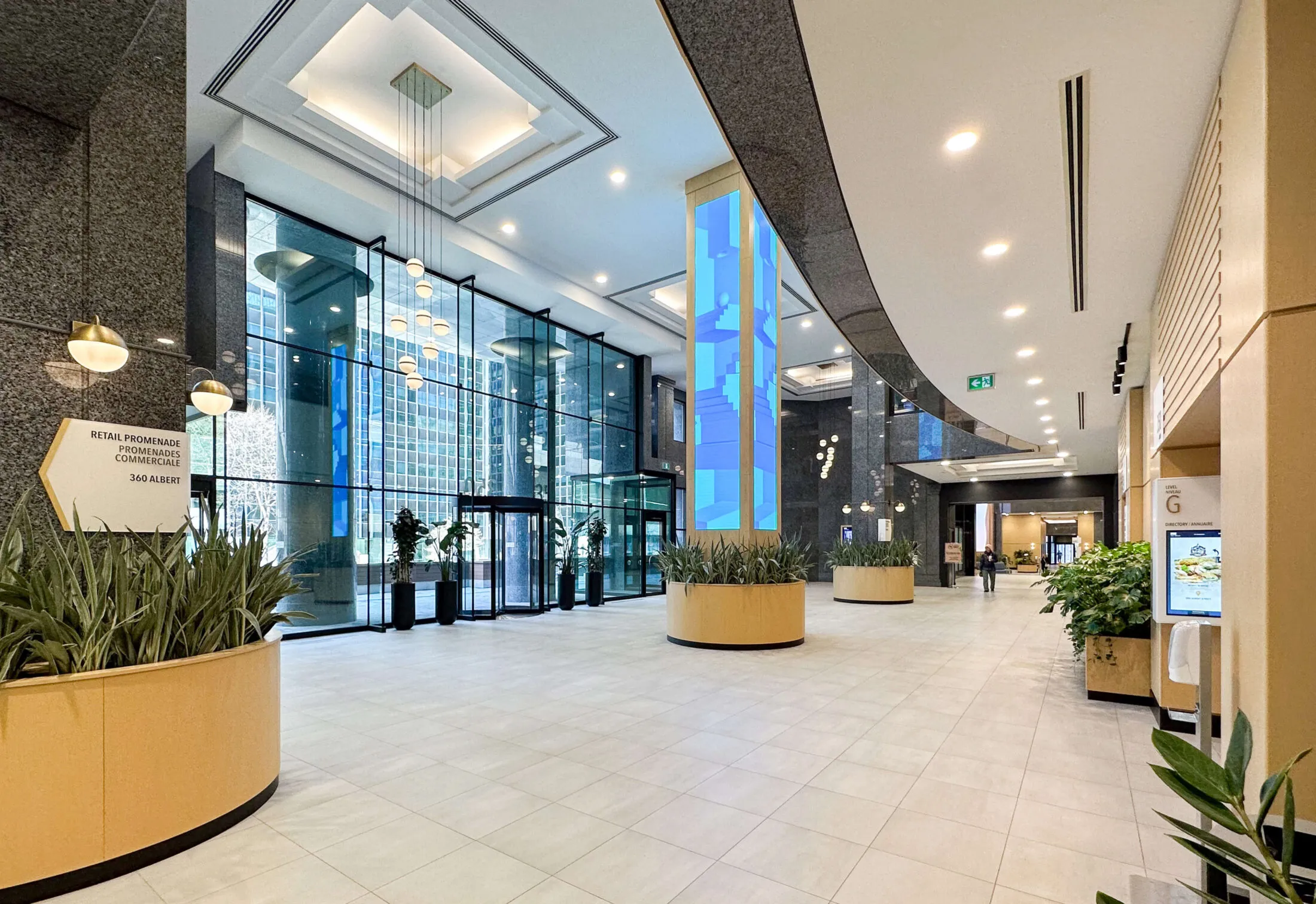
Sign for Retail Promenades Commerciales at 340 Albert, with plants in foreground.
Consistent signage application throughout the entire building complex

Art as a reflection of brand values

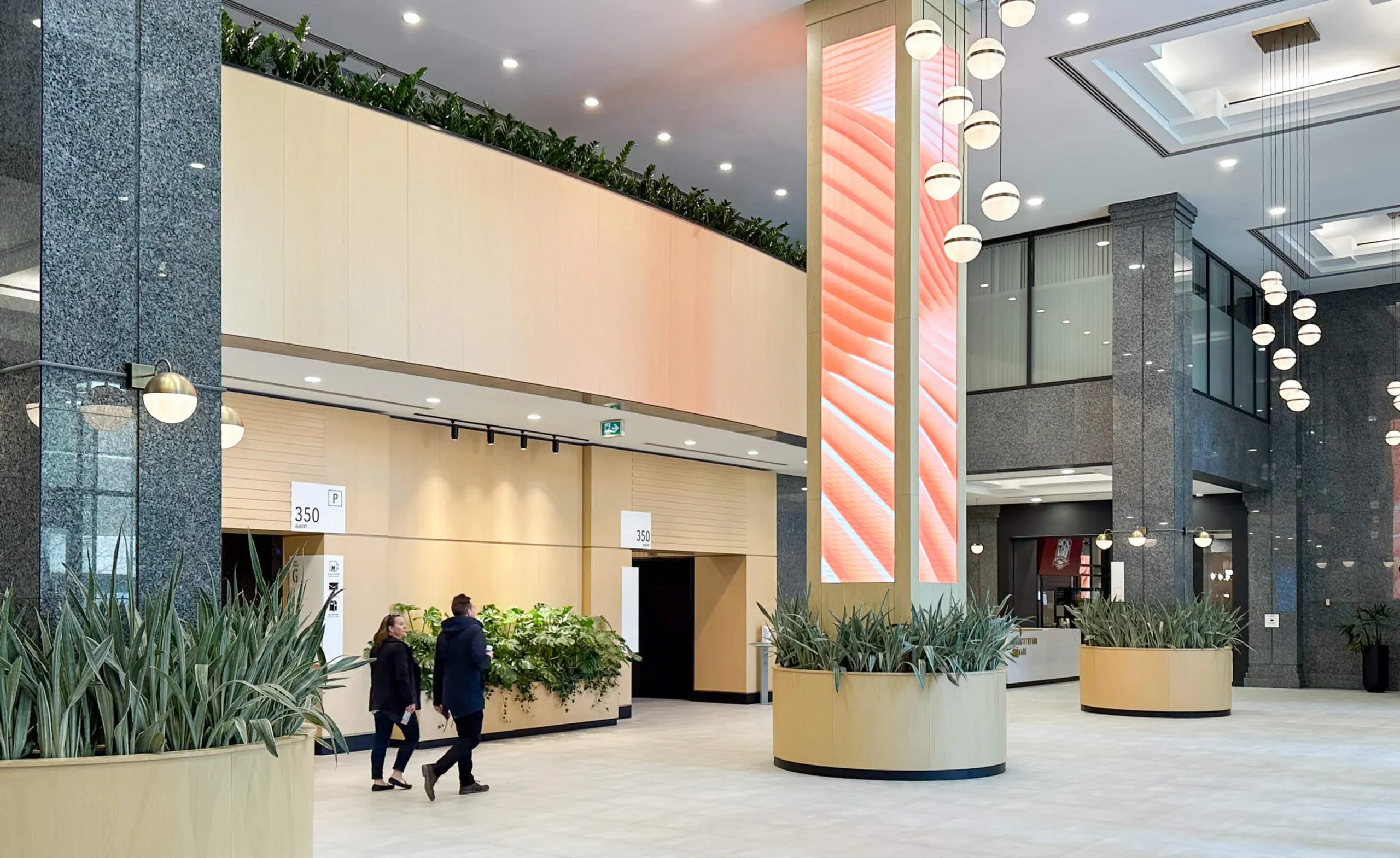
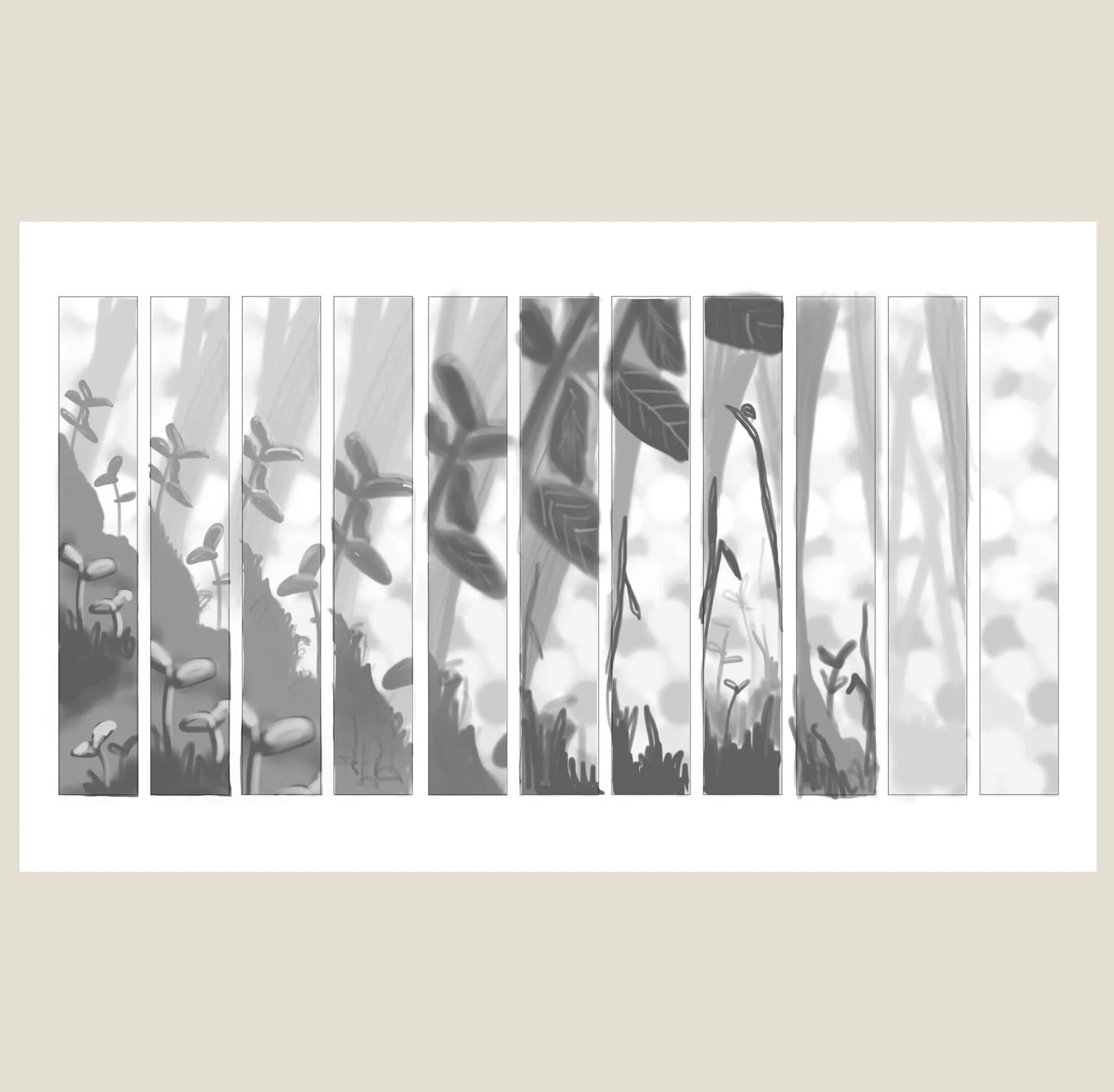
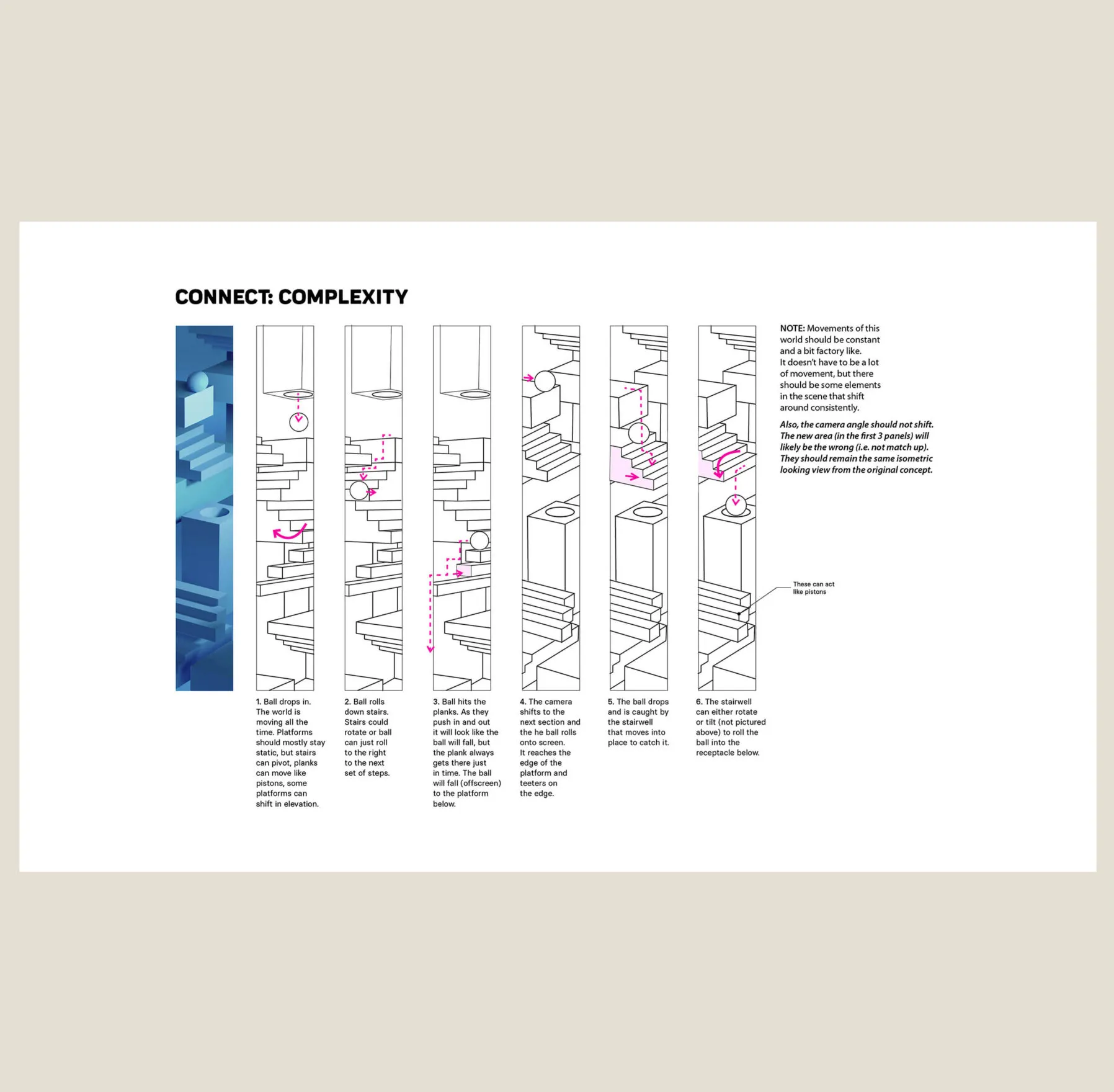
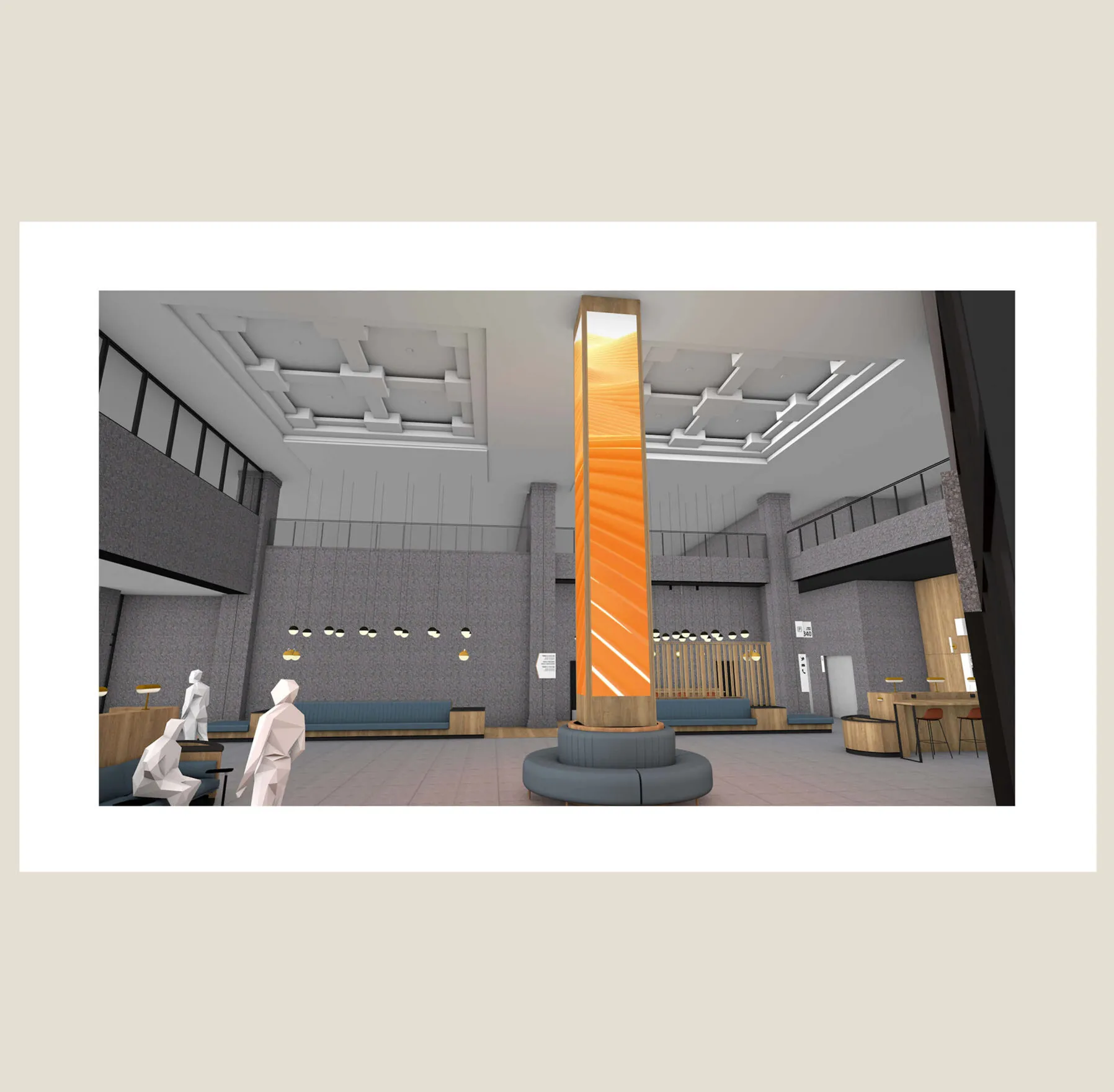
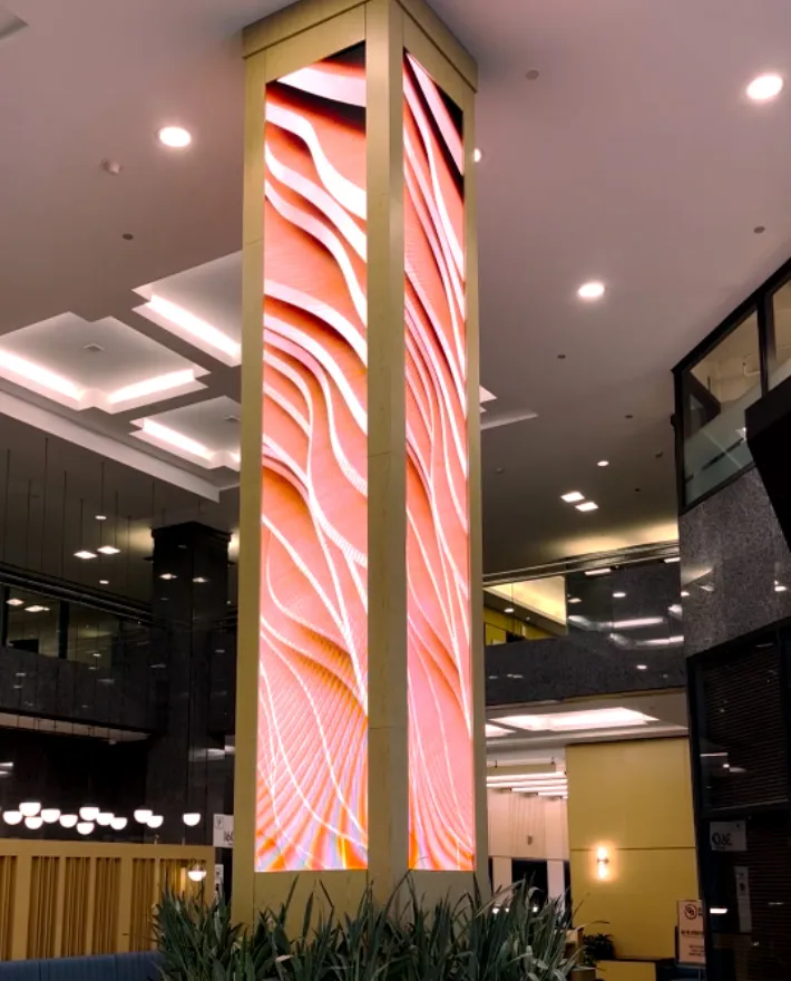
At the heart of each building’s lobby is a 4-sided LED column featuring a series of custom-crafted artwork that ties directly into the brand’s themes of Gather, Grow, Connect, Evolve. The three pillars create a symmetry between the buildings as you walk the concourse, and their impressive presence infuses the space with a sense of palpable energy and vivid life. They further underpin Canderel’s desire to make these public common areas a pleasant place to work and dwell.

Modern office lobby with plants, digital display, and globe lights.
Enhancing the lobby experience through a digital art installation on three centre columns
A tall pillar with a digital display showing abstract orange and white wavy patterns.
Digital art installation in action
  • 1986 year of completion of first tower
  • 1M+ sq. ft. office complex
  • 21 floors of highest tower
  • 3 towers that make up CSQ
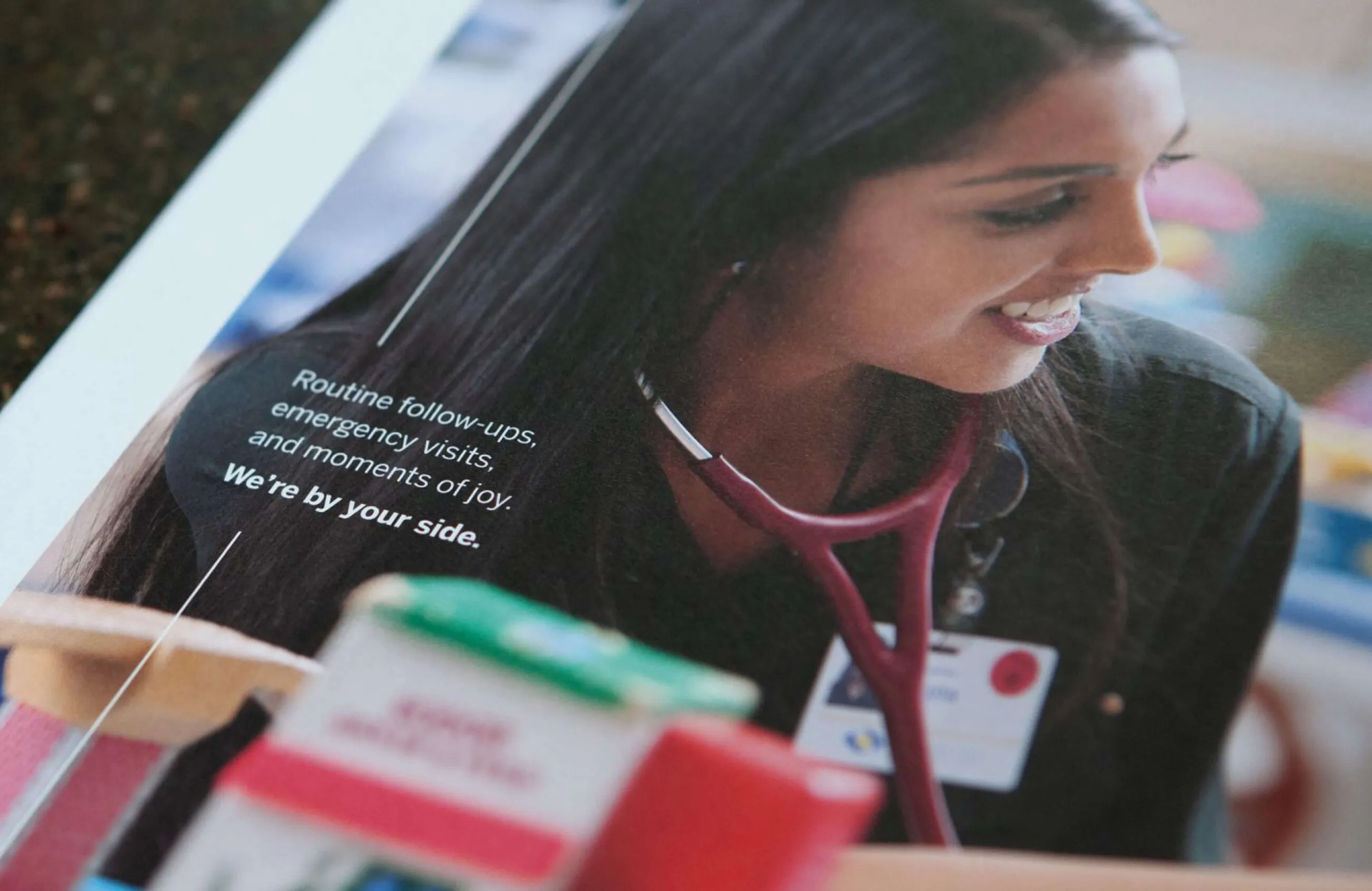
Smiling nurse with Southlake campaign text A nurse smiles while wearing a stethoscope and ID badge.

Southlake Regional Health Centre

Services Deliverables
  • Logo
  • Strategic Plan
  • Brand Guide
  • Photography Art Direction
  • Community Report

Shaping the future of healthcare at Southlake
Southlake Regional Health Centre, located in Newmarket, Ontario, is a full-service hospital, providing advanced levels of care to more than one million people living in surrounding communities. Looking to launch a leading-edge strategic plan capturing the hospital’s dedication to shaping the future of healthcare, the Southlake team turned to Forge for visual design and campaign creation to support and evolve internal and external marketing materials for the next five years.
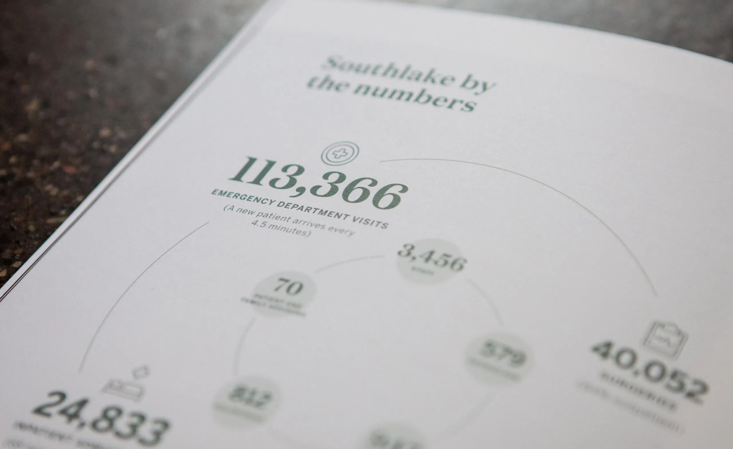
Southlake by the numbers infographic showing emergency department visits and other statistics.
Strategic Plan design including custom photoshoot within hospital
Southlake Regional Health Centre logo and website address on a dark brochure.
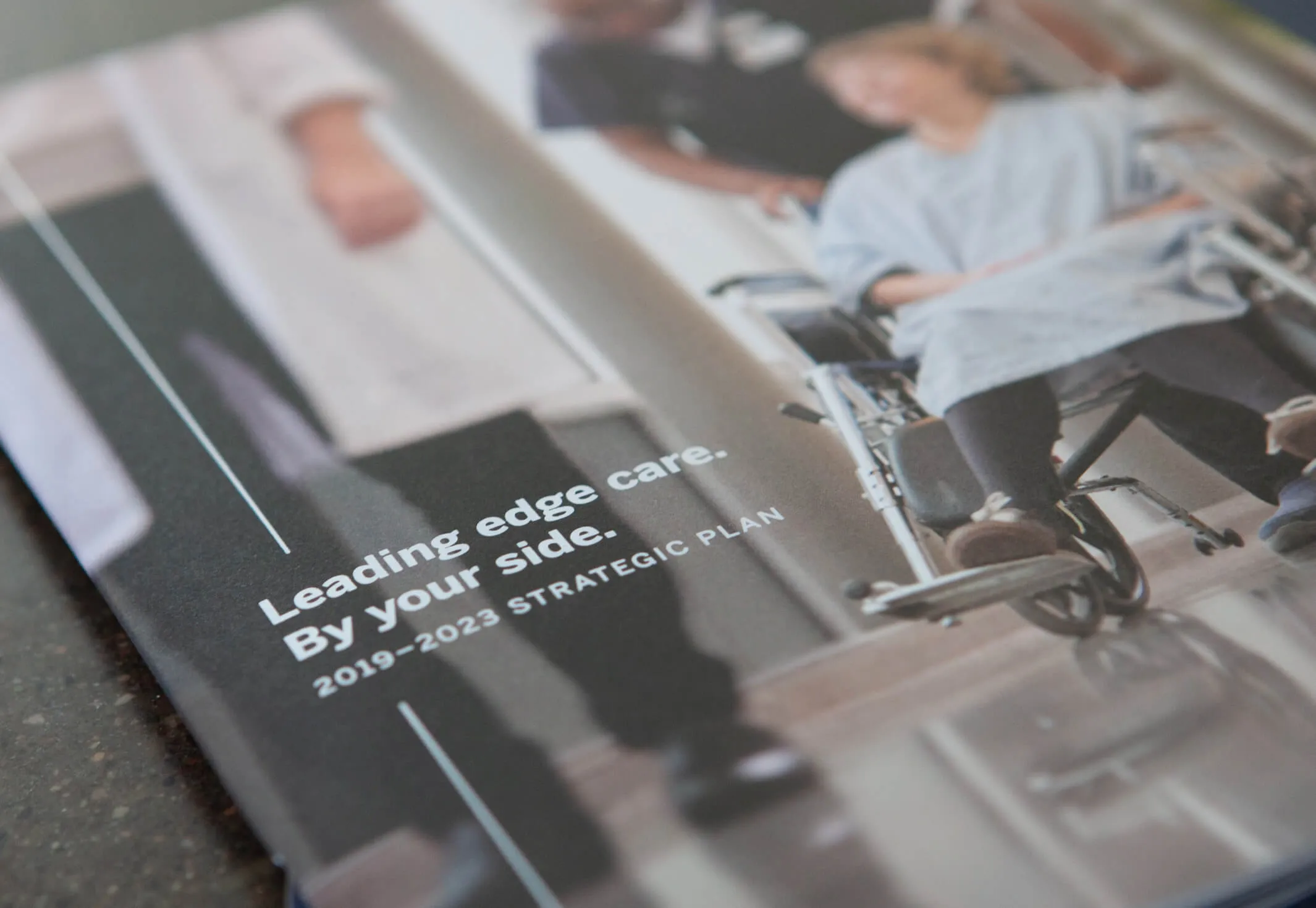
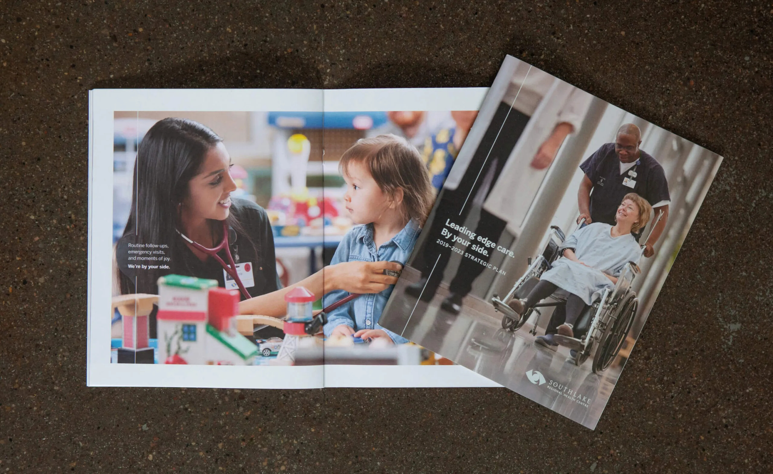
Southlake strategic plan brochure cover

Building healthy communities

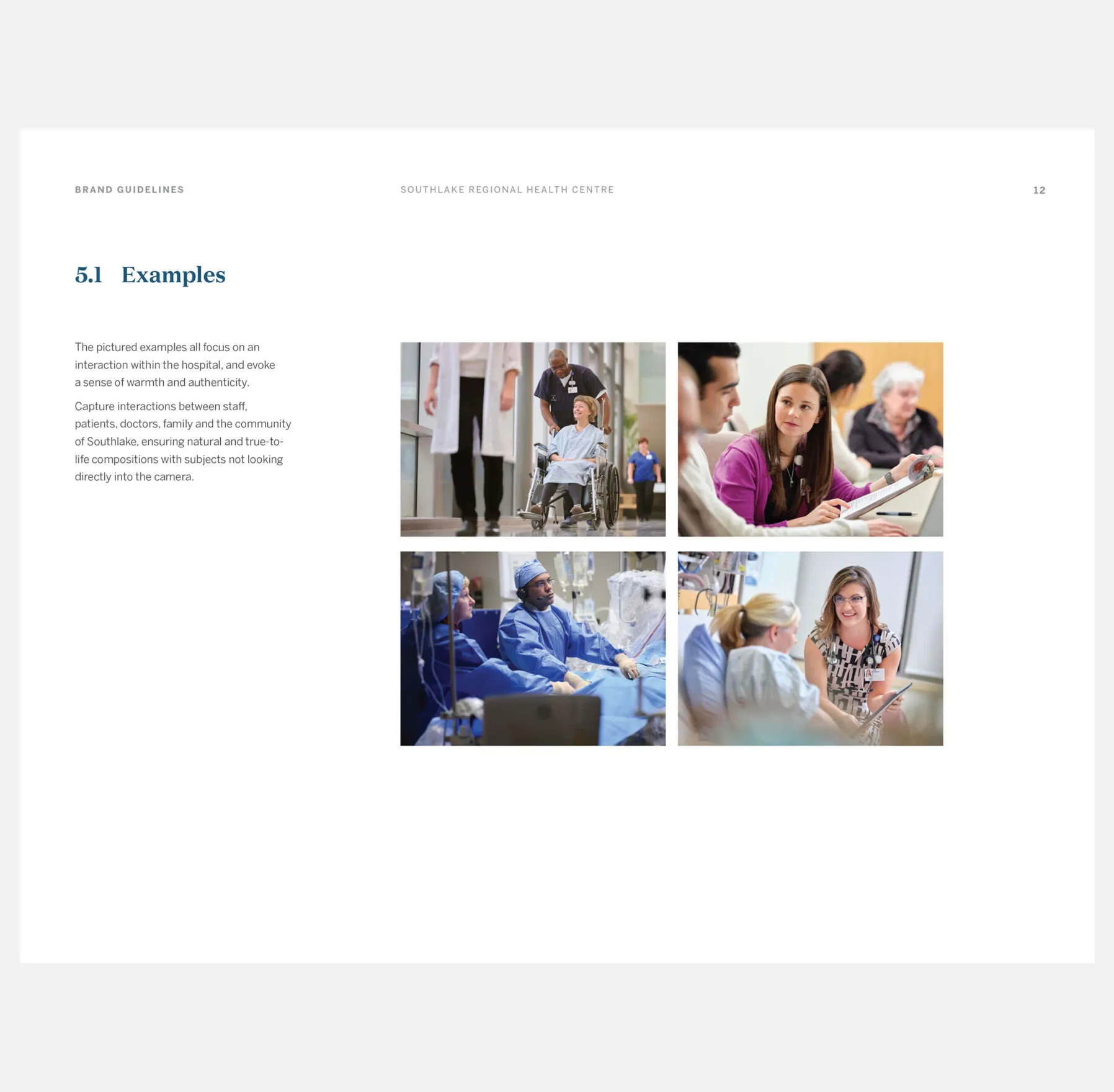
To position Southlake as a top healthcare provider, leading-edge in both research and technology, Forge created a distinct visual treatment and messaging direction. The intention was to evoke an authentic sense of emotion while highlighting the people and culture of the hospital and reinforcing the key message of “We’re by your side”.

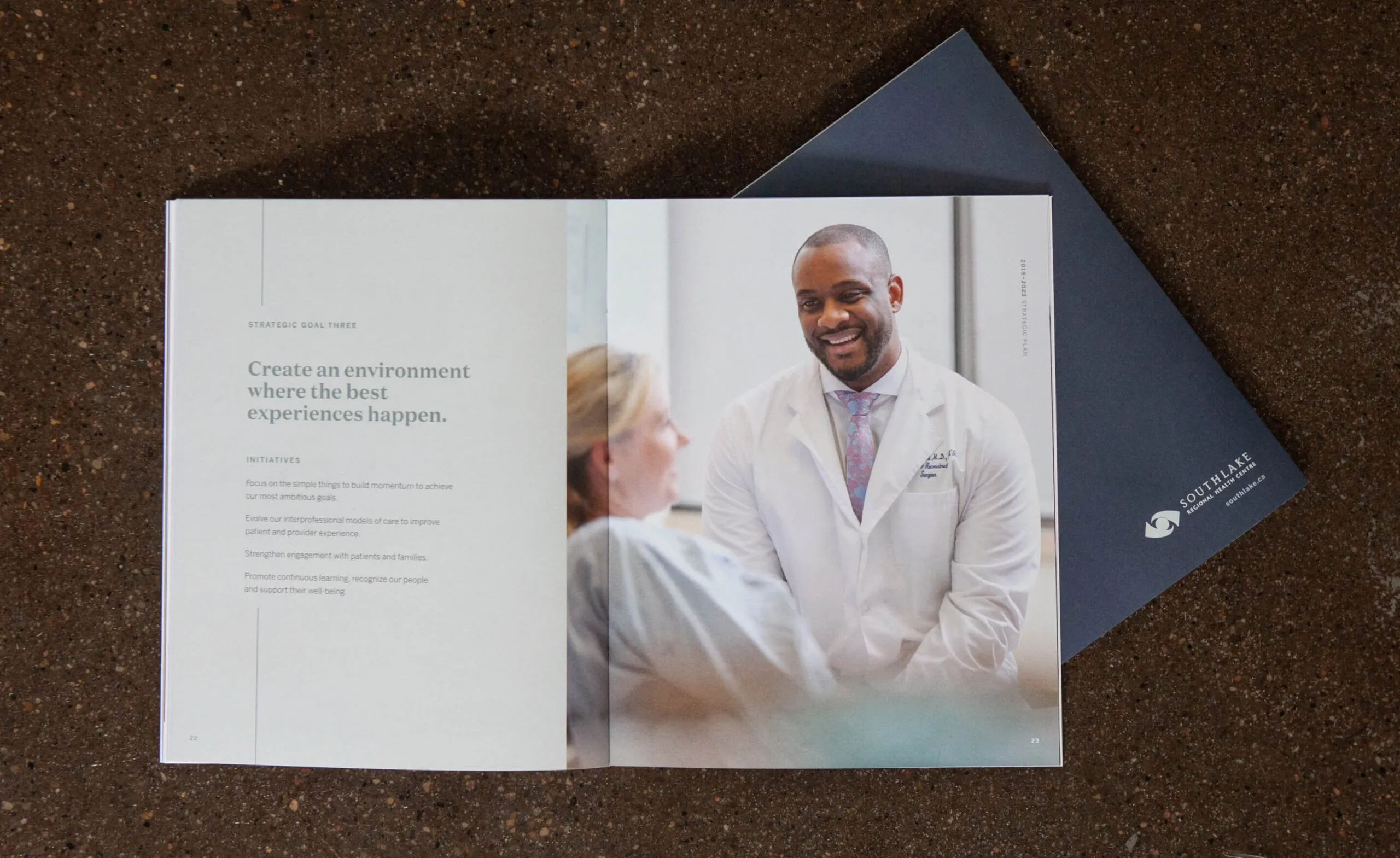
Southlake Regional Health Centre strategic plan with a doctor and patient.
Southlake Regional Health Centre strategic plan with images of healthcare providers and patients.

Reinforcing the human element of care

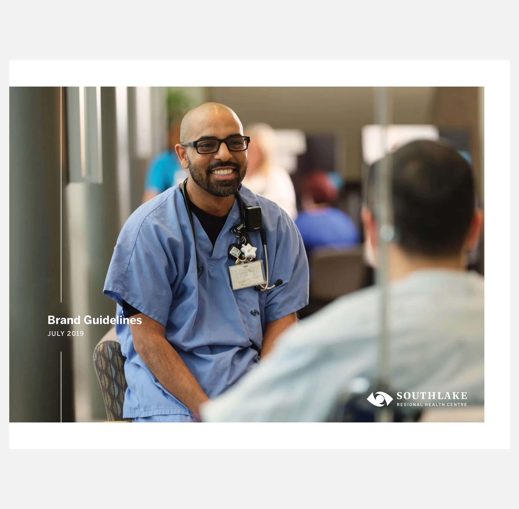
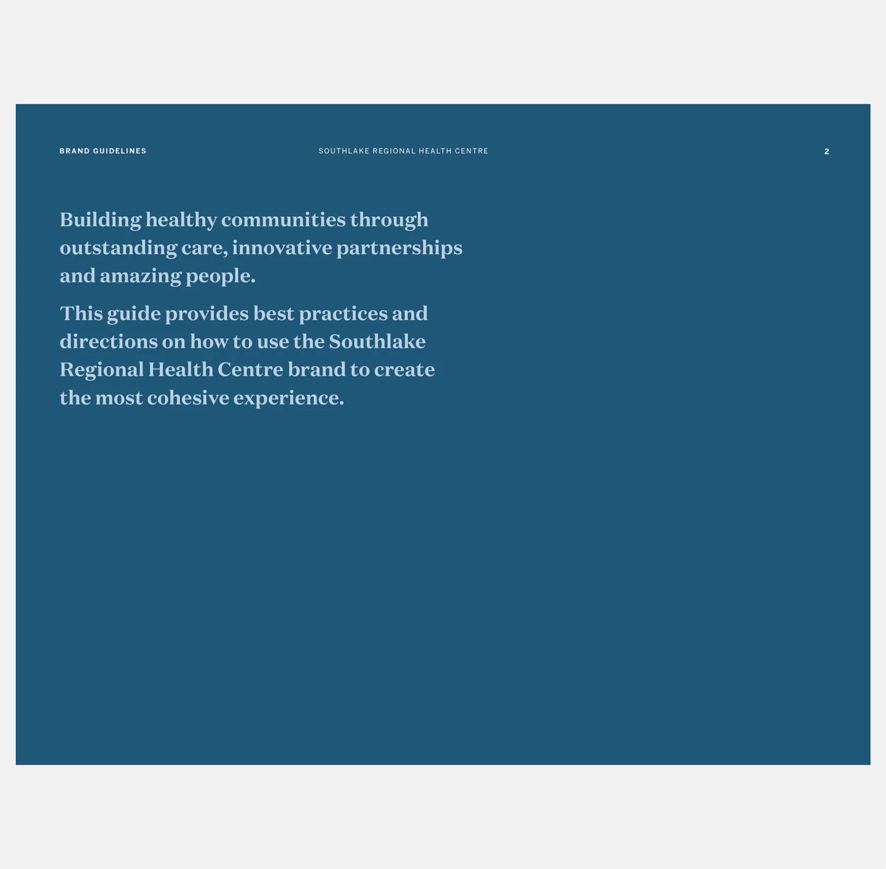
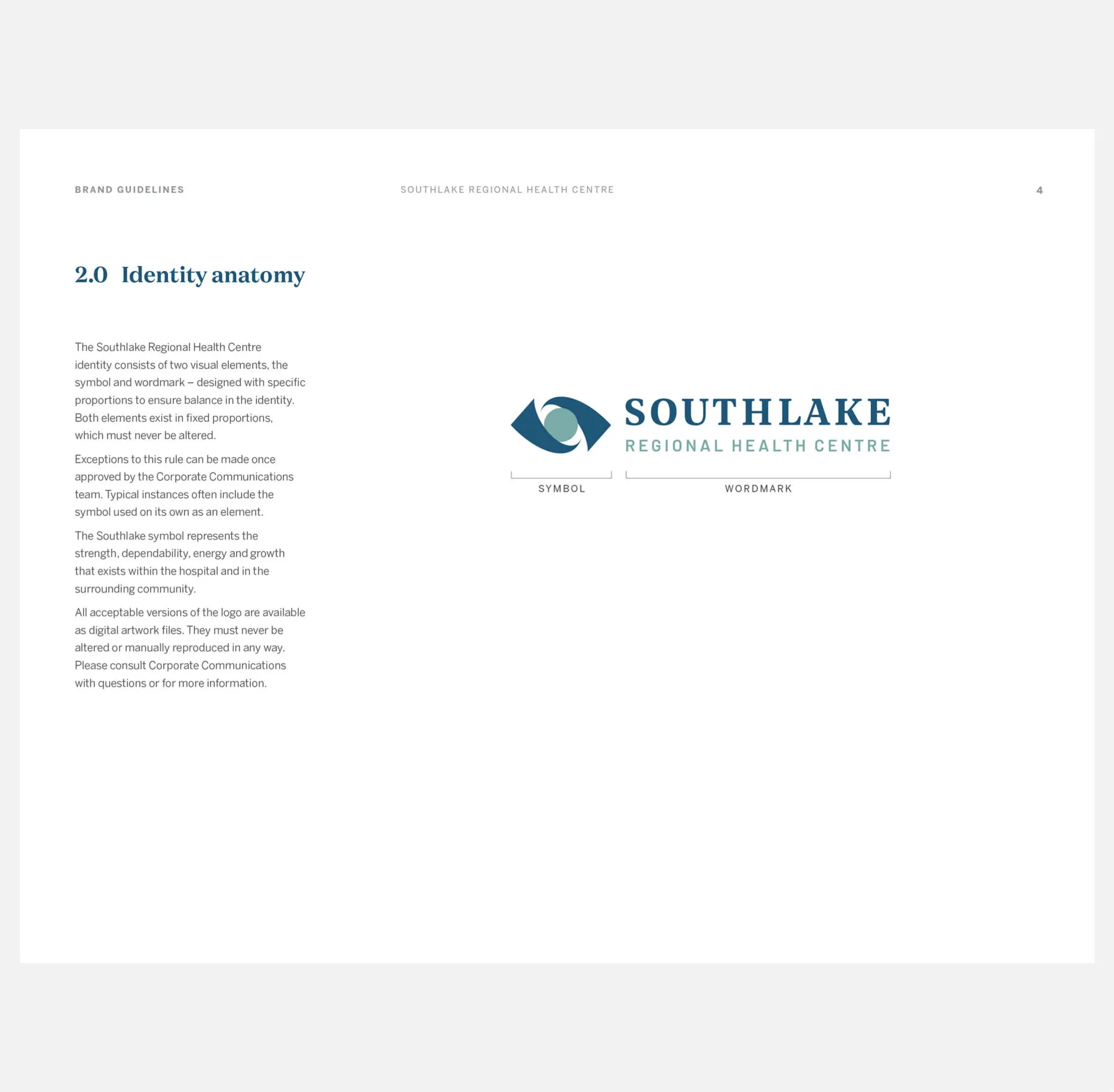
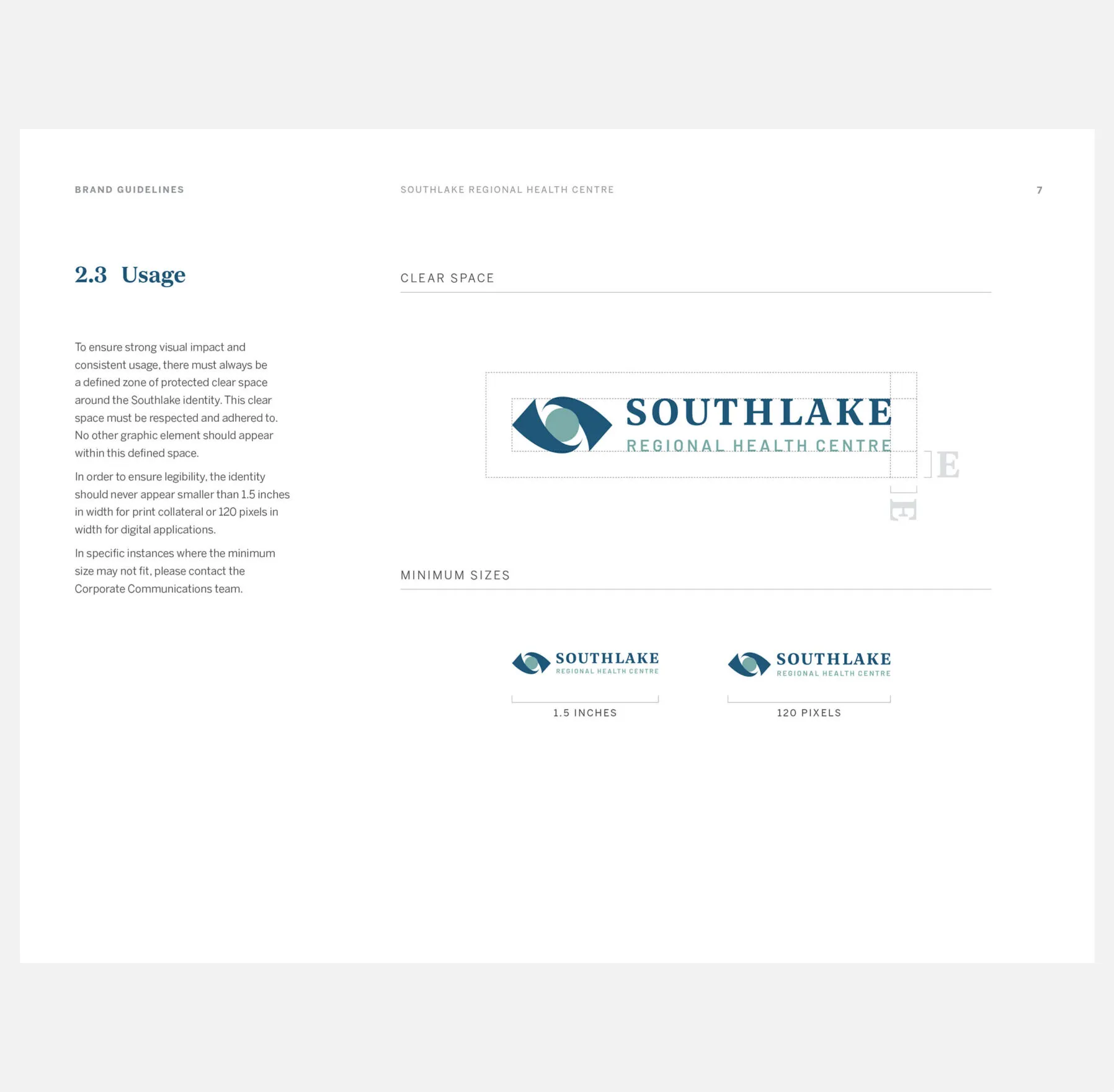
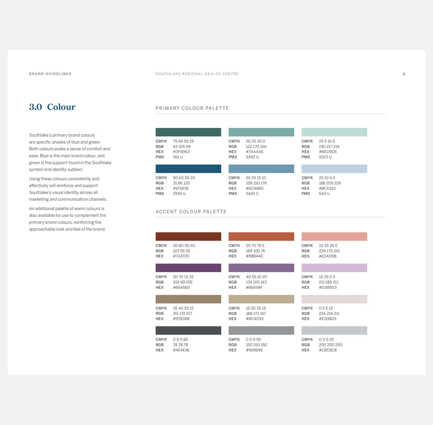
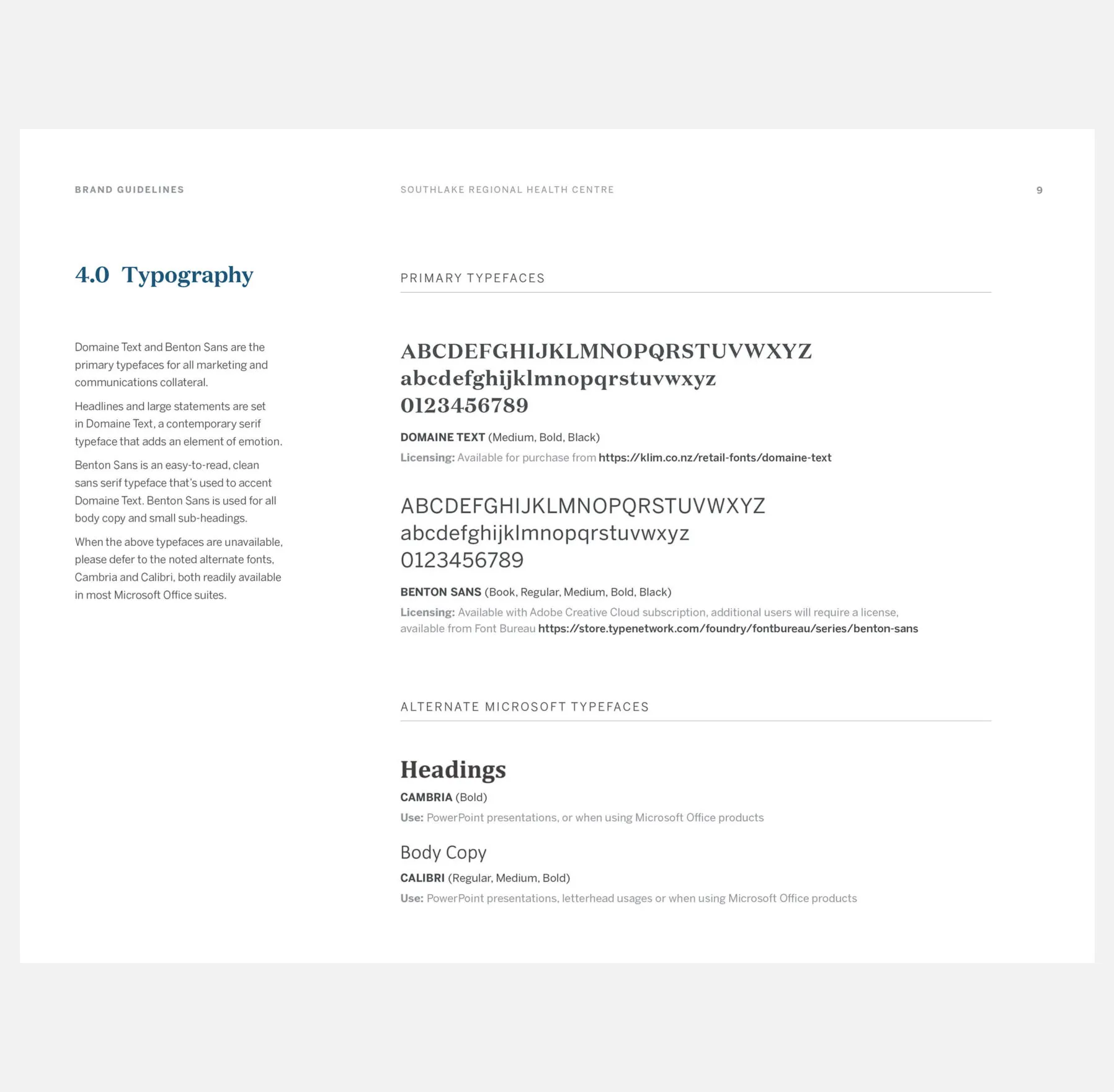
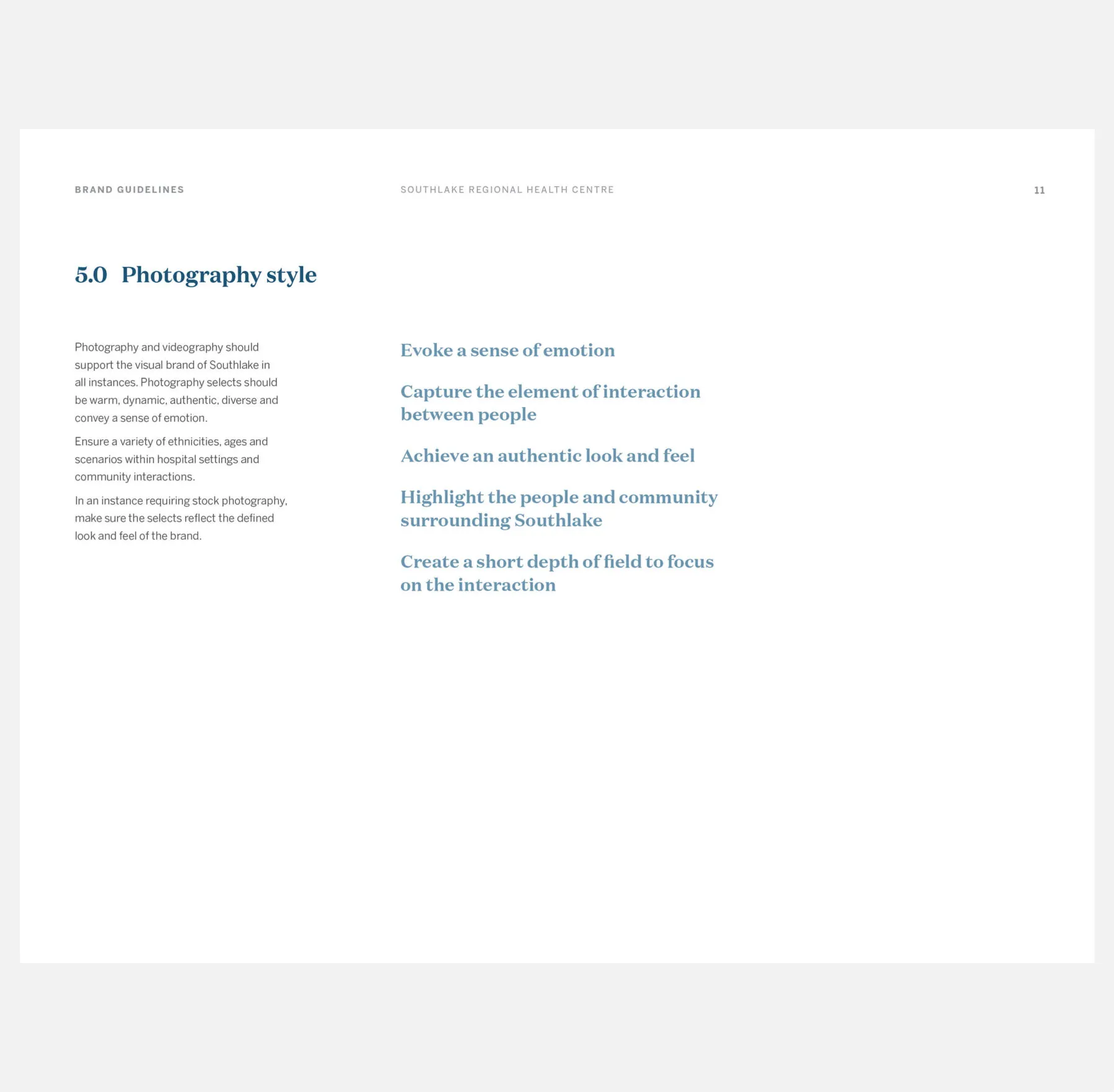
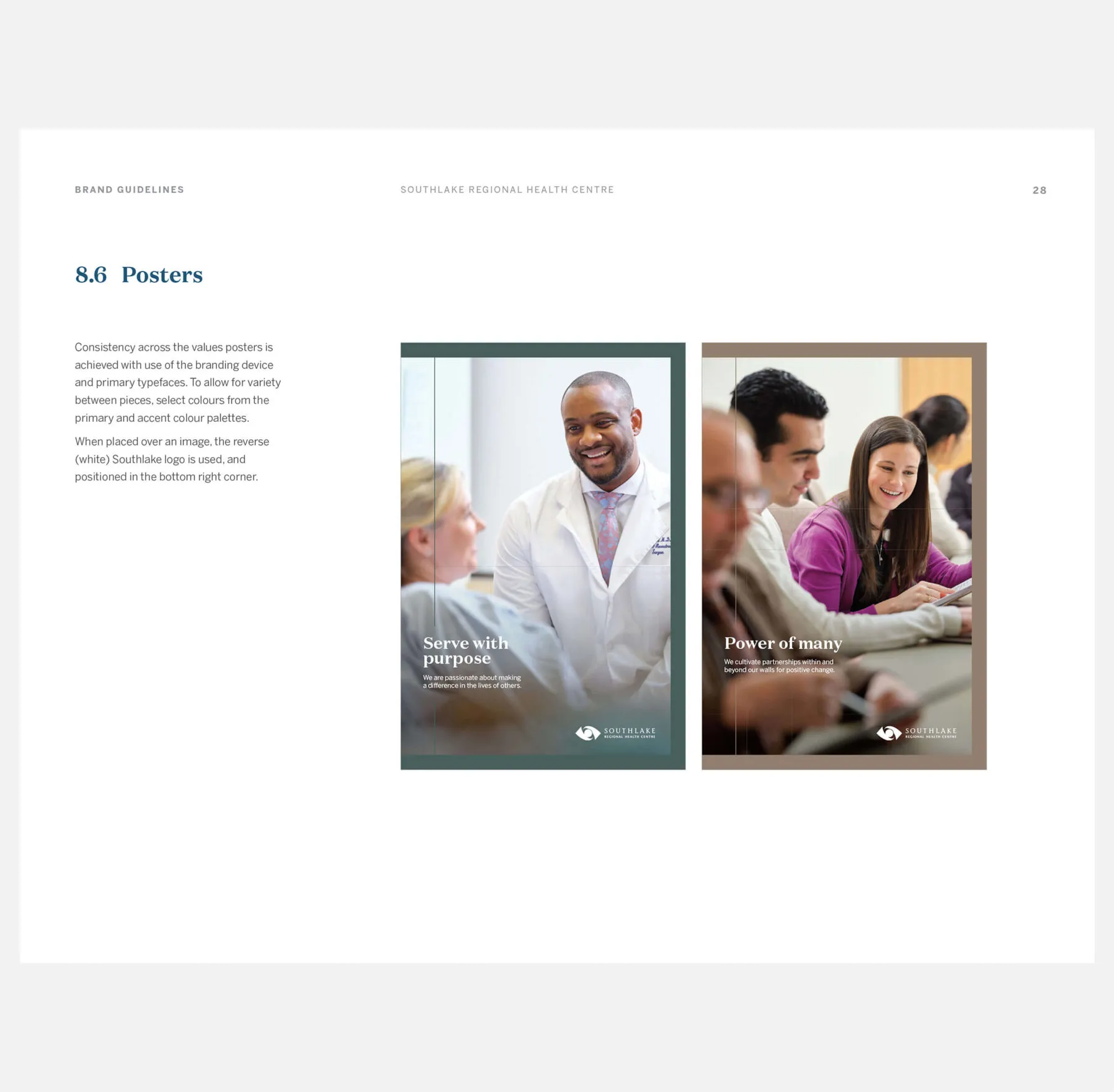
Forge continued to evolve the Southlake brand by developing a complete set of brand guidelines that established identity usage, colour specifications, typography direction, photography style, and recommendations around creating communication collateral.

The old Southlake Regional Health Centre logo
The new Southlake Regional Health Centre logo
Original identity and evolved identity
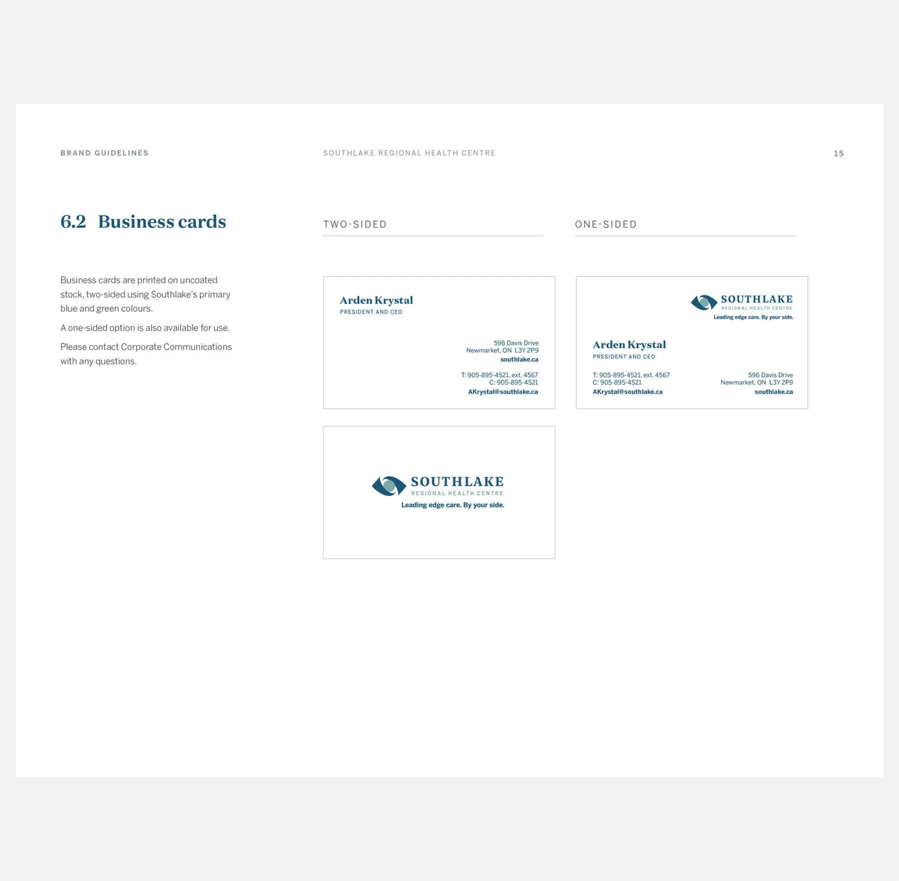
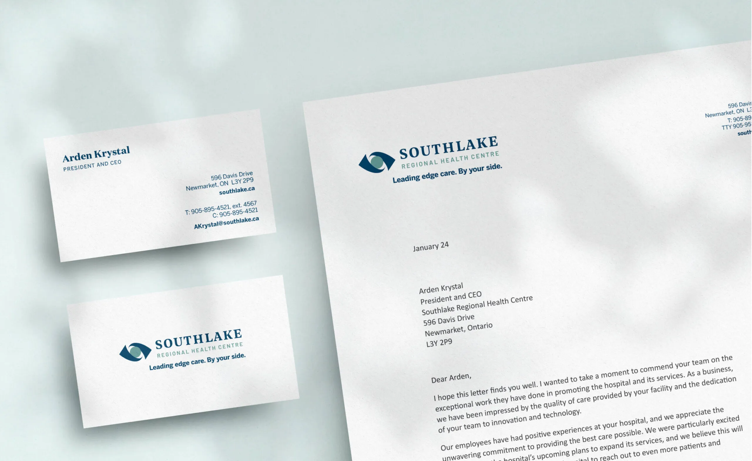
Southlake Regional Health Centre letterhead and business cards.
Business card and letterhead

Reinforcing the human element of care

Southlake’s newly launched brand experience captured the simplicity of emotional interactions and strengthened the hospital’s dedication to patient and provider care. The creative direction of the campaign reinforced the hospital’s commitment to providing outstanding care to surrounding communities.

  • 560K+ sq. ft. of hospital space
  • $500M annual operating budget
  • 400 patient beds
  • 6K people employed at hospital
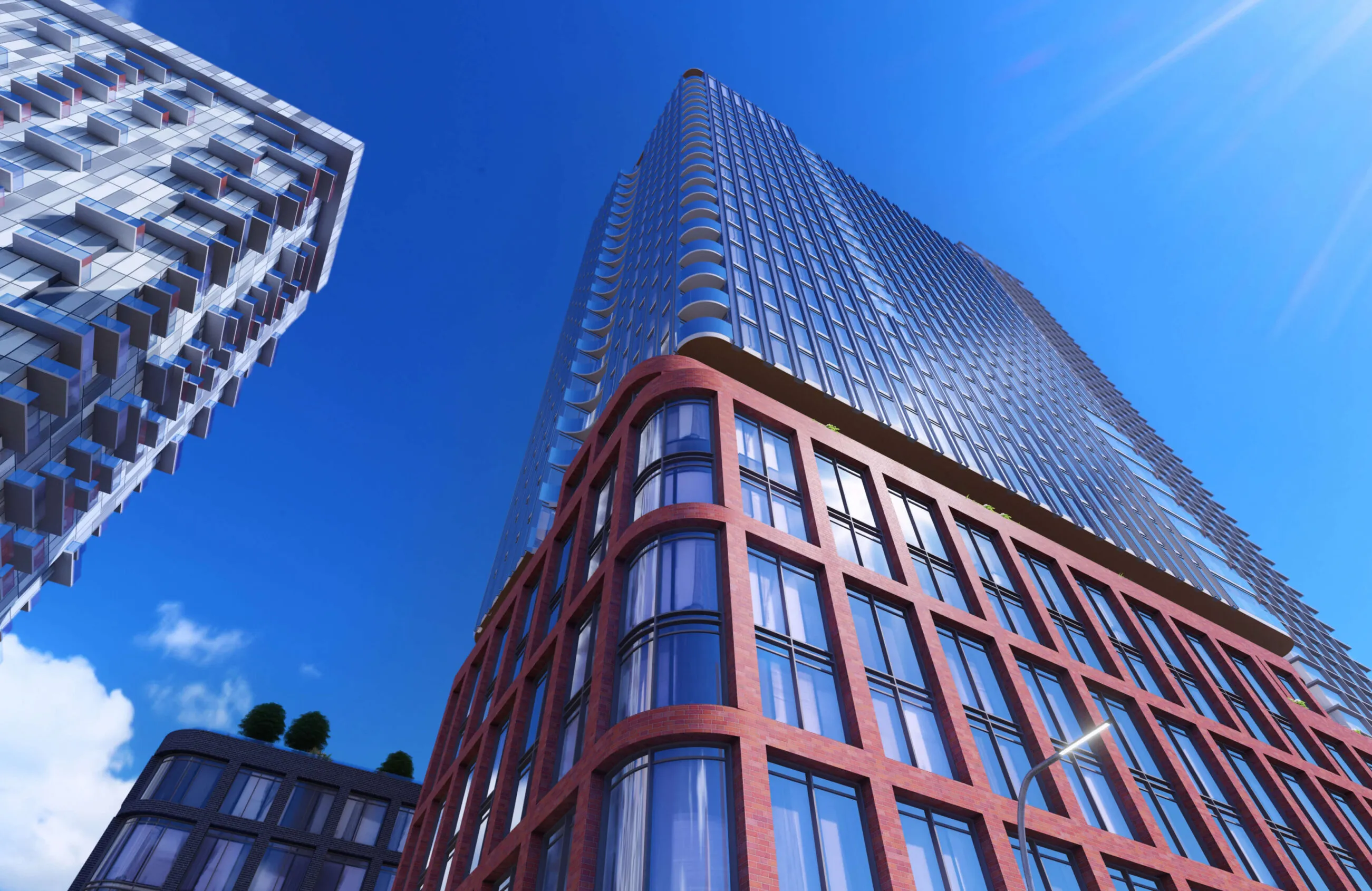
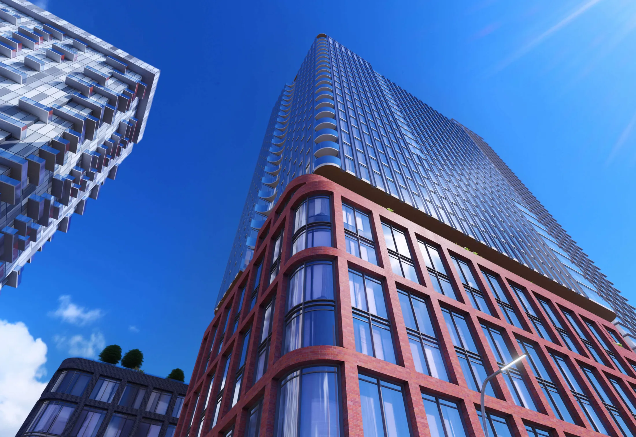
Modern glass and brick skyscrapers against a bright blue sky.

The Mews

Services Deliverables
  • Logo
  • Brand Guide
  • Stationery
  • Marketing Materials
  • Placemaking
  • Signage

Engaging the interconnectivity of people and community

The Mews is an exciting new mixed-use development located in the east end of Toronto’s downtown core, designed and developed by Fitzrovia Real Estate and Hariri Pontarini Architects. Offering more than a place to live, this development features residential, retail and outdoor spaces connected through numerous pathways. The team at Fitzrovia aimed to name, brand and position this memorable community as a trendy destination for both residents and tourists while elevating the surrounding neighbourhood of Toronto’s Queen Street East.

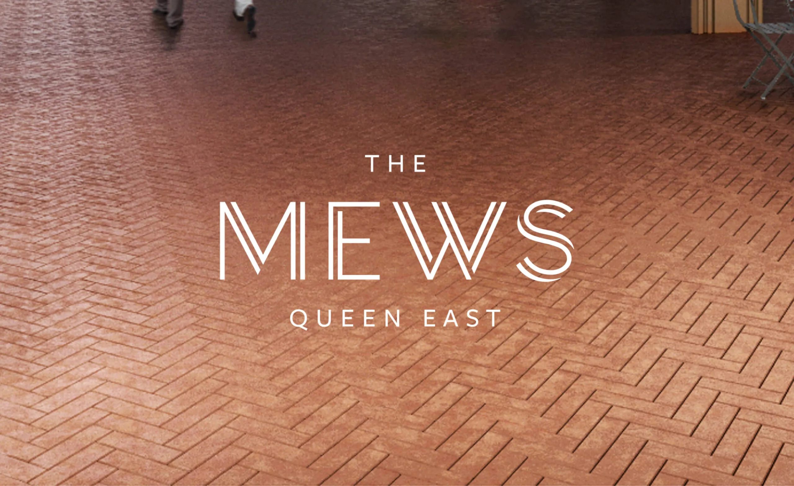
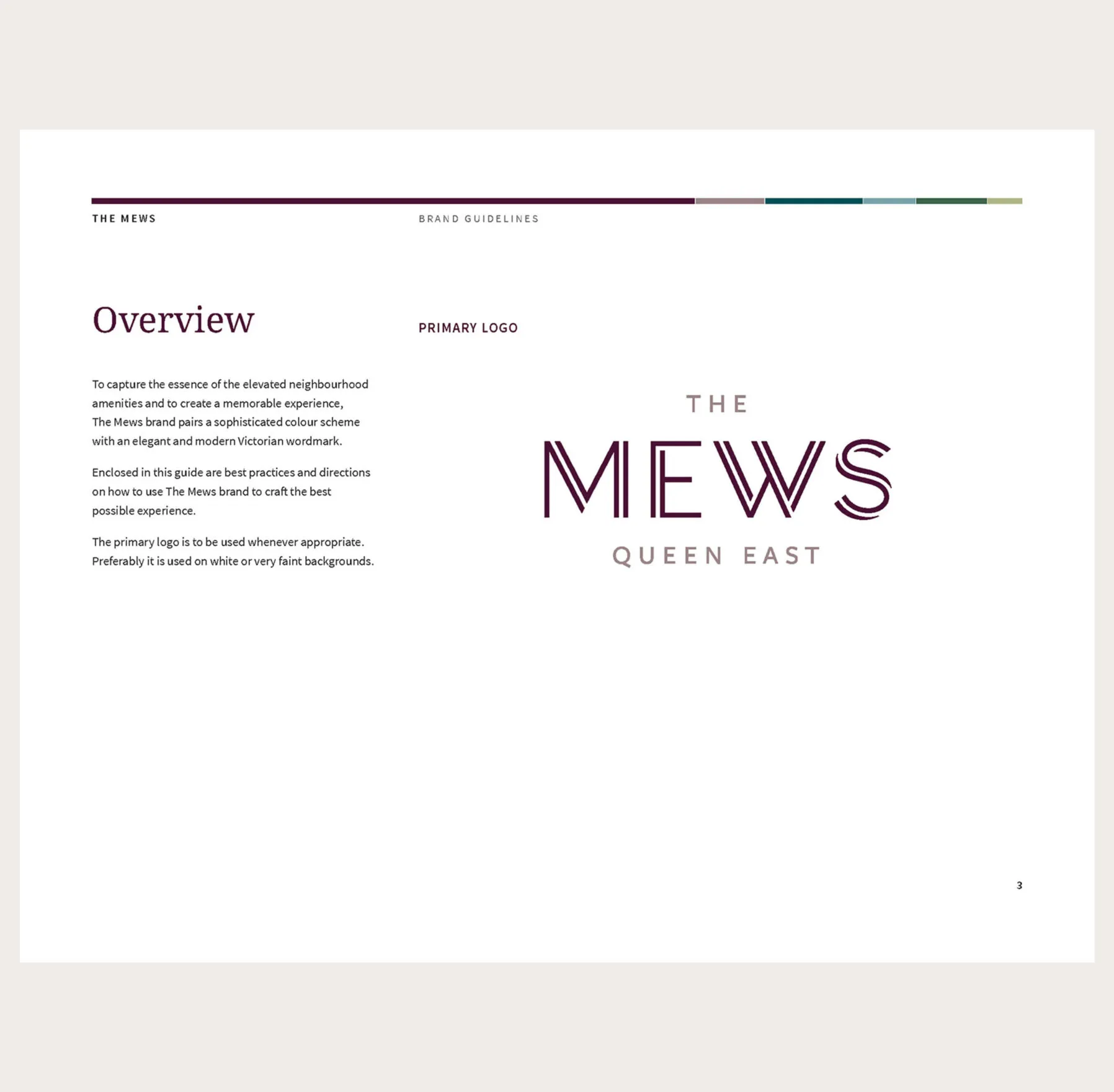
The Mews Queen East logo on a brick patterned background.
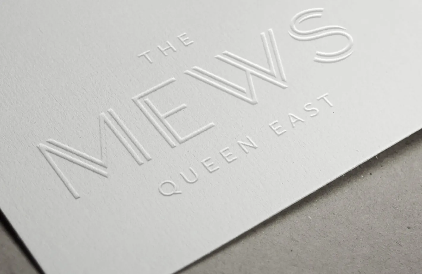
Logo design inspired by herringbone courtyard flooring
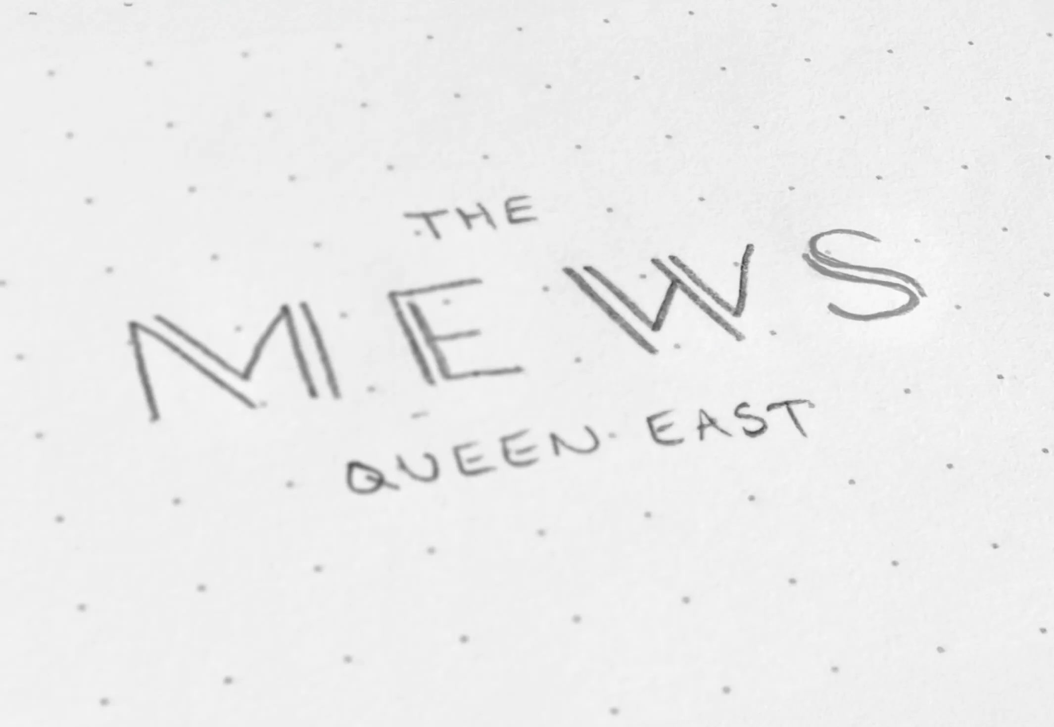
A preliminary logo sketch for The Mews
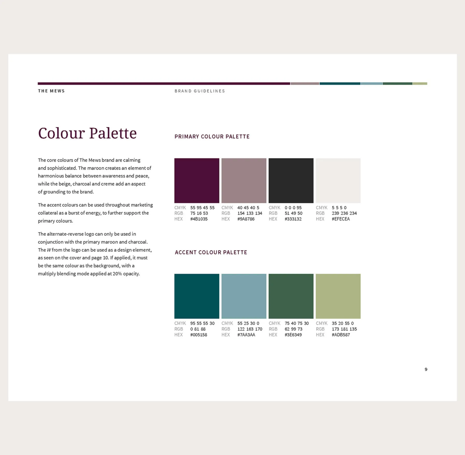
A vertical colour palette with stripes of deep plum, muted taupe, teal, slate blue, forest green and pale olive.
Preliminary sketch and organic colour palette
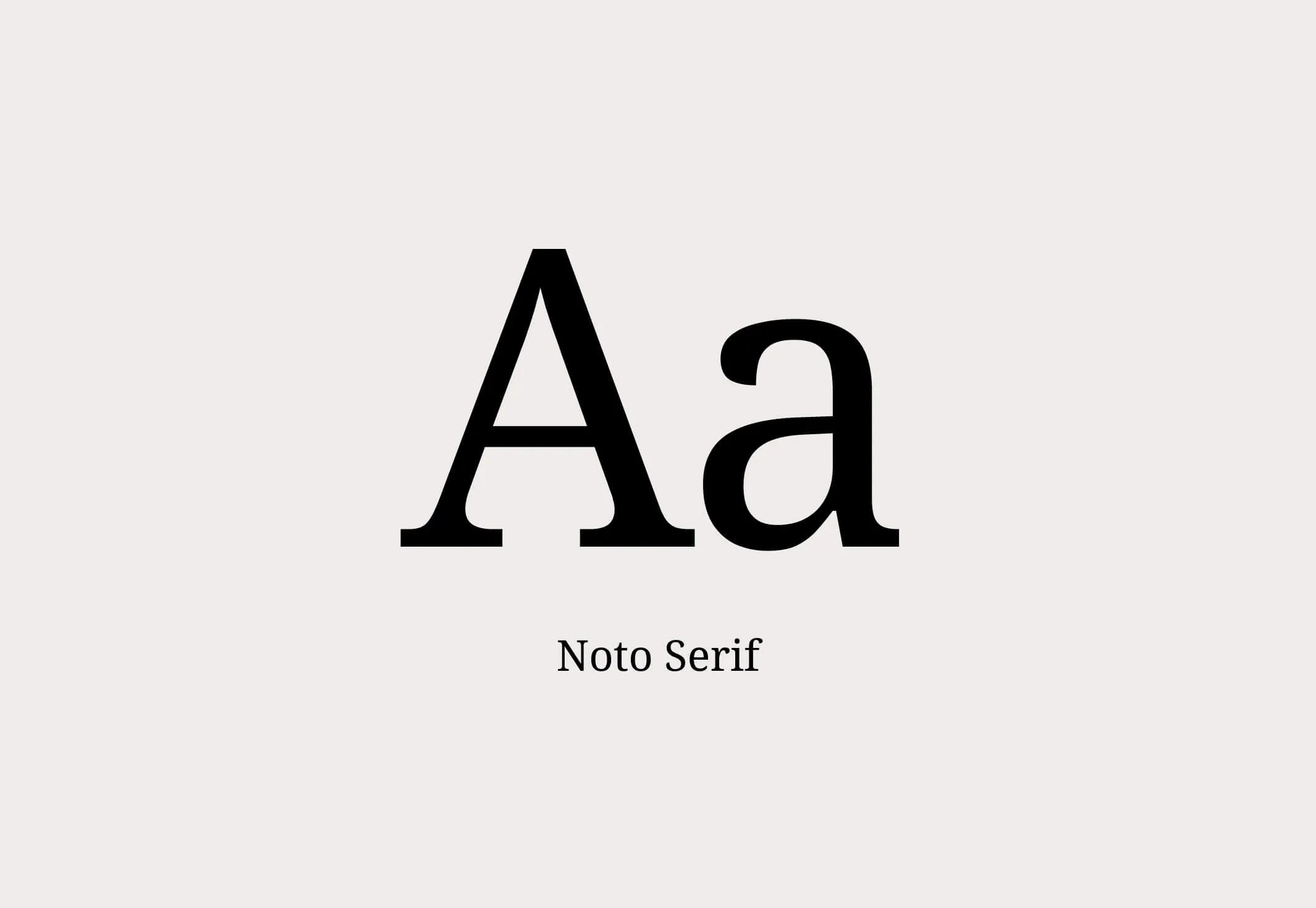
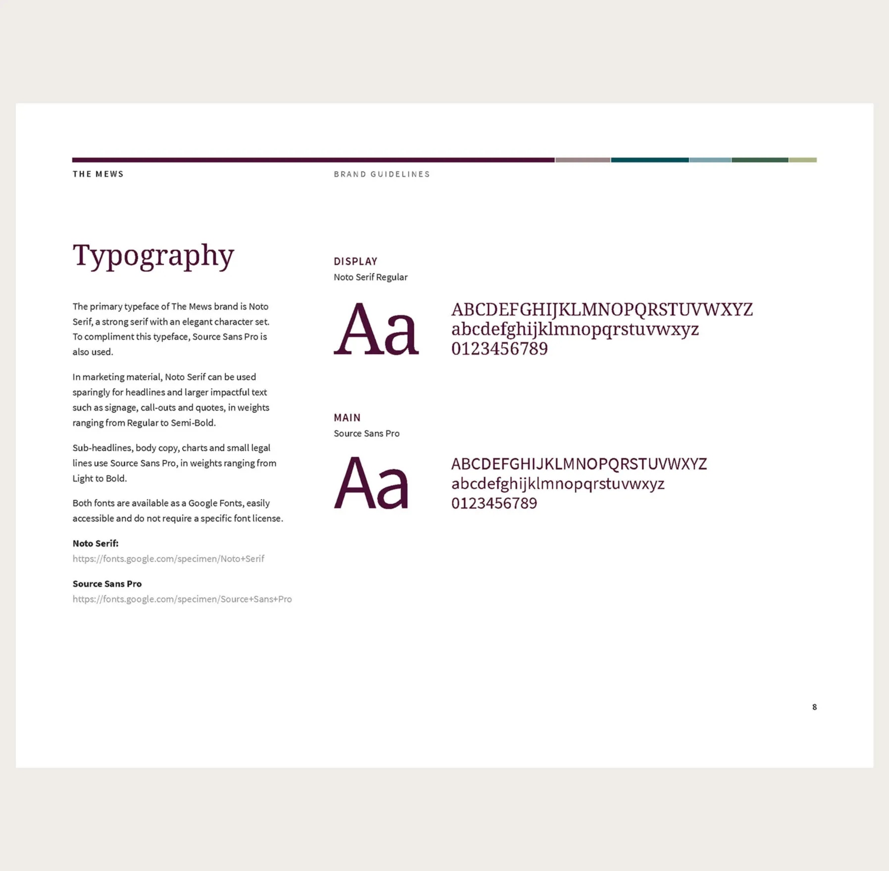
Noto Serif font sample showing uppercase and lowercase A.
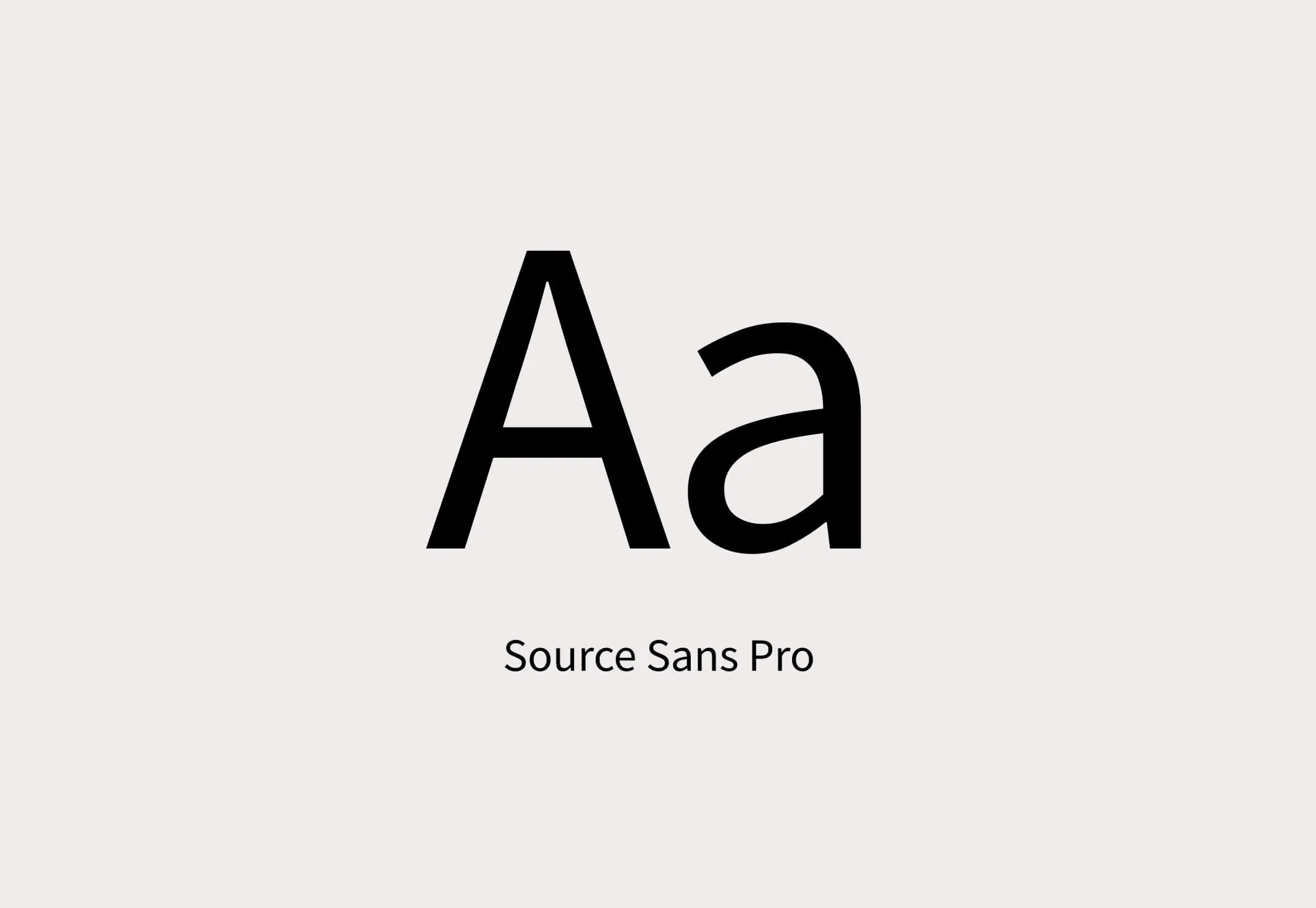
Source Sans Pro font with uppercase and lowercase A.
Typography to support custom logo font

Merging classic with contemporary

At the outset of the project, Forge worked with Fitzrovia to understand the desired feeling of the brand, ensuring this essence translated seamlessly to the name and visual interpretation of the development’s identity. The selected name, The Mews, reflects the European-style pedestrian pathways once lined with carriage houses or stables.

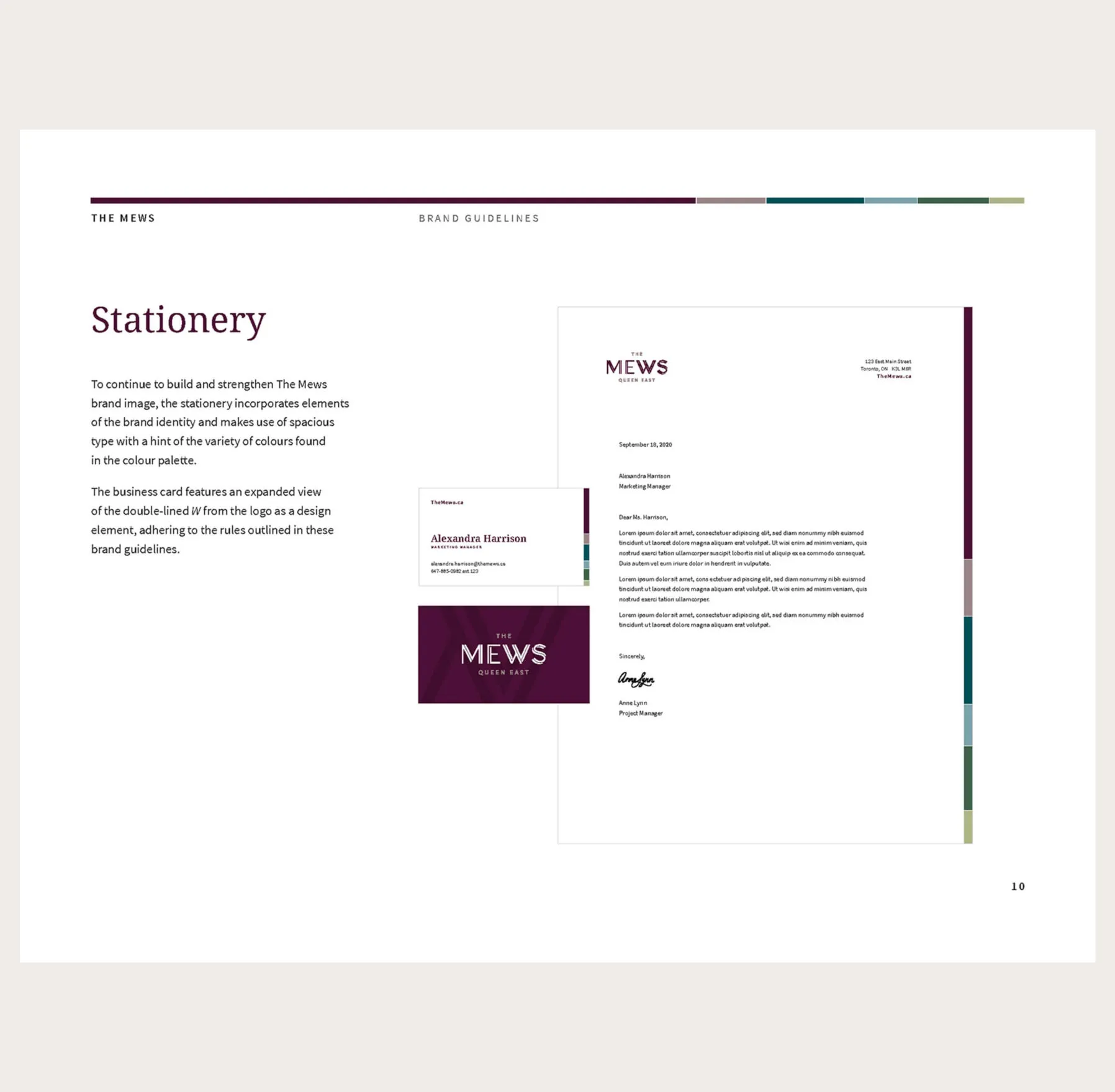
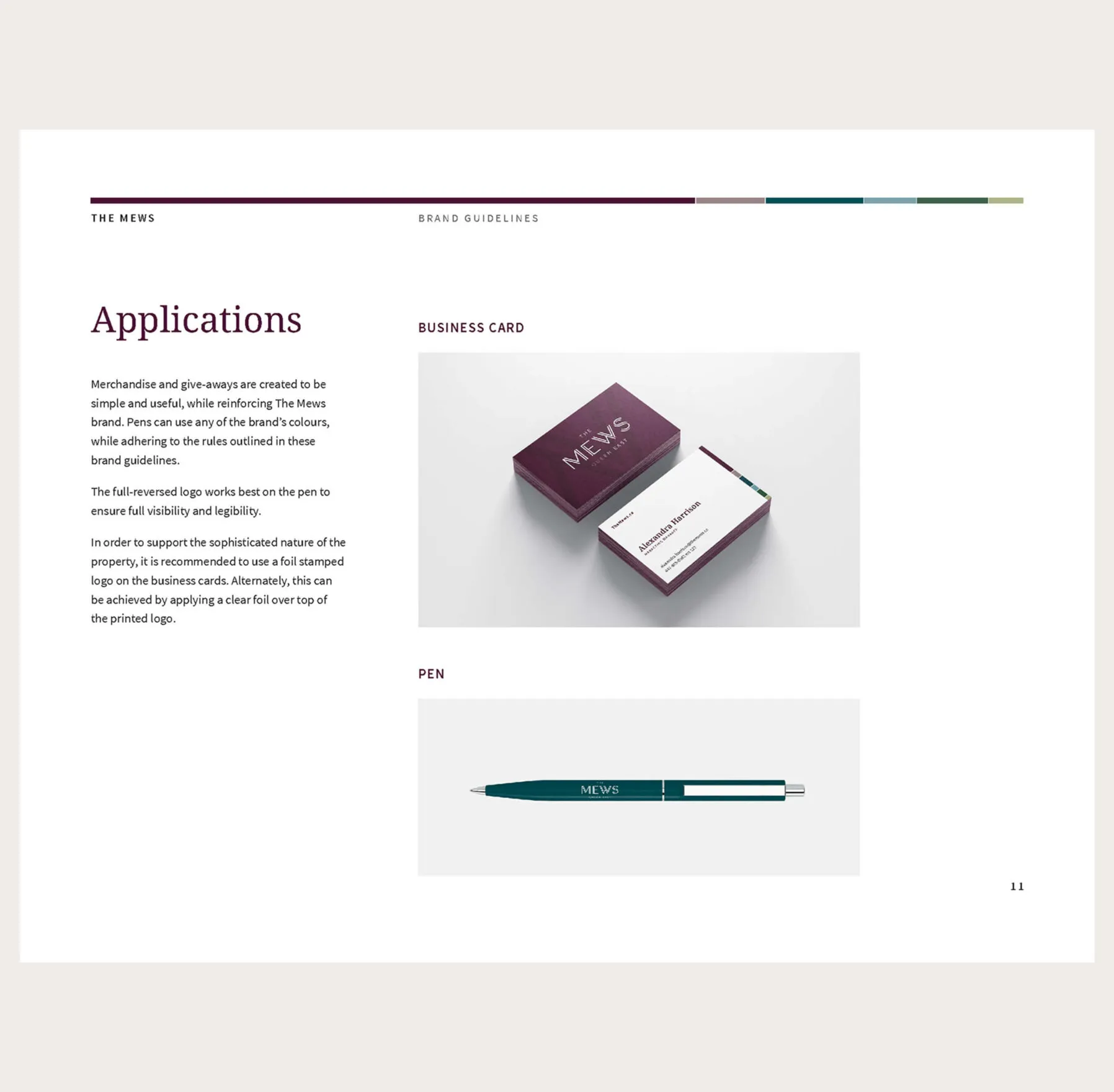
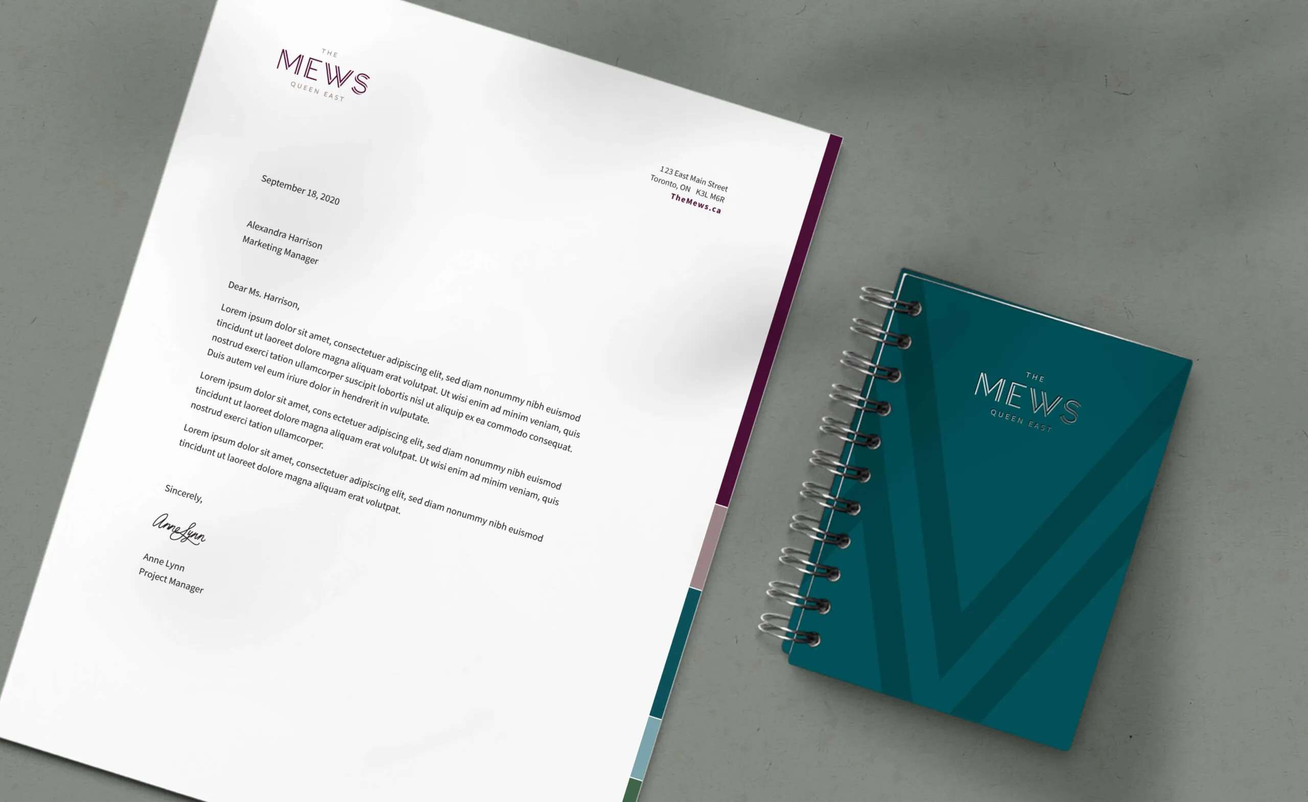
Letterhead and notebook with The Mews Queen East logo
Stationery and promotional material design
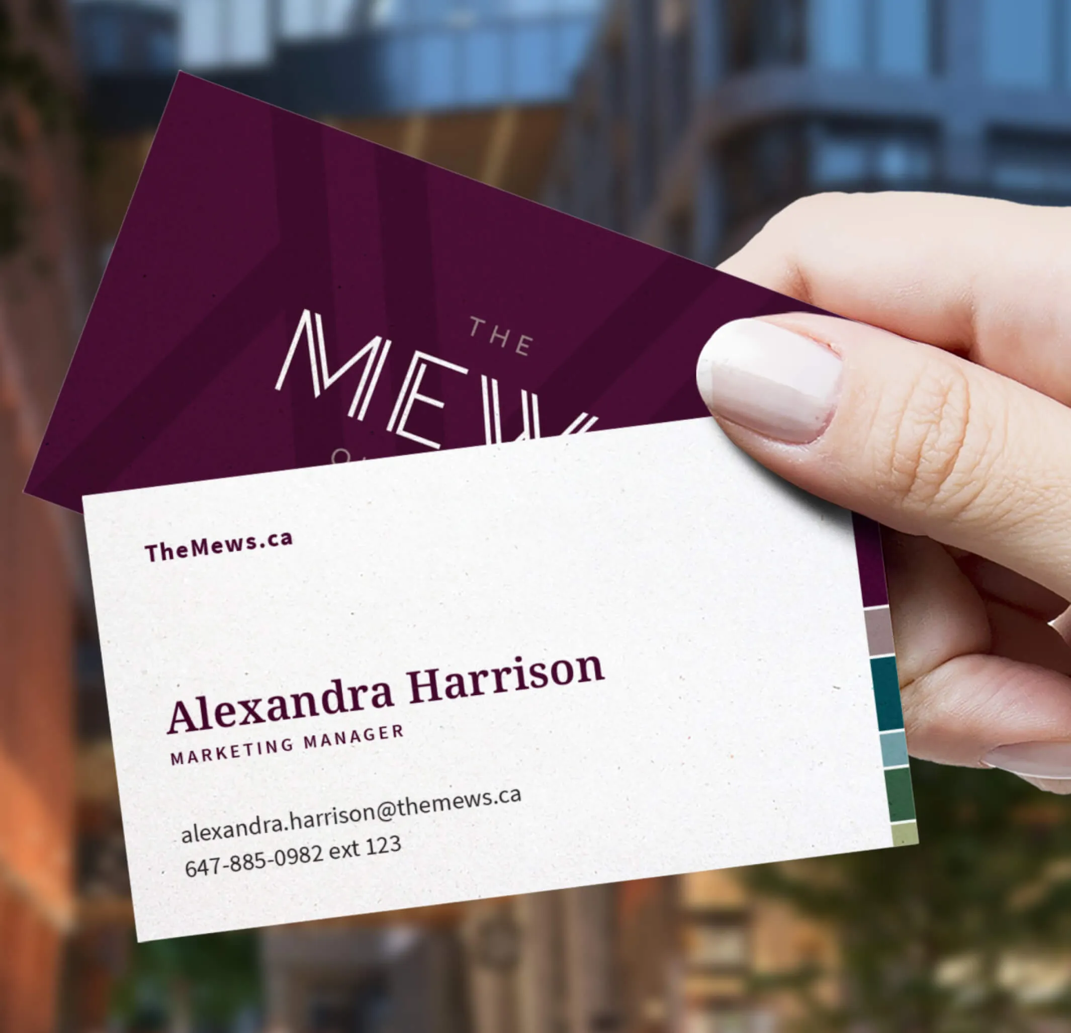
Business card for Alexandra Harrison, Marketing Manager at The Mews.
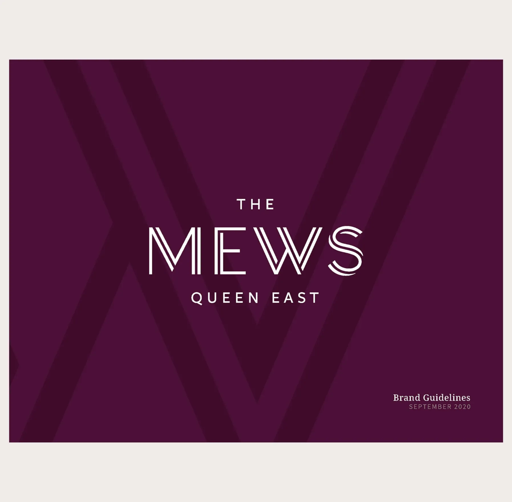
The Mews Queen East logo