This website uses cookies.

West Lincoln Memorial Hospital

Grimsby, ON
Services Deliverables
  • Signage
  • Wayfinding
  • Masterplan
  • Placemaking
  • Donor Recognition

A vision of care with a local community feel

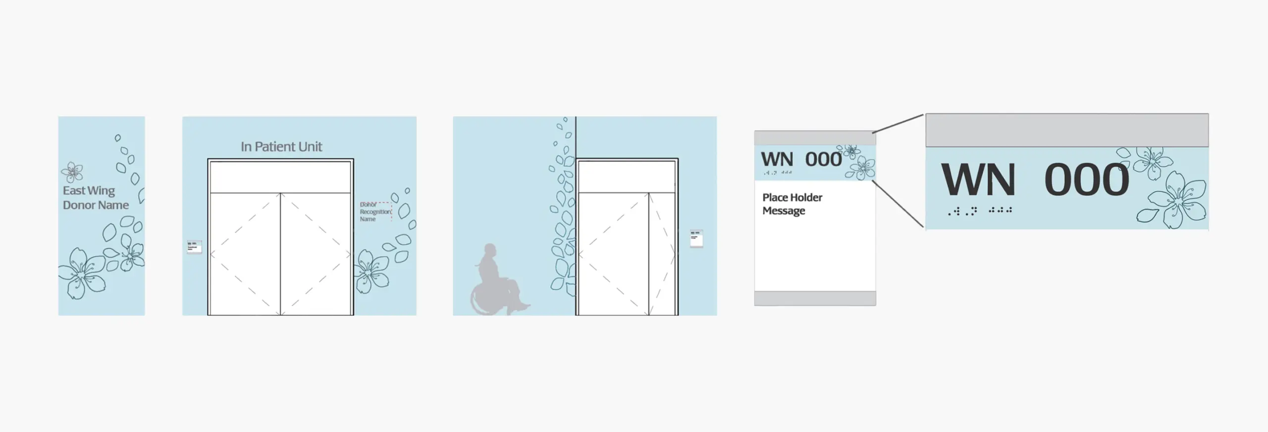
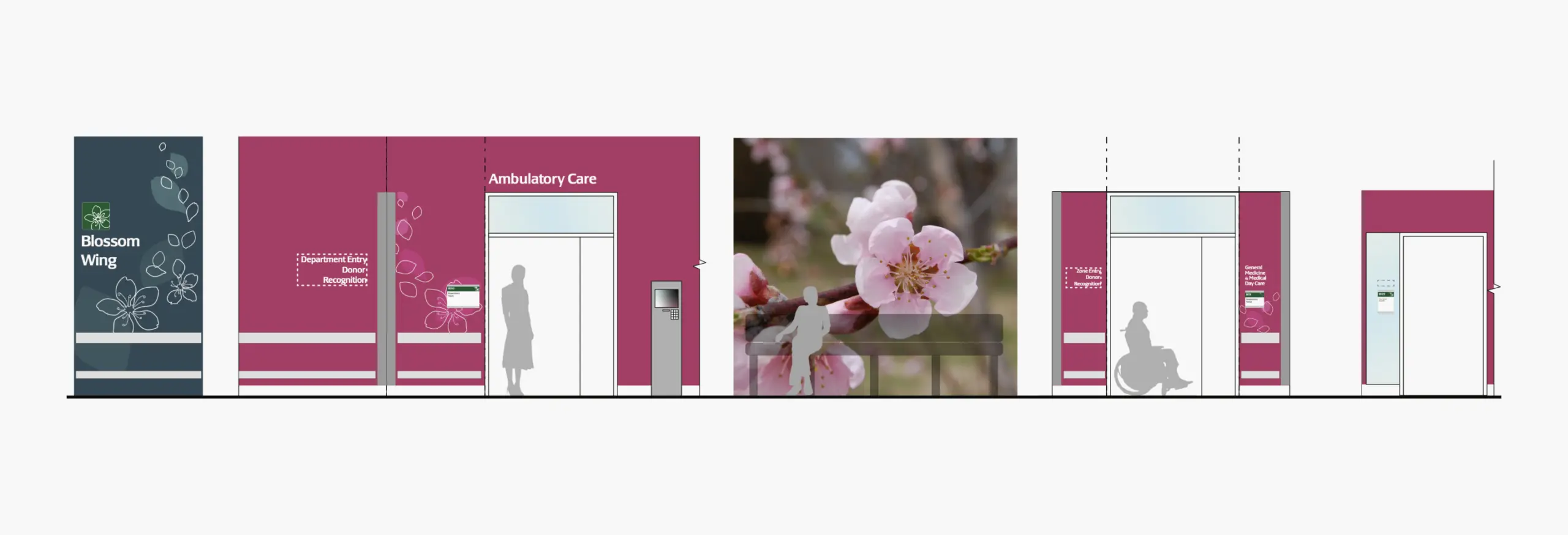
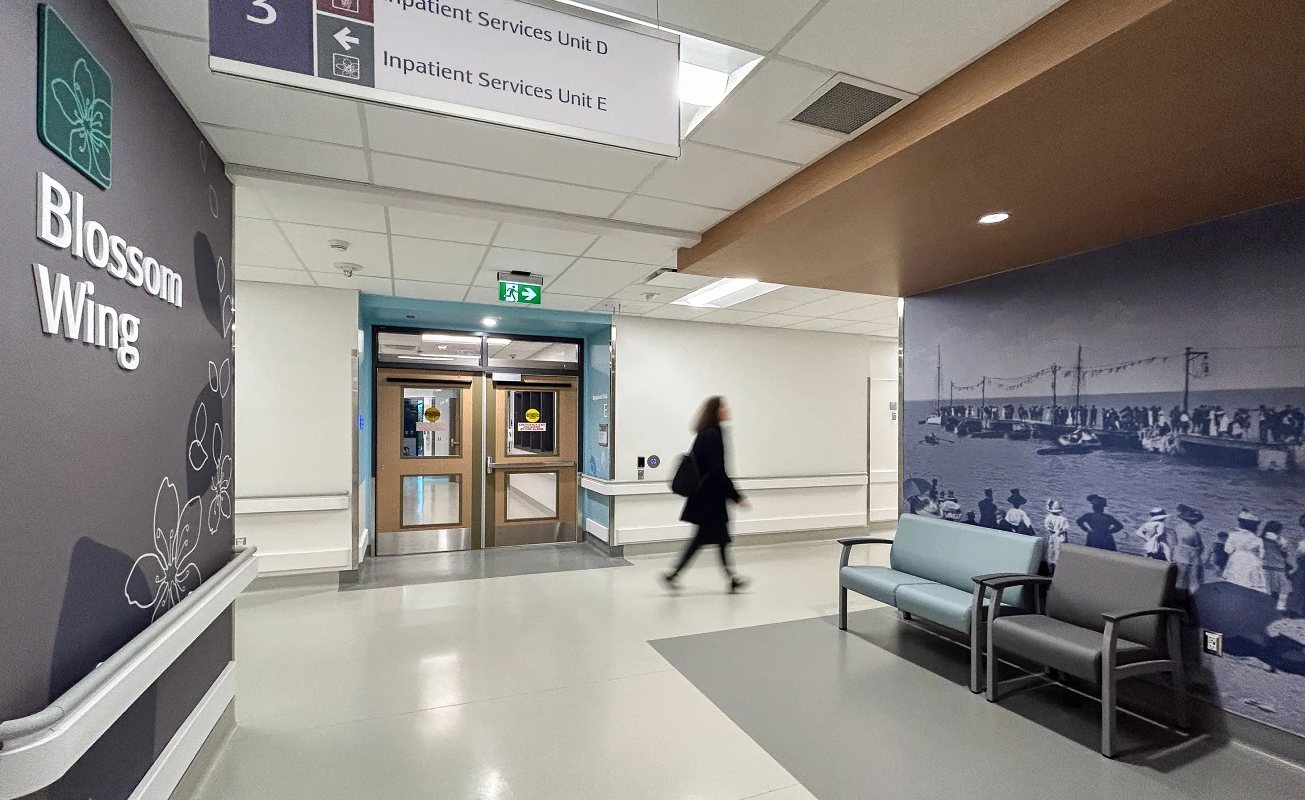
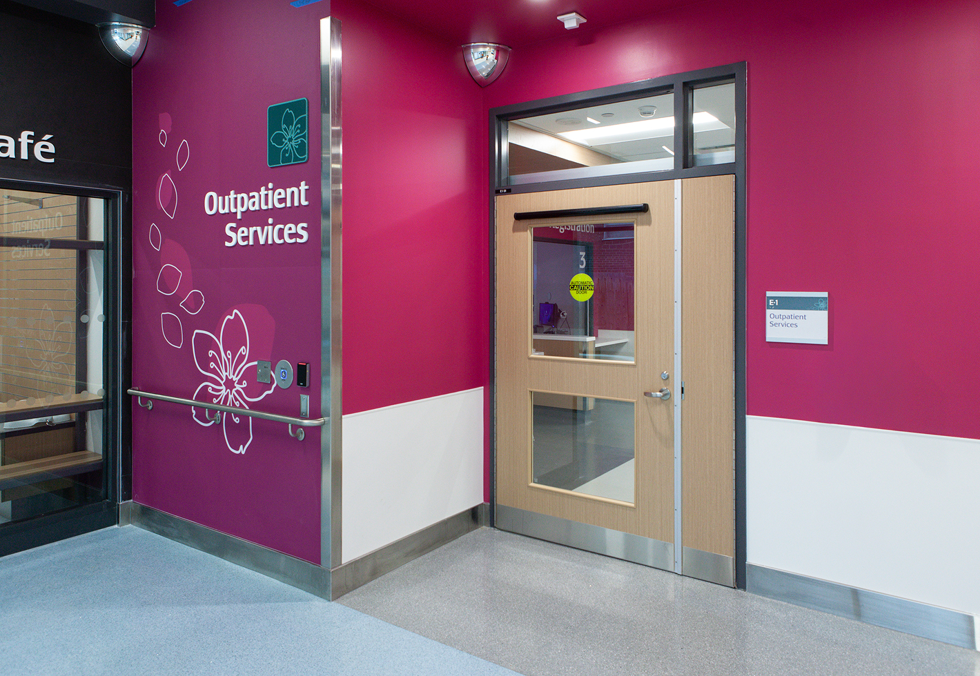
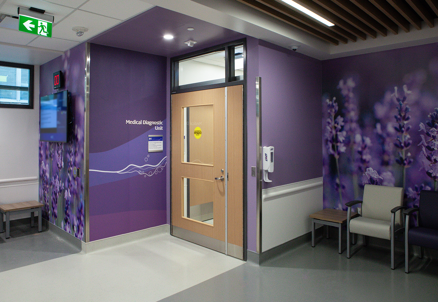
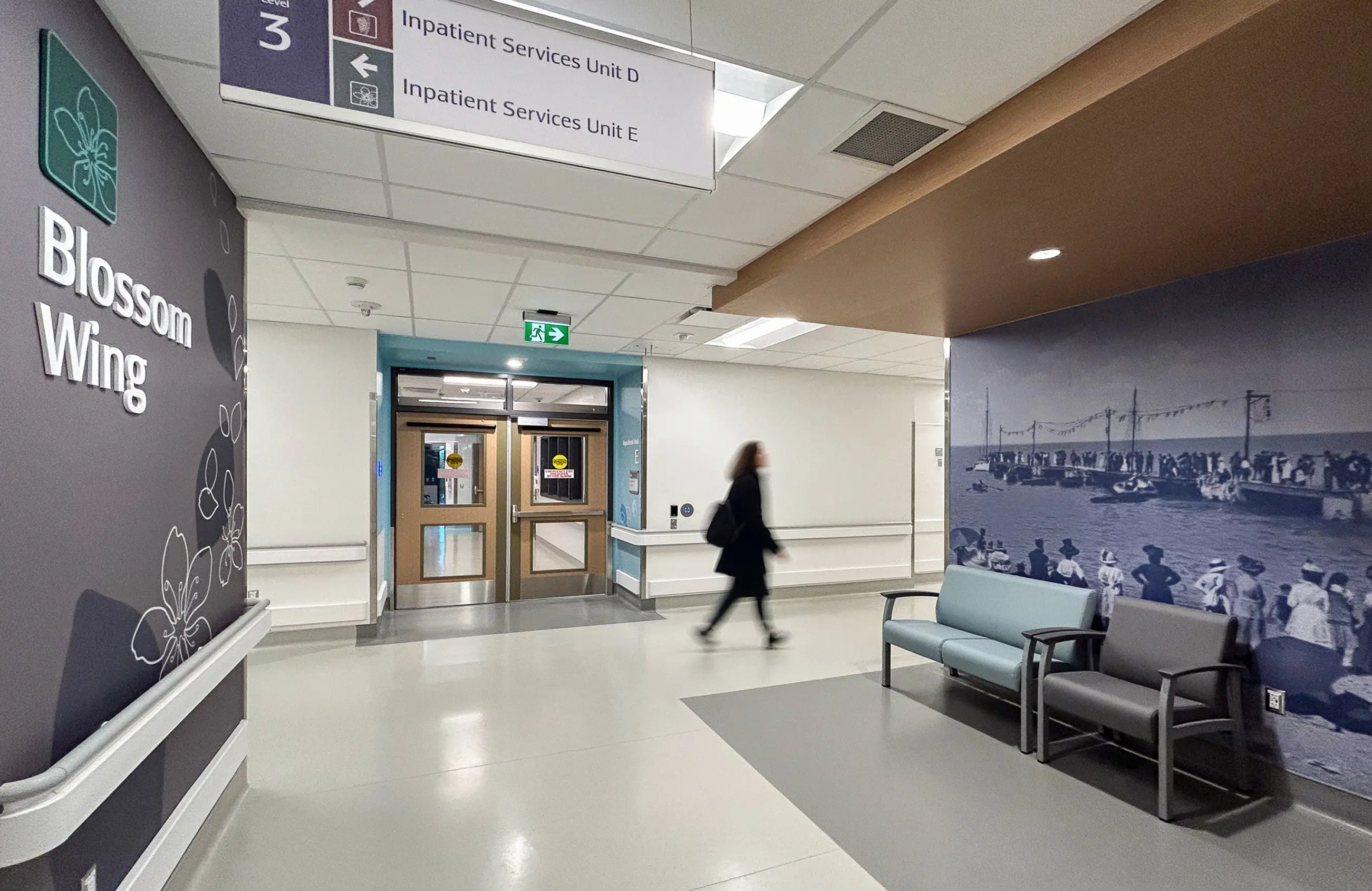
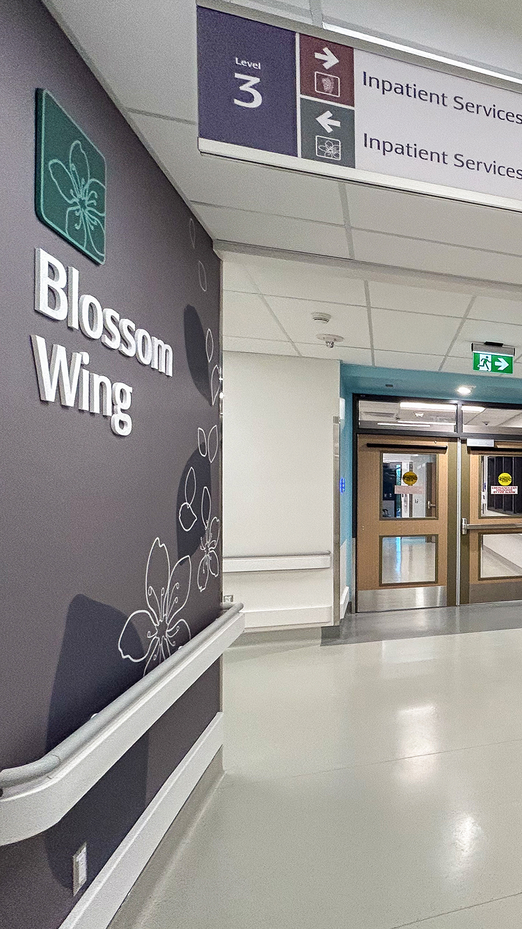
West Lincoln Memorial Hospital (WLMH) has a long and proud history in the community of Grimsby, Ontario. The redevelopment sought to ensure this building reflected the community and its history. Forge worked with the hospital to develop an experiential narrative theme through use of local biophilic theming and historic image placemaking. This approach became the framework for a wayfinding masterplan that integrated Hamilton Health Sciences Corporation (HHSC) standards for signage.

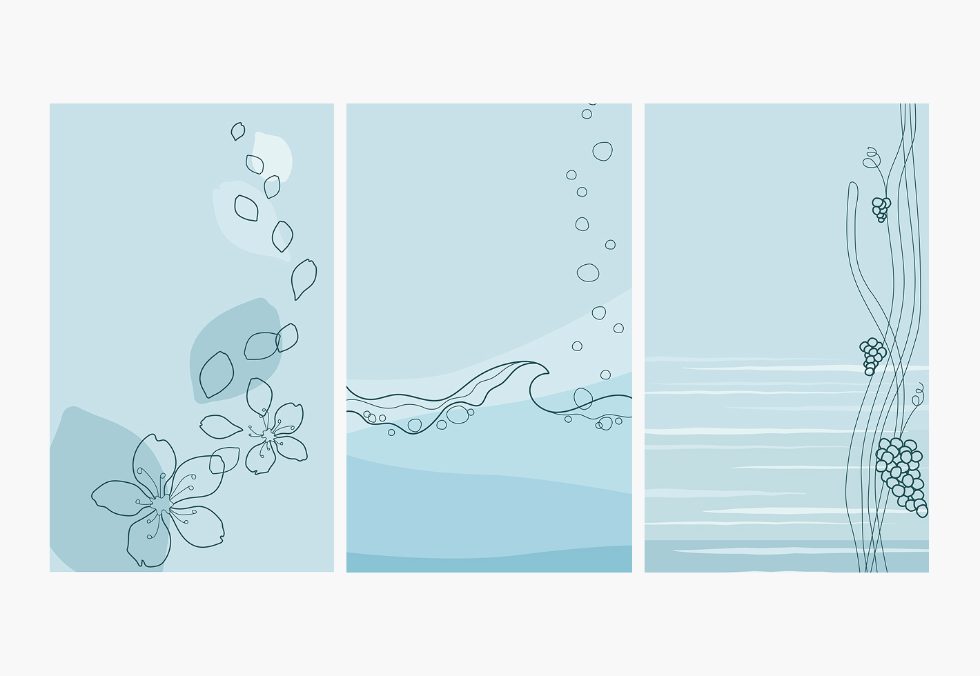
Initial wing-theming and planning
Wing-themed graphic development
Development of patient experience through typical journey
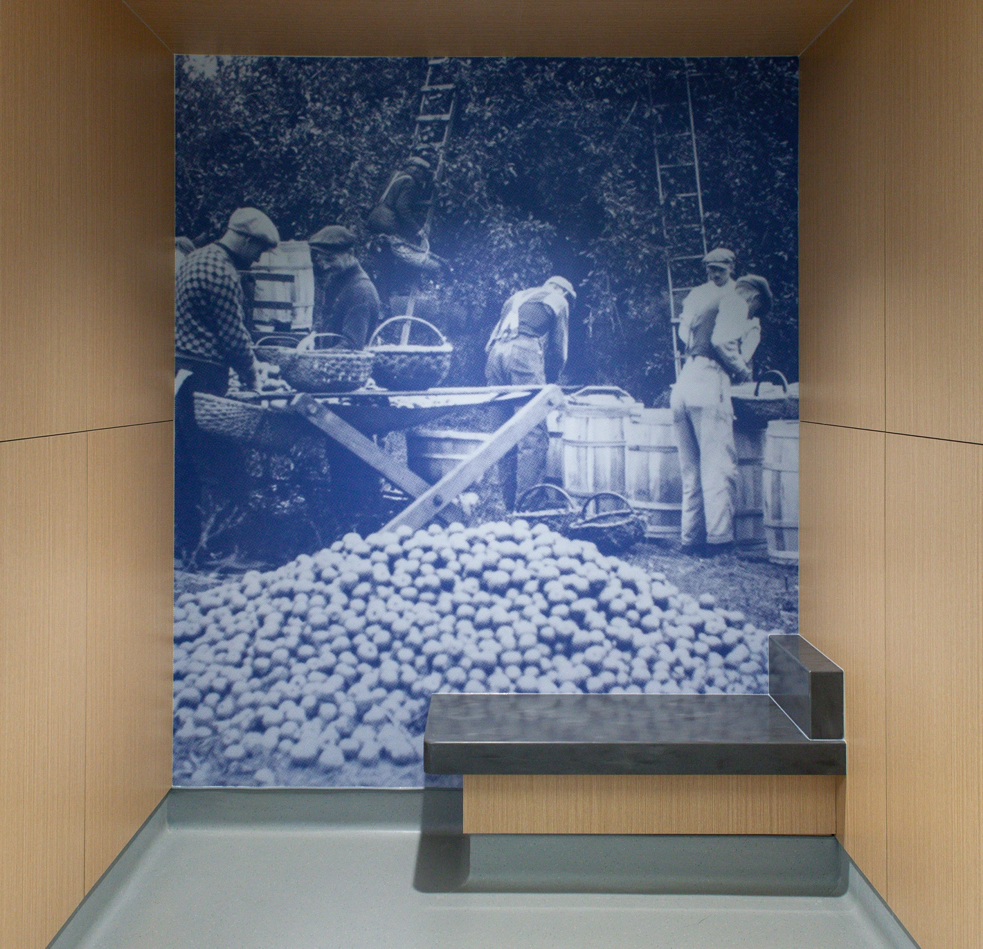
Placemaking establishes transitions of space and also provides an area of rest
Place distinction through colour and image
Images tell the story of Grimsby

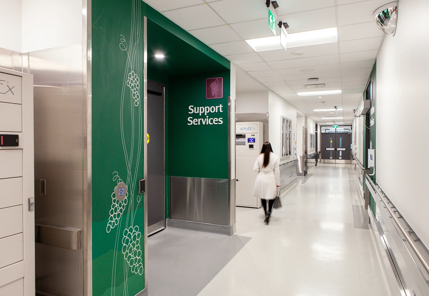
Story, architecture and wayfinding working together

Delivering a high density of integrated graphics within a compact, modern hospital setting required navigating complex spatial constraints. We bridged these complexities through an iterative development process. By facilitating close workshops with the hospital team, end users and the architectural team, we translated the client’s unique identity and history into a cohesive, authentic visual language that resonates throughout the facility.
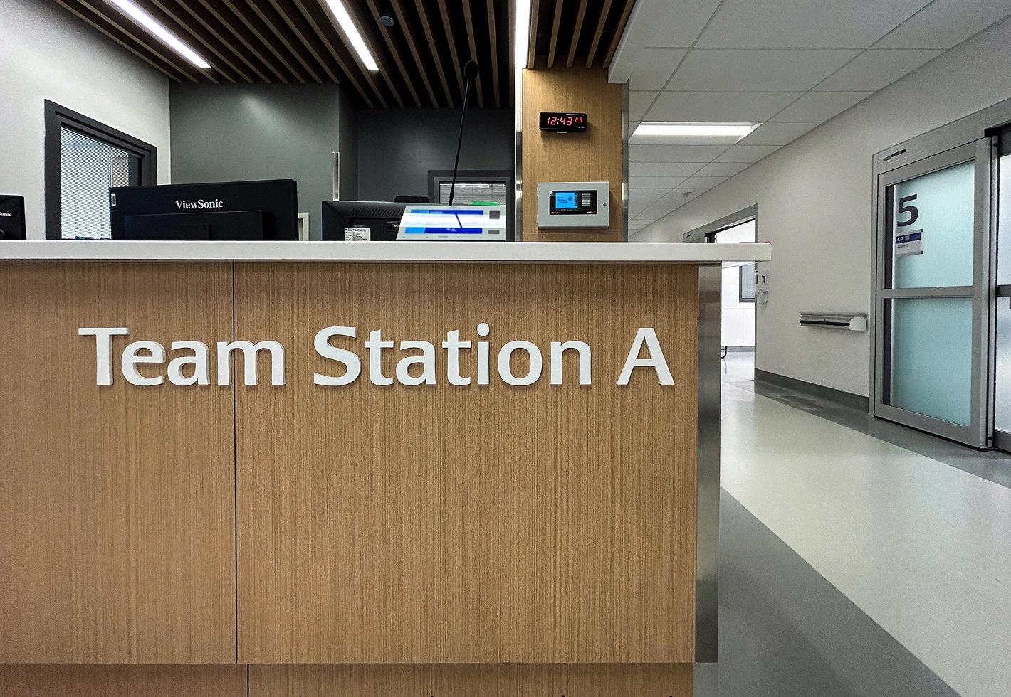
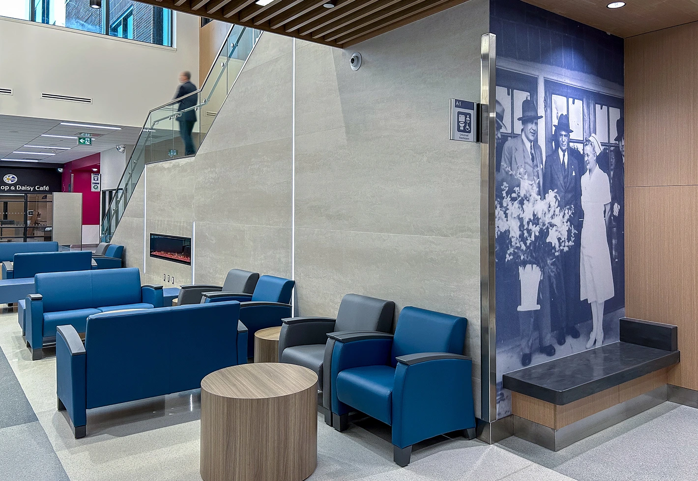
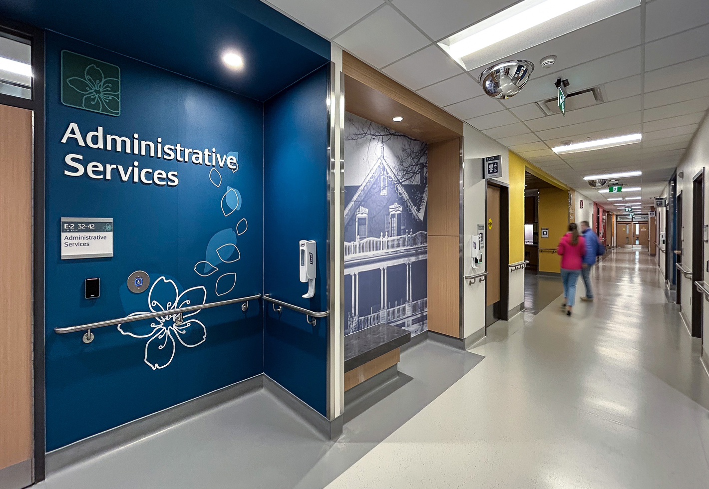
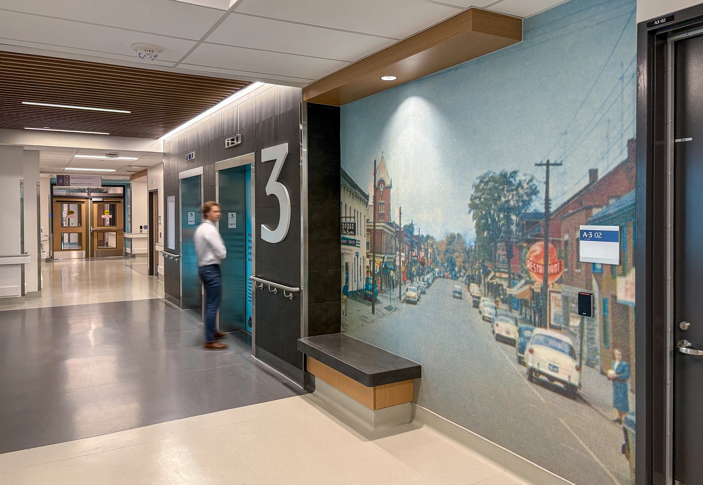
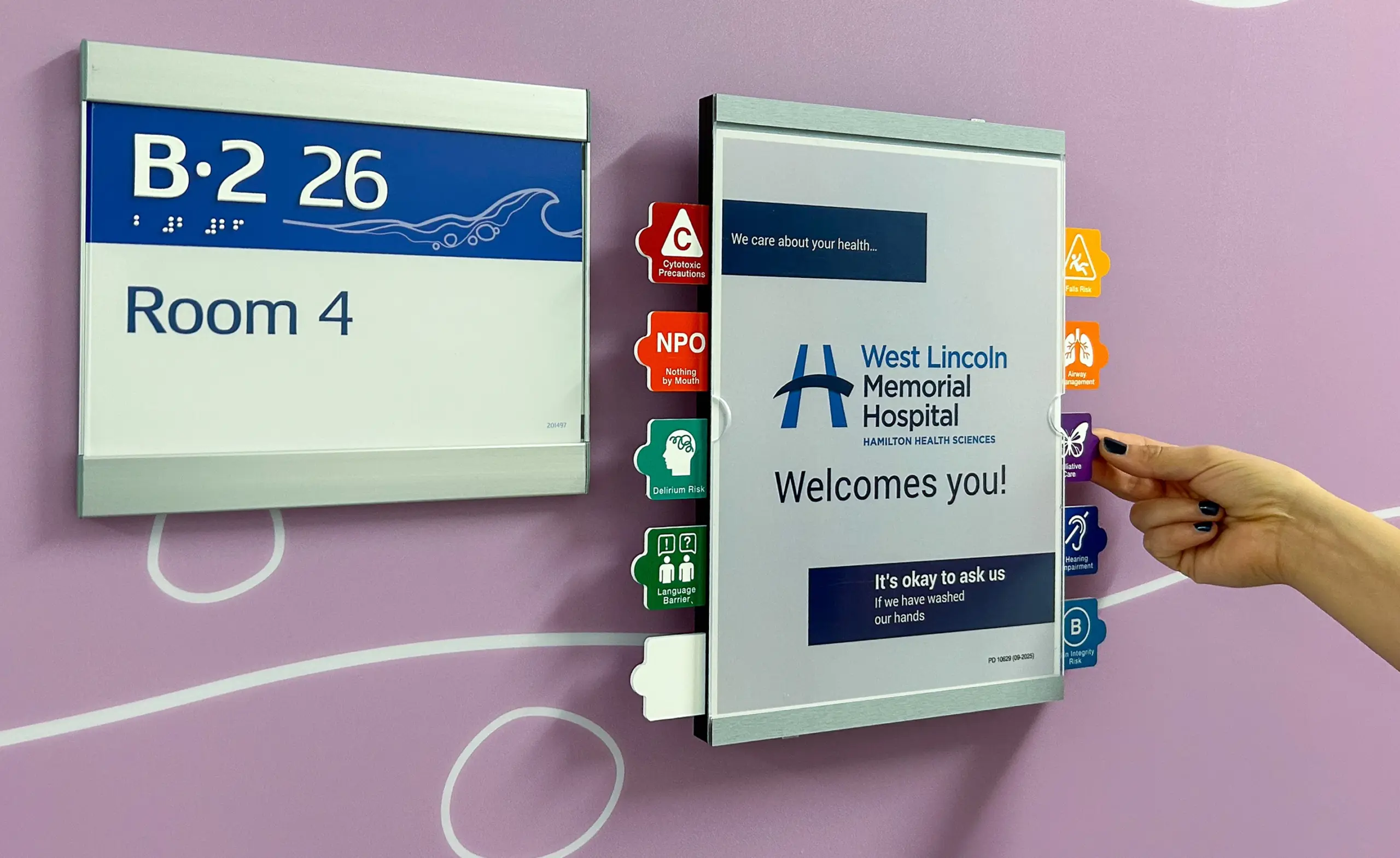
Integrated signage at a staff station and treatment room, and historic imagery to provide a restful pause moment
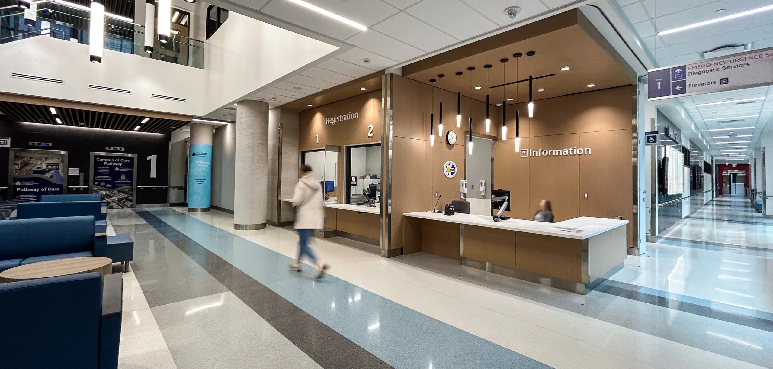
Signage and placemaking creates a welcoming and functional lobby experience
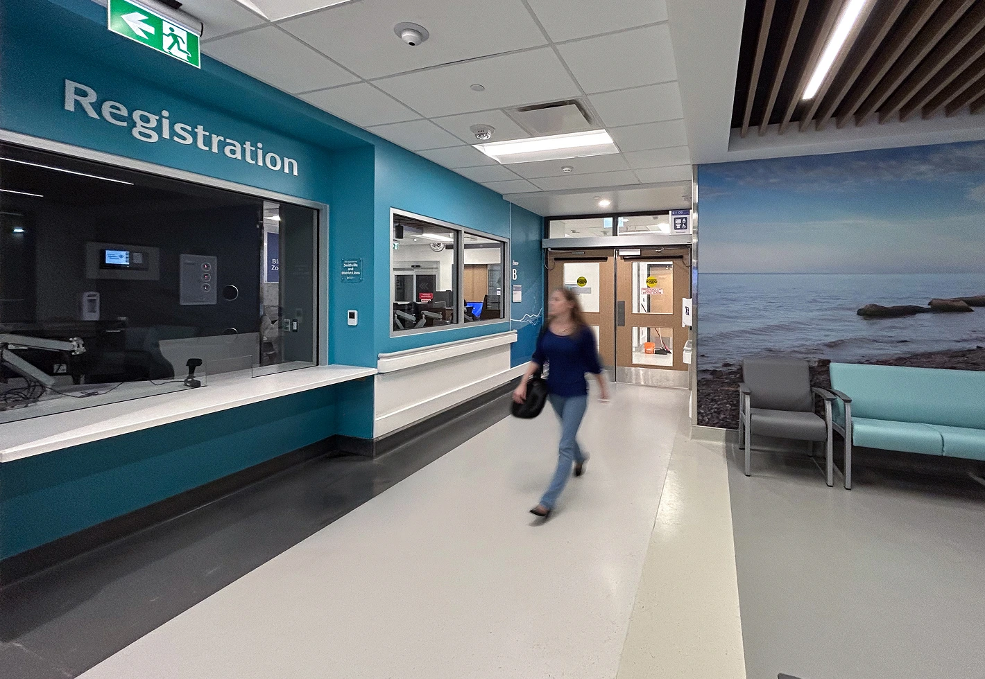
High-stress areas benefit from careful use of biophilic (nature) activation, while murals serve as both visual enhancements and memorable landmarks for navigation

A holistic wayfinding masterplan

Our approach to creating a highly intuitive wayfinding experience for staff, patients and visitors also involved the development of static signage to meet the needs of people of all abilities. Using hospital standards as a guide, Forge crafted a robust sign program and identified where distinct information was needed for the new facility. This included designing signs with a sensibility of messaging and icons in specific cases for both staff and public.
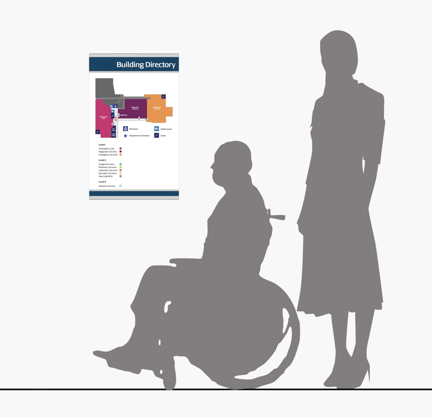
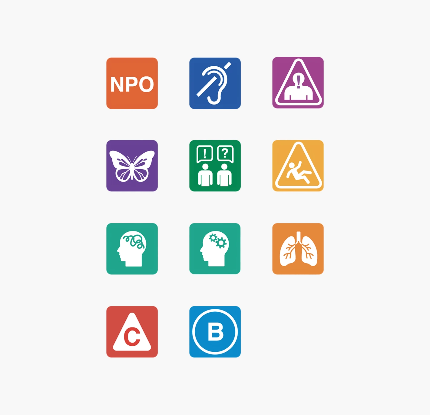
Initial public signage and staff icon developments
Accessible signage serves the needs of staff and public, while also being highly adaptable for day-to-day patient care

A joyous celebration of life

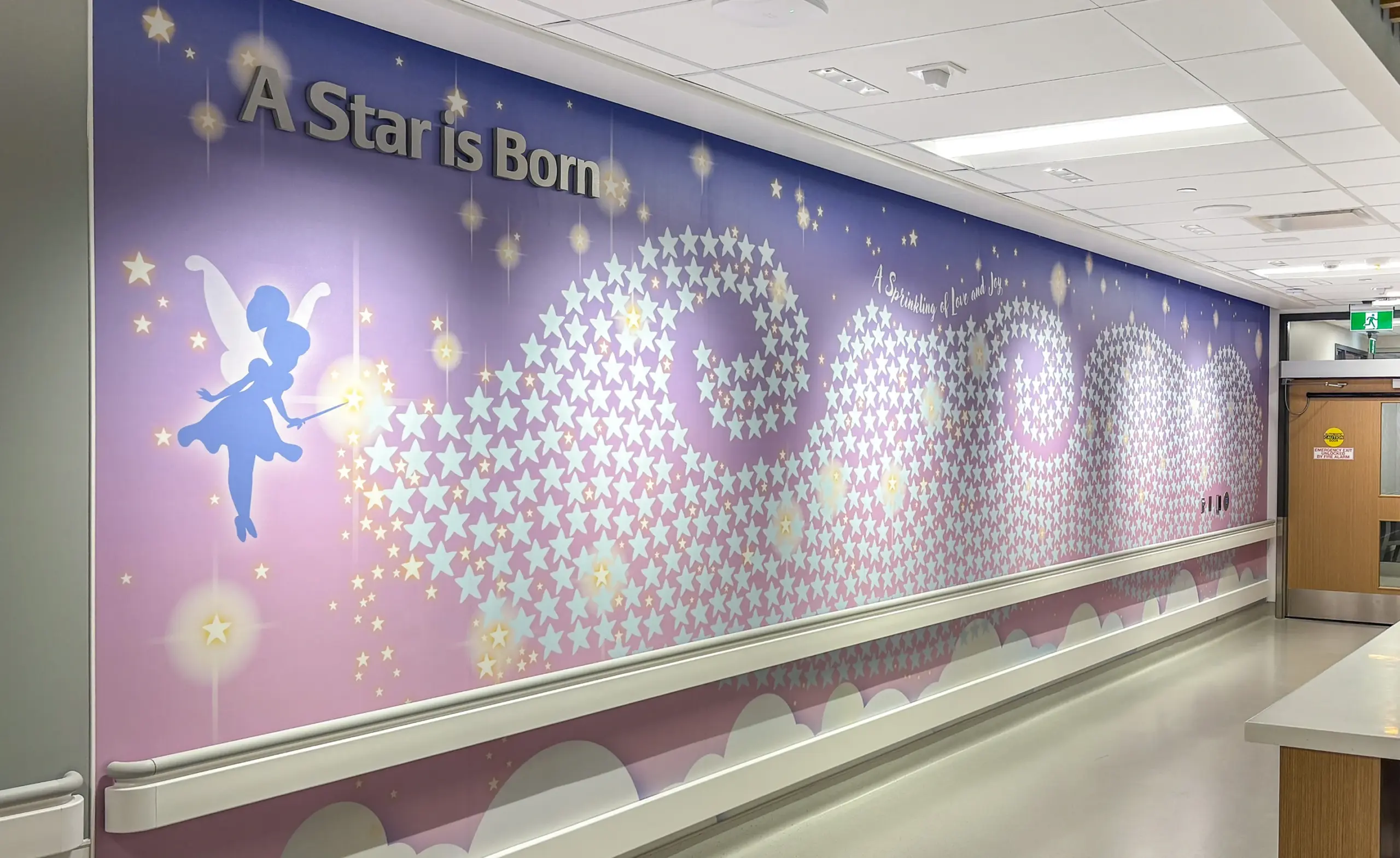
Part of the WLMH hospital experience is creating opportunities for the community to celebrate moments of joy. Working closely with the hospital foundation team, Forge developed a themed baby wall to help ensure new parents and staff can enjoy a shared place of connection. The ‘A Star is Born’ wall was developed with the intent for future application of newborn names as applied stars. The initial single lobby location was expanded to include a larger location inside the department.
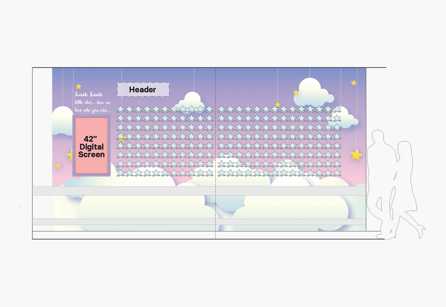
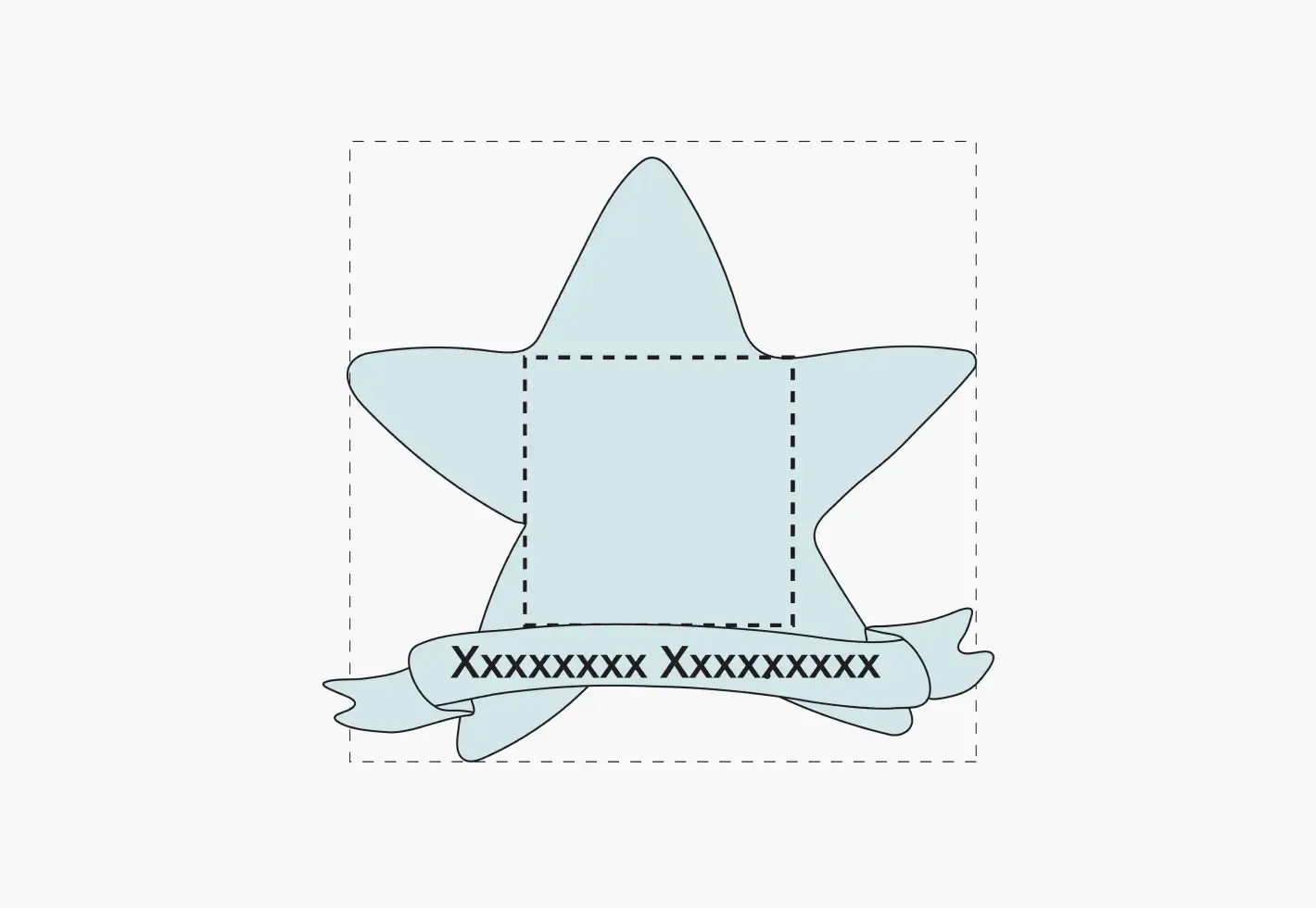
Initial graphic and baby name plaque development
The entry experience for Obstetrics opens an opportunity for community building with applied newborn names, while also making for a joyful gateway walk
  • 3 storeys
  • 5K+ square metres
  • 61 beds
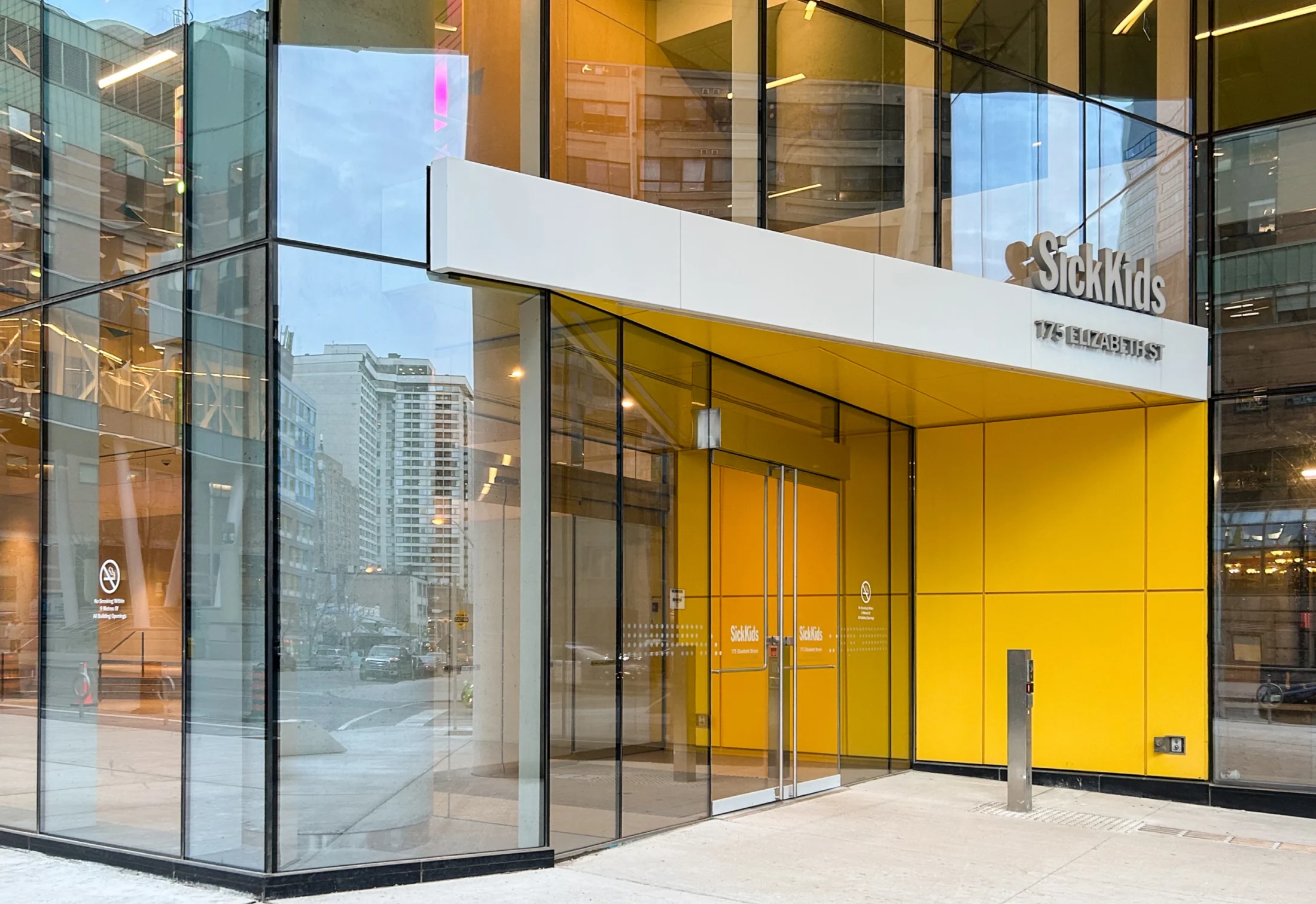
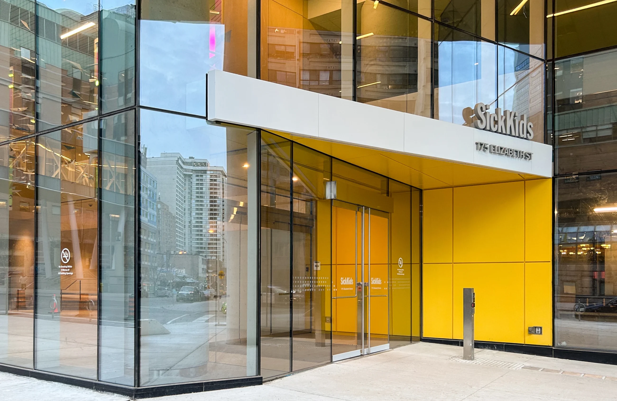
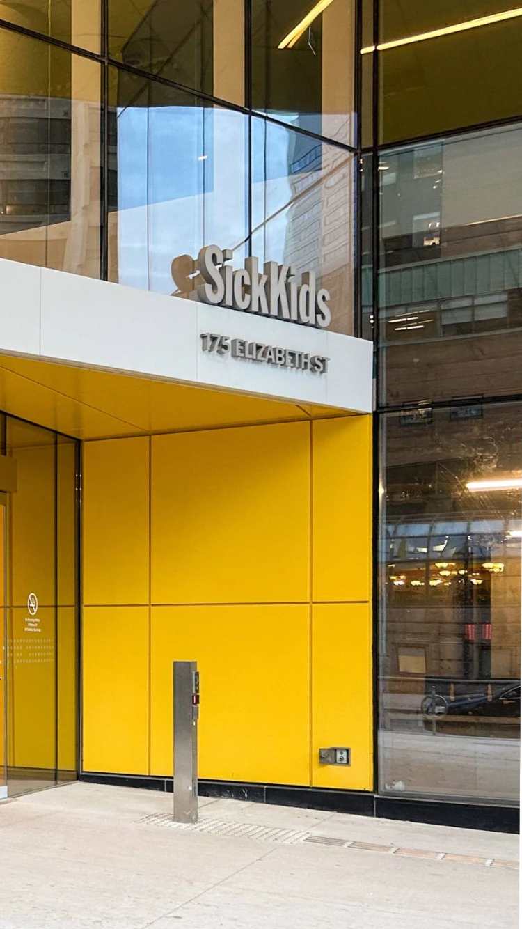
SickKids hospital entrance at 175 Elizabeth Street with yellow accents. SickKids logo and building entrance at 175 Elizabeth Street.

The Hospital for Sick Children

Toronto, ON
Services Deliverables
  • Wayfinding
  • Signage
  • Placemaking
  • Masterplan

A connected hub for collaboration, education and research

Designed as a hub for virtual care, collaboration, education, research and events—the new Patient Support Centre at The Hospital for Sick Children (SickKids) is a space that fosters innovation. In keeping with SickKids values, this ambitious new space meant developing an experience which expresses a feeling of welcome and support. Forge was invited by B+H Architects to create a wayfinding masterplan that ensured visitor peace of mind, while creating a distinct sense of place and community connectedness for staff and visitors.

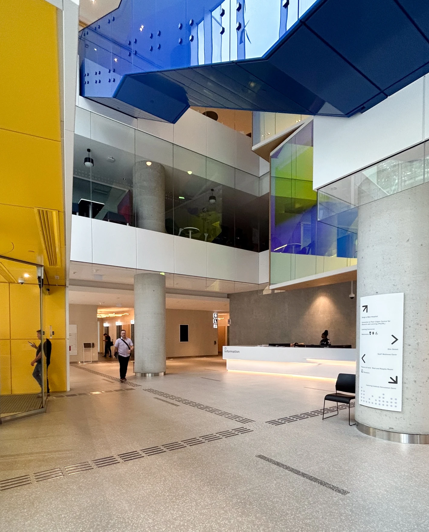
Modern hospital lobby with yellow and blue accents, a reception desk, and people walking.
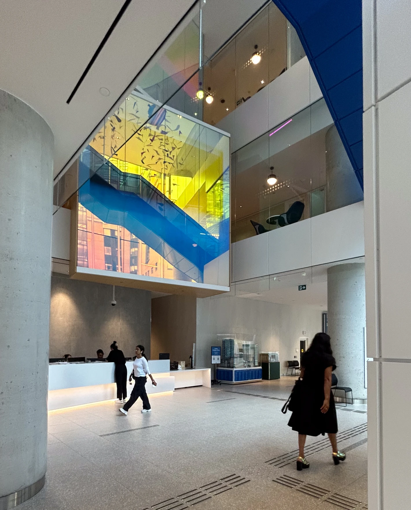
Modern interior with colourful glass staircase and people walking.
A vibrant lobby experience with colour accents visible at ground level

Intuitive wayfinding through purposeful placemaking

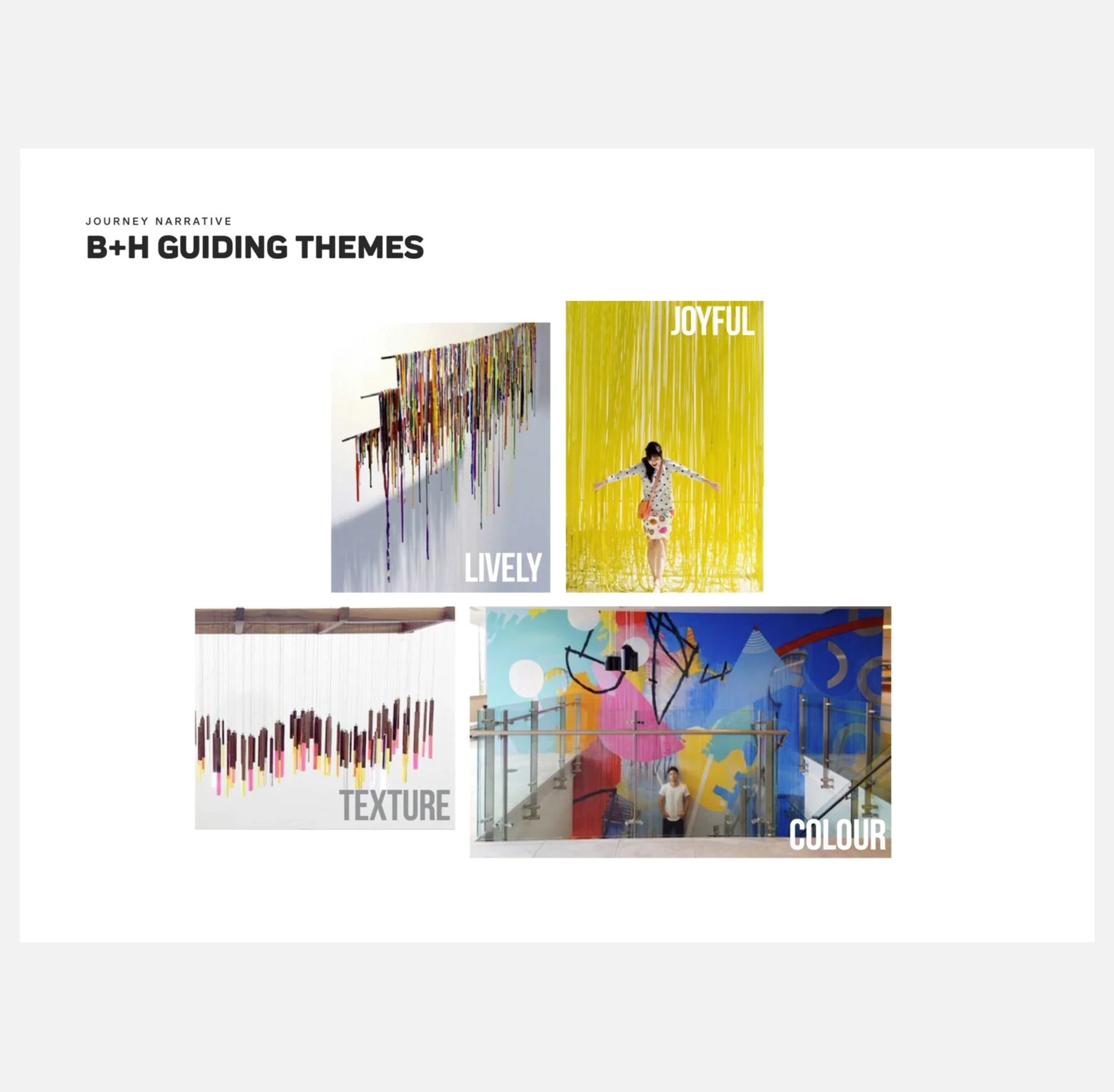
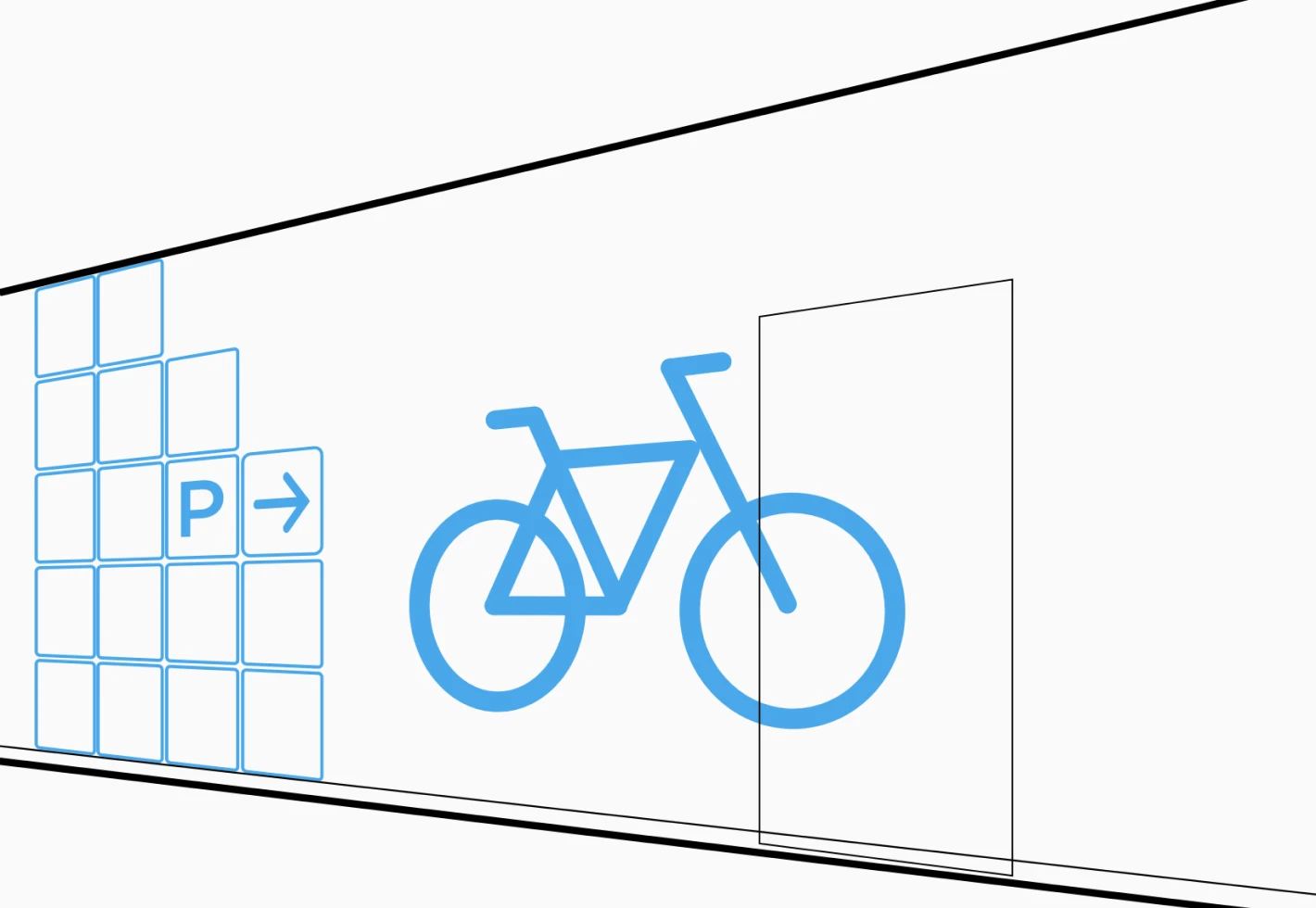
Forge began its masterplanning of the wayfinding journey through careful consideration of the voices that space and place concerns; namely kids. Ensuring an intuitive experience throughout all spaces meant collaborating with relevant groups to create a themed journey narrative. Our wayfinding approach also prioritizes intuitive paths of circulation through the use of placemaking.

Blue bicycle icon next to a parking sign with an arrow
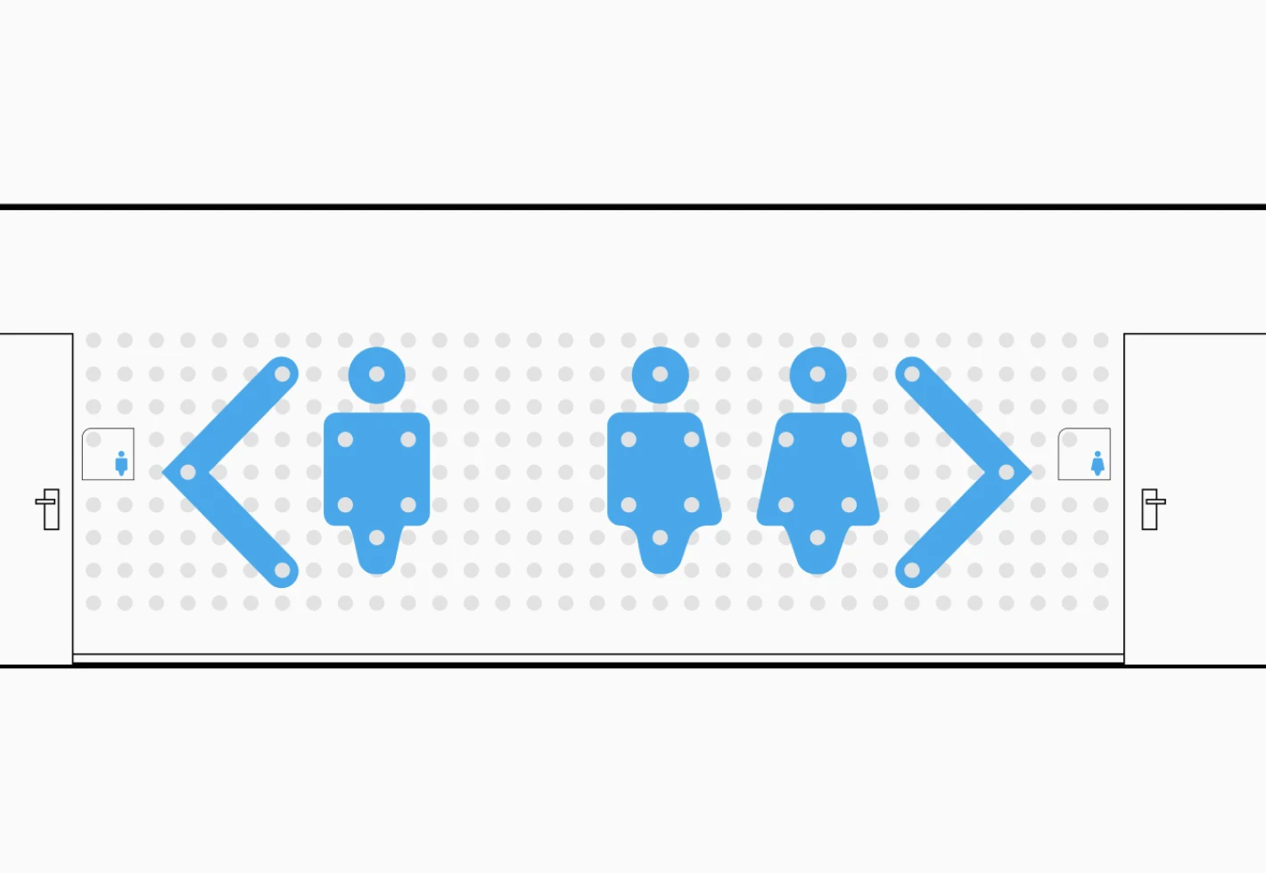
Blue icons of people and arrows on a dotted background, indicating gender-neutral restrooms.
Initial exploration of iconography as supergraphic landmarking
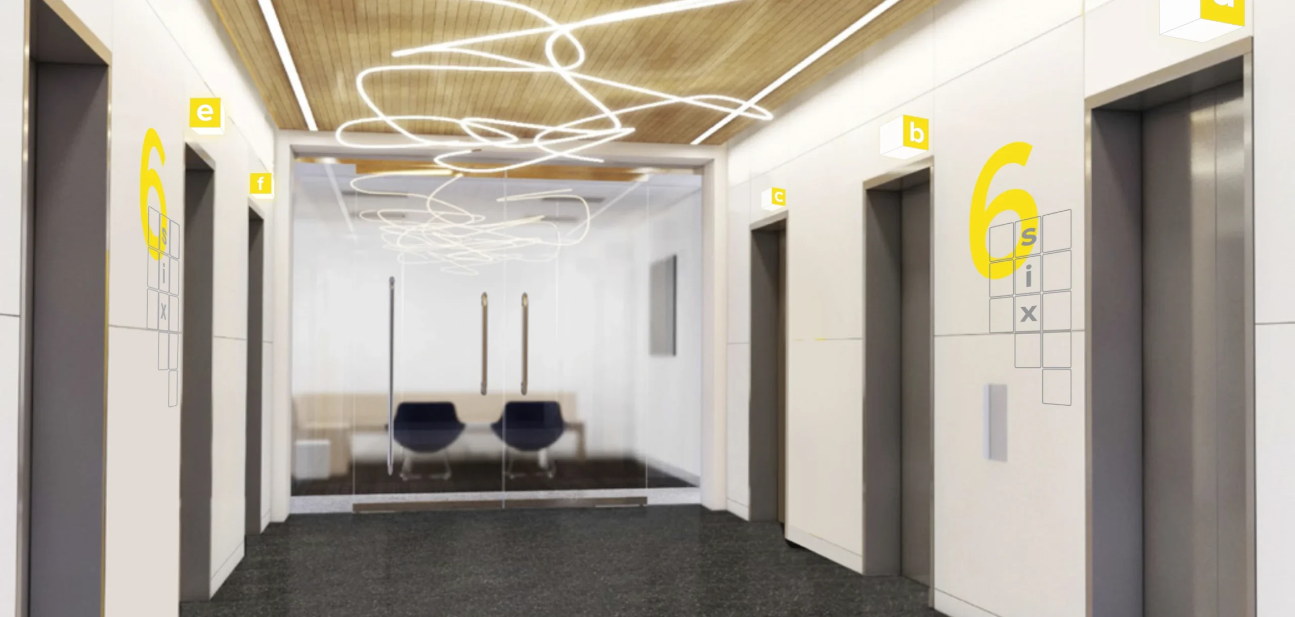
Elevator lobby with yellow number 6 signage and modern lighting.
Elevator lobby signage conceptual render
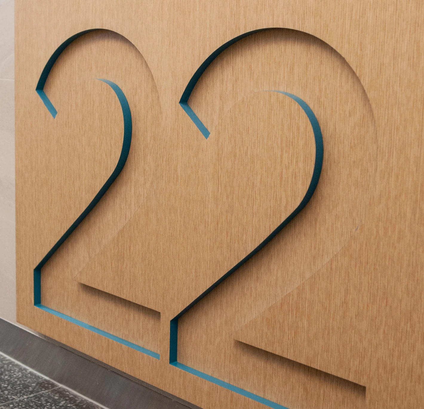
Close-up of the number 22 carved into a wooden surface with blue accents.
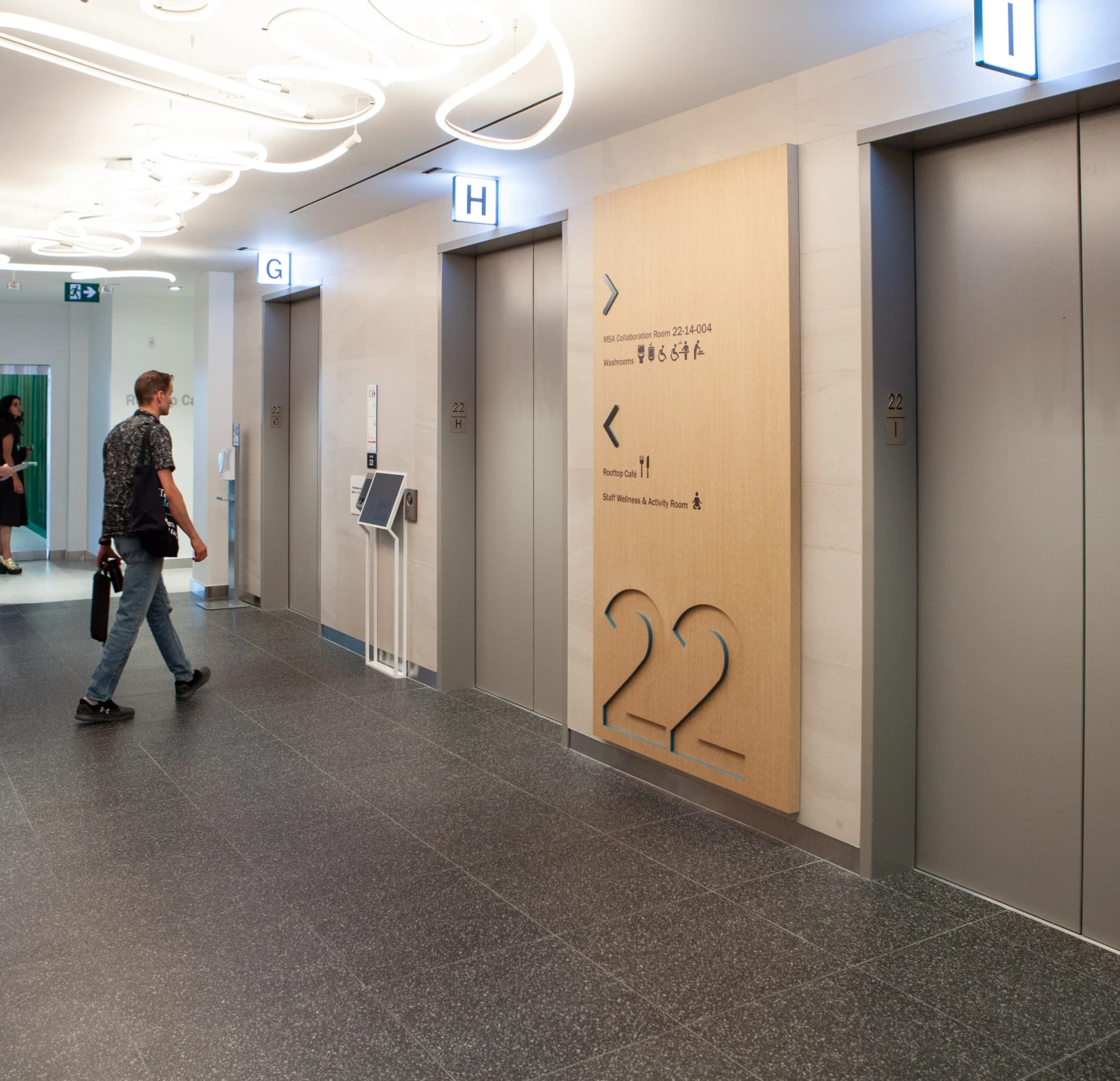
Modern office hallway with elevators and directional signage.
Final elevator lobby integrates level number as landmark element with iconography and level colours

A journey of colour

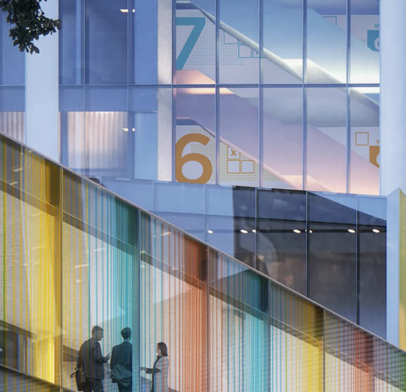
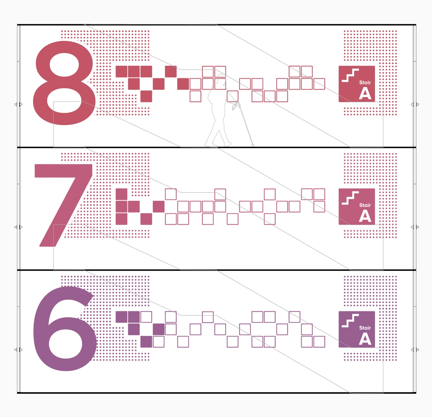
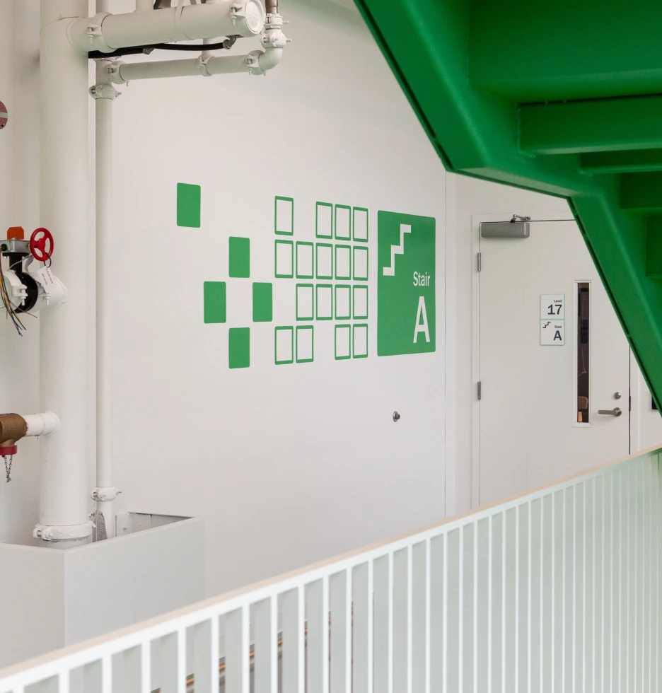
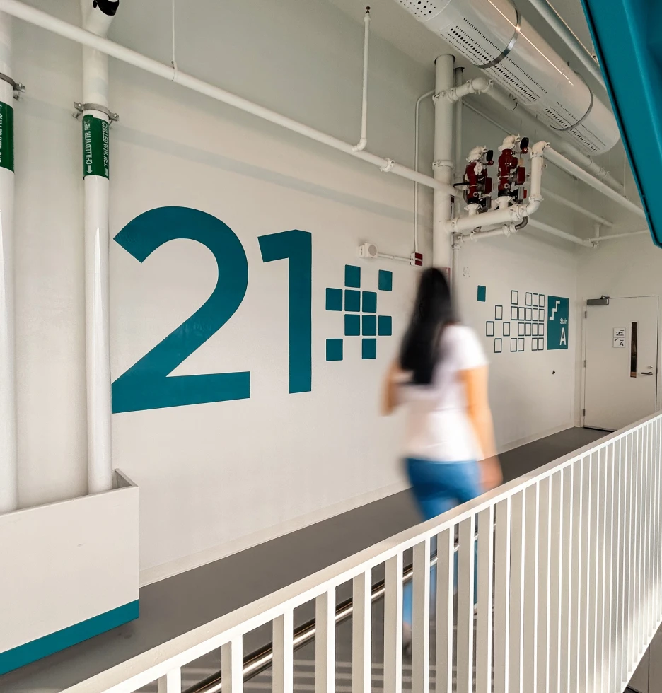
Colour was another layer of the expression of joy and play integrated throughout each level of the building. Working closely with stakeholders, Forge curated hints of colour cues into signage and murals that changed on each floor. Working in harmony with interior design palettes, this journey of colour strengthens the sense of place identity whether at street level or travelling floor to floor. 

Modern building with colourful string facade and people walking on stairs.
Floor markers for levels 8, 7, and 6 with
Level ID concept rendering and feature stairwell elevation
Green stairwell signage with abstract green squares on a white wall.
A person walks past a large number 21 on a white wall with pipes overhead.
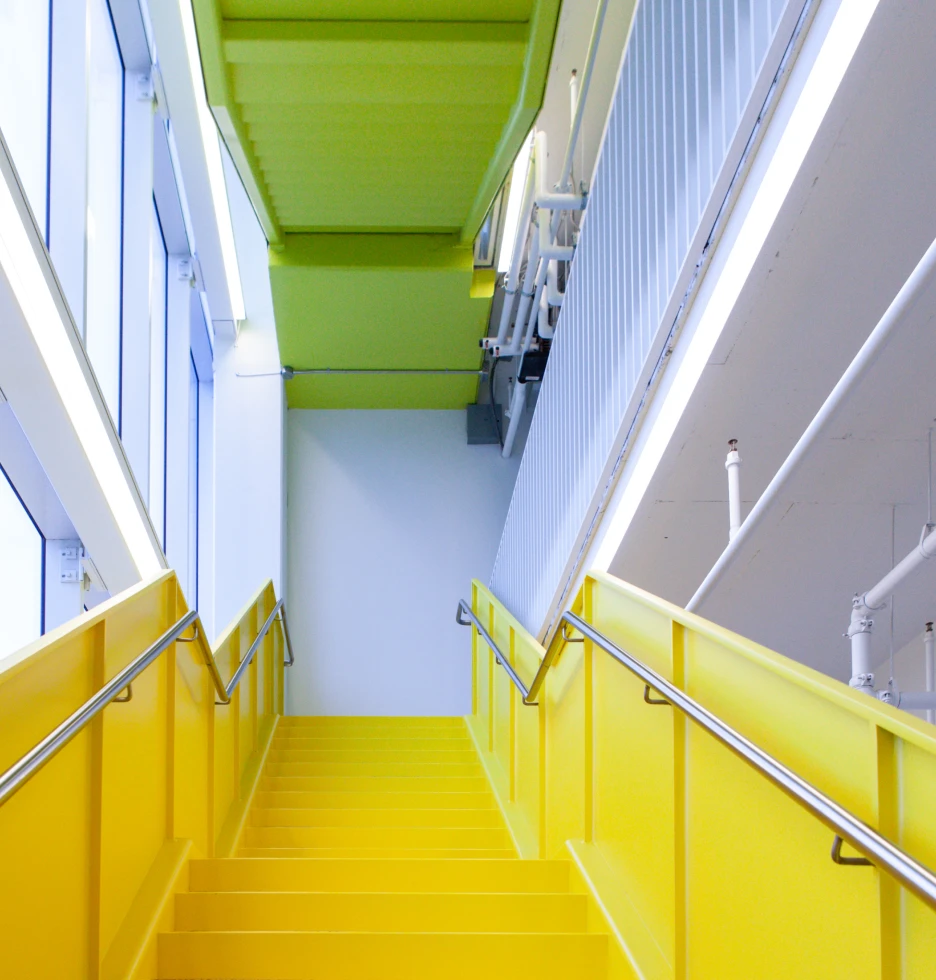
Bright yellow staircase with green ceiling and large windows.
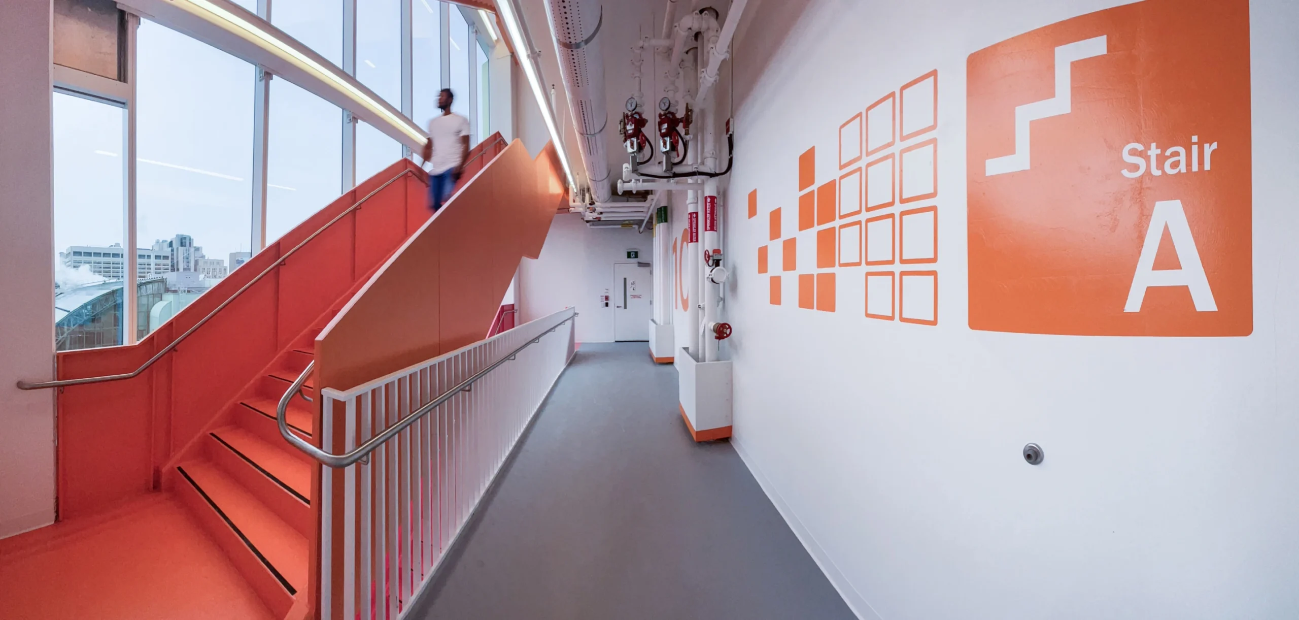
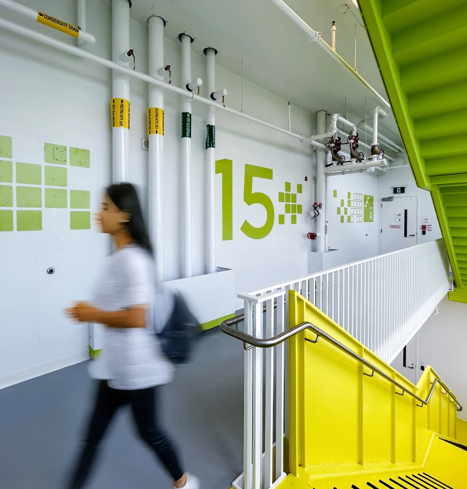
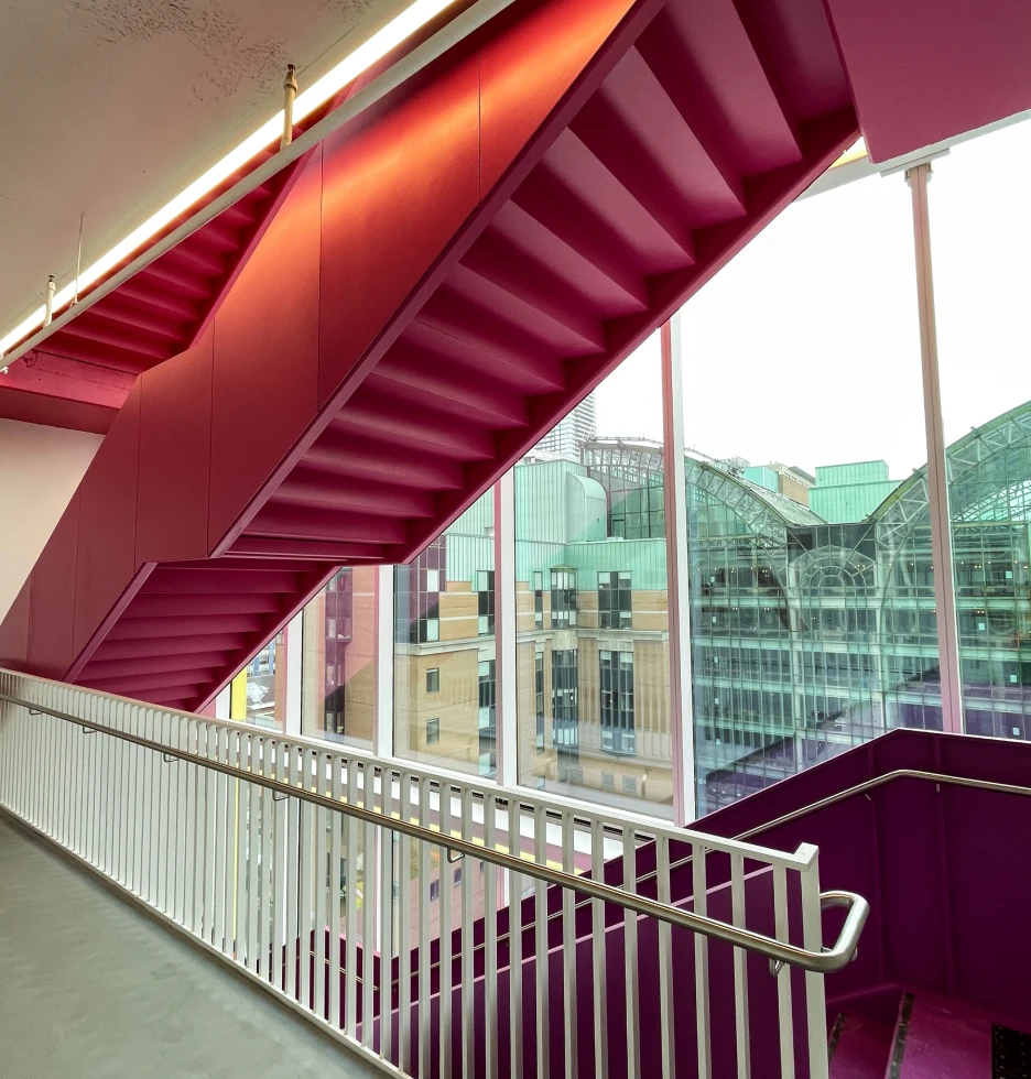
A colourful journey in this feature stairwell encourages use of an underused space to promote well-being
Modern orange staircase with a person walking down, leading to a hallway with
Modern hallway with bright yellow stairs and green accents, a person walks by.
Modern pink staircase with a view of city buildings through a large window.
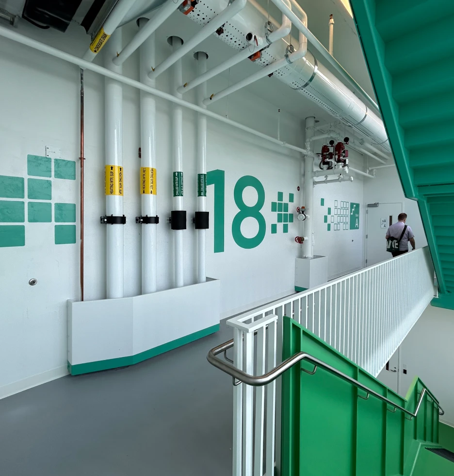
Interior view of a modern hallway with green accents and large number 18 on the wall.

A metaphor for play

Crafting the space’s influence on how people feel became foundational to establishing a theme for placemaking. Forge explored children’s perspectives of joy and play as metaphors for developing a consistent visual language that became integral to each element of the wayfinding design. Taking cues from block letters, peg and post toys, provided a visual framework that developed over the course of the project.

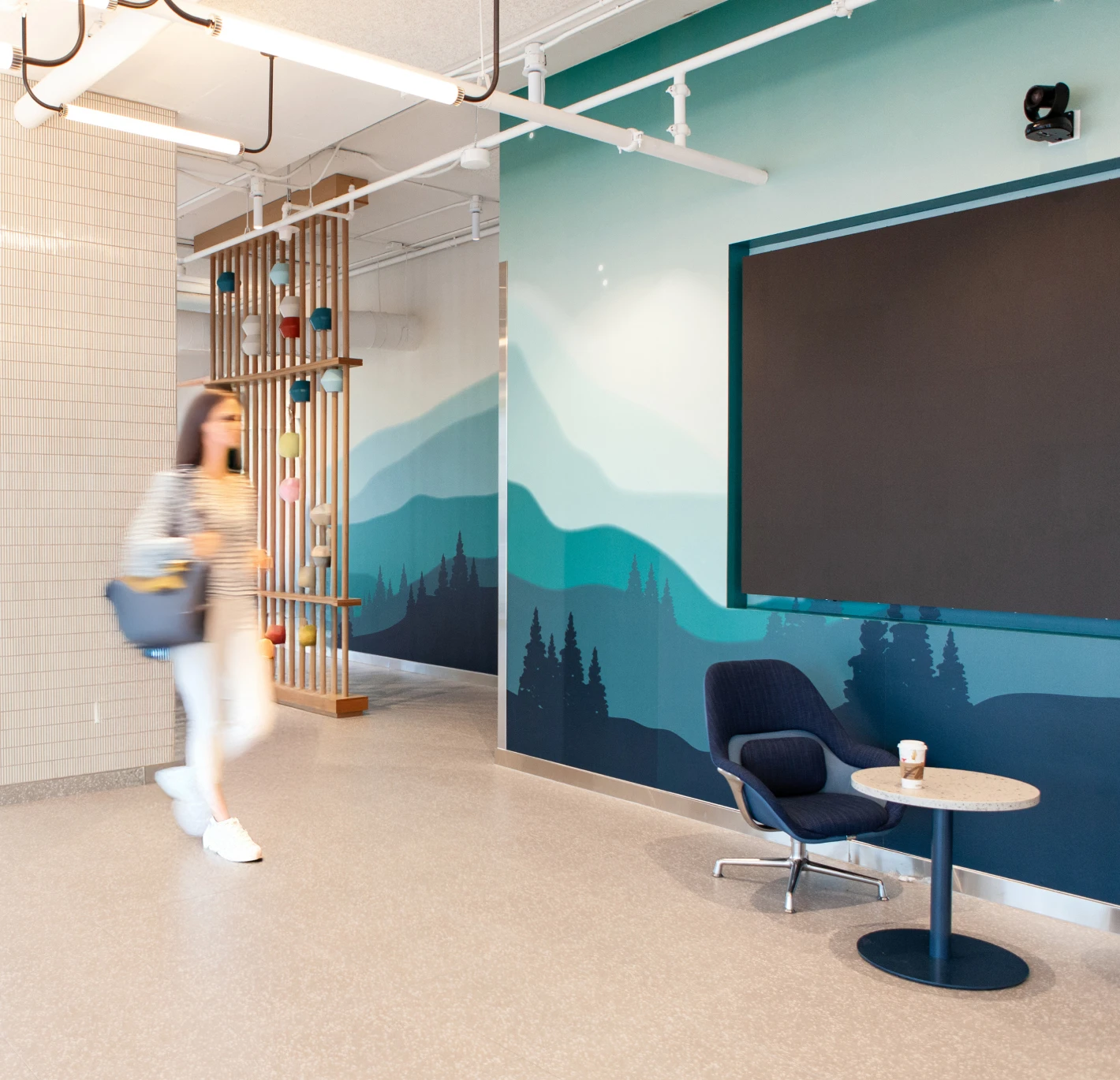
Modern office interior with a woman walking past a decorative screen and a mural.
Wall mural with text
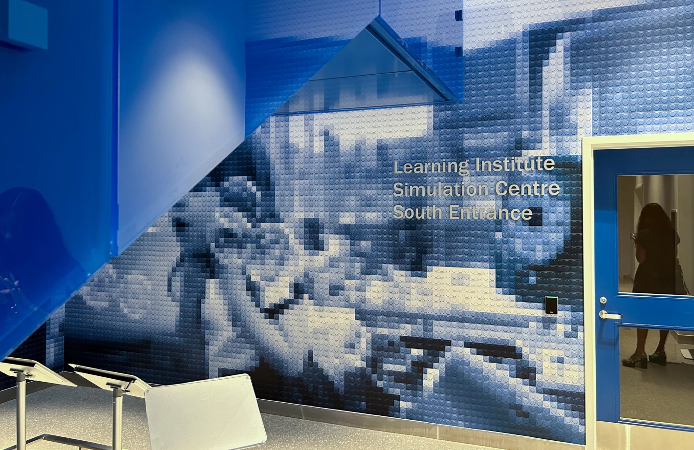
Murals depicting stylized landscapes and lego inspired supergraphics
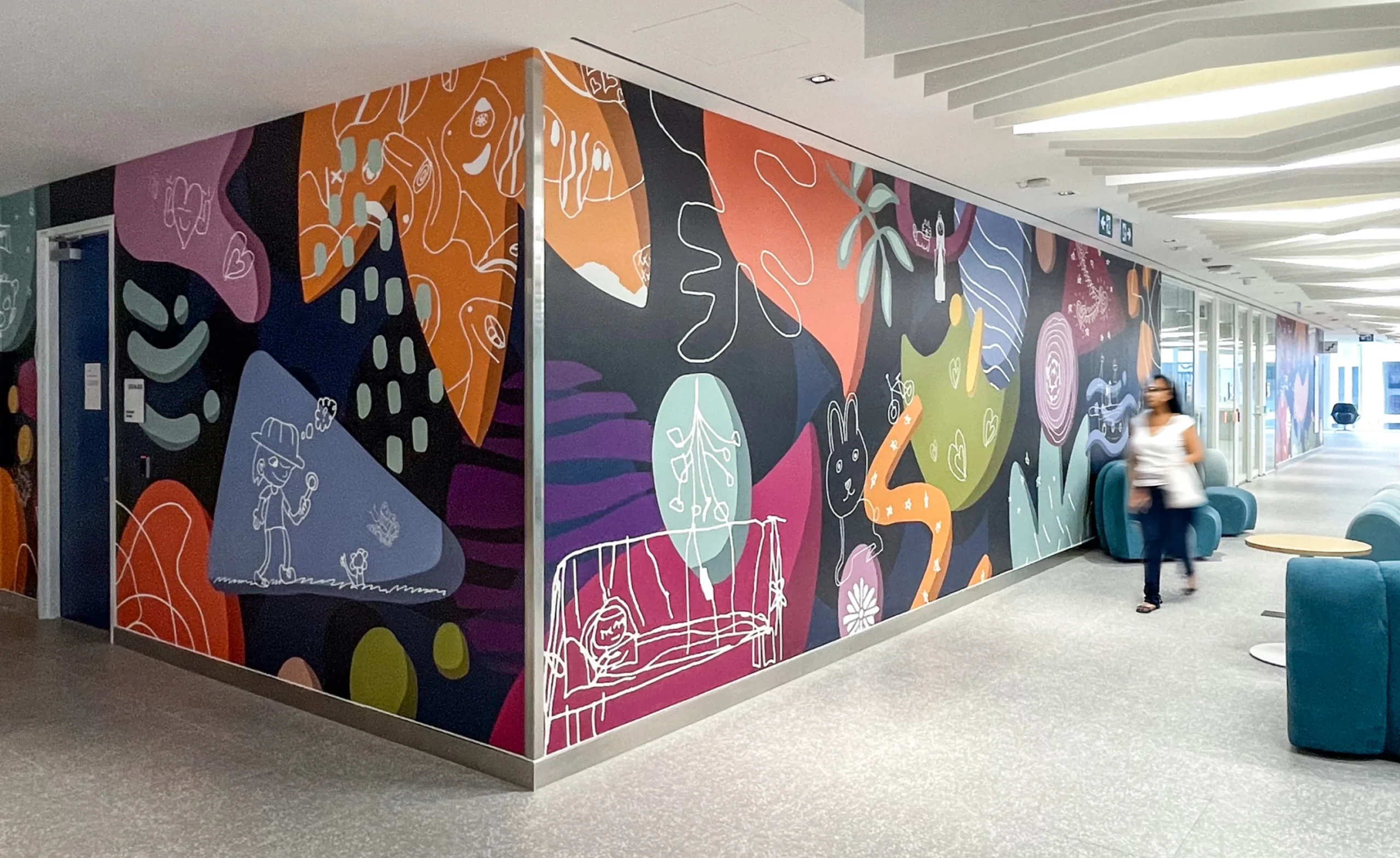
A colourful mural with abstract shapes and cartoon drawings adorns a hallway with teal seating.
Murals with drawings supplied by children liven up the space and ease the experience for staff and visitors
Silhouette of a person walking past abstract, colourful, coiled structures.
Silhouette of a person walking past a pattern of triangles in yellow, grey and blue.
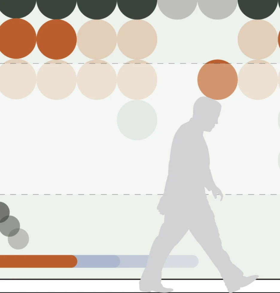
Silhouette of a person walking past a series of coloured circles and bars.
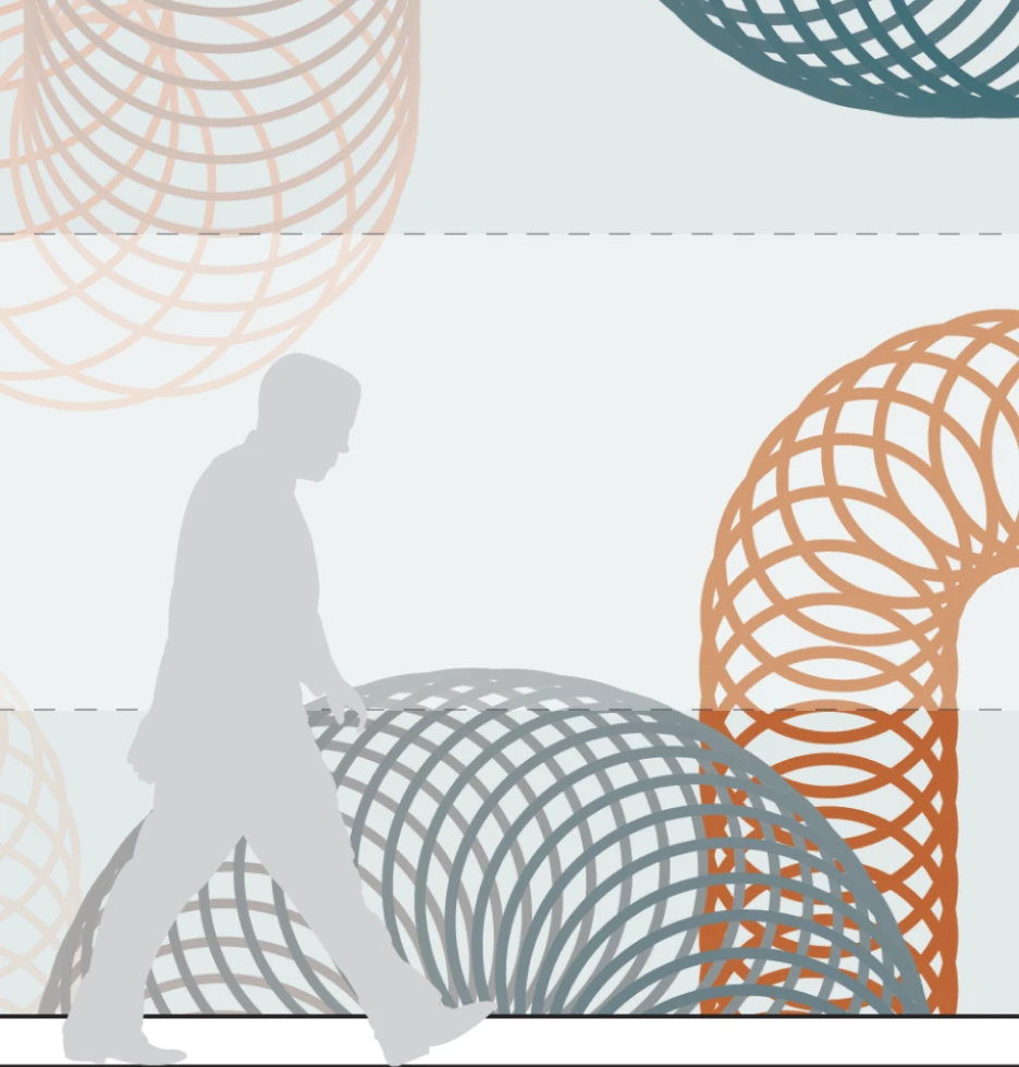
Preliminary renderings of mural artwork
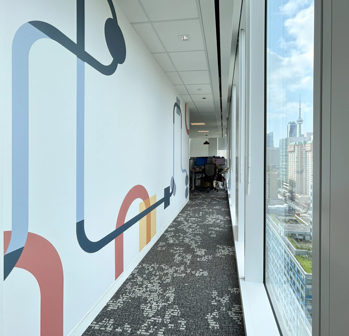
Modern office hallway with abstract wall art and city view.
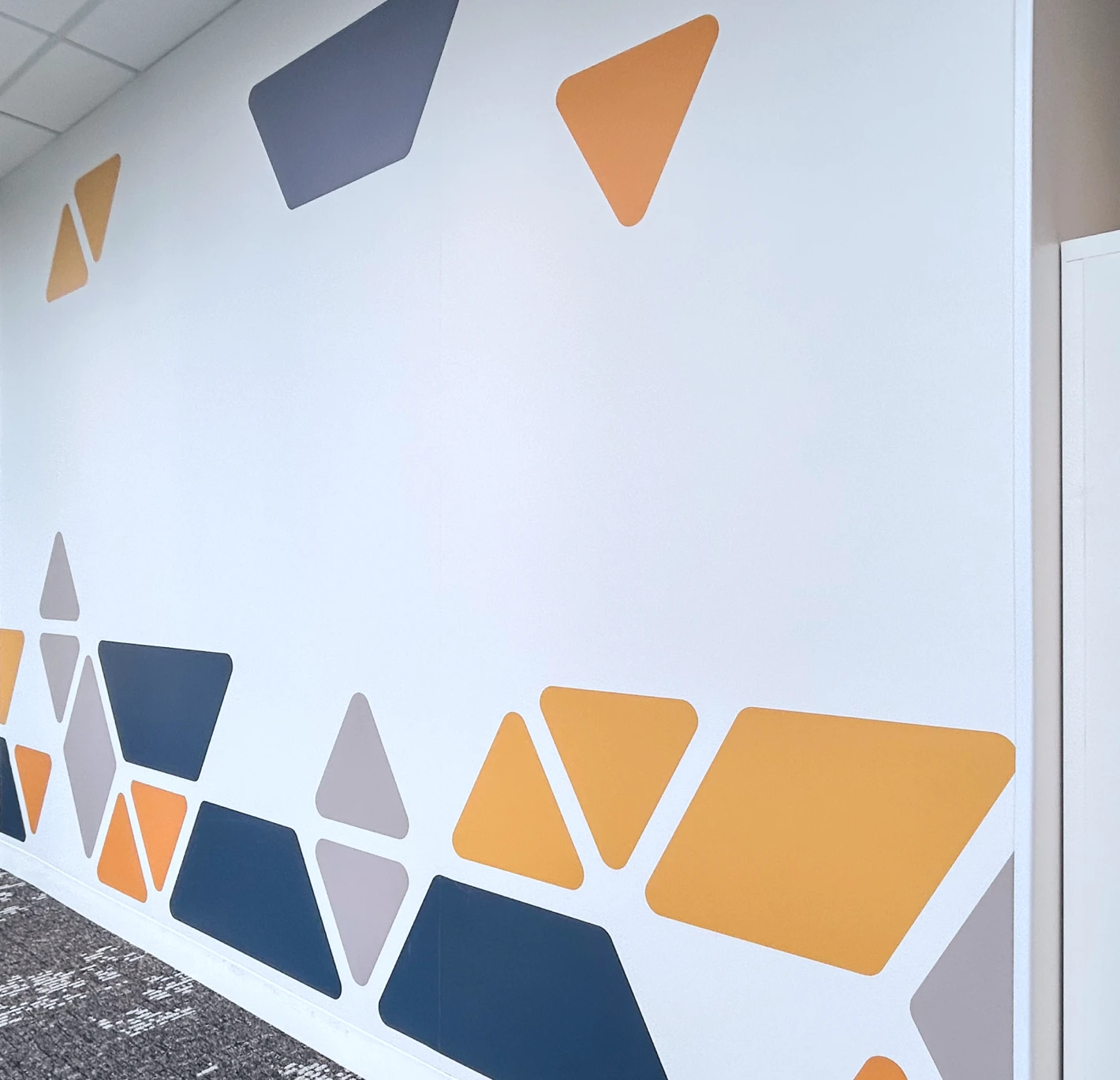
Abstract geometric pattern on a white wall with orange, grey and blue shapes.
Corridor supergraphics developed with games-inspired themes and input from the Children’s Council

Freeing the act of mobility

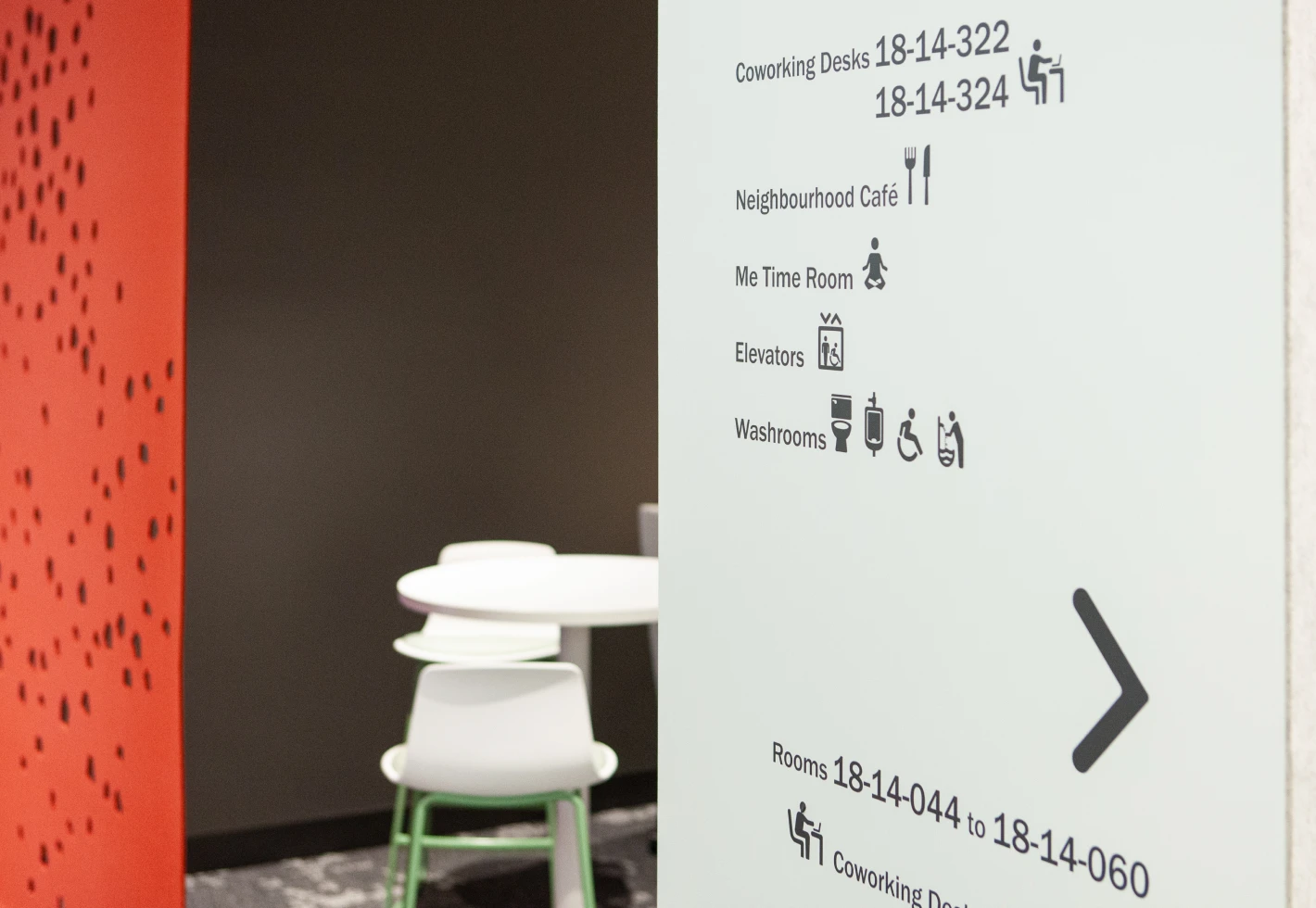
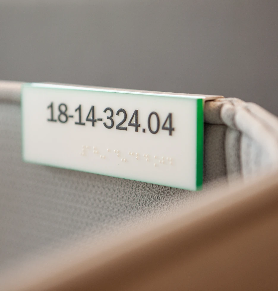
Promoting safe and independent movement for people of all abilities was also an important priority for SickKids. Wayfinding included development of tactile maps and cues at key locations for people with sight disabilities. Forge advised on proper semiotic use of pictographic language to be inclusive to a wide audience, ensuring that design of these elements felt aligned with the overall visual narrative.

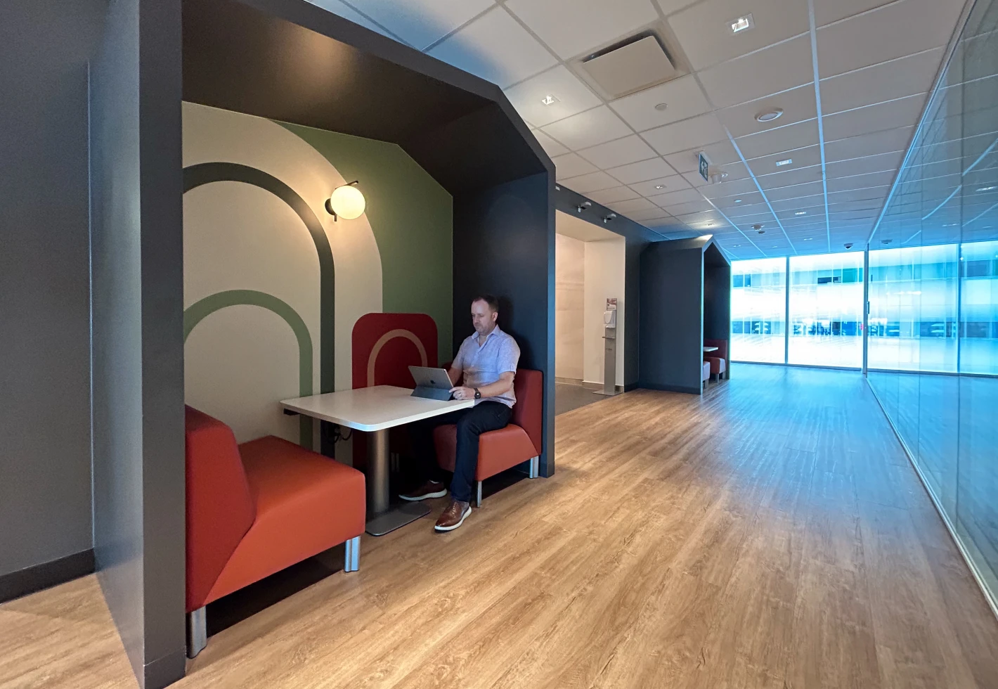
Man working on a laptop in a modern office booth with orange seating and a geometric mural.
Signage with room numbers and icons for coworking desks, cafe, me time room, elevators, and restrooms.
Open collaboration spaces including pictograms aiding with self-navigation
A white label with black text
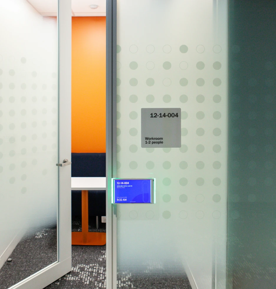
Door to a workroom with a digital display showing room availability.
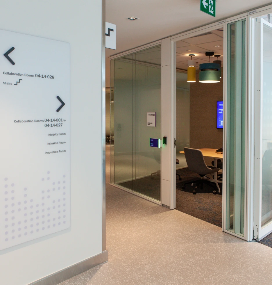
Modern office hallway with glass-walled meeting rooms and directional signage.
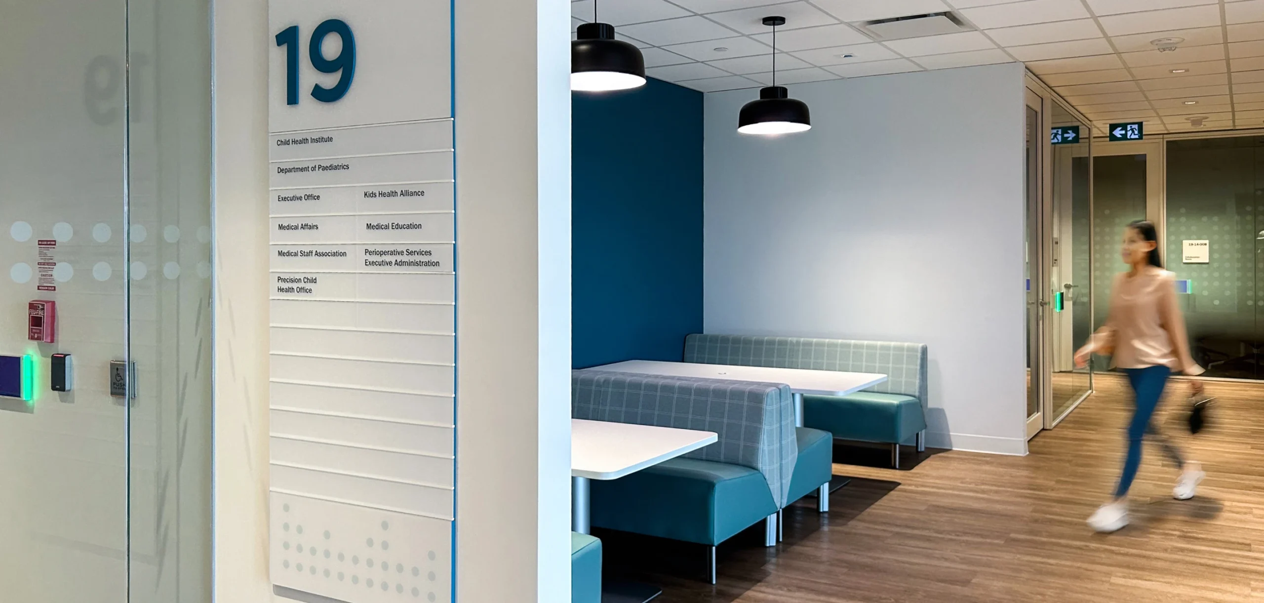
Interior view of a hospital hallway with a directory sign, seating area, and a woman walking.
Dot motif and colour coding harmonized with interior design cues
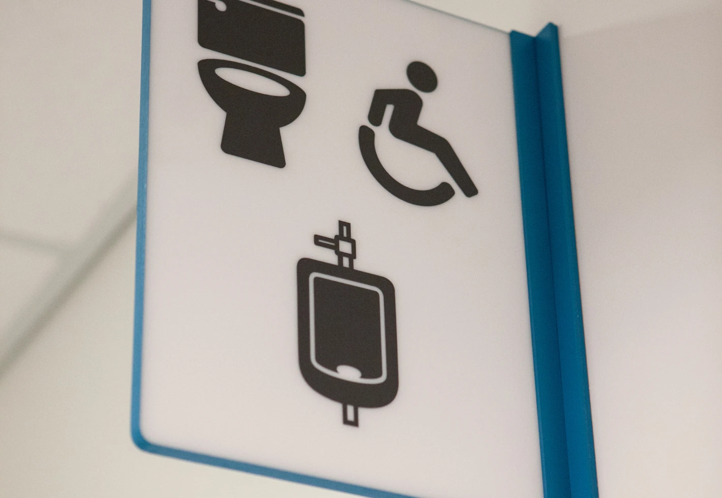
Restroom signs: toilet, accessible, and urinal icons.
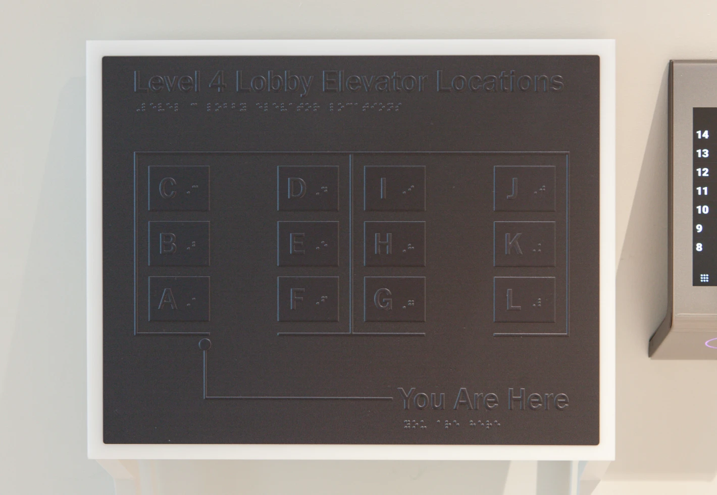
Braille and raised letter directory for Level 4 Lobby elevator locations.
Amenity directional signage and innovative tactile maps
Featured
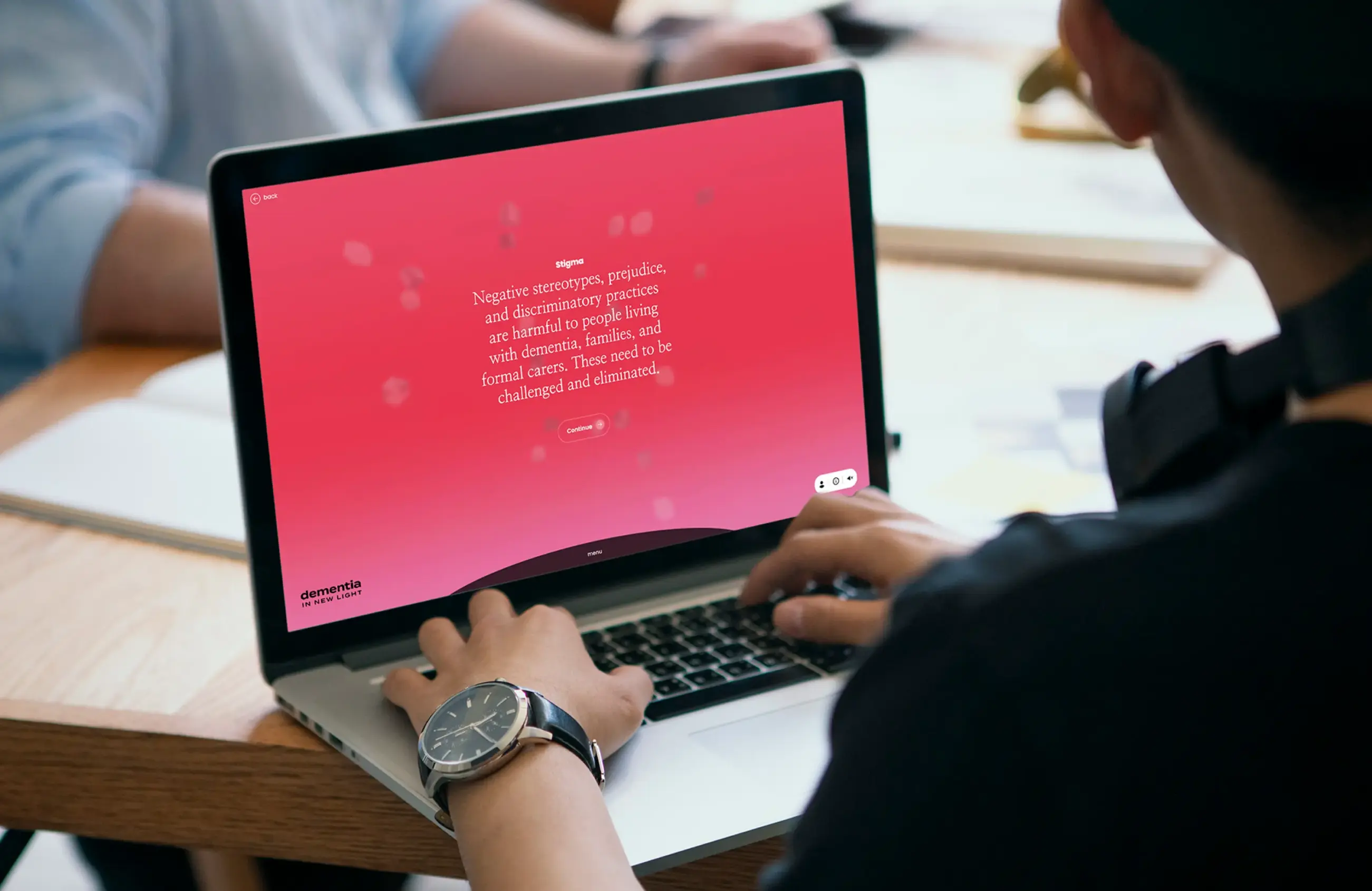
Person using a laptop displaying text about dementia stigma and a

Dementia In New Light

dementiainnewlight.com
Services Deliverables
  • Logo
  • Website
  • Illustration
  • Social Media
  • Lesson Development

Shedding light into the world of dementia

Dementia in New Light is a digital learning experience that builds upon the research-driven production, Cracked: New Light on Dementia. By following individuals with dementia and their families, it aims to challenge the stigma around dementia and its care. Forge collaborated with a diverse team of researchers and artists and applied co-design methodologies to create an accessible educational experience, fostering a reimagining of dementia and improved support for those impacted.

Features

Headless CMS

React framework

WebGL 3D render with custom shaders

User account portal

Analytics

Emotive narratives, challenging stigma

In our initial discovery phase, we met with the project stakeholders, care providers and individuals affected by dementia to understand how to spread awareness and educate people better about dementia and its effects. We listened to each individual’s story about their lived experiences, engaged in co-design discussions to shape our digital learning outcome and fostered an open, inclusive forum for collaboration. This discovery process uncovered invaluable information from diverse perspectives to enrich the outcome of our digital learning experience.

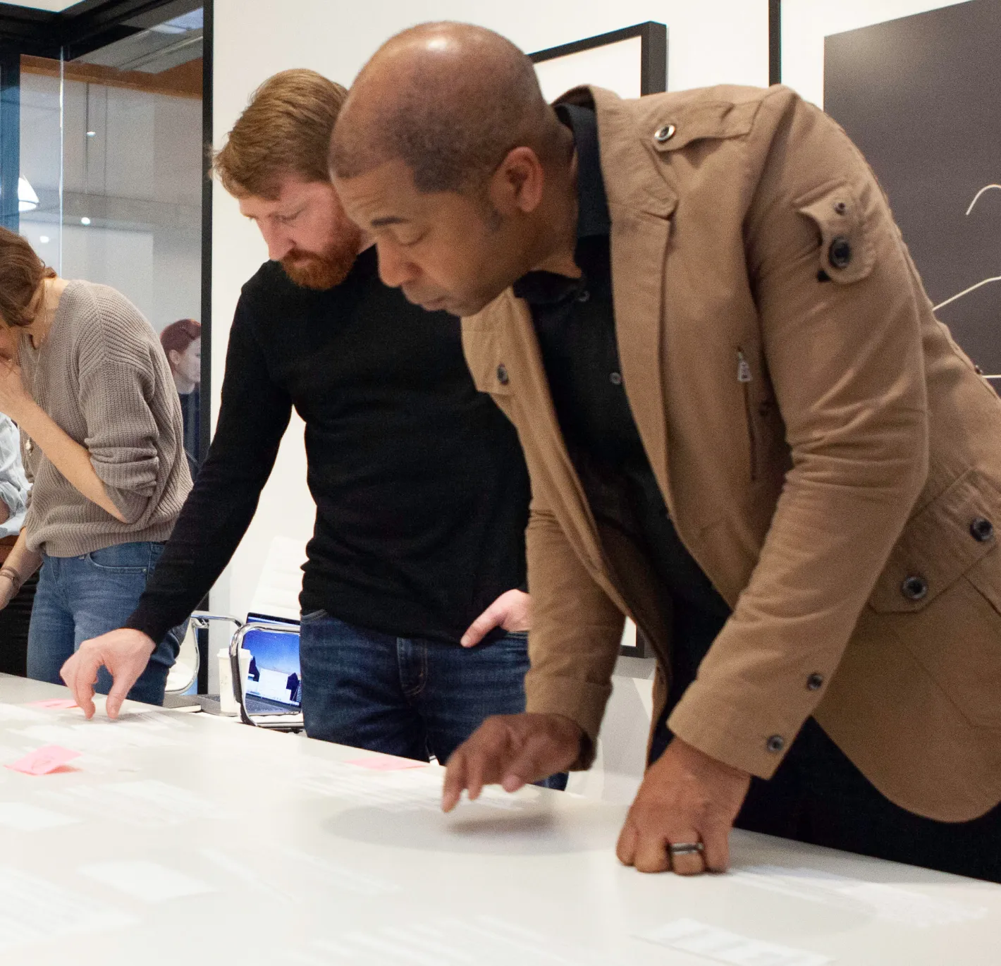
Two people sitting in a boardroom.
A group of people discussion research, while looking a table.
Snapshots from our discovery and research synthesis process

An engaging and informative experience

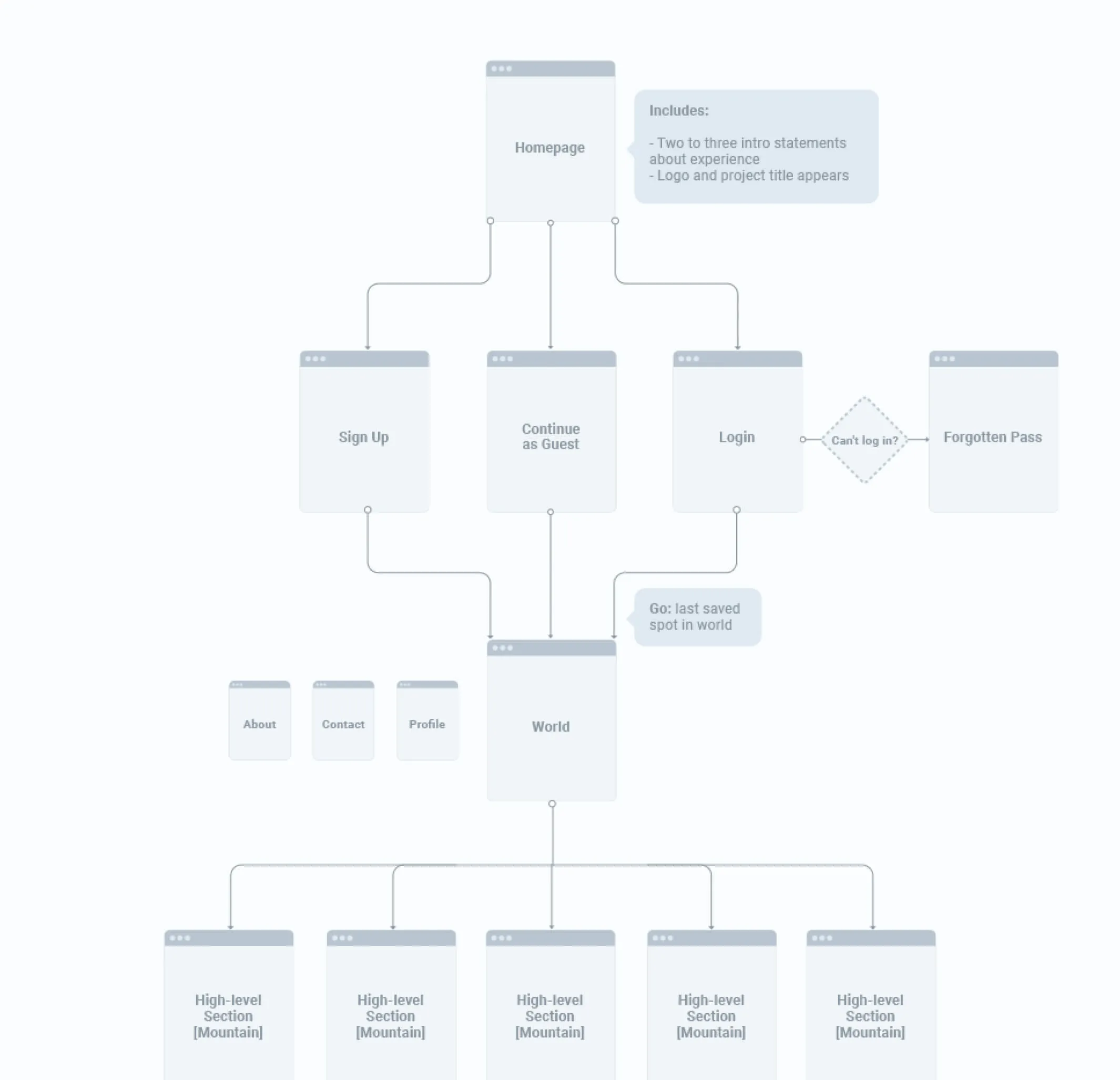
Our core objective was to enable learners to explore a wide range of topics related to dementia care while providing them with insights into the daily lives of persons living with dementia and their families, fostering empathy and understanding throughout their journey. To ensure an intuitive user journey, we developed detailed site architecture and wireframes, meticulously planning how learners would navigate the content.

An image showing the site architecture with information hierarchy
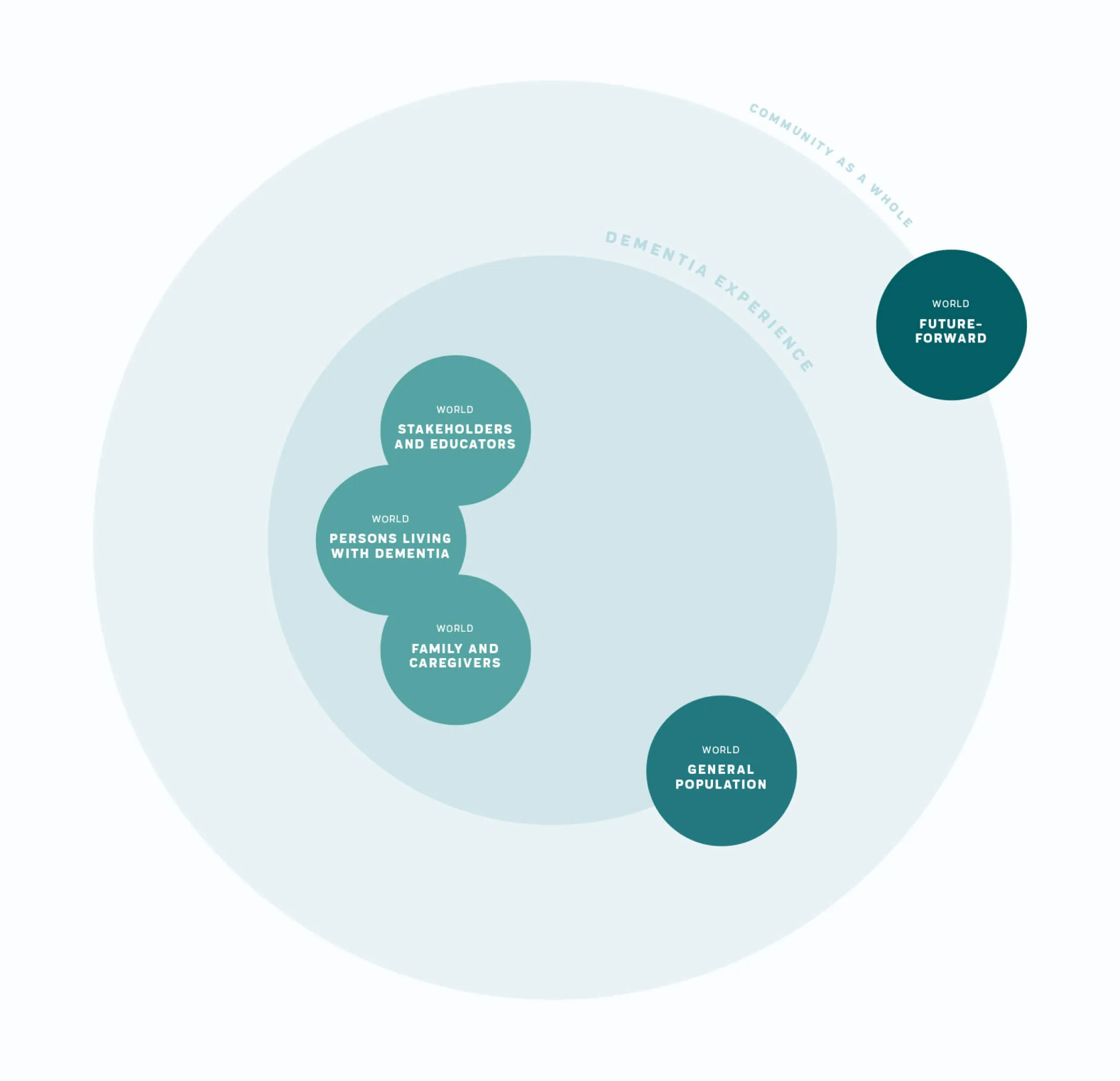
A circle diagram that shows the relationship between various topics
Detailed sitemap for a complex website and a small sample from our extensive discovery
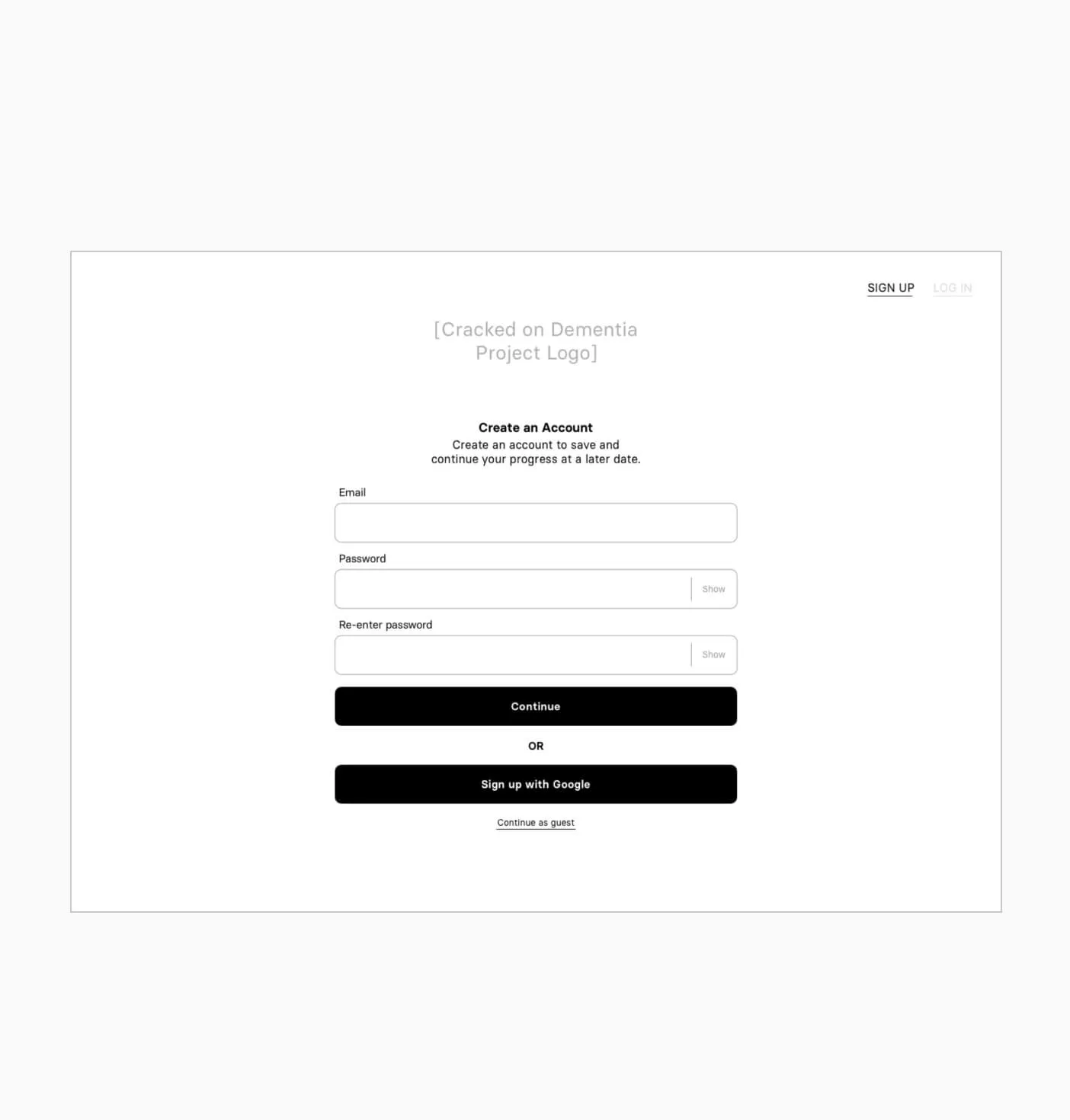
wireframe image of the login screen
a sketch exploring the theme of murmuration, or clusters of meaning
wireframe showing the idea behind the unique navigation
Wireframes to start defining the experience

Inspiring others to share their stories

The experience presents content in a number of ways and invites the learner to reflect on what they’ve seen and challenge their perceptions. Forge built a custom application backed by a headless CMS that allows the client to update content as needed.

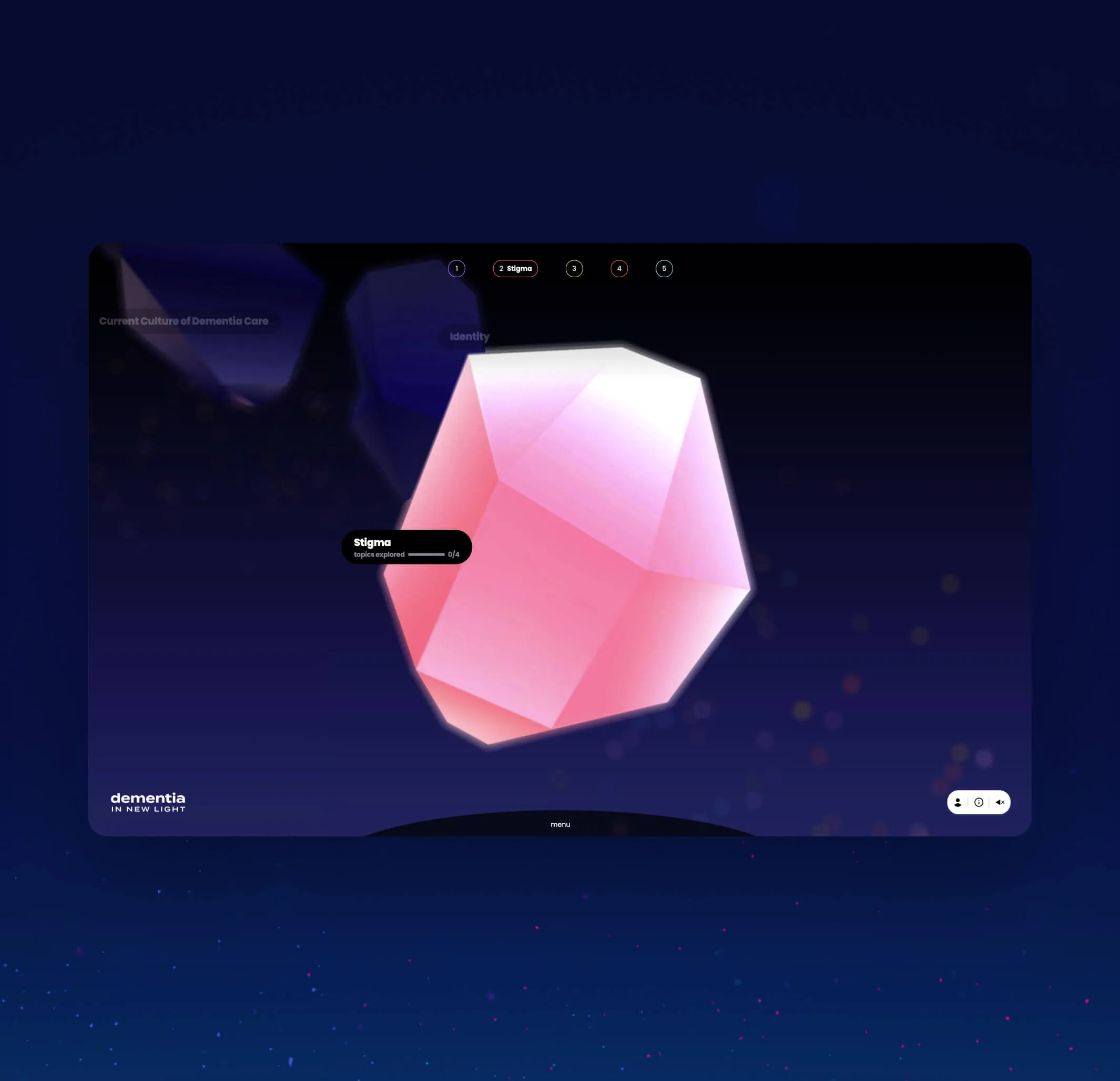
A close up of one of the topics in focus. The topic is shown as a crystal-like gem floating in space
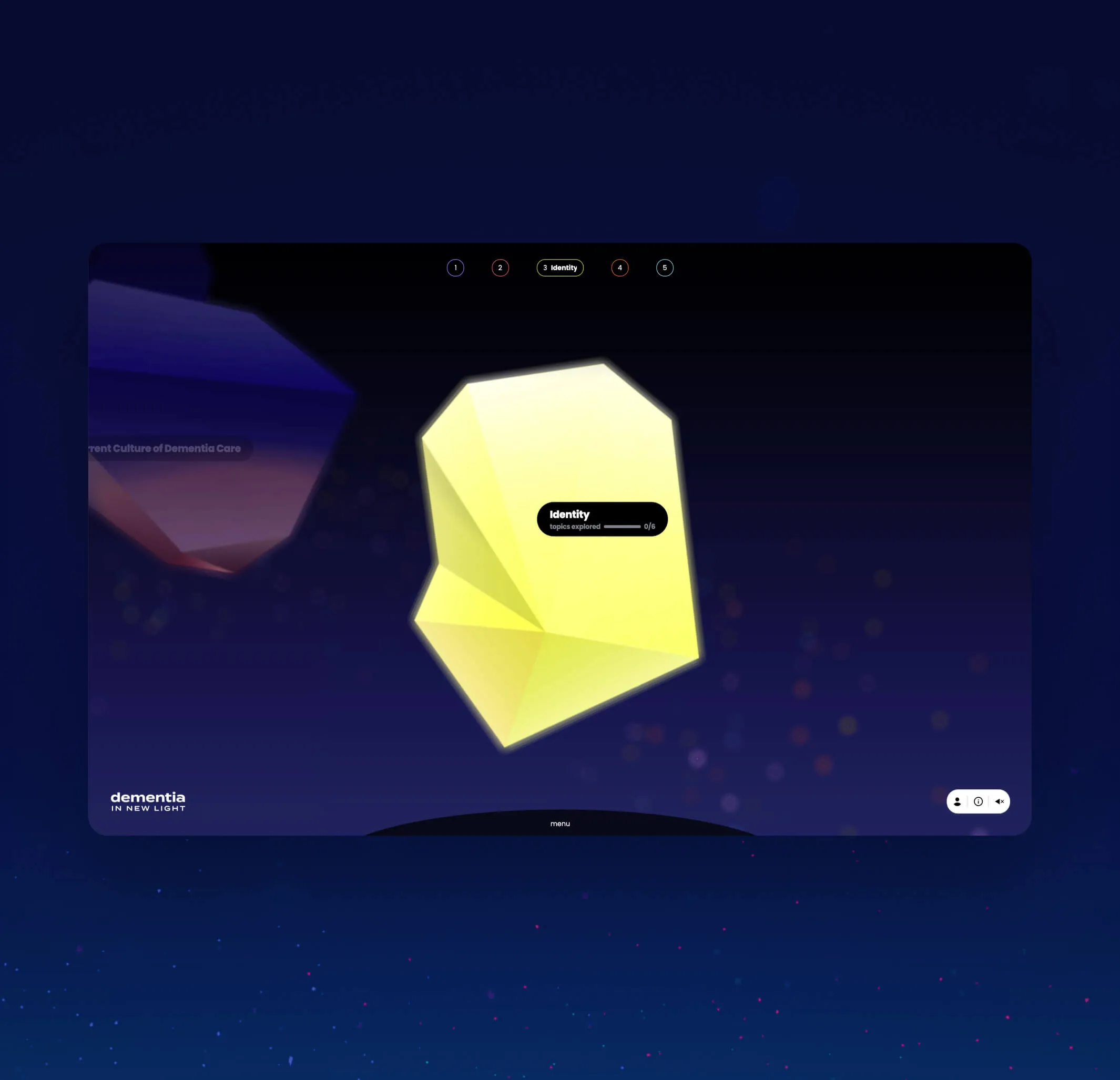
Another close up of one of the topics in focus. The topic is shown as a crystal-like gem floating in space
Topics browser which acts as the main navigation
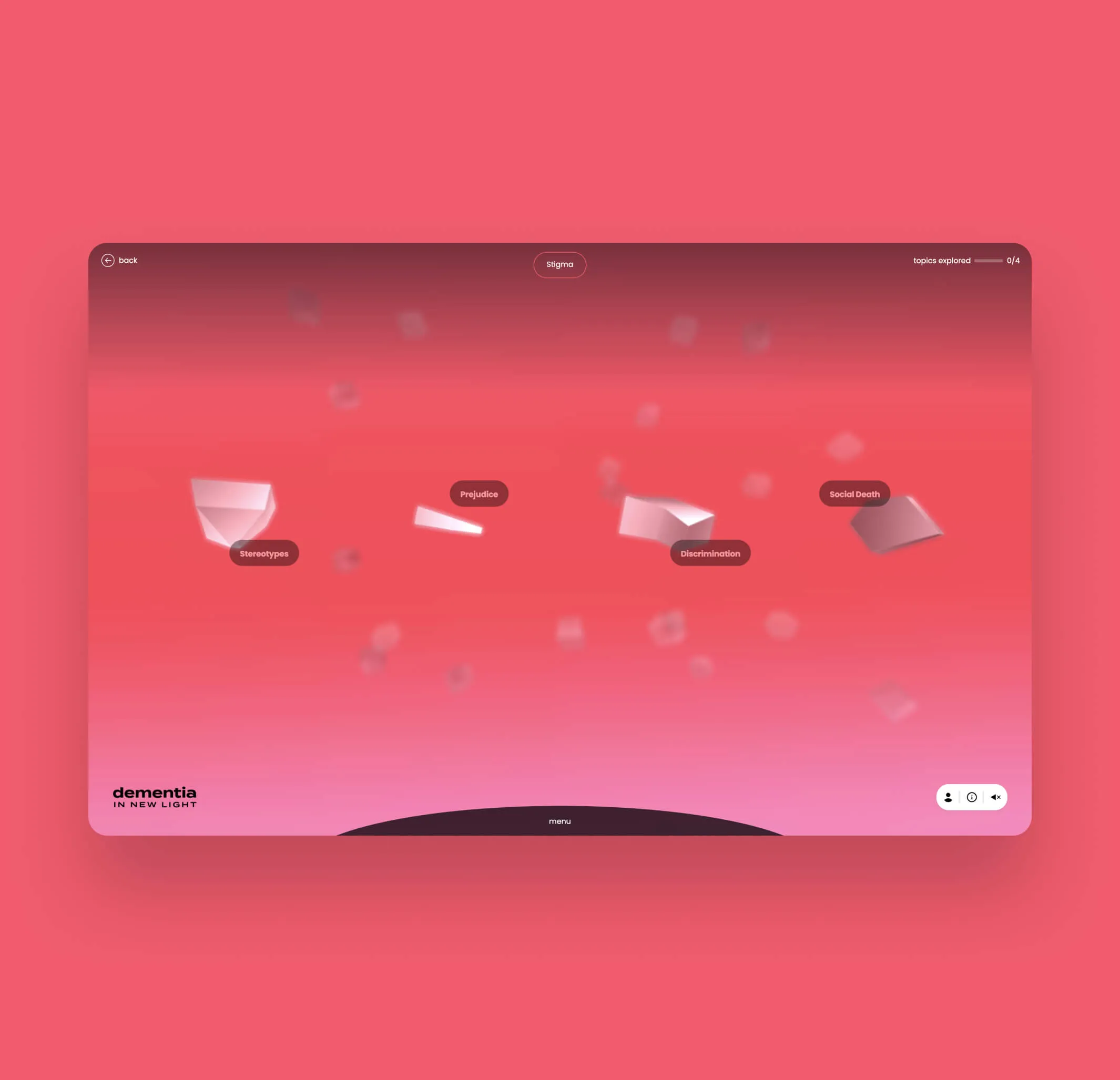
The stigma topic expanded, to show the sub topics. The topics are shown as crystal-like gems floating in space
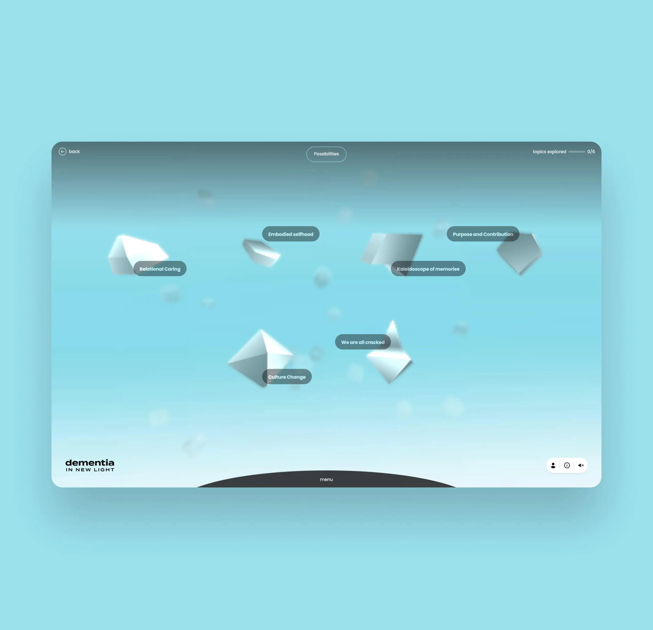
The Possibilities topic expanded, to show the sub topics. The topics are shown as crystal-like gems floating in space
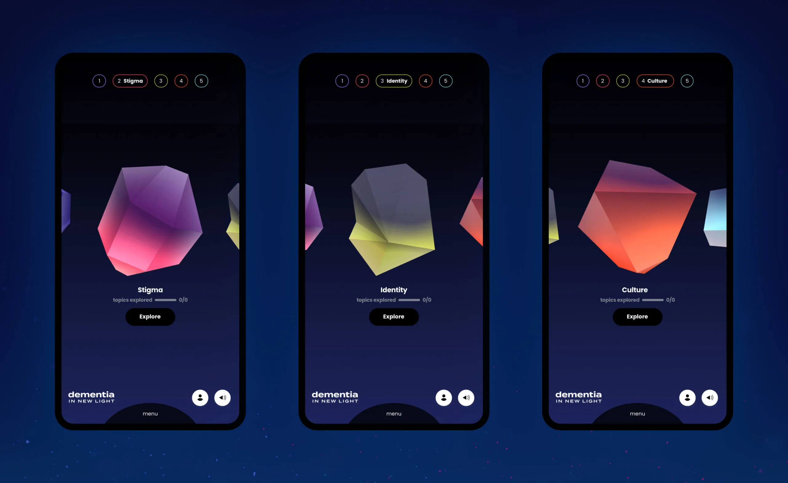
Three phone screens displaying abstract geometric shapes and topics related to dementia: Stigma, Identity, and Culture.

Shifting perspective through interactive storytelling

Learners are immersed through dynamic audio and visual learning moments while incorporating scenes from the original production. Learners can explore various topics surrounding dementia care and see things from the perspective of the person living with dementia and their families.

Illustration of a radio
Illustration of open eyes with eyebrows
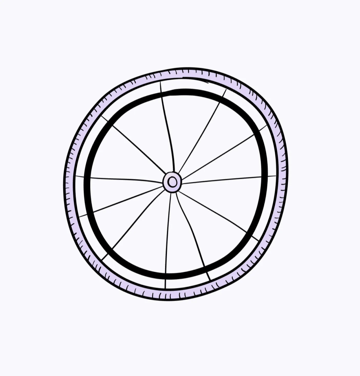
Illustration of a bike wheel
Custom illustrations to help tell the stories
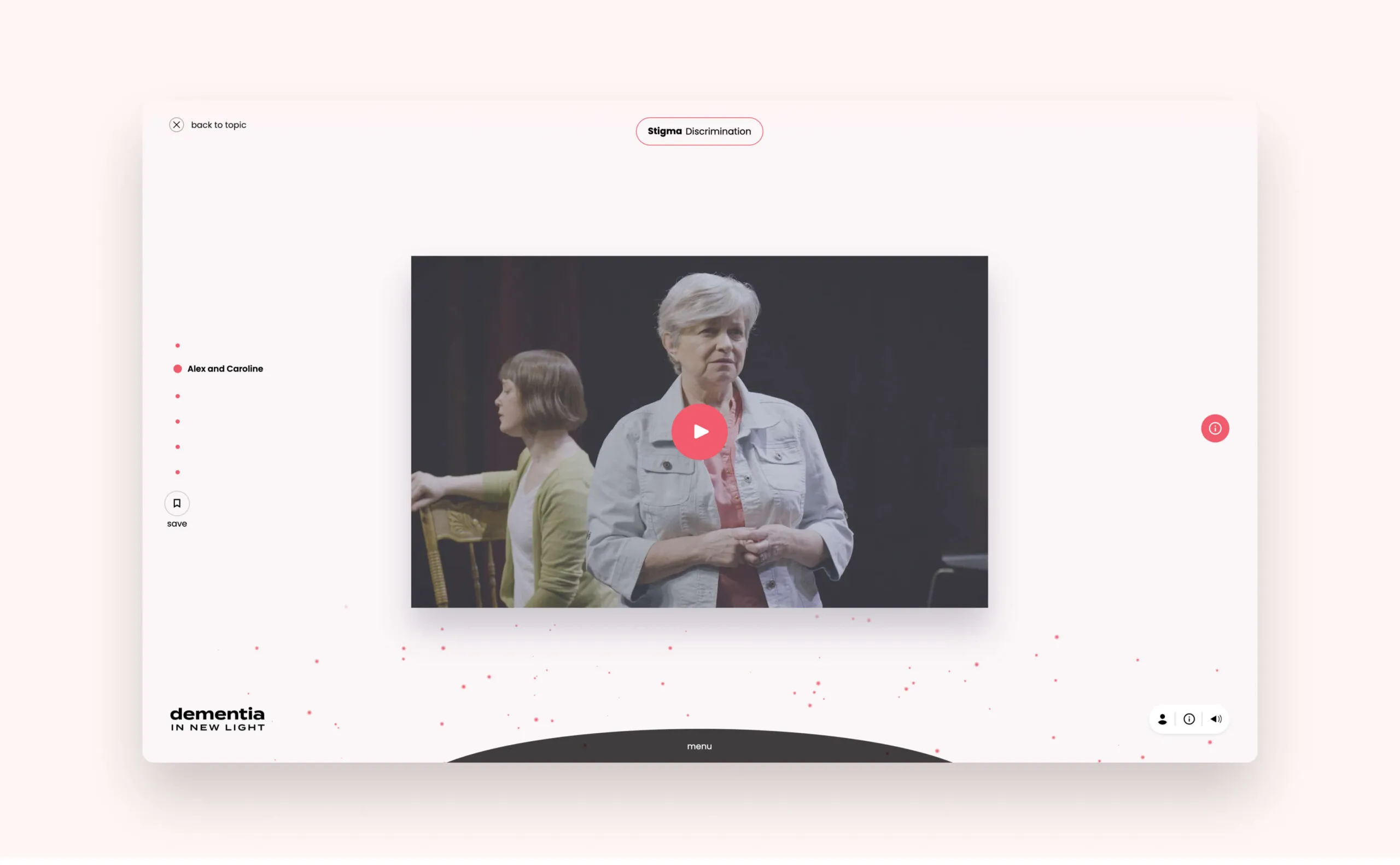
A desktop screen that shows what the video player looks like
Learning modules to educate users about dementia
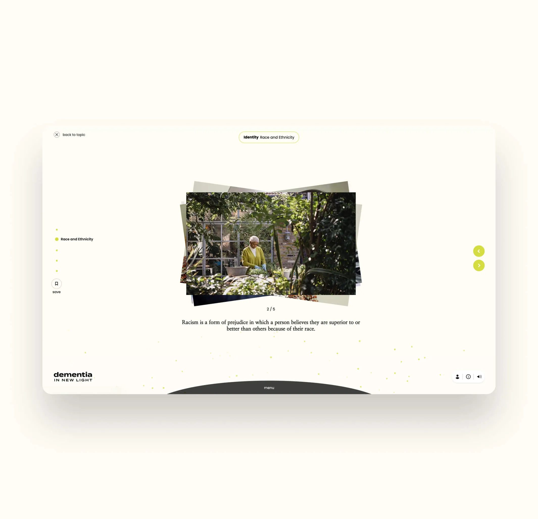
An image gallery is shown in one of the subtopics
A handwritten quote in one of the subtopics

Promoting engagement through tracked user progress

Learners have the ability to create personal accounts where engagement can be tracked and referenced throughout the experience, allowing them to take in content at their own pace and feel a sense of progress. Content can also be easily saved and referenced at any time.

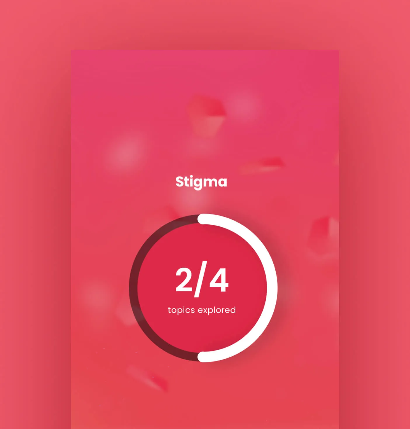
A screen showing that the Stigma topic is half completed.
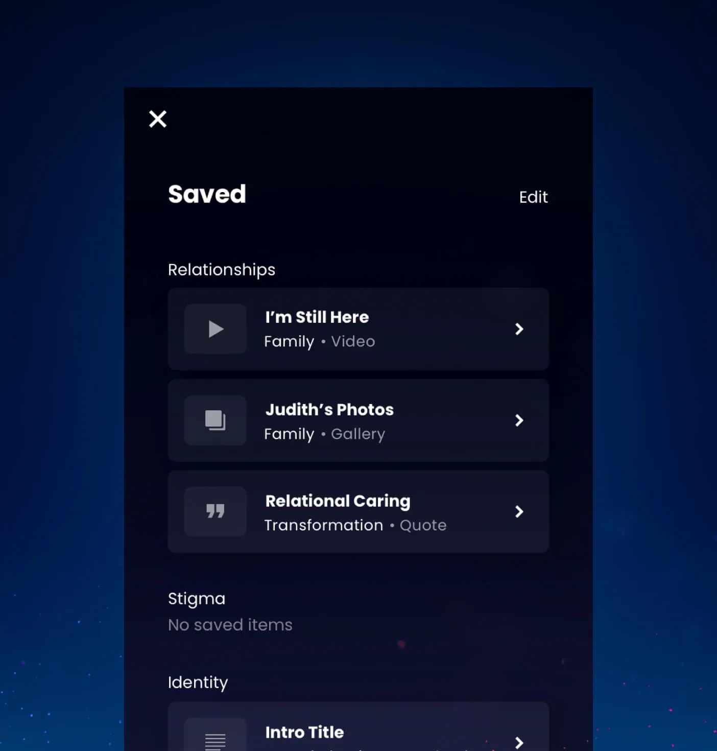
A screen showing learning modules the user has saved to their profile
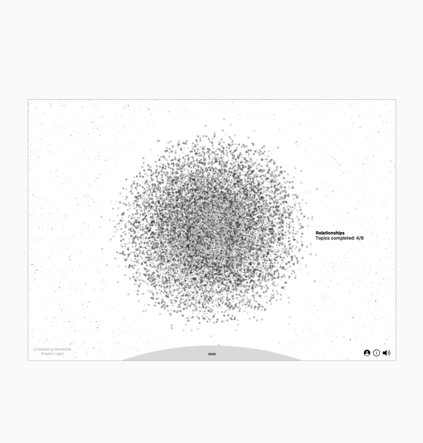
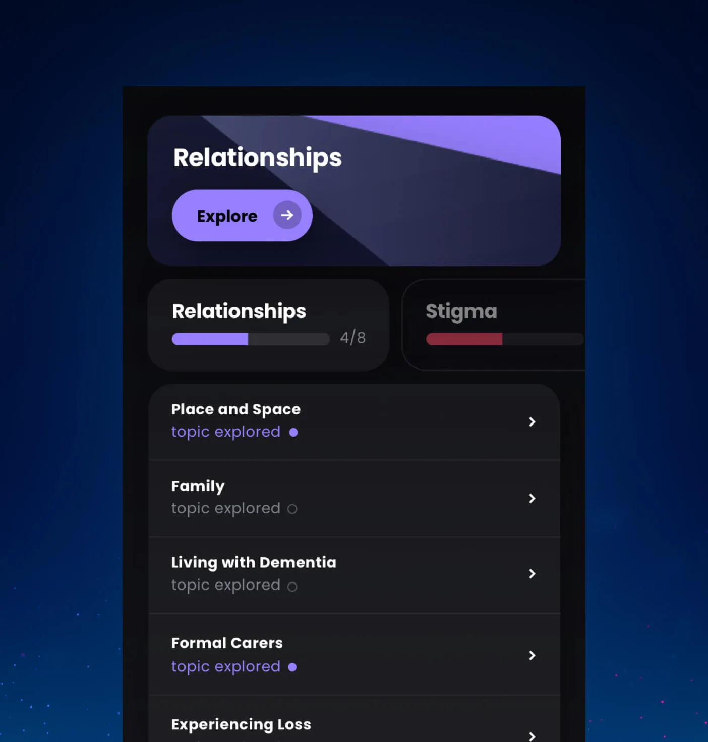
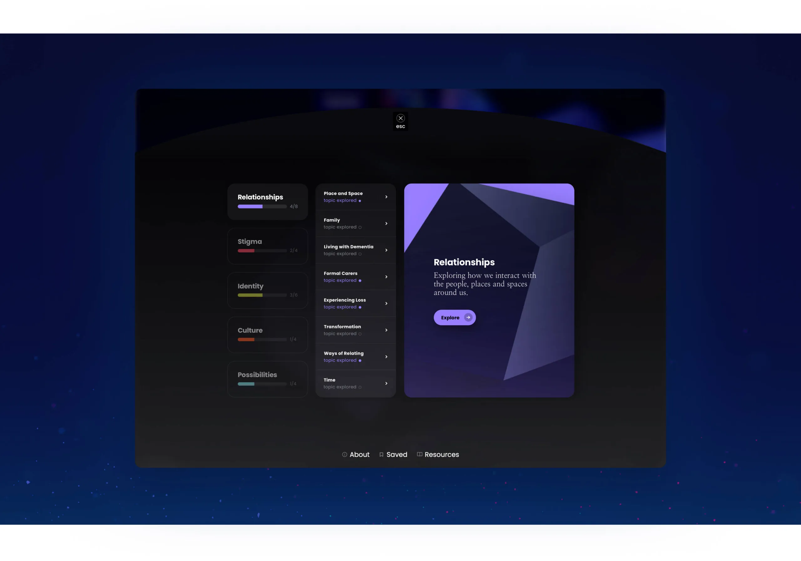
A screen showing the relationship topic with its sub topics and indicators to show which sections have been completed.
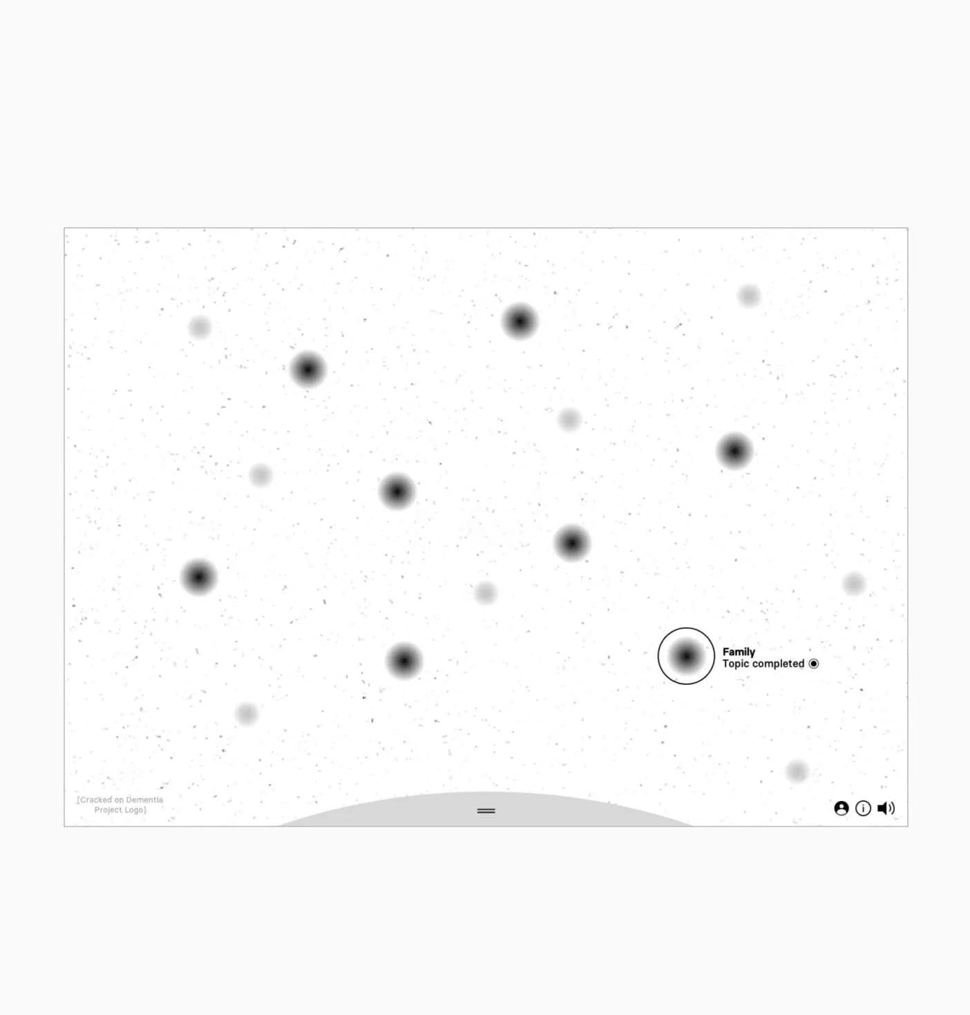
A playful display to keep track of your progress within the lesson plans
A desktop view of the Relationships topic, showing the sub topics and completion status of each topic.
  • 597K of people are living with dementia in Canada as of 2020
  • 61.8% of those living with dementia are women
Forge is a ‘dream team’! They developed an award-winning, multi-media digital learning experience about dementia-related stigma that deepens learners’ engagement. Despite the ever increasing complexities of its design and build, their team never disappointed – they model the very best of efficiency, ingenuity, and participatory design.
Pia Kontos, PhD, Senior Scientist, Professor
Backside of interactive donor recognition panels.

Stella’s Place

Toronto, ON
Services Deliverables
  • Signage
  • Wayfinding
  • Donor Recognition
  • Video Production
  • Motion Graphics
  • Kiosk
  • Placemaking
  • Masterplan

Young people are 20% of the population, but 100% of the future

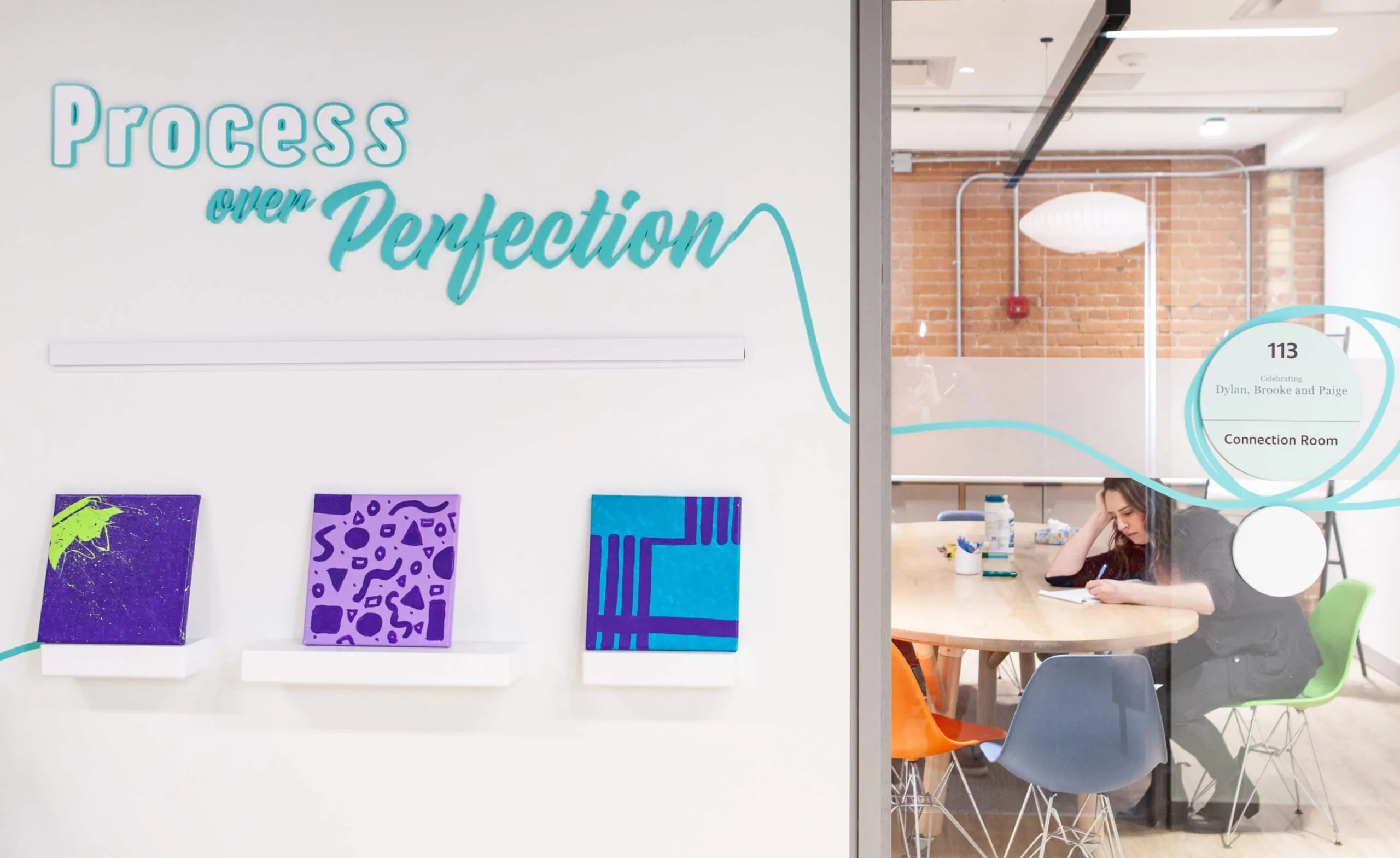
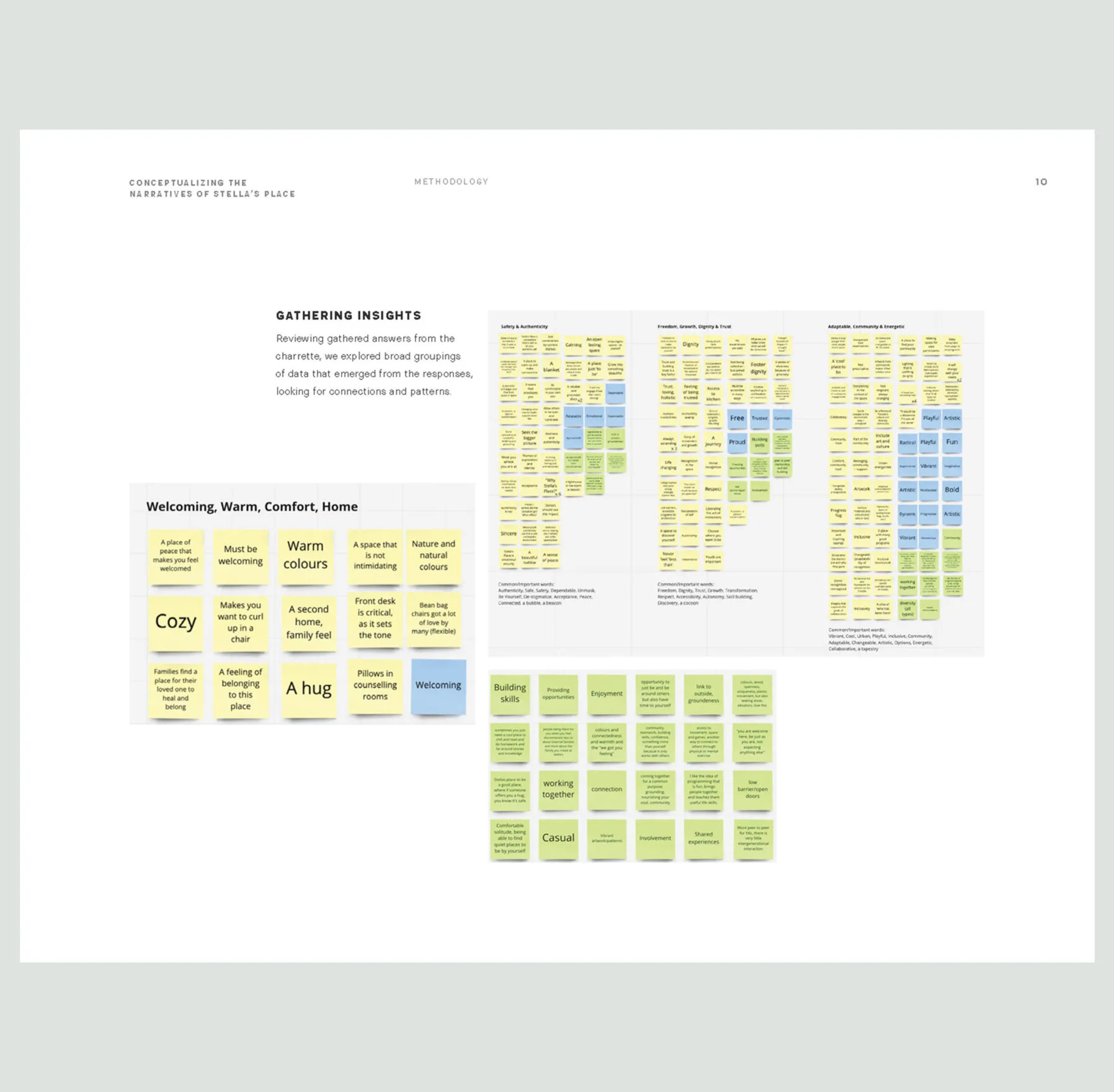
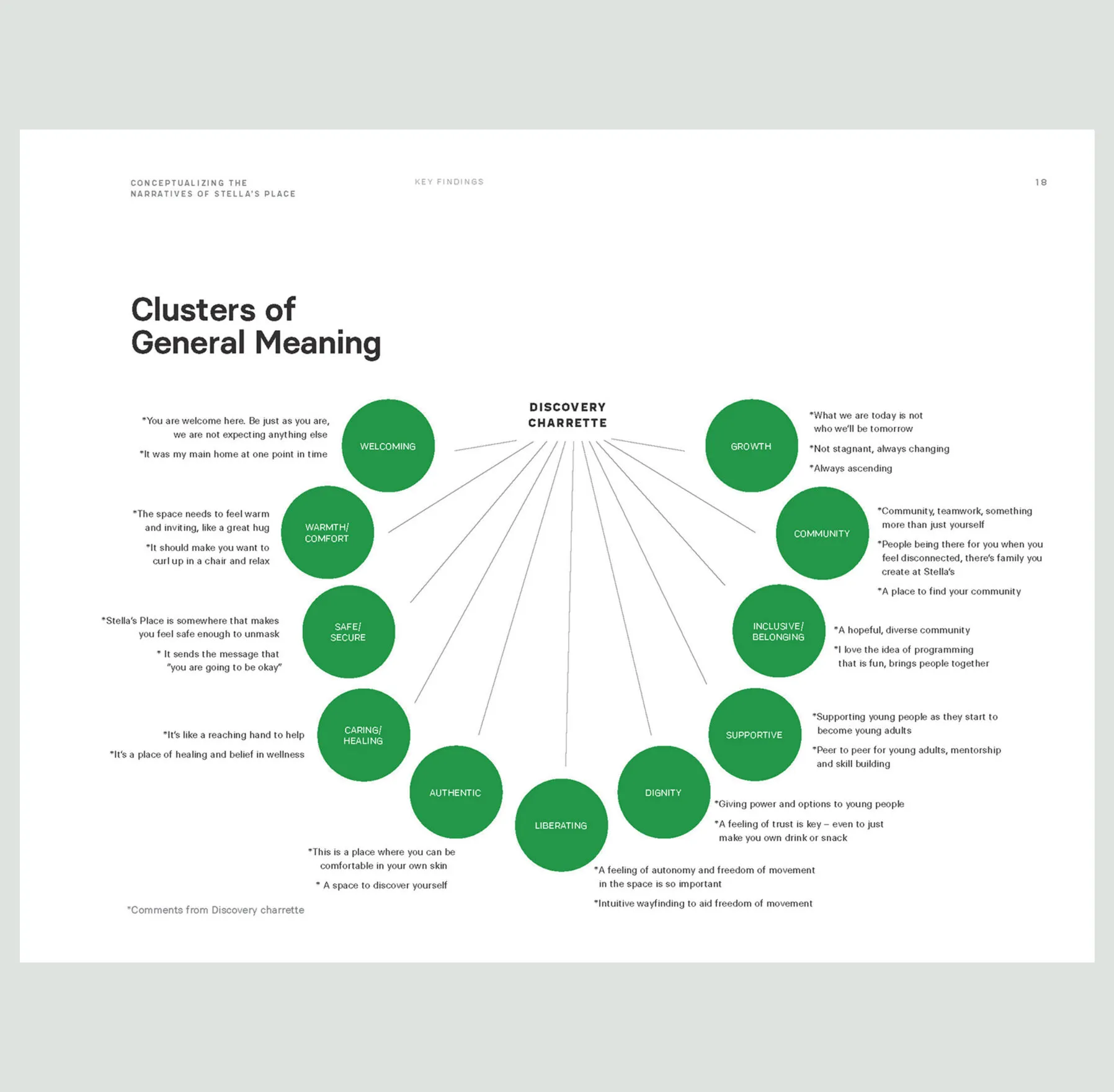
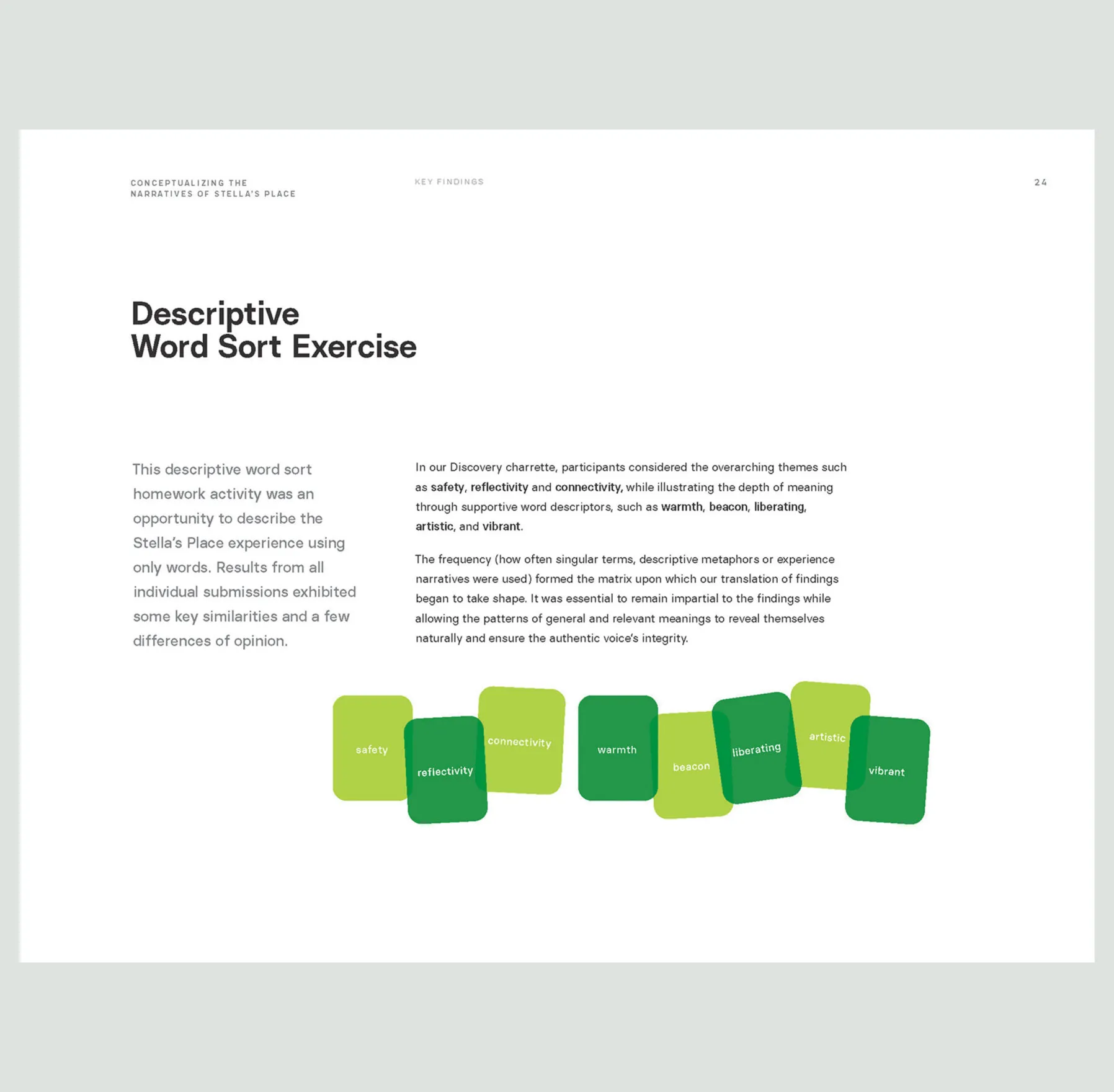
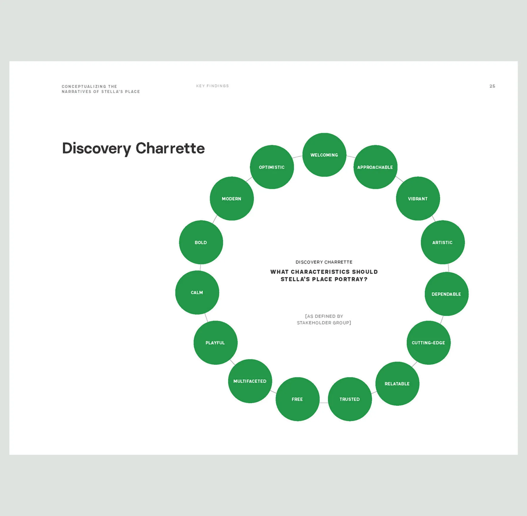
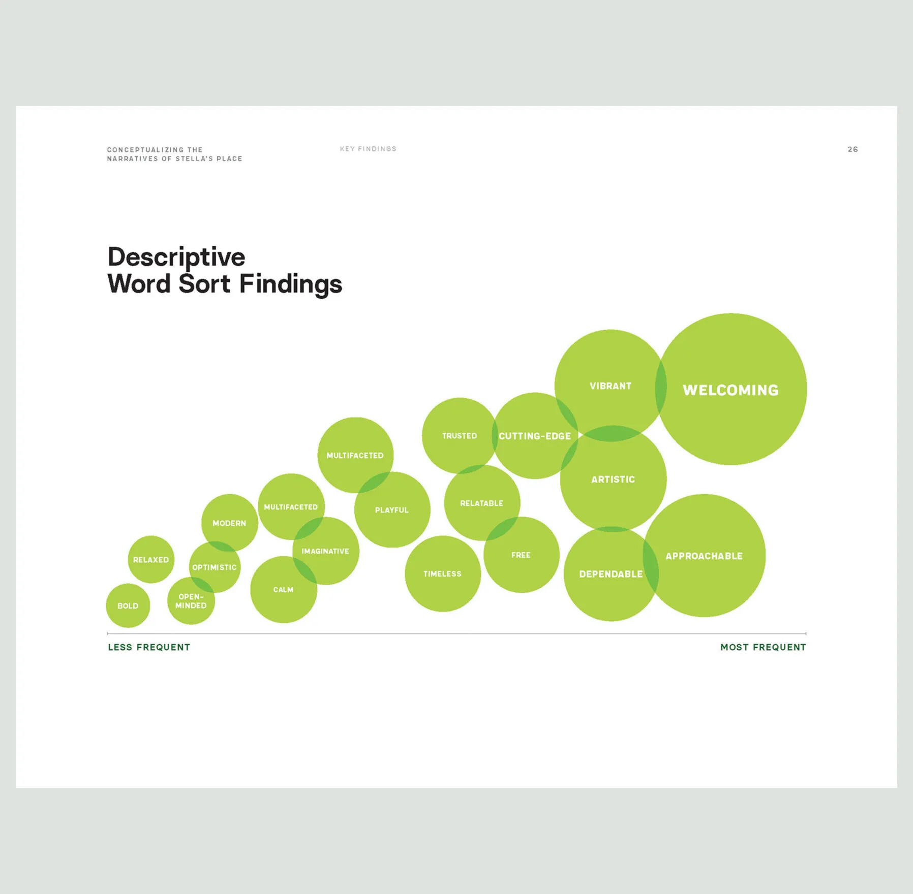
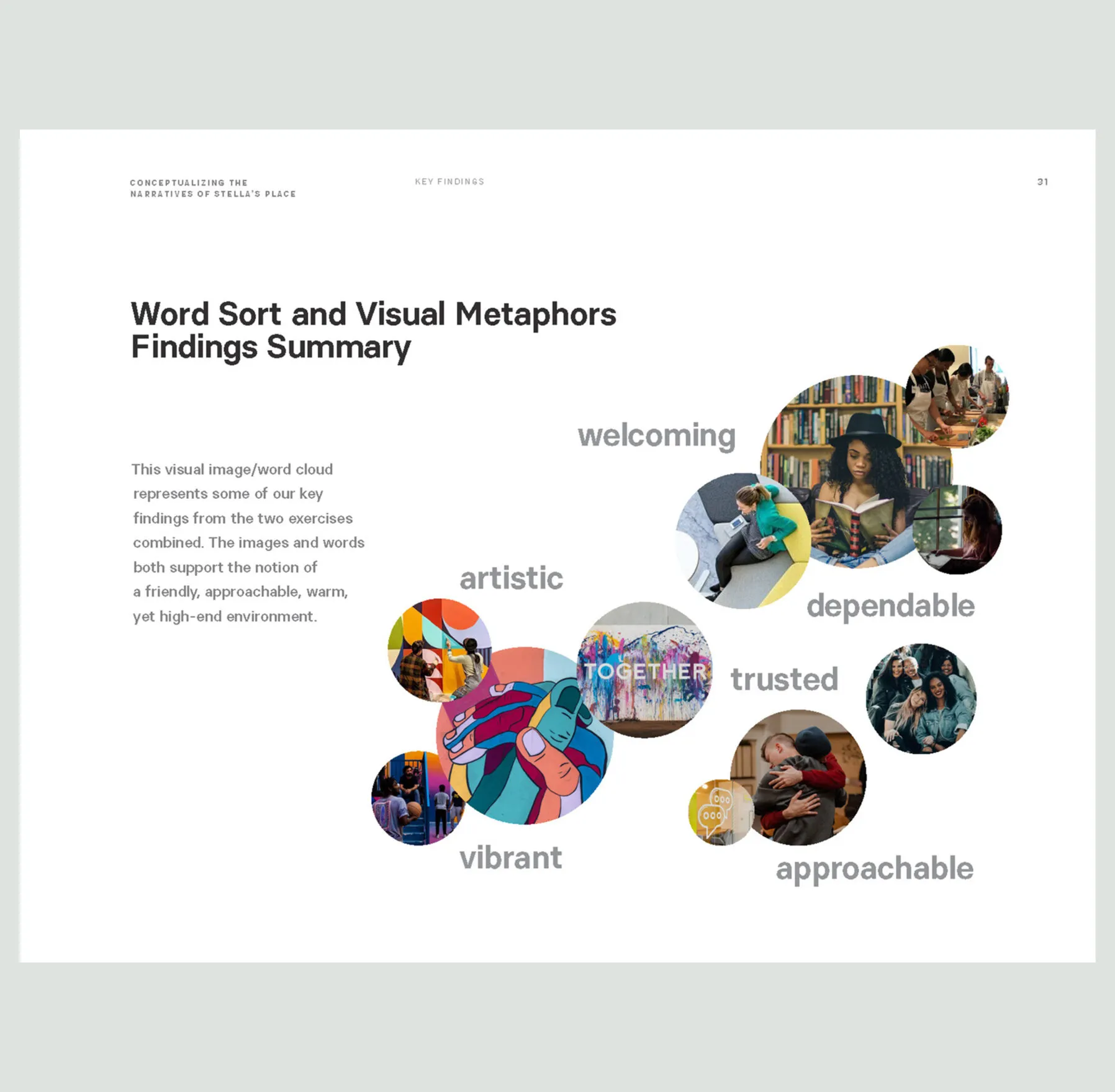
Forge had the pleasure of working with Stella’s Place – a not-for-profit organization in Toronto, ON, that helps young adults empower themselves to manage their mental health and wellness. During our inclusive co-design session, a rich diversity of stories from the stakeholders and youth participants revealed the tapestry of the community they are weaving together. This direction became a foundational theme for the project.

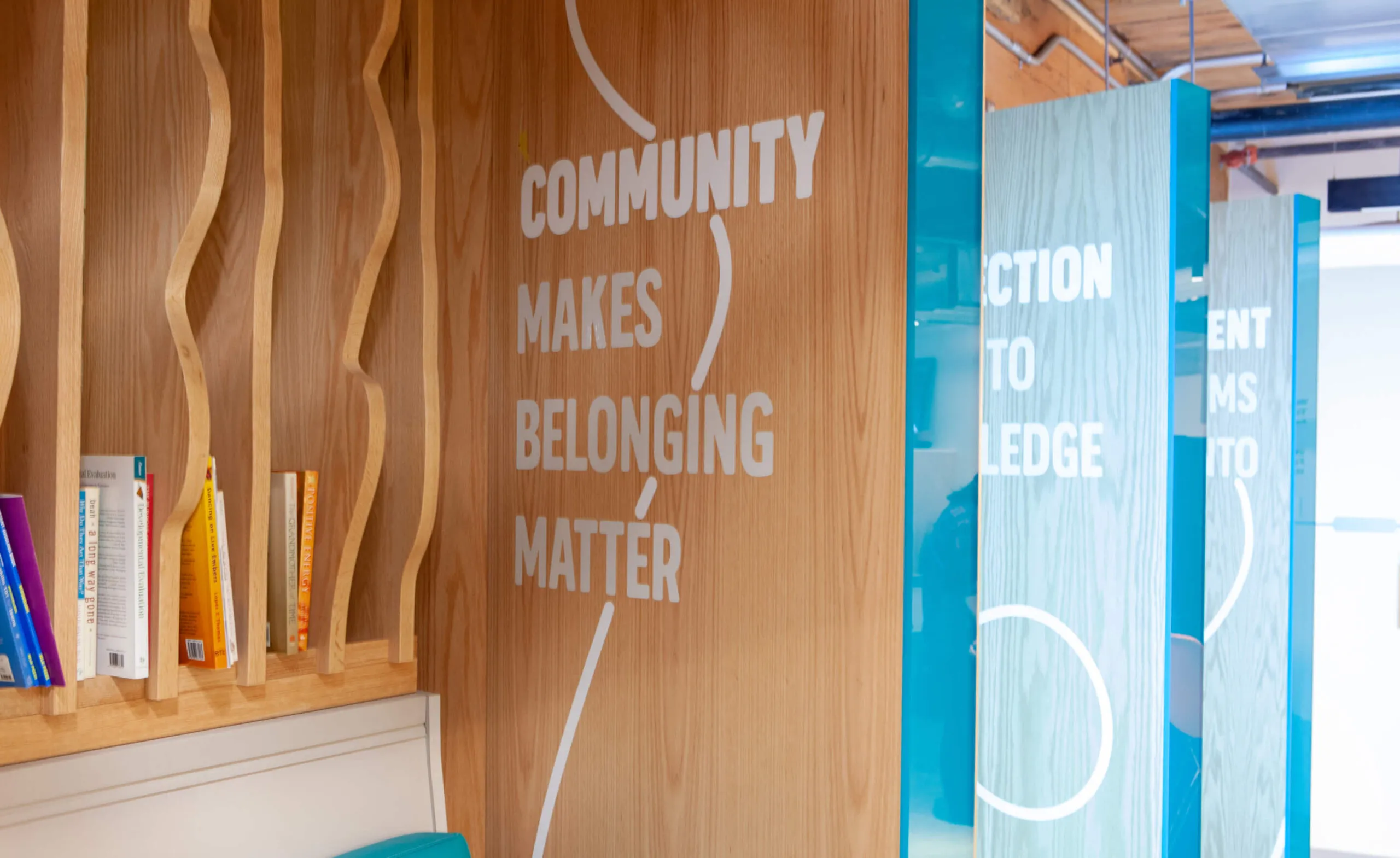
Inspirational interior signage.
A place for sharing art

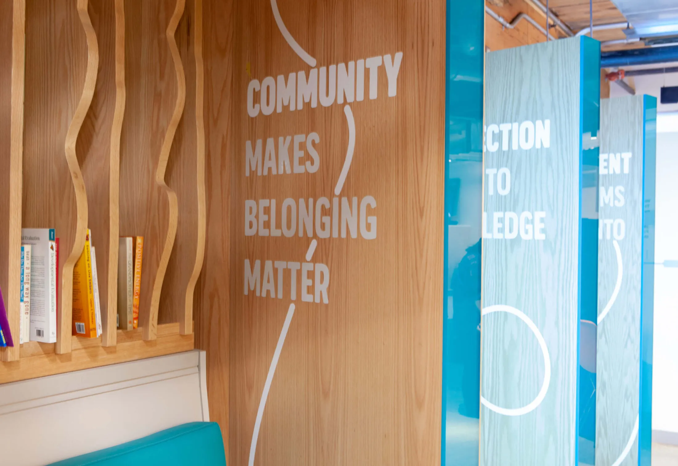
A through-line connection throughout the space

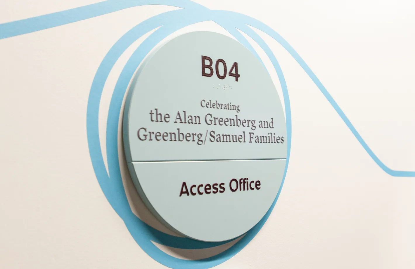
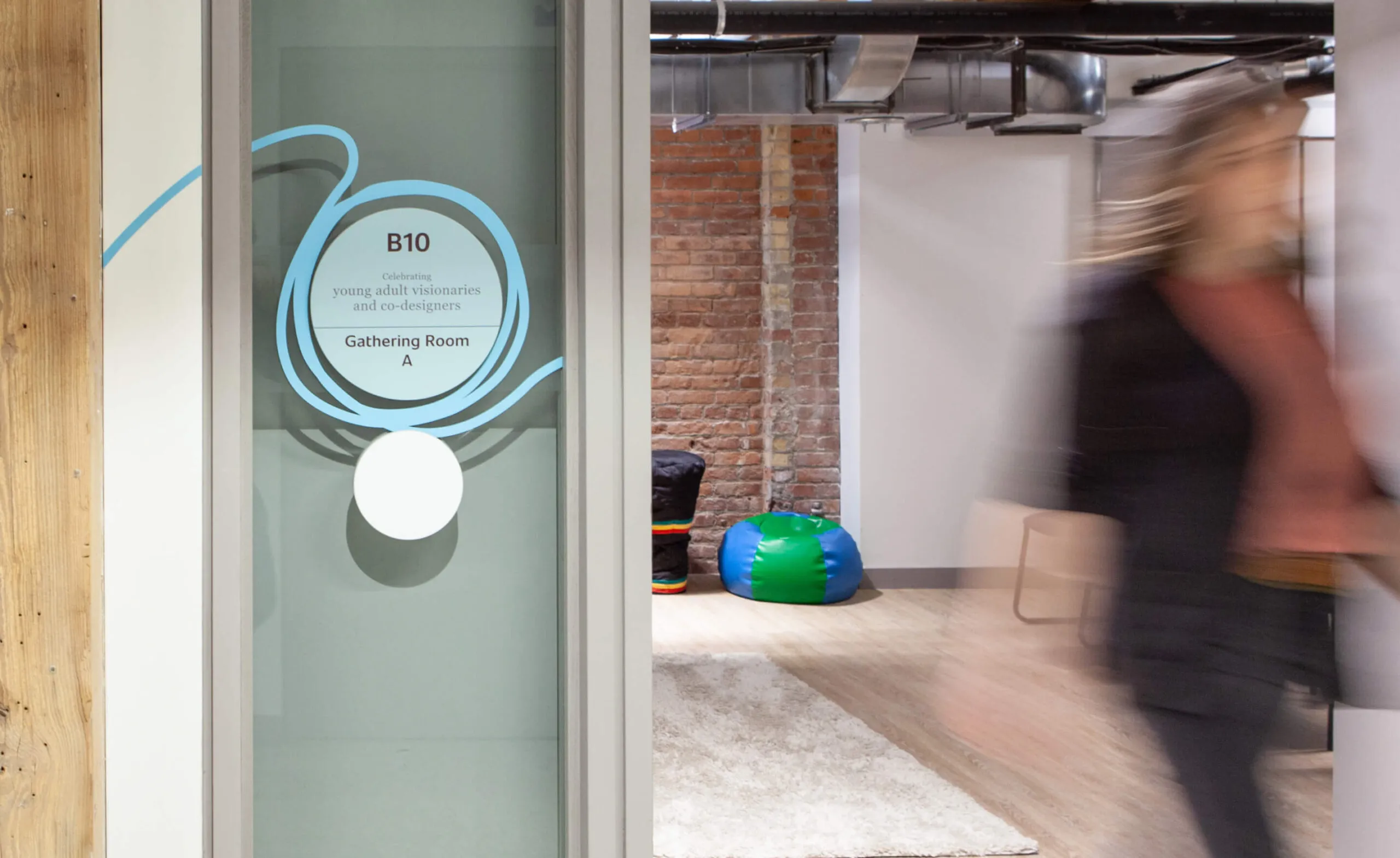
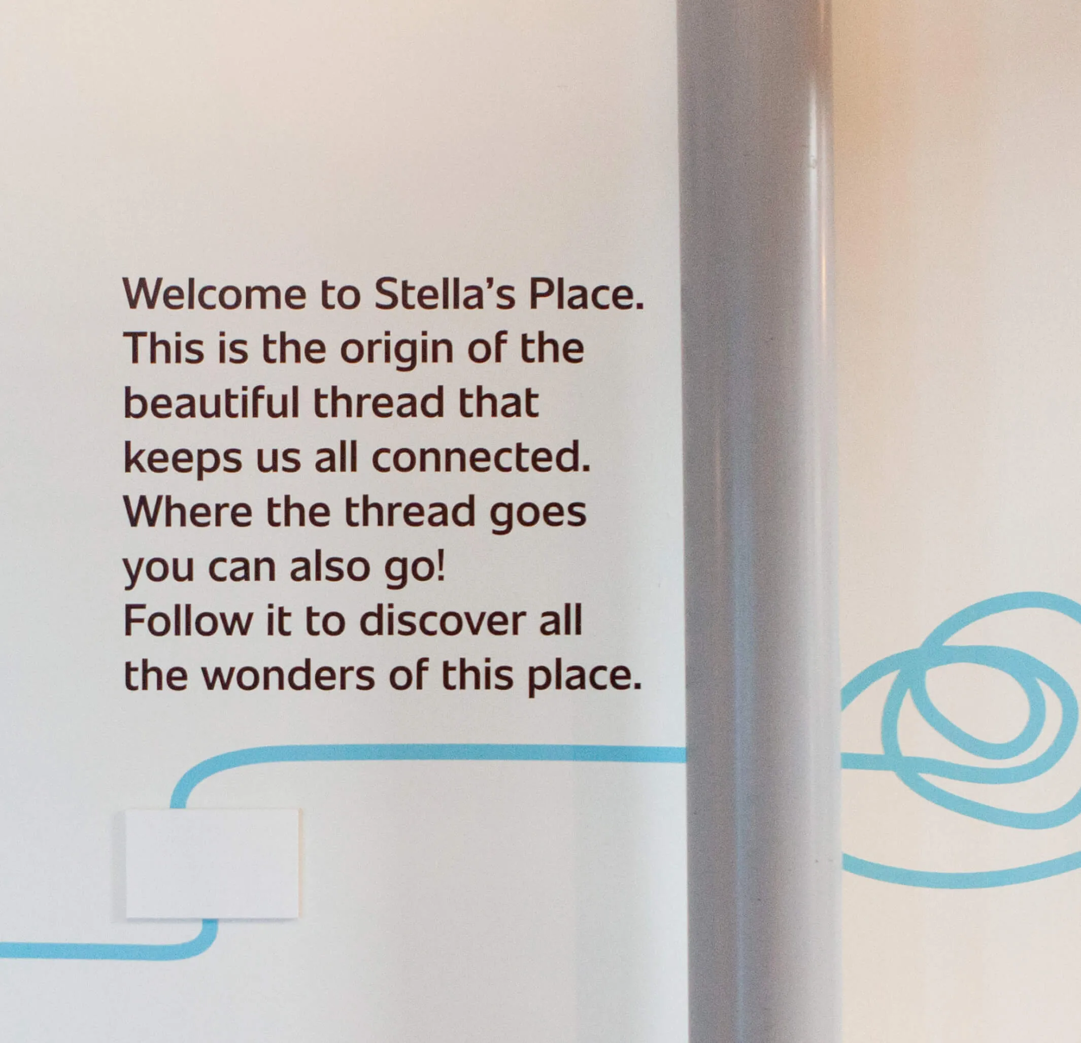
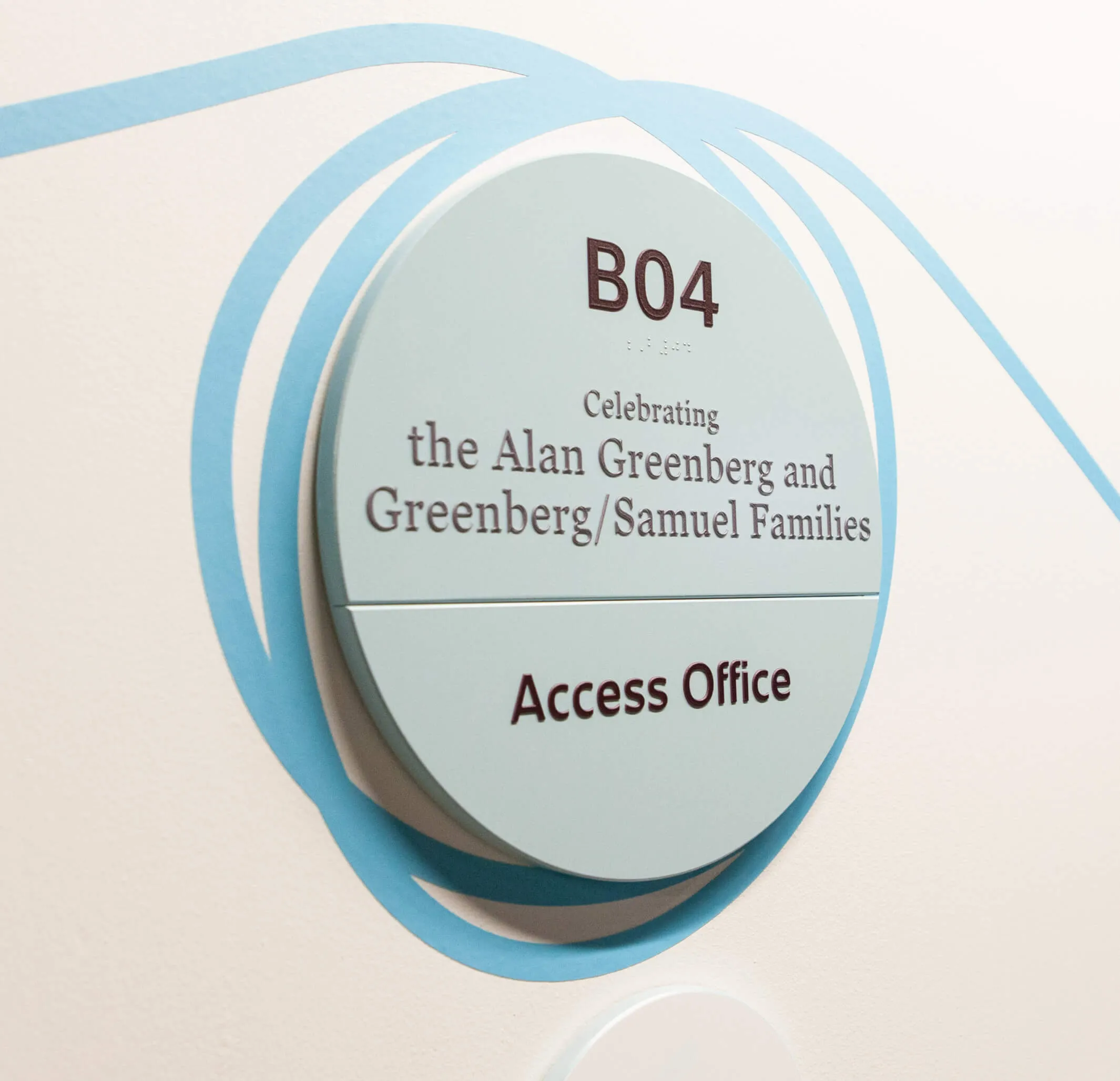
The interconnected concept of community is in all of the project elements, including a colourful thread graphic that weaves throughout the space, intuitively delineating areas that youth participants are welcome to utilize. Every detail of the signage keeps the safety of the participants in mind and features a high level of changeability to allow for future donor recognition of spaces.

Room signage and donor recognition, with a person walking by.
Integrated room sign and donor recognition
Close-up of messaging on an interior wall.
Close-up of donor recognition and room signage.
A connecting thread

Designing an accessible experience

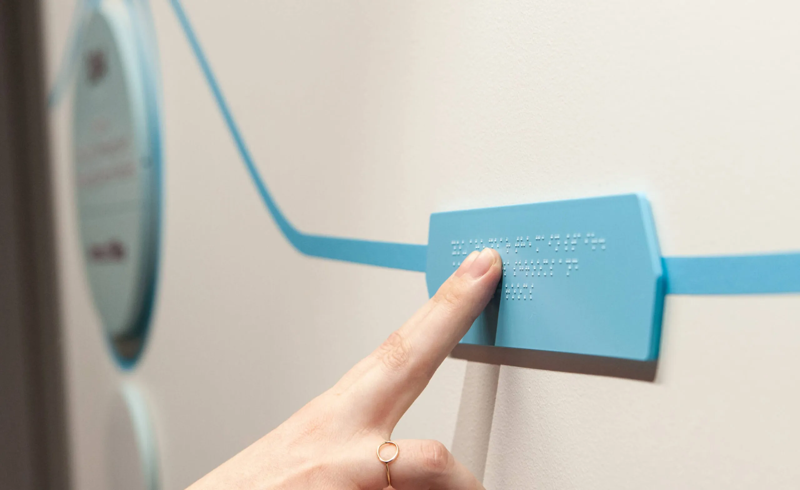
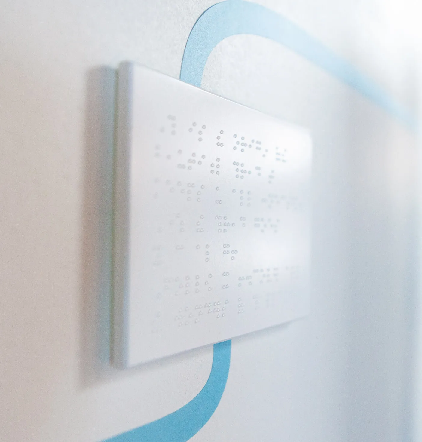
Also integrated into The thread is a tactile surface that distinguishes it from the wall. Braille directional pannels are strategically located at key decision points to help those with vision disability to orient themselves.

A person's hand touching a braille sign.
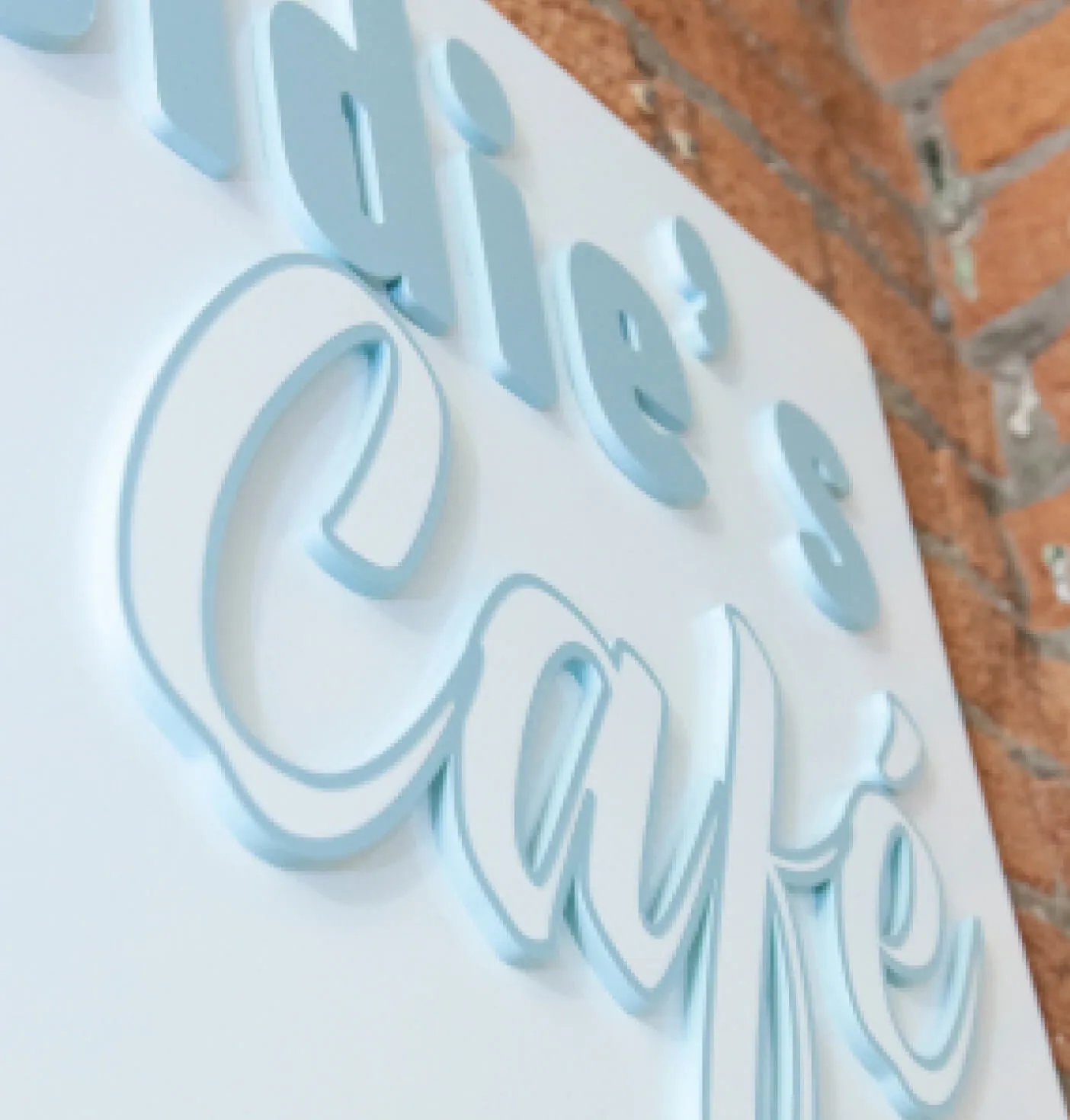
Close-up of raised signage letters.
Close-up of braille signage.
Close-up of raised signage letters.
Calming design cues

Thoughtfully showcasing personal stories through design

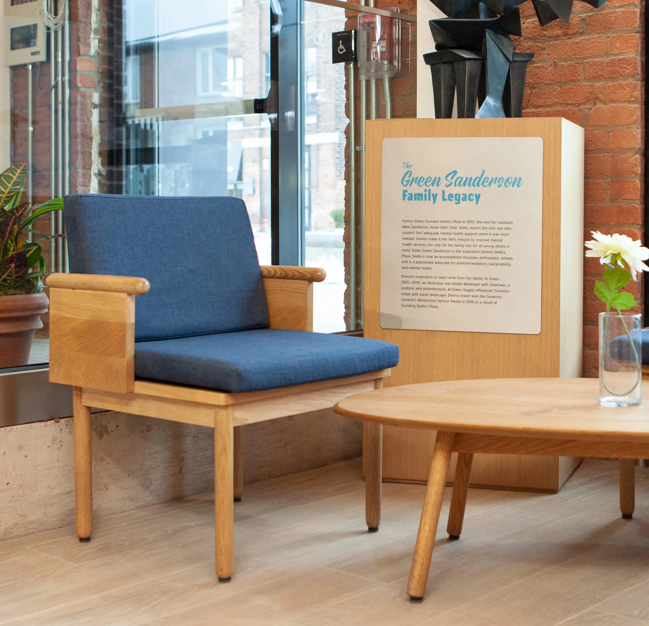
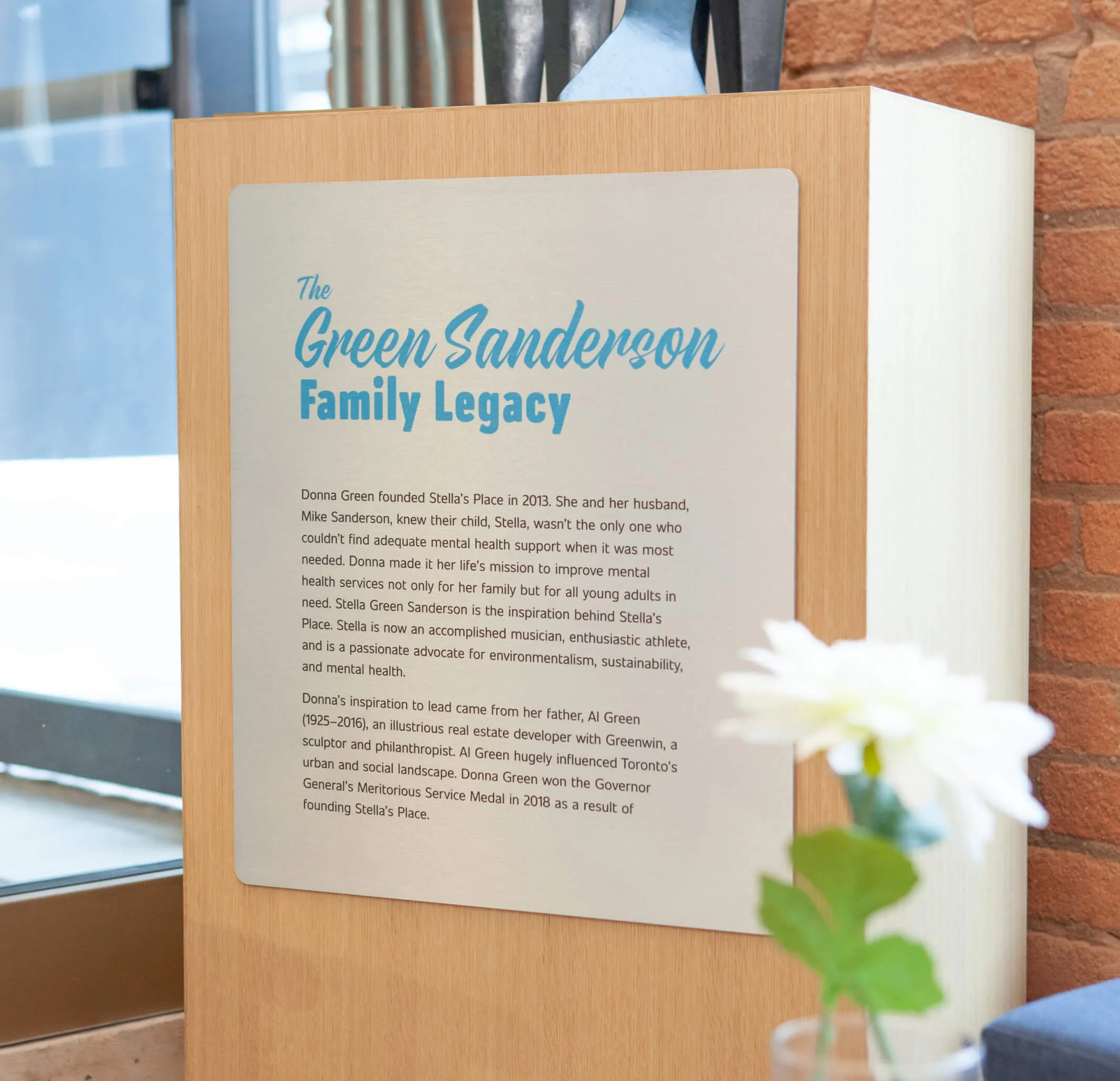
Forge worked closely with Stella’s Place to ensure everyone’s story was carefully told. Choosing where and how those moments were displayed was a collaborative effort between client, interior designers and Forge’s environments team.

A chair and donor legacy sign.
Close-up of interior donor legacy sign.
Founder recognition plaque

Creating a place of their own

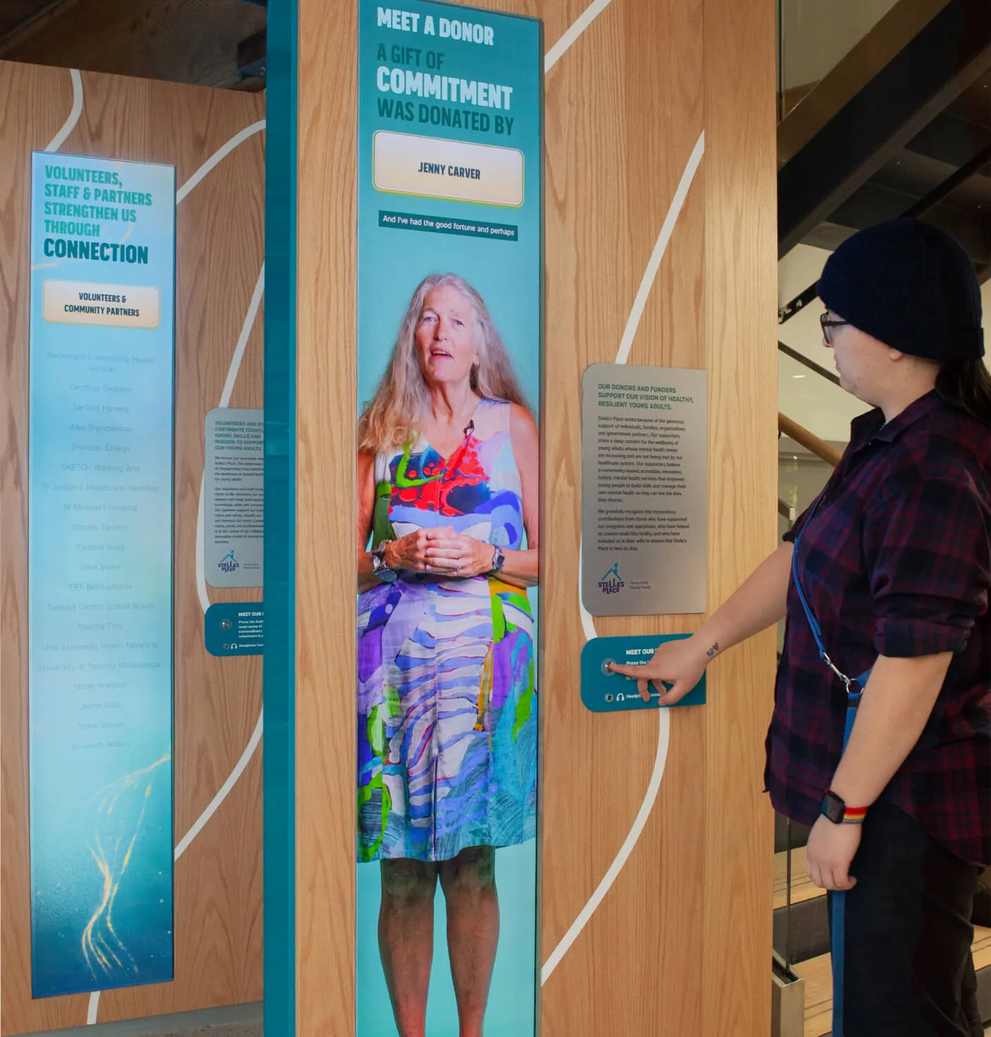
The digital donor wall was placed at the heart of the new building, highlighting the importance of the people that provide funding, service, and participation. At the push of a button, video testimonials of donors, participants, peers and staff capture the essence of ‘Why Stella’s Place matters’ and illustrates the strong sense of belonging shared by all who walk through its doors.

Backside of interactive donor recognition panels.
A person interacting with the donor touch screen.
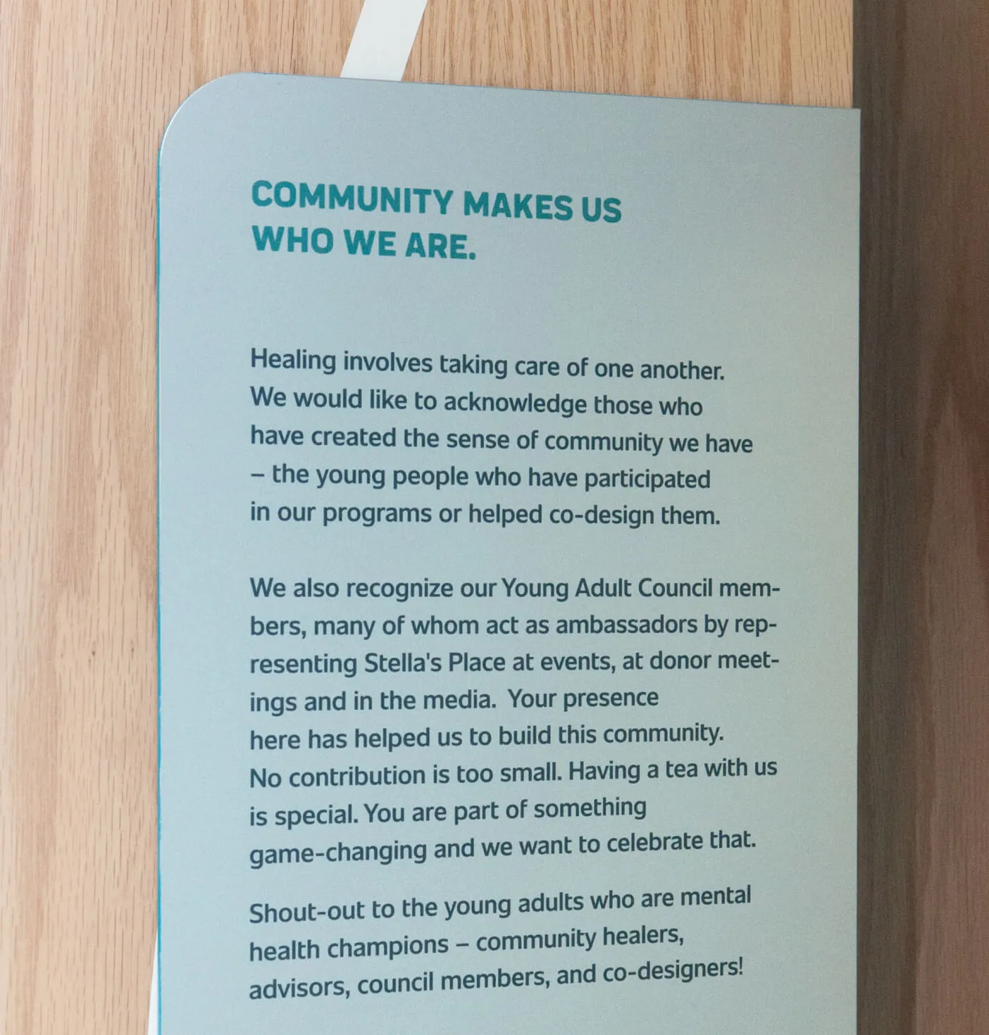
A close-up of a sign describing the community at Stella's Place.
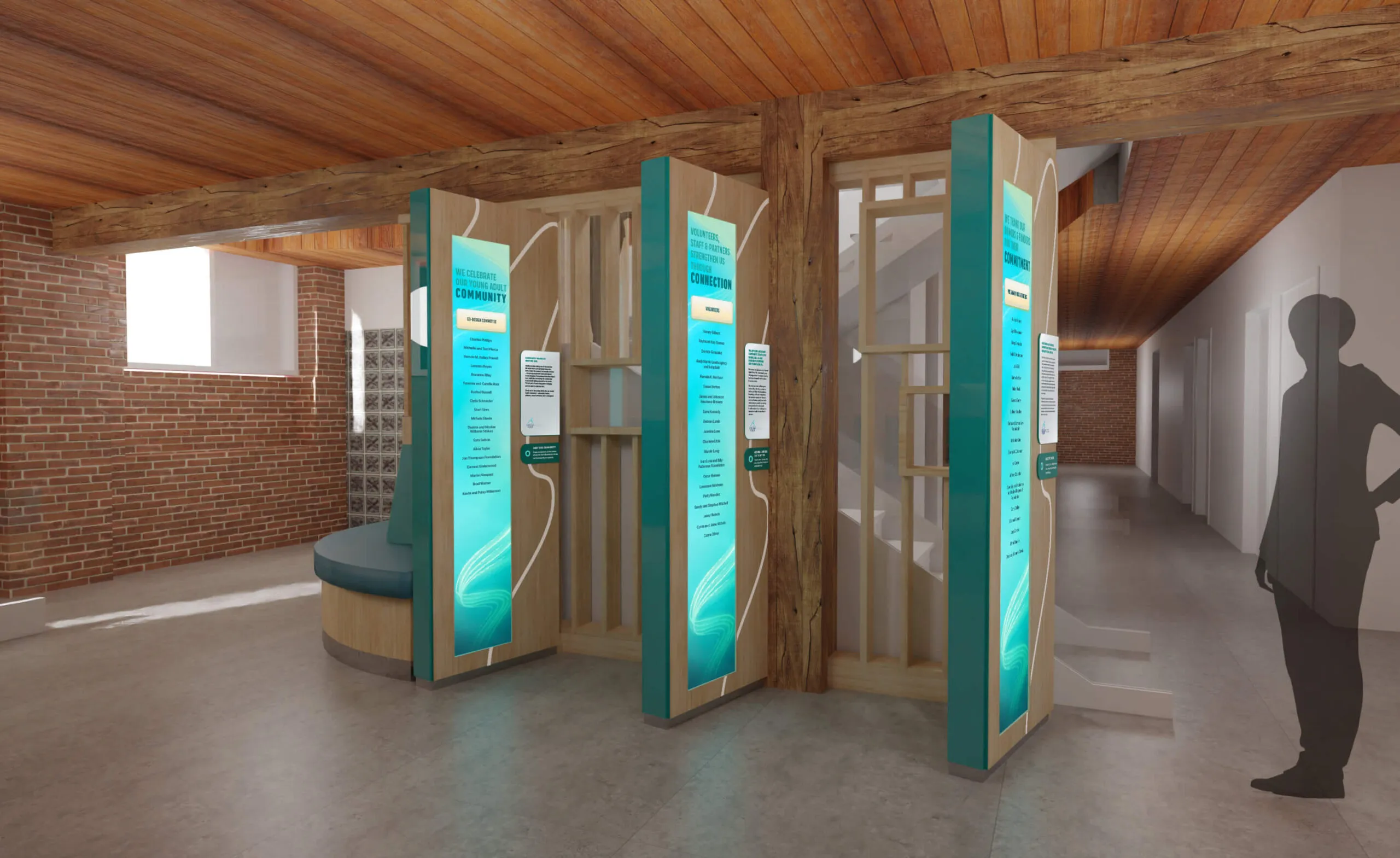
A rendering of the donor wall concept.
  • 12K sq. ft. community space
  • 300+ 1-on-1 counselling sessions in 2022
  • 80% group session retention rate in 2022
Featured
"Forge Media + Design were a pleasure to work with. This project exceeded my expectations of what is possible with donor recognition and placemaking and I’m so proud of the result. I am especially grateful for the process they used to co-design this project with our program participants, staff and Board members. They really listened to our input and our voice is apparent throughout the space. Forge was responsive, engaged and professional for the whole of the process."
Catherine Dyer, Director of Development
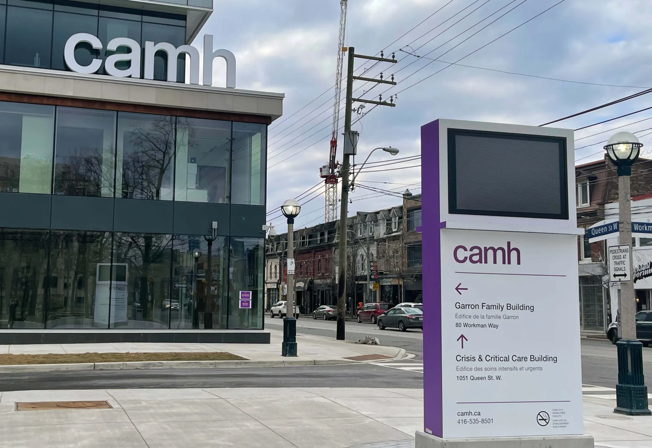
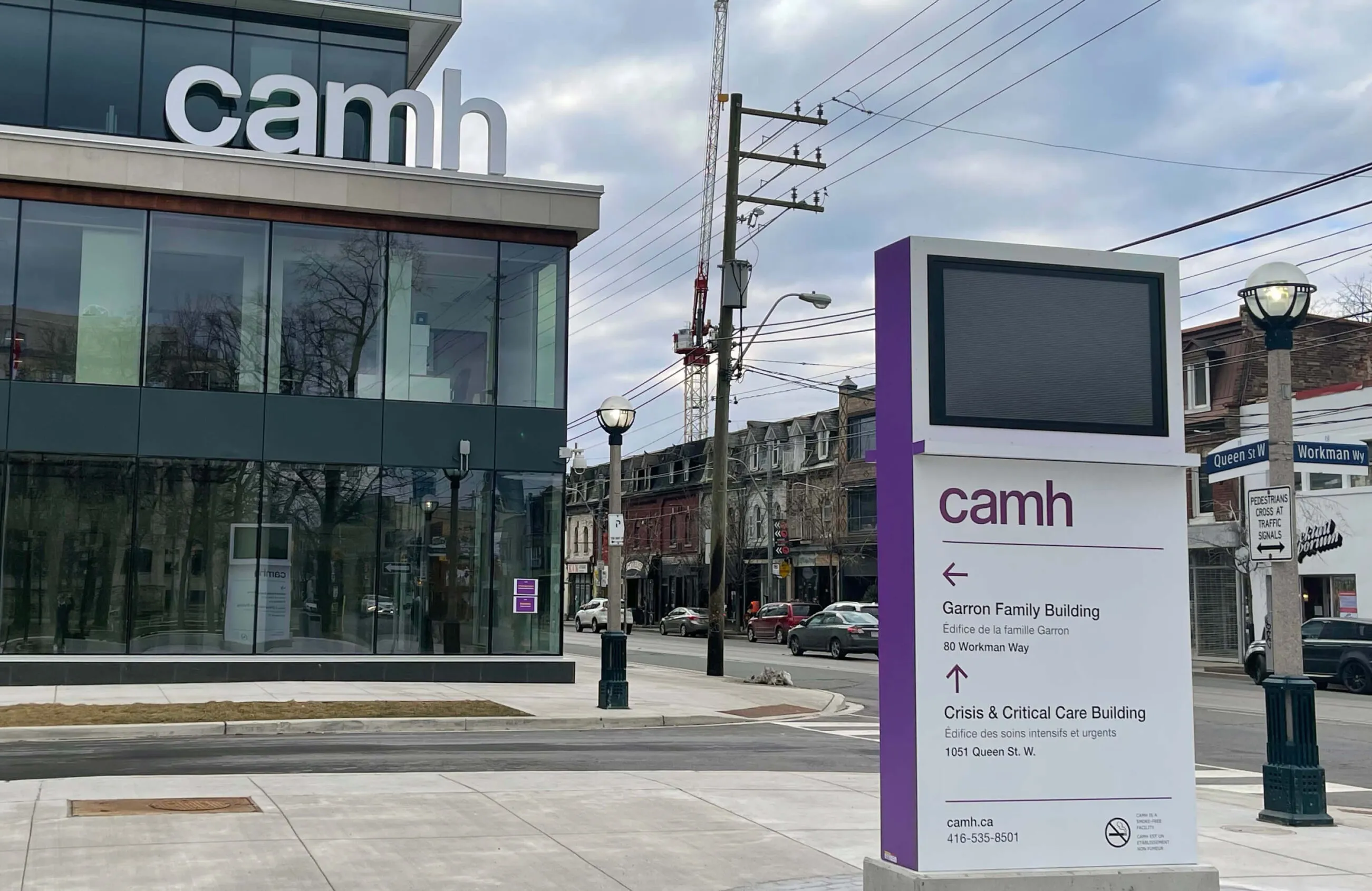
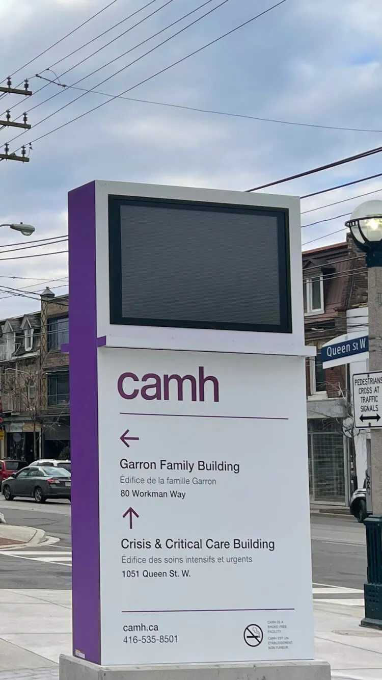
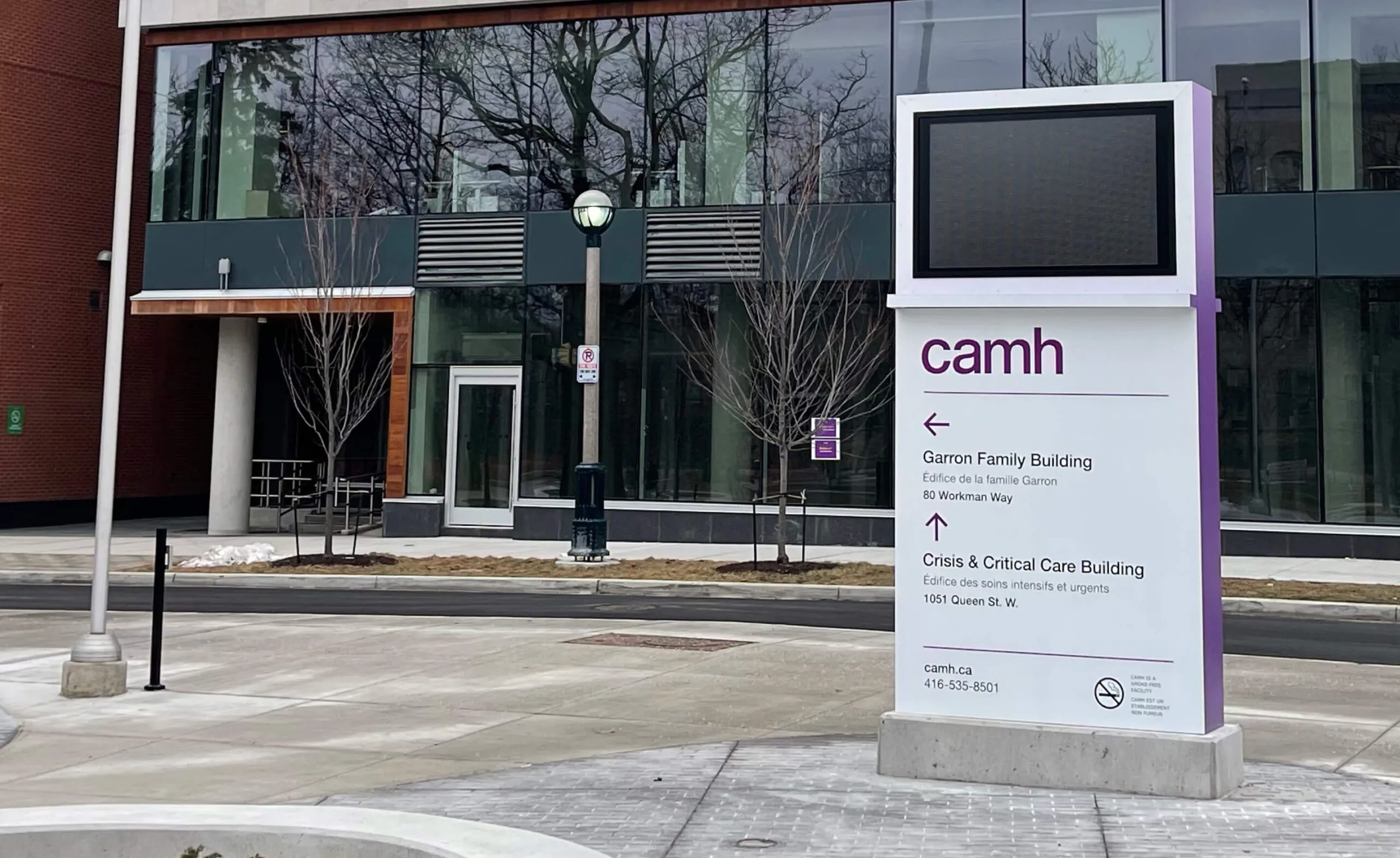
CAMH building with directional signage for Garron Family Building and Crisis & Critical Care Building. CAMH building directory sign with directions to Garron Family Building and Crisis & Critical Care Building.

CAMH

Toronto, ON
Services Deliverables
  • Signage
  • Wayfinding
  • Placemaking
  • Masterplan
  • Donor Recognition
  • Illustration

Moving people through a holistic wayfinding approach

The Centre for Addiction and Mental Health (CAMH) is Canada’s largest mental health teaching hospital. CAMH drives innovative research, provides expert training to healthcare professionals, and advocates for social change. Working alongside Stantec and Acumen Visual Group, we developed a holistic wayfinding approach at CAMH’s Queen Street site to fully integrate two new CAMH campus buildings – Building B1 (McCain Complex Care & Recovery Building) and Building D1 (Crisis & Critical Care Building).

Person walking down stairs next to a directory sign at CAMH.
Clear and simple direction

Creating a welcoming sense of belonging

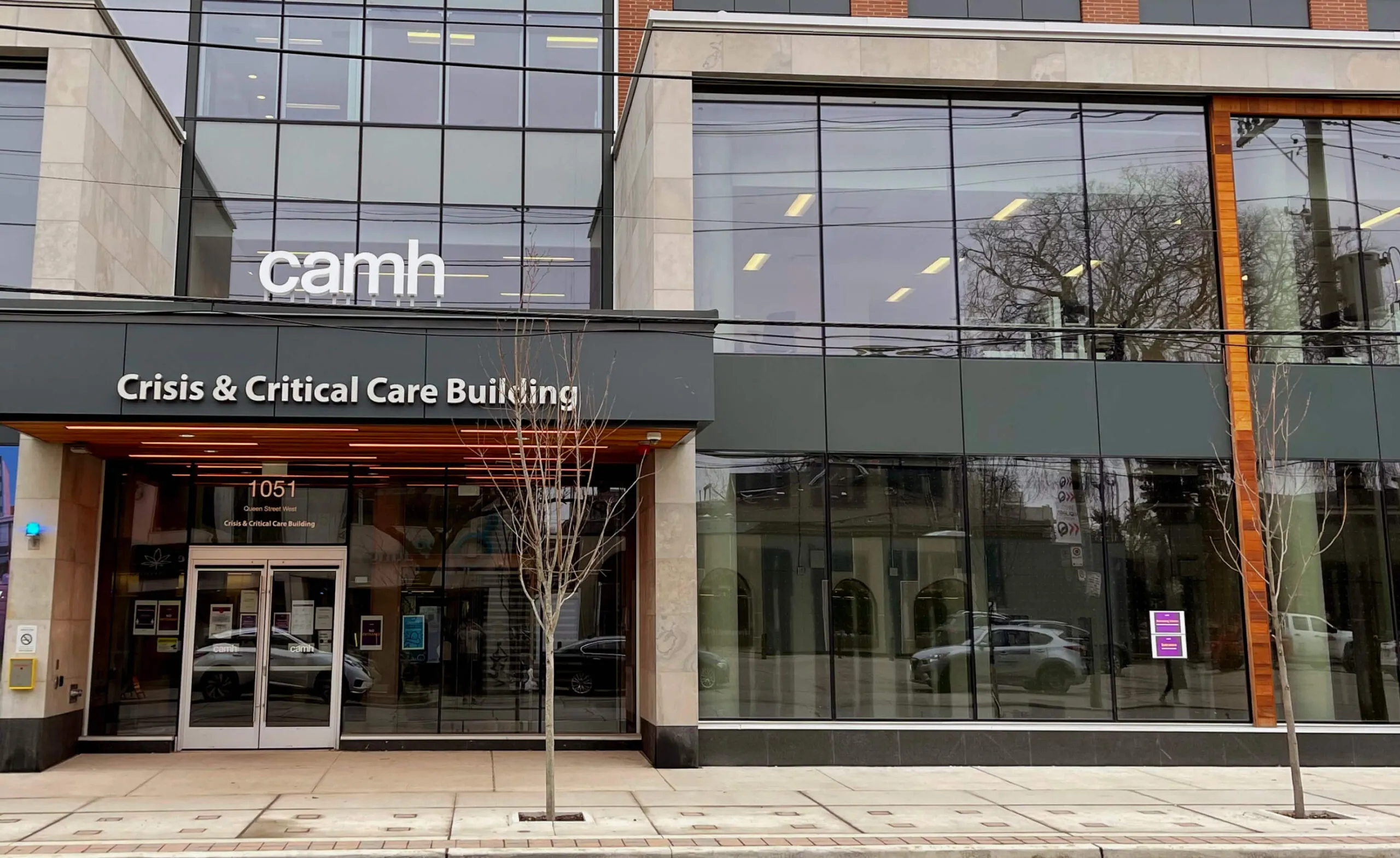
The wayfinding program uses critical campus points to help patients, workers and visitors reach their intended destinations safely and with clarity throughout the day. Signage recognizing the generous donors and their contributions is celebrated proudly in the newly built Crisis & Critical Care and McCain Complex Care & Recovery buildings.⁠

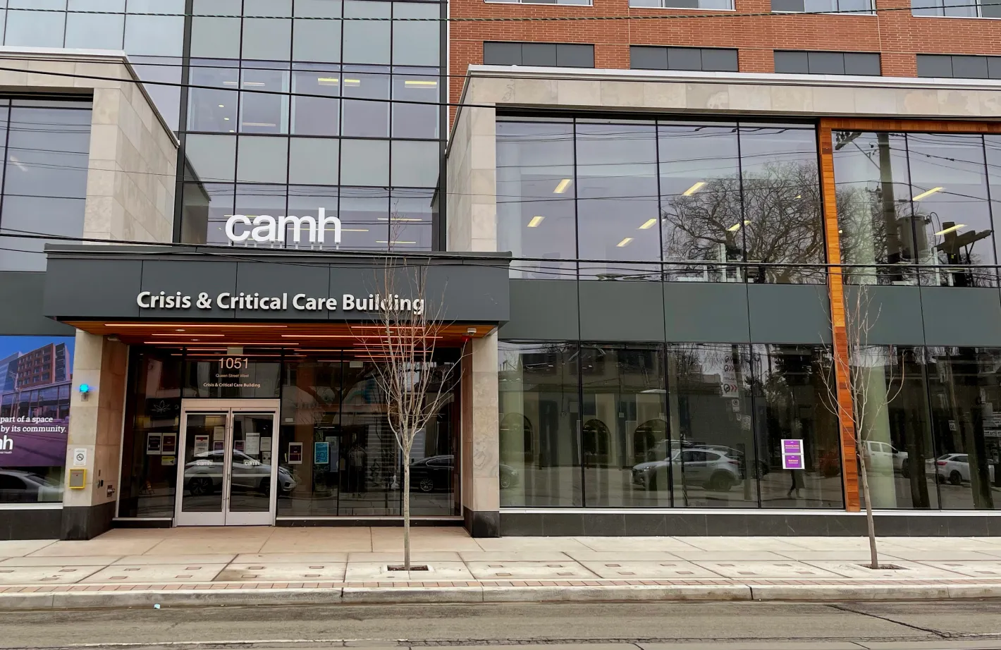
CAMH Crisis & Critical Care Building entrance with glass facade and signage.
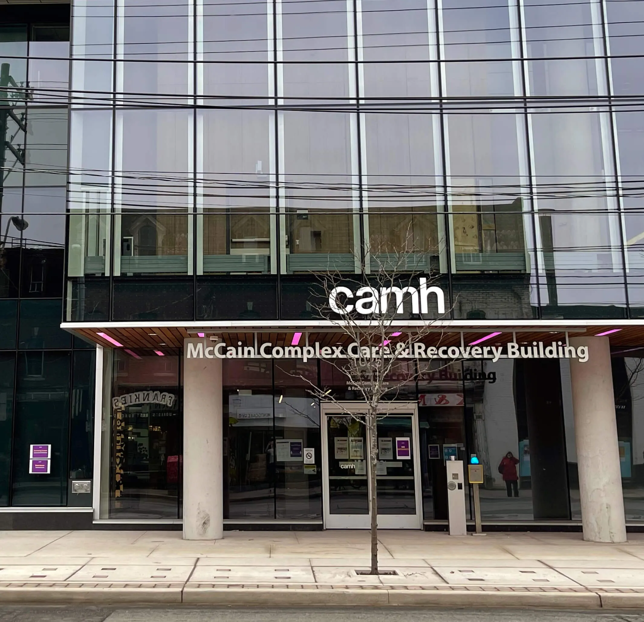
A new beginning for community care
CAMH McCain Complex Care & Recovery Building entrance with a bare tree in front.
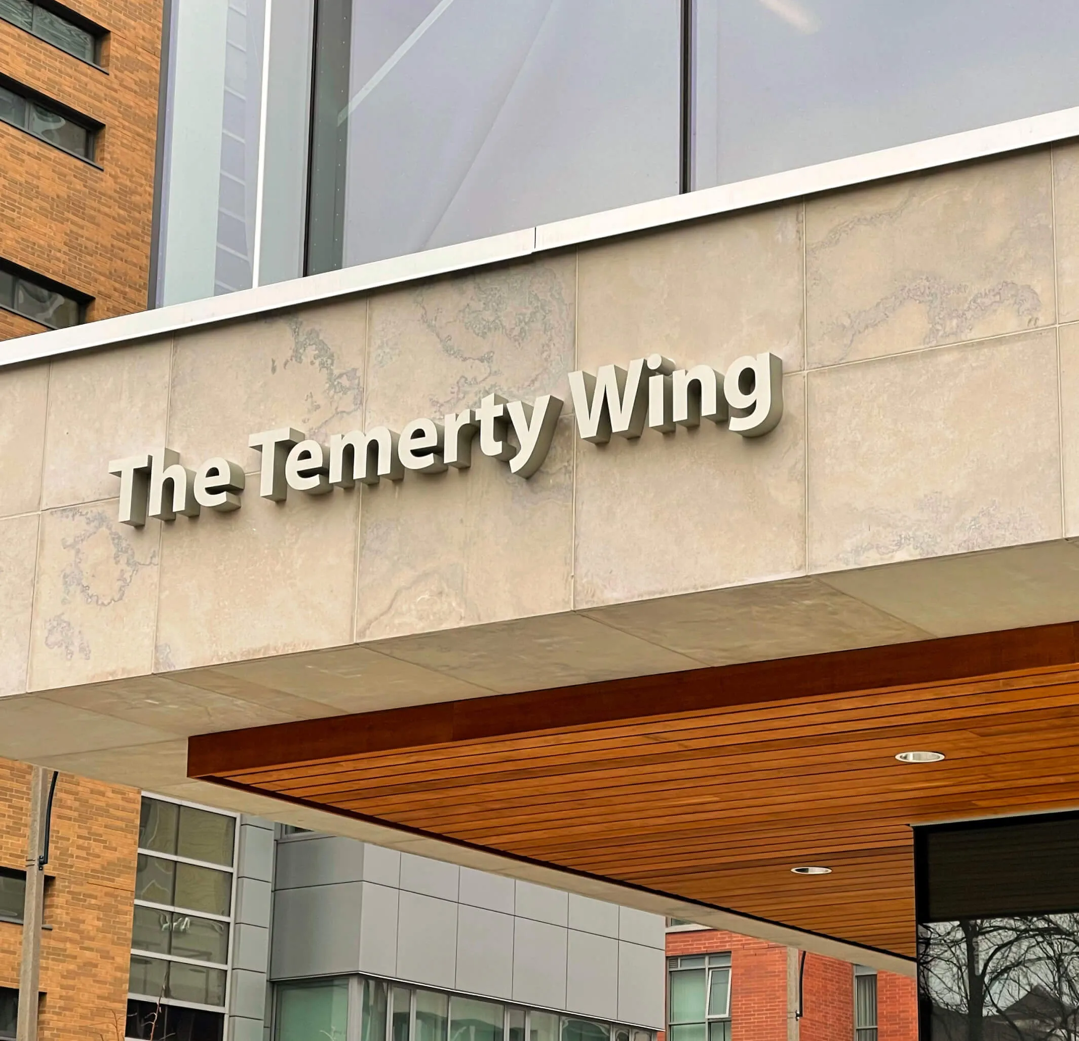
The Temerty Wing building sign.
Contribution as identity
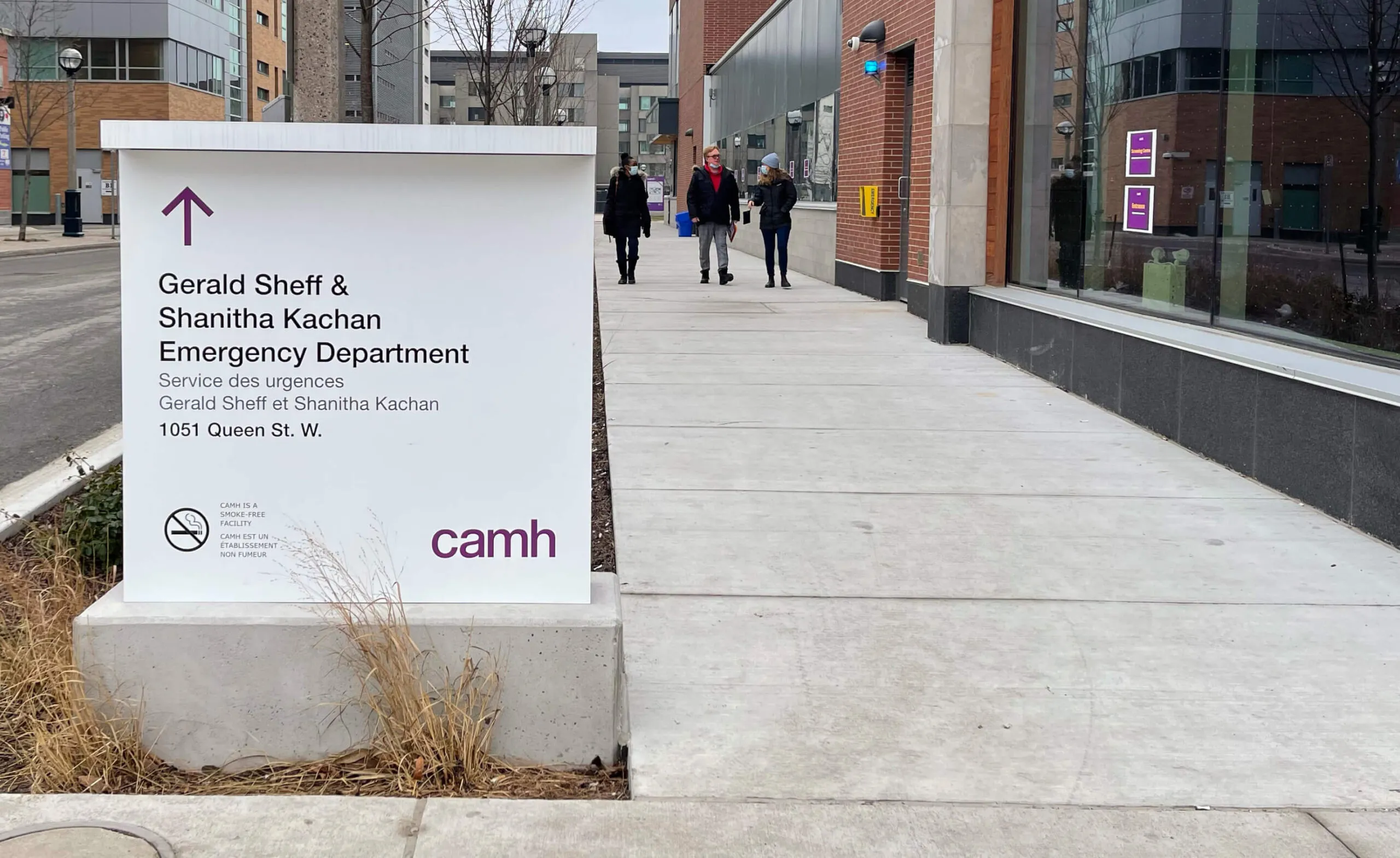
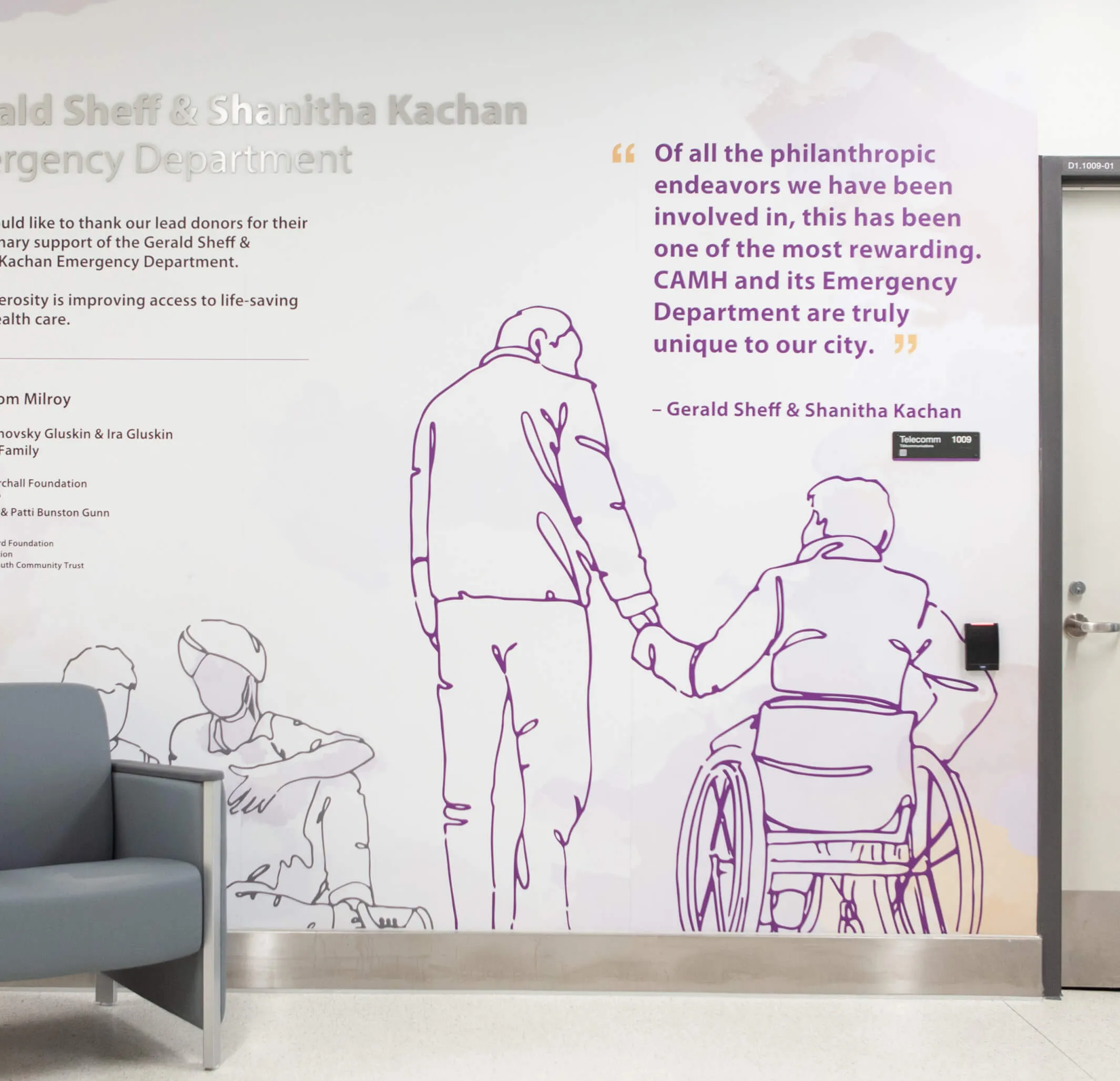
CAMH sign for Gerald Sheff & Shanitha Kachan Emergency Department.
Campus navigation
CAMH sign with directions to Garron Family Building and Crisis & Critical Care Building.
Expressing subtle brand cues with wayfinding

Improving the movement and flow of people in the space

The interior signage program for the new CAMH campus buildings improves the flow and movement of people throughout the space, as patients, visitors and staff have the tools they require to self-navigate the buildings. The signage welcomes the community and encourages people to utilize the building’s many resources.

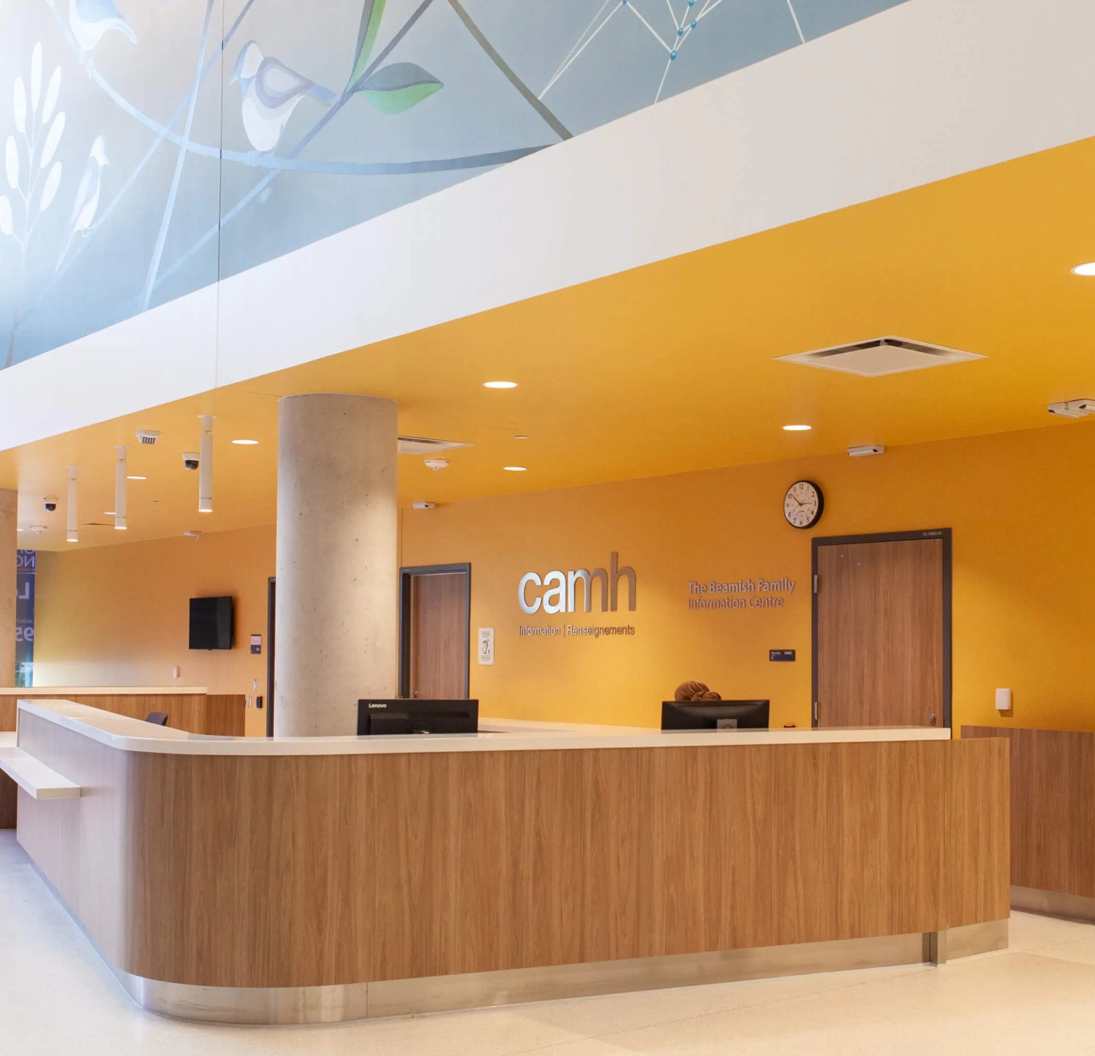
Modern reception desk with CAMH logo and artwork in a bright, yellow-walled building.
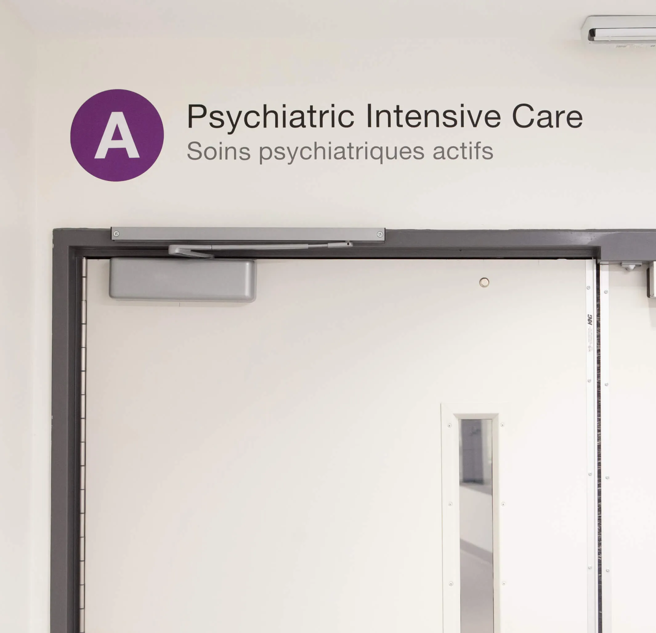
Sign for Psychiatric Intensive Care Unit A, with French translation.
Place and colour help inform wayfinding
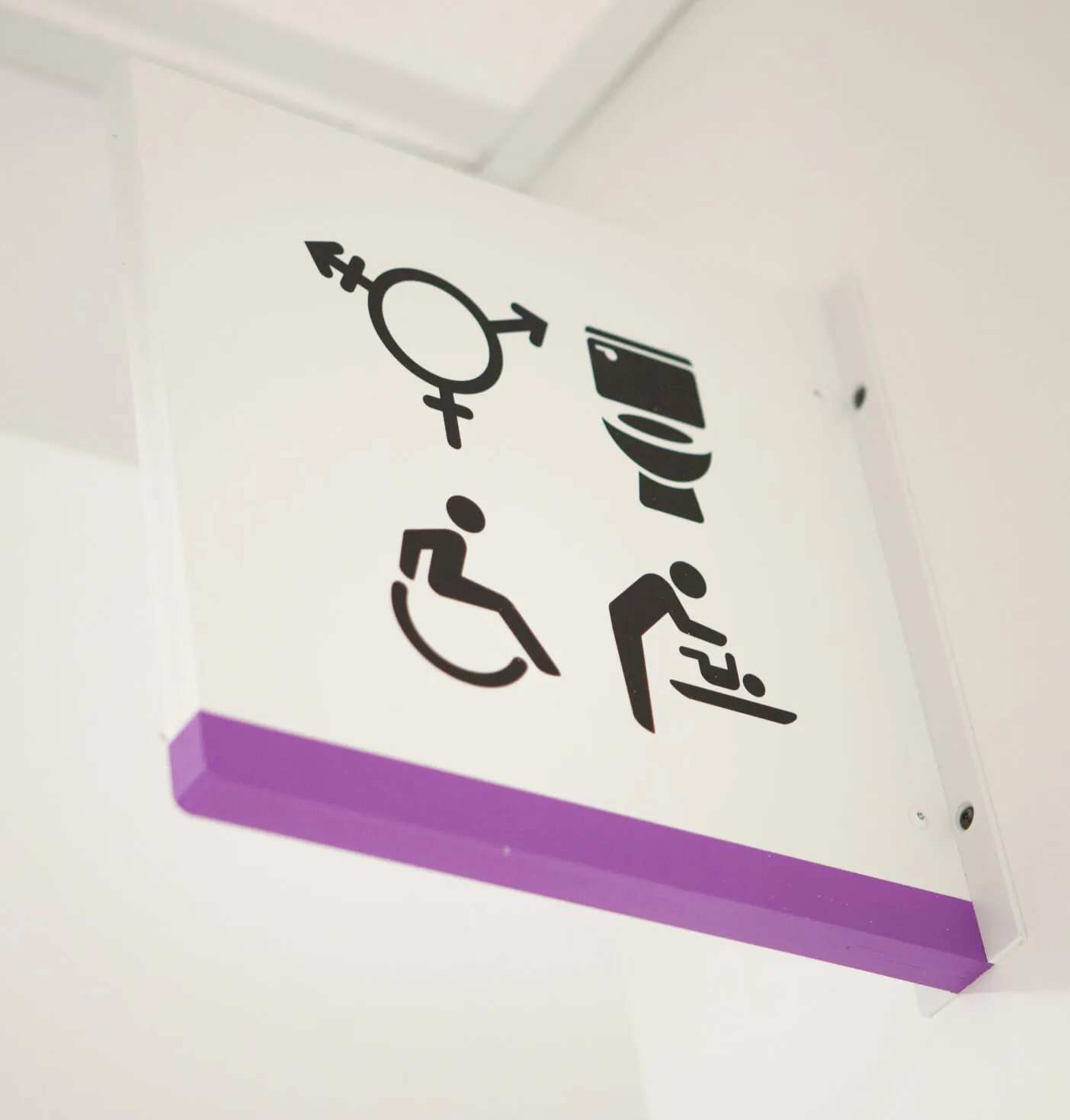
Restroom sign with symbols for transgender, toilet, wheelchair, and changing table.
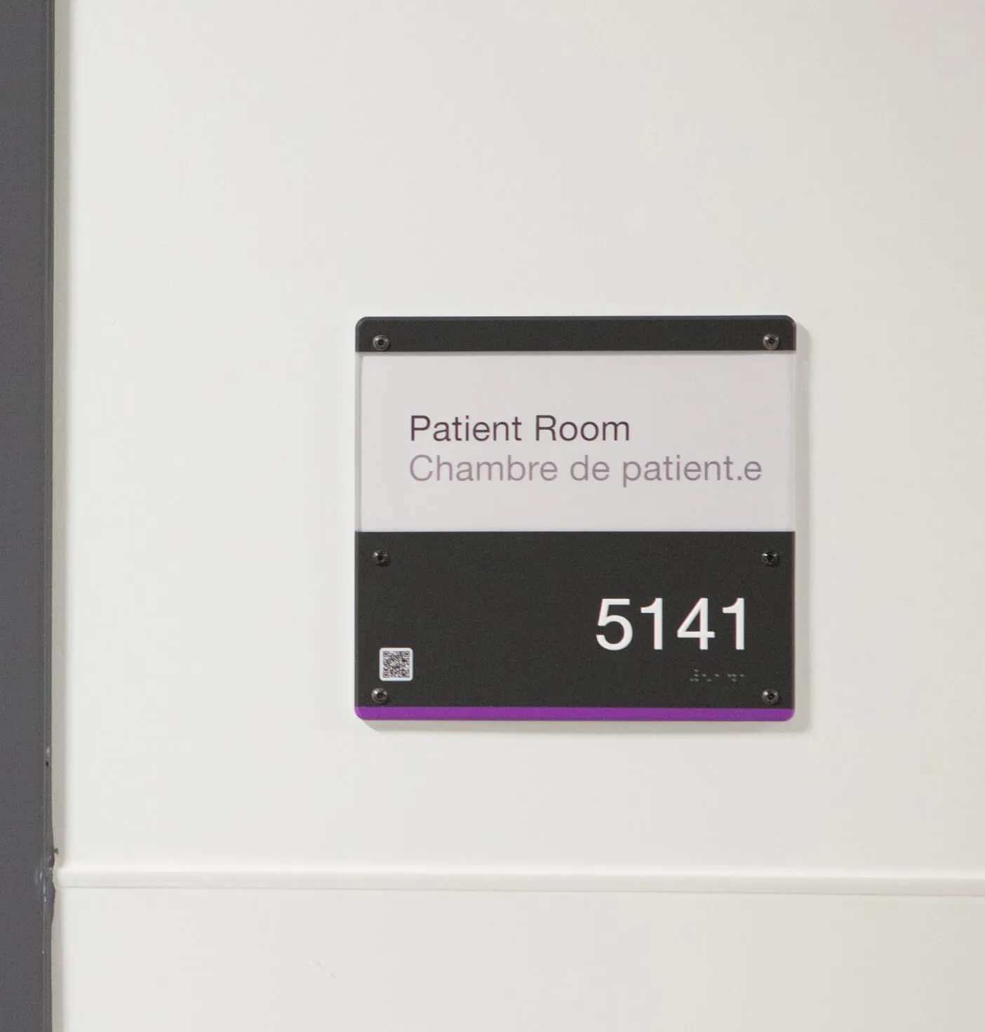
Patient room sign with number 5141 and QR code.
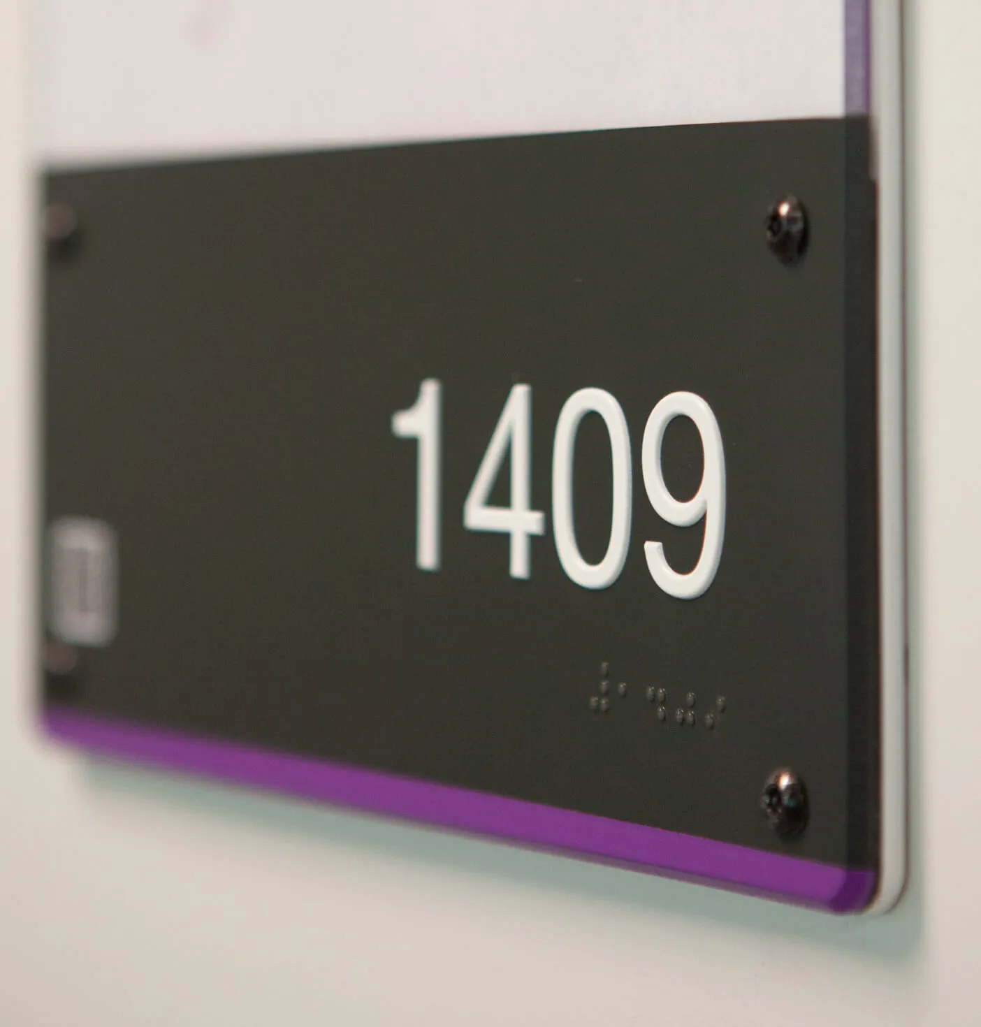
Room number 1409 sign with braille.
Gender inclusivity and secure mounting are key features
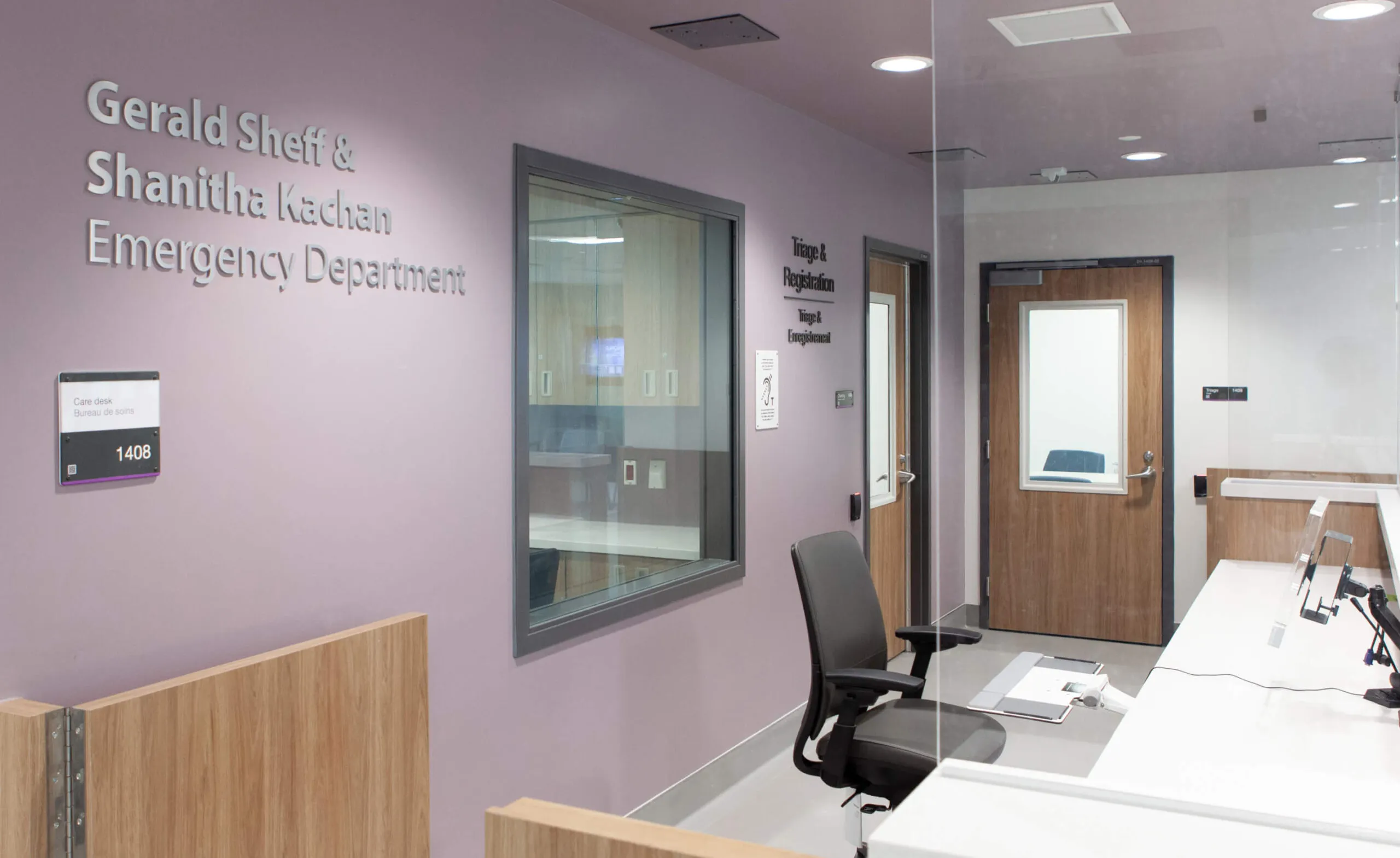
Interior view of the Gerald Sheff & Shanitha Kachan Emergency Department with signage and doors.
Creating calm with hierarchy of information

Hand-drawn expressions depicting the people of CAMH

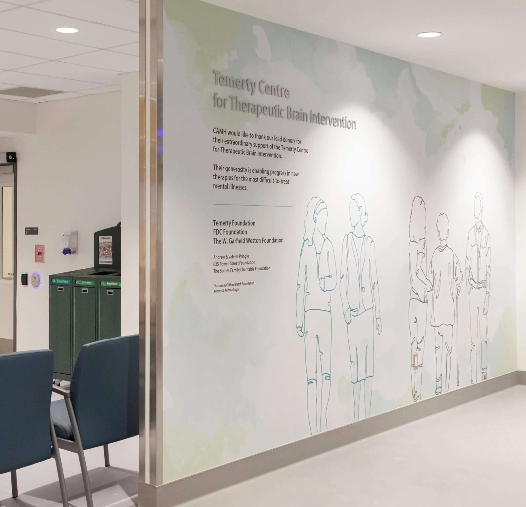
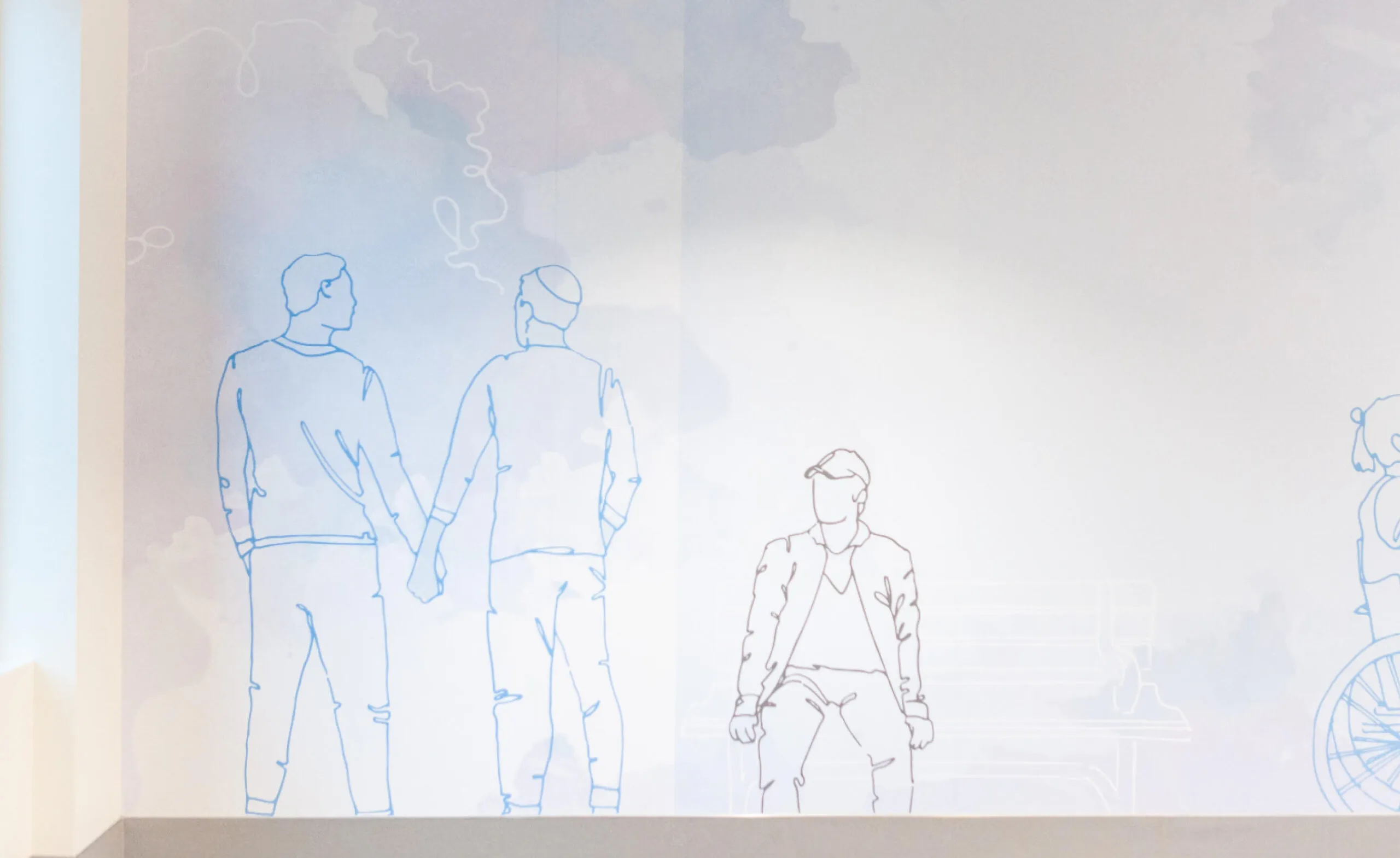
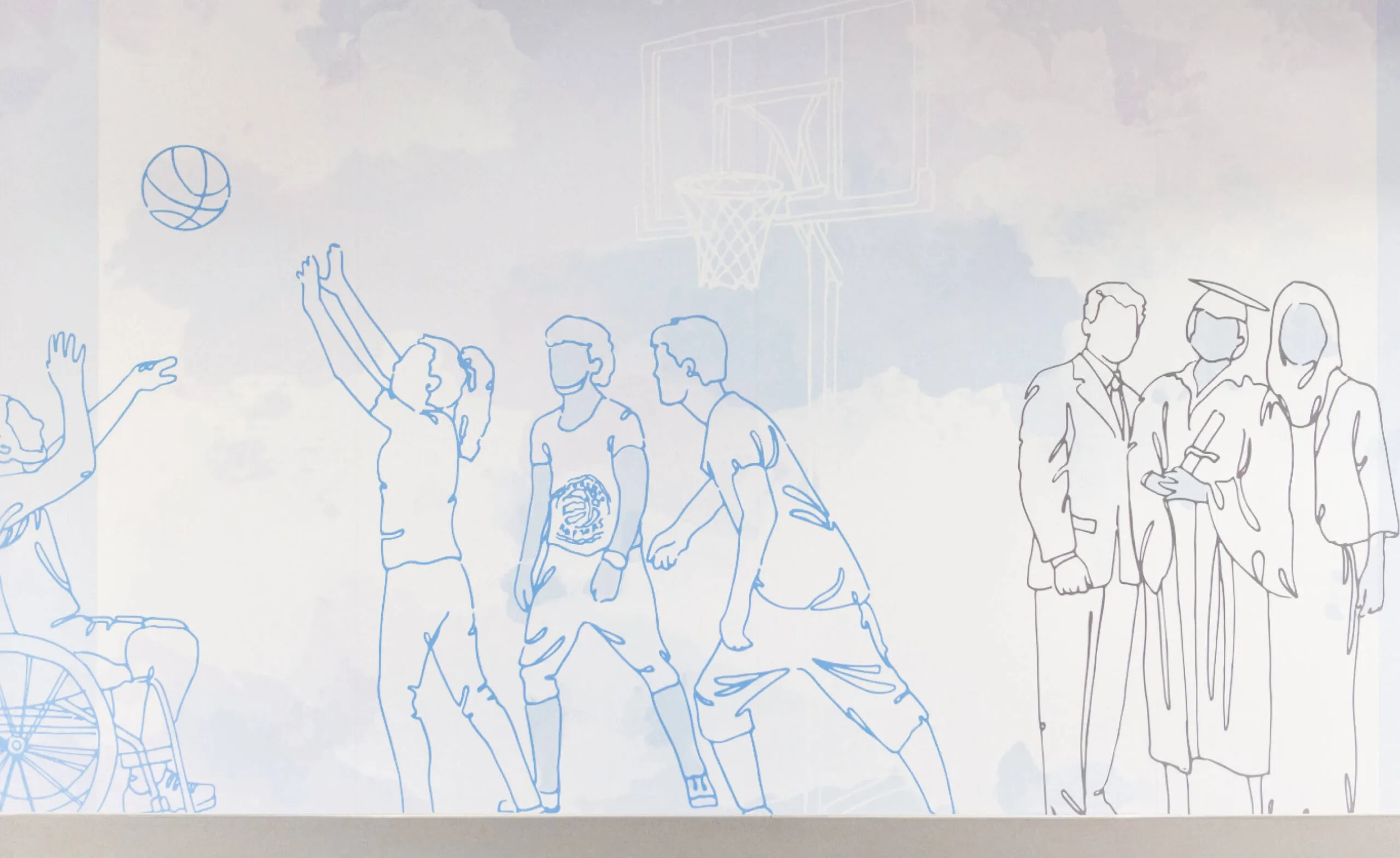
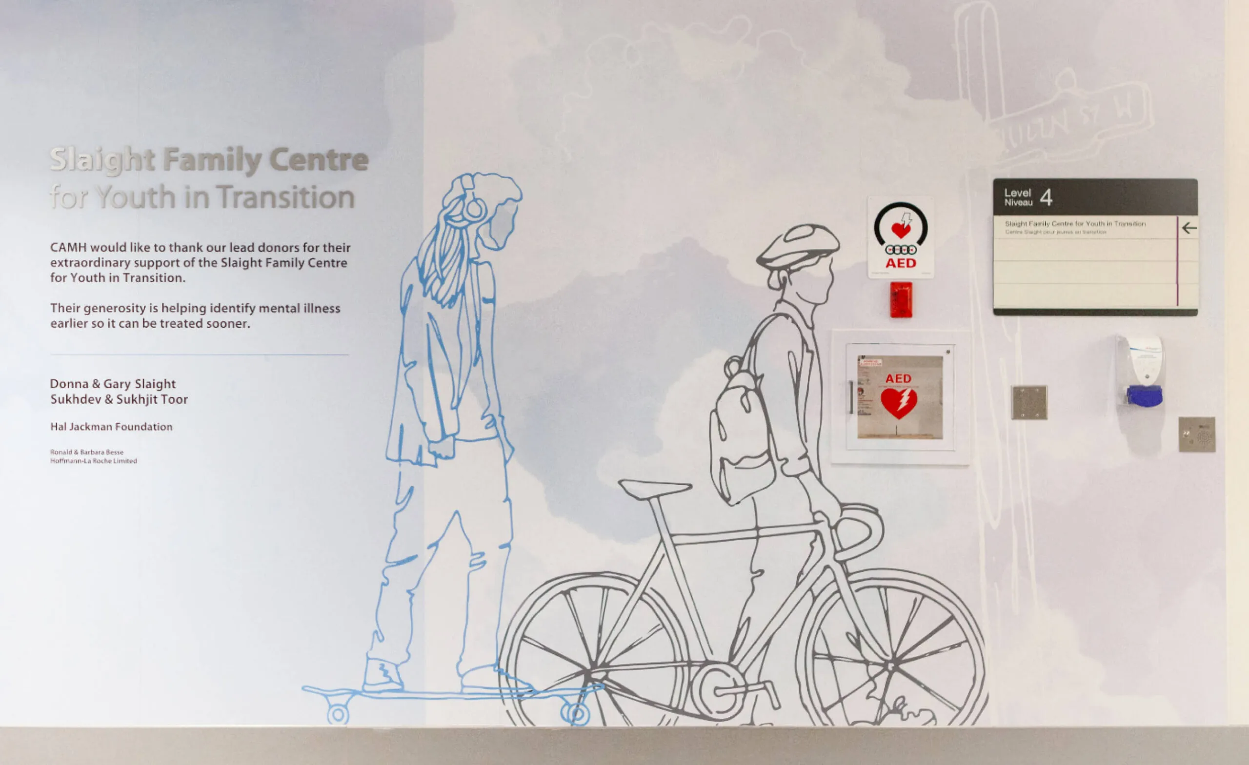
Vibrant murals featuring hand-drawn characters accompanied the written words of donors at the Ossington and Queen Street Campus.⁠⁠ A wall for each department – representing the patients, the caregivers and the staff at CAMH – was thoughtfully designed and placed the patient’s unique journey at the forefront of one’s experience.

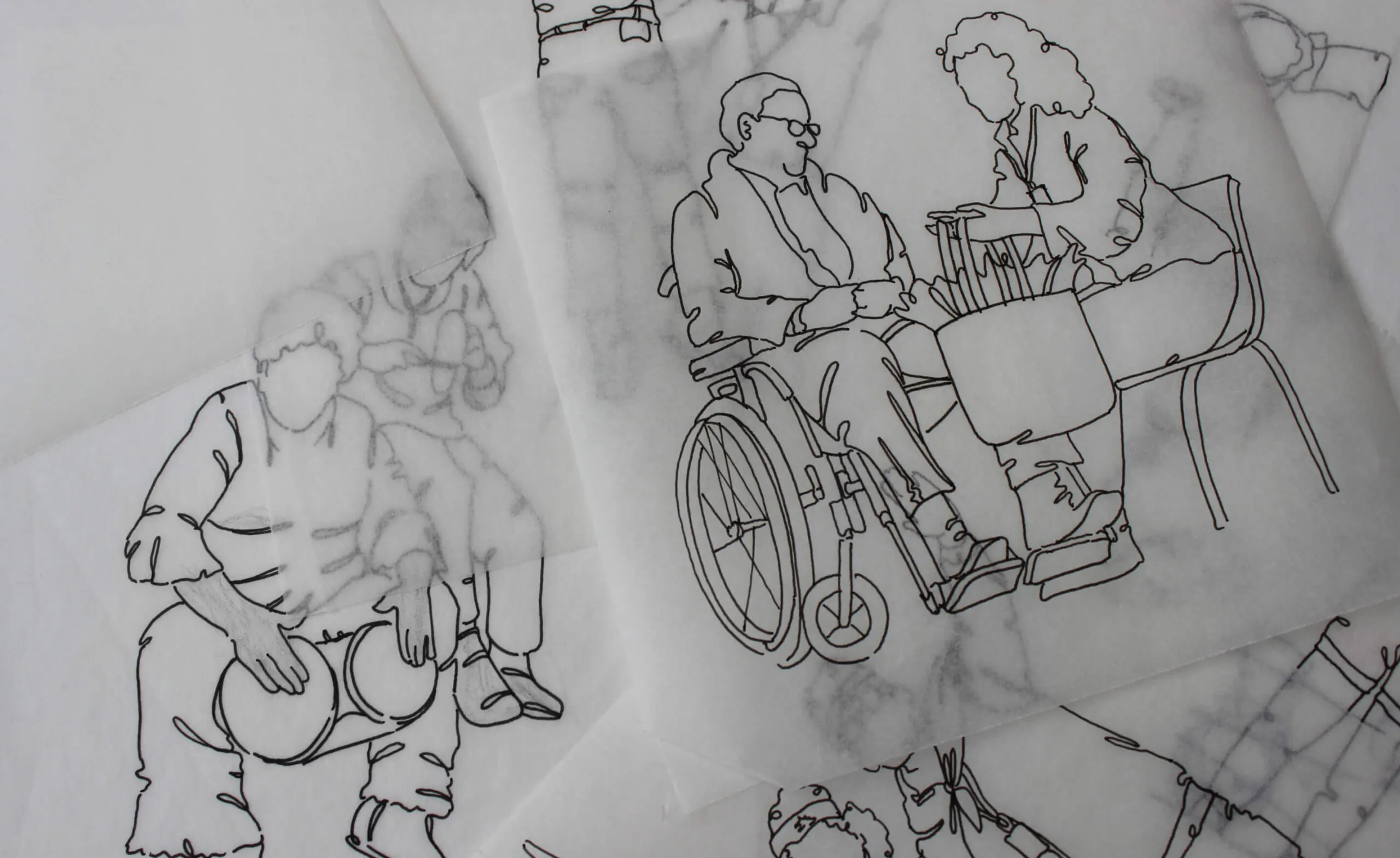
Line drawing of a person playing drums and another person in a wheelchair with a companion.
Concept sketches
Wall mural thanking donors to the Gerald Sheff & Shanitha Kachan Emergency Department at CAMH.
Wall mural at Temerty Centre for Therapeutic Brain Intervention thanking donors.
A moment of pause and recognition
  • $685M project value
  • 600K sq. ft. campus
  • 235 beds
Featured
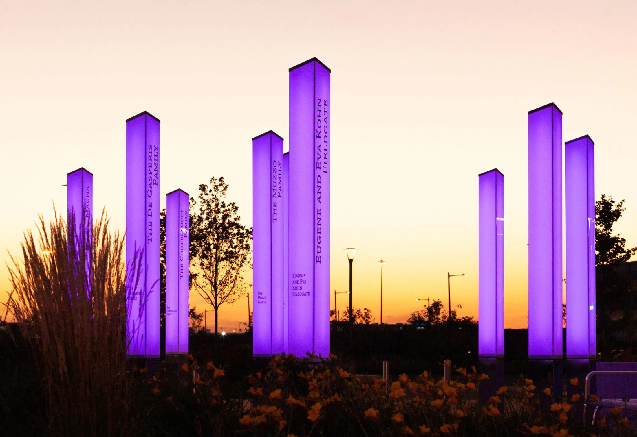
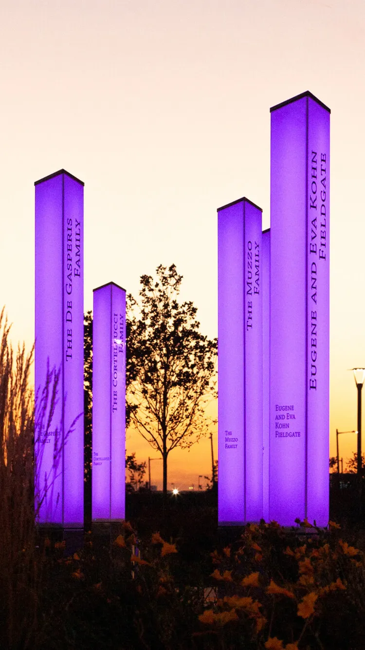
Purple illuminated pillars with family names at sunset with flowers in the foreground. Purple illuminated pillars with family names at sunset.

Cortellucci Vaughan Hospital

Vaughan, ON
Services Deliverables
  • Signage
  • Wayfinding
  • Masterplan
  • Donor Recognition
  • Kiosk
  • Art Installation
  • Placemaking

Celebrating generosity in a tech-forward healthcare facility

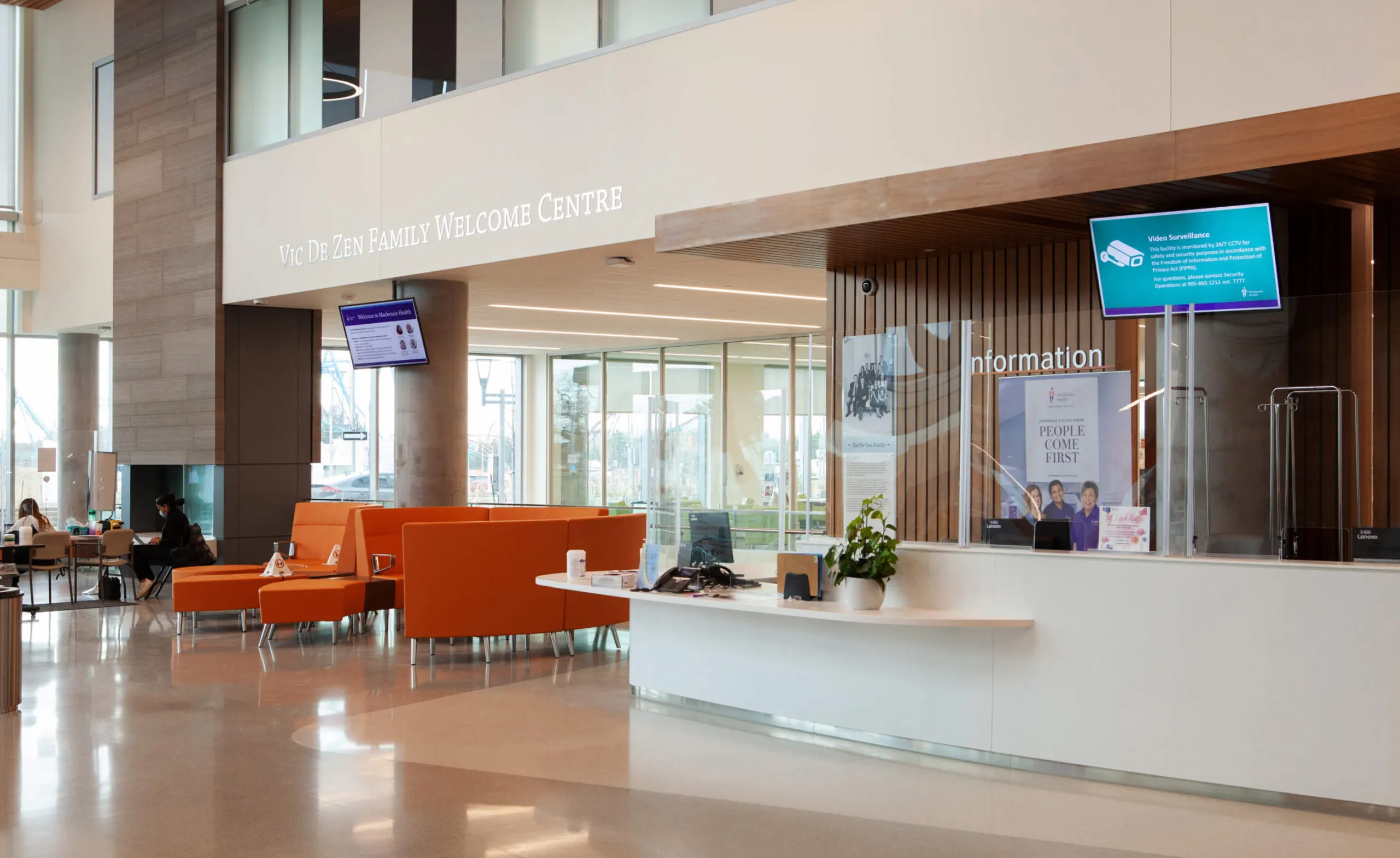
Cortellucci Vaughan Hospital (CVH) is Canada’s first smart hospital, featuring innovative technology and medical devices that provide state-of-the-art healthcare to the surrounding communities of Vaughan, Ontario. The Mackenzie Health redevelopment team worked closely with Forge to bring the vision of a fully integrated donor recognition program for the hospital and exterior campus to celebrate those who made the impressive facility possible.

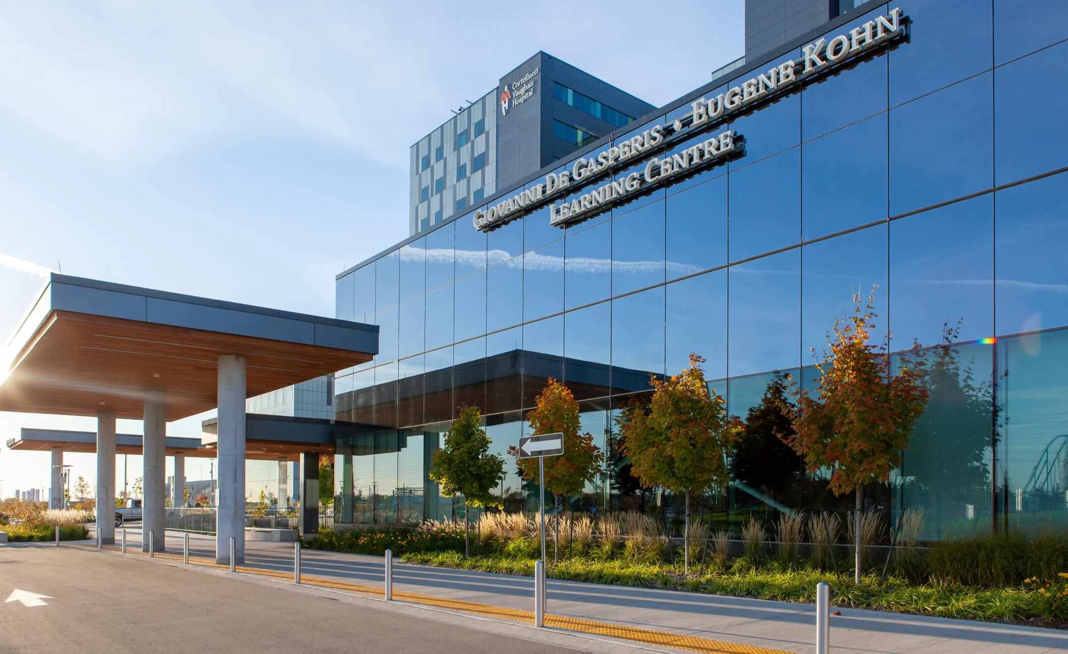
Exterior of the Cortellucci Vaughan Hospital's Giovanni De Gasperis Eugene Kohn Learning Centre.
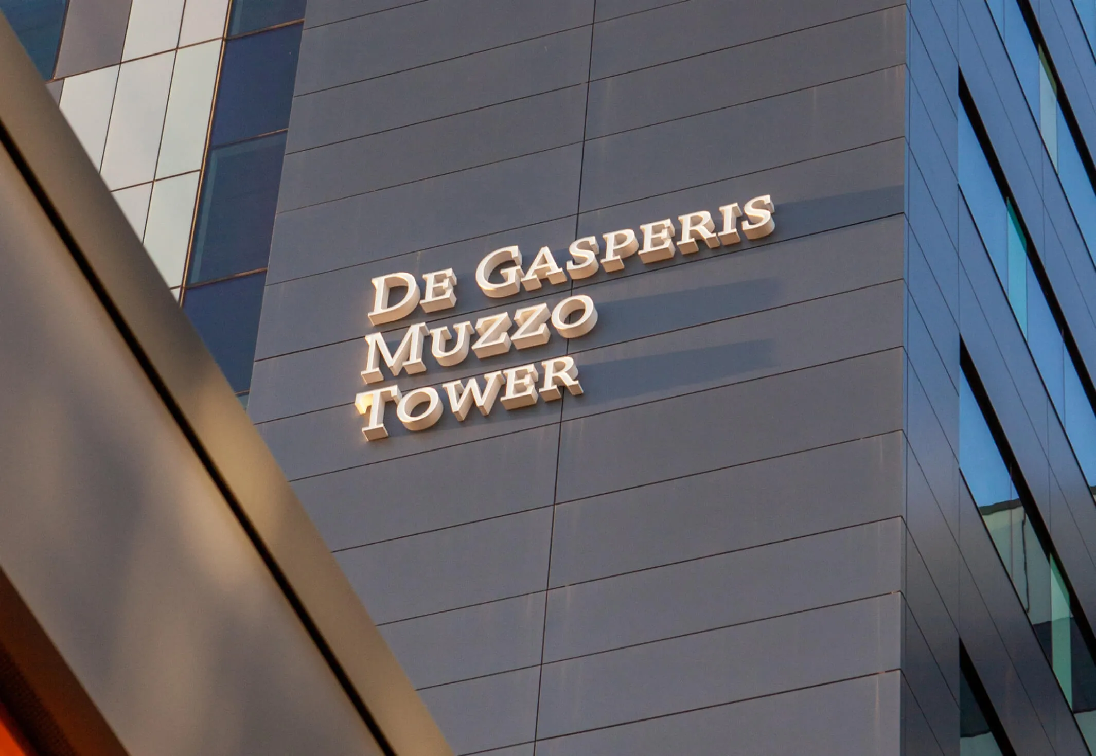
Building recognition
De Gasperis Muzzo Tower sign on a modern building facade.
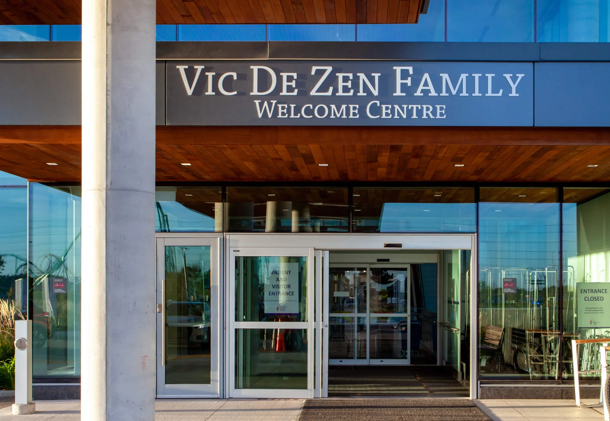
Vic De Zen Family Welcome Centre entrance with glass doors and signage.
Welcoming arrival
Interior of a modern hospital welcome centre with orange seating and an information desk.
Recognizing a family’s welcome

A multifaceted expression of gratitude

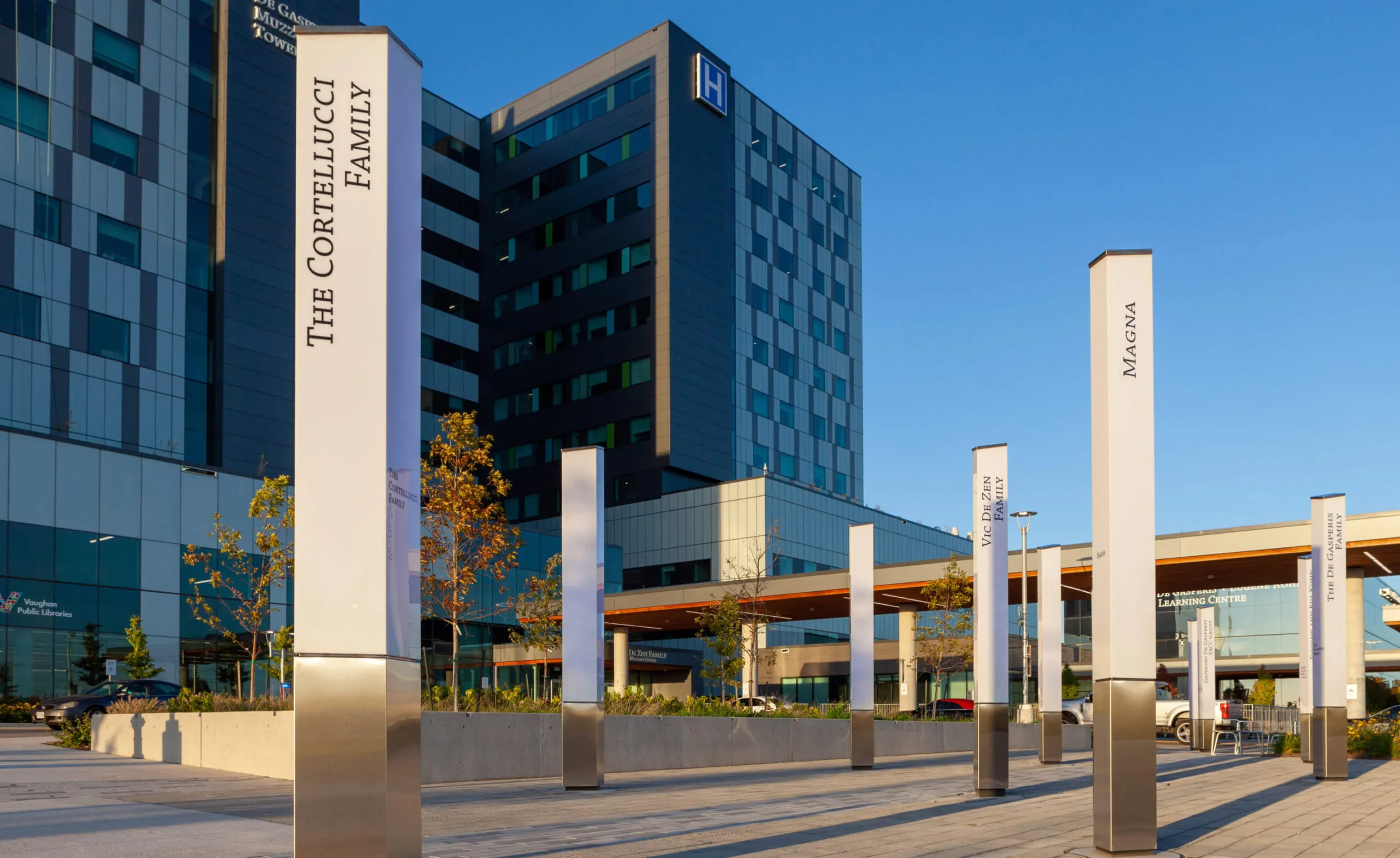
The goal of the donor recognition program was to ensure that every aspect worked seamlessly with the architecture and wayfinding program while providing donors with a sense of appreciation for their incredible generosity. The donor recognition walls collectively celebrate the impact of donors’ crucial contributions and inspire future givings, inform patients, visitors, and staff alike.

Modern hospital building with signage for The Cortellucci Family and other donors.
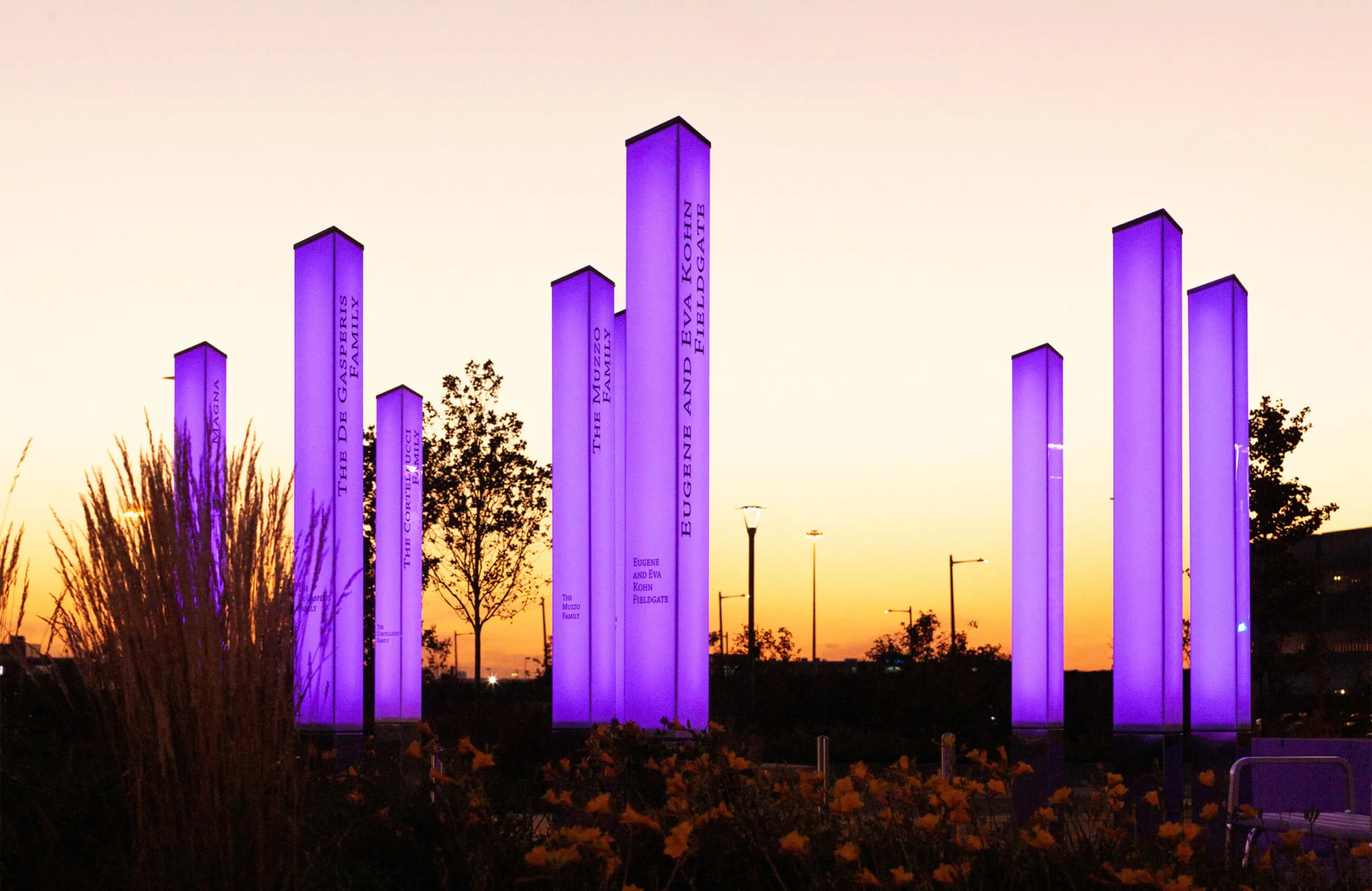
A garden of gratitude
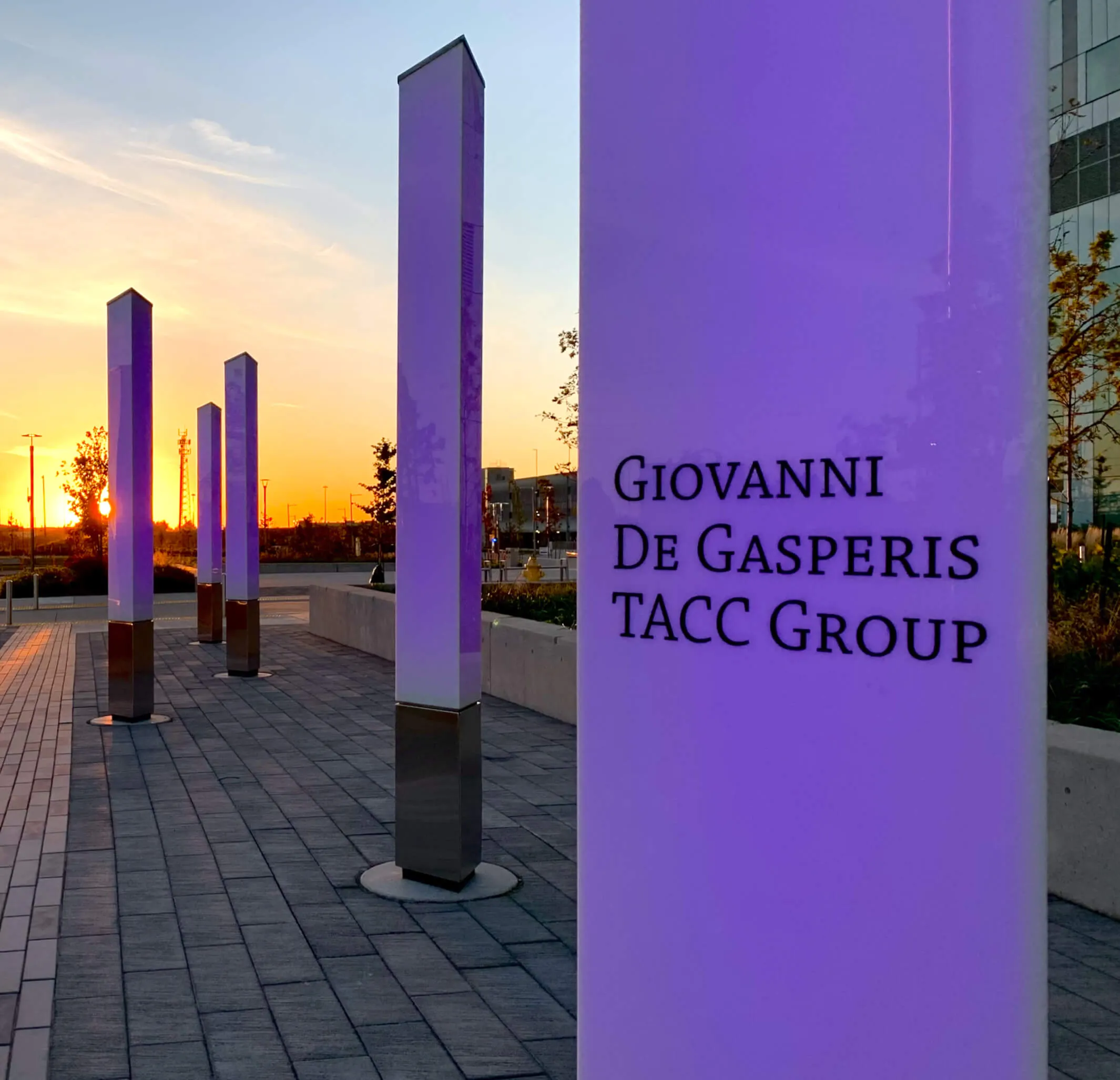
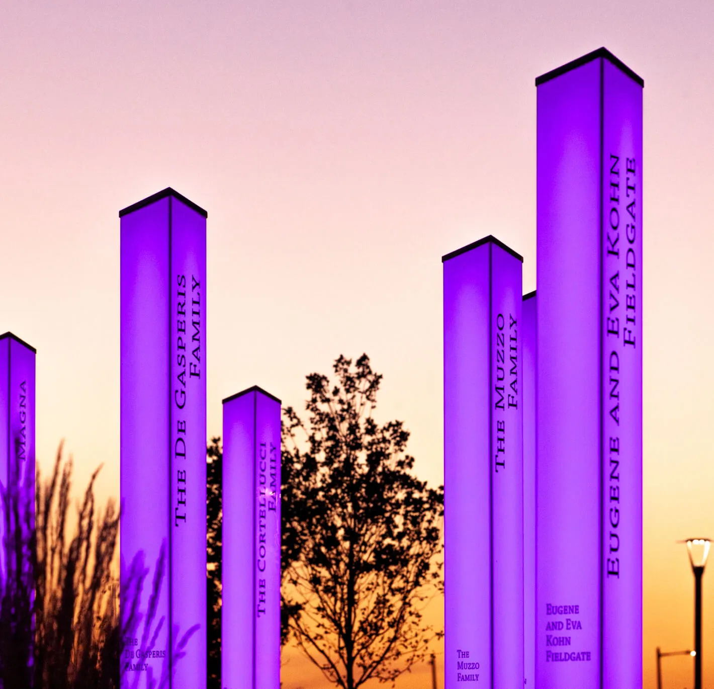
Purple illuminated pillars with company name at sunset
Purple illuminated pillars with family names at sunset.
Glowing recognition

An inspired donor-focused experience

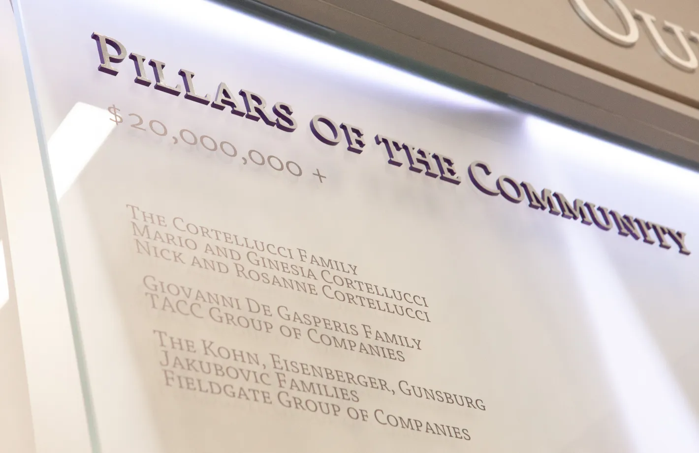
CVH’s commitment to providing innovative healthcare became a central theme that inspired the development of this large-scale donor program. From the integrated programmable LED plinths on the exterior to three unique digital donor walls on the interior and donor signage throughout the campus, this suite of applications creates a beautifully varied, yet cohesive expression of appreciation.

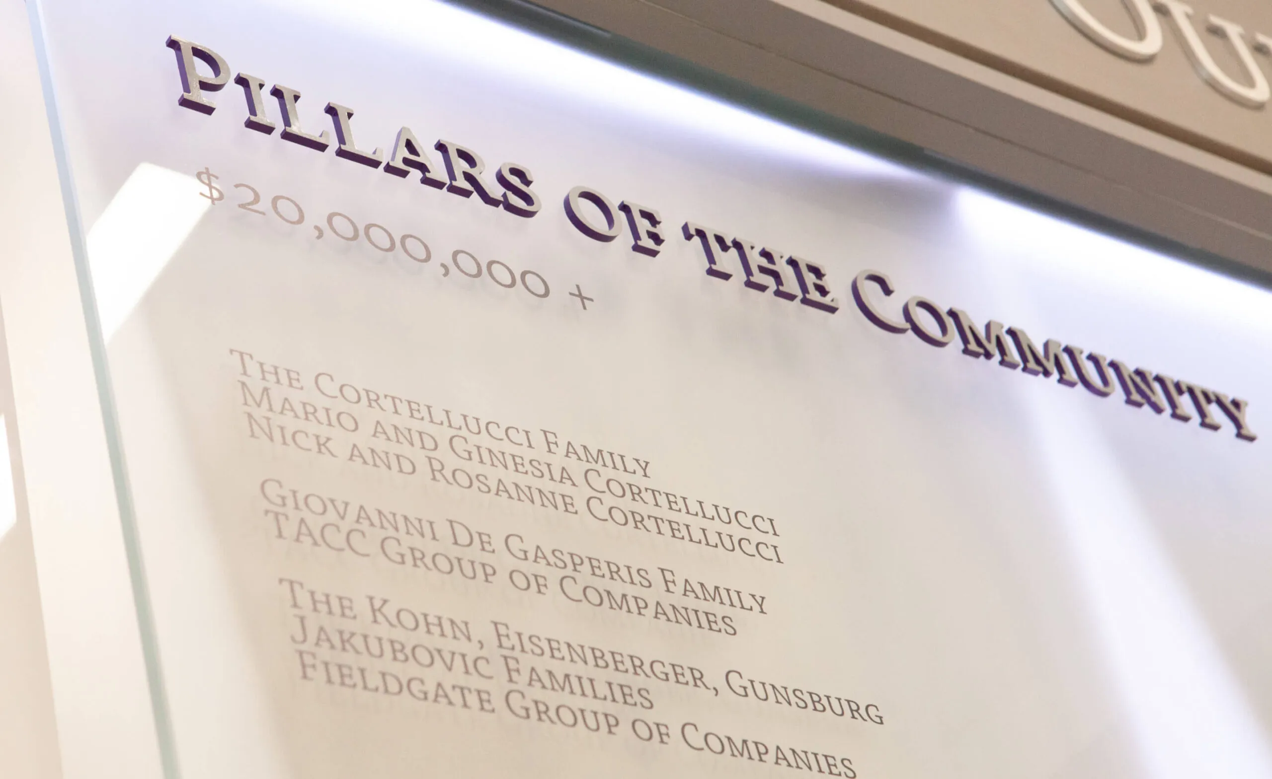
Pillars of the Community donation list with names and amounts.
Detailed view of donor recognition wall
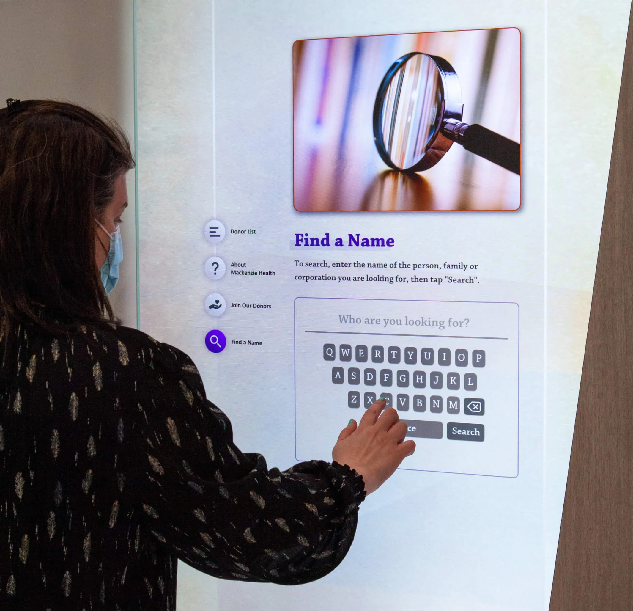
Woman using a touchscreen to search for a name on a digital display.
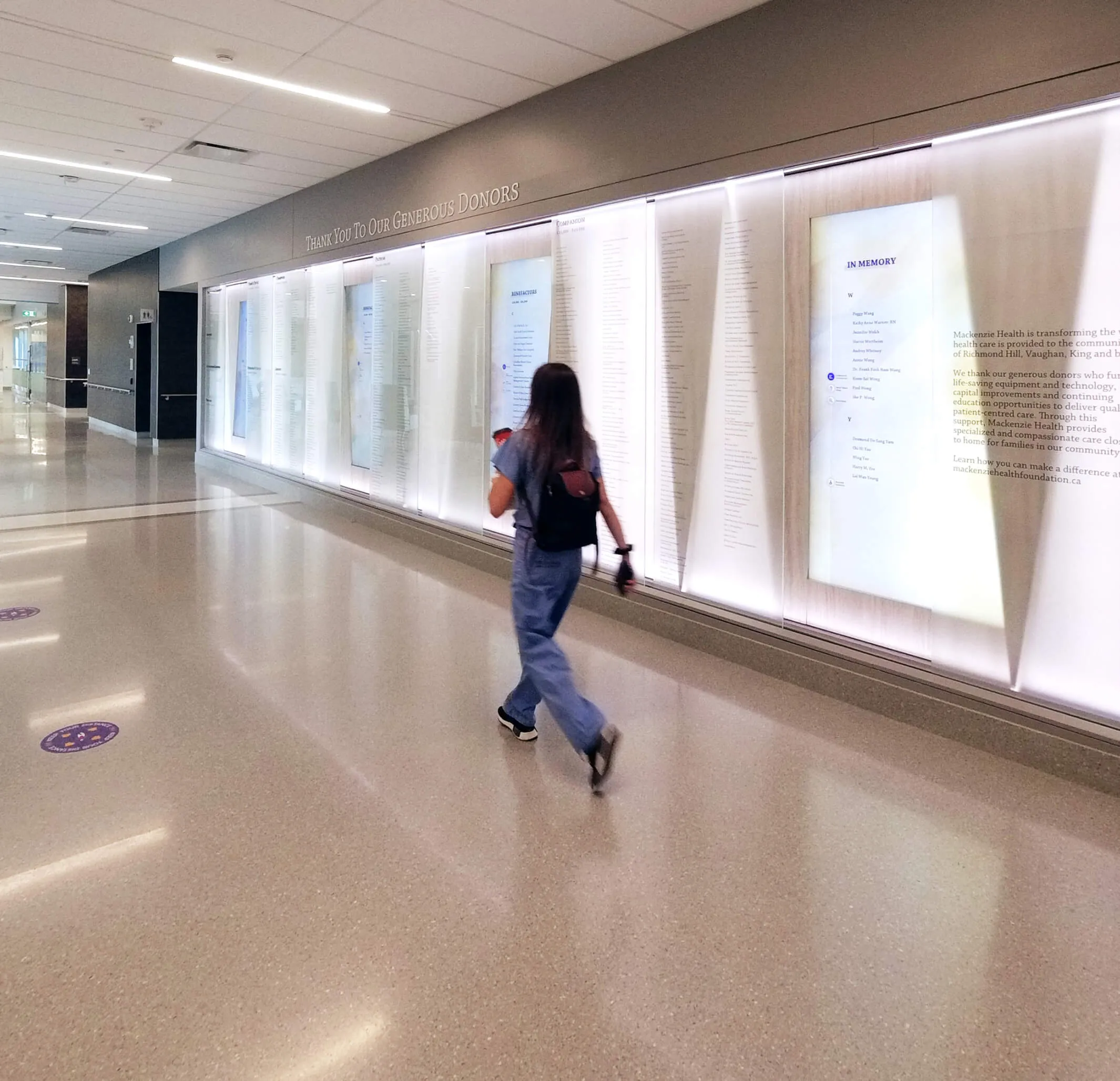
A person in scrubs walks past a wall of donor names in a hospital hallway.
Interactive donor recognition wall

Celebrating the wonder and joy of new beginnings

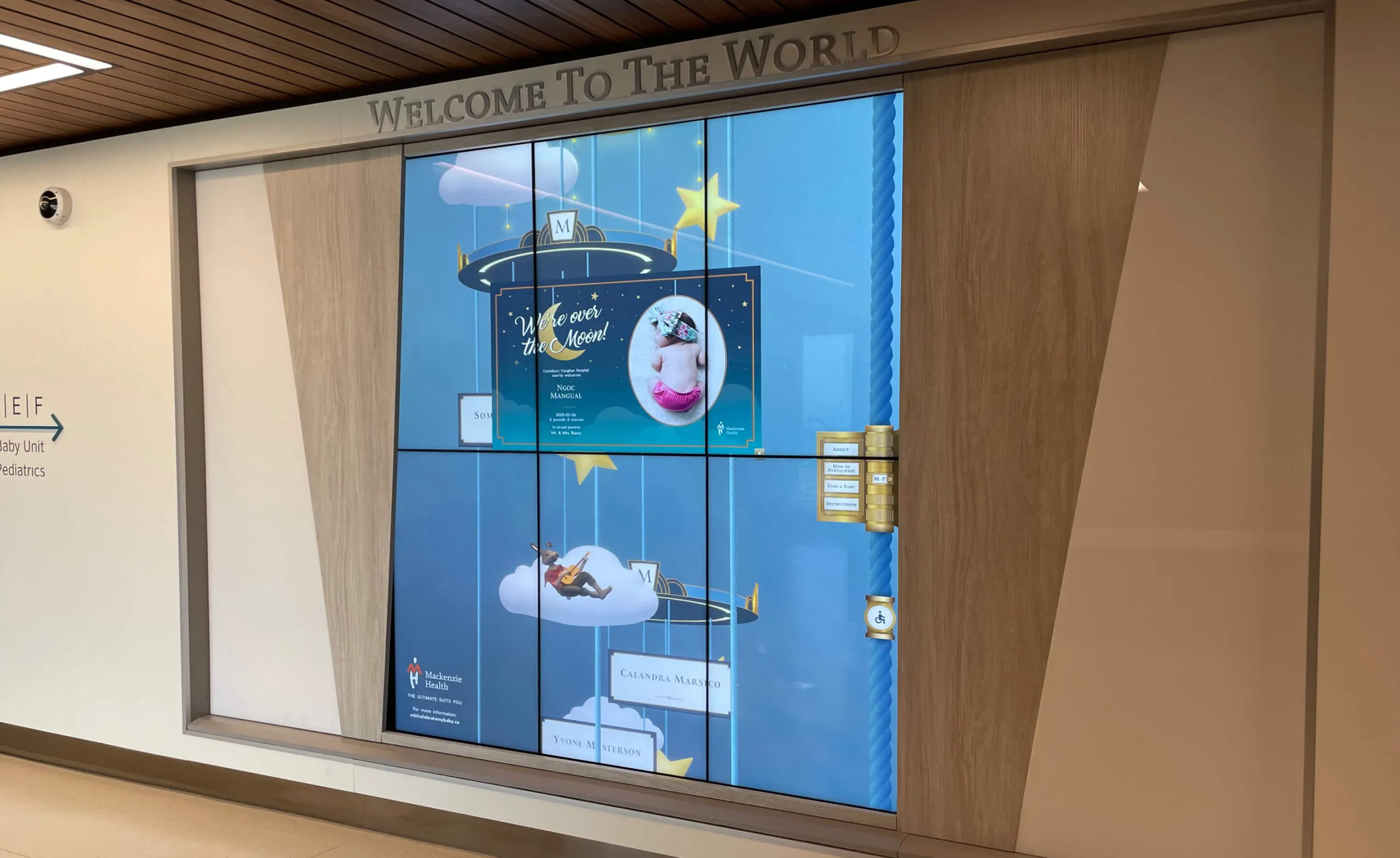
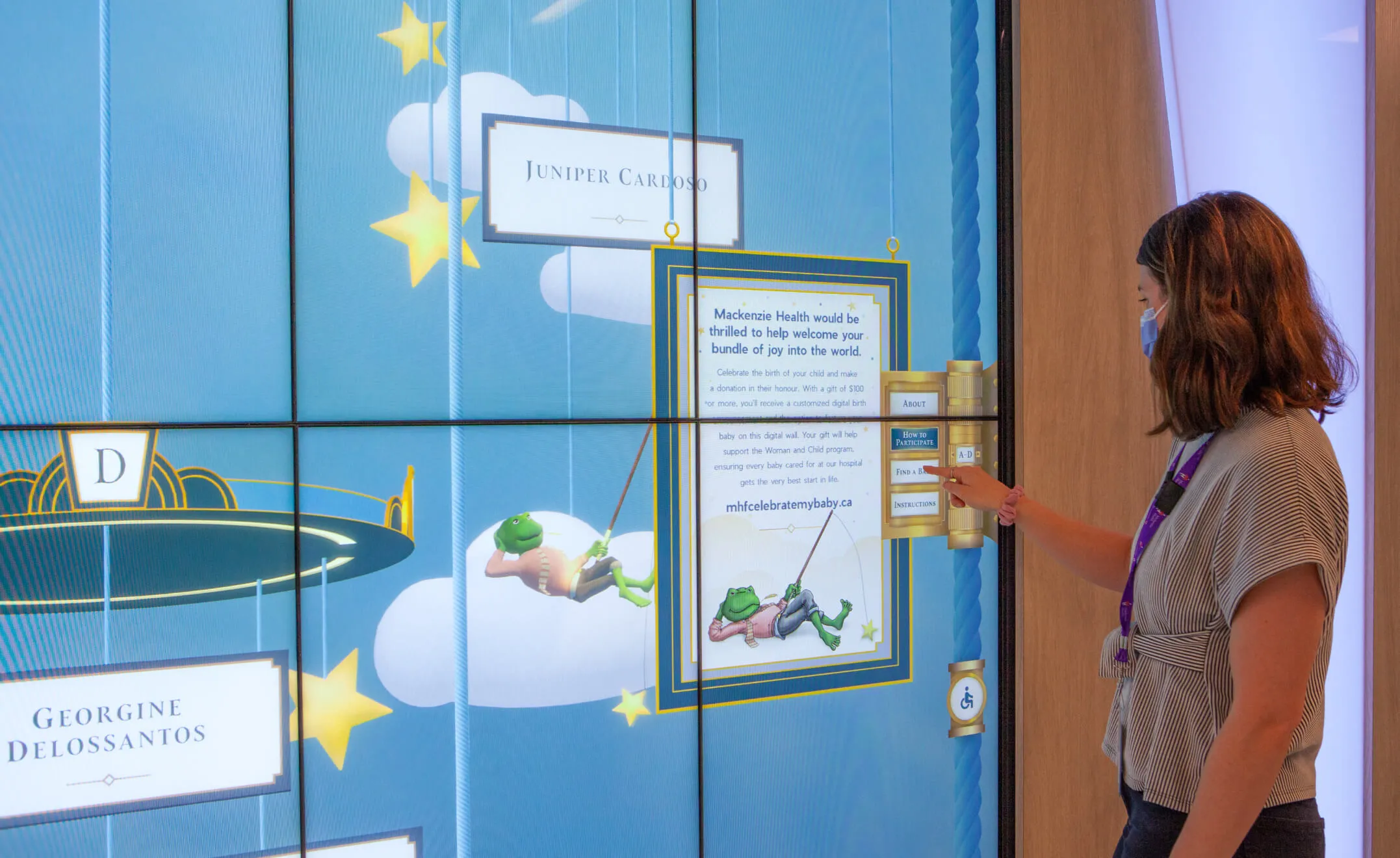
At the entrance to the maternity ward, families can commemorate and celebrate the arrival of their newborns. This large-scale display presents an interactive sky-themed mobile with baby name plaques hanging from its alphabetically categorized plates. Families can make a small contribution to showcase a personalized baby announcement, including the name, date, weight and photo of the child, triggered by tapping on the name plaques or using the user interface’s search function.

Digital display in a hospital lobby with
Anthropomorphic fox in a coat and scarf holding balloons.
A cartoon fox in a coat and scarf holds three balloons.
Character sketch and rendering design development
Woman interacting with a digital wall displaying baby names and donation information.
Large-scale display with baby announcements
  • 350 beds
  • 500 bed capacity
  • 1.2M sq. ft. hospital campus
  • 11 storeys
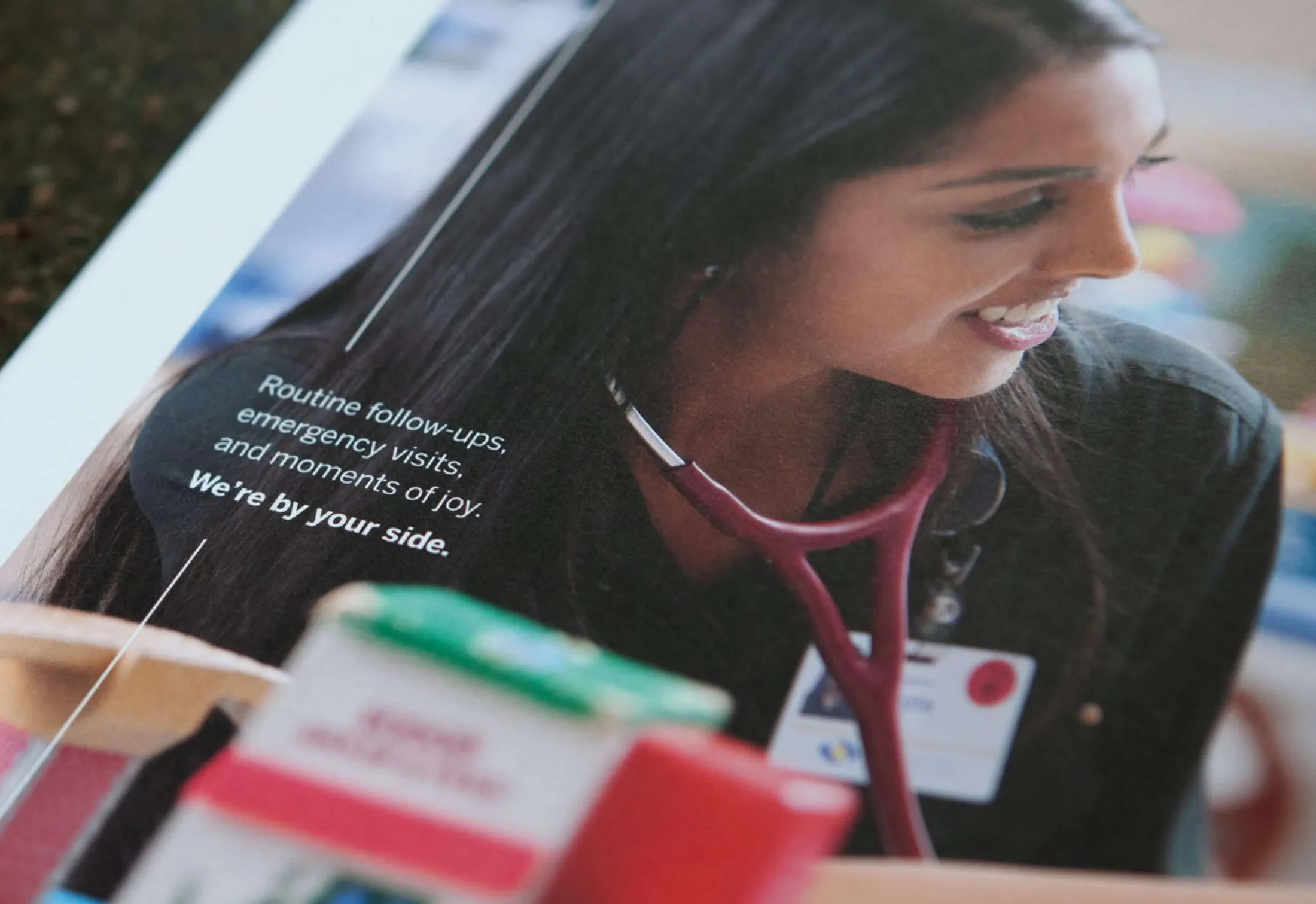
Smiling nurse with Southlake campaign text A nurse smiles while wearing a stethoscope and ID badge.

Southlake Regional Health Centre

Services Deliverables
  • Logo
  • Strategic Plan
  • Brand Guide
  • Photography Art Direction
  • Community Report

Shaping the future of healthcare at Southlake

Southlake Regional Health Centre, located in Newmarket, Ontario, is a full-service hospital, providing advanced levels of care to more than one million people living in surrounding communities. Looking to launch a leading-edge strategic plan capturing the hospital’s dedication to shaping the future of healthcare, the Southlake team turned to Forge for visual design and campaign creation to support and evolve internal and external marketing materials for the next five years.

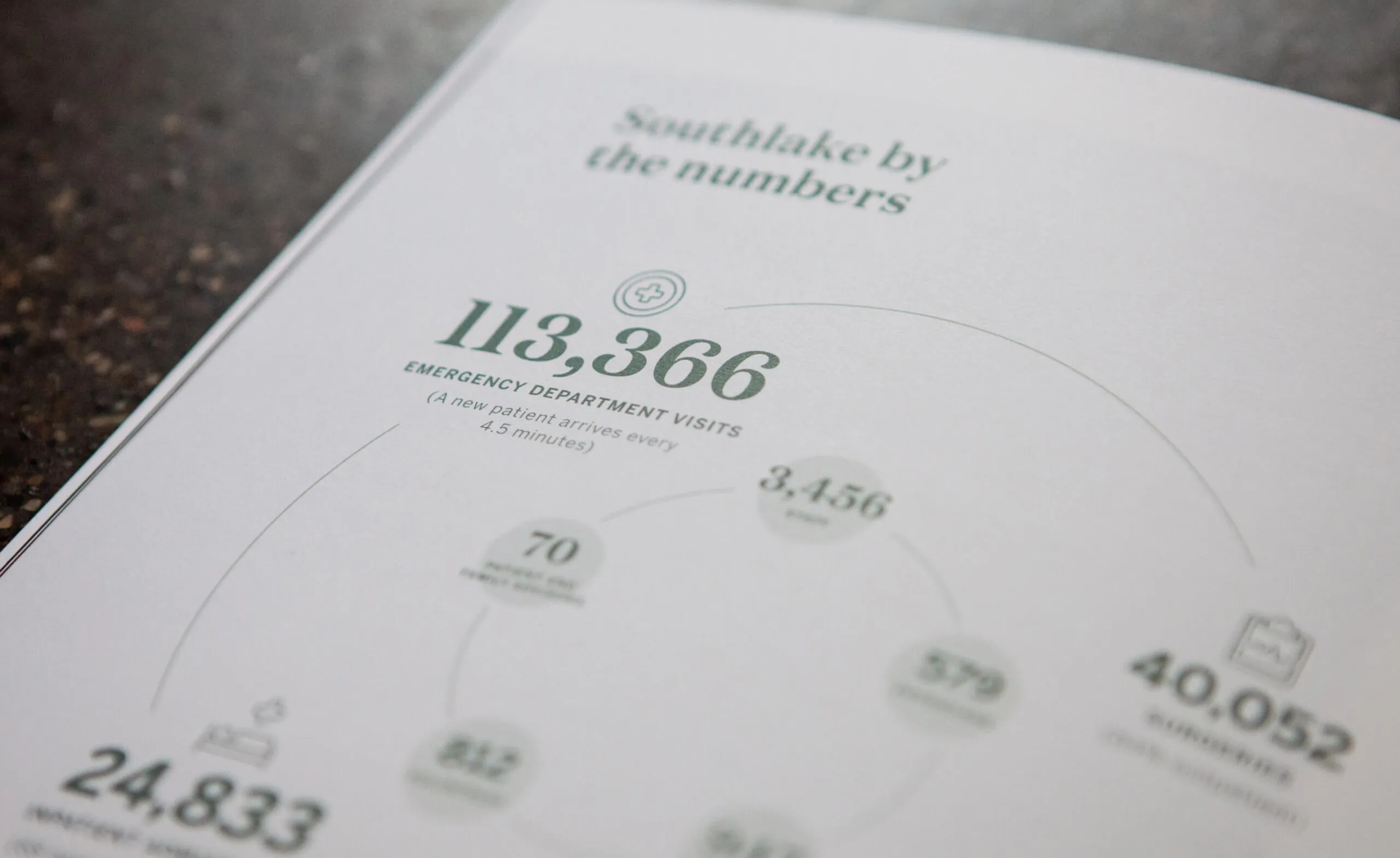
Southlake by the numbers infographic showing emergency department visits and other statistics.
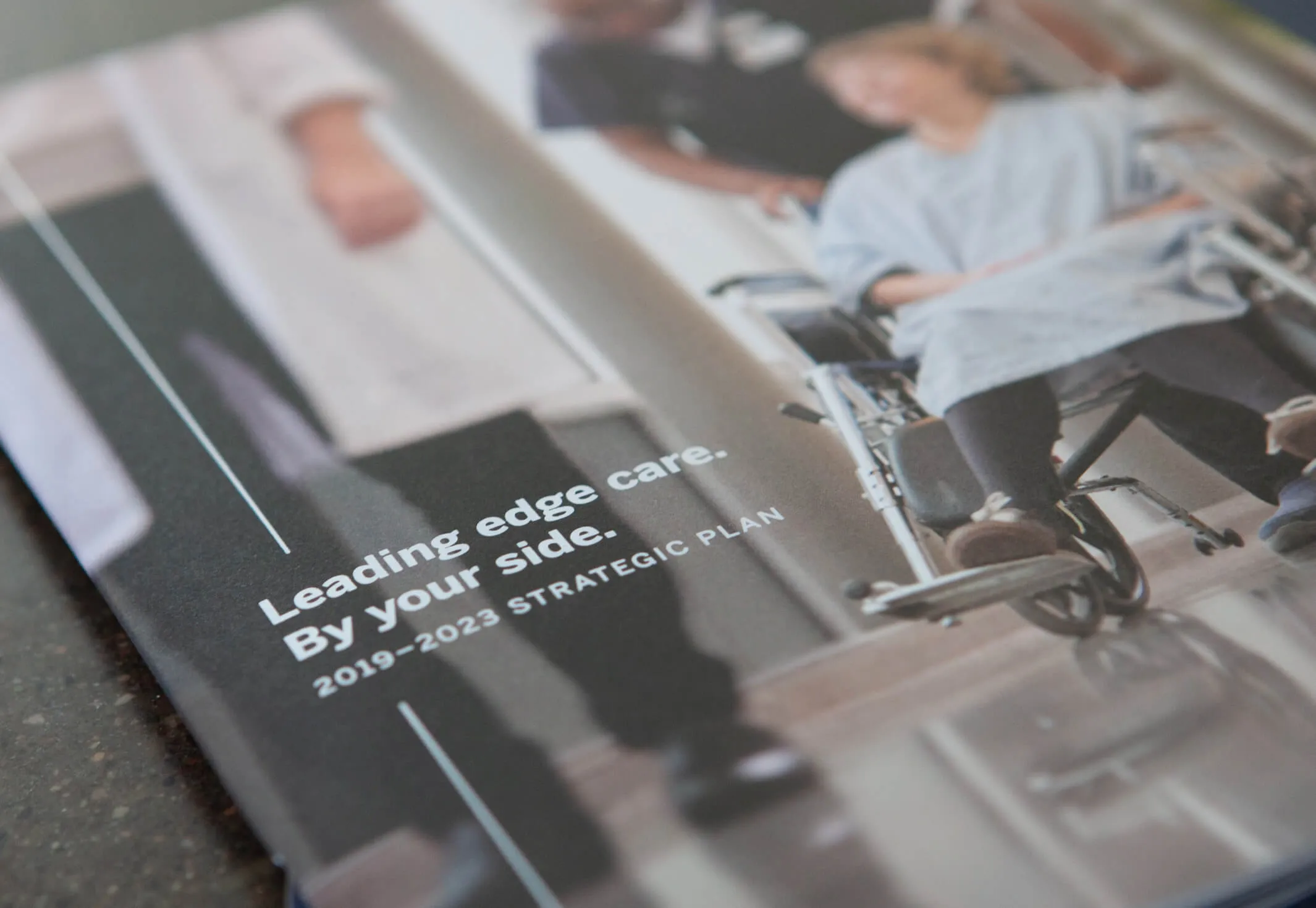
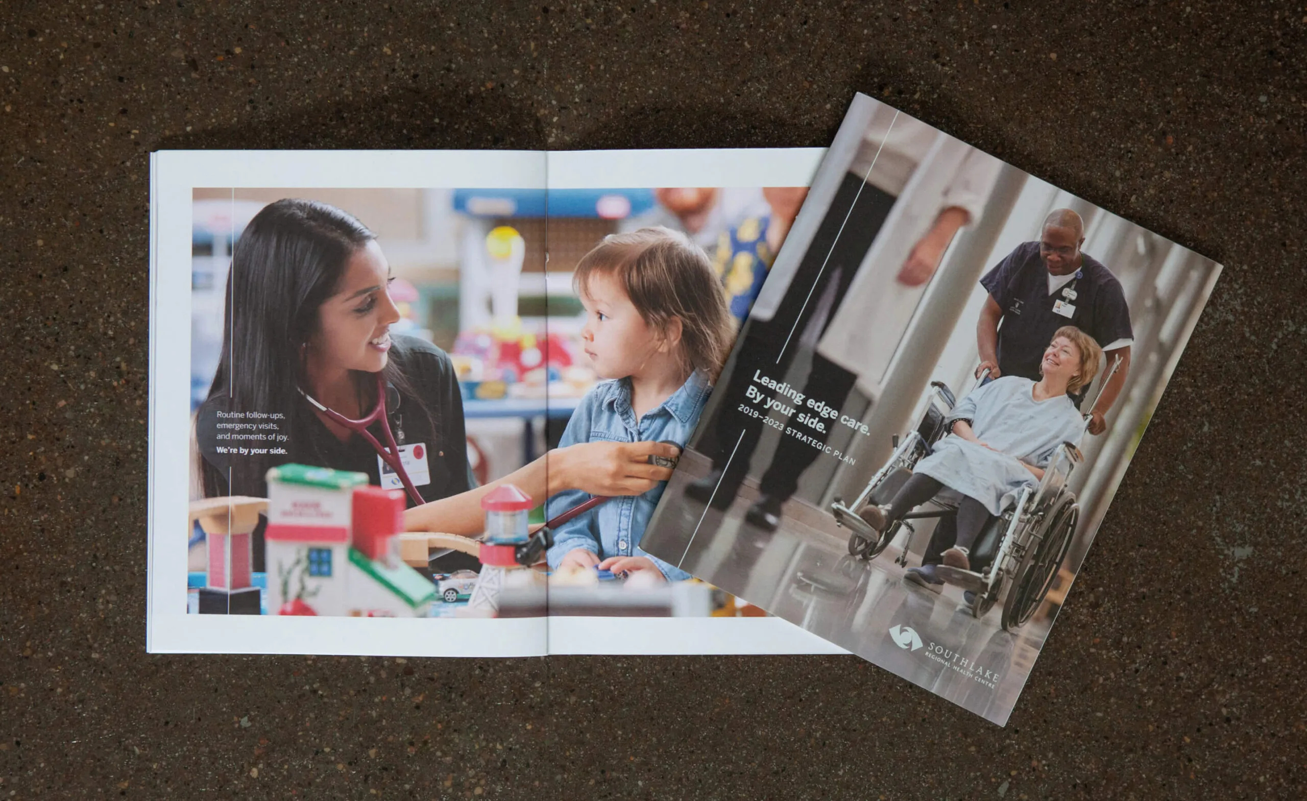
Strategic Plan design including custom photoshoot within hospital
Southlake Regional Health Centre logo and website address on a dark brochure.
Southlake strategic plan brochure cover

Building healthy communities

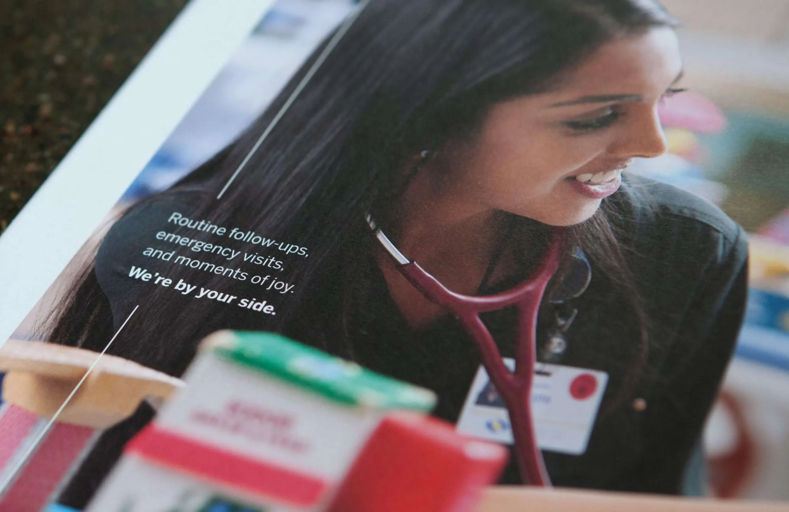
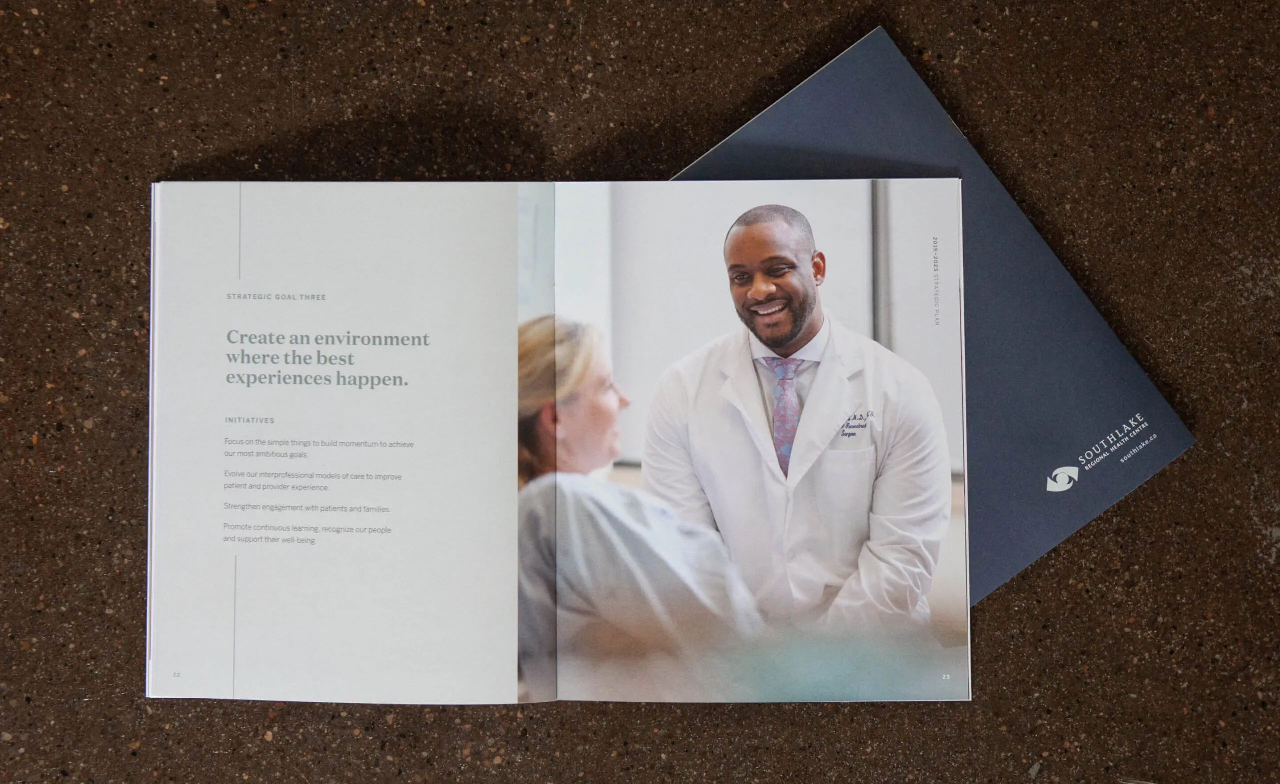
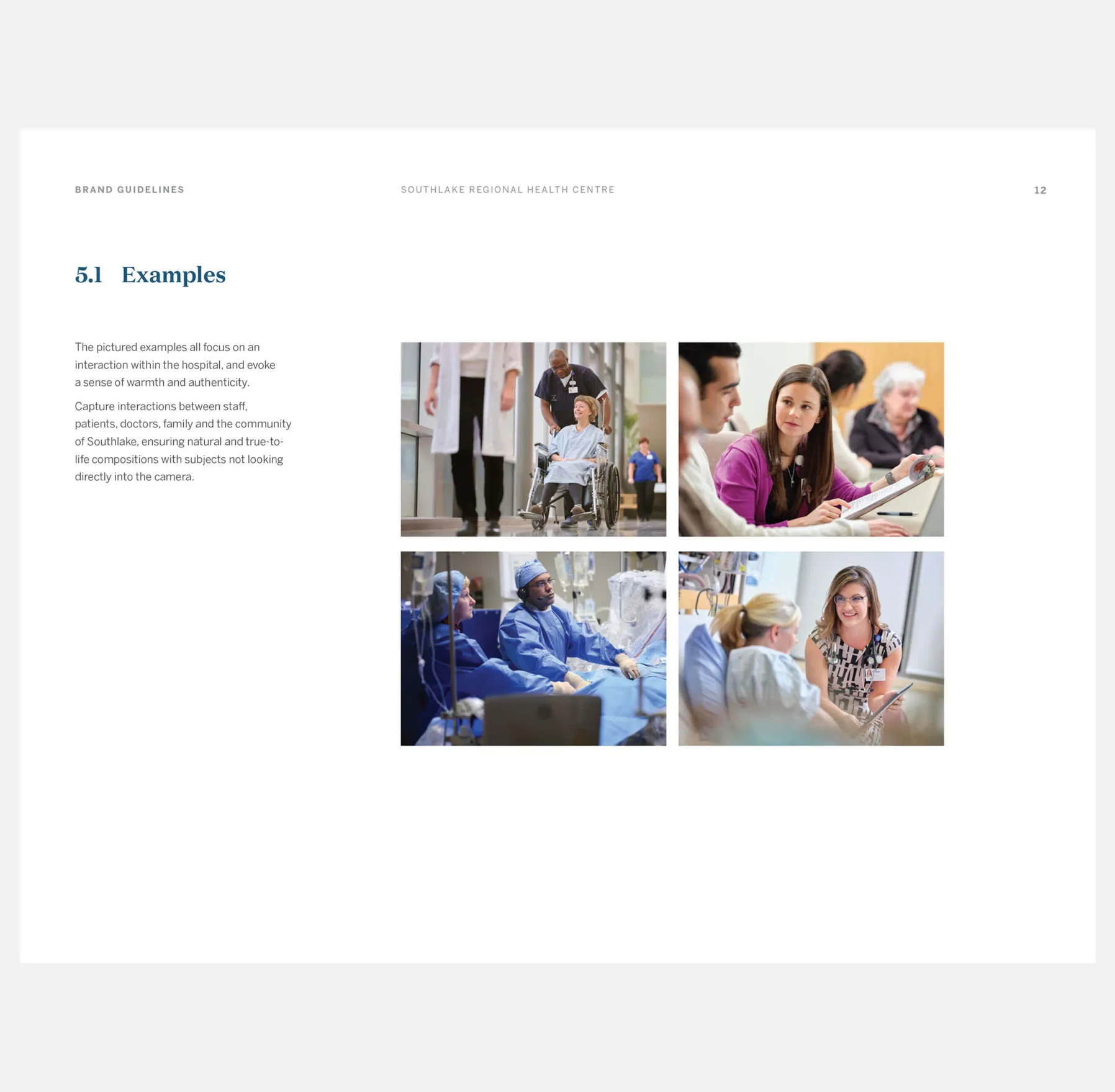
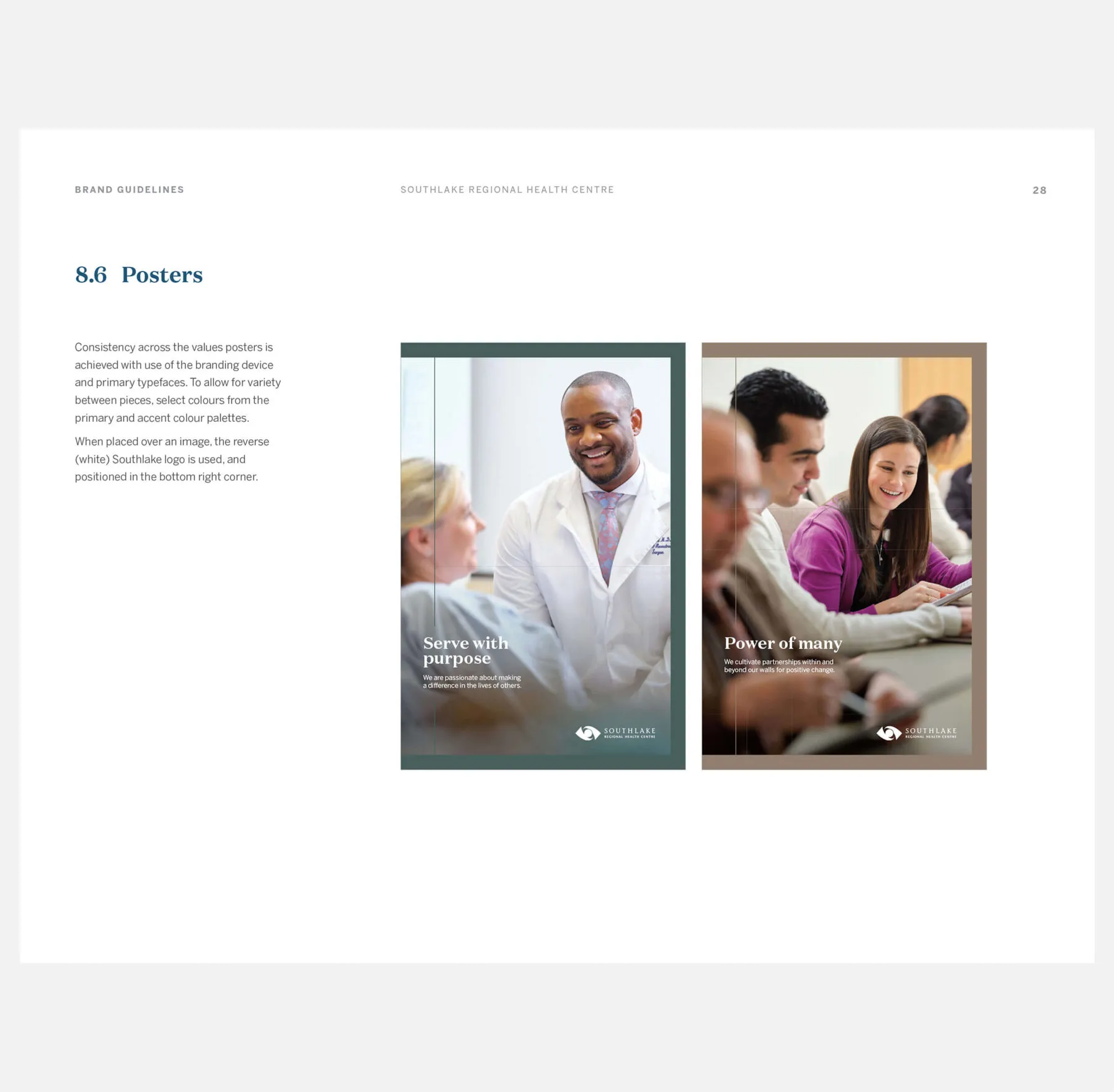
To position Southlake as a top healthcare provider, leading-edge in both research and technology, Forge created a distinct visual treatment and messaging direction. The intention was to evoke an authentic sense of emotion while highlighting the people and culture of the hospital and reinforcing the key message of “We’re by your side”.

Southlake Regional Health Centre strategic plan with a doctor and patient.
Southlake Regional Health Centre strategic plan with images of healthcare providers and patients.

Reinforcing the human element of care

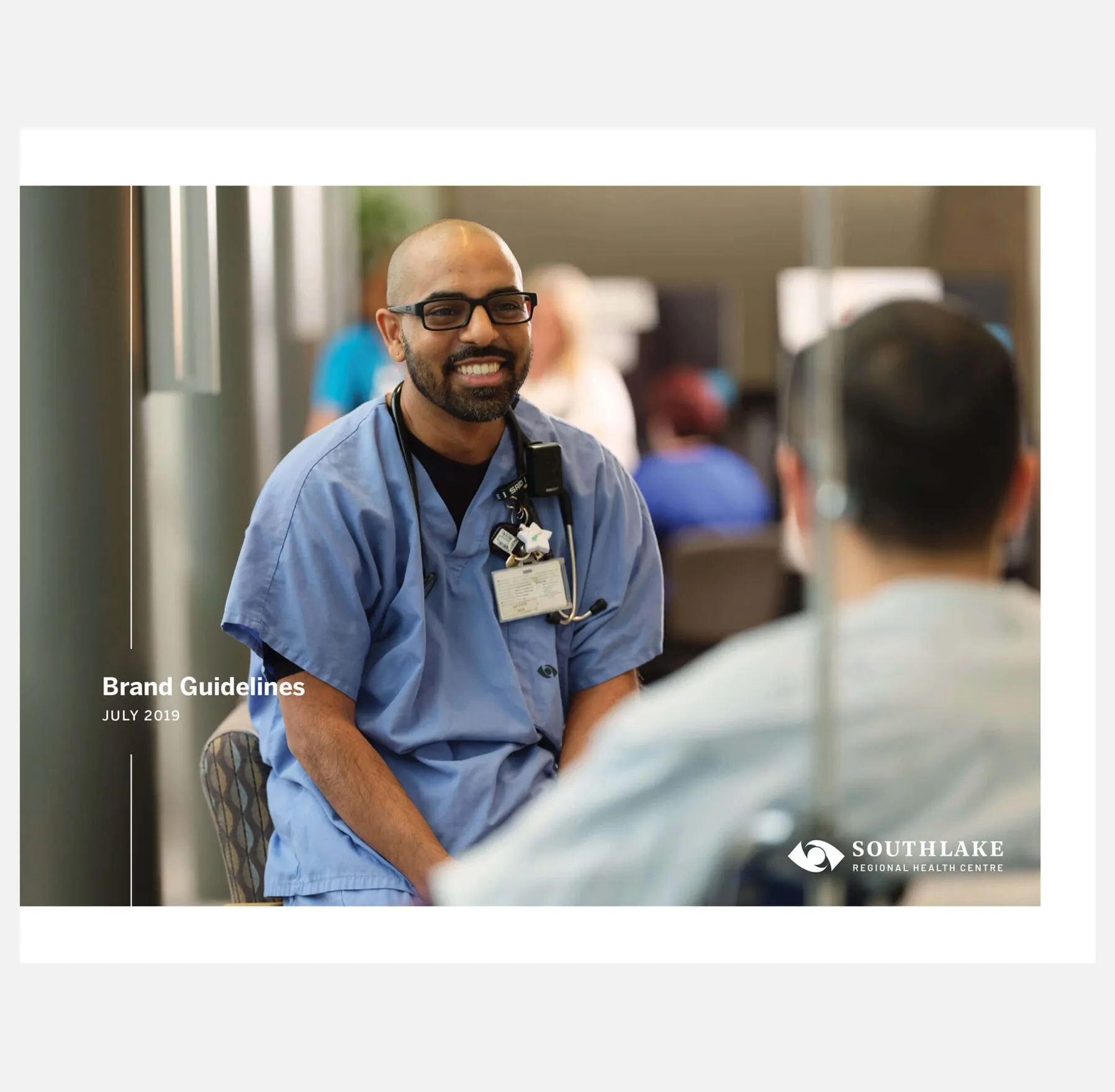
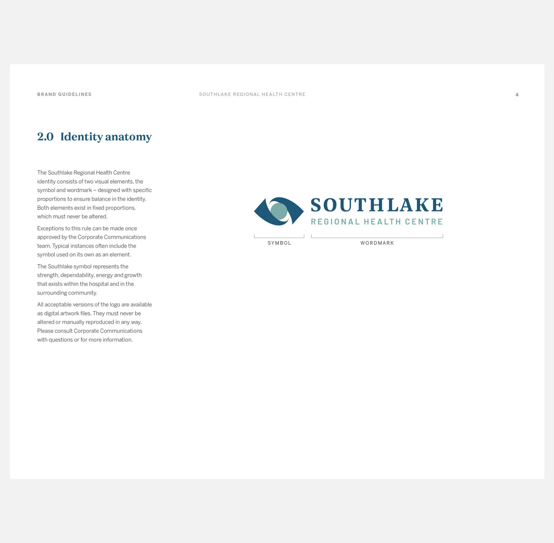
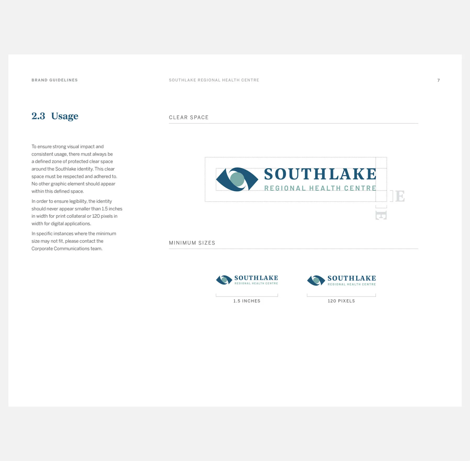
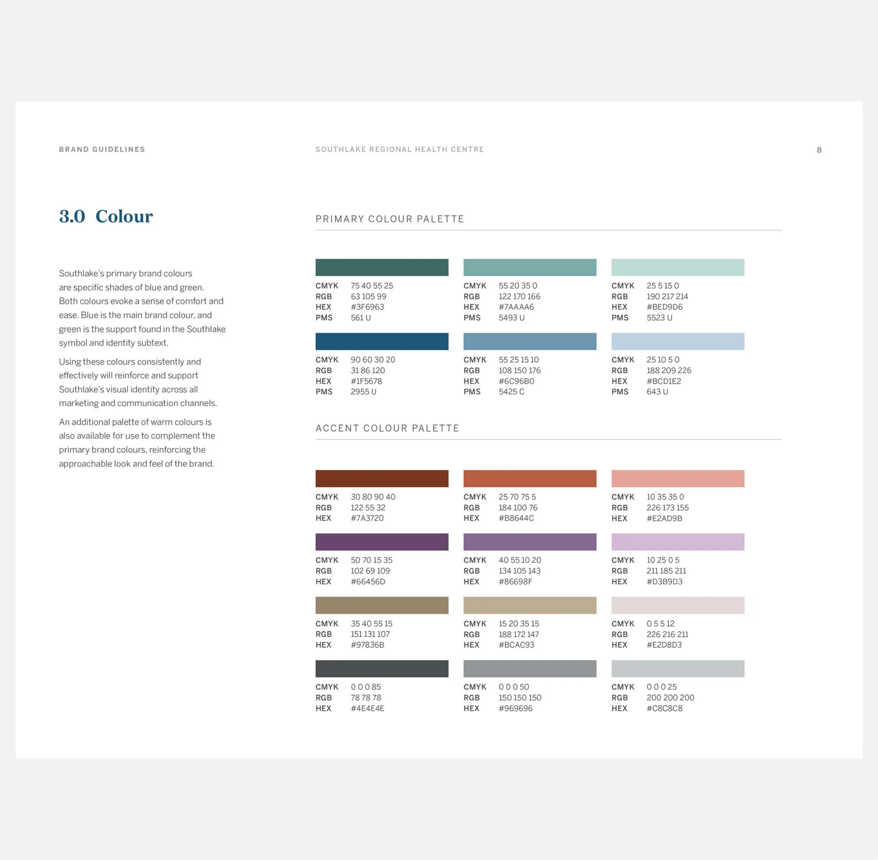
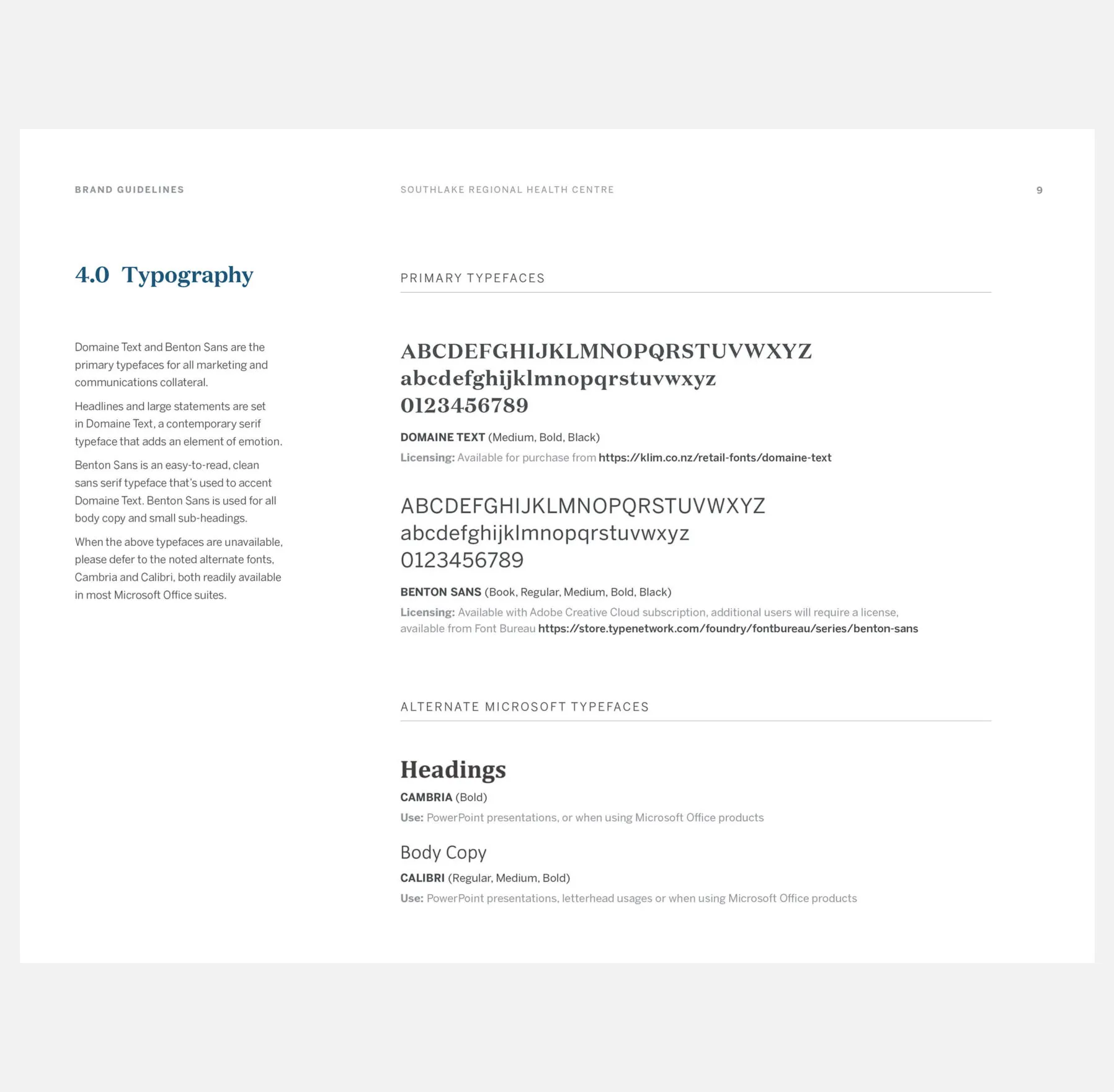
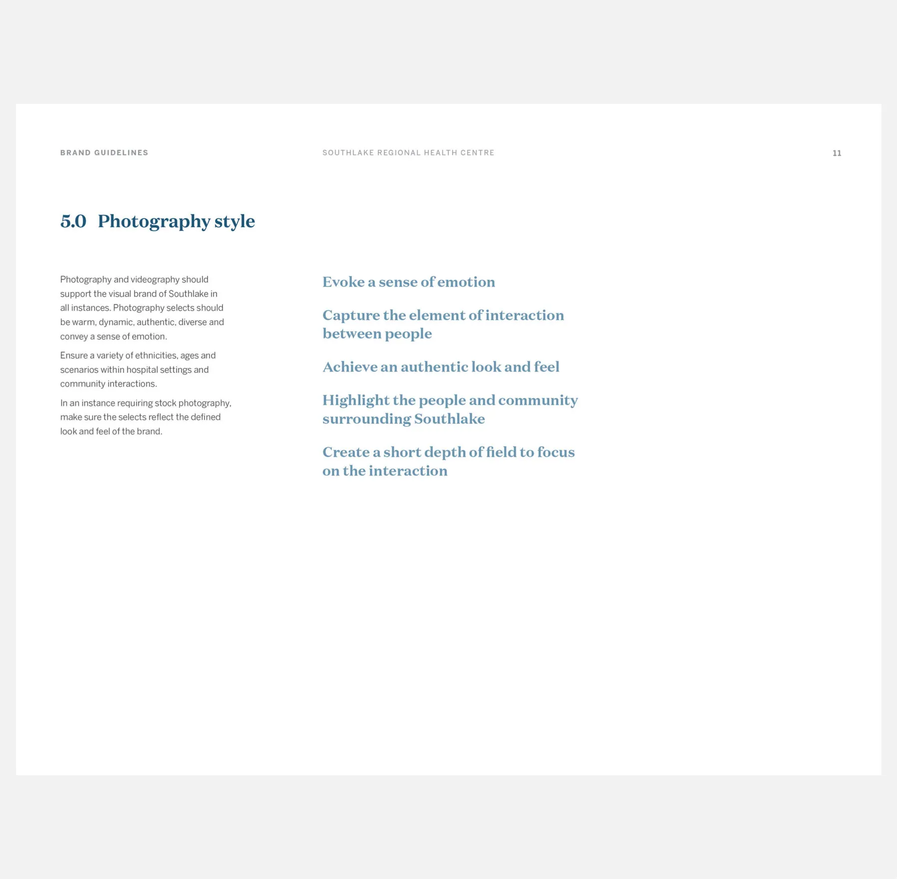
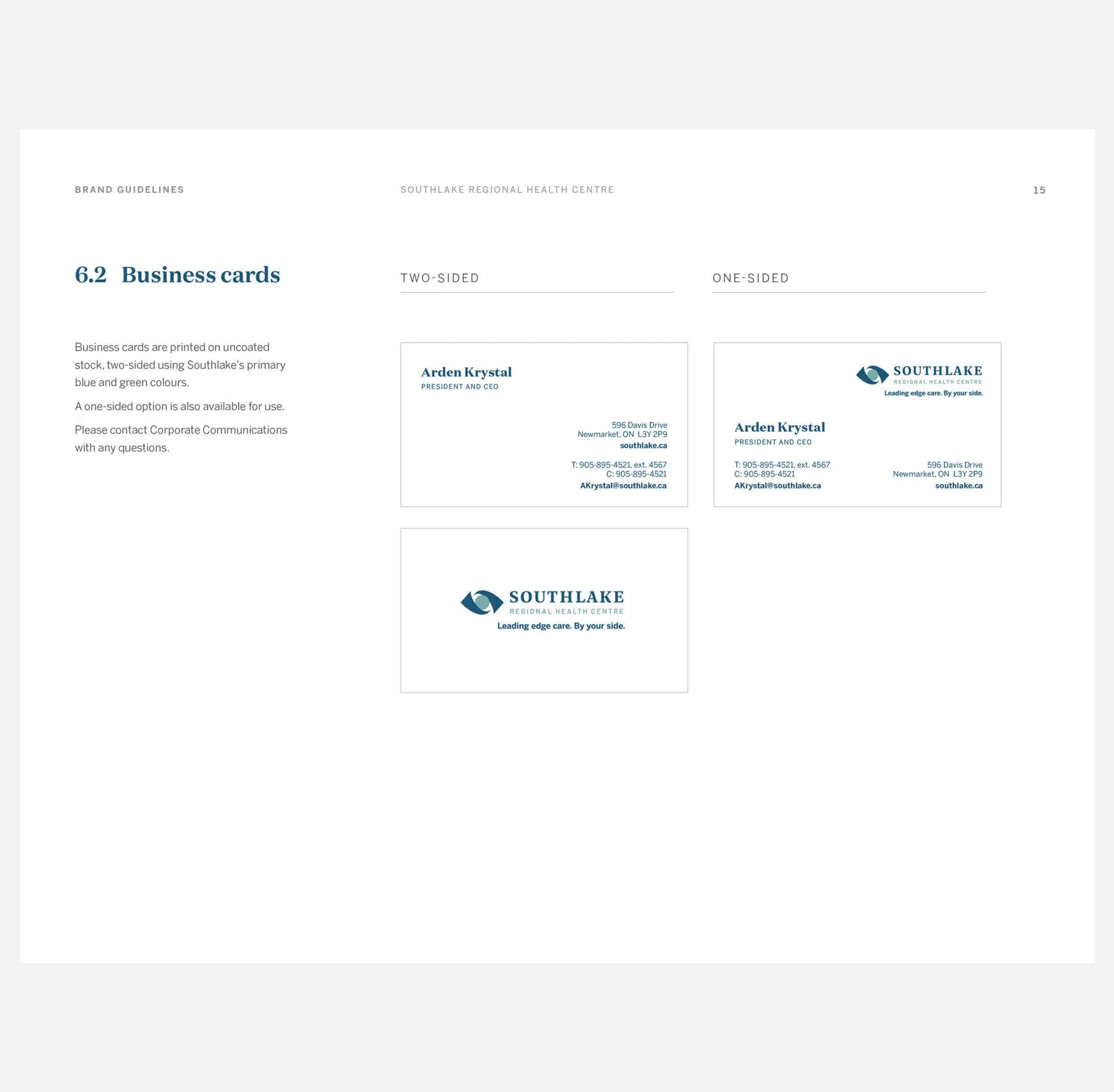
Forge continued to evolve the Southlake brand by developing a complete set of brand guidelines that established identity usage, colour specifications, typography direction, photography style, and recommendations around creating communication collateral.

The old Southlake Regional Health Centre logo
The new Southlake Regional Health Centre logo
Original identity and evolved identity
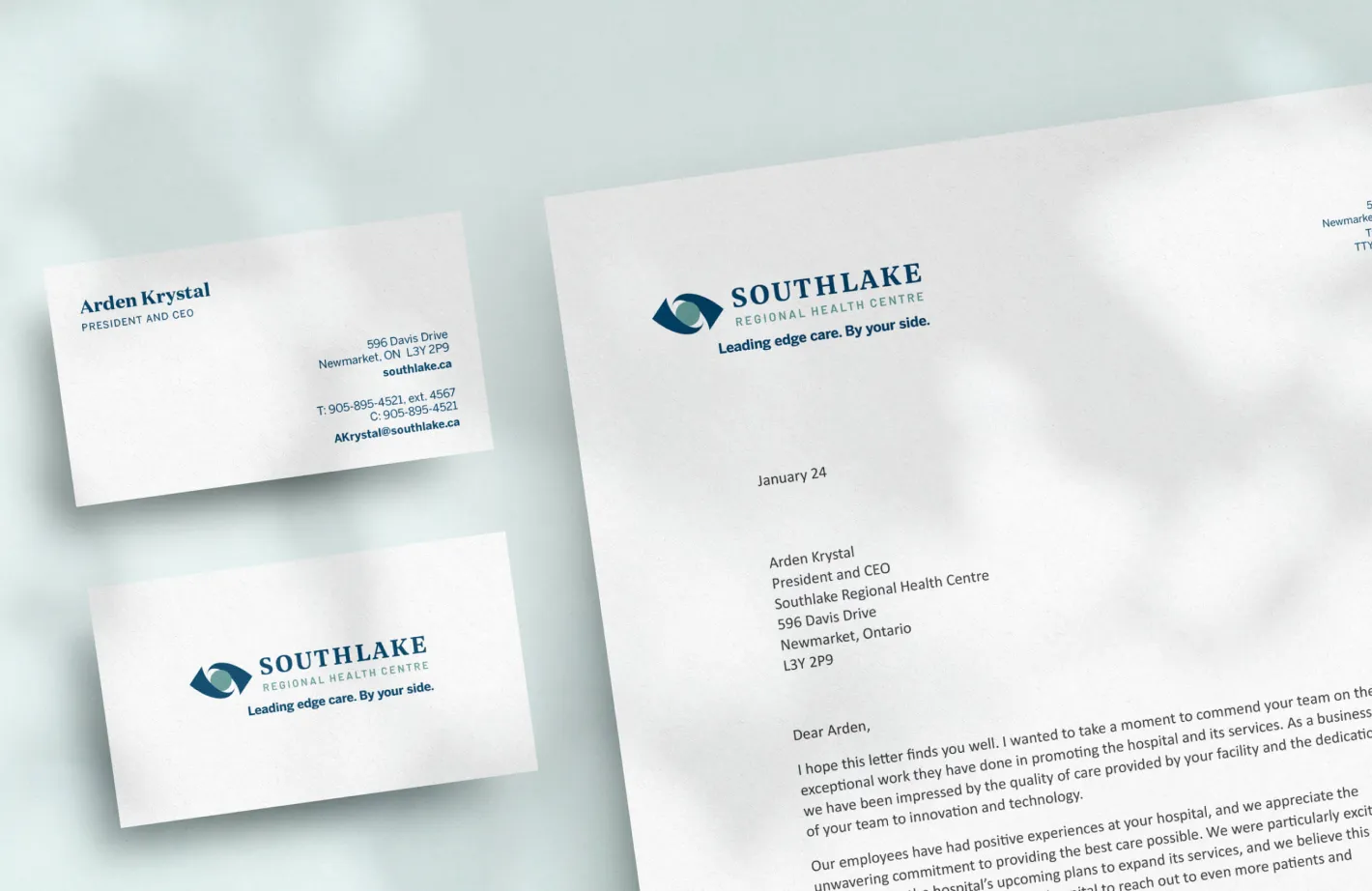
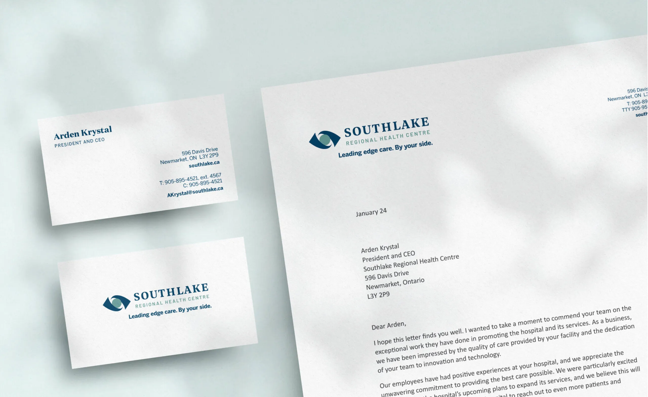
Southlake Regional Health Centre letterhead and business cards.
Business card and letterhead

Reinforcing the human element of care

Southlake’s newly launched brand experience captured the simplicity of emotional interactions and strengthened the hospital’s dedication to patient and provider care. The creative direction of the campaign reinforced the hospital’s commitment to providing outstanding care to surrounding communities.

  • 560K+ sq. ft. of hospital space
  • $500M annual operating budget
  • 400 patient beds
  • 6K people employed at hospital